Strategies for a revolution

This must be a record. It has taken me several months to get around to recording the talk I gave last year at EAGE in Vienna — Strategies for a revolution. Rather a gradiose title, sorry about that, especially over-the-top given that I was preaching to the converted: the workshop on open source. I did, at least, blog aobut the goings on in the workshop itself at the time. I even followed it up with a slightly cheeky analysis of the discussion at the event. But I never posted my own talk, so here it is:

Too long didn't watch? No worries, my main points were:

  1. It's not just about open source code. We must write open access content, put our data online, and push the whole culture towards openness and reproducibility. 
  2. We, as researchers, professionals, and authors, need to take responsibility for being more open in our practices. It has to come from within the community.
  3. Our conferences need more tutorials, bootcamps, , hackathons and sprints. These events build skills and networks much faster than (just) lectures and courses.
  4. We need something like an Open Geoscience Foundation to help streamline funding channels for open source projects and community events.

If you depend on open source software, or care about seeing more of it in our field, I'd love to hear your thoughts about how we might achieve the goal of having greater (scientific, professional, societal) impact with technology. Please leave a comment.


No secret codes: announcing the winners

The SEG / Agile / Enthought Machine Learning Contest ended on Tuesday at midnight UTC. We set readers of The Leading Edge the challenge of beating the lithology prediction in October's tutorial by Brendon Hall. Forty teams, mostly of 1 or 2 people, entered the contest, submitting several hundred entries between them. Deadlines are so interesting: it took a month to get the first entry, and I received 4 in the second month. Then I got 83 in the last twenty-four hours of the contest.

How it ended

Team F1 Algorithm Language Solution
1 LA_Team (Mosser, de la Fuente) 0.6388 Boosted trees Python Notebook
2 PA Team (PetroAnalytix) 0.6250 Boosted trees Python Notebook
3 ispl (Bestagini, Tuparo, Lipari) 0.6231 Boosted trees Python Notebook
4 esaTeam (Earth Analytics) 0.6225 Boosted trees Python Notebook
ml_contest_lukas_alfo.png

The winners are a pair of graduate petroelum engineers, Lukas Mosser (Imperial College, London) and Alfredo de la Fuente (Wolfram Research, Peru). Not coincidentally, they were also one of the more, er, energetic teams — it's say to say that they explored a good deal of the solution space. They were also very much part of the discussion about the contest on GitHub.com and on the Software Underground Slack chat group, aka Swung (you're in there, right?).

I will be sending Raspberry Shakes to the winners, along with some other swag from Enthought and Agile. The second-place team will receive books from SEG (thank you SEG Book Mart!), and the third-place team will have to content themselves with swag. That team, led by Paolo Bestagini of the Politecnico di Milano, deserves special mention — their feature engineering approach was very influential, being used by most of the top-ranking teams.

Coincidentally Gram and I talked to Lukas on Undersampled Radio this week:

Back up a sec, what the heck is a machine learning contest?

To enter, a team had to predict the lithologies in two wells, given wireline logs and other data. They had complete data, including lithologies, in nine other wells — the 'training' data. Teams trained a wide variety of models — from simple nearest neighbour models and support vector machines, to sophisticated deep neural networks and random forests. These met with varying success, with accuracies ranging between about 0.4 and 0.65 (i.e., error rates from 60% to 35%). Here's one of the best realizations from the winning model:

One twist that made the contest especially interesting was that teams could not just submit their predictions — they had to submit the code that made the prediction, in the open, for all their fellow competitors to see. As a result, others were quickly able to adopt successful strategies, and I'm certain the final result was better than it would have been with secret code.

I spent most of yesterday scoring the top entries by generating 100 realizations of the models. This was suggested by the competitors themselves as a way to deal with model variance. This was made a little easier by the fact that all of the top-ranked teams used the same language — Python — and the same type of model: extreme gradient boosted trees. (It's possible that the homogeneity of the top entries was a negative consequence of the open format of the contest... or maybe it just worked better than anything else.)

What now?

There will be more like this. It will have something to do with seismic data. I hope I have something to announce soon.

I (or, preferably, someone else) could write an entire thesis on learnings from this contest. I am busy writing a short article for next month's Leading Edge, so if you're interested in reading more, stay tuned for that. And I'm sure there wil be others.

If you took part in the contest, please leave a comment telling about your experience of it or, better yet, write a blog post somewhere and point us to it.

Hard things that look easy

After working on a few data science (aka data analytics aka machine learning) problems with geoscientific data, I think we've figured out the 10-step workflow. I'm happy to share it with you now:

  1. Look at all these cool problems, machine learning can solve all of these! I just need to figure out which model to use, parameterize it, and IT'S GONNA BE AWESOME, WE'LL BE RICH. Let's just have a quick look at the data...
  2. Oh, there's no data.
  3. Three months later: we have data! Oh, the data's a bit messy.
  4. Six months later: wow, cleaning the data is gross and/or impossible. I hate my life.
  5. Finally, nice clean data. Now, which model do I choose? How do I set parameters? At least you expected these problems. These are well-known problems.
  6. Wait, maybe there are physical laws governing this natural system... oh well, the model will learn them.
  7. Hmm, the results are so-so. I guess it's harder to make predictions than I thought it would be.
  8. Six months later: OK, this sort of works. And people think it sounds cool. They just need a quick explanation.
  9. No-one understands what I've done.
  10. Where is everybody?

I'm being facetious of course, but only a bit. Modeling natural systems is really hard. Much harder for the earth than for, say, the human body, which is extremely well-known and readily available for inspection. Even the weather is comparitively easy.

Coupled with the extreme difficulty of the problem, we have a challenging data environment. Proprietary, heterogeneous, poor quality, lost, non-digital... There are lots of ways the data goblins can poop on the playground of machine learning.

If the machine learning lark is so hard, why not just leave it to non-artificial intelligence — humans. We already learned how to interpret data, right? We know the model takes years to train. Of course, but I don't accept that we couldn't use some of the features of intelligently applied big data analytics: objectivity, transparency, repeatability (by me), reproducibility (by others), massive scale, high speed... maybe even error tolerance and improved decisions, but those seem far off right now.

I also believe that AI models, like any software, can encode the wisdom of professionals — before they retire. This seems urgent, as the long-touted Great Crew Change is finally underway.

What will we work on?

There are lots of fascinating and tractable problems for machine learning to attack in geoscience — I hope many of them get attacked at the hackathon in June — and the next 2 to 3 years are going to be very exciting. There will be the usual marketing melée to wade through, but it's up to the community of scientists and data analysts to push their way through that with real results based on open data and, ideally with open code.

To be sure, this is happening already — we've had over 25 entrants publishing their solutions to the SEG machine learning contest already, and there will be more like this. It's the only way to building transparent problem-solving systems that we can all participate in and, ultimately, trust.

What machine learning problems are most pressing in geoscience?
I'm collecting ideas for projects to tackle in the hackathon. Please visit this Tricider question and contribute your comments, opinions, or ideas of your own. Help the community work on the problems you care about.

News and updates and a sandwich

Plans for the hackathon in Paris in June are well underway. We now have two major sponsors: Dell EMC and now Total E&P too will be supporting the event with generous funding. Bolstered by this, I've set a goal of getting 50 participants in the event. Imagine that!

If you would like to help us reach this goal, please consider printing out some of these posters (right) and putting them up in your place of work or study >> hi-res PDF << It should even be readable in black & white, if that's your only option.

You can find links to everything you need to know about the event at agilescientific.com/paris.

Le grand sandwich délicieux

The hackathon is really just the filling in a delicious Parisian sandwich of geocomputing goodness. The bread at the bottom is the Hacker Bootcamp on 9 June. The filling is the hackathon weekend... and the final piece is the EAGE workshop on machine learning. Convened by geoscientists at Total and IFP, it should be a great day of knowledge sharing and discussion. I can't wait.

11 days to go!

There are only 11 days left to take part in the SEG Machine Learning contest, in which you are challenged to predict lithologies in two wells, given some wireline logs and lithologies in several other nearby wells. Everything you need to get started, even if you've never tried anything like this before, is right here. See Brendon Hall's TLE article for more deets.

The radio show for geo-nerds

Undersampled Radio is still going strong. We just recorded episode 32 today. Last week's chat with Prof Chris Jackson (Imperial College London) — who's embarking on a GSA lecture tour this year — was a real cracker, check it out:

The other thing you need to know about Chris is that he's started writing his blog again. It's awesome, of course, and you should probably just go and read it now...

Silos are a feature, not a bug

If you’ve had the same problem for a long time, maybe it’s not a problem. Maybe it’s a fact.
— Yitzhak Rabin

"Break down the silos" is such a hackneyed phrase that it's probably not even useful any more. But I still hear it all the time — especially in our work in governments and large enterprises. It's the wrong idea — silos are awesome.

The thing is: people like silos. That's why they are there. Whether they are project teams, organizational units, technical communities, or management layers, silos are comfortable. People can speak freely. Everyone shares the same values. There is trust. There is purpose.

The problem is that much of the time — maybe most of the time, for most people — you want silos not to matter. Don't confuse this with not wanting them to exist. They do exist: get used to it. So now make them not matter. Cope don't fix. 

Permeable seals

In the context of groups of humans who want to work together, what do permeable silos look like? I mean really leaky ones.

The answer is: it depends. Here are the features they will have:

  • They serve their organization. The silo must serve the organization or community it's part of. I think a service-oriented mindset gets the best out of people: get them asking "How can I help?". If it is not serving anyone, the silo needs to die.
  • They are internally effective. This is the whole point of the silo, so this had better be true. Make sure people can do a better job because of the efficiencies of the silo. Resources are provided. Responsibilities are understood. The shared purpose must result in great things... if not, the silo needs to die.
  • They are open. This is the leakiness criterion. If someone needs something from the silo, it must be obvious how to get it, and the cost of getting it must be very low. If someone wants to join the silo, it's obvious how to do this, and they are welcomed. If something about the silo needs to change, there is a clear path to making this known.
  • They are transparent. People need to know what the silo is for. If people look in, they can see how things work. Don't build secret clubs, black boxes, or other dark places. Conversely, if people in the silo want to look outside, they can. Importantly: if the silo's level of transparency doesn't make you uncomfortable, you're not doing enough of it.

The openness is key. Ideally, the mechanism for getting things from the silo is the same one that the silo's own inhabitants use. This is by far the simplest, cheapest way to nail it. Think of it as an interface; if you're a programmer, think of it as an API. Indeed, in many cases, it will involve an actual API. If this does not exist, other people will come up with their own solutions, and if this happens often enough, the silo will cease to be useful to the organization. Competition between silos is unhelpful.

Build more silos!

A government agency can be a silo, as long as it has a rich, free interface for other agencies and the general public to access its services. Geophysics can be a silo, as long as it's easy for a wave-curious engineer to join in, and the silo is promoting excellence and professional development amongst its members. An HR department can be a silo, as long as its practices and procedures are transparent and people can openly ask why the heck they still use Myers–Briggs tests.

Go and build a silo. Then make it not matter most of the time.


Image: Silos by Flickr user Guerretto, licensed CC-BY.

x lines of Python: machine learning

You might have noticed that our web address has changed to agilescientific.com, reflecting our continuing journey as a company. Links and emails to agilegeoscience.com will redirect for the foreseeable future, but if you have bookmarks or other links, you might want to change them. If you find anything that's broken, we'd love it if you could let us know.


Artificial intelligence in 10 lines of Python? Is this really the world we live in? Yes. Yes it is.

After reminding you about the SEG machine learning contest just before Christmas, I thought I could show you how you train a model in a supervised learning problem, then use it to make predictions on unseen data. So we'll just break a simple contest entry down into ten easy steps (note that you could do this on anything, doesn't have to be this problem). 

A machine learning primer

Before we start, let's review quickly what a machine learning problem looks like, and introduct a bit of jargon. To begin, we have a dataset (e.g. the 'Old' well in the diagram below). This consists of records, called instances. In this problem, each instance is a depth location. Each instance is a feature vector: a row vector comprising attributes or features, which in our case are wireline log values for GR, ILD, and so on. Each feature vector is a row in a matrix we conventionally call \(X\). Associated with each instance is some target label — the thing we want to predict — which is a continuous quantity in a regression problem, discrete in a classification problem. The vector of labels is usually called \(y\). In the problem below, the labels are integers representing 9 different facies.

You can read much more about the dataset I'm using in Brendon Hall's tutorial (The Leading Edge, October 2016).

The ten steps to glory

Well, maybe not glory, but something. A prediction of facies at two wells, based on measurements made at 10 other wells. You can follow along in the notebook, but all the highlights are included here. We start by loading the data into a 'dataframe', which you can think of like a spreadsheet:

Now we specify the features we want to use, and make the matrix \(X\) and label vector \(y\):

  features = ['GR', 'ILD_log10', 'DeltaPHI', 'PHIND', 'PE']
  X = df[features].values
  y = df.Facies.values

Since this dataset is all we have, we'd like to set aside some data to test our model on. The library we're using, scikit-learn, has functions to do this sort of thing; by default, it'll split \(X\) and \(y\) into train and test datasets, with 25% of the data going into the test part:

  X_train, X_test, y_train, y_test = train_test_split(X, y)

Now we're ready to choose a model, instantiate it (with some parameters if we want), and train the model (i.e. 'fit' the data). I am calling the trained model augur, because I like that word.

  from sklearn.ensemble import ExtraTreesClassifier
  model = ExtraTreesClassifier()
  augur = model.fit(X_train, y_train)

Now we're ready to take the part of the dataset we reserved for validation, X_test, and predict its labels. Then we can compare those with the known labels, y_test, to see how well we did:

  y_pred = augur.predict(X_test)

We can get a quick idea of the quality of prediction with sklearn.metrics.accuracy_score(y_test, y_pred), but it's more interesting to look at the classification report, which shows us the precision and recall for each class, along with their harmonic mean, the F1 score:

  from sklearn.metrics import classification_report
  print(classification_report(y_test, y_pred))
classification_report.png

Each row is a facies (facies 1, facies 2, etc.). The support is the number of instances representing that label. The key number here is 0.63 — we can regard this as an expression of the accuracy of our prediction. If that sounds low to you, I encourage you to enter the machine learning contest! If it sounds high, that's because it is — it's much too high. In fact, the instances of our dataset are not independent: they are spatially correlated (in depth). It would be smarter not to remove some random samples for validation, but to reserve entire wells. After all, this is how we typically collect subsurface data: one well at a time.

But now we're getting into the weeds of data science. I'll let you venture in there on your own...

2016 retrospective

As we see out the year — or rather shove it out, slamming the door firmly behind it, then changing the locks and filing a restraining order — we like to glance back over the blog. We remember the posts that we enjoyed writing, and the ones you seemed to enjoy reading, and record them here for posterity.

The most popular

The great thing about writing on the web, compared to print, is that you quickly find out whether it was any good, or useful, or at least slightly interesting. You can't hide from data. Without adjusting for the age of posts (older ones have had longer to garner readers of course), the most popular posts of the last 12 months — from the 47 we have published — were:

None of these posts comes anywhere near the most popular page on the site, k is for wavenumber, which I wrote in 2012 but still gets about 600 pageviews a month, nearly 4% of the traffic on the site. Other perennials include Well tie workflow, What is anisotropy? and What is SEG Y?

If you gauge popularity by real engagement — comments, which are like diamonds to bloggers — then, apart from the pieces I already mentioned, these were the next most commenty posts:

Where is everybody?

We don't collect data about our readers beyond what's reported by your browser to Google Analytics, most of which is pretty esoteric. But it is interesting to see the geographic distribution of our readers. The top dozen cities from the roughly two thirds of sessions — out of about 9000 monthly sessions — that report this information:

  1. Houston (3,457 users)
  2. Calgary (2,244)
  3. London (1,500)
  4. Perth (723)
  5. Kuala Lumpur (700)
  6. Stavanger
  7. Delhi
  8. Rio de Janeiro
  9. Leeds
  10. Aberdeen
  11. Jakarta
  12. New York

Last thing

You rock! I mean it. This blog would be pretty pointless without your eyeballs. We appreciate every visit, however short, and when you share a post with someone... it really makes our day. I love hearing from readers, even about typos. Especially aobut typos. Anyway, the point is: thank you for stopping by, and being part of this global community of geoscientists.

Whatever festival you celebrate this week, have a peaceful time*. And all the best for 2017!

* Well, maybe squeeze in a bit of writing: it's good for you. 


Previous Retrospective posts... 2011 retrospective •  2012 retrospective • 2013 retrospective • 2014 retrospective

There was no Retrospective in 2015, I was too discombobulated this time last year :(

Burning the surface onto the subsurface

Previously, I described a few of the reasons why we don't get a clean ground surface event on land seismic data like we do the water-bottom in marine seismic. In land data, the worst part of the image is right at the surface. But ground level is not just tricky to see, it's impossible to see. Since the vibe truck is on the ground, there's no reflection from that surface. Even if there was some kind of event there, processors apply a magic eraser to the top of the section — the mute — to erase the early arrivals. So it's not possible to see the ground in land data, and you can't pick what isn't there.  

But I still want to know where the ground is. Why can't we slap a ground-level seismic 'reflection' event on the section? 

What you need

We need the ground level, which is in depth of course, in the time domain of the seismic section. To compute this, let's call it \(t_\mathrm{G}\), we need three pieces of information at every trace location: the ground elevation \(G\), the seismic reference datum (SRD) which I'll call \(D\), and the replacement velocity \(V_\mathrm{r}\). 

$$ t_\mathrm{G} = \frac{2 (G - D)}{V_\mathrm{r}} $$

Ground elevation.  If you're lucky, you'll be able to find the ground elevation corresponding to each trace stored in the trace headers. Ground elevation might be located in bytes 41-44 or 45-48 of the trace header, which correspond to the receiver group elevation and the surface elevation of the source, respectively. These should be the same for a stacked trace, but as with any meta-data to do with SEGY, this info could be hiding somewhere else, or missing altogether. And if you're that unlucky, you might have to comb through processing reports for the missing information. If you are even more unlucky (as I was in this example), you won't have any kind of processing report to fall back on and you'll have to concoct something else. In the accompanying Jupyter notebook, I resorted to interpolating a digitized elevation profile from a JPEG plot of the seismic line. So if you're all out of options, you might find refuge in those legacy plots! 

This profile is particularly wonky, because the seismic reference datum (red) is not the same across the profile

This profile is particularly wonky, because the seismic reference datum (red) is not the same across the profile

Seismic reference datum. And to make life yet more complicated, the seismic reference datum is not flat across the profile. It goes downhill and then flattens out (red line below). Don't ask me what the advantages are of processing data to a variable datum, but whatever they are, I hope they offset the disadvantages of all-to-easily mistaking the datum to be flat.

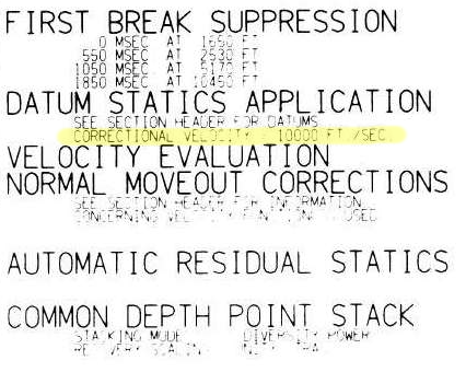
The replacement velocity is given in the sidelabel of the raster image online (shown right). It's 10 000 ft/sec, or 3048 m/s. 

Byte locations 53-56 and 57-60 are the standard trace header placeholders reserved for holding the datum elevation at the receiver group and the datum elevation at source. Again, for a stacked trace, these should be the same value. If these fields are zeros, then check the fields of the Trace Header Extension. If they turn up empty, and if the datum is horizontal, it might be listed in the file's text header. 

Convert elevation to time

By definition, the seismic reference datum is horizontal in the time-domain (red line below). Notice how the ground elevation – in the time domain – plots mostly as negative values (before) time zero. In other words, most of the ground is being cut-off by the top of the section. So, if we want to see it, we need to shift everything down into the field of view. Conceptually, this means adjusting the seismic reference datum so it floats entirely above the ground-level. Computationally, we can achieve this easily enough by padding the top of the data with zeros.

A time-domain representation of the ground-level along the seismic profile. The surface of the earth extends above the start of the seismic data for most of the locations along the profile.&nbsp;

A time-domain representation of the ground-level along the seismic profile. The surface of the earth extends above the start of the seismic data for most of the locations along the profile. 

Make the ground a pickable event

As a final bit of post-processing, we could actually burn the ground-level into the data as a sort of synthetic seismic event. The reason I like this concept is that it alleviates the need to dig up old-processing reports, puzzle over missing header data, or worse, maintain and munge external text files containing elevation information. I say, let's make it self-contained. Let's put it directly into the data so that it can be treated like any other seismic reflection. Why would I do this?

  • You can see where there might be fold, velocity or other issues related to topography.
  • You can immediately see the polarity of the data. 
  • You could use the bandwidth of the data to make the pseudo-reflector, giving a visual hint to the interpreter.
  • Keeping track of amplitude adjustments and phase rotations would be self-documenting and reversible.
  • you could autotrack it to get a topographic map (or just get this from the processor).
  • It looks cool!
Seismic profile with ground level SYNTHETICALLY SLAPPED ON TOP. &nbsp;Bandlimited, of course, so you can Autotrack till your hearts content!

Seismic profile with ground level SYNTHETICALLY SLAPPED ON TOP.  Bandlimited, of course, so you can Autotrack till your hearts content!

I've deliberately constructed a band-limited reflection, opposed to placing a sharp spike at ground-level. The problem with a spike is that it has infinite bandwidth. It contains higher frequencies than the image, so as Carl Reine commented on that last post, that might not play nice with seismic attributes. Also, there's the problem of selecting an amplitude value to assign to the spike: we don't want to introduce amplitudes that are ridiculously out of range of the existing data.  

The whole image

I hereby propose that this synthetic ground level trick adopted as the new standard for any land seismic processing and interpretation. The great thing is, it can be done just as easily by interpreters and seismic data technologists, as by the processing companies that create the rest of the image. I realize we're adding stuff to the data that isn't actually signal. We do non-real things to signals all the time. The question is, do the benefits outweigh the artificiality?

Here's the view of the entire section:

The whole section, ground level included.

The whole section, ground level included.

The details of this exercise can be found in the this Jupyter Notebook.

References

The seismic is line 36_77_PR from the USGS data repository.

SEG Y rev 2 Data Exchange Format. SEG Technical Standards Committee. Draft 2.0, January, 2015. 

SEG machine learning contest: there's still time

Have you been looking for an excuse to find out what machine learning is all about? Or maybe learn a bit of Python programming language? If so, you need to check out Brendon Hall's tutorial in the October issue of The Leading Edge. Entitled, "Facies classification using machine learning", it's a walk-through of a basic statistical learning workflow, applied to a small dataset from the Hugoton gas field in Kansas, USA.

But it was also the launch of a strictly fun contest to see who can get the best prediction from the available data. The rules are spelled out in ther contest's README, but in a nutshell, you can use any reproducible workflow you like in Python, R, Julia or Lua, and you must disclose the complete workflow. The idea is that contestants can learn from each other.

Left: crossplots and histograms of wireline log data, coloured by facies — the idea is to highlight possible data issues, such as highly correlated features. Right: true facies (left) and predicted facies (right) in a validation plot. See the rest of the paper for details.

What's it all about?

The task at hand is to predict sedimentological facies from well logs. Such log-derived facies are sometimes called e-facies. This is a familiar task to many development geoscientists, and there are many, many ways to go about it. In the article, Brendon trains a support vector machine to discriminate between facies. It does a fair job, but the accuracy of the result is less than 50%. The challenge of the contest is to do better.

Indeed, people have already done better; here are the current standings:

Team F1 Algorithm Language Solution
1 gccrowther 0.580 Random forest Python Notebook
2 LA_Team 0.568 DNN Python Notebook
3 gganssle 0.561 DNN Lua Notebook
4 MandMs 0.552 SVM Python Notebook
5 thanish 0.551 Random forest R Notebook
6 geoLEARN 0.530 Random forest Python Notebook
7 CannedGeo 0.512 SVM Python Notebook
8 BrendonHall 0.412 SVM Python Initial score in article

As you can see, DNNs (deep neural networks) are, in keeping with the amazing recent advances in the problem-solving capability of this technology, doing very well on this task. Of the 'shallow' methods, random forests are quite prominent, and indeed are a great first-stop for classification problems as they tend to do quite well with little tuning.

How do I enter?

There is still over 6 weeks to enter: you have until 31 January. There is a little overhead — you need to learn a bit about git and GitHub, there's some programming, and of course machine learning is a massive field to get up to speed on — but don't be discouraged. The very first entry was from Bryan Page, a self-described non-programmer who dusted off some basic skills to improve on Brendon's notebook. But you can run the notebook right here in mybinder.org (if it's up today — it's been a bit flaky lately) and a play around with a few parameters yourself.

The contest aspect is definitely low-key. There's no money on the line — just a goody bag of fun prizes and a shedload of kudos that will surely get the winners into some awesome geophysics parties. My hope is that it will encourage you (yes, you) to have fun playing with data and code, trying to do that magical thing: predict geology from geophysical data.


Reference

Hall, B (2016). Facies classification using machine learning. The Leading Edge 35 (10), 906–909. doi: 10.1190/tle35100906.1. (This paper is open access: you don't have to be an SEG member to read it.)

Where is the ground?

This is the upper portion of a land seismic profile in Alaska. Can you pick a horizon where the ground surface is? Have a go at pickthis.io.

Pick the Ground surface at the top of the seismic section at pickthis.io.

Pick the Ground surface at the top of the seismic section at pickthis.io.

Picking the ground surface on land-based seismic data is not straightforward. Picking the seafloor reflection on marine data, on the other hand, is usually a piece of cake, a warm-up pick. You can often auto-track the whole thing with a few seeds.

Seafloor reflection on Penobscot 3D survey, offshore Nova Scotia. from Matt's tutorial in the April 2016 The Leading Edge, The function of interpolation.

Seafloor reflection on Penobscot 3D survey, offshore Nova Scotia. from Matt's tutorial in the April 2016 The Leading Edge, The function of interpolation.

Why aren't interpreters more nervous that we don't know exactly where the surface of the earth is? I'm sure I'm not the only one that would like to have this information while interpreting. Wouldn't it be great if land seismic were more like marine?

Treacherously Jagged TopographY or Near-Surface processing ArtifactS?

Treacherously Jagged TopographY or Near-Surface processing ArtifactS?

If you're new to land-based seismic data, you might notice that there isn't a nice pickable event across the top of the section like we find in marine seismic data. Shot noise at the surface has been muted (deleted) in processing, and the low fold produces an unclean, jagged look at the top of the section. Additionally, the top of the section, time-zero — the seismic reference datum — usually floats somewhere above the land surface — and we can't know where that is unless it can be found in the file header, or looked up in the processing report.

The seismic reference datum, at a two-way time of zero seconds on seismic data,&nbsp;is typically set at mean sea level for offshore data. For land data, it is usually chosen to 'float' above the land surface.

The seismic reference datum, at a two-way time of zero seconds on seismic data, is typically set at mean sea level for offshore data. For land data, it is usually chosen to 'float' above the land surface.

Reframing the question

This challenge is a bit of a trick question. It begs the viewer to recognize that the seemingly simple task of mapping the ground level on a land seismic section is actually a rudimentary velocity modeling or depth conversion exercise in itself. Wouldn't it be nice to have the ground surface expressed as pickable seismic event? Shouldn't we have it always in our images? Baked into our data, so to speak, such that we've always got an unambiguous pick? In the next post, I'll illustrate what I mean and show what's involved in putting it in. 

In the meantime, I challenge you to pick where you think the (currently absent) ground surface is on this profile, so in the next post we can see how well you did.