Illuminated equations

Last year I wrote a post about annotated equations, and why they are useful teaching tools. But I never shared all the cool examples people tweeted back, and some of them are too good not to share.

Let’s start with this one from Andrew Alexander that he uses to explain complex number notation:

illuminated_complex.png

Paige Bailey tweeted some examples of annotated equations and code from the reinforcement learning tutorial, Building a Powerful DQN in TensorFlow by Sebastian Theiler. Here’s one of the algorithms, with slightly muted annotations:

Illuminated_code_Theiler_edit.jpeg.png

Finally, Jesper Dramsch shared a new one today (and reminded me that I never finished this post). It links to Edward Raff’s book, Inside Deep Learning, which has some nice annotations, e.g. expressing a fundamental idea of machine learning:

Raff_cost_function.png

Dynamic explication

The annotations are nice, but it’s quite hard to fully explain an equation or algorithm in one shot like this. It’s easier to do, and easier to digest, over time, in a presentation. I remember a wonderful presentation by Ross Mitchell (then U of Calgary) at the also brilliant lunchtime mathematics lectures that Shell used to sponsor in Calgary. He unpeeled time-frequency analysis, especially the S transform, and I still think about his talk today.

What Ross understood is that the learner really wants to see the maths build, more or less from first principles. Here’s a nice example — admittedly in the non-ideal medium of Twitter: make sure you read the whole thread — from Darrel Francis, a cardiologist at Imperial Colege, London:

A video is even more dynamic of course. Josef Murad shared a video in which he derives the Navier–Stokes equation:

In this video, Grant Sanderson, perhaps the equation explainer nonpareil, unpacks the Fourier transform. He creeps up on the equation, starting instead with building the intuition around frequency decomposition:

If you’d like to try making this sort of thing, you might like to know that Sanderson’s Python software, manim, is open source.


Multi-modal explication

Sanderson illustrates nicely that the teacher has several pedagogic tools at their disposal:

  • The spoken word.

  • The written word, especially the paragraph describing a function.

  • A symbolic representation of the function.

  • A graphical representation of the function.

  • A code representation of the function, which might also have a docstring, which is a formal description of the code, its inputs, and its outputs. It might also produce the graphical representation.

  • Still other modes, e.g. pseudocode (see Theiler’s example, above), a cartoon (esssentially a ‘pseudofigure’),

Virtually all of these things are, or can be dynamic (in a video, on a whiteboard) and annotated. They approach the problem from different directions. The spoken and written descriptions should be rigorous and unambiguous, but this can make them clumsy. Symbolic maths can be useful to those that can read it, but authors must take care to define symbols properly and to be consistent. The code representation must be strict (assuming it works), but might be hard for non-programmers to parse. Figures help most people, but are more about building intuition than providing the detail you might need for implementation, say. So perhaps the best explanations have several modes of explication.

In this vein of multi-modal explication, Jeremy Howard shared a nice example from his book, Deep learning for coders, of combining text, symbolic maths, and code:

illuminated_jeremy_howard.png

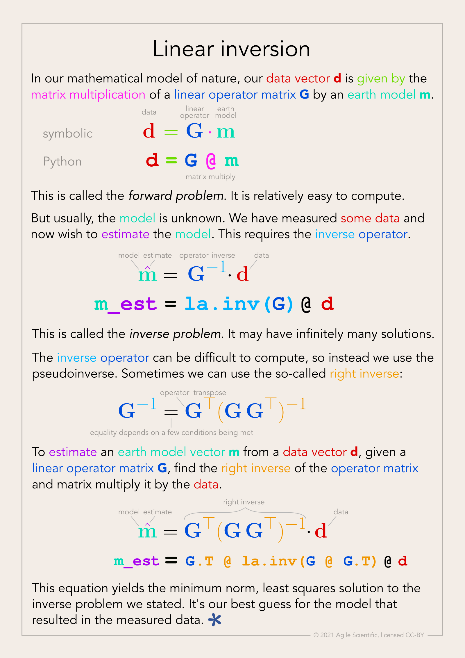
Eventually I settled on calling these things, that go beyond mere annotation, illuminated equations (not to directly compare them to the beautiful works of devotion produced by monks in the 13th century, but that’s the general idea). I made an attempt to describe linear regression and the neural network equation (not sure what else to call it!) in a series of tweets last year. Here’s the all-in-one poster version (as a PDF):

linear_inversion_page.png

There’s nothing intuitive about physics, maths, or programming. The more tricks we have for spreading intuition about these important scientific tools, the better. I think there’s something in illuminated equations for teachers to practice — and students too. In fact, Jackie Caplan-Auerbach decribes coaching her students in creating ‘equation dictionaries’ in her geophysics classes. I think this is a wonderful idea.

If you’re teaching or learning maths, I’d love to hear your thoughts. Are these things worth the effort to produce? Do you have any favourite examples to share?

Hooke's oolite

52 Things You Should Know About Rock Physics came out last week. For the first, and possibly the last, time a Fellow of the Royal Society — the most exclusive science club in the UK — drew the picture on the cover. The 353-year-old drawing was made by none other than Robert Hooke

The title page from Micrographia, and part of the dedication to Charles II. You can browse the entire book at archive.org.

The title page from Micrographia, and part of the dedication to Charles II. You can browse the entire book at archive.org.

The drawing, or rather the engraving that was made from it, appears on page 92 of Micrographia, Hooke's groundbreaking 1665 work on microscopy. In between discovering and publishing his eponymous law of elasticity (which Evan wrote about in connection with Lamé's \(\lambda\)), he drew and wrote about his observations of a huge range of natural specimens under the microscope. It was the first time anyone had recorded such things, and it was years before its accuracy and detail were surpassed. The book established the science of microscopy, and also coined the word cell, in its biological context.

Sadly, the original drawing, along with every other drawing but one from the volume, was lost in the Great Fire of London, 350 years ago almost to the day. 

Ketton stone

The drawing on the cover of the new book is of the fractured surface of Ketton stone, a Middle Jurassic oolite from central England. Hooke's own description of the rock, which he mistakenly called Kettering Stone, is rather wonderful:

I wonder if anyone else has ever described oolite as looking like the ovary of a herring?

These thoughtful descriptions, revealing a profundly learned scientist, hint at why Hooke has been called 'England's Leonardo'. It seems likely that he came by the stone via his interest in architecture, and especially through his friendsip with Christopher Wren. By 1663, when it's likely Hooke made his observations, Wren had used the stone in the façades of several Cambridge colleges, including the chapels of Pembroke and Emmanuel, and the Wren Library at Trinity (shown here). Masons call porous, isotropic rock like Ketton stone 'freestone', because they can carve it freely to make ornate designs. Rock physics in action!

You can read more about Hooke's oolite, and the geological significance of his observations, in an excellent short paper by material scientist Derek Hull (1997). It includes these images of Ketton stone, for comparison with Hooke's drawing:

Reflected light photomicrograph (left) and backscatter scanning electron microscope image (right) of Ketton Stone. Adapted from figures 2 and 3 of Hull (1997). Images are © Royal Society and used in accordance with their terms.

Reflected light photomicrograph (left) and backscatter scanning electron microscope image (right) of Ketton Stone. Adapted from figures 2 and 3 of Hull (1997). Images are © Royal Society and used in accordance with their terms.

I love that this book, which is mostly about the elastic behaviour of rocks, bears an illustration by the man that first described elasticity. Better still, the illustration is of a fractured rock — making it the perfect preface. 


References

Hall, M & E Bianco (eds.) (2016). 52 Things You Should Know About Rock Physics. Nova Scotia: Agile Libre, 134 pp.

Hooke, R (1665). Micrographia: or some Physiological Descriptions of Minute Bodies made by Magnifying Glasses, pp. 93–100. The Royal Society, London, 1665.

Hull, D (1997). Robert Hooke: A fractographic study of Kettering-stone. Notes and Records of the Royal Society of London 51, p 45-55. DOI: 10.1098/rsnr.1997.0005.

Your best work(space)

Doing your best work requires placing yourself in the right environment. For me, I need to be in an uncluttered space, free from major distractions, yet close enough to interactions to avoid prolonged isolation. I also believe in surrounding yourself with the energetic and inspired people, if you can afford such a luxury.

The model workspace

My wife an I are re-doing our office at home. Currently mulling over design ideas, but websites and catalogs only take me so far. I find they fall short of giving me the actual look and feel of a future space. To cope, I have built a model using SketchUp, catering to my geeky need for spatial visualization. It took me 35 minutes to build the framework using SketchUp: the walls, doors and closets and windows. Now, it's taking us much longer to design and build the workspace inside it. I was under the impression that, just as in geoscience, we need models for making detailed descisions. But perhaps, this model is complicating or delaying us getting started. Or maybe we are just being picky. Refined tastes.

This is a completely to-scale drafting of my new office. It is missing some furniture, but the main workspace is shown on the left wall; a large, expansive desk to house (up to) two monitors, two chairs, and two laptops. The wide window sill will be fitted with bench cushions for reading. Since we want a built-in look, it makes sense construct a digital model to see how the components line up with other features in the space. 

More than one place to work 

So much of what we do in geoscience is centered around effectively displaying information, so it helps to feel fresh and inspired by the environment beyond the desktop. Where we work affects how we work. Matt and I have that luxury of defining our professional spaces, and we are flexible and portable enough to work in a number of settings. I like this.

There is a second place to go to when I want to get out of the confines of my condo. I spend about 30 hours a month at a co-working space downtown. The change in scenery is invigorating. I can breathe the same air as like-minded entrepreneurs, freelancers, and sprouters of companies. I can plug into large monitors, duck into a private room for a conference call, hold a meeting, or collaborate with others. Part of what makes an office is the technology, the furniture, the lighting, which is important. The other part of a workspace is your relationship and interaction to other people and places; a sense of community.

What does your best work space look like? Are you working there now?