x lines of Python: static basemaps with contextily

Difficulty rating: Beginner

Something that is often useful in planning is to have a basemap of the area in which you have data or an interest. This can be made using a number of different tools, up to and including full-fledged GIS software, but we will use Contextily for a quick static basemap using Python. Installation is as simple as using conda install contextily or pip install contextily.

The steps that we want to take are the following, expressed in plain English, each of which will roughly be one line of code:

  1. Get a source for our basemap (placenames and similar things)
  2. Get a source for our geological map
  3. Get the location that we would like to map
  4. Plot the location with our geological data
  5. Add the basemap to our geological map
  6. Add the attribution for both maps
  7. Plot our final map

We will start with the imports, which as usual do not count:

 
import contextily as ctx
import matplotlib.pyplot as plt

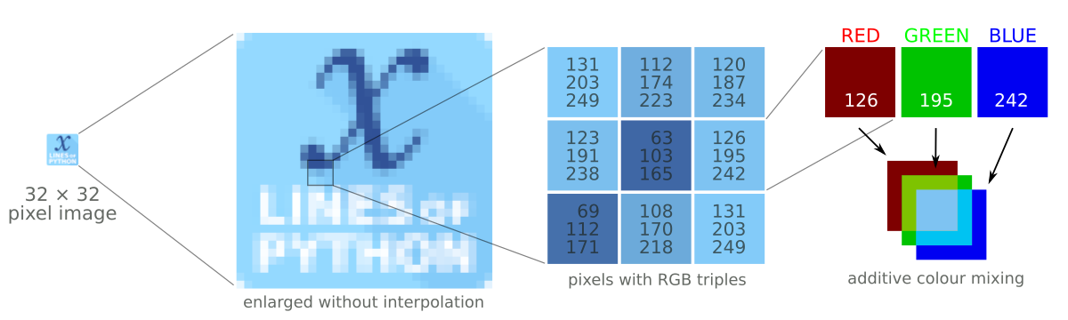
Contextily has a number of built-in providers of map tiles, which can be accessed using the ctx.providers dictionary. This is nested, with some providers offering multiple tiles. An example is the ctx.providers.OpenStreetMap.Mapnik provider, which contains the following:

 
{'url': 'https://{s}.tile.openstreetmap.org/{z}/{x}/{y}.png',
 'max_zoom': 19,
 'attribution': '(C) OpenStreetMap contributors',
 'name': 'OpenStreetMap.Mapnik'}

The most important parameter in the dictionary for each provider is the url. These are of the form example.com/{z}/{x}/{y}.png. The {z} is the zoom level, while {x} and {y} relate to the latitude and longitude of a given tile, respectively. Note that these are the same as those used by interactive Slippy maps; contextily just downloads them as a single static image.

The easiest is to use one of these providers, but we can also define our own provider, using the above pattern for the URL. For geological data, the Macrostrat project is a great resource, especially because they have a tileserver supplying some detail. Their tileserver can be added using

 
geology_tiles = 'https://tiles.macrostrat.org/carto/{z}/{x}/{y}.png'

We also need a place to map. Contextily has a geocoder that can return the tiles covering a given location. It uses OpenStreetMap, so anything that is present there is useable as a location. This includes countries (e.g. 'Paraguay'), provinces/states ('Nova Scotia'), cities ('Lubumbashi'), and so on.

We will use Nova Scotia as our area of interest, as well as giving our desired map tiles. We can also use .plot() on the Place object to get a look at it immediately, using that basemap.

 
ctx.Place('Nova Scotia', source=ctx.providers.CartoDB.Positron).plot()
The Positron style from Carto for Nova Scotia.

The Positron style from Carto for Nova Scotia.

We'll use a different basemap though:

 
basemap = ctx.providers.Stamen.Toner

We can create the Place with our desired source — geology_tiles in this case — and then plot this on the basemap with some transparency. We will also add an attribution, since we need to credit MacroStrat.

 
place = ctx.Place('Nova Scotia', source=geology_tiles)

base_ax = place.plot()
ctx.add_basemap(ax=base_ax, source=basemap, alpha=0.5)
text = basemap.attribution + ' | Geological data: MacroStrat.org (CC-BY)'
ctx.add_attribution(ax=base_ax, text=text)

Finally, after a plt.show() call, we get the following:

nova_scotia_geology.png

Obviously this is still missing some important things, like a proper legend, but as a quick overview of what we can expect in a given area, it is a good approach. This workflow is probably better suited for general location maps.

Contextily also plays well with geopandas, allowing for an easy locality map of a given GeoDataFrame. Check out the accompanying Notebook for an example.

Binder  Run the accompanying notebook in MyBinder

x lines of Python: Loading images

Difficulty rating: Beginner

We'd often like to load images into Python. Once loaded, we might want to treat them as images, for example cropping them, saving in another format, or adjusting brightness and contrast. Or we might want to treat a greyscale image as a two-dimensional NumPy array, perhaps so that we can apply a custom filter, or because the image is actually seismic data.

This image-or-array duality is entirely semantic — there is really no difference between images and arrays. An image is a regular array of numbers, or, in the case of multi-channel rasters like full-colour images, a regular array of several numbers: one for each channel. So each pixel location in an RGB image contains 3 numbers:

raster_with_RGB_triples.png

In general, you can go one of two ways with images:

  1. Load the image using a library that 'knows about' (i.e. uses language related to) images. The preeminent tool here is pillow (which is a fork of the grandparent of all Python imaging solutions, PIL).
  2. Load the image using a library that knows about arrays, like matplotlib or scipy. These wrap PIL, making it a bit easier to use, but potentially losing some options on the way.

The Jupyter Notebook accompanying this post shows you how to do both of these things. I recommend learning to use some of PIL's power, but knowing about the easier options too.

Here's the way I generally load an image:

 
from PIL import Image
im = Image.open("my_image.png")

(One strange thing about pillow is that, while you install it with pip install pillow, you still actually import and use PIL in your code.) This im is an instance of PIL's Image class, which is a data structure especially for images. It has some handy methods, like im.crop(), im.rotate(), im.resize(), im.filter(), im.quantize(), and lots more. Doing some of these operations with NumPy arrays is fiddly — hence PIL's popularity.

But if you just want your image as a NumPy array:

 
import numpy as np
arr = np.array(im)

Note that arr is a 3-dimensional array, the dimensions being row, column, channel. You can go off with arr and do whatever you need, then cast back to an Image with Image.fromarray(arr).

All this stuff is demonstrated in the Notebook accompanying this post, or you can use one of these links to run it right now in your browser:

Binder   Run the accompanying notebook in MyBinder


Unweaving the rainbow

Last week at the Canada GeoConvention in Calgary I gave a slightly silly talk on colourmaps with Matteo Niccoli. It was the longest, funnest, and least fruitful piece of research I think I've ever embarked upon. And that's saying something.

Freeing data from figures

It all started at the Unsession we ran at the GeoConvention in 2013. We asked a roomful of geoscientists, 'What are the biggest unsolved problems in petroleum geoscience?'. The list we generated was topped by Free the data, and that one topic alone has inspired several projects, including this one. 

Our goal: recover digital data from any pseudocoloured scientific image, without prior knowledge of the colourmap.

I subsequently proferred this challenge at the 2015 Geophysics Hackathon in New Orleans, and a team from Colorado School of Mines took it on. Their first step was to plot a pseudocoloured image in (red, green blue) space, which reveals the colourmap and brings you tantalizingly close to retrieving the data. Or so it seems...

Here's our talk:

Images as data

I was at the Atlantic Geoscience Society's annual meeting on Friday and Saturday, held this year in a cold and windy Truro, Nova Scotia. The AGS is a fairly small meeting — maybe a couple of hundred geoscientists make the trip — but usually good value, especially if you're working in the area. 

A few talks and posters caught my attention, as they were all around a similar theme: getting data from images. Not in an interpretive way, though — these papers were about treating images fairly literally. More like extracting impedance from seismic than, say, making a horizon map.

Drone to stereonet

Amazing 3D images generated from a large number of 2D images of outcrop. LEft: the natural colour image. Middle: all facets generated by point cloud analysis. Right: the final set of human-filtered facets. © Joseph Cormier 2016

Amazing 3D images generated from a large number of 2D images of outcrop. LEft: the natural colour image. Middle: all facets generated by point cloud analysis. Right: the final set of human-filtered facets. © Joseph Cormier 2016

Probably the most eye-catching poster was that of Joseph Cormier (UNB), who is experimenting with computer-assisted structural interpretation. Using dozens of high-res photographs collected by a UAV, Joseph combines them to create reconstruct the 3D scene of the outcrop — just from photographs, no lidar or other ranging technology. The resulting point cloud reveals the orientations of the outcrop's faces, as well as fractures, exposed faults, and so on. A human interpreter can then apply her judgment to filter these facets to groups of tectonically significant sets, at which point they can be plotted on a stereonet. Beats crawling around with a Brunton or Suunto for days!

Hyperspectral imaging

There was another interesting poster by a local mining firm that I can't find in the abstract volume. They had some fine images from CoreScan, a hyperspectral imaging and analysis company operating in the mining industry. The technology, which can discern dozens of rock-forming minerals from their near infrared and shortwave infrared absorption characteristics, seems especially well-suited to mining, where mineralogical composition is usually more important than texture and sedimentological interpretation. 

Isabel Chavez (SMU) didn't need a commercial imaging service. To help correlate Laurasian shales on either side of the Atlantic, she presented results from using a handheld Konica-Minolta spectrophotometer on core. She found that CIE L* and a* colour parameters correlated with certain element ratios from ICP-MS analysis. Like many of the students at AGS, Isabel was presenting her undergraduate thesis — a real achievement.

Interesting aside: one of the chief applications of colour meters is measuring the colour of chips. Fascinating.

The hacker spirit is alive and well

The full spectrum (top), and the CCD responses with IR filter, Red filter, green filter, and blue filter (bottom). All of the filters admitted some infrared light, causing problems for calibration. © Robert McEwan 2016.

The full spectrum (top), and the CCD responses with IR filter, Red filter, green filter, and blue filter (bottom). All of the filters admitted some infrared light, causing problems for calibration. © Robert McEwan 2016.

After seeing those images, and wishing I had a hyperspectral imaging camera, Rob McEwan (Dalhousie) showed how to build one! In a wonderfully hackerish talk, he showed how he's building a $100 mineralogical analysis tool. He started by removing the IR filter from a second-hand Nikon D90, then — using a home-made grating spectrometer — measured the CCD's responses in the red, green, blue, and IR bands. After correcting the responses, Rob will use the USGS spectral library (Clark et al. 2007) to predict the contributions of various minerals to the image. He hopes to analyse field and lab photos at many scales. 

Once you have all this data, you also have to be able to process it. Joshua Wright (UNB) showed how he has built a suite of VisualBasic Macros to segment photomicrographs into regions representing grains using FIJI, then post-process the image data as giant arrays in an Excel spreadsheet (really!). I can see how a workflow like this might initially be more accessible to someone new to computer programming, but I felt like he may have passed Excel's sweetspot. The workflow would be much smoother in Python with scikit-image, or MATLAB with the Image Processing Toolbox. Maybe that's where he's heading. You can check out his impressive piece of work in a series of videos; here's the first:

Looking forward to 2016

All in all, the meeting was a good kick off to the geoscience year — a chance to catch up with some local geoscientists, and meet some new ones. I also had the chance to update the group on striplog, which generated a bit of interest. Now I'm back in Mahone Bay, enjoying the latest winter storm, enjoying the feeling of having something positive to blog about!

Please be aware that, unlike the images I usually include in posts, the images in this post are not open access and remain the copyright of their respective authors.


References

Isabel Chavez, David Piper, Georgia Pe-Piper, Yuanyuan Zhang, St Mary's University (2016). Black shale Selli Level recorded in Cretaceous Naskapi Member cores in the Scotian Basin. Oral presentation, AGS Colloquium, Truro NS, Canada.

Clark, R.N., Swayze, G.A., Wise, R., Livo, E., Hoefen, T., Kokaly, R., Sutley, S.J., 2007, USGS digital spectral library splib06a: U.S. Geological Survey, Digital Data Series 231

Joseph Cormier, Stefan Cruse, Tony Gilman, University of New Brunswick (2016). An optimized method of unmanned aerial vehicle surveying for rock slope analysis, 3D modeling, and structural feature extraction. Poster, AGS Colloquium, Truro NS, Canada.

Robert McEwan, Dalhousie University (2016). Detecting compositional variation in granites – a method for remotely sensed platform. Oral presentation, AGS Colloquium, Truro NS, Canada.

Joshua Wright, University of New Brunswick (2016). Using macros and advanced functions in Microsoft ExcelTM to work effectively and accurately with large data sets: An example using sulfide ore characterizatio. Oral presentation, AGS Colloquium, Truro NS, Canada.

Save the samples

A long while ago I wrote about how to choose an image format, and then followed that up with a look at vector vs raster graphics. Today I wanted to revisit rasters (you might think of them as bitmaps, images, or photographs). Because a question that seems to come up a lot is 'what resolution should my images be?' 

Forget DPI

When writing for print, it is common to be asked for a certain number of dots per inch, or dpi (or, equivalently, pixels per inch or ppi). For example, I've been asked by journal editors for images 'at least 200 dpi'. However, image files do not have an inherent resolution — they only have pixels. The resolution depends on the reproduction size you choose. So, if your image is 800 pixels wide, and will be reproduced in a 2-inch-wide column of print, then the final image is 400 dpi, and adequate for any purpose. The same image, however, will look horrible at 4 dpi on a 16-foot-wide projection screen.

Rule of thumb: for an ordinary computer screen or projector, aim for enough pixels to give about 100 pixels per display inch. For print purposes, or for hi-res mobile devices, aim for about 300 ppi. If it really matters, or your printer is especially good, you are safer with 600 ppi.

The effect of reducing the number of pixels in an image is more obvious in images with a lot of edges. It's clear in the example that downsampling a sharp image (a to c) is much more obvious than downsampling the same image after smoothing it with a 25-pixel Gaussian filter (b to d). In this example, the top images have 512 × 512 samples, and the downsampled ones underneath have only 1% of the information, at 51 × 51 samples (downsampling is a type of lossy compression).

Careful with those screenshots

The other conundrum is how to get an image of, say, a seismic section or a map.

What could be easier than a quick grab of your window? Well, often it just doesn't cut it, especially for data. Remember that you're only grabbing the pixels on the screen — if your monitor is small (or perhaps you're using a non-HD projector), or the window is small, then there aren't many pixels to grab. If you can, try to avoid a screengrab by exporting an image from one of the application's menus.

For seismic data, you'd like to capture sample as a pixel. This is not possible for very long or deep lines, because they don't fit on your screen. Since CGM files are the devil's work, I've used SEGY2ASCII (USGS Open File 2005–1311) with good results, converting the result to a PGM file and loading into Gimp

Large seismic lines are hard to capture without decimating the data. Rockall Basin. Image: BGS + Virtual Seismic Atlas.If you have no choice, make the image as large as possible. For example, if you're grabbing a view from your browser, maximize the window, turn off the bookmarks and other junk, and get as many pixels as you can. If you're really stuck, grab two or more views and stitch them together in Gimp or Inkscape

When you've got the view you want, crop the window junk that no-one wants to see (frames, icons, menus, etc.) and save as a PNG. Then bring the image into a vector graphics editor, and add scales, colourbars, labels, annotation, and other details. My advice is to do this right away, before you forget. The number of times I've had to go and grab a screenshot again because I forgot the colourbar...

The Lenna image is from Hall, M (2006). Resolution and uncertainty in spectral decomposition. First Break 24, December 2006, p 43-47.

A stupid seismic model from core

On the plane back from Calgary, I got an itch to do some image processing on some photographs I took of the wonderful rocks on display at the core convention. Almost inadvertently, I composed a sequence of image filters that imitates a seismic response. And I came to these questions:  

  • Is this a viable way to do forward modeling? 
  • Can we exploit scale invariance to make more accurate forward models?
  • Can we take the fabric from core and put it in a reservoir model?
  • What is the goodness of fit between colour and impedance? 

Click to enlargeAbove all, this image processing excerise shows an unambiguous demonstration of the effects of bandwidth. The most important point, no noise has been added. Here is the sequence, it is three steps: convert to grayscale, compute Laplacian, apply bandpass filter. This is analgous to the convolution of a seismic wavelet and the earth's reflectivity. Strictly speaking, it would be more physically sound to make a forward model using wavelet convolution (simple) or finite difference simulation (less simple), but that level of rigour was beyond the scope of my tinkering.

The two panels help illustrate a few points. First, finely layered heterogeneous stratal packages coalesce into crude seismic events. This is the effect of reducing bandwidth. Second, we can probably argue about what is 'signal' and what is 'noise'. However, there is no noise, per se, just geology that looks noisy. What may be mistaken as noise, might in fact be bonafide interfaces within material properties. 

If the geometry of geology is largely scale invariant, perhaps, just perhaps, images like these can be used at the basin and reservoir scale. I really like the look of the crumbly fractures near the bottom of the image. This type of feature could drive the placement of a borehole, and the production in a well. The patches, speckles, and bands in the image are genuine features of the geology, not issues of quality or noise. 

Do you think there is a role for transforming photographs of rocks into seismic objects?

Segmentation and decomposition

Day 4 of the SEG Annual Meeting in Las Vegas was a game of two halves: talks in the morning and workshops in the afternoon. I caught two signal processing talks, two image processing talks, and two automatic interpretation talks, then spent the afternoon in a new kind of workshop for students. My highlights:

Anne Solberg, DSB, University of Oslo

Evan and I have been thinking about image segmentation recently, so I'm drawn to those talks (remember Halpert on Day 2?). Angélique Berthelot et al. have been doing interesting work on salt body detection. Solberg (Berthelot's supervisor) showed some remarkable results. Their algorithm:

  1. Compute texture attributes, including Haralick and wavenumber textures (Solberg 2011)
  2. Supervised Bayesian classification (we've been using fuzzy c-means)
  3. 3D regularization and segmentation (okay, I got a bit lost at this point)

The results are excellent, echoing human interpretation well (right) — but having the advantage of being objective and repeatable. I was especially interested in the wavenumber textures, and think they'll help us in our geothermal work. 

Jiajun Han, BLISS, University of Alberta

The first talk of the day was that classic oil industry: a patented technique with an obscure relationship to theory. But Jiajun Han and Mirko van der Baan of the University of Alberta gave us the real deal — a special implementation of empirical mode decomposition, which is a way to analyse time scales (frequencies, essentially), without leaving the time domain. The result is a set of intrinsic mode functions (IMFs), a bit like Fourier components, from which Han extracts instantaneous frequency. It's a clever idea, and the results are impressive. Time–frequency displays usually show smearing in either the time or frequency domain, but Han's method pinpoints the signals precisely:

That's it from me for SEG — I fly home tomorrow. It's tempting to stay for the IQ Earth workshop tomorrow, but I miss my family, and I'm not sure I can crank out another post. If you were in Vegas and saw something amazing (at SEG I mean), please let us know in the comments below. If you weren't, I hope you've enjoyed these posts. Maybe we'll see you in Houston next year!

More posts from SEG 2012.

The images adapted from Berthelot and Han are from the 2012 Annual Meeting proceedings. They are copyright of SEG, and used here in accordance with their permissions guidelines.

Smoothing, unsmoothness, and stuff

Day 2 at the SEG Annual Meeting in Las Vegas continued with 191 talks and dozens more posters. People are rushing around all over the place — there are absolutely no breaks, other than lunch, so it's easy to get frazzled. Here are my highlights:

Adam Halpert, Stanford

Image segmentation is an important class of problems in computer vision. An application to seismic data is to automatically pick a contiguous cloud of voxels from the 3D seismic image — a salt body, perhaps. Before trying to do this, it is common to reduce noise (e.g. roughness and jitter) by smoothing the image. The trick is to do this without blurring geologically important edges. Halpert did the hard work and assessed a number of smoothers for both efficacy and efficiency: median (easy), Kuwahara, maximum homogeneity median, Hale's bilateral [PDF], and AlBinHassan's filter. You can read all about his research in his paper online [PDF]. 

Dave Hale, Colorado School of Mines

Automatic fault detection is a long-standing problem in interpretation. Methods tend to focus on optimizing a dissimilarity image of some kind (e.g. Bø 2012 and Dorn 2012), or on detecting planar discontinuities in that image. Hale's method is, I think, a new approach. And it seems to work well, finding fault planes and their throw (right).

Fear not, it's not complete automation — the method can't organize fault planes, interpret their meaning, or discriminate artifacts. But it is undoubtedly faster, more accurate, and more objective than a human. His test dataset is the F3 dataset from dGB's Open Seismic Repository. The shallow section, which resembles the famous polygonally faulted Eocene of the North Sea and elsewhere, contains point-up conical faults that no human would have picked. He is open to explanations of this geometry. 

Other good bits

John Etgen and Chandan Kumar of BP made a very useful tutorial poster about the differences and similarities between pre-stack time and depth migration. They busted some myths about PreSTM:

  • Time migration is actually not always more amplitude-friendly than depth migration.
  • Time migration does not necessarily produce less noisy images.
  • Time migration does not necessarily produce higher frequency images.
  • Time migration is not necessarily less sensitive to velocity errors.
  • Time migration images do not necessarily have time units.
  • Time migrations can use the wave equation.
  • But time migration is definitely less expensive than depth migration. That's not a myth.

Brian Frehner of Oklahoma State presented his research [PDF] to the Historical Preservation Committee, which I happened to be in this morning. Check out his interesting-looking book, Finding Oil: The Nature of Petroleum Geology

Jon Claerbout of Stanford gave his first talk in several years. I missed it unfortunately, but Sergey Fomel said it was his highlight of the day, and that's good enough for me. Jon is a big proponent of openness in geophysics, so no surprise that he put his talk on YouTube days ago:

The image from Hale is copyright of SEG, from the 2012 Annual Meeting proceedings, and used here in accordance with their permissions guidelines. The DOI links in this post don't work at the time of writing — SEG is on it. 

N is for Nyquist

In yesterday's post, I covered a few ideas from Fourier analysis for synthesizing and processing information. It serves as a primer for the next letter in our A to Z blog series: N is for Nyquist.

In seismology, the goal is to propagate a broadband impulse into the subsurface, and measure the reflected wavetrain that returns from the series of rock boundaries. A question that concerns the seismic experiment is: What sample rate should I choose to adequately capture the information from all the sinusoids that comprise the waveform? Sampling is the capturing of discrete data points from the continuous analog signal — a necessary step in recording digital data. Oversample it, using too high a sample rate, and you might run out of disk space. Undersample it and your recording will suffer from aliasing.

What is aliasing?

Aliasing is a phenomenon observed when the sample interval is not sufficiently brief to capture the higher range of frequencies in a signal. In order to avoid aliasing, each constituent frequency has to be sampled at least two times per wavelength. So the term Nyquist frequency is defined as half of the sampling frequency of a digital recording system. Nyquist has to be higher than all of the frequencies in the observed signal to allow perfect recontstruction of the signal from the samples.

Above Nyquist, the signal frequencies are not sampled twice per wavelength, and will experience a folding about Nyquist to low frequencies. So not obeying Nyquist gives a double blow, not only does it fail to record all the frequencies, the frequencies that you leave out actually destroy part of the frequencies you do record. Can you see this happening in the seismic reflection trace shown below? You may need to traverse back and forth between the time domain and frequency domain representation of this signal.

Nyquist_trace.png

Seismic data is usually acquired with either a 4 millisecond sample interval (250 Hz sample rate) if you are offshore, or 2 millisecond sample interval (500 Hz) if you are on land. A recording system with a 250 Hz sample rate has a Nyquist frequency of 125 Hz. So information coming in above 150 Hz will wrap around or fold to 100 Hz, and so on. 

It's important to note that the sampling rate of the recording system has nothing to do the native frequencies being observed. It turns out that most seismic acquisition systems are safe with Nyquist at 125 Hz, because seismic sources such as Vibroseis and dynamite don't send high frequencies very far; the earth filters and attenuates them out before they arrive at the receiver.

Space alias

Aliasing can happen in space, as well as in time. When the pixels in this image are larger than half the width of the bricks, we see these beautiful curved artifacts. In this case, the aliasing patterns are created by the very subtle perspective warping of the curved bricks across a regularly sampled grid of pixels. It creates a powerful illusion, a wonderful distortion of reality. The observations were not sampled at a high enough rate to adequately capture the nature of reality. Watch for this kind of thing on seismic records and sections. Spatial alaising. 

Click for the full demonstration (or adjust your screen resolution).You may also have seen this dizzying illusion of an accelerating wheel that suddenly appears to change direction after it rotates faster than the sample rate of the video frames captured. The classic example is the wagon whel effect in old Western movies.

Aliasing is just one phenomenon to worry about when transmitting and processing geophysical signals. After-the-fact tricks like anti-aliasing filters are sometimes employed, but if you really care about recovering all the information that the earth is spitting out at you, you probably need to oversample. At least two times for the shortest wavelengths.

Geothermal facies from seismic

Here is a condensed video of the talk I gave at the SEG IQ Earth Forum in Colorado. Much like the tea-towel mock-ups I blogged about in July, this method illuminates physical features in seismic by exposing hidden signals and textures. 

This approach is useful for photographs of rocks and core, for satellite photography, or any geophysical data set, when there is more information to be had than rectangular and isolated arrangements of pixel values.

Click to download slides with notes!Interpretation has become an empty word in geoscience. Like so many other buzzwords, instead of being descriptive and specific jargon, it seems that everyone has their own definition or (mis)use of the word. If interpretation is the art and process of making mindful leaps between unknowns in data, I say, let's quantify to the best of our ability the data we have. Your interpretation should be iteratable, it should be systematic, and it should be cast as an algorithm. It should be verifiable, it should be reproducible. In a word, scientific.  

You can download a copy of the presentation with speaking notes, and access the clustering and texture codes on GitHub