A machine learning safety net
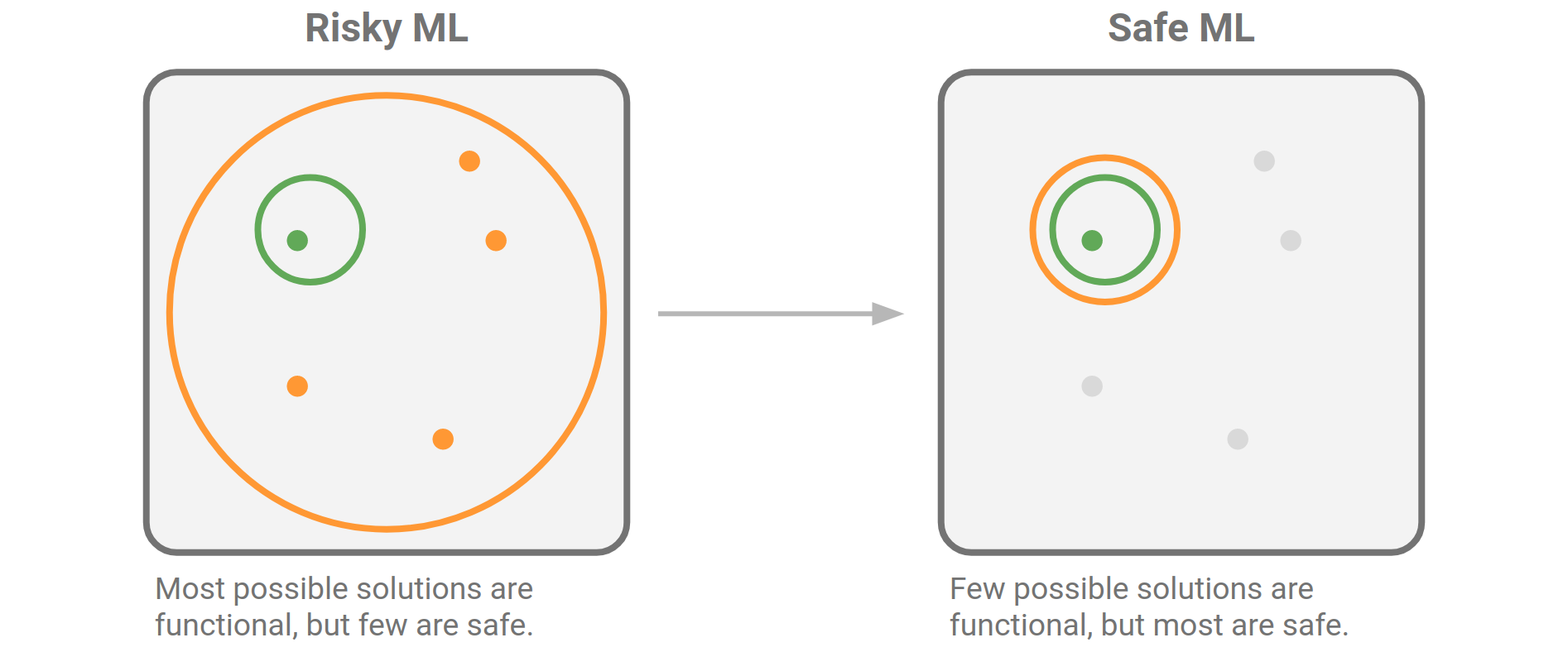
A while back, I wrote about machine learning safety measures. I was thinking about how easy it is to accidentally make terrible models (e.g. training a support vector machine on unscaled data), or misuse good models (e.g. forgetting to scale data before making a prediction). I suggested that one solution might be to make tools that help spot these kinds of mistakes:

[We should build] software to support good practice. Many of the problems I’m talking about are quite easy to catch, or at least warn about, during the training and evaluation process. Unscaled features, class imbalance, correlated features, non-IID records, and so on. Education is essential, but software can help us notice and act on them.

Introducing redflag

I’m pleased, and a bit nervous, to introduce redflag, a new Python library to help find the sorts of issues I’m describing. The vision for this tool is as a kind of safety net, or ‘entrance exam for data’ (a phrase Evan coined several years ago). It should be able to look at an array (or Pandas DataFrame), and flag potential issues, perhaps generating a report. And it should be able to sit in your Scikit-Learn pipeline, watching for issues.

The current version, 0.1.9 is still rather rough and experimental. The code is far from optimal, with quite a bit of repetition. But it does a few useful things. For example, suppose we have a DataFrame with a column, Lithology, which contains strings denoting 9 rock types (‘sandstone’, ‘limestone’, etc). We’d like to know if the classes are ‘balanced’ — present in roughly similar numbers — or not. If they are not, we will have to be careful with how we split this dataset up for our model evaluation workflow.

>>> import redflag as rf
>>> rf.imbalance_degree(df['Lithology'])
3.37859304086633
>>> rf.imbalance_ratio([df['Lithology'])
8.347368421052632

The imbalance degree, defined by Ortigosa-Hernandez et al. (2017), tells us that there are 4 minority classes (the next integer above this number), and that the imbalance severity is somewhere in the middle (3.1 would be well balanced, 3.9 would be strongly imbalanced). The simpler imbalance ratio tells us that there’s about 8 times as much of the biggest majority class as of the smallest minority class. Conclusion: depending on the size of this dataset, the class imbalance is probably not a show-stopper, but we need to pay attention.

Our dataset contains well log data. Unless they are very far apart, well log samples are usually not independent — they are correlated in depth — and this means we can’t split the data randomly in our evaluation workflow. Redflag has a function to help detect features that are correlated to themselves in this way:

>>> rf.is_correlated(df['GR'])
True

We need to be careful!

Another function, rf.wasserstein() computes the Wasserstein distance, aka the earth mover’s distance, between distributions. This can help us figure out if our data splits all have similar distributions or not — an important condition of our evaluation workflow. I’ll feed it 3 splits in which I have forgotten to scale the first feature (i.e. the first column) in the X_test dataset:

>>> rf.wasserstein([X_train, X_val, X_test])
array([[32.108,  0.025,  0.043,  0.034],
       [16.011,  0.025,  0.039,  0.057],
       [64.127,  0.049,  0.056,  0.04 ]])

The large distances in the first column are the clue that the distribution of the data in this column varies a great deal between the three datasets. Plotting the distributions make it clear what happened.

Working with sklearn

Since we’re often already working with scikit-learn pipelines, and because I don’t really want to have to remember all these extra steps and functions, I thought it would be useful to make a special redflag pipeline that runs “all the things”. It’s called rf.pipeline and it might be all you need. Here’s how to use it:

from sklearn.pipeline import make_pipeline
from sklearn.preprocessing import StandardScaler
from sklearn.svm import SVC

pipe = make_pipeline(StandardScaler(), rf.pipeline, SVC())

Here’s what this object contains:

Pipeline(steps=[('standardscaler', StandardScaler()),
                ('pipeline',
                 Pipeline(steps=[('rf.imbalance', ImbalanceDetector()),
                                 ('rf.clip', ClipDetector()),
                                 ('rf.correlation', CorrelationDetector()),
                                 ('rf.outlier', OutlierDetector()),
                                 ('rf.distributions',
                                  DistributionComparator())])),
                ('svc', SVC())])

Those redflag items in the inner pipeline are just detectors — think of them like smoke alarms — they do not change any data. Some of them acquire statistics during model fitting, then apply them during prediction. For example, the DistributionComparator learns the feature distributions from the training data, then compares the prediction data to them, to help ensure that you aren’t trying to extrapolate with your model. For example, it will warn you if you train a model on low-GR sandstones then try to predict on high-GR shales.

Here’s what happens when I fit my data with this pipeline:

These are just warnings, and it’s up to me to act on them. I can adjust detection thresholds and other aspects of the algorithms under the hood, but the goal is for redflag to wave its little flag, but not to get in the way. Apart from the warnings, this pipeline works exactly as it did before.


If this project sounds interesting or useful to you, please give it a look. The documentation is here, and contains more examples like those above. If you find bugs or want to request enhancements, there’s the GitHub Issues page. And if you use it for anything you can share, I’d love to hear how you get along!

Comparing regressors

There are several really nice comparisons between various algorithms in the Scikit-Learn documentation. The most famous, and useful, one is probably the classifier comparison:

A comparison of classification algorithms. Each row is a different dataset; each column (except the first) is a different classifier, each trying to separate the blue and red points. The accuracy score of each classifier is show in the lower right corner of each plot. There’s so much to look at in this one plot!

There’s also a very nice clustering algorithm comparison, and this anomaly detection comparison. As usual with awesome open source software packages like Scikit-Learn, the really wonderful thing is that all the source code is right there so you can hack these things to show your own data.

What about regression?

Regression problems are the other major kind of machine learning task. If the thing you’re trying to predict is not a category (like ‘blue’ or ‘red’, as above) but a continuous property (like porosity, say), then you’re looking at a regression problem.

I wondered what a comparison plot for the various regressors in Scikit-Learn would look like. I couldn’t find one, so I made one. I made up three one-dimensional datasets — one linear, one polynomial, and one periodic. Then I tried predicting each one with various different model types, from linear regression to a deep neural network. Here’s version 1 (well, 0.1 really) of my script; feel free to adapt and improve it!

Here’s the plot it produces:

A comparison of most of the regressors in scikit-learn, made with this script. The red lines are unregularized models; the blue have regularization. The pale points are the validation data. The small numbers in each plot are RMS error (lower is better!).

I think this plot repays careful study. Notice the smoothing effect of regularization. See how tree-based methods result in discretized predictions, and kernel-based ones are pretty horrible at extrapolation.

I’m 100% open to feedback on ways to improve this plot… or please improve it and show me how it goes!

Rocks in the Playground

It’s debatable whether neural networks should feature in an introductory course on machine learning. But it’s hard to avoid at least mentioning them, and many people are attracted to machine learning courses because they have heard so much about deep learning. So, reluctantly, we almost always get into neural nets in our Machine learning for geoscientists classes.

Our approach is to build a neural network from scratch, using only standard Python and NumPy data structures — that is, without using a specialist deep-learning framework. The code is all adapted from Gram Ganssle’s awesome Leading Edge tutorial from 2018. I like it because it lays out the components — the data, the activation function, the cost function, the forward pass, and all the steps involved in backpropagation — then combines them into a working neural network.

Figure 2 from Gram Ganssle’s 2018 tutorial in the Leading Edge. Licensed CC BY.

Figure 2 from Gram Ganssle’s 2018 tutorial in the Leading Edge. Licensed CC BY.

One drawback of our approach is that it would be quite fiddly to change some aspects of the network. For example, adding regularization, which almost all networks use, or even just adding another layer, are both beyond the scope of the class. So I like to follow it up with getting the students to build the same network using the scikit-learn library’s multilayer perceptron model. Then we build the same network using the PyTorch framework. (And one could do it in TensorFlow too, of course.) All of these libraries make it easier to play with the various options.

Introducing the Rocky Playground

Now we have another tool — one that makes it even easier to change parameters, add layers, use regularization, and so on. The students don’t even have to write any code! I invite you to play with it too — check out the Rocky Playground, an interactive deep neural network you can see inside.

Part of the user interface. Click on the image to visit the site.

Part of the user interface. Click on the image to visit the site.

This tool is a fork of Google’s well-known Neural Network Playground, as described at the bottom of our tool’s page. We made a few changes:

  • Added several new real and synthetic datasets, with descriptions.

  • There are more activation functions to try, including ELU and Swish.

  • You can change the regularization during training and watch the weights.

  • Anyone can upload their own dataset! (These stay on your computer, they are not uploaded anywhere.)

  • We added an the expression of the network in Python code.

One of the datasets we added is the same shear-sonic prediction dataset we use in the neural network class. So students can watch the same neural net they built (more or less) learn the task in real time. It’s really very cool.

I’ve written before about different expressions of mathematical ideas — words, symbols, annotations, code, etc. — and this is really just a natural extension of that thought. When people can hear and see the same idea in three — or five, or ten — different ways, it sticks. Or at least has a better chance of sticking.

What do you think? Do this tool help you? Could you use it for teaching? If you have suggestions feel free to drop them here in the comments, or submit an issue to the tool’s repo. We’d love your help to make it even more useful.

Machine learning safety measures

Yesterday in Functional but unsafe machine learning I wrote about how easy it is to build machine learning pipelines that yield bad predictions — a clear business risk. Today I want to look at some ways we might reduce this risk.


The diagram I shared yesterday tries to illustrate the idea that it’s easy to find a functional solution in machine learning, but only a few of those solutions are safe or fit for purpose. The question to ask is: what can we do about it?

Engineered_system_failure_types.png

You can’t make bad models safe, so there’s only one thing to do: shrink the field of functional models so that almost all of them are safe:

Engineered_system_safer_ML.png

But before we do this any old way, we should ask why the orange circle is so big, and what we’re prepared to do to shrink it.

Part of the reason is that libraries like scikit-learn, and the Python ecosystem in general, are very easy to use and completely free. So it’s absolutely possible for any numerate person with a bit of training to make sophisticated machine learning models in a matter of minutes. This is a wonderful and powerful thing, unprecedented in history, and it’s part of why machine learning has been so hot for the last 6 or 8 years.

Given that we don’t want to lose this feature, what actions could we take to make it harder to build bad models? How can we improve over time like aviation has, and without premature regulation? Here are some ideas:

  • Fix and maintain the data pipeline (not the data!). We spend most of our time getting training and validation data straight, and it always makes a big difference to the outcomes. But we’re obsessed with fixing broken things (which is not sustainable), when we should be coping with them instead.

  • Raise the digital literacy rate: educate all scientists about machine learning and data-driven discovery. This process starts at grade school, but it must continue at university, through grad school, and at work. It’s not a ‘nice to have’, it’s essential to being a scientist in the 21st century.

  • Build software to support good practice. Many of the problems I’m talking about are quite easy to catch, or at least warn about, during the training and evaluation process. Unscaled features, class imbalance, correlated features, non-IID records, and so on. Education is essential, but software can help us notice and act on them.

  • Evolve quality assurance processes to detect ML smell. Organizations that are adopting (building or buying) machine learning (i.e. all of them), must get really good at sniffing out problems with machine learning projects — then fixing those problems — and at connecting practitioners so they can learng together and share good practice.

  • Recognizing that machine learning models are made from code, and must be subject to similar kinds of quality assurance. We should adopt habits such as testing, documentation, code review, continuous integration, and issue tracking for users to report bugs and request enhancements. We already know how to do these things.

I know some of this might sound like I’m advocating command and control, but that approach is not compatible with a lean, agile organization. So if you’re a CTO reading this, the fastest path to success here is not hiring a know-it-all Chief Data Officer from a cool tech giant, then brow-beating your data science practitioners with Best Practice documents. Instead, help your digital professionals create a high-functioning community of practice, connected both inside and outside the organizations, and support them learning and adapting together. Yes it takes longer, but it’s much more effective.

What do you think? Are people already doing these things? Do you see people using other strategies to reduce the risk of building poor machine learning models? Share your stories in the comments below.

Does your machine learning smell?

Martin Fowler and Kent Beck popularized the term ‘code smell’ in the book Refactoring. They were describing the subtle signs of deeper trouble in code — signs that a program’s source code might need refactoring (restructuring and rewriting). There are too many aromas to list here, but here are some examples (remember, these things are not necessarily problems in themselves, but they suggest you need to look more closely):

  • Duplicated code.

  • Contrived complexity (also known as showing off).

  • Functions with many arguments, suggesting overwork.

  • Very long functions, which are hard to read.

More recently, data scientist Felienne Hermans applied the principle to the world’s number one programming environment: spreadsheets. The statistics on spreadsheet bugs are quite worrying, and Hermans enumerated the smells that might lead you to them. Here are four of her original five ‘formula’ smells, notice how they correspond to the code smells above:

  • Duplicated formulas.

  • Conditional complexity (e.g. nested IF statements).

  • Multiple references, analogous to the ‘many arguments’ smell.

  • Multiple operations in one cell.

What does a machine learning project smell like?

Most machine learning projects are code projects, so some familiar smells might be emanating from the codebase (if we even have access to it). But machine learning models are themselves functions — machines that map input X to some target y. And even if the statistical model is simple, like a KNN classifier, the workflow is a sort of ‘metamodel’ and can have complexities of its own. So what are the ‘ML smells’ that might alert us to deeper problems in our prediction tools?

I asked this question on Twitter (below) and in the Software Underground

I got some great responses. Here are some ideas adapted from them, with due credit to the people named:

  • Very high accuracy, especially a complex model on a novel task. (Ari Hartikainen, Helsinki and Lukas Mosser, Athens; both mentioned numbers around 0.99 but on earth science problems I start to get suspicious well before that: anything over 0.7 is excellent, and anything over 0.8 suggests ‘special efforts’ have been made.)

  • Excessive precision on hyperparameters might suggest over-tuning. (Chris Dinneen, Perth)

  • Counterintuitive model weights, e.g. known effects have low feature importance. (Reece Hopkins, Anchorage)

  • Unreproducible, non-deterministic code, e.g. not setting random seeds. (Reece Hopkins again)

  • No description of the train–val–test split, or justification for how it was done. Leakage between training and blind data is easy to introduce with random splits in spatially correlated data. (Justin Gosses, Houston)

  • No discussion of ground truth and how the target labels relate to it. (Justin Gosses again)

  • Less than 80% of the effort spent on preparing the data. (Michael Pyrcz, Austin — who actually said 90%)

  • No discussion of the evaluation metric, eg how it was selected or designed (Dan Buscombe, Flagstaff)

  • No consideration of the precision–recall trade-off, especially in a binary classification task. (Dan Buscombe again)

  • Strong class imbalance and no explicit mention of how it was handled. (Dan Buscombe again)

  • Skewed feature importance (on one or two features) might suggest feature leakage. (John Ramey, Austin)

  • Excuses, excuses — “we need more data”, “the labels are bad”, etc. (Hallgrim Ludvigsen, Stavanger)

  • AutoML, e.g. using a black box service, or an exhaustive automated seach of models and hyperparameters.

That’s already a long list, but I’m sure there are others. Or perhaps some of these are really the same thing, or are at least connected. What do you think? What red — or at least yellow — flags do you look out for when reviewing machine learning projects? Let us know in the comments below.


If you enjoyed this post, check out the Machine learning project review checklist I wrote bout last year. I’m currently working on a new version of the checklist that includes some tips for things to look for when going over the checklist. Stay tuned for that.


The thumbnail for this post was generated automatically from text (something like, “a robot smelling a flower”… but I made so many I can’t remember exactly!). Like a lot of unconstrained image generation by AI’s, it’s not great, but I quite like it all the same.

The AI is LXMERT from the Allen Institute. Try it out or read the paper.

download (7).png

The hacks are back

We ran the first geoscience hackathon over 7 years ago in Houston. Since then we’ve hosted another 26 subsurface hackathons — that’s 175 projects, and over 900 hackers. Last year, 10 of the 11 hackathons that Agile* facilitated were in-house.

This is exciting. It means that grass-roots, creative, high-speed collaboration and technology development is possible inside large corporations. But it came at the cost of reducing our public events… and we want to bring the hackathon experience to everyone!

So this year, as well as helping execute a dozen or so in-house hackathons, we’ll be running and supporting more public hackathons too. So if you’ve been waiting for a chance to learn to code or try a social coding event, or just hang out with a lot of nerdy geoscientists and engineers — here’s your chance!


May: Geothermal Hackathon

The first event of the year is a new one for us. We’ll be at the World Geothermal Congress in Reykjavik, Iceland, in the last week of April. The second weekend, 2 and 3 May, we’ll be running a hackathon on machine learning for geothermal subsurface applications. Iceland is only a short flight from the rest of Europe and many places in North America, so if you fancy something completely different, this is for you! Find out more and sign up.

[An earlier version of this post had the event on the previous weekend.]


June: Subsurface Hackathon (USA)

We’re back in Houston in June! The AAPG ACE is there — clashing with EAGE unfortunately — and we’ll be holding a (completely unrelated) hackathon on the weekend before: 5 to 7 June. Enthought is hosting the event in their beautiful new Houston digs, and Dell EMC is there too as a major sponsor. The theme is Tools… It’s going to be a big one! Find out more and sign up.

We are running two public Python classes before this event. Check them out.

houston-2020-sponsors.png
 

June: Amstel Hack (Europe)

The brilliant Filippo Broggini (ETHZ) is running a European hackathon again this year, again right before EAGE — and therefore the same weekend as the Houston event: 6 and 7 June. The event is being hosted at Shell’s Technology Centre in Amsterdam, and is guaranteed to be awesome. If you’re going to EAGE, it’s a no-brainer. Find out more and sign up.

We are also running a public Python class before this event. Check it out.

amstel-2020-sponsors.png
 

That’s it for now… I hope you can come to one of these events. If you’re just starting out on your technology journey, have no fear — these events are friendly and welcoming. If you can’t make any of them, don’t worry: there will be more in the autumn, so stay tuned. Or, if you want help making one happen at your company, get in touch.

The hack returns to Norway

Last autumn Agile helped Peter Bormann (ConocoPhillips Norge) and the FORCE consortium host the first geo-flavoured hackathon in Norway. Maybe you were there, or maybe you read about the nine fascinating machine learning projects here on the blog. If so, you’ll know it was a great event, so we’re doing it again!

Hackthon: 18 and 19 September
Symposium: 20 September


Check out last year’s projects here. Projects included Biostrat!, Virtual Metering, sketch2seis, and AVO ML — a really interesting AVO approach exploiting latent spaces (see image, right). Most of them are on GitHub and could be extended this year.

Part of what I love about these things is that we have no idea what the projects will be. As last year, there’ll be a pre-hackathon meetup in Storhaug the evening before Day 1 (on 17 September) — we’ll figure it all out there. In the meantime, if you have an idea check out the link at the end of this post where you can share and discuss it with others.


20180919_FUJ8654.jpg

The hackathon will be followed by a one-day symposium on machine learning in the subsurface (left). This well attended event was also excellent last year, and promises to deliver again in 2019. Peter did a briliant job of keeping things rooted in real results from real research, so you won’t be subjected to the parade of marketing talks you might have been subjected to at certain other conferences.


Find out more and sign up on NPD.no! Don’t delay; places are limited.

Submit and discuss project ideas on Agile’s Events page. Note that this does not sign you up for the event.

Get on softwareunderground.com/slack to discuss the event in the #force-hack-2019 channel.

See you there!

What makes a good benchmark dataset?

Last week I mentioned that we need more open benchmark datasets in geoscience. I think benchmarks are important for researchers to work on, as a teaching aid, and as a way for us to objectively measure how well we’re doing on a particular problem. How else can we know how we’re doing, or compare Company X’s claim with Company Y’s?

What makes a good benchmark?

I haven’t unearthed any guides from other domains to help answer this question, and we don’t yet have enought experience to know for ourselves. But here’s what I’m thinking:

  • It must address at least one clear machine learning task. The more obviously useful the task, the more useful (and important) the benchmark. The benchmark dataset should be well suited to the task (but does not have to be comprehensive or definitive).

  • It must be open. That means explicitly licensed with an open, and preferably permissive, license. I think we need to avoid non-permissive (so-called ‘copyleft’) licenses, because it’s not clear how the ‘sharealike’ clause would affect works that depended on the dataset. And we definitely need to avoid restrictive non-commercial clauses.

  • It must be discoverable and accessible. In other words, it needs to be easy to find, and anyone should be able to get it, without registering on a website or waiting for an email or doing anything else that slows down the pace of their research. A properly open dataset can be replicated anywhere, so openness should take care of this.

  • It must have enough features to be interesting. This might mean different things for different tasks, but in general we’d like to see a few physical measurements (e.g. seismic, well logs, RockEval, core photos, field observations, flow rates, and so on). The features should be independent — we can always generate derivatives.

  • It must have labels. As well as some interesting features, the dataset must have some interpretive information with high information value (e.g. seismic facies, lithologies, deposotional environment, sequence boundaries, EURs, and so on). Usually, these are expensive to acquire (which is partly why we’d like to be able to predct them).

  • It should name suitable prediction error evaluation methods, with reference implementations, for the intended task. If people are to use it as a score benchmark, they need to know how to score their own implementations of the task.

  • It can be de-localized, but not completely. We don’t need to know the exact whereabouts of the dataset, but if we remove the relative spatial relationships between wells, say, or don’t know which basin we’re in, then the questions we can ask about the data get a lot less interesting, and the whole situation gets much less realistic.

  • It should not be too big. More than about 1GB means unwieldy. It means difficult to download. It means too much room for nuance. And it means it’s probably impossible to explore in the space of a tutorial. It’s also much harder to get a big dataset into shape than a smaller one. A few thousand records, maybe 100,000 in some cases, is probably plenty.

  • It should be clean, but not too clean. No-one wants to spend hours processing a dataset before it can be used, or — worse — be bitten by some esoteric data problem only a domain expert would spot. But, on the other hand, a dataset with no issues at all might be a bit boring. And, in subsurface at least, completely unrepresentative!

  • It should be well documented. The dataset needs to be described to non-technical people, who know little or nothing about the subsurface. Remember that many users will not be proficient programmers either, so…

  • It should have an accompanying demonstration. For example, a script or notebook, preferably in at least a couple of languages, that shows how to load and inspect the data. Ideally this would include a demonstration of how to pose, and answer, a straightforward question as a machine learning task.

I’m not sure we can call this last one a criterion, but maybe in an ideal world…

  • It should be launched with a data science contest. If you’re felling really brave, what better way to attract attention to the new open dataset than with a Kaggle-style contest?

It’s certainly true that there are several datasets around. Unfortunately, the openness criterion eliminates most of them, so they fall at the first hurdle. For example, the very nice dataset that Brendon Hall used in the SEG machine learning contest is not open.

If you know of a dataset that could be coerced into meeting most of these criteria, we’d like to hear about it. I know a small army of people that would love to help get it into the open, and into the hands of machine learning researchers all over the world.


The thumbnail image for this post was adapted from an image by user arg_flickr on Flickr, licensed CC-BY.

Thanks to several people on Software Underground, for the discussion on this topic. In particular, Justin Gosses and Lukas Mosser pointed out the need for transparent error evaluation.

Closing the analytics–domain gap

I recently figured out where Agile lives. Or at least where we strive to live. We live on the isthmus — the thin sliver of land — between the world of data science and the domain of the subsurface.

We’re not alone. A growing number of others live there with us. There’s an encampment; I wrote about it earlier this week.

Backman’s Island, one of my favourite kayaking destinations, is a passable metaphor for the relationship between machine learning and our scientific domain.

Backman’s Island, one of my favourite kayaking destinations, is a passable metaphor for the relationship between machine learning and our scientific domain.

Closing the gap in your organization

In some organizations, there is barely a connection. Maybe a few rocks at low tide, so you can hop from one to the other. But when we look more closely we find that the mysterious and/or glamorous data science team, and the stories that come out of it, seem distinctly at odds with the daily reality of the subsurface professionals. The VP talks about a data-driven business, deep learning, and 98% accuracy (whatever that means), while the geoscientists and engineers battle with raster logs, giant spreadsheets, and trying to get their data from Petrel into ArcGIS (or, help us all, PowerPoint) so they can just get on with their day.

We’re not going to learn anything from those organizations, except maybe marketing skills.

We can learn, however, from the handful of organizations, or parts of them, that are serious about not only closing the gap, but building new paths, and infrastructure, and new communities out there in the middle. If you’re in a big company, they almost certainly exist somewhere in the building — probably keeping their heads down because they are so productive and don’t want anyone messing with what they’ve achieved.

Here are some of the things they are doing:

  • Blending data science teams into asset teams, sitting machine learning specialists with subsurface scientists and engineers. Don’t make the same mistake with machine learning that our industry made with innovation — giving it to a VP and trying to bottle it. Instead, treat it like Marmite: spread it very thinly on everything.*

  • Treating software like knowledge sharing. Code is, hands down, the best way to share knowledge: it’s unambiguous, tested (we hope anyway), and — above all — you can actually use it. Best practice documents are I’m afraid, not worth the paper they would be printed on if anyone even knew how to find them.

  • Learning to code. OK, I’m biased because we train people… but it seriously works. When you have 300 geoscientists in your organization that embrace computational thinking, that can write a function in Python, that know what a support vector machine is for — that changes things. It changes every conversation.

  • Providing infrastructure for digital science. Once you have people with skills, you need people with powers. The power to install software, instantiate a virtual machine, or recruit a coder. You need people with tools, like version control, continuous integration, and communities of practice.

  • Realizing that they need to look in new places. Those much-hyped conversations everyone is having with Google or Amazon are, admittedly, pretty cool to see in the extractive industries (though if you really want to live on the cutting edge of geospatial analytics, you should probably be talking to Uber). You will find more hope and joy in Kaggle, Stack Overflow, and any given hackathon than you will in any of the places you’ve been looking for ‘innovation’ for the last 20 years.

This machine learning bandwagon we’re on is not about being cool, or giving keynotes, or saying ‘deep learning’ and ‘we’re working with Google’ all the time. It’s about equipping subsurface professionals to make better and safer scientific, industrial, and business decisions with more evidence and more certainty.

And that means getting serious about closing that gap.


I thought about this gap, and Agile’s place in it — along with the several hundred other digital subsurface scientists in the world — after drawing an attempt at drawing the ‘big picture’ of data science on one of our courses recently. Here’s a rendering of that drawing, without further comment. It didn’t quite fit with my ‘sliver of land’ analogy somehow…

On the left, the world of ‘advanced analytics’, on the right, how the disciplines of data science and earth science overlap on and intersect the computational world. We live in the green belt. (yes, we could argue for hours about these terms, but le…

On the left, the world of ‘advanced analytics’, on the right, how the disciplines of data science and earth science overlap on and intersect the computational world. We live in the green belt. (yes, we could argue for hours about these terms, but let’s not.)


* If you don’t know what Marmite is, it’s not too late to catch up.

The London hackathon

At the end of November I reported on the projects at the Oil & Gas Authority’s machine learning hackathon in Aberdeen. This post is about the follow-up event at London Olympia.


Like the Aberdeen hackathon the previous weekend, the theme was ‘machine learning’. The event unfolded in the Apex Room at Olympia, during the weekend before the PETEX conference. The venue was excellent, with attentive staff and top-notch catering. Thank you to the PESGB for organizing that side of things.

Thirty-eight digital geoscientists spent the weekend with us, and most of them also took advantage of the bootcamp on Friday; at least a dozen of those had not coded at all before the event. It’s such a privilege to work with people on their skills at these events, and to see them writing their own code over the weekend.

Here’s the full list of projects from the event…


Sweet spot hunting

Sweet Spot Sweat Shop: Alan Wilson, Geoff Chambers, Marco van der Linden, Maxim Kotenev, Rowan Haddad.

Project: We’ve seen a few people tackling the issue of making decisions from large numbers of realizations recently. The approach here was to generate maps of various outputs from dynamic modeling and present these to the user in an interactive way. The team also had maps of sweet spots, as determined by simulation, and they attempted to train models to predict these sweetspots directly from the property maps. The result was a unique and interesting exploration of the potential for machine learning to augment standard workflows in reservoir modeling and simulation. Project page. GitHub repo.

sweetspot_prediction.png

An intelligent dashboard

Dash AI: Vincent Penasse, Pierre Guilpain.

Project: Vincent and Pierre believed so strongly in their project that they ran with it as a pair. They started with labelled production history from 8 wells in a Pandas dataframe. They trained some models, including decision trees and KNN classifiers, to recognizedata issues and recommend required actions. Using skills they gained in the bootcamp, they put a flask web app in front of these to allow some interaction. The result was the start of an intelligent dashboard that not only flagged issues, but also recommended a response. Project page.

This project won recognition for impact.

DashAI-team.jpg

Predicting logs ahead of the bit

Team Mystic Bit: Connor Tann, Lawrie Cowliff, Justin Boylan-Toomey, Patrick Davies, Alessandro Christofori, Dan Austin, Jeremy Fortun.

Project: Thinking of this awesome demo, I threw down the gauntlet of real-time look-ahead prediction on the Friday evening, and Connor and the Mystic Bit team picked it up. They did a great job, training a series of models to predict a most likely log (see right) as well as upper and lower bounds. In the figure, the bit is currently at 1770 m. The model is shown the points above this. The orange crosses are the P90, P50 and P10 predictions up to 40 m ahead of the bit. The blue points below 1770 m have not yet been encountered. Project page. GitHub repo.

This project won recognition for best execution.

MysticBit_log-pred.png

The seals make a comeback

Selkie Se7en: Georgina Malas, Matthew Gelsthorpe, Caroline White, Karen Guldbaek Schmidt, Jalil Nasseri, Joshua Fernandes, Max Coussens, Samuel Eckford.

Project: At the Aberdeen hackathon, Julien Moreau brought along a couple of satellite image with the locations of thousands of seals on the images. They succeeded in training a model to correctly identify seal locations 80% of the time. In London, another team of almost all geologists picked up the project. They applied various models to the task, and eventually achieved a binary prediction accuracy of over 97%. In addition, the team trained a multiclass convolutional neural network to distinguish between whitecoats (pups), moulted seals (yearlings and adults), double seals, and dead seals.

Impressive stuff; it’s always inspiring to see people operating way outside their comfort zone. Project page.

selkie-seven.png

Interpreting the language of stratigraphy

The Lithographers: Gijs Straathof, Michael Steventon, Rodolfo Oliveira, Fabio Contreras, Simon Franchini, Malgorzata Drwila.

Project: At the project bazaar on Friday (the kick-off event at which we get people into teams), there was some chat about the recent paper on lithology prediction using recurrent neural networks (Jiang & James, 2018). This team picked up the idea and set out to reproduce the results from the paper. In the process, they digitized lithologies from one of the Posiedon wells. Project page. GitHub repo.

This project won recognition for teamwork.

Lithographers_team_logs.png

Know What You Know

Team KWYK: Malcolm Gall, Thomas Stell, Sebastian Grebe, Marco Conticini, Daniel Brown.

Project: There’s always at least one team willing to take on the billions of pseudodigital documents lying around the industry. The team applied latent semantic analysis (a standard approach in natural language processing) to some of the gnarlier documents in the OGA’s repository. Since the documents don’t have labels, this is essentially an unsupervised task, and therefore difficult to QC, but the method seemed to be returning useful things. They put it all in a nice web app too. Project page. GitHub repo.

This project won recognition for Most Value.


A new approach to source separation

Cocktail Party Problem: Song Hou, Fai Leung, Matthew Haarhoff, Ivan Antonov, Julia Sysoeva.

Project: Song, who works at CGG, has a history of showing up to hackathons with very cool projects, and this was no exception. He has been working on solving the seismic source separation problem, more generally known as the cocktail party problem, using deep learning… and seems to have some remarkable results. This is cool because the current deblending methods are expensive. At the hackathon he and his team looked for ways to express the uncertainty in the deblending result, and even to teach a model to predict which parts of the records were not being resolved with acceptable signal:noise. Highly original work and worth keeping an eye on.

cocktail-party-problem.jpg

A big Thank You to the judges: Gillian White of the OGTC joined us a second time, along with the OGA’s own Jo Bagguley and Tom Sandison from Shell Exploration. Jo and Tom both participated in the Subsurface Hackathon in Copenhagen earlier this year, so were able to identify closely with the teams.

Thank you as well to the sponsors of these events, who all deserve the admiration of the community for stepping up so generously to support skill development in our industry:

oga-sponsors.png

That’s it for hackathons this year! If you feel inspired by all this digital science, do get involved. There are computery geoscience conversations every day over at the Software Underground Slack workspace. We’re hosting a digital subsurface conference in France in May. And there are lots of ways to get started with scientific computing… why not give the tutorials at Learn Python a shot over the holidays?

To inspire you a bit more, check out some more pictures from the event…