
Visual crossplotting
/To clarify, add detail
Edward Tufte
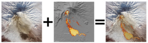 Pyroclastic flow on Nabro, Eritrea. Click for a larger image. NASA.Recently, the prolific geoblogger Brian Romans posted a pair of satellite images of a pyroclastic flow on Nabro in Eritrea. One image was in the visible spectrum, the other was a thermal image. Correlating them by looking back and forth at the images is unsatisying, so I spent 10 minutes merging the data into a single view, making the correlation immediate and intuitive.
Maps like this are always better than abstractions of data like graphs or crossplots (or scatter plots, if you prefer). Plots get unwieldy with more than three dimensions, and there are almost always more dimensions to the data, especially in geoscience. In the image above there are at least half a dozen dimensions to the data: x and y position, elevation, slope, rugosity, vegetation (none!), heat intensity, heat distribution,... And these other dimensions, however tenuous or qualitative, might actually be important—they provide context, circumstantial evidence, if you will.
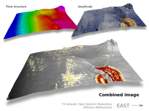 When I review papers, one of the comments I almost always make is: get all your data into one view—help your reader make the comparison. Instead of two maps showing slightly different seismic attributes, make one view and force the comparison. Be careful with colours: don't use them all up for one of the attributes, leaving nothing for the other. Using greys and blues for one leaves reds and yellows for the other. This approach is much more effective than a polygon around your anomaly, say, because then you have indelibly overlain your interpretation too early in the story: wait until you have unequivocally demonstrated the uncanny correlation.
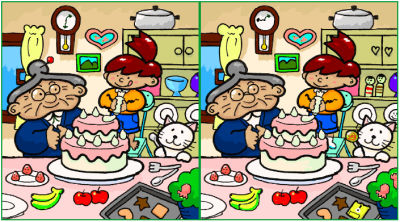
If you're still not convinced that the richer image conveys more information, see how long it takes you to do this Spot The Difference. Come back tomorrow for the answer (and the point!)...
Creative Commons licensed image from Wikimedia Commons, work of User Muband (Japan)
GIMP is your friend!


 Except where noted, this content is licensed