Machine learning meets seismic interpretation

Agile has been reverberating inside the machine learning echo chamber this past week at EAGE. The hackathon's theme was machine learning, Monday's workshop was all about machine learning. And Matt was also supposed to be co-chairing the session on Applications of machine learning for seismic interpretation with Victor Aare of Schlumberger, but thanks to a power-cut and subsequent rescheduling, he found himself double-booked so, lucky me, he invited me to sit in his stead. Here are my highlights, from the best seat in the house.

Before I begin, I must mention the ambivalence I feel towards the fact that 5 of the 7 talks featured the open-access F3 dataset. A round of applause is certainly due to dGB Earth Sciences for their long time stewardship of open data. On the other hand, in the sardonic words of my co-chair Victor Aarre, it would have been quite valid if the session was renamed The F3 machine learning session. Is it really the only quality attribute research dataset our industry can muster? Let's do better.

Using seismic texture attributes for salt classification

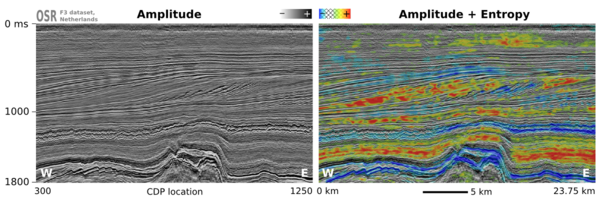
Ghassan AlRegib ruled the stage throughout the session with not one, not two, but three great talks on behalf of himself and his grad students at Georgia Institute of Technology (rather than being a show of bravado, this was a result of problems with visas). He showed some exciting developments in shallow learning methods for predicting facies in seismic data. In addition to GLCM attributes, he also introduced a couple of new (to me anyway) attributes for salt classification. Namely, textural gradient and a thing he called seismic saliency, a metric modeled after the human visual system describing the 'reaction' between relative objects in a 3D scene. 

Twelve Seismic attributes used for multi-attribute salt-boundary classification. (a) is RMS Amplitude, (B) to (M) are TEXTURAL attributes. See abstract for details. This figure is copyright of Ghassan AlRegib and licensed CC-BY-SA by virtue of being generated from the F3 dataset of dGB and TNO.

Ghassan also won the speakers' lottery, in a way. Due to the previous day's power outage and subsequent reshuffle, the next speaker in the schedule was a no-show. As a result, Ghassan had an extra 20 minutes to answer questions. Now for most speakers that would be a public-speaking nightmare, but Ghassan hosted the onslaught of inquiring minds beautifully. If we hadn't had to move on to the next next talk, I'm sure he could have entertained questions all afternoon. I find it fascinating how unpredictable events like power outages can actually create the conditions for really effective engagement. 

Salt classification without using attributes (using deep learning)

Matt reported on Anders Waldeland's work a year ago, and it was interesting to see how his research has progressed, as he nears the completion of his thesis. 

Anders successfully demonstrated how convolutional neural networks (CNNs) can classify salt bodies in seismic datasets. So, is this a big deal? I think it is. Indeed, Anders's work seems like a breakthough in seismic interpretation, at least of salt bodies. To be clear, I don't think this means that it is time for seismic interpreters to pack up and go home. But maybe we can start looking forward to spending our time doing less tedious things than picking complex salt bodies.  

One slice of a 3d seismic volume with two CLASS LABELS: Salt (red) and Not SALT (GREEN). This is the training data. On the right: Extracted 3D salt body in the same dataset, coloured by elevation. Copyright of A Waldeland, used with permission.

One slice of a 3d seismic volume with two CLASS LABELS: Salt (red) and Not SALT (GREEN). This is the training data. On the right: Extracted 3D salt body in the same dataset, coloured by elevation. Copyright of A Waldeland, used with permission.

He trained a CNN on one manually labeled slice of a 3D cube and used the network to automatically classify the full 3D salt body (on the right in the figure). Conventional algorithms for salt picking, such as that used by AlRegib (see above), typically rely on seismic attributes to define a feature space. This requires professional insight and judgment, and is prone to error and bias. Nicolas Audebert mentioned the same shortcoming in his talk in the workshop Matt wrote about last week. In contrast, the CNN algorithm works directly on the seismic data, learning the most discriminative filters on its own, no attributes needed

Intuition training

Machine learning isn't just useful for computing in the inverse direction such as with inversion, seismic interpretation, and so on. Johannes Amtmann showed us how machine learning can be useful for ranking the performance of different clustering methods using forward models. It was exciting to see: we need to get back into the habit of forward modeling, each and every one of us. Interpreters build synthetics to hone their seismic intuition. It's time to get insanely good at building forward models for machines, to help them hone theirs. 

There were so many fascinating problems being worked on in this session. It was one of the best half-day sessions of technical content I've ever witnessed at a subsurface conference. Thanks and well done to everyone who presented.


White magic: calibrating seismic attributes

This post is part of a series on seismic attributes; the previous posts were...

  1. An attribute analysis primer
  2. Attribute analysis and statistics

Last time, I hinted that there might be a often-overlooked step in attribute analysis:

Calibration is a gaping void in many published workflows. How can we move past "that red blob looks like a point bar so I drew a line around it in PowerPoint" to "there's a 70% chance of finding reservoir quality sand at that location"?

Why is this step such a 'gaping void'? A few reasons:

  • It's fun playing with attributes, and you can make hundreds without a second thought. Some of them look pretty interesting, geological even. "That looks geological" is, however, not an attribute calibration technique. You have to prove it.
  • Nobody will be around when we find out the answer. There's a good chance that well will never be drilled, but when it is, you'll be on a different project, in a different company, or have left the industry altogether and be running a kayak rental business in Belize.
  • The bar is rather low. The fact that many published examples of attribute analysis include no proof at all, just a lot of maps with convincing-looking polygons on them, and claims of 'better reservoir quality over here'. 

This is getting discouraging. Let's look at an example. Now, it's hard to present this without seeming over-critical, but I know these gentlemen can handle it, and this was only a magazine article, so we needn't make too much of it. But it illustrates the sort of thing I'm talking about, so here goes.

Quoting from Chopra & Marfurt (AAPG Explorer, April 2014), edited slightly for brevity:

While coherence shows the edges of the channel, it gives little indication of the heterogeneity or uniformity of the channel fill. Notice the clear definition of this channel on the [texture attribute — homogeneity].
We interpret [the] low homogeneity feature [...] to be a point bar in the middle of the incised valley (green arrow). This internal architecture was not delineated by coherence.

A nice story, making two claims:

  1. The attribute incompletely represents the internal architecture of the channel.
  2. The labeled feature on the texture attribute is a point bar.

I know explorers have to be optimists, and geoscience is all about interpretation, but as scientists we must be skeptical optimists. Claims like this are nice hypotheses, but you have to take the cue: go off and prove them. Remember confirmation bias, and Feynman's words:

The first principle is that you must not fool yourself — and you are the easiest person to fool.

The twin powers

Making geological predictions with seismic attribute analysis requires two related workflows:

  1. Forward modeling — the best way to tune your intuition is to make a cartoonish model of the earth (2D, isotropic, homogeneous lithologies) and perform a simplified seismic experiment on it (convolutional, primaries only, noise-free). Then you can compare attribute behaviour to the known model.
  2. Calibration — you are looking for an explicit, quantitative relationship between a physical property you care about (porosity, lithology, fluid type, or whatever) and a seismic attribute. A common way to show this is with a cross-plot of the seismic amplitude against the physical property.

When these foundations are not there, we can be sure that one or more bad things will happen:

  • The relationship produces a lot of type I errors (false positives).
  • It produces a lot of type II error (false negatives).
  • It works at some wells and not at others.
  • You can't reproduce it with a forward model.
  • You can't explain it with physics.

As the industry shrivels and questions — as usual — the need for science and scientists, we have to become more stringent, more skeptical, and more rigorous. Doing anything else feeds the confirmation bias of the non-scientific continent. Because it says, loud and clear: geoscience is black magic.


The image is part of the figure from Chopra, S and K Marfurt (2014). Extracting information from texture attributes. AAPG Explorer, April 2014. It is copyright of the Authors and AAPG.

Monday highlights from SEG

Ben and I are in New Orleans at the 2015 SEG Annual Meeting, a fittingly subdued affair, given the industry turmoil recently. Lots of people are looking for work, others are thankful to have it.

We ran our annual Geophysics Hackathon over the weekend; I'll write more about that later this week. In a nutshell: despite a low-ish turnout, we had 6 great projects, all of them quite different from anything we've seen before. Once again, Colorado School of Mines dominated.

Beautiful maps

One of the most effective ways to make a tight scientific argument is to imagine trying to convince the most skeptical person you know that your method works. When it comes to seismic attribute analysis, I am that skeptical person.

Some of the nicest images I saw today were in the 'Attributes for Stratigraphic Analysis' session, chaired by Rupert Cole and Yuefeng Sun. For example, Tao Zhao, one of Kurt Marfurt's students, showed some beautiful images from the Waka 3D offshore New Zealand (Zhao & Marfurt). He used 2D colourmaps to co-render two attributes together, along with semblance mapped to opacity on a black layer, and were very nice to look at. However I was left wondering, and not for the first time, how we can do a better job calibrating those maps to geology. We (the interpretation community) need to stop side-stepping that issue; it's central to our credibility. Even if you have no wells, as in this study, you can still use forward models, analogs, or at least interpretation by a sedimentologist, preferably two.

© SEG and Zhao & Marfurt. Left to right: Peak spectral frequency and peak spectral magnitude; GLCM homogeneity; shape index and curvedness. All of the attributes are also corendered with Sobel edge detection.

© SEG and Zhao & Marfurt. Left to right: Peak spectral frequency and peak spectral magnitude; GLCM homogeneity; shape index and curvedness. All of the attributes are also corendered with Sobel edge detection.

Pavel Jilinski at GeoTeric gave a nice talk (Calazans Muniz et al.) about applying some of these sort of fancy displays to a large 3D dataset in Brazil, in a collaboration with Petrobras. The RGB displays of spectral attributes were as expected, but I had not seen their cyan-magenta-yellow (CMY) discontinuity displays before. They map dip to the yellow channel, similarity to the magenta channel, and 'tensor discontinuity' to the cyan channel. No, I don't know what that means either, but the displays were pretty cool.

Publications news

This evening we enjoyed the Editor's Dinner (I coordinate a TLE column and review for Geophysics and Interpretation, so it's totally legit). Good things are coming to the publication world: adopted Canadian Mauricio Sacchi is now Editor-in-Chief, there are no more page charges for colour in Geophysics (up to 10 pages), and watch out for video abstracts next year. Also, Chris Liner mentioned that Interpretation gets 18% of its submissions from oil companies, compared to only 5% for Geophysics. And I heard, but haven't verified, that downturns result in more papers. So at least our journals are healthy. (You do read them, right?)

That's it for today (well, yesterday). More tomorrow!


References

Calazans Muniz, Moises, Thomas Proença, and Pavel Jilinski (2015). Use of Color Blend of seismic attributes in the Exploration and Production Development - Risk Reduction. SEG Technical Program Expanded Abstracts 2015: pp. 1638-1642. doi: 10.1190/segam2015-5916038.1

Zhao, Tao, and Kurt J. Marfurt (2015). Attribute assisted seismic facies classification on a turbidite system in Canterbury Basin, offshore New Zealand. SEG Technical Program Expanded Abstracts 2015: pp. 1623-1627. doi: 10.1190/segam2015-5925849.1

Attribute analysis and statistics

Last week I wrote a basic introduction to attribute analysis. The post focused on the different ways of thinking about sampling and intervals, and on how instantaneous attributes have to be interpolated from the discrete data. This week, I want to look more closely at those interval attributes. We'd often like to summarize the attributes of an interval info a single number, perhaps to make a map.

Before thinking about amplitudes and seismic traces, it's worth reminding ourselves about different kinds of average. This table from SubSurfWiki might help... 

A peculiar feature of seismic data. from a statistical point of view, is the lack of the very low frequencies needed to give it a trend. Because of this, it oscillates around zero, so the average amplitude over a window tends to zero — seismic data has a mean value of zero. So not only do we have to think about interpolation issues when we extract attributes, we also have to think about statistics.

Fortunately, once we understand the issue it's easy to come up with ways around it. Look at the trace (black line) below:

The mean is, as expected, close to zero. So I've applied some other statistics to represent the amplitude values, shown as black dots, in the window (the length of the plot):

  • Average absolute amplitude (light green) — treat all values as positive and take the mean.
  • Root-mean-square amplitude (dark green) — tends to emphasize large values, so it's a bit higher.
  • Average energy (magenta) — the mean of the magnitude of the complex trace, or the envelope, shown in grey.
  • Maximum amplitude (blue) — the absolute maximum value encountered, which is higher than the actual sample values (which are all integers in this fake dataset) because of interpolation.
  • Maximum energy (purple) — the maximum value of the envelope, which is higher still because it is phase independent.

There are other statistics besides these, of course. We could compute the median average, or some other mean. We could take the strongest trough, or the maximum derivative (steepest slope). The options are really only limited by your imagination, and the physical relationship with geology that you expect.

We'll return to this series over the summer, asking questions like How do you know what to expect? and Does a physically realistic relationship even matter? 


To view and run the code that I used in creating the figures for this post, grab the iPython/Jupyter Notebook.

An attribute analysis primer

A question on Stack Exchange the other day reminded me of the black magic feeling I used to have about attribute analysis. It was all very meta: statistics of combinations of attributes, with shifted windows and crazy colourbars. I realized I haven't written much about the subject, despite the fact that many of us spend a lot of time trying to make sense of attributes.

Time slices, horizon slices, and windows

One of the first questions a new attribute-analyser has is, "Where should the window be?" Like most things in geoscience: it depends. There are lots of ways of doing it, so think about what you're after...

  • Timeslice. Often the most basic top-down view is a timeslice, because they are so easy to make. This is often where attribute analysis begins, but since timeslices cut across stratigraphy, not usually where it ends.
  • Horizon. If you're interested in the properties of a strong reflector, such as a hard, karsted unconformity, maybe you just want the instantaneous attribute from the horizon itself.
  • Zone. If the horizon was hard to interpret, or is known to be a gradual facies transition, you may want to gather statistics from a zone around it. Or perhaps you couldn't interpret the thing you really wanted, but only that nice strong reflection right above it... maybe you can bootstrap yourself from there. 
  • Interval. If you're interested in a stratigraphic interval, you can bookend it with existing horizons, perhaps with a constant shift on one or both of them.
  • Proportional. If seismic geomorphology is your game, then you might get the most reasonable inter-horizon slices from proportionally slicing in between stratigraphic surface. Most volume interpretation software supports this. 

There are some caveats to simply choosing the stratigraphic interval you are after. Beware of choosing an interval that strong reflectors come into and out of. They may have an unduly large effect on most statistics, and could look 'geological'. And if you're after spectral attributes, do remember that the Fourier transform needs time! The only way to get good frequency resolution is to provide long windows: a 100 ms window gives you frequency information every 10 Hz.

Extraction depends on sample interpolation

When you extract an attribute, say amplitude, from a trace, it's easy to forget that the software has to do some approximation to give you an answer. This is because seismic traces are not continuous curves, but discrete series, with samples typically every 1, 2, or 4 milliseconds. Asking for the amplitude at some arbitrary time, like the point at which a horizon crosses a trace, means the software has to interpolate between samples somehow. Different software do this in different ways (linear, spline, polynomial, etc), and the methods give quite different results in some parts of the trace. Here are some samples interpolated with a spline (black curve) and linearly (blue). The nearest sample gives the 'no interpolation' result.

As well as deciding how to handle non-sampled parts of the trace, we have to decide how to represent attributes operating over many samples. In a future post, we'll give some guidance for using statistics to extract information about the entire window. What options are available and how do we choose? Do we take the average? The maximum? Something else?

There's a lot more to come!

As I wrote this post, I realized that this is a massive subject. Here are some aspects I have not covered today:

  • Calibration is a gaping void in many published workflows. How can we move past "that red blob looks like a point bar so I drew a line around it in PowerPoint" to "there's a 70% chance of finding reservoir quality sand at that location"?
  • This article was about  single-trace attributes at single instants or over static windows. Multi-trace and volume attributes, like semblance, curvature, and spectral decomposition, need a post of their own.
  • There are a million attributes (though only a few that count, just ask Art Barnes) so choosing which ones to use can be a challenge. Criteria range from what software licenses you have to what is physically reasonable.
  • Because there are a million attributes, the art of combining attributes with statistical methods like principal component analysis or multi-linear regression needs a look. This gets into seismic inversion.

We'll return to these ideas over the next few weeks. If you have specific questions or workflows to share, please leave a comment below, or get in touch by email or Twitter.

To view and run the code that I used in creating the figures for this post, grab the iPython/Jupyter Notebook.

Corendering more attributes

My recent post on multi-attribute data visualization painted two seismic attributes from on a timeslice. Let's look now at corendering attributes extracted on a seismic horizon. I'll reproduce the example Matt gave in his post on colouring maps.

Although colour choices come down to personal preference, there are some points to keep in mind:

  • Data that varies relatively gradually across the canvas — e.g. elevation here — should use a colour scale that varies monotonically in hue and luminance, e.g. CubeHelix or Matteo Niccoli's colourmaps.
  • Data that varies relatively quickly across the canvas — e.g. my similarity data, (a member of the family that includes coherencesemblance, and so on) — should use a monochromatic colour scale, e.g. black–white. 
  • If we've chosen our colourmaps wisely, there should be some unused hues for rendering other additional attributes. In this case, there are no red hues in the elevation colourmap, so we can map redness to instantaneous amplitude.

Adding a light source

Without wanting to get too gimmicky, we can sometimes enliven the appearance of an attribute, accentuating its texture, by simulating a bumpy surface and shining a virtual light onto it. This isn't the same as casting a light source on the composite display. We can make our light source act on only one of our attributes and leave the others unchanged. 

Similarity attribute Displayed using a Greyscale Colourbar (left). Bump mapping of similarity attribute using a lightsource positioned at azimuth 350 degrees, inclination 20 degrees. 

The technique is called hill-shading. The terrain doesn't have to be a physical surface; it can be a slice. And unlike physical bumps, we're not actually making a new surface with relief, we are merely modifying the surface's luminance from an artificial light source. The result is a more pronounced texture.

One view, two dimensions, three attributes

Constructing this display takes a bit of trial an error. It wasn't immediately clear where to position the light source to get the most pronounced view. Furthermore, the amplitude extraction looked quite noisy, so I softened it a little bit using a Gaussian filter. Plus, I wanted to show only the brightest of the bright spots, so that all took a bit of fiddling.

Even though 3D data visualization is relatively common, my assertion is that it is much harder to get 3D visualization right, than for 2D. Looking at the 3 colour-bars that I've placed in the legend. I'm reminded of this difficulty of adding a third dimension; it's much harder to produce a colour-cube in the legend than a series of colour-bars. Maybe the best we can achieve is a colour-square like last time, with a colour-bar for the overlay on the side.

Check out the IPython notebook for the code used to create these figures.

Corendering attributes and 2D colourmaps

The reason we use colourmaps is to facilitate the human eye in interpreting the morphology of the data. There are no hard and fast rules when it comes to choosing a good colourmap, but a poorly chosen colourmap can make you see features in your data that don't actually exist. 

Colourmaps are typically implemented in visualization software as 1D lookup tables. Given a value, what colour should I plot it? But most spatial data is multi-dimensional, and it's useful to look at more than one aspect of the data at one time. Previously, Matt asked, "how many attributes can a seismic interpreter show with colour on a single display?" He did this by stacking up a series of semi-opaque layers, each one assigned its own 1D colourbar. 

Another way to add more dimensions to the display is corendering. This effectively adds another dimension to the colourmap itself: instead of a 1D colour line for a single attribute, for two attributes we're defining a colour square; for 3 attributes, a colour cube, and so on.

Let's illustrate this by looking at a time-slice through a portion of the F3 seismic volume. A simple way of displaying two attributes is to decrease the opacity of one, and lay it on top of the other. In the figure below, I'm setting the opacity of the continuity to 75% in the third panel. At first glance, this looks pretty good; you can see both attributes, and because they have different hues, they complement each other without competing for visual bandwidth. But the approach is flawed. The vividness of each dataset is diminished; we don't see the same range of colours as we do in the colour palette shown above.

Overlaying one map on top of the other is one way to look at multiple attributes within a scene. It's not ideal however.

Overlaying one map on top of the other is one way to look at multiple attributes within a scene. It's not ideal however.

Instead of overlaying maps, we can improve the result by modulating the lightness of the amplitude image according to the magnitude of the continuity attribute. This time the corendered result is one image, instead of two. I prefer it, because it preserves the original colours we see in the amplitude image. If anything, it seems to deepen the contrast:

The lightness value of the seismic amplitude time slice has been modulated by the continuity attribute. 

The lightness value of the seismic amplitude time slice has been modulated by the continuity attribute. 

Such a composite display needs a two-dimensional colormap for a legend. Just as a 1D colourbar, it's also a lookup table; each position in the scene corresponds to a unique pair of values in the colourmap plane.

We can go one step further. Say we want to emphasize only the largest discontinuities in the data. We can modulate the opacity with a non-linear function. In this example, I'm using a sigmoid function:

In order to achieve this effect in most conventional software, you usually have to copy the attribute, colour it black, apply an opacity curve, then position it just above the base amplitude layer. Software companies call this workaround a 'workflow'. 

Are there data visualizations you want to create, but you're stuck with software limitations? In a future post, I'll recreate some cool co-rendering effects; like bump-mapping, and hill-shading.

To view and run the code that I used in creating the images for this post, grab the iPython/Jupyter Notebook.


You can do it too!

If you're in Calgary, Houston, New Orleans, or Stavanger, listen up!

If you'd like to gear up on coding skills and explore the benefits of scientific computing, we're going to be running the 2-day version of the Geocomputing Course several times this fall in select cities. To buy tickets or for more information about our courses, check out the courses page.

None of these times or locations good for you? Consider rounding up your colleagues for an in-house training option. We'll come to your turf, we can spend more than 2 days, and customize the content to suit your team's needs. Get in touch.

News of the month

The last news of the year. Here's what caught our eye in December.

Online learning, at a price

There was an online university revolution in 2012 — look for Udacity (our favourite), Coursera, edX, and others. Paradigm, often early to market with good new ideas, launched the Paradigm Online University this month. It's a great idea — but the access arrangement is the usual boring oil-patch story: only customers have access, and they must pay $150/hour — more than most classroom- and field-based courses! Imagine the value-add if it was open to all, or free to customers.

Android apps on your PC

BlueStacks is a remarkable new app for Windows and Mac that allows you to run Google's Android operating system on the desktop. This is potentially awesome news — there are over 500,000 apps on this platform. But it's only potentially awesome because it's still a bit... quirky. I tried running our Volume* and AVO* apps on my Mac and they do work, but they look rubbish. Doubtless the technology will evolve rapidly — watch this space. 

2PFLOPS HPC 4 BP

In March, we mentioned Total's new supercomputer, delivering 2.3 petaflops (quadrillion floating point operations per second). Now BP is building something comparable in Houston, aiming for 2 petaflops and 536 terabytes of RAM. To build it, the company has allocated 0.1 gigadollars to high-performance computing over the next 5 years.

Haralick textures for everyone

Matt wrote about OpendTect's new texture attributes just before Christmas, but the news is so exciting that we wanted to mention it again. It's exciting because Haralick textures are among the most interesting and powerful of multi-trace attributes — right up there with coherency and curvature. Their appearance in the free and open-source core of OpendTect is great news for interpreters.

That's it for 2012... see you in 2013! Happy New Year.

This regular news feature is for information only. We aren't connected with any of these organizations, and don't necessarily endorse their products or services. Except OpendTect, which we definitely do endorse.

Seismic texture attributes — in the open at last

I read Brian West's paper on seismic facies a shade over ten years ago (West et al., 2002, right). It's a very nice story of automatic facies classification in seismic — in a deep-water setting, presumably in the Gulf of Mexico. I have re-read it, and handed it to others, countless times.

Ever since, for over a decade, I've wanted to be able to reproduce this workflow. It's one of the frustrations of the non-programming geophysicist that such reproduction is so hard (or expensive!). So hard that you may never quite manage it. Indeed, it took until this year, when Evan implemented the workflow in MATLAB, for a geothermal project. Phew!

But now we're moving to SciPy for our scientific programming, so Evan was looking at building the workflow again... until Paul de Groot told me he was building texture attributes into OpendTect, dGB's awesome, free, open source seismic interpretation tool. And this morning, the news came: OpendTect 4.4.0e is out, and it has Haralick textures! Happy Christmas, indeed. Thank you, dGB.

Parameters

There are 4 parameters to set, other than selecting an attribute. Choose a time gate and a kernel size, and the number of grey levels to reduce the image to (either 16 or 32 — more options might be nice here). You also have to choose the dynamic range of the data — don't go too wide with only 16 grey levels, or you'll throw almost all your data into one or two levels. Only the time gate and kernel size affect the run time substantially, and you'll want them to be big enough to capture your textures. 

Reference
West, B, S May, J Eastwood, and C Rossen (2002). Interactive seismic faces classification using textural attributes and neural networks. The Leading Edge, October 2002. DOI: 10.1190/1.1518444

The seismic dataest is the F3 offshore Netherlands volume from the Open Seismic Repository, licensed CC-BY-SA.

Geothermal facies from seismic

Here is a condensed video of the talk I gave at the SEG IQ Earth Forum in Colorado. Much like the tea-towel mock-ups I blogged about in July, this method illuminates physical features in seismic by exposing hidden signals and textures. 

This approach is useful for photographs of rocks and core, for satellite photography, or any geophysical data set, when there is more information to be had than rectangular and isolated arrangements of pixel values.

Click to download slides with notes!Interpretation has become an empty word in geoscience. Like so many other buzzwords, instead of being descriptive and specific jargon, it seems that everyone has their own definition or (mis)use of the word. If interpretation is the art and process of making mindful leaps between unknowns in data, I say, let's quantify to the best of our ability the data we have. Your interpretation should be iteratable, it should be systematic, and it should be cast as an algorithm. It should be verifiable, it should be reproducible. In a word, scientific.  

You can download a copy of the presentation with speaking notes, and access the clustering and texture codes on GitHub