
Graphics that repay careful study
/The Visual Display of Quantitative Information by Edward Tufte (2nd ed., Graphics Press, 2001) celebrates communication through data graphics. The book provides a vocabulary and practical theory for data graphics, and Tufte pulls no punches — he suggests why some graphics are better than others, and even condemns failed ones as lost opportunities. The book outlines empirical measures of graphical performance, and describes the pursuit of graphic-making as one of sequential improvement through revision and editing. I see this book as a sort of moral authority on visualization, and as the reference book for developing graphical taste.
Through design, the graphic artist allows the viewer to enter into a transaction with the data. High performance graphics, according to Tufte, 'repay careful study'. They support discovery, probing questions, and a deeper narrative. These kinds of graphics take a lot of work, but they do a lot of work in return. In later books Tufte writes, 'To clarify, add detail.'
A stochastic AVO crossplot
Consider this graphic from the stochastic AVO modeling section of modelr. Its elements are constructed with code, and since it is a program, it is completely reproducible.
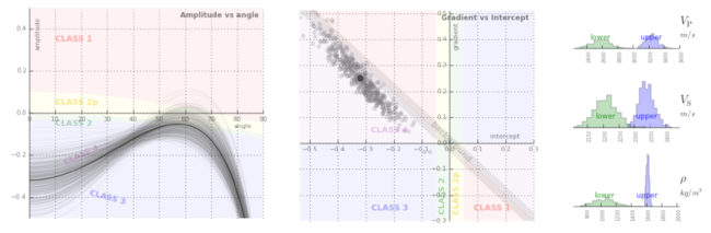
Let's dissect some of the conceptual high points. This graphic shows all the data simultaneously across 3 domains, one in each panel. The data points are sampled from probability density estimates of the physical model. It is a large dataset from many calculations of angle-dependent reflectivity at an interface. The data is revealed with a semi-transparent overlay, so that areas of certainty are visually opaque, and areas of uncertainty are harder to see.
At the same time, you can still see every data point that makes the graphic giving a broad overview (the range and additive intensity of the lines and points) as well as the finer structure. We place the two modeled dimensions with templates in the background, alongside the physical model histograms. We can see, for instance, how likely we are to see a phase reversal, or a Class 3 response subject to the physical probability estimates. The statistical and site-specific nature of subsurface modeling is represented in spirit. All the data has context, and all the data has uncertainty.
Rules for graphics that work
Tufte summarizes that excellent data graphics should:
- Show all the data.
- Provoke the viewer into thinking about meaning.
- Avoid distorting what the data have to say.
- Present many numbers in a small space.
- Make large data sets coherent.
- Encourage the eye to compare different pieces of the data.
- Reveal the data at several levels of detail, from a broad overview to the fine structure.
- Serve a reasonably clear purpose: description, exploration, tabulation, or decoration.
- Be closely integrated with the statistical and verbal descriptions of a data set.
The data density, or data-to-ink ratio, looks reasonably high in my crossplot, but it could like still be optimized. What would you remove? What would you add? What elements need revision?


 Except where noted, this content is licensed