The deep time clock

Check out this video by a Finnish Lego engineer on the Brick Experiment Channel (BEC):

This brilliant, absurd machine — which fits easily on a coffee table — made me think about geological time.

Representing deep time is a classic teaching problem in geoscience. Most of them are variants of “Imagine the earth’s history compressed into 24 hours” and use a linear scale. It’s amazing how even the Cretaceous is only 25 minutes long, and humans arrived a few seconds ago. These memorable and effective demos have been blowing people’s minds for years.

Clocks with v e r y s l o w hands

I think an even nicer metaphor is the clock. Although non-linear, it’s instantly familiar, even if its inner workings of cogs and gears are not. We all understand how the hands move with different periods (especially if you’ve ever had a dull job). So this image (right) from the video is, I think, a nice lead-in to what ends up being a mind-exploding depiction of deep time, beyond anything you can do with a linear analogy.

Indeed, if the googol-gear-machine viking minifigure rotation was a day, the Cretaceous essentially doesn’t exist. Nothing does, it’s just 24 hours of protons decaying.

Screenshot from 2020-05-19 12-21-53.png

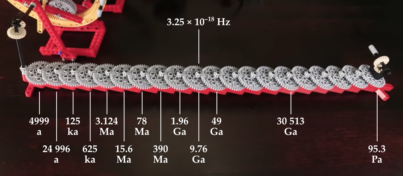
After a couple of giant gears, the engineer adds this chain of gears (below). Once attached to the rest of the machine, these things — the first 10 of them anyway — are essentially the hands on a geological clock.

geological_time_cogs.png

The first hand on this clock, so to speak, turns once every 4999 years. This is not a bad unit of measure if you’re looking at earth surface processes. Then each new gear multiplies by a factor of 40/8, so the next one is 25 ka, and the next 125 ka — around the domain of Milankovich cycles. Then things start getting really geological. The 5th clock hand does one rotation every 3.1 million years, then the 6th is 15.6 Ma. Unfortunately it quickly gets out of hand: the 10th has only turned once since the start of the universe, and after that they are all basically useless for thinking about anything but cosmological timelines. The last one here turns once every 95 petayears.

Remarkably, the BEC machine is still just getting started here. 95 Pa is nothing compared to the last wheel, which would require more energy than exists in the universe to turn. Think about that.

I want one of these

Apparently the BEC machine was inspired by a Daniel de Bruin creation:

Each wheel here is a 100:10 reduction. You’d only need the first 20 of them to have the last one do one single revolution since the birth of the solar system!

If someone would like to build such a geological clock for me, I’ll pay a sub-googol amount of money for it. Bonus points if it fits in a wristwatch.

The right writing tools

Scientists write, it's part of the job. If writing feels laborious, it might be because you haven't found the right tools yet. 

The wrong tools <cough>Word</cough> feel like a lot of work. You spend a lot of time fiddling with font sizes and not being sure whether to use italic or bold. You're constantly renumbering sections after edits. Everything moves around when you resize a figure. Tables are a headache. Table of contents? LOL.

If this sounds familiar, check out the following tools — arranged more or less in order of complexity.

Markdown

If you've never experienced writing with a markup language, you're in for a treat. At first it might feel clunky, but it quickly gets out of the way, leaving you to focus on the writing. Markdown was invented by John Gruber in about 2004; it is now almost ubiquitous in tools for developers. It's very lightweight, but compatible with HTML and LaTeX math, so it has plenty of features. Styling is absent from the document itself, being applied enitrely in post-production, as it were. With help from pandoc, you can compile Markdown documents to almost any format (e.g. PDF or Word). As a result, Markdown is sufficient for at least 70% of my writing projects. Here's a sampling of Markdown markup, rendered on the right with no styling:

Markdown_raw.png
Markdown_render.png

Jupyter Notebook

If you've been following along with our X Lines of Python series, or any of our other code-centric content, you'll have come across Jupyter Notebooks. These documents combine Markdown with code (in more or less any language you can think of) and the outputs of code — data, charts, images, etc. More than containing code, a so-called kernel can also run the code: Notebooks are fully computable documents. Not only could you write a paper or book in a Notebook, many people use them to give presentations with fully interactive, live code blocks and widgets.

Notebook_example.png
latex_folder___by_missyobo-d3azzbh.png

LaTeX

I discovered LaTeX in about 1993 and it was love at first sight. I've always been a bit of a typography nerd, and LaTeX — like TeX, around which LaTeX is wrapped — really cares about typography. So you get ligatures, hyphenation, sentence spacing, and kerning for free. It also cares about mathematics, cross-references, bibliographies, page numbering, tables of contents, and everything else you need for publication-ready documents.

You can install LaTeX locally, but there are several ways to use LaTeX online, without installing anything — and you get the best of both worlds: markup with WYSIWYG editing. OverleafShareLaTex (which is merging with Overleaf), Authorea, and Papeeria are all worth a look, especially if you write scientific papers.

When WYSISYG works

Sometimes you just want a couple of headings and some text, or you need to share a document with others. I often go for WYSISYG in those situations too — Google Docs is the best WYSIWYG editor I've used. When it supports Markdown too, which is surely only a matter of time, it will be perfect.

What about you, do you have a favourite writing tool? Share it in the comments.

Abstract horror

This isn't really a horror story, more of a Grimm fairy tale. Still, I thought it worthy of a Hallowe'eny title.

I've been reviewing abstracts for the 2018 AAPG annual convention. It's fun, because you get to read about new research months ahead of the rest of the world. But it's also not fun because... well, most abstracts aren't that great. I have no idea what proportion of abstracts the conference accepts, but I hope it's not too far above about 50%. (There was some speculation at SEG that there are so many talks now — 18 parallel sessions! — because giving a talk is the only way for many people to get permission to travel to it. I hope this isn't true.)

Some of the abstracts were great; at least 1 in 4 was better than 'good'. So  what's wrong with the others? Here are the three main issues I saw: 

  1. Lots of abstracts were uninteresting.
  2. Even more of them were vague.
  3. Almost all of them were about unreproducible research.

Let's look at each of these in turn and ask what we can do about it.

Uninteresting

Let's face it, not all research is interesting research. That's OK — it might still be useful or otherwise important. I think you can still write an interesting abstract about it. Here are some tips:

  • Don't be vague! Details are interesting. See the next section.
  • Break things up a bit. Use at least 2 paragraphs, maybe 3 or 4. Maybe a list or two. 
  • Use natural, everyday language. Try reading your abstract aloud. 
  • In the first sentence, tell me why I should come to your talk or visit your poster. 

Vague

I scribbled 'Vague' on nearly every abstract. In almost every case, either the method or the results, and usually both, were described in woolly language. For example (this is not a direct quote, but paraphrased):

Machine learning was used to predict the reservoir quality in most of the wells in the area, using millions of training examples and getting good results. The inputs were wireline log data from nearby wells.

This is useless information — which algorithm? How did you optimize it? How much training data did you have, and how many data instances did you validate against? How many features did you use? What kind of validation did you do, and what scores did you achieve? Which competing methods did you compare with? Use numbers, be specific:

We used a 9-dimensional support vector machine, implemented in scikit-learn, to model the permeability. With over 3 million training examples from logs in 150 nearby wells in the training set, and 1 million in cross-validation, we achieved an F1 score of 0.75 or more in 18 of the 20 wells.

A roughly 50% increase in the number of words, but an ∞% increase in the information content.

Unreproducible

Maybe I'm being unfair on this one, because I can't really tell if something is going to be reproducible or not from an abstract... or can I?

I'd venture to say that, if the formations are called A, B, C, and D, and the wells are called 1, 2, 3, and 4, then I'm pretty sure I'm not going to find out much about your research. (I had a long debate with someone in Houston recently about whether this sort of thing even qualifies as science.)

So what can you do to make a more useful abstract? 

  • Name your methods and algorithms. Where did they come from? Which other work did you build on?
  • Name the dataset and tell me where it came from. Don't obfuscate the details — they're what make you interesting! Share as much of the data as you can.
  • Name the software you're using. If it's open source, it's the least you can do. If it's not open source, it's not reproducible, but I'd still like to know how you're doing what you do.

I realize not everyone is in a position to do 100% reproducible research, but you can aim for something over 50%. If your work really is top secret (<50% reproducible), then you might think twice about sharing your work at conferences, since no-one can really learn anything from you. Ask yourself if your paper is really just an advertisement.

So what does a good abstract look like?

Well, I do like this one-word abstract from Gardner & Knopoff (1974), from the Bulletin of the Seismological Society of America:

Is the sequence of earthquakes in Southern California, with aftershocks removed, Poissonian?

Yes.

A classic, but I'm not sure it would get your paper accepted at a conference. I don't collect awesome abstracts — maybe I should — but here are some papers with great abstracts that caught my interest recently:

  • Dean, T (2017). The seismic signature of rain. Geophysics 82 (5). The title is great too; what curious person could resist this paper? 
  • Durkin, P et al. (2017) on their beautiful McMurry Fm interpretation in JSR 27 (10). It could arguably be improved by a snappier first sentence that gives punchline of the paper.
  • Doughty-Jones, G, et al (2017) in AAPG Bulletin 101 (11). There's maybe a bit of an assumption that the reader cares about intraslope minibasins, but the abstract has meat.

Becoming a better abstracter

The number one thing to improve as a writer is probably asking other people — friendly but critical ones — for honest feedback. So start there.

As I mentioned in my post More on brevity way back in March 2011, you should probably read Landes (1966) once every couple of years:

Landes, K (1966). A scrutiny of the abstract II. AAPG Bulletin 50 (9). Available online. (An update to his original 1951 piece, A scrutiny of the abstract, AAPG Bulletin 35, no 7.)

There's also this plea from geophysicist Paul Lowman, to stop turning abstracts into introductions:

Lowman, Paul (1988). The abstract rescrutinized. Geology 16 (12). Available online.

Give those a read — they are very short — and maybe pay extra attention to the next dozen or so abstracts you read. Do they tell you what you need to know? Are they either useful or interesting? Do they paint a vivid picture? Or are they too... abstract?

EarthArXiv wants your preprints

eartharxiv.png

If you're into science, and especially physics, you've heard of arXiv, which has revolutionized how research in physics is shared. BioarXiv, SocArXiv and PaleorXiv followed, among others*.

Well get excited, because today, at last, there is an open preprint server especially for earth science — EarthArXiv has landed! 

I could write a long essay about how great this news is, but the best way to get the full story is to listen to two of the founders — Chris Jackson (Imperial College London and fellow University of Manchester alum) and Tom Narock (University of Maryland, Baltimore) — on Undersampled Radio this morning:

Congratulations to Chris and Tom, and everyone involved in EarthArXiv!

  • Friedrich Hawemann, ETH Zurich, Switzerland
  • Daniel Ibarra, Earth System Science, Standford University, USA
  • Sabine Lengger, University of Plymouth, UK
  • Andelo Pio Rossi, Jacobs University Bremen, Germany
  • Divyesh Varade, Indian Institute of Technology Kanpur, India
  • Chris Waigl, University of Alaska Fairbanks, USA
  • Sara Bosshart, International Water Association, UK
  • Alodie Bubeck, University of Leicester, UK
  • Allison Enright, Rutgers - Newark, USA
  • Jamie Farquharson, Université de Strasbourg, France
  • Alfonso Fernandez, Universidad de Concepcion, Chile
  • Stéphane Girardclos, University of Geneva, Switzerland
  • Surabhi Gupta, UGC, India

Don't underestimate how important this is for earth science. Indeed, there's another new preprint server coming to the earth sciences in 2018, as the AGU — with Wiley! — prepare to launch ESSOAr. Not as a competitor for EarthArXiv (I hope), but as another piece in the rich open-access ecosystem of reproducible geoscience that's developing. (By the way, AAPG, SEG, SPE: you need to support these initiatives. They want to make your content more relevant and accessible!)

It's very, very exciting to see this new piece of infrastructure for open access publishing. I urge you to join in! You can submit all your published work to EarthArXiv — as long as the journal's policy allows it — so you should make sure your research gets into the hands of the people who need it.

I hope every conference from now on has an EarthArXiv Your Papers party. 


* Including snarXiv, don't miss that one!

Tune in to Undersampled Radio

Back in the summer I mentioned Undersampled Radio, the world's newest podcast about geoscience. Well, geoscience and computers. OK, machine learning and geoscience. And conferences.

We're now 25 shows in, having started with Episode 0 on 28 January. The show is hosted by Graham 'Gram' Ganssle, a consulting and research geophysicist based in New Orleans, and me. Appropriately enough, I met Gram at the machine-learning-themed hackathon we did at SEG in 2015. He was also a big help with the local knowledge.

I broadcast from one of the phone rooms at The HUB South Shore. Gram has the luxury of a substantial book-lined office, which I imagine has ample views of paddle-steamers lolling on the Mississippi (but I actually have no idea where it is). 

To get an idea of what we chat about, check out the guests on some recent episodes:

Better than cable

The podcast is really more than just a podcast, it's really a live TV show, broadcasting on YouTube Live. You can catch the action while it's happening on the Undersampled Radio channel. However, it's not easy to catch live because the episodes are not that predictable — they are announced about 24 hours in advance on the Software Underground Slack group (you are in there, right?). We should try to put them out on the @undrsmpldrdio Twitter feed too... 

So, go ahead and watch the very latest episode, recorded last Thursday. We spoke to Tim Hopper, a data scientist in Raleigh, NC, who works at Distil Networks, a cybersecurity firm. It turns out that using machine learning to filter web traffic has some features in common with computational geophysics...

You can subscribe to the show in iTunes or Google Play, or anywhere else good podcasts are served. Grab the RSS Feed from the UndersampledRad.io website.

Of course, we take guest requests. Who would you like to hear us talk to? 

The (bad) stuff of legend

What is a legend? Merriam–Webster says:

  1. A story from the past that is believed by many people but cannot be proved to be true.
  2. An explanatory list of the symbols on a map or chart.

I think we can combine these:

An explanatory list from the past that is believed by many to be useful but which cannot be proved to be.

Maybe that goes too far, sometimes you need a legend. But often, very often, you don't. At the very least, you should always try hard to make the legend irrelevant. Why, and how, can you do this? 

A case study

On the right is a non-scientific caricature of a figure from a paper I just finished reviewing for Geophysics. I won't give any more details because I don't want to pick on it unduly — lots of authors make the same mistakes.

Here are some of the things I think are confusing about this figure, detracting from the science in the paper. 

  • Making the reader cross-reference the line decoration with the legend makes it harder to make the comparison you're asking them to make. Just label the lines directly. 
  • Using unhelpful, generic names like 1, 2, and 3 for the models leads the reader into cross-reference Inception. The models were shown and explained on the previous page. 
  • Inception again: the models 1, 2, and 3 were shown in the previous figure parts (a), (b), and (c) respectively. So I had to cross-reference deeper still to really find out about them. 
  • The paper used colour elsewhere, so the use of black and white line decoration here seems unnecessary. There are other ways to ensure clarity if the paper is photocopied.
  • Everything on the same visual plane, so to speak, so the chart cannot take any more detail, such as gridlines. 

Getting better

I have tried to fix some of this in the version of the figure shown here. It's the same size as the original. The legend, such as it is, is now a visual key to the models. Careful juxtaposition of figures could obviate the need even for this extra key. The idea would be to use the colours and names of the models in every figure, to link them more intuitively.

The principles at work:

  • Reduce the fatigue of reading by labeling things directly.
  • Avoid using 'a' and 'b' or other generic names. Call the parts before and after, or 8 ms gate and 16 ms gate
  • Put things you want people to compare next to each other: models with data, output with input, etc. 
  • Use less ink for decoration, more ink for data. Gently direct the reader's attention. 

I'm sure there are other improvements we could make. Do you have any tips to share for making better figures? Leave them in the comments. 


Update, 30 Jan 2015

Some great comments came in today, and the point about black and white is well taken. Indeed, our 52 Things books are all black and white, and I end up transforming most images and figures to (I hope) make them clearer without colour. Here's how I'd do this figure in black and white.

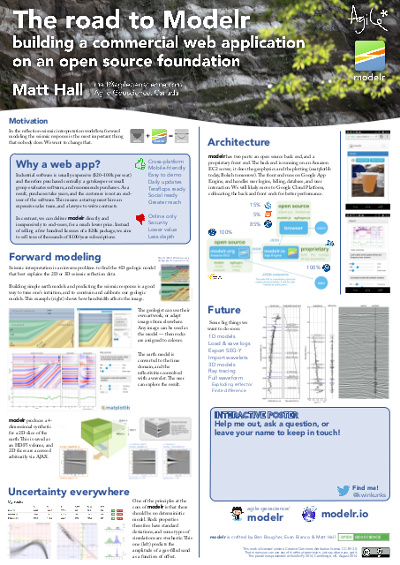
The road to Modelr: my EuroSciPy poster

At EuroSciPy recently, I gave a poster-ized version of the talk I did at SciPy. Unlike most of the other presentations at EuroSciPy, my poster didn't cover a lot of the science (which is well understood), or the code (which is esoteric).

Instead it focused on the advantages of spreading software via web applications, rather than only via source code, and on the challenges that we overcame — well, that we're still overcoming — to get our Modelr tool out there. I wanted other programmer-scientists to think about running some of their code as a web app for others to enjoy, but to be aware of the effort involved in doing this.

I've written before about my dislike of posters, though I'm told they are an important component at, say, the AGU Fall Meeting. I admit I do quite like the process of making them, and — on advice from Colin Purrington's useful page — I left a space on the poster for people to write comments or leave sticky notes. As a result, I heard about Docker, a lead I'll certainly follow up,

What's new in modelr

This wasn't part of the poster, but I might as well take the chance to let you know what we've updated recently:

  • You can now add noise to models by specifying the signal:noise.
  • Instead of automatic scaling, you can choose your own gain.
  • The app now returns the elastic moduli of the rocks in the model.
  • You can choose a spatial cross-section view or a space–offset–frequency view.

All of these features are now available to subscribers for only $9/month. Amazing value :)

Figshare

I've stored my poster on Figshare, a data storage site and part of Macmillan's Digital Science effort. What I love about Figshare, apart from the convenience of cloud-based storage and easy access for others, is that every item gets a digital object identifier or DOI. You've probably seen these on journal articles. They're a bit like other persistent and unique IDs for publications, such as ISBNs for books, but the idea is to provide more interactivity by making it easily linkable: you can get to any object with a DOI by prepending it with "http://dx.doi.org/".

Reference

Hall, M (2014). The road to modelr: building a commercial web app on an open source foundation. EuroSciPy, Cambridge, UK, August 29–30, 2014. Poster presentation. DOI:10.6084/m9.figshare.1151653

Graphics that repay careful study

The Visual Display of Quantitative Information by Edward Tufte (2nd ed., Graphics Press, 2001) celebrates communication through data graphics. The book provides a vocabulary and practical theory for data graphics, and Tufte pulls no punches — he suggests why some graphics are better than others, and even condemns failed ones as lost opportunities. The book outlines empirical measures of graphical performance, and describes the pursuit of graphic-making as one of sequential improvement through revision and editing. I see this book as a sort of moral authority on visualization, and as the reference book for developing graphical taste.

Through design, the graphic artist allows the viewer to enter into a transaction with the data. High performance graphics, according to Tufte, 'repay careful study'. They support discovery, probing questions, and a deeper narrative. These kinds of graphics take a lot of work, but they do a lot of work in return. In later books Tufte writes, 'To clarify, add detail.'

A stochastic AVO crossplot

Consider this graphic from the stochastic AVO modeling section of modelr. Its elements are constructed with code, and since it is a program, it is completely reproducible.

Let's dissect some of the conceptual high points. This graphic shows all the data simultaneously across 3 domains, one in each panel. The data points are sampled from probability density estimates of the physical model. It is a large dataset from many calculations of angle-dependent reflectivity at an interface. The data is revealed with a semi-transparent overlay, so that areas of certainty are visually opaque, and areas of uncertainty are harder to see.

At the same time, you can still see every data point that makes the graphic giving a broad overview (the range and additive intensity of the lines and points) as well as the finer structure. We place the two modeled dimensions with templates in the background, alongside the physical model histograms. We can see, for instance, how likely we are to see a phase reversal, or a Class 3 response subject to the physical probability estimates. The statistical and site-specific nature of subsurface modeling is represented in spirit. All the data has context, and all the data has uncertainty.

Rules for graphics that work

Tufte summarizes that excellent data graphics should:

  • Show all the data.
  • Provoke the viewer into thinking about meaning.
  • Avoid distorting what the data have to say.
  • Present many numbers in a small space.
  • Make large data sets coherent.
  • Encourage the eye to compare different pieces of the data.
  • Reveal the data at several levels of detail, from a broad overview to the fine structure.
  • Serve a reasonably clear purpose: description, exploration, tabulation, or decoration.
  • Be closely integrated with the statistical and verbal descriptions of a data set.

The data density, or data-to-ink ratio, looks reasonably high in my crossplot, but it could like still be optimized. What would you remove? What would you add? What elements need revision?

A culture of asking questions

When I worked at ConocoPhillips, I was quite involved in their knowledge sharing efforts (and I still am). The most important part of the online component is a set of 100 or so open discussion forums. These are much like the ones you find all over the Internet (indeed, they're a big part of what made the Internet what it is — many of us remember Usenet, now Google Groups). But they're better because they're highly relevant, well moderated, and free of trolls. They are an important part of an 'asking' culture, which is an essential prerequisite for a learning organization

Stack Exchange is awesome

Today, the Q&A site I use most is Stack Overflow. I read something on it almost every day. This is the place to get questions about programming answered fast. It is one of over 100 sites at Stack Exchange, all excellent — readers might especially like the GIS Stack Exchange. These are not your normal forums... Fields medallist Tim Gowers recognizes Math Overflow as an important research tool. The guy has a blog. He is awesome.

What's so great about the Stack Exchange family? A few things:

  • A simple system of up- and down-voting questions and answers that ensures good ones are easy to find.
  • A transparent system of user reputation that reflects engagement and expertise, and is not easy to game. 
  • A well defined path from proposal, to garnering support, to private testing, to public testing, to launch.
  • Like good waiters, the moderators keep a very low profile. I rarely notice them. 
  • There are lots of people there! This always helps.

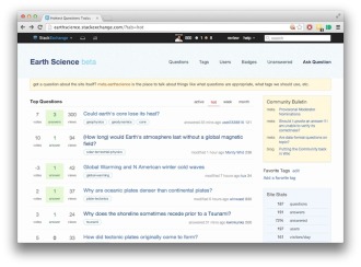
The new site for earth science

The exciting news is that, two years after being proposed in Area 51, the Earth Science site has reached the minimum commitment, spent a week in beta, and is now open to all. What happens next is up to us — the community of geoscientists that want a well-run, well-populated place to ask and answer scientific questions.

You can sign in instantly with your Google or Facebook credentials. So go and take a look... Then take a deep breath and help someone.