Illuminated equations

Last year I wrote a post about annotated equations, and why they are useful teaching tools. But I never shared all the cool examples people tweeted back, and some of them are too good not to share.

Let’s start with this one from Andrew Alexander that he uses to explain complex number notation:

illuminated_complex.png

Paige Bailey tweeted some examples of annotated equations and code from the reinforcement learning tutorial, Building a Powerful DQN in TensorFlow by Sebastian Theiler. Here’s one of the algorithms, with slightly muted annotations:

Illuminated_code_Theiler_edit.jpeg.png

Finally, Jesper Dramsch shared a new one today (and reminded me that I never finished this post). It links to Edward Raff’s book, Inside Deep Learning, which has some nice annotations, e.g. expressing a fundamental idea of machine learning:

Raff_cost_function.png

Dynamic explication

The annotations are nice, but it’s quite hard to fully explain an equation or algorithm in one shot like this. It’s easier to do, and easier to digest, over time, in a presentation. I remember a wonderful presentation by Ross Mitchell (then U of Calgary) at the also brilliant lunchtime mathematics lectures that Shell used to sponsor in Calgary. He unpeeled time-frequency analysis, especially the S transform, and I still think about his talk today.

What Ross understood is that the learner really wants to see the maths build, more or less from first principles. Here’s a nice example — admittedly in the non-ideal medium of Twitter: make sure you read the whole thread — from Darrel Francis, a cardiologist at Imperial Colege, London:

A video is even more dynamic of course. Josef Murad shared a video in which he derives the Navier–Stokes equation:

In this video, Grant Sanderson, perhaps the equation explainer nonpareil, unpacks the Fourier transform. He creeps up on the equation, starting instead with building the intuition around frequency decomposition:

If you’d like to try making this sort of thing, you might like to know that Sanderson’s Python software, manim, is open source.


Multi-modal explication

Sanderson illustrates nicely that the teacher has several pedagogic tools at their disposal:

  • The spoken word.

  • The written word, especially the paragraph describing a function.

  • A symbolic representation of the function.

  • A graphical representation of the function.

  • A code representation of the function, which might also have a docstring, which is a formal description of the code, its inputs, and its outputs. It might also produce the graphical representation.

  • Still other modes, e.g. pseudocode (see Theiler’s example, above), a cartoon (esssentially a ‘pseudofigure’),

Virtually all of these things are, or can be dynamic (in a video, on a whiteboard) and annotated. They approach the problem from different directions. The spoken and written descriptions should be rigorous and unambiguous, but this can make them clumsy. Symbolic maths can be useful to those that can read it, but authors must take care to define symbols properly and to be consistent. The code representation must be strict (assuming it works), but might be hard for non-programmers to parse. Figures help most people, but are more about building intuition than providing the detail you might need for implementation, say. So perhaps the best explanations have several modes of explication.

In this vein of multi-modal explication, Jeremy Howard shared a nice example from his book, Deep learning for coders, of combining text, symbolic maths, and code:

illuminated_jeremy_howard.png

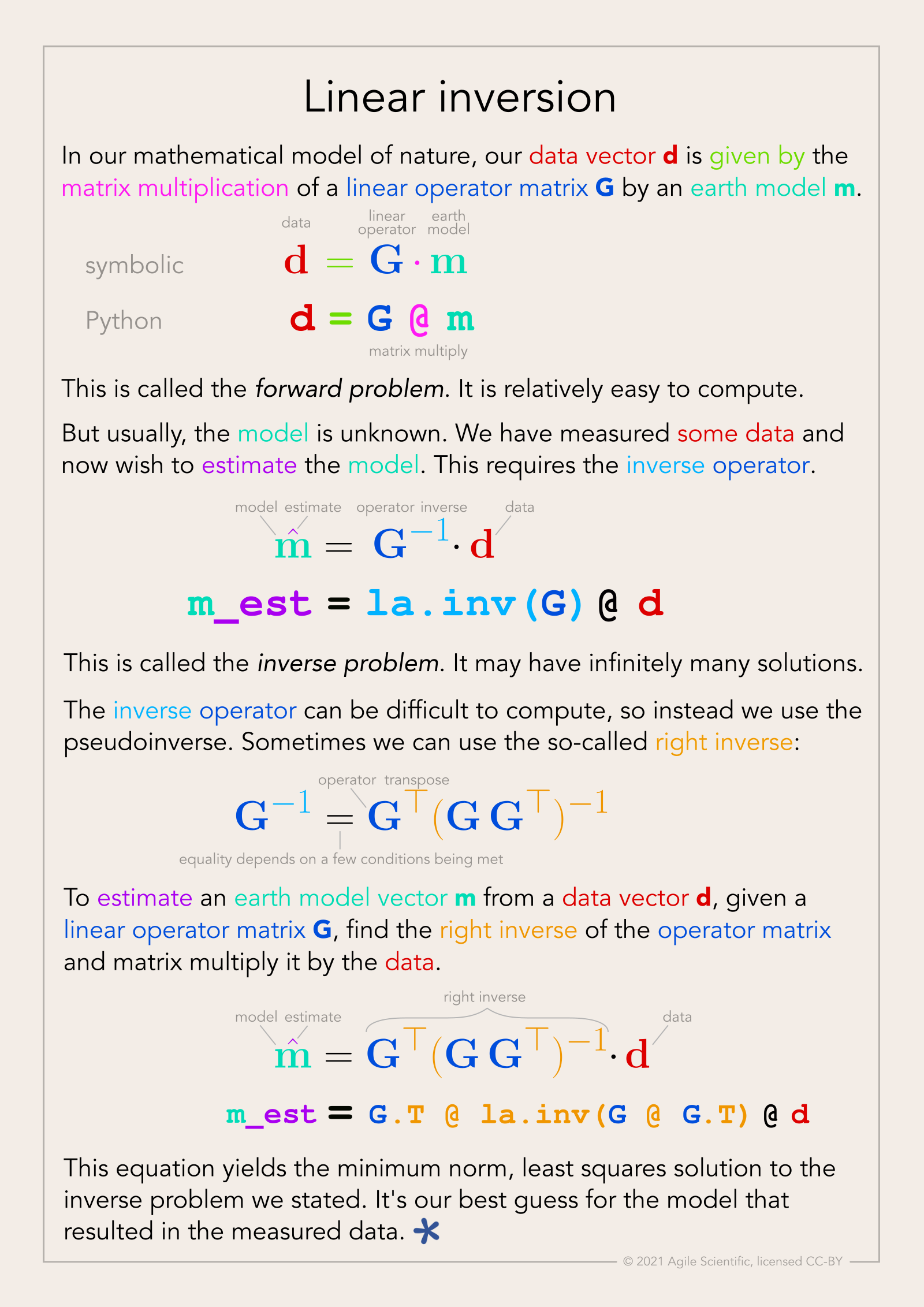
Eventually I settled on calling these things, that go beyond mere annotation, illuminated equations (not to directly compare them to the beautiful works of devotion produced by monks in the 13th century, but that’s the general idea). I made an attempt to describe linear regression and the neural network equation (not sure what else to call it!) in a series of tweets last year. Here’s the all-in-one poster version (as a PDF):

linear_inversion_page.png

There’s nothing intuitive about physics, maths, or programming. The more tricks we have for spreading intuition about these important scientific tools, the better. I think there’s something in illuminated equations for teachers to practice — and students too. In fact, Jackie Caplan-Auerbach decribes coaching her students in creating ‘equation dictionaries’ in her geophysics classes. I think this is a wonderful idea.

If you’re teaching or learning maths, I’d love to hear your thoughts. Are these things worth the effort to produce? Do you have any favourite examples to share?

The (bad) stuff of legend

What is a legend? Merriam–Webster says:

  1. A story from the past that is believed by many people but cannot be proved to be true.
  2. An explanatory list of the symbols on a map or chart.

I think we can combine these:

An explanatory list from the past that is believed by many to be useful but which cannot be proved to be.

Maybe that goes too far, sometimes you need a legend. But often, very often, you don't. At the very least, you should always try hard to make the legend irrelevant. Why, and how, can you do this? 

A case study

On the right is a non-scientific caricature of a figure from a paper I just finished reviewing for Geophysics. I won't give any more details because I don't want to pick on it unduly — lots of authors make the same mistakes.

Here are some of the things I think are confusing about this figure, detracting from the science in the paper. 

  • Making the reader cross-reference the line decoration with the legend makes it harder to make the comparison you're asking them to make. Just label the lines directly. 
  • Using unhelpful, generic names like 1, 2, and 3 for the models leads the reader into cross-reference Inception. The models were shown and explained on the previous page. 
  • Inception again: the models 1, 2, and 3 were shown in the previous figure parts (a), (b), and (c) respectively. So I had to cross-reference deeper still to really find out about them. 
  • The paper used colour elsewhere, so the use of black and white line decoration here seems unnecessary. There are other ways to ensure clarity if the paper is photocopied.
  • Everything on the same visual plane, so to speak, so the chart cannot take any more detail, such as gridlines. 

Getting better

I have tried to fix some of this in the version of the figure shown here. It's the same size as the original. The legend, such as it is, is now a visual key to the models. Careful juxtaposition of figures could obviate the need even for this extra key. The idea would be to use the colours and names of the models in every figure, to link them more intuitively.

The principles at work:

  • Reduce the fatigue of reading by labeling things directly.
  • Avoid using 'a' and 'b' or other generic names. Call the parts before and after, or 8 ms gate and 16 ms gate
  • Put things you want people to compare next to each other: models with data, output with input, etc. 
  • Use less ink for decoration, more ink for data. Gently direct the reader's attention. 

I'm sure there are other improvements we could make. Do you have any tips to share for making better figures? Leave them in the comments. 


Update, 30 Jan 2015

Some great comments came in today, and the point about black and white is well taken. Indeed, our 52 Things books are all black and white, and I end up transforming most images and figures to (I hope) make them clearer without colour. Here's how I'd do this figure in black and white.

Graphics that repay careful study

The Visual Display of Quantitative Information by Edward Tufte (2nd ed., Graphics Press, 2001) celebrates communication through data graphics. The book provides a vocabulary and practical theory for data graphics, and Tufte pulls no punches — he suggests why some graphics are better than others, and even condemns failed ones as lost opportunities. The book outlines empirical measures of graphical performance, and describes the pursuit of graphic-making as one of sequential improvement through revision and editing. I see this book as a sort of moral authority on visualization, and as the reference book for developing graphical taste.

Through design, the graphic artist allows the viewer to enter into a transaction with the data. High performance graphics, according to Tufte, 'repay careful study'. They support discovery, probing questions, and a deeper narrative. These kinds of graphics take a lot of work, but they do a lot of work in return. In later books Tufte writes, 'To clarify, add detail.'

A stochastic AVO crossplot

Consider this graphic from the stochastic AVO modeling section of modelr. Its elements are constructed with code, and since it is a program, it is completely reproducible.

Let's dissect some of the conceptual high points. This graphic shows all the data simultaneously across 3 domains, one in each panel. The data points are sampled from probability density estimates of the physical model. It is a large dataset from many calculations of angle-dependent reflectivity at an interface. The data is revealed with a semi-transparent overlay, so that areas of certainty are visually opaque, and areas of uncertainty are harder to see.

At the same time, you can still see every data point that makes the graphic giving a broad overview (the range and additive intensity of the lines and points) as well as the finer structure. We place the two modeled dimensions with templates in the background, alongside the physical model histograms. We can see, for instance, how likely we are to see a phase reversal, or a Class 3 response subject to the physical probability estimates. The statistical and site-specific nature of subsurface modeling is represented in spirit. All the data has context, and all the data has uncertainty.

Rules for graphics that work

Tufte summarizes that excellent data graphics should:

  • Show all the data.
  • Provoke the viewer into thinking about meaning.
  • Avoid distorting what the data have to say.
  • Present many numbers in a small space.
  • Make large data sets coherent.
  • Encourage the eye to compare different pieces of the data.
  • Reveal the data at several levels of detail, from a broad overview to the fine structure.
  • Serve a reasonably clear purpose: description, exploration, tabulation, or decoration.
  • Be closely integrated with the statistical and verbal descriptions of a data set.

The data density, or data-to-ink ratio, looks reasonably high in my crossplot, but it could like still be optimized. What would you remove? What would you add? What elements need revision?

Five more things about colour

Last time I shared some colourful games, tools, and curiosities, including the weird chromostereopsis effect (right). Today, I've got links to much, much more 'further reading' on the subject of colour...


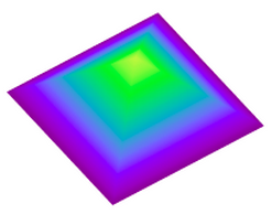
The provocation for this miniseries was Robert 'Blue Marble' Simmon's terrific blog series on colour, which he's right in the middle of. Robert is a data visualization pro at NASA Earth Observatory, so we should all listen to him. Here's his collection (updated after the original writing of this post):

Perception is everything! One of Agile's best friends is Matteo Niccoli, a quantitative geophysicist in Norway (for now). And one of his favourite subjects is colour — there are loads of great posts on his blog. He also has a fine collection of perceptual colour bars (left) for most seismic interpretation software. If you're still using Spectrum for maps, you need his help.

Dave Green is a physicist at the University of Cambridge. Like Matteo, he has written about the importance of using colour bars which have a linear increase in perceived brightness. His CUBEHELIX scheme (above) adapts easily to your needs — try out his colour bar creator. And if this level of geekiness gets you going, try David Dalrymple or Gregor Aisch.

ColorBrewer is a legendary web app and add-in for ArcGIS. It's worth playing with the various colour schemes, especially if you need a colour bar that is photocopy friendly, or that can still be used by colour blind people. The equally excellent, perhaps even slightly more excellent, i want hue is also worth playing with (thanks to Robert Simmon for that one). 

In scientific publishing, the Nature family of journals has arguably the finest graphics. Nature Methods carries a column called Points of View, which looks at scientific visualization. This mega-post on their Methagora blog links to them all, and covers everything from colour and 3D graphics to broader issues of design and typography. Wonderful stuff.

Since I don't seem to have exhausted the subject yet, we'll save a couple of practical topics for next time:

  1. A thought experiment: How many attributes can a seismic interpreter show with colour in a single display?
  2. Provoked by a reader via email, we'll think about that age old problem for thickness maps — should the thicks be blue or red?

Five things about colour

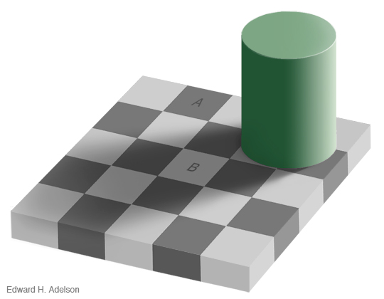
The fact that colour is a slippery subject is powerfully illustrated by my favourite optical illusion. Look at this:

Squares A and B are the same shade of grey. It's so hard to believe that you might need to see the proof to be convinced. 

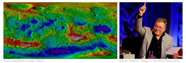
Chromostereopsis is a similarly disarming effect that you may have noticed on maps with bright spectrum colour bars. Most people perceive blue and red on different depth planes, so the pseudo-3D effect can work in your favour and make the map 'pop' (This is not a good reason to use a spectrum colour bar, however... more on this next time). I notice that at least one set designer knows about the effect, making William Shatner pop on the TV show Have I Got News For You:

Color is a fun way to test your colour intuition. The game starts easy, but is very hard by the end as you simulatneously match colour tetrads. The first time I played I managed 9.8, which I am not-very-secretly quite pleased about. But I haven't been able to repeat the performance.

X-Rite's Online Color Challenge is also tough. You have to sort the very subtle colours into order. It takes a while to play but is definitely worth it. If your job depends on spotting subtle effects in images (like seismic data, for example) then stand by to learn something about your detection system. 

Color blindness will change how these games work, of course, and should change how we make maps, figures, and slides. Since up to about 5% of a large audience might be colour blind, you might want to think about how your presentations look to them. You can easily check with Vischeck and correct images for colourblind people with the Daltonizer. They can still be beautiful, but you can avoid certain colour combinations and reach a wider audience.

I have lots more links about colour to share in the next post, including some required reading from Rob Simmon and Matteo Niccoli, among others. In the meantime, have you come across any handy colour tools, or has colour ever caught you out? Let us know in the comments.

The image of William Shatner is copyright and courtesy of Hat Trick Productions Ltd, London, UK, and used with permission.

Fabric textures

Beyond the traditional, well-studied attributes that I referred to last time, are a large family of metrics from image processing and robot vision. The idea is to imitate the simple pattern recognition rules our brains intuitively and continuously apply when we look at seismic data: how do the data look? How smooth or irregular are the reflections? If you thought the adjectives I used for my tea towels were ambiguous, I assure you seismic will be much more cryptic.

In three-dimensional data, texture is harder to see, difficult to draw, and impossible to put on a map. So when language fails us, discard words altogether and use numbers instead. While some attributes describe the data at a particular place (as we might describe a photographic pixel as 'red', 'bright', 'saturated'), other attributes describe the character of the data in a small region or kernel ('speckled', 'stripy', 'blurry').

Texture by numbers

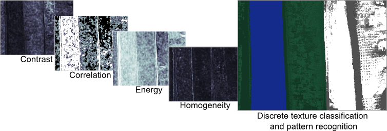
I converted the colour image from the previous post to a greyscale image with 256 levels (a bit-depth of 8) to match this notion of scalar seismic data samples in space. The geek speak is that I am computing local grey-level co-occurence matrices (or GLCMs) in a moving window around the image, and then evaluating some statistics of the local GLCM for each point in the image. These statistics are commonly called Haralick textures. Choosing the best kernel size will depend on the scale of the patterns. The Haralick textures are not particularly illustrative when viewed on their own but they can be used for data clustering and classification, which will be the topic of my next post.

  • Step 1: Reduce the image to 256 grey-levels
  • Step 2: For every pixel, compute a co-occurrence matrix from a p by q kernel (p, q = 15 for my tea towel photo)
  • Step 3: For every pixel, compute the Haralick textures (Contrast, Correlation, Energy, Homogeneity) from the GLCM

Textures in seismic data

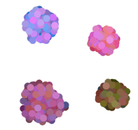
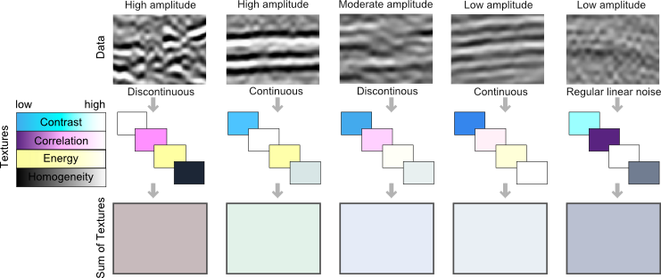
Here are a few tiles of seismic textures that I have loosely labeled as "high-amplitude continous", "high-amplitude discontinuous", "low-amplitude continuous", etc. You certainly might choose different words to describe them, but each has a unique and objective set of Haralick textures. I have explicitly represented the value of each's texture as a color; using cyan for contrast, magenta for correlation, yellow for energy, and black for homogeneity. Thus, the four Haralick textures span the CMYK color space. Merging these components back together into a single color gives you a sense of the degree of difference across the tiles. For instance, the high-amplitude continuous tile, is characterized by high contrast and high energy, but low correlation, relative to the low-amplitude continuous tile. Their textures are similar, so obviously, they map to similar color values in CMYK color space. Whether or not they are truly discernable is the challenge we offer to data clustering; be it employed by visual inspection or computational force.

Further reading:
Gao, D., 2003, Volume texture extraction for 3D seismic visualization and interpretation, Geophysics, 64, No. 4, 1294-1302
Haralick, R., Shanmugam, K., and Dinstein, I., 1973, Textural features for image classification: IEEE Tran. Systems, Man, and Cybernetics, SMC-3, 610-621.
Mryka Hall-Beyer has a great tutorial at http://www.fp.ucalgary.ca/mhallbey/tutorial.htm for learning more about GLCMs.
Images in this post were made using MATLAB, FIJI and Inkscape.

Reuse and recycle

I have recently started teaching an undergraduate course at Dalhousie University in Halifax. The regular professor is on sabbatical, so this is a part-time gig, and a one-off. It's hard work, and shockingly poorly paid, but a lot of fun; I'm fortunate to have a fairly small group of bright, motivated students. 

One of the things that's surprised me is how little decent-quality and openly-licensed material there is on the internet for teaching technical courses like this. I can find images as well as the next person, and 'fair use' is acceptable for teaching I suppose, but often I'm left with a low-resolution image that doesn't quite show what I want. Thus I'm creating a lot of stuff from scratch, which is fine because I enjoy it, but it's time-consuming and, besides, I may never teach this course again.

So... I am uploading the drawings I make to SubSurfWiki.org, where you can find and download them, and use or abuse them for whatever you like without permission (they are all licensed CC-BY so you only have to give attribution). They are in Scalable Vector Graphics format, so you can edit them with a vector graphics tool like Inkscape or Adobe Illustrator. 

Note: There are some issues with displaying SVG files in some browsers. They sometimes look weird or even broken. You should be able to download the files and use them in a vector graphics tool without any trouble. The only other option is to use the Portable Network Graphics files instead, as I often upload those too; look for the same name, with a PNG extension.