Tools for drawing geoscientific figures

This is a response to Boyan Vakarelov's useful post on LinkedIn about tools for creating geological figures. I especially liked his SketchUp tip.

It's a while since we wrote about our toolset, so I thought I'd document what we're currently using for making figures. You won't be surprised to hear that they're mostly open source. 

Our figure creation toolbox

  • QGIS — if it's a map, you should make it in a GIS, it's as simple as that.
  • Inkscape — for most drawing and figure creation tasks. It's just as good as Illustrator.
  • GIMP — for raster editing tasks. Rasters are no good for editable figures or line art though.
  • TimeScale Creator — a little-known tool for making editable chronostratigraphic columns. Here's an example from way back on this very blog. The best thing: you can export SVG files, then edit them in Inkscape.
  • Python, R, etc. — the best way to make reproducible scientific figures is not to draw them at all. Instead, create data visualizations programmatically.

To really appreciate how fantastic the programmatic approach is, check out Sergey Fomel's treasure trove of reproducible documents, in which every figure is really just the output of a little program that anyone can run. Here's one of my own, adapted from a previous post and a sneak peek of an upcoming Leading Edge tutorial:

Different sample interpolation styles give different amplitudes for inter-sample positions, as shown at the red 'horizon' time pick. From upcoming tutorial in the April edition of The Leading Edge

Everything you wanted to know about images

Screenshots often form part of a figure, because they're so much easier than trying to figure out how to export an image, or trying to wrangle the data from scratch. If you find yourself grabbing a screenshot, and any time you're providing an image for someone else — especially if it's destined for print — you need to know all about image resolution. Read my post Save the samples for my advice. 

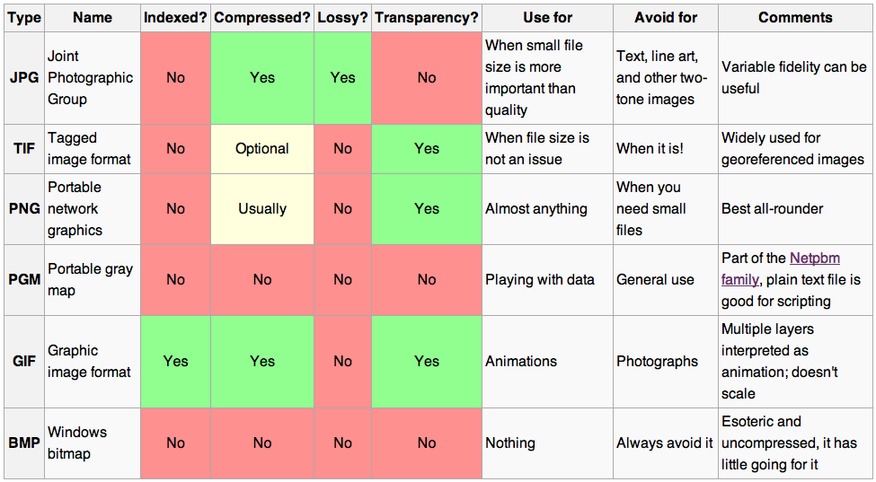
If you still save your images as JPEG, you also need to read my post about How to choose an image format. One day you might need the fidelity you are throwing away! Here's the short version: save everything as a PNG.

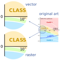
Last thing: know the difference between vector and raster graphics. Make vectors when you can.

Stop using PowerPoint!

The only bit of Boyan's post I didn't like was the bit about PowerPoint. I admit, fifteen years ago I was a bit of a slave to PowerPoint. I'd have preferred to use Illustrator at the time, but it was well beyond corporate IT's ken, and I hadn't yet discovered Inkscape. But I'm over it now — and just as well because it's a horrible drawing tool. The main limitation is not having layers, which is a show-stopper for me, but there's also the generic typography, simplistic spline editing, the inability to handle standard formats like SVG, and no scripting or plug-ins.

Getting good

If you want to learn about making effective scientific figures, I strongly recommend reading anything you can by Edward Tufte, Robert Kosara, Alberto Cairo, and Mike Bostock. For some quick inspiration check out the #dataviz hashtag on Twitter, or feast your eyes on this amazing collection of graphics, or Mike Bostock's interactive examples, or... there are too many resources to choose from.

How about you? Share your favourite tools in the comments or on Boyan's post.

When to use vectors not rasters

In yesterday's post, I looked at advantages and disadvantages of various image formats. Some chat ensued in the comments and on Twitter about making drawings and figures and such. I realized I hadn't been very clear: when I say 'image', I really mean 'raster' or 'bitmap'. That is, a discretized (pixel-based) grid of data.

What are vector graphics?

Click to enlarge — see a simulation of the difference between vector and raster art.What I was not writing about was drawings and graphics combining text, lines, and images. Such files usually contain vector graphics. Vector graphics do not contain descriptions of pixels, but instead they contain descriptions and positions of text, paths, and polygons. Example file formats are:

  • SVGScalable Vector Graphics, an open format and web standard
  • AI — a proprietary format used by Adobe Illustrator
  • CDRCorelDRAW's proprietary format
  • PPT — pictures in Microsoft PowerPoint are vector format
  • SHP — shapefiles are a (mostly) generic vector format for GIS

One of the most important properties of vector graphics is that you can rescale it without worrying about changing the resolution — as in the example (right).

What are composite formats?

Vector and raster graphics can be combined in all sorts of ways, and vector files can contain raster images. They can therefore be used for very large displays like posters. But vector files are subject to interpretation by different software, may be proprietary, and have complex features like guides and layers that you may not want to expose to someone else. So when you publish or share your work it's often a good idea to export to either a high-res PNG, or a composite page description format:

  • PDFPortable Document Format, the closest thing to an open, ubiquitous format; stable and predictable.
  • EPSEncapsulated PostScript; the precursor to PDF, it's rarely called for today, unless PDF is giving you problems.
  • PSPostScript is a programming and page description language underlying EPS and PDF; avoid it.
  • CGMComputer Graphics Metafiles are best left alone. If you are stuck with them, complain loudly.

What software do I need?

Any time you want to add text, or annotation, or anything else to a raster, or you wish to create a drawing from scratch, vector formats are the way to go. There are several tools for creating such graphics:

Judging by figures I see submitted to journals, some people use Microsoft PowerPoint for creating vector graphics. For a simple figure, this may be fine, but for anything complex — curved or wavy lines, complicated filled objects, image effects, pattern fills — it is hard work. And the drawing tools listed above have some great advantages over PowerPoint — layers, tracing, guides, proper typography, and a hundred other things.

Plus, and perhaps I'm just being a snob here, figures created in PowerPoint make it look like you just don't care. Do yourself a favour: take half a day to teach yourself to use Inkscape, and make beautiful figures for the rest of your career.

How to choose an image format

Choosing a file format for scientific images can be tricky. It seems simple enough on the outside, but the details turn out to be full of nuance and gotchas. Plenty of papers and presentations are spoiled by low quality images. Don't let yours be one! Get to know your image editor (I recommend GIMP), and your formats.

What determines quality?

The factors determining the quality of an image are:

  • The number of pixels in the image (aim for 1 million)
  • The size of the image (large images need more pixels)
  • If the image is compressed, e.g. a JPG, the fidelity of the compression (use 90% or more)
  • If the image is indexed, e.g. a GIF, the number of colours available (the bit-depth)

Beware: what really matters is the lowest-quality version of the image file over its entire history. In other words, it doesn't matter if you have a 1200 × 800 TIF today, if this same file was previously saved as a 600 × 400 GIF with 16 colours. You will never get the lost pixels or bit-depth back, though you can try to mitigate the quality loss with filters and careful editing. This seems obvious, but I have seen it catch people out.

JPG is only for photographs

Click on the image to see some artifacts.The problem with JPG is that the lossy compression can bite you, even if you're careful. What is lossy compression? The JPEG algorithm makes files much smaller by throwing some of the data away. It 'decides' which data to discard based on the smoothness of the image in the wavenumber domain, in which the algorithm looks for a property called sparseness. Once discarded, the data cannot be recovered. In discontinuous data — images with lots of variance or hard edges — you might see artifacts (e.g. see How to cheat at spot the difference). Bottom line: only use JPG for photographs with lots of pixels.

Formats in a nutshell

Rather than list advantages and disadvantages exhaustively, I've tried to summarize everything you need to know in the table below. There are lots of other formats, but you can do almost anything with the ones I've listed... except BMP, which you should just avoid completely. A couple of footnotes: PGM is strictly for geeks only; GIF is alone in supporting animation (animations are easy to make in GIMP). 

All this advice could have been much shorter: use PNG for everything. Unless file size is your main concern, or you need special features like animation or georeferencing, you really can't go wrong.

There's a version of this post on SubSurfWiki. Feel free to edit it!