
Rocks in the Playground
/It’s debatable whether neural networks should feature in an introductory course on machine learning. But it’s hard to avoid at least mentioning them, and many people are attracted to machine learning courses because they have heard so much about deep learning. So, reluctantly, we almost always get into neural nets in our Machine learning for geoscientists classes.
Our approach is to build a neural network from scratch, using only standard Python and NumPy data structures — that is, without using a specialist deep-learning framework. The code is all adapted from Gram Ganssle’s awesome Leading Edge tutorial from 2018. I like it because it lays out the components — the data, the activation function, the cost function, the forward pass, and all the steps involved in backpropagation — then combines them into a working neural network.
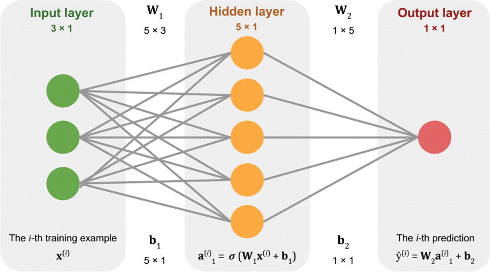
Figure 2 from Gram Ganssle’s 2018 tutorial in the Leading Edge. Licensed CC BY.
One drawback of our approach is that it would be quite fiddly to change some aspects of the network. For example, adding regularization, which almost all networks use, or even just adding another layer, are both beyond the scope of the class. So I like to follow it up with getting the students to build the same network using the scikit-learn library’s multilayer perceptron model. Then we build the same network using the PyTorch framework. (And one could do it in TensorFlow too, of course.) All of these libraries make it easier to play with the various options.
Introducing the Rocky Playground
Now we have another tool — one that makes it even easier to change parameters, add layers, use regularization, and so on. The students don’t even have to write any code! I invite you to play with it too — check out the Rocky Playground, an interactive deep neural network you can see inside.
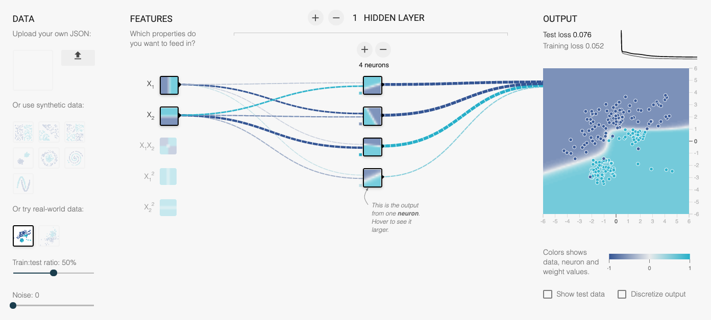
Part of the user interface. Click on the image to visit the site.
This tool is a fork of Google’s well-known Neural Network Playground, as described at the bottom of our tool’s page. We made a few changes:
Added several new real and synthetic datasets, with descriptions.
There are more activation functions to try, including ELU and Swish.
You can change the regularization during training and watch the weights.
Anyone can upload their own dataset! (These stay on your computer, they are not uploaded anywhere.)
We added an the expression of the network in Python code.
One of the datasets we added is the same shear-sonic prediction dataset we use in the neural network class. So students can watch the same neural net they built (more or less) learn the task in real time. It’s really very cool.
I’ve written before about different expressions of mathematical ideas — words, symbols, annotations, code, etc. — and this is really just a natural extension of that thought. When people can hear and see the same idea in three — or five, or ten — different ways, it sticks. Or at least has a better chance of sticking.
What do you think? Do this tool help you? Could you use it for teaching? If you have suggestions feel free to drop them here in the comments, or submit an issue to the tool’s repo. We’d love your help to make it even more useful.


 Except where noted, this content is licensed