Love Python and seismic? You need xarray

If you use Python on a regular basis, you might have noticed that Pandas is eating everything, not just things made out of bamboo.

But one thing Pandas is not useful for is 2-D or 3-D (or more-D) seismic data. Its DataFrames are implicitly two-dimensional tables, and shine when the columns represent all sorts of different quantities, e.g. different well logs. But, the really powerful thing about a DataFrame is its index. Instead of having row 0, row 1, etc, we can use an index that makes sense for the data. For example, we can use depth for the index and have row 13.1400 and row 13.2924, etc. Much easier than trying to figure out which index goes with 13.1400 metres!

Seismic data, on the other hand, does not fit comfortably in a table. But it would certainly be convenient to have real-world coordinates for the data as well as NumPy indices — maybe inline and crossline numbers, or (UTMx, UTMy) position, or the actual time position of the timeslices in milliseconds. With xarray we can.

In essence, xarray brings you Pandas-like indexing for n-dimensional arrays. Let’s see why this is useful.

Make an xarray.DataArray

The DataArray object is analogous to a NumPy array, but with the Pandas-like indexing added to each dimension via a property called coords. Furthermore, each dimension has a name.

Imagine we have a seismic volume called seismic with shape (inlines, xlines, time) and the inlines and crosslines are both numbered like 1000, 1001, 1002, etc. The time samples are 4 ms apart. All we need is an array of numbers representing inlines, another for the xlines, and another for the time samples. Then we can construct the DataArray like so:

 
import xarray as xr

il, xl, ts = seismic.shape  # seismic is a NumPy array.

inlines = np.arange(il) + 1000
xlines = np.arange(xl) + 1000
time = np.arange(ts) * 0.004

da = xr.DataArray(seismic,
                  name='amplitude',
                  coords=[inlines, xlines, time],
                  dims=['inline', 'xline', 'twt'],
                  )

This object da has some nice superpowers. For example, we can visualize the timeslice at 400 ms with a single line:

da.sel(twt=0.400).plot()

to produce this plot:

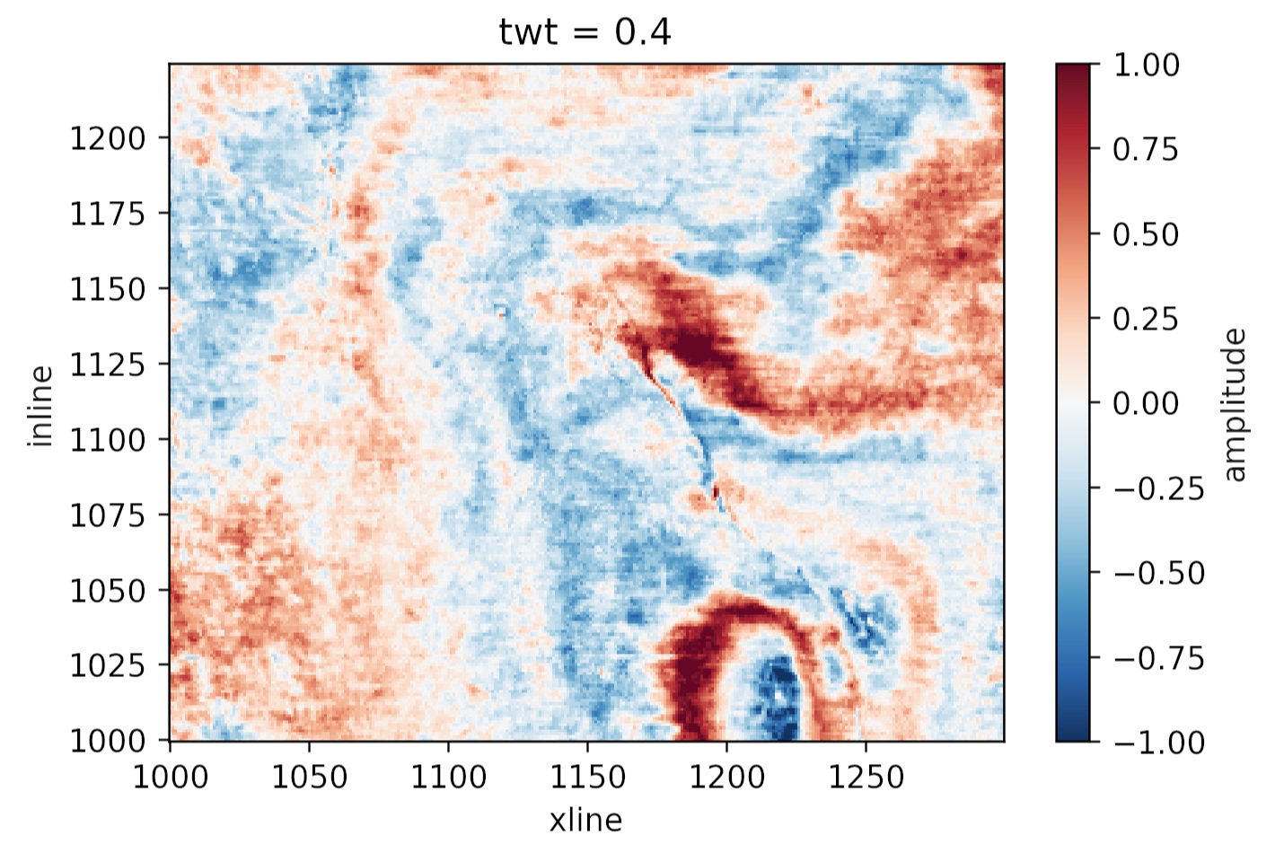
Plotting the same thing from the NumPy array would require us to figure out which index corresponds to 400 ms, and then write at least 8 lines of matplotlib code. Nice!

What else?

Why else might we prefer this data structure over a simple NumPy array? Here are some reasons:

  • Extracting amplitude (or whatever) on a horizon. In particular, if the horizon is another DataArray with the same dims as the volume, this is a piece of cake.

  • Extracting amplitude along a wellbore (again, use the same dims for the well path).

  • Making an arbitrary line (a view not aligned with the rows/columns) is easier, because interpolation is ‘free’ with xarray.

  • Exchanging data with Pandas DataFrame objects is easy, making reading from certain formats (e.g. OpendTect horizon export, which gives you inline, xline coords, not a grid) much easier. Even better: use our library gio for this! It makes xarray objects for you.

  • If you have multiple attributes, then xarray.Dataset is a nice data structure to keep things straight. You can think of it as a dictionary of DataArray objects, but it’s a lot more than that.

  • You can store arbitrary metadata in xarray objects, so it’s easy to attach things you’d like to retain like data rights and permissions, seismic attribute parameters, data acquisition details, and so on.

  • Adding more dimensions is easy, e.g. offset or frequency, because you can just add more dims and associated coords. It can get hard to keep these straight in NumPy (was time on the 3rd or 4th axis?).

  • Taking advantage of Dask, which gives you access to parallel processing and out-of-core operations.

All in all, definitely worth a look for anyone who uses NumPy arrays to represent data with real-world coordinates.


Do you already use xarray? What kind of data does it help you with? What are your reasons? Did I miss anything from my list? Let us know in the comments!

x lines of Python: static basemaps with contextily

Difficulty rating: Beginner

Something that is often useful in planning is to have a basemap of the area in which you have data or an interest. This can be made using a number of different tools, up to and including full-fledged GIS software, but we will use Contextily for a quick static basemap using Python. Installation is as simple as using conda install contextily or pip install contextily.

The steps that we want to take are the following, expressed in plain English, each of which will roughly be one line of code:

  1. Get a source for our basemap (placenames and similar things)
  2. Get a source for our geological map
  3. Get the location that we would like to map
  4. Plot the location with our geological data
  5. Add the basemap to our geological map
  6. Add the attribution for both maps
  7. Plot our final map

We will start with the imports, which as usual do not count:

 
import contextily as ctx
import matplotlib.pyplot as plt

Contextily has a number of built-in providers of map tiles, which can be accessed using the ctx.providers dictionary. This is nested, with some providers offering multiple tiles. An example is the ctx.providers.OpenStreetMap.Mapnik provider, which contains the following:

 
{'url': 'https://{s}.tile.openstreetmap.org/{z}/{x}/{y}.png',
 'max_zoom': 19,
 'attribution': '(C) OpenStreetMap contributors',
 'name': 'OpenStreetMap.Mapnik'}

The most important parameter in the dictionary for each provider is the url. These are of the form example.com/{z}/{x}/{y}.png. The {z} is the zoom level, while {x} and {y} relate to the latitude and longitude of a given tile, respectively. Note that these are the same as those used by interactive Slippy maps; contextily just downloads them as a single static image.

The easiest is to use one of these providers, but we can also define our own provider, using the above pattern for the URL. For geological data, the Macrostrat project is a great resource, especially because they have a tileserver supplying some detail. Their tileserver can be added using

 
geology_tiles = 'https://tiles.macrostrat.org/carto/{z}/{x}/{y}.png'

We also need a place to map. Contextily has a geocoder that can return the tiles covering a given location. It uses OpenStreetMap, so anything that is present there is useable as a location. This includes countries (e.g. 'Paraguay'), provinces/states ('Nova Scotia'), cities ('Lubumbashi'), and so on.

We will use Nova Scotia as our area of interest, as well as giving our desired map tiles. We can also use .plot() on the Place object to get a look at it immediately, using that basemap.

 
ctx.Place('Nova Scotia', source=ctx.providers.CartoDB.Positron).plot()
The Positron style from Carto for Nova Scotia.

The Positron style from Carto for Nova Scotia.

We'll use a different basemap though:

 
basemap = ctx.providers.Stamen.Toner

We can create the Place with our desired source — geology_tiles in this case — and then plot this on the basemap with some transparency. We will also add an attribution, since we need to credit MacroStrat.

 
place = ctx.Place('Nova Scotia', source=geology_tiles)

base_ax = place.plot()
ctx.add_basemap(ax=base_ax, source=basemap, alpha=0.5)
text = basemap.attribution + ' | Geological data: MacroStrat.org (CC-BY)'
ctx.add_attribution(ax=base_ax, text=text)

Finally, after a plt.show() call, we get the following:

nova_scotia_geology.png

Obviously this is still missing some important things, like a proper legend, but as a quick overview of what we can expect in a given area, it is a good approach. This workflow is probably better suited for general location maps.

Contextily also plays well with geopandas, allowing for an easy locality map of a given GeoDataFrame. Check out the accompanying Notebook for an example.

Binder  Run the accompanying notebook in MyBinder

x lines of Python: Loading images

Difficulty rating: Beginner

We'd often like to load images into Python. Once loaded, we might want to treat them as images, for example cropping them, saving in another format, or adjusting brightness and contrast. Or we might want to treat a greyscale image as a two-dimensional NumPy array, perhaps so that we can apply a custom filter, or because the image is actually seismic data.

This image-or-array duality is entirely semantic — there is really no difference between images and arrays. An image is a regular array of numbers, or, in the case of multi-channel rasters like full-colour images, a regular array of several numbers: one for each channel. So each pixel location in an RGB image contains 3 numbers:

raster_with_RGB_triples.png

In general, you can go one of two ways with images:

  1. Load the image using a library that 'knows about' (i.e. uses language related to) images. The preeminent tool here is pillow (which is a fork of the grandparent of all Python imaging solutions, PIL).
  2. Load the image using a library that knows about arrays, like matplotlib or scipy. These wrap PIL, making it a bit easier to use, but potentially losing some options on the way.

The Jupyter Notebook accompanying this post shows you how to do both of these things. I recommend learning to use some of PIL's power, but knowing about the easier options too.

Here's the way I generally load an image:

 
from PIL import Image
im = Image.open("my_image.png")

(One strange thing about pillow is that, while you install it with pip install pillow, you still actually import and use PIL in your code.) This im is an instance of PIL's Image class, which is a data structure especially for images. It has some handy methods, like im.crop(), im.rotate(), im.resize(), im.filter(), im.quantize(), and lots more. Doing some of these operations with NumPy arrays is fiddly — hence PIL's popularity.

But if you just want your image as a NumPy array:

 
import numpy as np
arr = np.array(im)

Note that arr is a 3-dimensional array, the dimensions being row, column, channel. You can go off with arr and do whatever you need, then cast back to an Image with Image.fromarray(arr).

All this stuff is demonstrated in the Notebook accompanying this post, or you can use one of these links to run it right now in your browser:

Binder   Run the accompanying notebook in MyBinder


Advice for a new hacker

So you’ve signed up for a hackathon — or maybe you’ve seen an event and you’re still thinking about it.

First thing: I can almost guarantee that you will not regret it, so if you haven’t committed yet, I challenge you to go and sign up now.

But even once you’ve chosen to go, maybe you feel nervous about your skills, or are worried about spending two days with strangers, or aren’t sure about the idea of competitive coding. Someone asked me recently how to prepare — technically and mentally — for the event.

I should say that I’ve only participated in a couple of hackathons, so I definitely don’t know everything there is to know. But I have organized more than 20 hackathons, and helped people skill up for them and (I hope!) enjoy them. Here are the top 10-ish things you can to do to get the most out of the event:

  1. Brush up on your coding. Before the event, find out a bit about what kinds of projects are in the offing. If it’s a machine learning theme, brush up on your data science. Maybe image processing or text processing will be needed. Data management skills and database manipulation are always appreciated. Familiarty with a cloud environment, e.g. AWS, will help.

  2. Find a friend. Either take someone with you, or find a friendly face when you get there. It’s 100% possible to navigate the experience on your own, but much more fun with a partner.

  3. Dive in. You get out of the event what you put in. It’s like most learning experiences. You need an open mind, an enthusiastic demeanour, and a can-do attitude.

  4. Contribute. There’s never enough time, so you are a much-needed part of your team, but unless there’s a strong effort to coordinate the project, it’ll be a bit unstructured. You’ll have to take the initiative on things.

  5. Use a kanban. To help team members see the big picture and select tasks for themselves, put them on stickies on a nearby board. Make 3 areas: ‘to do’, ‘in progress’ and ‘done’. The goal is to move them from left to right.

  6. Ask for help. Every event Agile runs has non-hackers around to help out with stuff — anything from dietary needs to datasets to coding advice. Don’t get stuck on something, find someone to help you.

  7. Take breaks. You and your team should go for a short walk every 90 minutes or so. Relax a bit, but also get caught up: get progress reports from everyone, re-evaluate the goals, identify issues. You will find more clarity away from your keyboards.

  8. Work backwards from the demo. A good strategy is to outline what would make a killer demo of the project you have selected. Include at least one “Wow” feature if at all possible. Then work out what you need to either fake or build to make that demo. Build what you can, fake the rest.

  9. Check in with the other teams. This might not fly at highly competitive events, but at more casual affairs or if everyone is working on different projects, try chatting to some other teams, especially during breaks.

  10. Label your equipment. Hackathons are pretty chaotic, and although 99.9% of hackers are awesome, it’s still a roomful of strangers, so label the gear you care about. And of course keep your phone and computer locked.

  11. Reciprocate. Almost all these bits of advice have corollaries: be friendly and welcoming, accept contributions from others, give help if asked, and so on. Hackathons are social events as much as technical ones — enjoy meeting and collaborating with others.

If you have signed up for an event — I hope you love it! Do let us know how you get along. Or, if you’ve already been to a hackathon and have some advice to share — leave a comment below.


If you’re looking for an event to go to and you’re in western Europe — here’s one! It’s the FORCE Machine Learning Hackathon in Stavanger, Norway. I recently wrote about it — check it out.

If you’re looking for subsurface or geoscience project ideas, then I have a lot of reading for you. Check out the long list of hackathons reports on this blog. You can also dive into the Software Underground Slack to discuss project ideas there.

x lines of Python: Physical units

Difficulty rating: Intermediate

Have you ever wished you could carry units around with your quantities — and have the computer figure out the best units and multipliers to use?

pint is a nice, compact library for doing just this, handling all your dimensional analysis needs. It can also detect units from strings. We can define our own units, it knows about multipliers (kilo, mega, etc), and it even works with numpy and pandas.

To use it in its typical mode, we import the library then instantiate a UnitRegistry object. The registry contains lots of physical units:

 
import pint
units = pint.UnitRegistry()
thickness = 68 * units.m

Now thickness is a Quantity object with the value <Quantity(68, 'meter')>, but in Jupyter we see a nice 68 meter (as far as I know, you're stuck with US spelling).

Let's make another quantity and multiply the two:

 
area = 60 * units.km**2
volume = thickness * area

This results in volume having the value <Quantity(4080, 'kilometer ** 2 * meter')>, which pint can convert to any units you like, as long as they are compatible:

 
>>> volume.to('pint')
8622575788969.967 pint

More conveniently still, you can ask for 'compact' units. For example, volume.to_compact('pint') returns 8.622575788969966 terapint. (I guess that's why we don't use pints for field volumes!)

There are lots and lots of other things you can do with pint; some of them — dealing with specialist units, NumPy arrays, and Pandas dataframes — are demonstrated in the Notebook accompanying this post. You can use one of these links to run this right now in your browser if you like:

Binder   Run the accompanying notebook in MyBinder

Open In Colab   Run the notebook in Google Colaboratory (note the install cell at the beginning)

That's it for pint. I hope you enjoy using it in your scientific computing projects. If you have your own tips for handling units in Python, let us know in the comments!


There are some other options for handling units in Python:

  • quantities, which handles uncertainties without also needing the uncertainties package.
  • astropy.units, part of the large astropy project, is popular among physicists.

The right writing tools

Scientists write, it's part of the job. If writing feels laborious, it might be because you haven't found the right tools yet. 

The wrong tools <cough>Word</cough> feel like a lot of work. You spend a lot of time fiddling with font sizes and not being sure whether to use italic or bold. You're constantly renumbering sections after edits. Everything moves around when you resize a figure. Tables are a headache. Table of contents? LOL.

If this sounds familiar, check out the following tools — arranged more or less in order of complexity.

Markdown

If you've never experienced writing with a markup language, you're in for a treat. At first it might feel clunky, but it quickly gets out of the way, leaving you to focus on the writing. Markdown was invented by John Gruber in about 2004; it is now almost ubiquitous in tools for developers. It's very lightweight, but compatible with HTML and LaTeX math, so it has plenty of features. Styling is absent from the document itself, being applied enitrely in post-production, as it were. With help from pandoc, you can compile Markdown documents to almost any format (e.g. PDF or Word). As a result, Markdown is sufficient for at least 70% of my writing projects. Here's a sampling of Markdown markup, rendered on the right with no styling:

Markdown_raw.png
Markdown_render.png

Jupyter Notebook

If you've been following along with our X Lines of Python series, or any of our other code-centric content, you'll have come across Jupyter Notebooks. These documents combine Markdown with code (in more or less any language you can think of) and the outputs of code — data, charts, images, etc. More than containing code, a so-called kernel can also run the code: Notebooks are fully computable documents. Not only could you write a paper or book in a Notebook, many people use them to give presentations with fully interactive, live code blocks and widgets.

Notebook_example.png
latex_folder___by_missyobo-d3azzbh.png

LaTeX

I discovered LaTeX in about 1993 and it was love at first sight. I've always been a bit of a typography nerd, and LaTeX — like TeX, around which LaTeX is wrapped — really cares about typography. So you get ligatures, hyphenation, sentence spacing, and kerning for free. It also cares about mathematics, cross-references, bibliographies, page numbering, tables of contents, and everything else you need for publication-ready documents.

You can install LaTeX locally, but there are several ways to use LaTeX online, without installing anything — and you get the best of both worlds: markup with WYSIWYG editing. OverleafShareLaTex (which is merging with Overleaf), Authorea, and Papeeria are all worth a look, especially if you write scientific papers.

When WYSISYG works

Sometimes you just want a couple of headings and some text, or you need to share a document with others. I often go for WYSISYG in those situations too — Google Docs is the best WYSIWYG editor I've used. When it supports Markdown too, which is surely only a matter of time, it will be perfect.

What about you, do you have a favourite writing tool? Share it in the comments.

Not getting hacked

This kind of password is horrible for lots of reasons. The real solution to password madness is a password manager.

This kind of password is horrible for lots of reasons. The real solution to password madness is a password manager.

The end of the year is a great time to look around at your life and sort stuff out. One of the things you almost certainly need to sort out is your online security. Because if you haven't been hacked already (you probably have), you're just about to be.

Just look at some recent stories from the world of data security:

There are plenty of others; Wired has been keeping track of them — read more here. Or check out Wikipedia's list.

Despite all this, I see hardly anyone using a password manager, and anecdotally I hear that hardly anyone uses two-factor authentication either. This tells me that at least 80% of smart people, inlcuding lots of my friends and relatives, are in daily peril. Oh no!

After reading this post, I hope you do two things:

  • Start using a password manager. If you only do one thing, do this.
  • Turn on two-factor authentication for your most vulnerable accounts.

Start using a password manager

Please, right now, download and install LastPass on every device and in every browser you use. It's awesome:

  • It stores all your passwords! This way, they can all be different, and each one can be highly secure.
  • It generates secure, random passwords for new accounts you create. 
  • It scores you on the security level of your passwords, and lets you easily change insecure ones.
  • The free version is awesome, and the premium version is only $2/month.

There are other password managers, of course, but I've used this one for years and it's excellent. Once you're set up, you can start changing passwords that are insecure, or re-used on multiple sites... or which are at Uber, Yahoo, or Equifax.

One surprise from using LastPass is being able to count the number of accounts I have created around the web over the years. I have 473 accounts stored in LastPass! That's 473 places to get hacked... how many places are you exposed?

The one catch: you need a bulletproof key for your password manager. Best advice: use a long pass-phrase instead.

The obligatory password cartoon, by xkcd and licensed CC-BY-NC

The obligatory password cartoon, by xkcd and licensed CC-BY-NC

authenticator.png

Two-factor authentication

Sure, it's belt and braces — but you don't want your security trousers to fall down, right? 

Er, anyway, the point is that even with a secure password, your password can still be stolen and your account compromised. But it's much, much harder if you use two-factor authentication, aka 2FA. This requires you to enter a code — from a hardware key or an app, or received via SMS — as well as your password. If you use an app, it introduces still another layer of security, because your phone should be locked.

I use Google's Authenticator app, and I like it. There's a little bit of hassle the first time you set it up, but after that it's plain sailing. I have 2FA turned on for all my 'high risk' accounts: Google, Twitter, Facebook, Apple, AWS, my credit card processor, my accounting software, my bank, my domain name provider, GitHub, and of course LastPass. Indeed, LastPass even lets me specify that logins must originate in Canada. 

What else can you do?

There are some other easy things you can do to make yourself less hackable:

  • Install updates on your phones, tablets, and other computers. Keep browsers and operating systems up to date.
  • Be on high alert for phishing attempts. Don't follow links to sites like your bank or social media sites — type them into your browser if possible. Be very suspicious of anyone contacting you, especially banks.
  • Don't use USB sticks. The cloud is much safer — I use Dropbox myself, it's awesome.

For more tips, check out this excellent article from Motherboard on not getting hacked.

Burning the surface onto the subsurface

Previously, I described a few of the reasons why we don't get a clean ground surface event on land seismic data like we do the water-bottom in marine seismic. In land data, the worst part of the image is right at the surface. But ground level is not just tricky to see, it's impossible to see. Since the vibe truck is on the ground, there's no reflection from that surface. Even if there was some kind of event there, processors apply a magic eraser to the top of the section — the mute — to erase the early arrivals. So it's not possible to see the ground in land data, and you can't pick what isn't there.  

But I still want to know where the ground is. Why can't we slap a ground-level seismic 'reflection' event on the section? 

What you need

We need the ground level, which is in depth of course, in the time domain of the seismic section. To compute this, let's call it \(t_\mathrm{G}\), we need three pieces of information at every trace location: the ground elevation \(G\), the seismic reference datum (SRD) which I'll call \(D\), and the replacement velocity \(V_\mathrm{r}\). 

$$ t_\mathrm{G} = \frac{2 (G - D)}{V_\mathrm{r}} $$

Ground elevation.  If you're lucky, you'll be able to find the ground elevation corresponding to each trace stored in the trace headers. Ground elevation might be located in bytes 41-44 or 45-48 of the trace header, which correspond to the receiver group elevation and the surface elevation of the source, respectively. These should be the same for a stacked trace, but as with any meta-data to do with SEGY, this info could be hiding somewhere else, or missing altogether. And if you're that unlucky, you might have to comb through processing reports for the missing information. If you are even more unlucky (as I was in this example), you won't have any kind of processing report to fall back on and you'll have to concoct something else. In the accompanying Jupyter notebook, I resorted to interpolating a digitized elevation profile from a JPEG plot of the seismic line. So if you're all out of options, you might find refuge in those legacy plots! 

This profile is particularly wonky, because the seismic reference datum (red) is not the same across the profile

This profile is particularly wonky, because the seismic reference datum (red) is not the same across the profile

Seismic reference datum. And to make life yet more complicated, the seismic reference datum is not flat across the profile. It goes downhill and then flattens out (red line below). Don't ask me what the advantages are of processing data to a variable datum, but whatever they are, I hope they offset the disadvantages of all-to-easily mistaking the datum to be flat.

The replacement velocity is given in the sidelabel of the raster image online (shown right). It's 10 000 ft/sec, or 3048 m/s. 

Byte locations 53-56 and 57-60 are the standard trace header placeholders reserved for holding the datum elevation at the receiver group and the datum elevation at source. Again, for a stacked trace, these should be the same value. If these fields are zeros, then check the fields of the Trace Header Extension. If they turn up empty, and if the datum is horizontal, it might be listed in the file's text header. 

Convert elevation to time

By definition, the seismic reference datum is horizontal in the time-domain (red line below). Notice how the ground elevation – in the time domain – plots mostly as negative values (before) time zero. In other words, most of the ground is being cut-off by the top of the section. So, if we want to see it, we need to shift everything down into the field of view. Conceptually, this means adjusting the seismic reference datum so it floats entirely above the ground-level. Computationally, we can achieve this easily enough by padding the top of the data with zeros.

A time-domain representation of the ground-level along the seismic profile. The surface of the earth extends above the start of the seismic data for most of the locations along the profile.&nbsp;

A time-domain representation of the ground-level along the seismic profile. The surface of the earth extends above the start of the seismic data for most of the locations along the profile. 

Make the ground a pickable event

As a final bit of post-processing, we could actually burn the ground-level into the data as a sort of synthetic seismic event. The reason I like this concept is that it alleviates the need to dig up old-processing reports, puzzle over missing header data, or worse, maintain and munge external text files containing elevation information. I say, let's make it self-contained. Let's put it directly into the data so that it can be treated like any other seismic reflection. Why would I do this?

  • You can see where there might be fold, velocity or other issues related to topography.
  • You can immediately see the polarity of the data. 
  • You could use the bandwidth of the data to make the pseudo-reflector, giving a visual hint to the interpreter.
  • Keeping track of amplitude adjustments and phase rotations would be self-documenting and reversible.
  • you could autotrack it to get a topographic map (or just get this from the processor).
  • It looks cool!
Seismic profile with ground level SYNTHETICALLY SLAPPED ON TOP. &nbsp;Bandlimited, of course, so you can Autotrack till your hearts content!

Seismic profile with ground level SYNTHETICALLY SLAPPED ON TOP.  Bandlimited, of course, so you can Autotrack till your hearts content!

I've deliberately constructed a band-limited reflection, opposed to placing a sharp spike at ground-level. The problem with a spike is that it has infinite bandwidth. It contains higher frequencies than the image, so as Carl Reine commented on that last post, that might not play nice with seismic attributes. Also, there's the problem of selecting an amplitude value to assign to the spike: we don't want to introduce amplitudes that are ridiculously out of range of the existing data.  

The whole image

I hereby propose that this synthetic ground level trick adopted as the new standard for any land seismic processing and interpretation. The great thing is, it can be done just as easily by interpreters and seismic data technologists, as by the processing companies that create the rest of the image. I realize we're adding stuff to the data that isn't actually signal. We do non-real things to signals all the time. The question is, do the benefits outweigh the artificiality?

Here's the view of the entire section:

The whole section, ground level included.

The whole section, ground level included.

The details of this exercise can be found in the this Jupyter Notebook.

References

The seismic is line 36_77_PR from the USGS data repository.

SEG Y rev 2 Data Exchange Format. SEG Technical Standards Committee. Draft 2.0, January, 2015. 

How to QC a seismic volume

I've had two emails recently about quality checking seismic volumes. And last month, this question popped up on LinkedIn:

We have written before about making a data quality volume for your seismic — a handy way to incorporate uncertainty into risk maps — but these recent questions seem more concerned with checking a new volume for problems.

First things first

Ideally, you'd get to check the volume before delivery (at the processing shop, say), otherwise you might have to actually get it loaded before you can perform your QC. I am assuming you've already been through the processing, so you've seen shot gathers, common-offset gathers, etc. This is all about the stack. Nonetheless, the processor needs to prepare some things:

  • The stack volume, of course, with and without any 'cosmetic' filters (eg fxy, fk).
  • A semblance (coherency, similarity, whatever) volume.
  • A fold volume.
  • Make sure the processor has some software that can rapidly scan the data, plot amplitude histograms, compute a spectrum, pick a horizon, and compute phase. If not, install OpendTect (everyone should have it anyway), or you'll have to load the volume yourself.

There are also some things you can do ahead of time. 

  1. Be part of the processing from the start. You don't want big surprises at this stage. If a few lines got garbled during file creation, no problem. If there's a problem with ground-roll attentuation, you're not going to be very popular.
  2. Make sure you know how the survey was designed — where the corners are, where you would expect live traces to be, and which way the shot and receiver lines went (if it was an orthogonal design). Get maps, take them with you.
  3. Double-check the survey parameters. The initial design was probably changed. The PowerPoint presentation was never updated. The processor probably has the wrong information. General rule with subsurface data: all metadata is probably wrong. Ideally, talk to someone who was involved in the planning of the survey.
  4. You didn't skip (2) did you? I'm serious, double check everything.

Crack open the data

OK, now you are ready for a visit with the processor. Don't fall into the trap of looking at the geology though — it will seduce you (it's always pretty, especially if it's the first time you've seen it). There is work to do first.

  1. Check the cornerpoints of the survey. I like the (0, 0) trace at the SW corner. The inline and crossline numbering should be intuitive and simple. Make sure the survey is the correct way around with respect to north.
  2. Scan through timeslices. All of them. Is the sample interval what you were expecting? Do you reach the maximum time you expected, based on the design? Make sure the traces you expect to be live are live, and the ones you expect to be dead are dead. Check for acquisition footprint. Start with greyscale, then try another colourmap.
  3. Repeat (5) but in a similarity volume (or semblance, coherency, whatever). Look for edges, and geometric shapes. Check again for footprint.
  4. Look through the inlines and crosslines. These usually look OK, because it's what processors tend to focus on.
  5. Repeat (7) but in a similarity volume.

Dive into the details

  1. Check some spectrums. Select some subsets of the data — at least 100 traces and 1000 ms from shallow, deep, north, south, east, west — and check the average spectrums. There should be no conspicuous notches or spikes, which could be signs of all sorts of things from poorly applied filters to reverberation.
  2. Check the amplitude histograms from those same subsets. It should be 32-bit data — accept no less. Check the scaling — the numbers don't mean anything, so you can make them range over whatever you like. Something like ±100 or ±1000 tends to make for convenient scaling of amplitude maps and so on; ±1.0 or less can be fiddly in some software. Check for any departures from an approximately Laplacian (double exponential) distribution: clipping, regular or irregular spikes, or a skewed or off-centre distribution:
  1. Interpret a horizon and check its phase. See Purves (Leading Edge, October 2014) or SubSurfWiki for some advice.
  2. By this time, the fold volume should yield no surprises. If any of the rest of this checklist throws up problems, the fold volume might help troubleshoot.
  3. Check any other products you asked for. If you asked for gathers or angle stacks (you should), check them too.

Last of all, before actual delivery, talk to whoever will be loading the data about what kind of media they prefer, and what kind of file organization. They may also have some preferences for the contents of the SEG-Y file and trace headers. Pass all of this on to the processor. And don't forget to ask for All The Seismic

What about you?

Have I forgotten anything? Are there things you always do to check a new seismic volume? Or if you're really brave, maybe you have some pitfalls or even horror stories to share...

Save the samples

A long while ago I wrote about how to choose an image format, and then followed that up with a look at vector vs raster graphics. Today I wanted to revisit rasters (you might think of them as bitmaps, images, or photographs). Because a question that seems to come up a lot is 'what resolution should my images be?' 

Forget DPI

When writing for print, it is common to be asked for a certain number of dots per inch, or dpi (or, equivalently, pixels per inch or ppi). For example, I've been asked by journal editors for images 'at least 200 dpi'. However, image files do not have an inherent resolution — they only have pixels. The resolution depends on the reproduction size you choose. So, if your image is 800 pixels wide, and will be reproduced in a 2-inch-wide column of print, then the final image is 400 dpi, and adequate for any purpose. The same image, however, will look horrible at 4 dpi on a 16-foot-wide projection screen.

Rule of thumb: for an ordinary computer screen or projector, aim for enough pixels to give about 100 pixels per display inch. For print purposes, or for hi-res mobile devices, aim for about 300 ppi. If it really matters, or your printer is especially good, you are safer with 600 ppi.

The effect of reducing the number of pixels in an image is more obvious in images with a lot of edges. It's clear in the example that downsampling a sharp image (a to c) is much more obvious than downsampling the same image after smoothing it with a 25-pixel Gaussian filter (b to d). In this example, the top images have 512 × 512 samples, and the downsampled ones underneath have only 1% of the information, at 51 × 51 samples (downsampling is a type of lossy compression).

Careful with those screenshots

The other conundrum is how to get an image of, say, a seismic section or a map.

What could be easier than a quick grab of your window? Well, often it just doesn't cut it, especially for data. Remember that you're only grabbing the pixels on the screen — if your monitor is small (or perhaps you're using a non-HD projector), or the window is small, then there aren't many pixels to grab. If you can, try to avoid a screengrab by exporting an image from one of the application's menus.

For seismic data, you'd like to capture sample as a pixel. This is not possible for very long or deep lines, because they don't fit on your screen. Since CGM files are the devil's work, I've used SEGY2ASCII (USGS Open File 2005–1311) with good results, converting the result to a PGM file and loading into Gimp

Large seismic lines are hard to capture without decimating the data. Rockall Basin. Image: BGS + Virtual Seismic Atlas.If you have no choice, make the image as large as possible. For example, if you're grabbing a view from your browser, maximize the window, turn off the bookmarks and other junk, and get as many pixels as you can. If you're really stuck, grab two or more views and stitch them together in Gimp or Inkscape

When you've got the view you want, crop the window junk that no-one wants to see (frames, icons, menus, etc.) and save as a PNG. Then bring the image into a vector graphics editor, and add scales, colourbars, labels, annotation, and other details. My advice is to do this right away, before you forget. The number of times I've had to go and grab a screenshot again because I forgot the colourbar...

The Lenna image is from Hall, M (2006). Resolution and uncertainty in spectral decomposition. First Break 24, December 2006, p 43-47.