
The digital well scorecard
/In my last post, I ranted about the soup of acronyms that refer to well log curves; a too-frequent book-keeping debacle. This pain, along with others before it, has motivated me to design a solution. At this point all I have is this sketch, a wireframe of should-be software that allows you visualize every bit of borehole data you can think of:
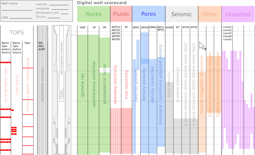 The goal is, show me where the data is in the domain of the wellbore. I don't want to see the data explicitly (yet), just its whereabouts in relation to all other data. Data from many disaggregated files, reports, and so on. It is part inventory, part book-keeping, part content management system. Clear the fog before the real work can begin. Because not even experienced folks can see clearly in a fog.
The scorecard doesn't yield a number or a grade point like a multiple choice test. Instead, you build up a quantitative display of your data extents. With the example shown above, I don't even have to look at the well log to tell you that you are in for a challenging well tie, with the absence of sonic measurements in the top half of the well.
The people that I showed this to immediately undestood what was being expressed. They got it right away, so that bodes well for my preliminary sketch. Can you imagine using a tool like this, and if so, what features would you need?


 Except where noted, this content is licensed