Five more things about colour
/ Last time I shared some colourful games, tools, and curiosities, including the weird chromostereopsis effect (right). Today, I've got links to much, much more 'further reading' on the subject of colour...
The provocation for this miniseries was Robert 'Blue Marble' Simmon's terrific blog series on colour, which he's right in the middle of. Robert is a data visualization pro at NASA Earth Observatory, so we should all listen to him. Here's his collection (updated after the original writing of this post):
- Introduction — must-read primer on colour theory and colour spaces
- The perfect palette — focusing on sequential data
- Different data, different colors — including colour maps for divergent data, like reflection seismic
- Connecting color to meaning — the power of the intuitive use of colour
- Tools & techniques — "the nuts and bolts of designing a color palette"
- References & resources — lots of books, tools, and links; possibly all of them!
 Perception is everything! One of Agile's best friends is Matteo Niccoli, a quantitative geophysicist in Norway (for now). And one of his favourite subjects is colour — there are loads of great posts on his blog. He also has a fine collection of perceptual colour bars (left) for most seismic interpretation software. If you're still using Spectrum for maps, you need his help.

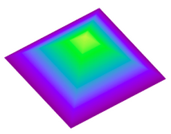
Dave Green is a physicist at the University of Cambridge. Like Matteo, he has written about the importance of using colour bars which have a linear increase in perceived brightness. His CUBEHELIX scheme (above) adapts easily to your needs — try out his colour bar creator. And if this level of geekiness gets you going, try David Dalrymple or Gregor Aisch.
 ColorBrewer is a legendary web app and add-in for ArcGIS. It's worth playing with the various colour schemes, especially if you need a colour bar that is photocopy friendly, or that can still be used by colour blind people. The equally excellent, perhaps even slightly more excellent, i want hue is also worth playing with (thanks to Robert Simmon for that one).
In scientific publishing, the Nature family of journals has arguably the finest graphics. Nature Methods carries a column called Points of View, which looks at scientific visualization. This mega-post on their Methagora blog links to them all, and covers everything from colour and 3D graphics to broader issues of design and typography. Wonderful stuff.
Since I don't seem to have exhausted the subject yet, we'll save a couple of practical topics for next time:
- A thought experiment: How many attributes can a seismic interpreter show with colour in a single display?
- Provoked by a reader via email, we'll think about that age old problem for thickness maps — should the thicks be blue or red?


 Except where noted, this content is licensed