No more rainbows!

"the rainbow color map can significantly reduce a person’s accuracy and efficiency"
Borkin et al. (2011)

File under "Aaarrrrrrgghhhhhhh"

File under "Aaarrrrrrgghhhhhhh"

The world has known for at least 20 years that the rainbow colourmap is A Bad Thing, perhaps even A Very Bad Thing. IBM researchers Bernice Rogowitz and Lloyd Treinish — whose research on the subject goes back to the early 90s — wrote their famous article Why should engineers and scientists be worried about color? in 1996. Visualization guru Edward Tufte highlighted the problems with it in his 1997 book Visual Explanations (if you haven't read this book, you must buy it immediately). 

This isn't a matter of taste, or opinion. We know — for sure, with science! — that the rainbow is a bad choice for the visualization of data. And yet people use it every day, even in peer-reviewed literature. And — purely anecdotally — it seems to be especially rife in geoscience <citation needed>.

Why are we talking about this? 

The rainbow colourmap suffers from a number of severe problems:

  • It's been linked to inferior image interpretation by professionals (Borkin et al 2011).

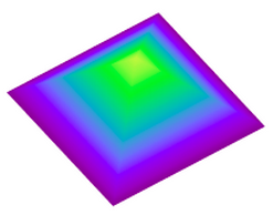
  • It introduces ambiguity into the display: are we looking at the data's distribution, or the colourmap's?

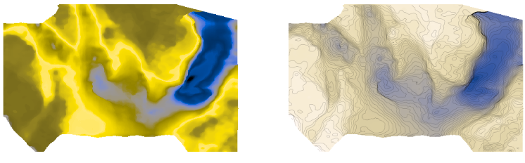
  • It introduces non-existent structure into the display — notice the yellow and cyan stripes, which manifest as contours:

rainbow.png
  • Colourblind people cannot read the colours properly — I made this protanopic simulation with Coblis

rainbow_protanope.png
  • It does not have monotonically increasing lightness, so you can't reproduce it in greyscale.

rainbow_grey.png
  • There's no implicit order to hues, so it's hard to interpret meaning intuitively.

  • On a practical note, it uses every available colour, leaving you none for annotation.

For all of these reasons, MATLAB and Matplotlib no longer use rainbow-like colourmaps by default. And neither should you.

But I like rainbows!

People tend like things that are bad for them. Chris Jackson (Imperial, see here and here) and Bert Bril (dGB, in Slack) have both expressed an appreciation for rainbow-like colourmaps, or at least an indifference. Bert went so far as to say he doesn't like 'perceptual' colourmaps — those that monotonically and linearly increase in brightness. 

I don't think indifference is allowed. Research with professional image interpreters has shown us that rainbow colourmaps impair the quality of their work. We know that these colours are hard for colourblind people to use. The practical issues of not being readable in greyscale and leaving no colours for annotation are always present. There's just no way we can ask, "Does it matter?" — at least not without offering some evidence that goes beyond mere anecdote.

I think what people like is the colour variance — it acts like contours, highlighting subtle features in the surface. Some of this extra detail is probably noise, but some is certainly signal, maybe even opportunity. 

See what you think of these renderings of the seafloor pick on the Penobscot dataset, offshore Nova Scotia (licensed CC-BY-SA by dGB Earth Sciences and The Government of Nova Scotia). The top row are some rainbow-like colourmaps, all bad. The others are a selection of (more-or-less) perceptually awesome colourmaps. The names under each map are the names of the colourmaps in Python's matplotlib package.

The solution

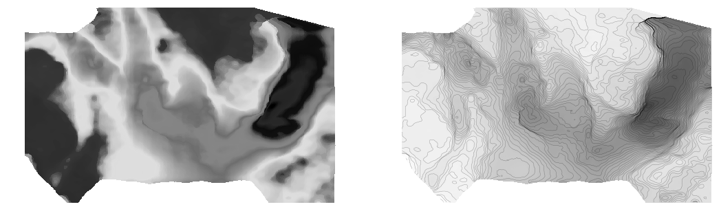
We know what kind of colourmaps are good for interpretation: those that increase linearly and monotonically in brightness, with no jumps or stripes of luminance. I've linked to lots of places where you can read about these — see the end of the post. You already know one perceptual colourmap: the humble Greyscale. But there are lots of others, so let's start with one of them.

Next, instead of using something that acts like contours, let's try using contours!

I think that's a big improvement already. Some tips for contouring:

  1. Make them thin and black, with opacity at about 0.2 to 0.5. Transparency is essential. 

  2. Choose a fairly small interval; use index contours if there are more than about 10.

  3. Label the contours directly on a large map. State the contour interval in the caption.

Let's try hillshading instead:

Also really nice.

Given that this is a water-bottom horizon, I like the YlGnBu colourmap, which resembles the thing it is modeling. (I think this is also a good basis for selecting a colourmap, by the way, all else being equal.)

I must admit I do find a lot of these perceptual colormaps get too dark at the 'low' end, which can make annotation (or seeing contours) hard. So we will fix that with a function (see the notebook) that generates perceptually linear colourmaps.

Now tell me the spectrum beats a perceptual colourmap...

Horizons_faceoff.png

Let's check that it is indeed colourblind-safe and grey-safe:

Horizons_faceoff_protanope.png
Horizons_faceoff_grey.png

There you have it. If you care about your data and your readers, avoid rainbow-like colourmaps in the lab and in publications. Go perceptual!

The Python code and data to generate these images is available on GitHub.

Binder     Better yet, click here to play with the data right in your browser!

What do you think? Are rainbow colourmaps here to stay? 

References and bibliography

Still not convinced?

For goodness sake, just listen to Kristin Thyng for 20 minutes:

Unweaving the rainbow

Last week at the Canada GeoConvention in Calgary I gave a slightly silly talk on colourmaps with Matteo Niccoli. It was the longest, funnest, and least fruitful piece of research I think I've ever embarked upon. And that's saying something.

Freeing data from figures

It all started at the Unsession we ran at the GeoConvention in 2013. We asked a roomful of geoscientists, 'What are the biggest unsolved problems in petroleum geoscience?'. The list we generated was topped by Free the data, and that one topic alone has inspired several projects, including this one. 

Our goal: recover digital data from any pseudocoloured scientific image, without prior knowledge of the colourmap.

I subsequently proferred this challenge at the 2015 Geophysics Hackathon in New Orleans, and a team from Colorado School of Mines took it on. Their first step was to plot a pseudocoloured image in (red, green blue) space, which reveals the colourmap and brings you tantalizingly close to retrieving the data. Or so it seems...

Here's our talk:

Corendering attributes and 2D colourmaps

The reason we use colourmaps is to facilitate the human eye in interpreting the morphology of the data. There are no hard and fast rules when it comes to choosing a good colourmap, but a poorly chosen colourmap can make you see features in your data that don't actually exist. 

Colourmaps are typically implemented in visualization software as 1D lookup tables. Given a value, what colour should I plot it? But most spatial data is multi-dimensional, and it's useful to look at more than one aspect of the data at one time. Previously, Matt asked, "how many attributes can a seismic interpreter show with colour on a single display?" He did this by stacking up a series of semi-opaque layers, each one assigned its own 1D colourbar. 

Another way to add more dimensions to the display is corendering. This effectively adds another dimension to the colourmap itself: instead of a 1D colour line for a single attribute, for two attributes we're defining a colour square; for 3 attributes, a colour cube, and so on.

Let's illustrate this by looking at a time-slice through a portion of the F3 seismic volume. A simple way of displaying two attributes is to decrease the opacity of one, and lay it on top of the other. In the figure below, I'm setting the opacity of the continuity to 75% in the third panel. At first glance, this looks pretty good; you can see both attributes, and because they have different hues, they complement each other without competing for visual bandwidth. But the approach is flawed. The vividness of each dataset is diminished; we don't see the same range of colours as we do in the colour palette shown above.

Overlaying one map on top of the other is one way to look at multiple attributes within a scene. It's not ideal however.

Overlaying one map on top of the other is one way to look at multiple attributes within a scene. It's not ideal however.

Instead of overlaying maps, we can improve the result by modulating the lightness of the amplitude image according to the magnitude of the continuity attribute. This time the corendered result is one image, instead of two. I prefer it, because it preserves the original colours we see in the amplitude image. If anything, it seems to deepen the contrast:

The lightness value of the seismic amplitude time slice has been modulated by the continuity attribute.&nbsp;

The lightness value of the seismic amplitude time slice has been modulated by the continuity attribute. 

Such a composite display needs a two-dimensional colormap for a legend. Just as a 1D colourbar, it's also a lookup table; each position in the scene corresponds to a unique pair of values in the colourmap plane.

We can go one step further. Say we want to emphasize only the largest discontinuities in the data. We can modulate the opacity with a non-linear function. In this example, I'm using a sigmoid function:

In order to achieve this effect in most conventional software, you usually have to copy the attribute, colour it black, apply an opacity curve, then position it just above the base amplitude layer. Software companies call this workaround a 'workflow'. 

Are there data visualizations you want to create, but you're stuck with software limitations? In a future post, I'll recreate some cool co-rendering effects; like bump-mapping, and hill-shading.

To view and run the code that I used in creating the images for this post, grab the iPython/Jupyter Notebook.


You can do it too!

If you're in Calgary, Houston, New Orleans, or Stavanger, listen up!

If you'd like to gear up on coding skills and explore the benefits of scientific computing, we're going to be running the 2-day version of the Geocomputing Course several times this fall in select cities. To buy tickets or for more information about our courses, check out the courses page.

None of these times or locations good for you? Consider rounding up your colleagues for an in-house training option. We'll come to your turf, we can spend more than 2 days, and customize the content to suit your team's needs. Get in touch.

Colouring maps

Over the last fortnight, I've shared five things, and then five more things, about colour. Some of the main points:

  • Our non-linear, heuristic-soaked brains are easily fooled by colour.
  • Lots of the most common colour bars (linear ramps, bright spectrums) are not good choices.
  • You can learn a lot by reading Robert Simmon, Matteo Niccoli, and others.

Last time I finished on two questions:

  1. How many attributes can a seismic interpreter show with colour in a single display?
  2. On thickness maps should the thicks be blue or red?

One attribute, two attributes

The answer to the first question may be a matter of personal preference. Doubtless we could show lots and lots, but the meaning would be lost. Combined red-green-blue displays are a nice way to cram more into a map, but they work best on very closely related attributes, such as seismic amplitude of three particular frequencies

Here's some seismic reflection data — the open F3 dataset, offshore Netherlands, in OpendTect

A horizon — just below the prominent clinoforms — is displayed (below, left) and coloured according to elevation, using one of Matteo's perceptual colour bars (now included in OpendTect!). A colour scale like this varies monotonically in hue and luminance.

Some of the luminance channel (sometimes called brightness or value) is showing elevation, and a little is being used up by the 3D shading on the surface, but not much. I think the brain processes this automatically because the 3D illusion is quite good, especially when the scene is moving. Elevation and shape are sort of the same thing, so we've still only really got one attribute. Adding contours is quite nice (above, middle), and only uses a narrow slice of the luminance channel... but again, it's the same data. Much better to add new data. Similarity (a member of the family that includes coherence, semblance, and so on) is a natural fit: it emphasizes a particular aspect of the shape of the surface, but which was measured independently of the interpretaion, directly from the data itself. And it looks awesome (above, right).

Three attributes, four

OK, we have elevation and/or shape, and similarity. What else can we add? Another intuitive attribute of seismic is amplitude (below, left) — closely related to the strength of the reflected energy. Two things: we don't trust amplitudes in areas with low fold — so we can mask those (below, middle). And we're only really interested in bright spots, so we can edit the opacity profile of the attribute and make low values transparent (below, right). Two more attributes — amplitude (with a cut-off that reflects my opinion of what's interesting — is that an attribute?) and fold.

Since we have only used one hue for the amplitude, and it was not in Matteo's colour bar, we can layer it on the original map without clobbering anything. Unfortunately, there's no easy way for the low fold mask to modulate amplitude without interfering with elevation, because the elevation map needs to be almost completely opaque. What I need is a way to modulate a surface's opacity with an attribute it is not displaying with hue...

Thickness maps

The second question — what to colour thicks — is easy. Thicks should be towards the red end of the spectrum, sometimes not-necessarily-intuitively called 'warm' colours. (As I mentioned before in the comments, a quick Google image poll suggests that about 75% of people agree). If you colour your map otherwise, perhaps because you like the way it suggests palaeobathymetry in some depositional settings, be careful to make this very clear with labels and legends (which you always do anyway, right?). And think about just making a 'palaeobathymetry' map, not a thickness map.

I suspect there are lots of quite personal opinions out there. Like grammar, I do think much of this is a matter of taste. The only real test is clarity. Do you agree? Is there a right and wrong here? 

Five more things about colour

Last time I shared some colourful games, tools, and curiosities, including the weird chromostereopsis effect (right). Today, I've got links to much, much more 'further reading' on the subject of colour...


The provocation for this miniseries was Robert 'Blue Marble' Simmon's terrific blog series on colour, which he's right in the middle of. Robert is a data visualization pro at NASA Earth Observatory, so we should all listen to him. Here's his collection (updated after the original writing of this post):

Perception is everything! One of Agile's best friends is Matteo Niccoli, a quantitative geophysicist in Norway (for now). And one of his favourite subjects is colour — there are loads of great posts on his blog. He also has a fine collection of perceptual colour bars (left) for most seismic interpretation software. If you're still using Spectrum for maps, you need his help.

Dave Green is a physicist at the University of Cambridge. Like Matteo, he has written about the importance of using colour bars which have a linear increase in perceived brightness. His CUBEHELIX scheme (above) adapts easily to your needs — try out his colour bar creator. And if this level of geekiness gets you going, try David Dalrymple or Gregor Aisch.

ColorBrewer is a legendary web app and add-in for ArcGIS. It's worth playing with the various colour schemes, especially if you need a colour bar that is photocopy friendly, or that can still be used by colour blind people. The equally excellent, perhaps even slightly more excellent, i want hue is also worth playing with (thanks to Robert Simmon for that one). 

In scientific publishing, the Nature family of journals has arguably the finest graphics. Nature Methods carries a column called Points of View, which looks at scientific visualization. This mega-post on their Methagora blog links to them all, and covers everything from colour and 3D graphics to broader issues of design and typography. Wonderful stuff.

Since I don't seem to have exhausted the subject yet, we'll save a couple of practical topics for next time:

  1. A thought experiment: How many attributes can a seismic interpreter show with colour in a single display?
  2. Provoked by a reader via email, we'll think about that age old problem for thickness maps — should the thicks be blue or red?

Five things about colour

The fact that colour is a slippery subject is powerfully illustrated by my favourite optical illusion. Look at this:

Squares A and B are the same shade of grey. It's so hard to believe that you might need to see the proof to be convinced. 

Chromostereopsis is a similarly disarming effect that you may have noticed on maps with bright spectrum colour bars. Most people perceive blue and red on different depth planes, so the pseudo-3D effect can work in your favour and make the map 'pop' (This is not a good reason to use a spectrum colour bar, however... more on this next time). I notice that at least one set designer knows about the effect, making William Shatner pop on the TV show Have I Got News For You:

Color is a fun way to test your colour intuition. The game starts easy, but is very hard by the end as you simulatneously match colour tetrads. The first time I played I managed 9.8, which I am not-very-secretly quite pleased about. But I haven't been able to repeat the performance.

X-Rite's Online Color Challenge is also tough. You have to sort the very subtle colours into order. It takes a while to play but is definitely worth it. If your job depends on spotting subtle effects in images (like seismic data, for example) then stand by to learn something about your detection system. 

Color blindness will change how these games work, of course, and should change how we make maps, figures, and slides. Since up to about 5% of a large audience might be colour blind, you might want to think about how your presentations look to them. You can easily check with Vischeck and correct images for colourblind people with the Daltonizer. They can still be beautiful, but you can avoid certain colour combinations and reach a wider audience.

I have lots more links about colour to share in the next post, including some required reading from Rob Simmon and Matteo Niccoli, among others. In the meantime, have you come across any handy colour tools, or has colour ever caught you out? Let us know in the comments.

The image of William Shatner is copyright and courtesy of Hat Trick Productions Ltd, London, UK, and used with permission.