Survival of the fittest or overcrowding?

If you’ve been involved in drilling boreholes in your career, you’ll be familiar with desurvey. Desurvey is the process of converting a directional well survey — which provides measured depth, inclination and azimuth points from the borehole — into a position log. The position log is an arbitrarily finely sampled set of (x, y, z) points along the wellbore. We need this to convert from measured depth (distance along the borehole path) to depth in the earth, which is usually given relative to mean sea-level.

I hunted around recently and found no fewer than nine Python packages that contain desurvey code. They are of various vintages and licences:

Other larger tools that contain desurvey code but not as re-usable

This is amazing — look at all the activity in the last 2 years or so! I think this is a strong sign that we've hit a new era in geocomputing. Fifteen years ago a big chunk of the open source geoscience stuff out there was the ten-or-so seismic processing libraries. Then about 7 or 8 years ago there was a proliferation of geophysical modeling and inversion tools. Now perhaps we're seeing the geological and wells communities entering the same stage of evolution. This is encouraging.

What now?

But there’s a problem here too. — this is a small community, with limited resources. Can we afford this diversity? I accept that there might be a sort of Cambrian explosion event that has to happen with new technology. But how can we ensure that it results in an advantageous “survival of the fittest” ecology, and avoid it becoming just another way for the community to spread itself too thinly? To put it another way, how can we accelerate the evolutionary process, so that we don’t drain the ecosystem of valuable resources?

There’s also the problem of how to know which of these tools is the fittest. As far as I’m aware, there are no well trajectory benchmarks to compare against. Some of the libraries I listed above do not have rigorous tests, certainly they all have bugs (it’s software) — how can we ensure quality emerges from this amazing pool of technology?

I don’t know, but I think this is a soluble problem. We’ve done the hard part! Nine times :D


swung_round_135px.png

There was another sign of subsurface technology maturity in the TRANSFORM conference this year. Several of the tutorials and hackathon projects were focused on integrating tools like GemPy, Devito, segyio, and the lasio/welly/striplog family. This is exciting to see — 2021 could be an important year in the history of the open subsurface Python stack. Stay tuned!

Welly to the wescue

I apologize for the widiculous title.

Last week I described some headaches I was having with well data, and I introduced welly, an open source Python tool that we've built to help cure the migraine. The first versions of welly were built — along with the first versions of striplog — for the Nova Scotia Department of Energy, to help with their various data wrangling efforts.

Aside — all software projects funded by government should in principle be open source.

Today we're using welly to get data out of LAS files and into so-called feature vectors for a machine learning project we're doing for Canstrat (kudos to Canstrat for their support for open source software!). In our case, the features are wireline log measurements. The workflow looks something like this:

  1. Read LAS files into a welly 'project', which contains all the wells. This bit depends on lasio.
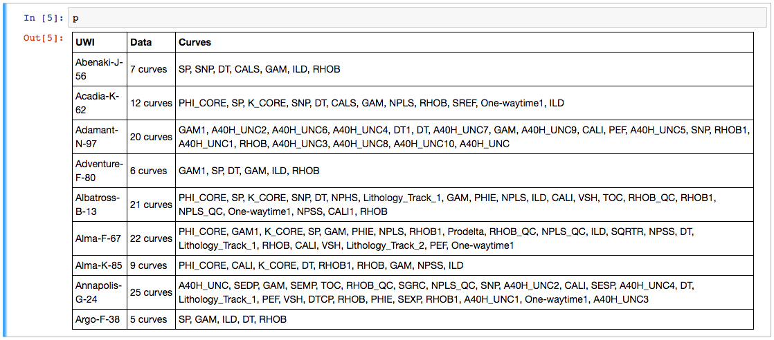
  2. Check what curves we have with the project table I showed you on Thursday.
  3. Check curve quality by passing a test suite to the project, and making a quality table (see below).
  4. Fix problems with curves with whatever tricks you like. I'm not sure how to automate this.
  5. Export as the X matrix, all ready for the machine learning task.

Let's look at these key steps as Python code.

1. Read LAS files

 
from welly import Project
p = Project.from_las('data/*.las')

2. Check what curves we have

Now we have a project full of wells and can easily make the table we saw last week. This time we'll use aliases to simplify things a bit — this trick allows us to refer to all GR curves as 'Gamma', so for a given well, welly will take the first curve it finds in the list of alternatives we give it. We'll also pass a list of the curves (called keys here) we are interested in:

The project table. The name of the curve selected for each alias is selected. The mean and units of each curve are shown as a quick QC. A couple of those RHOB curves definitely look dodgy, and they turned out to be DRHO correction curves.

The project table. The name of the curve selected for each alias is selected. The mean and units of each curve are shown as a quick QC. A couple of those RHOB curves definitely look dodgy, and they turned out to be DRHO correction curves.

3. Check curve quality

Now we have to define a suite of tests. Lists of test to run on each curve are held in a Python data structure called a dictionary. As well as tests for specific curves, there are two special test lists: Each and All, which are run on each curve encountered, and on all curves together, respectively. (The latter is required to, for example, compare the curves to each other to look for duplicates). The welly module quality contains some predefined tests, but you can also define your own test functions — these functions take a curve as input, and return either True (for a test pass) for False.

 
import welly.quality as qty
tests = {
    'All': [qty.no_similarities],
    'Each': [qty.no_monotonic],
    'Gamma': [
        qty.all_positive,
        qty.mean_between(10, 100),
    ],
    'Density': [qty.mean_between(1000,3000)],
    'Sonic': [qty.mean_between(180, 400)],
    }

html = p.curve_table_html(keys=keys, alias=alias, tests=tests)
HTML(html)
the green dot means that all tests passed for that curve. Orange means some tests failed. If all tests fail, the dot is red. The quality score shows a normalized score for all the tests on that well. In this case, RHOB and DT are failing the 'mean_b…

the green dot means that all tests passed for that curve. Orange means some tests failed. If all tests fail, the dot is red. The quality score shows a normalized score for all the tests on that well. In this case, RHOB and DT are failing the 'mean_between' test because they have Imperial units.

4. Fix problems

Now we can fix any problems. This part is not yet automated, so it's a fairly hands-on process. Here's a very high-level example of how I fix one issue, just as an example:

 
def fix_negs(c):
    c[c < 0] = np.nan
    return c

# Glossing over some details, we give a mnemonic, a test
# to apply, and the function to apply if the test fails.
fix_curve_if_bad('GAM', qty.all_positive, fix_negs)

What I like about this workflow is that the code itself is the documentation. Everything is fully reproducible: load the data, apply some tests, fix some problems, and export or process the data. There's no need for intermediate files called things like DT_MATT_EDIT or RHOB_DESPIKE_FINAL_DELETEME. The workflow is completely self-contained.

5. Export

The data can now be exported as a matrix, specifying a depth step that all data will be interpolated to:

 
X, _ = p.data_as_matrix(X_keys=keys, step=0.1, alias=alias)

That's it. We end up with a 2D array of log values that will go straight into, say, scikit-learn*. I've omitted here the process of loading the Canstrat data and exporting that, because it's a bit more involved. I will try to look at that part in a future post. For now, I hope this is useful to someone. If you'd like to collaborate on this project in the future — you know where to find us.

* For more on scikit-learn, don't miss Brendon Hall's tutorial in October's Leading Edge.


I'm happy to let you know that agilegeoscience.com and agilelibre.com are now served over HTTPS — so connections are private and secure by default. This is just a matter of principle for the Web, and we go to great pains to ensure our web apps modelr.io and pickthis.io are served over HTTPS. Find out more about SSL from DigiCert, the provider of Squarespace's (and Agile's) certs, which are implemented with the help of the non-profit Let's Encrypt, who we use and support with dollars.

Well data woes

I probably shouldn't be telling you this, but we've built a little tool for wrangling well data. I wanted to mention it, becase it's doing some really useful things for us — and maybe it can help you too. But I probably shouldn't because it's far from stable and we're messing with it every day.

But hey, what software doesn't have a few or several or loads of bugs?

Buggy data?

It's not just software that's buggy. Data is as buggy as heck, and subsurface data is, I assert, the buggiest data of all. Give units or datums or coordinate reference systems or filenames or standards or basically anything at all a chance to get corrupted in cryptic ways, and they take it. Twice if possible.

By way of example, we got a package of 10 wells recently. It came from a "data management" company. There are issues... Here are some of them:

  • All of the latitude and longitude data were in the wrong header fields. No coordinate reference system in sight anywhere. This is normal of course, and the only real side-effect is that YOU HAVE NO IDEA WHERE THE WELL IS.
  • Header chaos aside, the files were non-standard LAS sort-of-2.0 format, because tops had been added in their own little completely illegal section. But the LAS specification has a section for stuff like this (it's called OTHER in LAS 2.0).
  • Half the porosity curves had units of v/v, and half %. No big deal...
  • ...but a different half of the porosity curves were actually v/v. Nice.
  • One of the porosity curves couldn't make its mind up and changed scale halfway down. I am not making this up.
  • Several of the curves were repeated with other names, e.g. GR and GAM, DT and AC. Always good to have a spare, if only you knew if or how they were different. Our tool curvenam.es tries to help with this, but it's far from perfect.
  • One well's RHOB curve was actually the PEF curve. I can't even...

The remarkable thing is not really that I have this headache. It's that I expected it. But this time, I was out of paracetamol.

Cards on the table

Our tool welly, which I stress is very much still in development, tries to simplify the process of wrangling data like this. It has a project object for collecting a lot of wells into a single data structure, so we can get a nice overview of everything: 

Click to enlarge.

Our goal is to include these curves in the training data for a machine learning task to predict lithology from well logs. The trained model can make really good lithology predictions... if we start with non-terrible data. Next time I'll tell you more about how welly has been helping us get from this chaos to non-terrible data.