Big imaging, little imaging, and telescopes

I caught three lovely talks at the special session yesterday afternoon, Recent Advances and the Road Ahead. Here are my notes...

The neglected workhorse

If you were to count up all the presentations at this convention on seismic migration, only 6% of them are on time migration. Even though it is the workhorse of seismic data processing, it is the most neglected topic in migration. It's old technology, it's a commodity. Who needs to do research on time migration anymore? Sergey does.

Speaking as an academic, Fomel said, "we are used to the idea that most of our ideas are ignored by industry," even though many transformative ideas in the industry can be traced back to academics. He noted that it takes at least 5 years to get traction, and the 5 years are up for his time migration ideas, "and I'm starting to lose hope". Here's five things you probably didn't know about time migration:

  • Time migration does not need travel times.
  • Time migration does not need velocity analysis.
  • Single offsets can be used to determine velocities.
  • Time migration does need approximations, but the approximation can be made increasingly accurate.
  • Time migration distorts images, but the distortion can be removed with regularized inversion.

It was joy to listen to Sergey describe these observations through what he called beautiful equations: "the beautiful part about this equation is that it has no parameters", or "the beauty of this equation is that is does not contain velocity", an so on. Mad respect.

Seismic adaptive optics
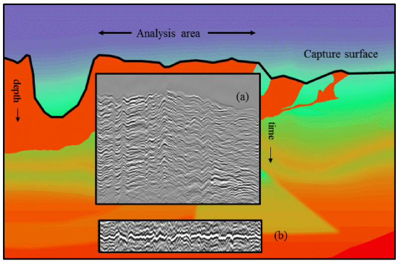
Alongside seismic multiples, poor illumination, and bandwidth limitations, John Etgen (BP) submitted that, in complex overburden, velocity is the number one problem for seismic imaging. Correct velocity model equals acceptable image. His (perhaps controversial) point was that when velocities are complex, multiples, no matter how severe, are second order thorns in the side of the seismic imager. "It's the thing that's killing us, and that's the frontier." He also posited that full waveform inversion may not save us after all, and image gather analysis looks even less promising.

While FWI looks to catch the wavefield and look at it in the space of the data, migration looks to catch the wavefield and look at it at the image point itself. He elegantly explained these two paradigms, and suggested that both may be flawed.

John urged, "We need things other than what we are working on", and shared his insights from another field. In ground-based optical astronomy, for example, when the image of a star is be distorted by turbulence in our atmosphere, astromoners numerically warp the curvature of the lens to correct for rapid variations in phase of the incoming wavefront. The lenses we use for seismic focusing, velocities, can be tweaked just the same by looking at the wavefield part of the way through its propagation. He quoted Jon Claerbout:

If you want to understand how a horse runs, you gotta run along with it.
Big imaging, little imaging, and combination of the two

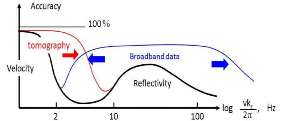
There's a number of ways one could summarize what petroleum seismologists do. But hearing (CGG researcher) Sam Gray's talk yesterday was a bit of an awakening. His talk was a remark on the notion of big imaging vs little imaging, and the need for convergence.

Big imaging is the structural stuff. Structural migration, stratigraphic imaging, wide-azimuth acquisition, and so on. It includes the hardware and compute innovations of broadband, blended sources, deblending processing, anisotropic imaging, and the beginnings of viscoacoustic reverse-time migration. 

Little imaging is inversion. It's reservoir characterization. It's AVO and beyond. Azimuthal velocities (fast and slow directions) hint at fracture orientations, azimuthal amplitudes hint even more subtly at fracture compliance.

Big imaging is hard because it's computationally expensive, and velocities are unknown. Little imaging is hard because features like fractures, faults and pores are at the centimetre scale, but on land we lay out inlines and crossline hundreds of metres apart, and use signals that carry only a few bits of information from an area the size of a football field.

What we've been doing with imaging is what he called a separated workflow. We use gathers to make big images. We use gathers to make rock properties, but seldom do they meet. How often have you tested to see if the rock properties the little are explain the wiggles in the big? Our work needs to be such a cycle, if we want our relevance and impact to improve.

The figures are copyright of the authors of SEG, and used in accordance with SEG's permission guidelines.

K is for Wavenumber

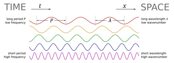
Wavenumber, sometimes called the propagation number, is in broad terms a measure of spatial scale. It can be thought of as a spatial analog to the temporal frequency, and is often called spatial frequency. It is often defined as the number of wavelengths per unit distance, or in terms of wavelength, λ:

$$k = \frac{1}{\lambda}$$

The units are \(\mathrm{m}^{–1}\), which are nameless in the International System, though \(\mathrm{cm}^{–1}\) are called kaysers in the cgs system. The concept is analogous to frequency \(f\), measured in \(\mathrm{s}^{–1}\) or Hertz, which is the reciprocal of period \(T\); that is, \(f = 1/T\). In a sense, period can be thought of as a temporal 'wavelength' — the length of an oscillation in time.

If you've explored the applications of frequency in geophysics, you'll have noticed that we sometimes don't use ordinary frequency f, in Hertz. Because geophysics deals with oscillating waveforms, ones that vary around a central value (think of a wiggle trace of seismic data), we often use the angular frequency. This way we can also express the close relationship between frequency and phase, which is an angle. So in many geophysical applications, we want the angular wavenumber. It is expressed in radians per metre:

$$k = \frac{2\pi}{\lambda}$$

The relationship between angular wavenumber and angular frequency is analogous to that between wavelength and ordinary frequency — they are related by the velocity V:

$$k = \frac{\omega}{V}$$

It's unfortunate that there are two definitions of wavenumber. Some people reserve the term spatial frequency for the ordinary wavenumber, or use ν (that's a Greek nu, not a vee — another potential source of confusion!), or even σ for it. But just as many call it the wavenumber and use k, so the only sure way through the jargon is to specify what you mean by the terms you use. As usual!

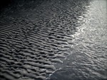
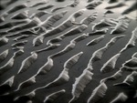
Just as for temporal frequency, the portal to wavenumber is the Fourier transform, computed along each spatial axis. Here are two images and their 2D spectra — a photo of some ripples, a binary image of some particles, and their fast Fourier transforms. Notice how the more organized image has a more organized spectrum (as well as some artifacts from post-processing on the image), while the noisy image's spectrum is nearly 'white':

Explore our other posts about scale.

The particle image is from the sample images in FIJI. The FFTs were produced in FIJI.

Update

on 2012-05-03 16:41 by Matt Hall

Following up on Brian's suggesstion in the comments, I added a brief workflow to the SubSurfWiki page on wavenumber. Please feel free to add to it or correct it if I messed anything up. 

Well worth showing off

Have you ever had difficulty displaying a well log in a presentation? Now, instead of cycling through slides, you can fluidly move across a digital, zoomable canvas using Prezi. I think it could be a powerful visual tool and presentation aid for geoscientists. Prezi allows users to to construct intuitive, animated visualizations, using size to denote emphasis or scale, and proximity to convey relevance. You navigate through the content simply by moving the field of view and zooming in and out through scale space. In geoscience, scale isn't just a concept for presentation design, it is a fundamental property that can now be properly tied-in and shown in a dynamic way.

I built this example to illustrate how geoscience images, spread across several orders of magnitude, can be traversed seamlessly for a better presentation. In a matter of seconds, one can navigate a complete petrophysical analysis, a raw FMI log, a segment of core, and thin section microscopy embedded at its true location. Explore heterogeniety and interpret geology with scale in context. How could you use a tool like this in your work?

Clicking on the play button will steer the viewer step by step through a predefined set of animations, but you can break off and roam around freely at any time (click and drag with your mouse, try it!). Prezi could be very handy for workshops, working meetings, or any place where it is appropriate to be transparent and thorough in your visualizations.

You can also try roaming Prezi by clicking on the image of this cheatsheet. Let us know what you think!

Thanks to Burns Cheadle for Prezi enthusiasm, and to Neil Watson for sharing the petrophysical analysis he built from public data in Alberta.

Scales of sea-level change

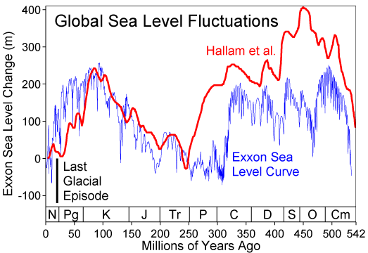
Relative sea-level curve for the PhanerozoicClick to read about sea level on Wikipedia. Image prepared by Robert Rohde and licensed for public use under CC-BY-SA.Sea level changes. It changes all the time, and always has (right). It's well known, and obvious, that levels of glaciation, especially at the polar ice-caps, are important controls on the rate and magnitude of changes in global sea level. Less intuitively, lots of other effects can play a part: changes in mid-ocean ridge spreading rates, the changing shape of the geoid, and local tectonics.

A recent paper in Science by Petersen et al (2010) showed evidence for mantle plumes driving the cyclicity of sedimentary sequences. This would be a fairly local effect, on the order of tens to hundreds of kilometres. This is important because some geologists believe in the global correlatability of these sequences. A fanciful belief in my view—but that's another story.

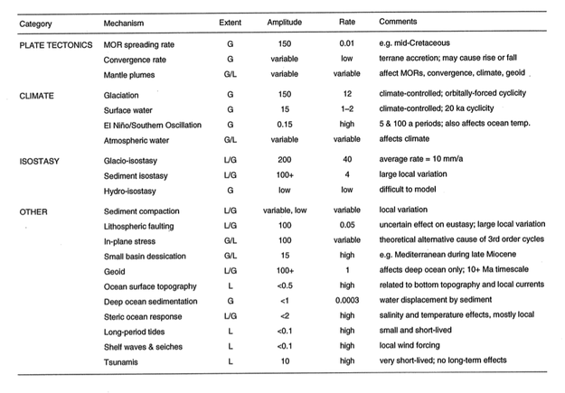
The paper reminded me of an attempt I once made to catalog the controls on sea level, from long-term global effects like greenhouse–icehouse periods, to short-term local effects like fault movement. I made the table below. I think most of the data, perhaps all of it, were from Emery and Aubrey (1991). It's hard to admit, because I don't feel that old, but this is a rather dated publication now; I think it's solid enough for the sort of high-level overview I am interested in. 

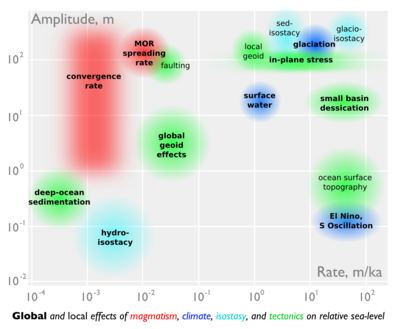
After last week's doodling, the table inspired me to try another scale-space cartoon. I put amplitude on the y-axis, rate on the x-axis. Effects with global reach are in bold, those that are dominantly local are not. The rather lurid colours represent different domains: magmatic, climatic, isostatic, and (in green) 'other'. The categories and the data correspond to the table.
Infographic: scales of sea level changeIt is interesting how many processes are competing for that top right-hand corner: rapid, high-amplitude sea level change. Clearly, those are the processes we care about most as sequence stratigraphers, but also as a society struggling with the consequences of our energy addiction.

References
Emery, K & D Aubrey (1991). Sea-levels, land levels and tide gauges. Springer-Verlag, New York, 237p.
Petersen, K, S Nielsen, O Clausen, R Stephenson & T Gerya (2010). Small-scale mantle convection produces stratigraphic sequences in sedimentary basins. Science 329 (5993) p 827–830, August 2010. DOI: 10.1126/science.1190115

The scales of geoscience

Helicopter at Mount St Helens in 2007. Image: USGS.Geoscientists' brains are necessarily helicoptery. They can quickly climb and descend, hover or fly. This ability to zoom in and out, changing scale and range, develops with experience. Thinking and talking about scales, especially those outside your usual realm of thought, are good ways to develop your aptitude and intuition. Intuition especially is bound to the realms of your experience: millimetres to kilometres, seconds to decades. 

Being helicoptery is important because processes can manifest themselves in different ways at different scales. Currents, for example, can result in sorting and rounding of grains, but you can often only see this with a hand-lens (unless the grains are automobiles). The same environment might produce ripples at the centimetre scale, dunes at the decametre scale, channels at the kilometre scale, and an entire fluvial basin at another couple of orders of magnitude beyond that. In moments of true clarity, a geologist might think across 10 or 15 orders of magnitude in one thought, perhaps even more.

A couple of years ago, the brilliant web comic artist xkcd drew a couple of beautiful infographics depicting scale. Entitled height and depth (left), they showed the entire universe in a logarithmic scale space. More recently, a couple of amazing visualizations have offered different visions of the same theme: the wonderful Scale of the Universe, which looks at spatial scale, and the utterly magic ChronoZoom, which does a similar thing with geologic time. Wonderful.

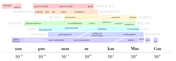
These creations inspired me to try to map geological disciplines onto scale space. You can see how I did below. I do like the idea but I am not very keen on my execution. I think I will add a time dimension and have another go, but I thought I'd share it at this stage. I might even try drawing the next one freehand, but I ain't no Randall Munroe.

I'd be very happy to receive any feedback about improving this, or please post your own attempts!

Unstable at any scale

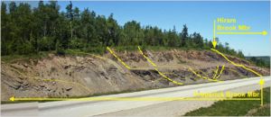
Rights reserved, Adrian Park, University of New Brunswick

Studying outcrops can be so valuable for deducing geologic processes in the subsurface. Sometimes there is a disconnect between outcrop work and geophysical work, but a talk I saw a few weeks ago communicated nicely to both.

At the 37th Annual Colloquium of the Atlantic Geological Society, held at the Fredericton Inn, Fredericton, New Brunswick, Canada, February 11-12, 2011, Adrian Park gave a talk entitled: 

Adrian Park, Paul Wilson, and David Keighley: Unstable at any scale: slumps, debris flows, and landslides during deposition of the Albert Formation, Tournaisian, southern New Brunswick.

He has granted me permission to summarize his presentation here, which was one of my favorites talks of the conference.

Read More

What is a darcy?

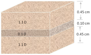
Permeability is the capacity of a porous material to transmit fluids. The SI unit of permeability is m2 (area) but the units adopted by the petroleum industry have been named after Henry Darcy, who derived Darcy's law. A darcy is a confusing jumble of units which combines a standardized set of laboratory experiments. By definition, a material of 1 darcy permits a flow of 1 cm3/s of a fluid with viscosity 1 cP (1 mPa.s) under a pressure gradient of 1 atm/cm across an area of 1 cm2.

Apart from having obscure units with an empirical origin, permeability can be an incredibly variable quantity. It can vary be as low as 10–9 D for tight gas reservoirs and shale, to 101 D for unconsolidated conventional reservoirs. Just as electrical resistivity, values are plotted on a logarithmic scale. Many factors such as rock type, pore size, shape and connectedness and can effect fluid transport over volume scales from millimetres to kilometres.

Okay then, with that said, what is the upscaled permeability of the cube of rock shown here? In other words, if you only had to find one number to describe the permeability of this sample, what would it be? I'll pause for a moment while you grab your calculator... Okay, got an answer? What is it?

Read More

The integration gap

Agile teams have lots of ways to be integrated. They need to be socially integrated: they need to talk to each other, know what team-mates are working on, and have lots of connections to other agile teams and individuals. They need to be actively integrated: their workflows must complement one another's. If the geologist is working on new bulk density curves, the geophysicist uses those curves for the synthetic seismograms; if the geophysicist tweaks the seismic inversion result, the geomodeller uses that volume for the porosity distribution.

But the agile team also needs to be empirically integrated: the various datasets need to overlap somehow so they can be mutually calibrated and correlated. But if we think about the resolution of subsurface data, both spatially, in the (x,y) plane, and vertically, on the z axis, we reveal a problem—the integration gap.

Scales_of_measurement.png

This picks up again on scale (see previous post). Geophysical data is relatively low-resolution: we can learn all about large, thick features. But we know nothing about small things, about a metre in size, say. Conversely, well-based data can tell us lots about small things, even very small things indeed. A vertical well can tell us about thick things, but not spatially extensive things. A horizontal well can tell us a bit more about spatially large things, but not about thick things. And in between this small-scale well data and the large-scale seismic data? A gap. 

This little gap is responsible for much of the uncertainty we encounter in the subsurface. It is where the all-important well-tie lives. It leads to silos, un-integrated behaviour, and dysfunctional teams. And it's where all the fun is!

† I've never thought about it before, but there doesn't seem to be an adjectival form of the word 'data'. 


UPDATE This figure was updated later:

Scales_of_measurement_complete.png

Ripples

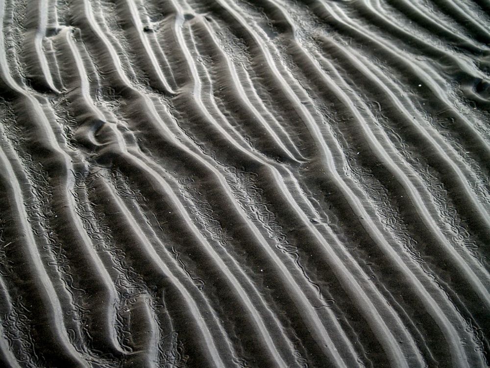
Yesterday I visited Sand Dollar Beach, near Lunenburg, with the kids. There's lots of room to run around: the beach has a 400 m wide foreshore, which means lots of shallow water at high tide (as in the Google Maps picture here). The low angle (less than half a degree) also sees the tide go in and out very quickly, allowing little time for reworking the delicate ripples. Their preservation is further helped by the fact that the waves along this sheltered coast are typically low-amplitude.


View Larger Map

At the edge of the just-visible stream cutting through the beach, the regular wave ripples, produced by oscillating currents, morph into more chaotic linguiod current ripples (right-hand side, mostly obscured by the stream). I can't say for sure, but the pattern may have been modified by animal tracks (deer, dog, dude?) during some previous low tide.

As I posted before, I am interested in the persistence of patterns across scales and even processes. For instance, this view (right) reminded me of blogger Silver Fox's recent post about the Basin and Range caterpillar army. An entirely different process: parallel morpholution.

If you look closely at the Google Map, above, you can see dim duneforms in the shallows, as a series of sub-parallel dark stripes. They echo the ripples in orientation and process, but have a wavelength of about 30 m. If you can't see them maybe this annotated version will help.

I would not claim to be an expert in the feeding traces of invertebrates, but I love taking pictures of them. I think the animals grazing in the cusps of these ripples were Chiridotea coeca, a tiny crustacean. You can read (a lot) more about them in Hauck et al (2008), Palaios 23, 336–343. According to these authors, such trails may be modern analogs of a rather common trace fossil called Nereites

Scale

One of the most persistent themes in geoscience is scale. Some properties of the earth are scale independent, or fractal; the shapes of rivers and coastlines, sediment grain shapes, and fracture size distributions might fall into this category. Other properties are scale dependent, such as statistical variance, seismic velocities (which are wavelength dependent), or stratigraphic stacking patterns.

Scale independent phenomena are common in nature, and in some human inventions. For example, Randall Munroe's brilliant comic today illustrating the solutions to tic-tac-toe (or noughts-and-crosses, as I'd call it). It's the optimal subset of the complete solution space, which shows its fractal nature completely.

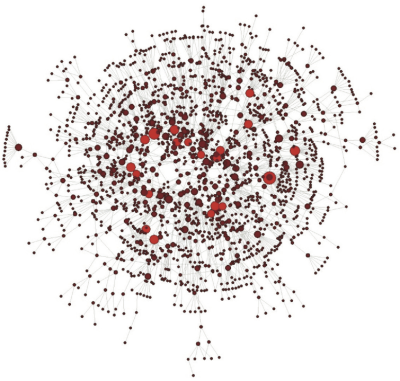
The network of co-authorship relationships in SEG's journal Geophysics is also scale-free (most connected authors shown in red). From my 2010 paper in The Leading Edge.