Stratigraphic interpretation

Over the weekend, Lisa Stright posted a question on the Software Underground’s Slack:

[… W]hat are you favorite seismic attributes for analyzing subtle stratigraphic changes in vertical sections (not time or strata slices)? I’m trying to quantitatively analyze sedimentological information from seismic data and am curious about either best practices and/or useful approaches in reservoir geophysics.

I really like questions like this, because they tend to bring out a lot of useful tricks and ideas from the community. However, my own response turned into a bit of a wall of text, so I thought I’d unpack it a bit here, with some links and detail.

I’ll start with the general advice for any reservoir seismic interpretation:

  1. Before trying any interpretation that relies on reflector patterns, it’s crucial to make sure the phase is good. There are two really good papers to read on phase determination: Roden & Sepulveda (1999) and Perz, Sacchi and O’Byrne (2004). I summarized this in the SubSurfWiki article on phase determination. (Note to self: it would be fun to write a tool to semi-automate some of these tests.)

  2. Always use at least 16-bit, unfiltered data for attributes. If you’re having data processed, it’s important to ask for unfiltered data, because in my experience most processors just can’t help themselves.

  3. If using marine data, it's imperative that you know where to expect multiples because they can create convincing pinch out etc. Make integer multiples of the seafloor to help predict — and there are lots of other horizons you could make.

  4. You need to know the tuning thickness for the interval of interest. You can compute it with the uppermost frequency, \(f_\mathrm{max}\) (the frequency when the normalized power hites –20 dB down) and velocity \(v\) as \(v / 4f_\mathrm{max}\) (n.b. spatial resolution is \(v / 2f_\mathrm{max}\)). Amplitudes that you can interpret as tuning effect might help you spot thickness variations in thin beds near and below seismic resolution.

As for the attributes, I've never got on with fancy 'pattern' attributes like parallelism, although it is different from anything else. Plenty of experienced interpreters mention cosine of phase too, but again I don’t recall having used it on the battlefield; perhaps I’m missing out, or maybe my data’s just never been suitable.

Instead, here are the ones I tend to go for:

  1. Integrated trace is the most under-appreciated attribute, in my opinion. It is sometimes called relative acoustic impedance and is incredibly cheap to compute.

  2. Semblance is a genuinely different view of your data, at least in stratal slices. (I realize now that Lisa explicitly said she wasn’t interested in stratal horizontal attributes, but I‘ll leave it in for completeness Same for the next one…)

  3. Spectral decomposition is a good tool if done carefully, again in stratal slices. Stick to the band of your data though.

By the way, before doing anything important with attributes, read everything you can by Art Barnes, starting with Too many seismic attributes? (Barnes 2006). TL;DR — he says there are only 10 you need to know about.

Advice from other interpreters

Art Barnes isn’t the only one with good advice to offer!

In the same Slack thread, Steve Purves (who wrote a nice Geophysical Tutorial about phase) mentioned the awesome PyLops tutorial on coloured inversion (PyLops is a linear operator package from Equinor). And Rob G also pointed out the merits of inversion for stratigraphic interpretation. (With the added bonus that you don’t need absolute impedance from it, so a lot of the usual inversion challenges, like low-frequency models, aren’t quite as critical).

Rob G also had this awesome advice:

I would also have a look at the amplitude-frequency spectrum of your seismic data compare it to the spectra of your well acoustic impedance logs (in your AOI). Then consider doing some spectral shaping to enhance the higher frequencies in the seismic to match the well logs (spectral blueing). This should allow you to see more details, however you have to be very careful to ensure you are not over boosting the higher frequencies which contain more noise than signal.

Finally, Doug McClymont, who I know from several events in the UK to be a wise geophysicist, underscored the usefulness of both the ‘instantaneous phase of the peak envelope’ and the ‘phase rotation with the highest amplitude’ methods, especially when well ties are prone to unresolvable time shift residuals. Great advice.

As the Software Underground continues to evolve, these are the conversations that keep it awesome.


References

  • Barnes, A (2006). Too many seismic attributes? CESG Recorder 31 (3). Available online.

  • Perz, M, M Sacchi and A O'Byrne (2004). Instantaneous phase and the detection of lateral wavelet stability. The Leading Edge 23 (7), 639–643. DOI 10.1190/1.1776731.

  • Purves, S (2014). Geophysical Tutorial: Phase and the Hilbert transform. The Leading Edge 33, p 1164–1166. DOI 10.1190/tle33101164.1

  • Roden, R and H Sepulveda (1999). The significance of phase to the interpreter; practical guidelines for phase analysis The Leading Edge 18 (7), p. 774–777. DOI 10.1190/1.1438375

Superpowers for striplogs

In between recent courses and hackathons, I’ve been chipping away at some new features in striplog. An open-source Python package, striplog handles irregularly sampled data, like lithologic intervals, chronostratigraphic zones, or anything that isn’t regularly sampled like, say, a well log. Instead of defining what is present at every depth location, you define intervals with a top and a base. The interval can contain whatever you like: names of rocks, images, or special core analyses, or anything at all.

You can read about all of the newer features in the changelog, but let’s look at a couple of the more interesting ones…

Binary morphology filters

Sometimes we’d like to simplify a striplog a bit, for example by ‘weeding out’ the thin beds. The tool has long had a method prune to systematically remove all intervals (e.g. beds) thinner than some cutoff; one can then optionally anneal the gaps, and merge the resulting striplog to combine similar neighbours. The result of this sequence of operations (prune, anneal, merge, or ‘PAM’) is shown below on the left.

striplog_binary_ops.png

If the intervals of a striplog have at least one property of a binary nature — with only two states, like sand and shale, or pay and non-pay — one can also use binary morphological operations. This well-known image processing technique aims to simplify data by eliminating small things. The result of opening vs closing operations is shown above.

Markov chains

I wrote about Markov chains earlier this year; they offer a way to identify bias in the order of units in a stratigraphic column. I’ve now put all the code into striplog — albeit not in a very fancy way. You can import the Markov_chain class from striplog.markov, then use it in exactly the same way as in the notebook I shared in that Markov chain post:

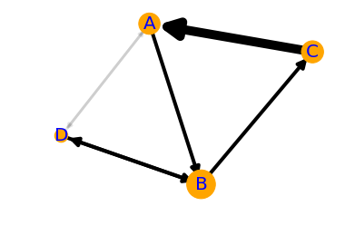
I started with some pseudorandom data (top) representing a known succession of Mudstone (M), Siltstone (S), Fine Sandstone (F) and coarse sandstone (C). Then I generate a Markov chain model of the succession. The chi-squared test indicates that the succession is highly unlikely to be unordered. We can look at the normalized difference matrix, generate a synthetic sequence of lithologies, or plot the difference matrix as a heatmap or a directed graph. The graph illustrates the order we originally imposed: M-S-F-C.

There is one additional feature compared to the original implementation: multi-step Markov chains. Previously, I was only looking at immediately adjacent intervals (beds or whatever). Now you can look at actual vs expected transition frequencies for next-but-one interval, or next-but-two. Don’t ask me how to interpret that information though…

Other new things

  • New ways to anneal. Now the user can choose whether the gaps in the log are filled in by flooding upwards (that is, by extending the interval below the gap upwards), flooding downwards (extending the upper interval), or flooding symmetrically into the middle from both above and below, meeting in the middle. (Note, you can also fill gaps with another component, using the fill() method.)

  • New merging strategies. Now you can merge overlapping intervals by precedence, rather than by blending the contents of the intervals. Precedence is defined however you like; for example, you can choose to keep the thickest interval in all overlaps, or if intervals have a date, you could keep the latest interval.

  • Improved bar charts. The histogram is easier to use, and there is a new bar chart summary of intervals. The bars can be sorted by any property you like.

Try it out and help add new stuff

You can install the latest version of striplog using pip. It’s as easy as:

pip install striplog

Start by checking out the tutorial notebooks in the repo, especially Striplog_basics.ipynb. Let me know how you get on, or jump on the Software Underground Slack to ask for help.

Here are some things I’d like striplog to support in the future:

  • Stratigraphic prediction.

  • Well-to-well correlation.

  • More interactions with well logs.

What ideas do you have? Or maybe you can help define how these things should work? Either way, do get in touch or check out the Striplog repository on GitHub.

The order of stratigraphic sequences

Much of stratigraphic interpretation depends on a simple idea:

Depositional environments that are adjacent in a geographic sense (like the shoreface and the beach, or a tidal channel and tidal mudflats) are adjacent in a stratigraphic sense, unless separated by an unconformity.

Usually, geologists are faced with only the stratigraphic picture, and are challenged with reconstructing the geographic picture.

One interpretation strategy might be to look at which rocks tend to occur together in the stratigraphy. The idea is that rock types tend to be associated with geographic environments — maybe fine sand on the shoreface, coarse sand on the beach; massive silt in the tidal channel, rhythmically laminated mud in the mud-flats. Since if two rocks tend to occur together, their environments were probably adjacent, we can start to understand associations between the rock types, and thus piece together the geographic picture.

So which rock types tend to occur together, and which juxtapositions are spurious — perhaps the result of allocyclic mechanisms like changes in relative sea-level, or sediment supply? To get at this question, some stratigraphers turn to Markov chain analysis.

What is a Markov chain?

Markov chains are sequences of events, or states, resulting from a Markov process. Here’s how Wikipedia describes a Markov process:

A stochastic process that satisfies the Markov property (sometimes characterized as “memorylessness”). Roughly speaking, a process satisfies the Markov property if one can make predictions for the future of the process based solely on its present state just as well as one could knowing the process’s full history, hence independently from such history; i.e., conditional on the present state of the system, its future and past states are independent.

So if we believe that a stratigraphic sequence (I’m using ‘sequence’ here in the most general sense) can be modeled by a process like this — i.e. that its next state depends substantially on its present state — then perhaps we can model it as a Markov chain.

For example, we might have a hunch that we can model a shallow marine system as a sequence like:

offshore mudstone > lower shoreface siltstone > upper shoreface sandstone > foreshore sandstone

Then we might expect to see these transitions occur more often than other, non-successive transitions. In other words — if we compare the transition frequencies we observe to the transition frquencies we would expect from a random sequence of the same beds in the same proportions, then autocyclic or genetic transitions might happen unusually frequently.

The Powers & Easterling method

Several workers have gone down this path. The standard approach seems to be that of Powers & Easterling (1982). Here are the steps they describe:

  • Count the upwards transitions for each rock type. This results in a matrix of counts. Here’s the transition frequency matrix for the example used in the Powers & Easterling paper, in turn taken from Gingerich (1969):

 
data = [[ 0, 37,  3,  2],
        [21,  0, 41, 14],
        [20, 25,  0,  0],
        [ 1, 14,  1,  0]]
  • Compute the expected counts by an iterative process, which usually converges in a few steps. The expected counts represent what Goodman (1968) called a ‘quasi-independence’ model — a random sequence:

 
array([[ 0. , 31.3,  8.2,  2.6],
       [31.3,  0. , 34.1, 10.7],
       [ 8.2, 34. ,  0. ,  2.8],
       [ 2.6, 10.7,  2.8,  0. ]])
  • Now we can compare our observed frequencies with the expected ones in two ways. First, we can inspect the \(\chi^2\) statistic, and compare it with the \(\chi^2\) distribution, given the degrees of freedom (5 in this case). In this example, it’s 35.7, which is beyond the 99.999th percentile of the chi-squared distribution. This rejects the hypothesis of quasi-independence. In other words: the succession appears to be organized. Phew!

  • Secondly, we can compute a matrix of so-called normalized differences. This lets us compare the observed and expected data. By calculating Z-scores, which are approximately normally distributed; since 95% of the distribution falls between −2 and +2, any value greater in magnitude than 2 is ‘fairly unusual’, in the words of Powers & Easterling. In the example, we can see that the large number of transitions from C (third row) to A (first column) is anomalous:


array([[ 0. ,  1. , -1.8, -0.3],
       [-1.8,  0. ,  1.2,  1. ],
       [ 4.1, -1.6,  0. , -1.7],
       [-1. ,  1. , -1.1,  0. ]])
powers_easterling_normdiff.png
  • The normalized difference matrix can also be interpreted as a directed graph, indicating the ‘strengths’ of the connections (edges) between rock types (nodes):

powers_easterling_graph.png

It would be all too easy to over-interpret this graph — B and D seem to go together, as do A and C, and C tends to pass into A, which tends to pass into a B/D system before passing back into C — and one could get carried away. But as a complement to sedimentological interpretation, knowledge of processes and the succession in hand, perhaps inspecting Markov chains can help understand the stratigraphic story.

One last thing… there is another use for Markov chains. We can also use the model to produce stochastic realizations of stratigraphy. These will share the same statistics as the original data, but are otherwise quite random. Here are 20 random beds generated from our model:

 
'ABABCBABABCABDABABCA'

The code to build your own Markov chains is all in this notebook. It’s very much a work in progress. Eventually I hope to merge it into the striplog library, but for now it’s a ‘minimum viable product’. Stay tuned for more on striplog.

Open In Colab   ⇐   Launch the notebook right here in your browser!


References

Gingerich, PD (1969). Markov analysis of cyclic alluvial sediments. Journal of Sedimentary Petrology, 39, p. 330-332. https://doi.org/10.1306/74D71C4E-2B21-11D7-8648000102C1865D

Goodman, LA (1968), The analysis of cross-classified data: independence, quasi-independence, and interactions in contingency tables with or without missing entries. Journal of American Statistical Association 63, p. 1091-1131. https://doi.org/10.2307/2285873

Powers, DW and RG Easterling (1982). Improved methodology for using embedded Markov chains to describe cyclical sediments. Journal of Sedimentary Petrology 52 (3), p. 0913-0923. https://doi.org/10.1306/212F808F-2B24-11D7-8648000102C1865D

In search of the Kennetcook Thrust

Behind every geologic map, is a much more complex geologic truth. Most of the time it's hidden under soil and vegetation, forcing geologists into a detective game in order to fill gaps between hopelessly sparse spatterings of evidence.

Two weeks ago, I joined up with an assortment of geologists on the side of the highway an hour north of Halifax for John Waldron to guide us along some spectacular stratigraphy exposed in the coastline cliffs on the southern side of the Minas Basin (below). John has visited these sites repeatedly over his career, and he's supervised more than a handful of graduate students probing a variety of geologic processes on display here. He's published numerous papers teasing out the complex evolution of the Windsor-Kennetcook Basin: one of three small basins onshore Nova Scotia with the potential to contain economic quantities of hydrocarbons.

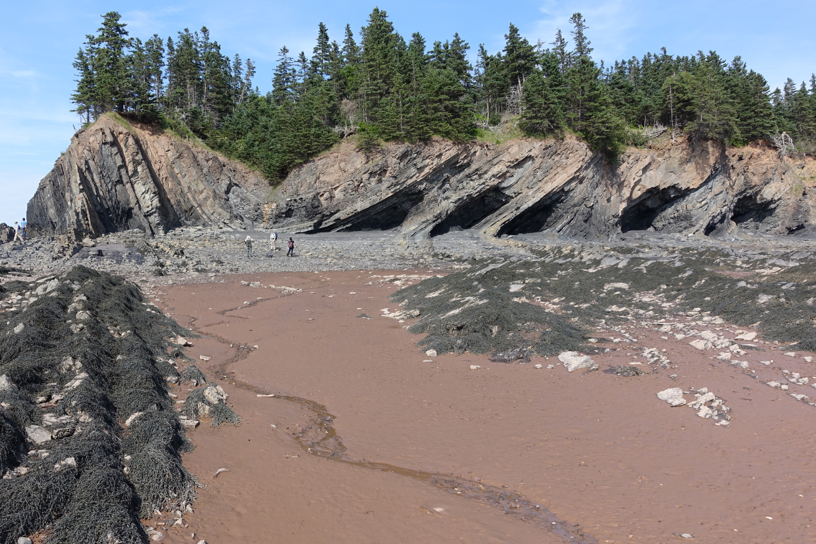
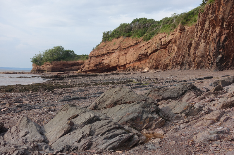
John retold the history of mappers past and present riddled by the massively deformed, often duplicated Carboniferous evaporites in the Windsor Group which are underlain by sub-horizontal seismic reflectors at depth. Local geologists agree that this relationship reflects thrusting of the near-surface package, but there is disagreement on where this thrust is located, and whether and where it intersects the surface. On this field trip, John showed us symptoms of this Kennetcook thrust system, at three sites. We started in the footwall. The second and third sites were long stretches spectacularly deformed exposures in the hangingwall.  

Footwall: Cheverie Point

SEE GALLERY BELOW FOR ENLARGEMENT

SEE GALLERY BELOW FOR ENLARGEMENT

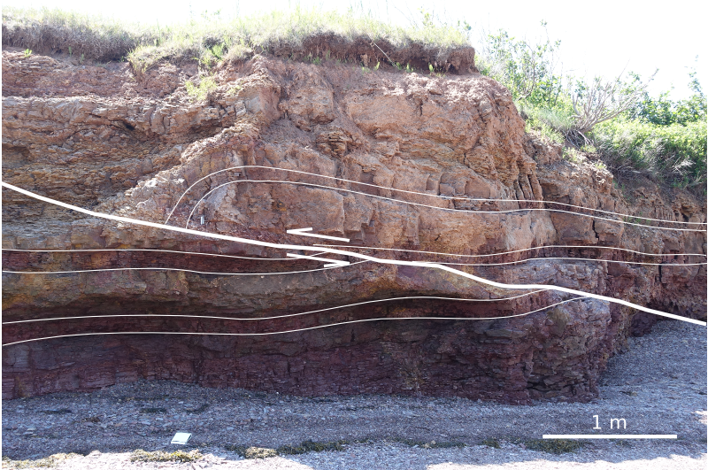
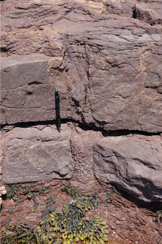
The first stop was Cheverie Point and is interpreted to be well in the footwall of the Kennetcook thrust. Small thrust faults (right) cut through the type section of the Macumber Formation and match the general direction of the main thrust system. The Macumber Formation is a shallow marine microbial limestone that would have fooled anyone as a mudstone, except it fizzed violently under a drop of HCl. Just to the right of this photo, we stood on the unconformity between the petroliferous and prospective Horton Group and the overlying Windsor Group. It's a pick that turns out to be one of the most reliably mappable seismic events on seismic sections so it was neat to stand on that interface.

Further down section we studied the Mississippian Cheverie Formation: stacked cycles of point-bar deposits ranging from accretionary lag conglomerates to caliche paleosols with upright tree trunks. Trees more than a metre or more in diameter were around from the mid Devonian, but Cheverie forests are still early and good examples of trees within point-bars and levees.  

Hangingwall: Red Head / Johnson Beach / Split Rock

SEE GALLERY BELOW FOR ENLARGEMENT

SEE GALLERY BELOW FOR ENLARGEMENT

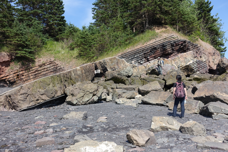
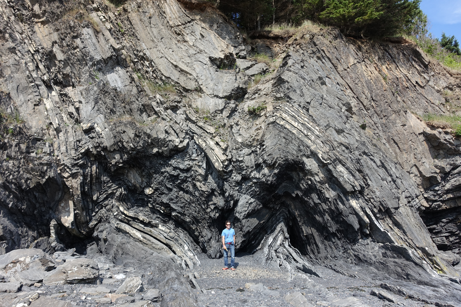
The second site featured some spectacularly folded black shales from the Horton Bluff Formation, as well as protruding sills up to two metres thick that occasionally jumped across bedding (right). We were clumsily contemplating the curious occurrence of these intrusions for quite some time until hard-rock guru Trevor McHattie halted the chatter, struck off a clean piece rock with a few blows of his hammer, wetted it with a slobbering lick, and inspected it with his hand lens. We all watched him in silence and waited for his description. I felt a little schooled. He could have said anything. It was my favourite part of the day.

Hangingwall continued: Rainy Cove

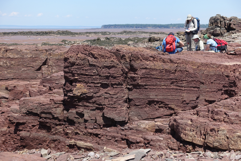
The patterns in the rocks at Rainy Cove are a wonderland for any structural geologist. It's a popular site for geology labs from Atlantic Universities, but it would be an absolute nightmare to try to actually measure the section here. 

SEE GALLERY BELOW FOR ENLARGEMENT

SEE GALLERY BELOW FOR ENLARGEMENT

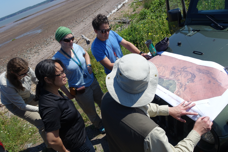
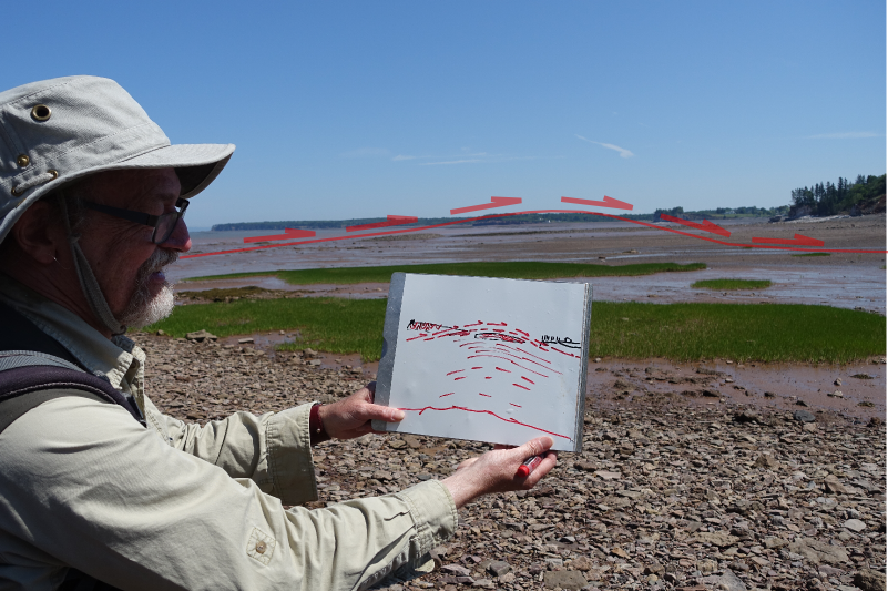
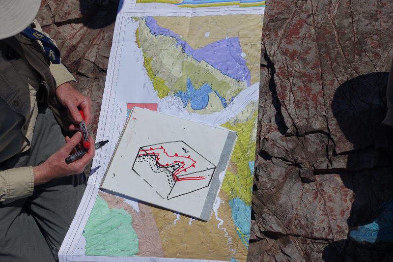
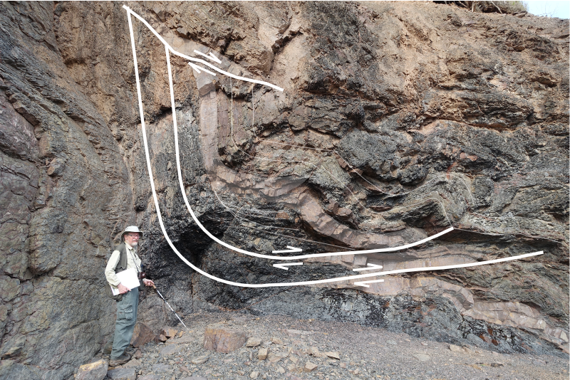
John stands next to a small system of duplicated thrusts in the main hangingwall that have been subsequently folded (left). I tried tracing out the fault planes by following the offsets in the red sandstone bed amidst black shales whose fabric has been deformed into an accordion effect. Your picks might very well be different from mine.

A short distance away we were pointed to an upside-down view of load structures in folded beds. "This antiform is a syncline", John paused while we processed. "This synform over here is an anticline". Features telling of such intense deformation are hard to fathom. Especially in plain sight.

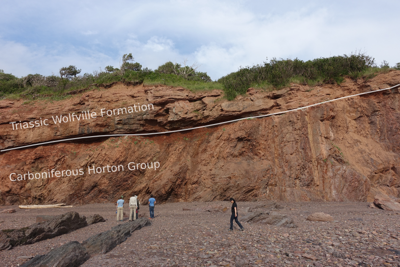
The rock lessons ended in the early evening at the far end of Rainy Cove where the Triassic Wolfville formation sits unconformably on top of ridiculously folded, sometimes doubly overturned Carboniferous Horton Rocks. John said it has to be one of the most spectacularly exposed unconformities in the world. 

I often take for granted the vast stretches of geology hiding beneath soil and vegetation, and the preciousness of finding quality outcrop. Check out the gallery below for pictures from our day.  

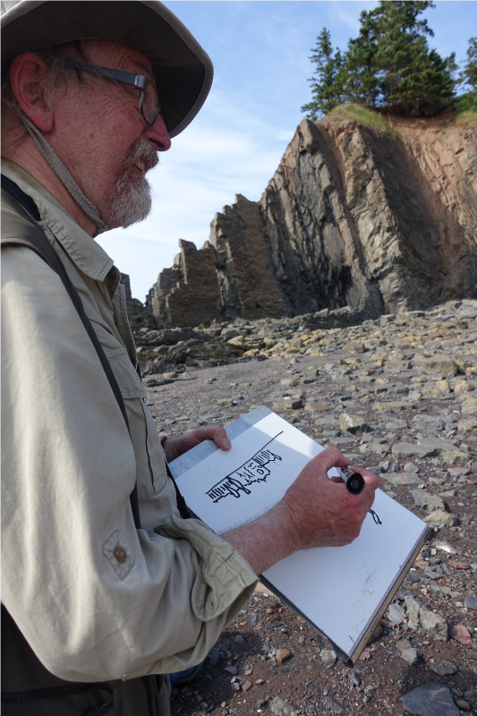
I was quite enamoured with John's format. His field trip technologies. The maps and sections: canvases for communication and works in progress. His white boarding, his map-folding techniques: a practised impresario.

What are some of the key elements from the best field trips you've been on? Let us know in the comments.

News of the month

A few bits of news about geology, geophysics, and technology in the hydrocarbon and energy realm. Do drop us a line if you hear of something you think we ought to cover.

All your sequence strat

The SEPM, which today calls itself the Society for Sedimentary Geology (not the Society of Economic Palaeontologists and Mineralogists, which is where the name comes from, IIRC), has upgraded its website. It looks pretty great (nudge nudge, AAPG!). The awesome SEPM Strata, a resource for teaching and learning sequence stratigraphy, also got a facelift. 

Hat-tip to Brian Romans for this one.

Giant sand volcano

Helge Løseth of Statoil, whom we wrote about last week in connection with the Source Rocks from Seismic workflow, was recently in the news again. This time he and his exploration team were describing the Pleistocene extrusion of more than 10 km3 of sand onto the sea-floor in the northern North Sea, enough to bury Manhattan in 160 m of sand.

The results are reported in Løseth, H, N Rodrigues, and P Cobbold (2012) and build on earlier work by the same team (Rodrigues et al. 2009). 

Tape? There's still tape??

Yes, there's still tape. This story just caught my eye because I had no idea people were still using tape. It turns out that the next generation of tape, Ultrium LTO-6, will be along in the second half of 2012. The specs are pretty amazing: 8 TB (!) of compressed data, and about 200 MB/s (that's megabytes) transfer rates. The current generation of cartridges, LTO-5, cost about $60 and hold 3 TB — a similar-performing hard drive will set you back more than double that. 

The coolest cluster

Physics enables geophysics in lots of cool ways. CGGVeritas is using a 600 kW Green Revolution Cooling CarnotJet liquid cooling system to refrigerate 24 cluster racks in GRC's largest installation to date. In the video below, you can see an older 100 kW system. The company claims that these systems, in which the 40°C racks sit bathed in non-conductive oil, reduce the cost of cooling a supercomputer by about 90%... pretty amazing.

Awesomer still, this server is using Supermicro's SuperServer GPU-accelerated servers. GPUs, or graphics processing units, have massively parallel architectures (over 1000 cores per server), and can perform some operations much faster than ordinary CPUs, which are engineered to perform 'executive' functions as well as just math.

This regular news feature is for information only. We aren't connected with any of these organizations, and don't necessarily endorse their products or services. The cartridge image is licensed CC-BY-SA by Wikimedia Commons user andy_hazelbury. The CarnotJet image is from grcooling.com and thought to be fair use.

News of the week

We hope you're having a great summer. Our website has been quieter than usual this week, but we're busy building things—stay tuned. And we haven't done a news post for a few weeks, so here are some things that have caught our eye.

A new imaging paradigm

Lytro has begun what may be a revolution for photography with the light field camera, putting the choice of the focal point and depth of field in the hands of the viewer, not the photographer. Try it yourself: click on these examples to change the focal point of the images.

The radical new sensor works by not only capturing the intensity of light, but also its direction. This means the full visual field can be reconstructed. You can view the inspiring gallery of dynamic images or read more about the methods behind computational photography from Ian Hopkinson's blog post. The analogy to full wavefield imaging is obvious, but perhaps the most exciting story is not the technology, but the shift of control from imager (processor) to viewer (interpreter). 

Don't compress the data, expand the medium

Wolfram, makers of Mathematica among other things, are a deeply innovative bunch. This week they launched the Computable Document Format, or CDF, for interactive documents. These new documents could make reports, presentations, e-textbooks, and journal articles much more interesting. 

INT releases Geo Toolkit 4.2

Interactive Network Technologies, makers of the INTViewer interpretation software, have released a new version of its GeoToolkit, version 4.2. It's a proprietary C++ library for developers of geoscience software, and is used by many of the major exploration companies. New features include

  • Improved Seismic display with support for anti-aliasing, transparency, and image rotation
  • New indexed seismic data support for rapid access of large datasets
  • Enhancements to Chart libraries, including multiple selection within charts and ability to link charts.

TimeScale Creator gets a major upgrade

We have written before about this handy application from a Purdue consortium; it should be in every geoscientist's toolbox. Keep an eye out over the summer and fall for new datapacks (including Arctic Canada, Australia, NE Russia), and an all-new web version. Version 5 has some great enhancements:

  • A new data input format, and some limits on user data in the free version
  • Database and display improvements for humanoids, dinocycsts, and passive margins, plus new datapacks
  • Improved geographic interface, now with index maps

This regular news feature is for information only. We aren't connected with any of these organizations, and don't necessarily endorse their products or services.

What changes sea-level?

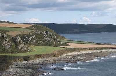
Relative sea-level is complicated. It is measured from some fixed point in the sediment pile, not a fixed point in the earth. So if, for example, global sea-level (eustasy) stays constant but there is local subsidence at a fault, say, then we can say that relative sea-level has increased. Another common cause is isostatic rebound during interglacials, causing a fall in relative sea-level and a seaward regression of the coastline. Because the system didn't build out into the sea by itself, this is sometimes called a forced regression. Here's a nice example of a raised beach formed this way, from Langerstone Point, near Prawle in Devon, UK:

Image: Tony Atkin, licensed under CC-BY-SA-2.0. From Wikimedia Commons

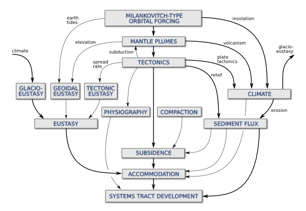
Two weeks ago I wrote about some of the factors affecting relative sea-level, and the scales on which those processes operate. Before that, I had mentioned my undergraduate fascination with Milankovitch cyclicity and its influence on a range of geological processes. Complexity and interaction were favourite subjects of mine, and I built on this a bit in my graduate studies. To try to visualize some of the connectedness of the controls on sea-level, I drew a geophantasmagram that I still refer to occasionally:

Accommodation refers to the underwater space available for sediment deposition; it is closely related to relative sea-level. The end of the story, at least as far as gross stratigraphy is concerned, is the development of stratigraphic package, like a shelf-edge delta or a submarine fan. Systems tracts is just a jargon term for these packages when they are explicitly related to changes in relative sea-level. 

I am drawn to making diagrams like this; I like mind-maps and other network-like graphs. They help me think about complex systems. But I'm not sure they always help anyone other than the creator; I know I find others' efforts harder to read than my own. But if you have suggestions or improvements to offer, I'd love to hear from you.

Scales of sea-level change

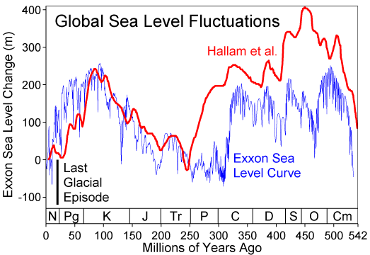
Relative sea-level curve for the PhanerozoicClick to read about sea level on Wikipedia. Image prepared by Robert Rohde and licensed for public use under CC-BY-SA.Sea level changes. It changes all the time, and always has (right). It's well known, and obvious, that levels of glaciation, especially at the polar ice-caps, are important controls on the rate and magnitude of changes in global sea level. Less intuitively, lots of other effects can play a part: changes in mid-ocean ridge spreading rates, the changing shape of the geoid, and local tectonics.

A recent paper in Science by Petersen et al (2010) showed evidence for mantle plumes driving the cyclicity of sedimentary sequences. This would be a fairly local effect, on the order of tens to hundreds of kilometres. This is important because some geologists believe in the global correlatability of these sequences. A fanciful belief in my view—but that's another story.

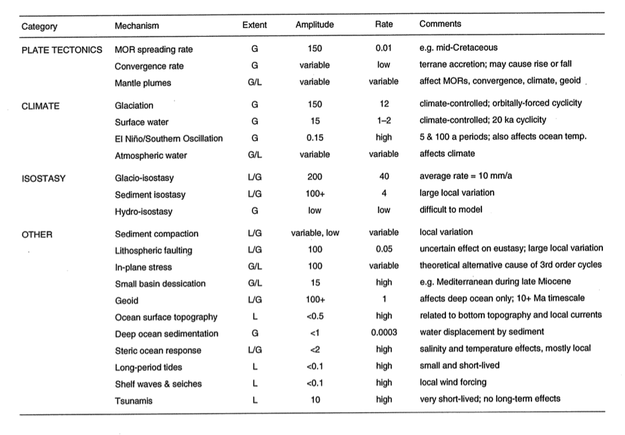
The paper reminded me of an attempt I once made to catalog the controls on sea level, from long-term global effects like greenhouse–icehouse periods, to short-term local effects like fault movement. I made the table below. I think most of the data, perhaps all of it, were from Emery and Aubrey (1991). It's hard to admit, because I don't feel that old, but this is a rather dated publication now; I think it's solid enough for the sort of high-level overview I am interested in. 

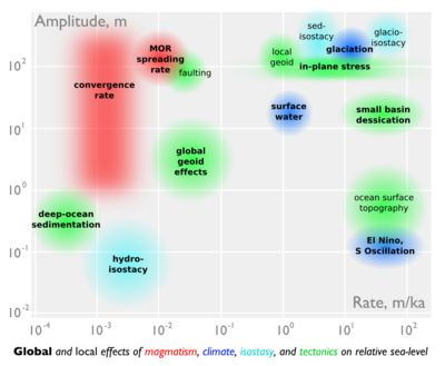
After last week's doodling, the table inspired me to try another scale-space cartoon. I put amplitude on the y-axis, rate on the x-axis. Effects with global reach are in bold, those that are dominantly local are not. The rather lurid colours represent different domains: magmatic, climatic, isostatic, and (in green) 'other'. The categories and the data correspond to the table.
Infographic: scales of sea level changeIt is interesting how many processes are competing for that top right-hand corner: rapid, high-amplitude sea level change. Clearly, those are the processes we care about most as sequence stratigraphers, but also as a society struggling with the consequences of our energy addiction.

References
Emery, K & D Aubrey (1991). Sea-levels, land levels and tide gauges. Springer-Verlag, New York, 237p.
Petersen, K, S Nielsen, O Clausen, R Stephenson & T Gerya (2010). Small-scale mantle convection produces stratigraphic sequences in sedimentary basins. Science 329 (5993) p 827–830, August 2010. DOI: 10.1126/science.1190115