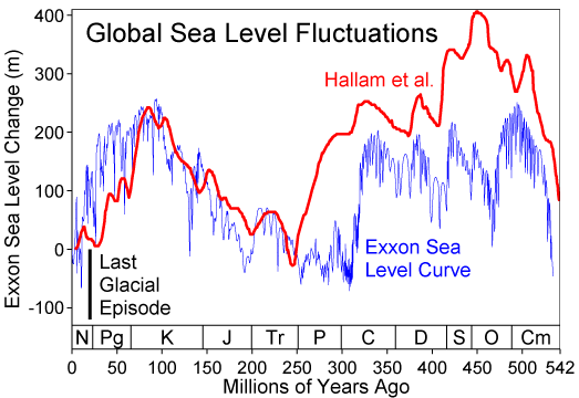
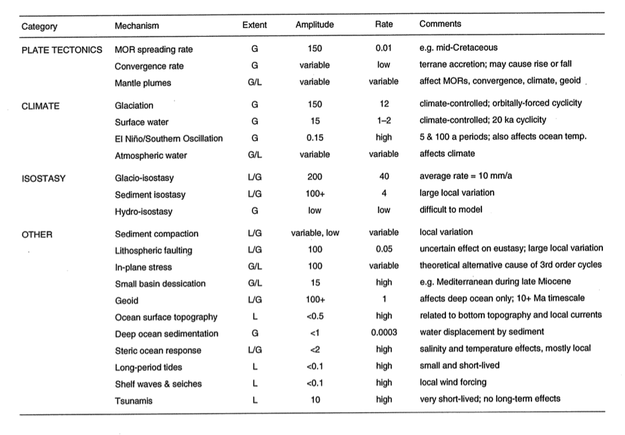
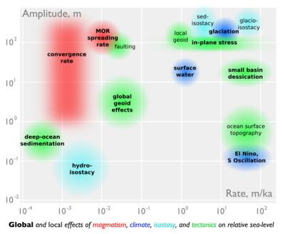
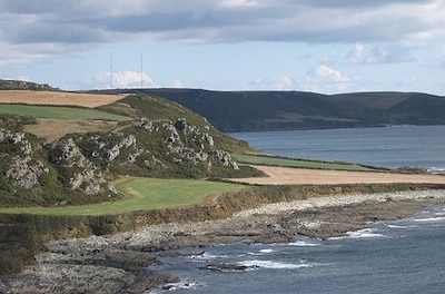
What is AVO?

I used to be a geologist (but I'm OK now). When I first met seismic data, I took the reflections and geometries quite literally. The reflections come from geology, so it seems reasonable to interpret them as geology. But the reflections are waves, and waves are slippery things: they have to travel through kilometres of imperfectly known geology; they can interfere and diffract; they emanate spherically from the source and get much weaker quickly. This section from the Rockall Basin in the east Atlantic shows this attenuation nicely, as well as spectacular echo reflections from the ocean floor called multiples:

Rockall seismic
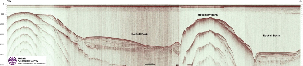
Data from the Virtual Seismic Atlas, contributed by the British Geological Survey.

Impedance is the product of density and velocity. Despite the complexity of seismic reflections, all is not lost. Even geologists interpreting seismic know that the strength of seismic reflections can have real, quantitative, geological meaning. For example, amplitude is related to changes in acoustic impedance Z, which is equal to the product of bulk density ρ and P-wave velocity V, itself related to lithology, fluid, and porosity.

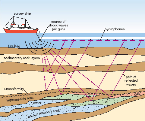
Flawed cartoon of a marine seismic survey. OU, CC-BY-SA-NC.

But when the amplitude versus offset (AVO) behaviour of seismic reflections gets mentioned, most non-geophysicists switch off. If that's your reaction too, don't be put off by the jargon, it's really not that complicated.

The idea that we collect data from different angles is not complicated or scary. Remember the classic cartoon of a seismic survey (right). It's clear that some of the ray paths bounce off the geological strata at relatively small incidence angles, closer to straight down-and-up. Others, arriving at receivers further away from the source, have greater angles of incidence. The distance between the source and an individual receiver is called offset, and is deducible from the seismic field data because the exact location of the source and receivers is always known.

The basic physics behind AVO analysis is that the strength of a reflection does not only depend on the acoustic impedance—it also depends on the angle of incidence. Only when this angle is 0 (a vertical, or zero-offset, ray) does the simple relationship above hold.

Total internal reflection underwater. Source: Mbz1 via Wikimedia Commons.Though it may be unintuitive at first, angle-dependent reflectivity is an idea we all know well. Imagine an ordinary glass window: you can see through it perfectly well when you look straight through it, but when you move to a wide angle it suddenly becomes very reflective (at the so-called critical angle). The interface between water and air is similarly reflective at wide angles, as in this underwater view.

Karl Bernhard Zoeppritz (German, 1881–1908) was the first seismologist to describe the relationship between reflectivity and angle of incidence. In this context, describe means write down the equations for. Not two or three equations, lots of equations.

The Zoeppritz equations are very good model for how seismic waves propagate in the earth. There are some unnatural assumptions about isotropy, total isolation of the interface, and other things, but they work well in many real situations. The problem is that the equations are unwieldy, especially if you are starting from seismic data and trying to extract rock properties—trying to solve the so-called inverse problem. Since we want to be able to do useful things quickly, and since seismic data are inherently approximate anyway, several geophysicists have devised much friendlier models of reflectivity with offset.Google Nexus S

I'll take a look at these more friendly models next time, because I want to tell a bit about how we've implemented them in our soon-to-be-released mobile app, AVO*. No equations, I promise! Well, one or two...

Geophysical stamps 2: Sonic

Recently I bought some stamps on eBay. This isn't something I've done before, but when I saw these stamps I couldn't resist their pure geophysical goodness. They are East German stamps from 1980, and they are unusual because they aren't fanciful illustrations, but precise, technical drawings. Last week I described the gravimeter; today it's the turn of a borehole instrument, the sonic tool.

← The 25 pfennig stamp in the series of four shows a sonic tool, complete with the logged data on the left, and a cross-section on the right. Bohrlochmessung means well-logging; Wassererkundung translates as water exploration. The actual size of the stamp is 43 × 26 mm.

The tool has two components: a transmitter and a recevier. It is lowered to the bottom of the target interval and logs data while being pulled up the hole. In its simplest form, an ultrasound pulse (typically 20–40 kHz) is emitted from the transmitter, travels through the formation, and is recorded at the receiver. The interval transit time is recorded continuously, giving the trace shown on left hand side of the stamp. Transit time is measured in µs/m (or µs/ft if you're old-school), and is generally between 160 µs/m and 550 µs/m (or, in terms of velocity, 1800 m/s to 6250 m/s). Geophysicists often use the transit time to estimate seismic velocities; it's important to correct for the phenomenon called dispersion: lower-frequency seismic waves travel more slowly than the high-frequency waves measured by these tools.

Sonic logs are used for all sorts of other things, for example:

  • Predicting the seismic response (when combined with the bulk density log)
  • Predicting porosity, because of the large difference between velocity in fluids vs minerals
  • Predicting pore pressure, an important safety concern and reservoir property
  • Measuring anisotropy, especially due to oriented fractures (important for permeability)
  • Qualitatively predicting lithology, especially coals (slow), salt (4550 m/s), dolomite (fast)

Image credit: National Energy Technology Lab.Modern tools are not all that different from early sonic tools. They measure the same thing, but with better electronics for improved vertical resolution and noise attenuation. The biggest innovations are dipole sonic tools for accurate shear-wave velocities, multi-azimuth tools for measuring anisotropy, high resolution tools, and high-pressure, high-temperature (HPHT) tools.

Another relatively recent advance is reliable sonic-while-drilling tools such as Schlumberger's sonicVISION™ system, the receiver array of which is shown here (for the 6¾" tool).

The sonic tool may be the most diversely useful of all the borehole logging tools. In a totally contrived scenario where I could only run a single tool, it would have to be the sonic, especially if I had seismic data... What would you choose?

Next time I'll look at the 35 pfennig stamp, which shows a surface geophone. 

Geophysical stamps

About a month ago I tweeted about some great 1980 East German stamps I'd seen on eBay. I impulsively bought them and they arrived a couple of weeks ago. I thought I'd write a bit about them and the science that inspired them. This week: Gravimeter.

East Germany in 1980 was the height of 'consumer socialism' under Chairman & General Secretary Eric Honecker. Part of this movement was a new appreciation for economic growth, and the role of science and technology in the progress of society. Putting the angsts and misdeeds of the Cold War to one side, perhaps these stamps reflect the hopes for modernity and prosperity.

← The 20 pfennig stamp from the set of four 1980 stamps from the German Democratic Republic (Deutsche Demokratische Republik). The illustration shows a relative gravimeter, the profile one might expect over a coal field (top), and a cross section through a coal deposit. Braunkohlenerkundung translates roughly as brown coal survey. Brown coal is lignite, a low-grade, low maturity coal.

There are two types of gravimeter: absolute and relative. Absolute gravimeters usually time the free-fall of a mass in a vacuum. The relative gravimeter is also a simple instrument. It must be level to measure the downward force, hence the adjustable legs. Inside the cylinder, a reference body called a proof mass is held by a spring and an electrostatic restoring force. If the gravitational force on the mass changes, the electrostatic force required to restore its position indicates the change in the gravitational field.

Fundamentally, all gravimeters measure acceleration due to gravity. Surprisingly, geophysicists do not generally use SI units, but the CGS system (centimetre–gram–second system). Thus the standard reporting units for gravimetry are not m/s2 but cm/s2, or gals (sometimes known as galileos, symbol Gal). In this system, the acceleration due to gravity at the earth's surface is approximately 980 Gal. Variations due to elevation and subsurface geology are measured in mGal or even µGal.

Image credit: David Monniaux, from commons.wikimedia.org, licensed under CC-BY-SA

Some uses for gravimeters:

  • Deep crustal structure (given the density of the crust)
  • Mineral exploration (for example, low gravity due to coal, as shown on the stamp)
  • Measuring peak ground acceleration due to natural or induced seismicity
  • Geodesic measurement, for example in defining the geoid and reference ellipsoid
  • Calibration and standards in metrology

Modern relative gravimeters use the same basic engineering, but of course has much better sensitivity, smaller errors, improved robustness, remote operation, and a more user-friendly digital interface. Vibrational noise suppression is also quite advanced, with physical isolation and cunning digital signal processing algorithms. The model shown here is the Autograv CG-5 from Scintrex in Concord, Ontario, Canada. It's designed for portability and ease of use.

Have you ever wielded a gravimeter? I've never met one face to face, but I love tinkering with precision instruments. I bet they pop up on eBay occasionally...

Next time I'll look at the the 25 pfennig stamp, which depicts a sonic borehole  tool.

The core of the conference

Andrew Couch of Statoil answering questions about his oil sands core, standing in front of a tiny fraction of the core collection at the ERCBToday at the CSPG CSEG CWLS convention was day 1 of the core conference. This (unique?) event is always well attended and much talked-about. The beautiful sunshine and industry-sponsored lunch today helped (thanks Weatherford!).

One reason for the good turn-out is the incredible core research facility here in Calgary. This is the core and cuttings storage warehouse and lab of the Energy Resources Conservation Board, Alberta's energy regulator. I haven't been to a huge number of core stores around the world, but this is easily the largest, cleanest, and most efficient one I have visited. The picture gives no real indication of the scale: there are over 1700 km of core here, and cuttings from about 80 000 km of drilling. If you're in Calgary and you've never been, find a way to visit. 

Ross Kukulski of the University of Calgary is one of Stephen Hubbard's current MSc students. Steve's students are consistently high performers, with excellent communication and drafting skills; you can usually spot their posters from a distance. Ross is no exception: his poster on the stratigraphic architecture of the Early Cretaceous Monach Formation of NW Alberta was a gem. Ross has integrated data from about 30 cores, 3300 (!) well logs, and outcrop around Grand Cache. While this is a fairly normal project for Alberta, I was impressed with the strong quantitative elements: his provenance assertions were backed up with Keegan Raines' zircon data, and channel width interpretation was underpinned by Bridge & Tye's empirical work (2000; AAPG Bulletin 84).

The point bar in Willapa Bay where Jesse did his coring. Image from Google Earth. Jesse Schoengut is a MSc student of Murray Gingras, part of the ichnology powerhouse at the University of Alberta. The work is an extension of Murray's long-lived project in Willapa Bay, Washington, USA. Not only had the team collected vibracore along a large point bar, but they had x-rayed these cores, collected seismic profiles across the tidal channel, and integrated everything into the regional dataset of more cores and profiles. The resulting three-dimensional earth model is helping solve problems in fields like the super-giant Athabasca bitumen field of northeast Alberta, where the McMurray Formation is widely interpreted to be a tidal estuary somewhat analogous to Willapa. 

Greg Hu of Tarcore presented his niche business of photographing bitumen core, and applying image processing techniques to complement and enhance traditional core descriptions and analysis. Greg explained that unrecovered core and incomplete sampling programs result in gaps and depth misalignment—a 9 m core barrel can have up to several metres of lost core which can make integrating core information with other subsurface information intractable. To help solve this problem, much of Tarcore's work is depth-correcting images. He uses electrical logs and FMI images to set local datums on centimetre-scale beds, mud clasts, and siderite nodules. Through color balancing, contrast stretching, and image analysis, shale volume (a key parameter in reservoir evaluation) can be computed from photographs. This approach is mostly independent of logs and offers much higher resolution.

It's awesome how petroleum geologists are sharing so openly at this core workshop, and it got us thinking: what would a similar arena look like for geophysics or petrophysics? Imagine wandering through a maze of 3D seismic volumes, where you can touch, feel, ask, and learn.

Don't miss our posts from day 1 of the convention, and from days 2 and 3.

Cracks, energy, and nanoseismic

Following on from our post on Monday, here are some presentations that caught our attention on days 2 and 3 at the CSPG CSEG CWLS convention this week in Calgary. 

On Tuesday, Eric von Lunen of Nexen chose one of the more compelling titles of the conference: What do engineers need from geophysicists in shale resource plays? Describing some of the company's work in the Horn River sub-basin, he emphasized the value of large, multi-faceted teams of subsurface scientists, including geochemists, geologists, geophysicists, petrophysicists, and geo-mechanics. One slightly controversial assertion: Nexen interprets less than 20% of the fractures as vertical, and up to 40% as horizontal. 

Jon Olson is Associate Professor at University of Texas at Austin, shared some numerical modeling and physical experiments that emphasized the relevance of subcritical crack indices for unconventional reservoir exploitation. He presented the results of a benchtop hydrofracking experiment on a cubic foot of gyprock. By tinting frac fluids with red dye, Jon is able to study the fracture patterns directly by slicing the block and taking photographs. It would be curious to perform micro-micro-seismic (is that nanoseismic?) experiments, to make a more complete small-scale analog.

Shawn Maxwell of Schlumberger is Mr Microseismic. We're used to thinking of the spectrum of a seismic trace; he showed the spectrum of a different kind of time series, the well-head pressure during a fracture stimulation. Not surprisingly, most of the energy in this spectrum is below 1 Hz. What's more, if you sum the energy recorded by a typical microseismic array, it amounts to only one millionth of the total energy pumped into the ground. The deficit is probably aseismic, at least certainly outside the seismic band (about 5 Hz to 200 Hz on most jobs). Where is the rest of the pumped energy? Some sinks are: friction losses in the pipe, friction losses in the reservoir, heat, etc.

Image of Horn River shale is licensed CC-BY-SA, from Qyd on Wikimedia Commons. 

Noise, sampling, and the Horn River Basin

Some highlights from day 1 of GeoCon11, the CSPG CSEG CWLS annual convention in Calgary.

Malcolm Lansley of Sercel, with Peter Maxwell of CGGVeritas, presented a fascinating story of a seismic receiver test in a Maginot Line bunker in the Swiss Alps. The goal was to find one of the quietest places on earth to measure the sensitivity to noise at very low frequencies. The result: if signal is poor then analog geophones outperform MEMS accelerometers in the low frequency band, but MEMS are better in high signal:noise situations (for example, if geological contrasts are strong).

Click for the reportWarren Walsh and his co-authors presented their work mapping gas in place for the entire Horn River Basin of northeast British Columbia, Canada. They used a stochastic approach to simulate both free gas (held in the pore space) and adsorbed gas (bound to clays and organic matter). The mean volume: 78 Tcf, approximately the same size as the Hugoton Natural Gas Area in Kansas, Texas, and Oklahoma. Their report (right) is online

RECON Petrotechnologies showed results from an interesting physical experiment to establish the importance of well-log sample rate in characterizing thin beds. They constructed a sandwich of gyprock, between slices of aluminium and magnesium, then pulled a logging tool through a hole in the middle of the sandwich. An accurate density measurement in a 42-cm thick slice of gyprock needed 66 samples per metre, much higher than the traditional 7 samples per metre, and double the so-called 'high resolution' rate of 33 samples per metre. Read their abstract

Carl Reine at Nexen presented Weighing in on seismic scale, exploring the power law relationship of fracture lengths in Horn River shales. He showed that the fracture system has no characteristic scale, and fractures are present at all lengths. Carl used two independent seismic techniques for statistically characterizing fracture lengths and azimuths, which he called direct and indirect. Direct fault picking was aided by coherency (a seismic attribute) and spectral decomposition; indirect fault picking used 3D computations of positive and negative curvature. Integrating these interpretations with borehole and microseismic data allowed him to completely characterize fractures in a reservoir model. (See our post about crossing scales in interpretation.)

Evan and Matt are tweeting from the event, along with some other attendees; follow the #geocon11 hashtag to get the latest.


Seeing red

Temperature is not often a rock property given a lot of attention by geoscientists. Except in oil sands. Bitumen is a heavily biodegraded oil greater than 10 000 cP and less than 10˚API. It is a viscoelastic solid at room temperature, and flows only when sufficiently heated. Operators inject steam (through a process called SAGD), as opposed to hot water, because steam carrys a large portion of its energy as latent heat. When steam condenses against the chamber walls, it transfers heat into the surrounding reservoir. This is akin to the pain you'd feel when you place your hand over a pot of rolling water.

This image is a heat map across 3 well pairs (green dots) at the Underground Test Facility (UTF) in the Early Cretaceous McMurray Formation in the Athabasca oil sands of Alberta. This data is from downhole thermocouple measurements, shown in white dots, the map was made by doing a linear 2D interpolation.

Rather than geek out on the physics and processes taking place, I'd rather talk about why I think this is a nifty graphic.

What I like about this figure

Colour is intiutive – Blue for cold, red for hot, it doesn't get much more intuitive than that. A single black contour line delineates the zone of stable steam and a peripheral zone being heated.  

Unadulterated interpolation – There are many ways of interpolating or filling-in where there is no data. In this set, the precision of each measurement is high, within a degree or two, but the earth is sampled irregularly. There is much higher sampling in the vertical direction than the x,y direction, and this presents, somewhat unsightly, as horizontal edges on the interpolated colours. To smooth the interpolation, or round its slightly jagged edges would, in my opinion, degrade the information contained in the graphic. It's a display of the sparseness of the measurements. 

Sampling is shown – You see exactly how many points make up the data set. Fifteen thermocouples in each of 7 observation wells. It makes the irregularities in the contours okay, meaningful even. I wouldn’t want to smooth it. I think map makers and technical specialists too readily forget about where their data comes from. Recognize the difference between hard data and interpolation, and recognize the difference between observation and interpretation.

Sampling is scale – Imagine what this image would look like if we took the first, third, fifth, and seventh observation well away. Our observations and thus physical interpretation would be dramatically different. Every data point is accurate, but resolution depends on sample density.

Layers of context – Visualizing data enables heightened interpretation. Interpreting the heated zone is a simply a temperature contour (isotherm). Even though this is just a heat map, you can infer that one steam chamber is isolated, and two have joined into one another. Surely, more can be understood by adding more context, by integrating other subsurface observations.

In commercial scale oil sands operations, it is rare to place observation wells so close to each other. But if we did, and recorded the temperature continuously, would we even need time lapse seismic at all? (see right) 

If you are making a map or plot of any kind, I encourage you to display the source data. Both its location and its value. It compels the viewer to ask questions like, Can we make fewer measurements in the next round? Do we need more? Can we drill fewer observation wells and still infer the same resolution? Will this cost reduction change how we monitor the depletion process?

What changes sea-level?

Relative sea-level is complicated. It is measured from some fixed point in the sediment pile, not a fixed point in the earth. So if, for example, global sea-level (eustasy) stays constant but there is local subsidence at a fault, say, then we can say that relative sea-level has increased. Another common cause is isostatic rebound during interglacials, causing a fall in relative sea-level and a seaward regression of the coastline. Because the system didn't build out into the sea by itself, this is sometimes called a forced regression. Here's a nice example of a raised beach formed this way, from Langerstone Point, near Prawle in Devon, UK:

Image: Tony Atkin, licensed under CC-BY-SA-2.0. From Wikimedia Commons

Two weeks ago I wrote about some of the factors affecting relative sea-level, and the scales on which those processes operate. Before that, I had mentioned my undergraduate fascination with Milankovitch cyclicity and its influence on a range of geological processes. Complexity and interaction were favourite subjects of mine, and I built on this a bit in my graduate studies. To try to visualize some of the connectedness of the controls on sea-level, I drew a geophantasmagram that I still refer to occasionally:

Accommodation refers to the underwater space available for sediment deposition; it is closely related to relative sea-level. The end of the story, at least as far as gross stratigraphy is concerned, is the development of stratigraphic package, like a shelf-edge delta or a submarine fan. Systems tracts is just a jargon term for these packages when they are explicitly related to changes in relative sea-level. 

I am drawn to making diagrams like this; I like mind-maps and other network-like graphs. They help me think about complex systems. But I'm not sure they always help anyone other than the creator; I know I find others' efforts harder to read than my own. But if you have suggestions or improvements to offer, I'd love to hear from you.

Shattering shale

In shale gas exploration, one of the most slippery attributes we are interested in is fracability. The problem is that the rocks we study have different compositions and burial histories, so it's hard to pin down the relative roles of intrinsic rock properties and extrinsic stress states. Glass could be considered an end member for brittleness, and it has fairly uniform elastic parameters and bulk composition (it's amorphous silica). Perhaps we can learn something about the role of stresses by looking more closely at how glass fractures. 

The mechanics of glass can be characterized by two aspects: how it's made, and how it breaks.

Annealed glass is made by pouring molten glass onto a thin sheet of tin. Upon contact, the tin melts allowing for two perfectly smooth and parallel surfaces. The glass is cooled slowly so that stress irregularities dissipate evenly throughout, reducing local weak points. This is ordinary glass, as you might find in a mirror.

Tempered glass is made by heating annealed glass to near its softening point, about 720˚C, and then quickly cooling it by quenching with air jets. The exterior surface shrinks, freezing it into compression, while the soft interior of the glass gets pulled out by tensional forces as it freezes (diagram). 

How glass is made is directly linked to how it breaks. Annealed glass is weaker, and breaks into sparse splinters. The surface of tempered glass is stronger, and when it breaks, it breaks catastrophically; the interior tensional energy releases cracks from the inside out.

A piece of tempered glass is 4-6 times stronger than a piece of annealed glass with the same elastic properties, composition, density and dimensions. This means it looks almost identical but requires much more stress to break. Visually and empirically, it is not easy to tell the difference between annealed and tempered glass. But when you break it, the difference is obvious. So here, for two very brittle materials, with all else being equal, the stress state plays the dominant role in determining the mode of failure.

Because natural permeability is so low in fine grained rocks, production companies induce artificial fractures to connect flow pathways to the wellbore. The more surface area exposed, the more methane will be liberated.

If we are trying to fracture-stimulate shale to get at the molecules trapped inside, we would clearly prefer shale that shatters like tempered glass. The big question is: how do we explore for shale like this?

One approach is to isolate parameters such as natural fractures, anisotropy, pore pressure, composition, and organic content and study their independent effects. In upcoming posts, we'll explore the tools and techniques for measuring these parameters across scale space for characterizing fracability. 

Scales of sea-level change

Relative sea-level curve for the PhanerozoicClick to read about sea level on Wikipedia. Image prepared by Robert Rohde and licensed for public use under CC-BY-SA.Sea level changes. It changes all the time, and always has (right). It's well known, and obvious, that levels of glaciation, especially at the polar ice-caps, are important controls on the rate and magnitude of changes in global sea level. Less intuitively, lots of other effects can play a part: changes in mid-ocean ridge spreading rates, the changing shape of the geoid, and local tectonics.

A recent paper in Science by Petersen et al (2010) showed evidence for mantle plumes driving the cyclicity of sedimentary sequences. This would be a fairly local effect, on the order of tens to hundreds of kilometres. This is important because some geologists believe in the global correlatability of these sequences. A fanciful belief in my view—but that's another story.

The paper reminded me of an attempt I once made to catalog the controls on sea level, from long-term global effects like greenhouse–icehouse periods, to short-term local effects like fault movement. I made the table below. I think most of the data, perhaps all of it, were from Emery and Aubrey (1991). It's hard to admit, because I don't feel that old, but this is a rather dated publication now; I think it's solid enough for the sort of high-level overview I am interested in. 

After last week's doodling, the table inspired me to try another scale-space cartoon. I put amplitude on the y-axis, rate on the x-axis. Effects with global reach are in bold, those that are dominantly local are not. The rather lurid colours represent different domains: magmatic, climatic, isostatic, and (in green) 'other'. The categories and the data correspond to the table.
Infographic: scales of sea level changeIt is interesting how many processes are competing for that top right-hand corner: rapid, high-amplitude sea level change. Clearly, those are the processes we care about most as sequence stratigraphers, but also as a society struggling with the consequences of our energy addiction.

References
Emery, K & D Aubrey (1991). Sea-levels, land levels and tide gauges. Springer-Verlag, New York, 237p.
Petersen, K, S Nielsen, O Clausen, R Stephenson & T Gerya (2010). Small-scale mantle convection produces stratigraphic sequences in sedimentary basins. Science 329 (5993) p 827–830, August 2010. DOI: 10.1126/science.1190115