The order of stratigraphic sequences

Much of stratigraphic interpretation depends on a simple idea:

Depositional environments that are adjacent in a geographic sense (like the shoreface and the beach, or a tidal channel and tidal mudflats) are adjacent in a stratigraphic sense, unless separated by an unconformity.

Usually, geologists are faced with only the stratigraphic picture, and are challenged with reconstructing the geographic picture.

One interpretation strategy might be to look at which rocks tend to occur together in the stratigraphy. The idea is that rock types tend to be associated with geographic environments — maybe fine sand on the shoreface, coarse sand on the beach; massive silt in the tidal channel, rhythmically laminated mud in the mud-flats. Since if two rocks tend to occur together, their environments were probably adjacent, we can start to understand associations between the rock types, and thus piece together the geographic picture.

So which rock types tend to occur together, and which juxtapositions are spurious — perhaps the result of allocyclic mechanisms like changes in relative sea-level, or sediment supply? To get at this question, some stratigraphers turn to Markov chain analysis.

What is a Markov chain?

Markov chains are sequences of events, or states, resulting from a Markov process. Here’s how Wikipedia describes a Markov process:

A stochastic process that satisfies the Markov property (sometimes characterized as “memorylessness”). Roughly speaking, a process satisfies the Markov property if one can make predictions for the future of the process based solely on its present state just as well as one could knowing the process’s full history, hence independently from such history; i.e., conditional on the present state of the system, its future and past states are independent.

So if we believe that a stratigraphic sequence (I’m using ‘sequence’ here in the most general sense) can be modeled by a process like this — i.e. that its next state depends substantially on its present state — then perhaps we can model it as a Markov chain.

For example, we might have a hunch that we can model a shallow marine system as a sequence like:

offshore mudstone > lower shoreface siltstone > upper shoreface sandstone > foreshore sandstone

Then we might expect to see these transitions occur more often than other, non-successive transitions. In other words — if we compare the transition frequencies we observe to the transition frquencies we would expect from a random sequence of the same beds in the same proportions, then autocyclic or genetic transitions might happen unusually frequently.

The Powers & Easterling method

Several workers have gone down this path. The standard approach seems to be that of Powers & Easterling (1982). Here are the steps they describe:

  • Count the upwards transitions for each rock type. This results in a matrix of counts. Here’s the transition frequency matrix for the example used in the Powers & Easterling paper, in turn taken from Gingerich (1969):

 
data = [[ 0, 37,  3,  2],
        [21,  0, 41, 14],
        [20, 25,  0,  0],
        [ 1, 14,  1,  0]]
  • Compute the expected counts by an iterative process, which usually converges in a few steps. The expected counts represent what Goodman (1968) called a ‘quasi-independence’ model — a random sequence:

 
array([[ 0. , 31.3,  8.2,  2.6],
       [31.3,  0. , 34.1, 10.7],
       [ 8.2, 34. ,  0. ,  2.8],
       [ 2.6, 10.7,  2.8,  0. ]])
  • Now we can compare our observed frequencies with the expected ones in two ways. First, we can inspect the \(\chi^2\) statistic, and compare it with the \(\chi^2\) distribution, given the degrees of freedom (5 in this case). In this example, it’s 35.7, which is beyond the 99.999th percentile of the chi-squared distribution. This rejects the hypothesis of quasi-independence. In other words: the succession appears to be organized. Phew!

  • Secondly, we can compute a matrix of so-called normalized differences. This lets us compare the observed and expected data. By calculating Z-scores, which are approximately normally distributed; since 95% of the distribution falls between −2 and +2, any value greater in magnitude than 2 is ‘fairly unusual’, in the words of Powers & Easterling. In the example, we can see that the large number of transitions from C (third row) to A (first column) is anomalous:


array([[ 0. ,  1. , -1.8, -0.3],
       [-1.8,  0. ,  1.2,  1. ],
       [ 4.1, -1.6,  0. , -1.7],
       [-1. ,  1. , -1.1,  0. ]])
powers_easterling_normdiff.png
  • The normalized difference matrix can also be interpreted as a directed graph, indicating the ‘strengths’ of the connections (edges) between rock types (nodes):

powers_easterling_graph.png

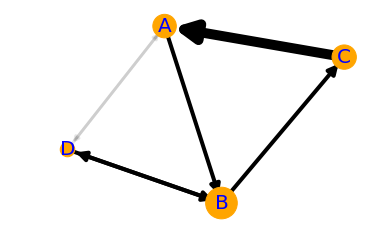
It would be all too easy to over-interpret this graph — B and D seem to go together, as do A and C, and C tends to pass into A, which tends to pass into a B/D system before passing back into C — and one could get carried away. But as a complement to sedimentological interpretation, knowledge of processes and the succession in hand, perhaps inspecting Markov chains can help understand the stratigraphic story.

One last thing… there is another use for Markov chains. We can also use the model to produce stochastic realizations of stratigraphy. These will share the same statistics as the original data, but are otherwise quite random. Here are 20 random beds generated from our model:

 
'ABABCBABABCABDABABCA'

The code to build your own Markov chains is all in this notebook. It’s very much a work in progress. Eventually I hope to merge it into the striplog library, but for now it’s a ‘minimum viable product’. Stay tuned for more on striplog.

Open In Colab   ⇐   Launch the notebook right here in your browser!


References

Gingerich, PD (1969). Markov analysis of cyclic alluvial sediments. Journal of Sedimentary Petrology, 39, p. 330-332. https://doi.org/10.1306/74D71C4E-2B21-11D7-8648000102C1865D

Goodman, LA (1968), The analysis of cross-classified data: independence, quasi-independence, and interactions in contingency tables with or without missing entries. Journal of American Statistical Association 63, p. 1091-1131. https://doi.org/10.2307/2285873

Powers, DW and RG Easterling (1982). Improved methodology for using embedded Markov chains to describe cyclical sediments. Journal of Sedimentary Petrology 52 (3), p. 0913-0923. https://doi.org/10.1306/212F808F-2B24-11D7-8648000102C1865D

White magic: calibrating seismic attributes

This post is part of a series on seismic attributes; the previous posts were...

  1. An attribute analysis primer
  2. Attribute analysis and statistics

Last time, I hinted that there might be a often-overlooked step in attribute analysis:

Calibration is a gaping void in many published workflows. How can we move past "that red blob looks like a point bar so I drew a line around it in PowerPoint" to "there's a 70% chance of finding reservoir quality sand at that location"?

Why is this step such a 'gaping void'? A few reasons:

  • It's fun playing with attributes, and you can make hundreds without a second thought. Some of them look pretty interesting, geological even. "That looks geological" is, however, not an attribute calibration technique. You have to prove it.
  • Nobody will be around when we find out the answer. There's a good chance that well will never be drilled, but when it is, you'll be on a different project, in a different company, or have left the industry altogether and be running a kayak rental business in Belize.
  • The bar is rather low. The fact that many published examples of attribute analysis include no proof at all, just a lot of maps with convincing-looking polygons on them, and claims of 'better reservoir quality over here'. 

This is getting discouraging. Let's look at an example. Now, it's hard to present this without seeming over-critical, but I know these gentlemen can handle it, and this was only a magazine article, so we needn't make too much of it. But it illustrates the sort of thing I'm talking about, so here goes.

Quoting from Chopra & Marfurt (AAPG Explorer, April 2014), edited slightly for brevity:

While coherence shows the edges of the channel, it gives little indication of the heterogeneity or uniformity of the channel fill. Notice the clear definition of this channel on the [texture attribute — homogeneity].
We interpret [the] low homogeneity feature [...] to be a point bar in the middle of the incised valley (green arrow). This internal architecture was not delineated by coherence.

A nice story, making two claims:

  1. The attribute incompletely represents the internal architecture of the channel.
  2. The labeled feature on the texture attribute is a point bar.

I know explorers have to be optimists, and geoscience is all about interpretation, but as scientists we must be skeptical optimists. Claims like this are nice hypotheses, but you have to take the cue: go off and prove them. Remember confirmation bias, and Feynman's words:

The first principle is that you must not fool yourself — and you are the easiest person to fool.

The twin powers

Making geological predictions with seismic attribute analysis requires two related workflows:

  1. Forward modeling — the best way to tune your intuition is to make a cartoonish model of the earth (2D, isotropic, homogeneous lithologies) and perform a simplified seismic experiment on it (convolutional, primaries only, noise-free). Then you can compare attribute behaviour to the known model.
  2. Calibration — you are looking for an explicit, quantitative relationship between a physical property you care about (porosity, lithology, fluid type, or whatever) and a seismic attribute. A common way to show this is with a cross-plot of the seismic amplitude against the physical property.

When these foundations are not there, we can be sure that one or more bad things will happen:

  • The relationship produces a lot of type I errors (false positives).
  • It produces a lot of type II error (false negatives).
  • It works at some wells and not at others.
  • You can't reproduce it with a forward model.
  • You can't explain it with physics.

As the industry shrivels and questions — as usual — the need for science and scientists, we have to become more stringent, more skeptical, and more rigorous. Doing anything else feeds the confirmation bias of the non-scientific continent. Because it says, loud and clear: geoscience is black magic.


The image is part of the figure from Chopra, S and K Marfurt (2014). Extracting information from texture attributes. AAPG Explorer, April 2014. It is copyright of the Authors and AAPG.

What is AVO-friendly processing?

It's the Geophysics Hackathon next month! Come down to Propeller in New Orleans on 17 and 18 October, and we'll feed you and give you space to build something cool. You might even win a prize. Sign up — it's free!

Thank you to the sponsors, OpenGeoSolutions and Palladium Consulting — both fantastic outfits. Hire them.

AVO-friendly processing gets called various things: true amplitude, amplitude-friendly, and controlled amplitude, controlled phase (or just 'CACP'). And, if you've been involved in any processing jobs you'll notice these phrases get thrown around a lot. But seismic geophysics has a dirty little secret... we don't know exactly what it is. Or, at least, we can't agree on it.

A LinkedIn discussion in the Seismic Data Processing group earlier this month prompted this post:

I can't compile a list of exactly which processes will harm your AVO analysis (can anyone? Has anyone??), but I think I can start a list of things that you need to approach with caution and skepticism:

  • Anything that is not surface consistent. What does that mean? According to Oliver Kuhn (now at Quantec in Toronto):
Surface consistent: a shot-related [process] affects all traces within a shot gather in the same way, independent of their receiver positions, and, a receiver-related [process] affects all traces within a receiver gather in the same way, independent of their shot positions.
  • Anything with a window — spatial or temporal. If you must use windows, make them larger or longer than your areas and zones of interest. In this way, relative effects should be preserved.
  • Anything that puts the flattening of gathers before the accuracy of the data (<cough> trim statics). Some flat gathers don't look flat. (The thumbnail image for this post is from Duncan Emsley's essay in 52 Things.)
  • Anything that is a sort of last resort, post hoc attempt to improve the data — what we might call 'cosmetic' treatments. Things like wavelet stretch correction and spectral shaping are good for structural interpreters, but not for seismic analysts. At the very least, get volumes without them, and convince yourself they did no harm.
  • Anything of which people say, "This should be fine!" but offer no evidence.

Back to my fourth point there... spectral shaping and wavelet stretch correction (e.g. this patented technique I was introduced to at ConocoPhillips) have been the subject of quite a bit of discussion, in my experience. I don't know why; both are fairly easy to model, on the face of it. The problem is that we start to get into the sticky question of what wavelets 'see' and what's a wavelet anyway, and hang on a minute why does seismic reflection even work? Personally, I'm skeptical, especially as we get more used to, and better at, looking at spectral decompositions of stacked and pre-stack data.

Divergent paths

I have seen people use seismic data with very different processing paths for structural interpretation and for AVO analysis. This can happen on long-term projects, where the structural framework depends on an old post-stack migration that was later reprocessed for AVO friendliness. This is a bad idea — you won't be able to put the quantitative results into the structural framework without introducing substantial error.

What we need is a clinical trial of processing algorithms, in which they are tested against a known model like Marmousi, and their effect on attributes is documented. If such studies exist, I'd love to hear about them. Come to think of it, this would make a good topic for a hackathon some day... Maybe Dallas 2016?

Attribute analysis and statistics

Last week I wrote a basic introduction to attribute analysis. The post focused on the different ways of thinking about sampling and intervals, and on how instantaneous attributes have to be interpolated from the discrete data. This week, I want to look more closely at those interval attributes. We'd often like to summarize the attributes of an interval info a single number, perhaps to make a map.

Before thinking about amplitudes and seismic traces, it's worth reminding ourselves about different kinds of average. This table from SubSurfWiki might help... 

A peculiar feature of seismic data. from a statistical point of view, is the lack of the very low frequencies needed to give it a trend. Because of this, it oscillates around zero, so the average amplitude over a window tends to zero — seismic data has a mean value of zero. So not only do we have to think about interpolation issues when we extract attributes, we also have to think about statistics.

Fortunately, once we understand the issue it's easy to come up with ways around it. Look at the trace (black line) below:

The mean is, as expected, close to zero. So I've applied some other statistics to represent the amplitude values, shown as black dots, in the window (the length of the plot):

  • Average absolute amplitude (light green) — treat all values as positive and take the mean.
  • Root-mean-square amplitude (dark green) — tends to emphasize large values, so it's a bit higher.
  • Average energy (magenta) — the mean of the magnitude of the complex trace, or the envelope, shown in grey.
  • Maximum amplitude (blue) — the absolute maximum value encountered, which is higher than the actual sample values (which are all integers in this fake dataset) because of interpolation.
  • Maximum energy (purple) — the maximum value of the envelope, which is higher still because it is phase independent.

There are other statistics besides these, of course. We could compute the median average, or some other mean. We could take the strongest trough, or the maximum derivative (steepest slope). The options are really only limited by your imagination, and the physical relationship with geology that you expect.

We'll return to this series over the summer, asking questions like How do you know what to expect? and Does a physically realistic relationship even matter? 


To view and run the code that I used in creating the figures for this post, grab the iPython/Jupyter Notebook.

An attribute analysis primer

A question on Stack Exchange the other day reminded me of the black magic feeling I used to have about attribute analysis. It was all very meta: statistics of combinations of attributes, with shifted windows and crazy colourbars. I realized I haven't written much about the subject, despite the fact that many of us spend a lot of time trying to make sense of attributes.

Time slices, horizon slices, and windows

One of the first questions a new attribute-analyser has is, "Where should the window be?" Like most things in geoscience: it depends. There are lots of ways of doing it, so think about what you're after...

  • Timeslice. Often the most basic top-down view is a timeslice, because they are so easy to make. This is often where attribute analysis begins, but since timeslices cut across stratigraphy, not usually where it ends.
  • Horizon. If you're interested in the properties of a strong reflector, such as a hard, karsted unconformity, maybe you just want the instantaneous attribute from the horizon itself.
  • Zone. If the horizon was hard to interpret, or is known to be a gradual facies transition, you may want to gather statistics from a zone around it. Or perhaps you couldn't interpret the thing you really wanted, but only that nice strong reflection right above it... maybe you can bootstrap yourself from there. 
  • Interval. If you're interested in a stratigraphic interval, you can bookend it with existing horizons, perhaps with a constant shift on one or both of them.
  • Proportional. If seismic geomorphology is your game, then you might get the most reasonable inter-horizon slices from proportionally slicing in between stratigraphic surface. Most volume interpretation software supports this. 

There are some caveats to simply choosing the stratigraphic interval you are after. Beware of choosing an interval that strong reflectors come into and out of. They may have an unduly large effect on most statistics, and could look 'geological'. And if you're after spectral attributes, do remember that the Fourier transform needs time! The only way to get good frequency resolution is to provide long windows: a 100 ms window gives you frequency information every 10 Hz.

Extraction depends on sample interpolation

When you extract an attribute, say amplitude, from a trace, it's easy to forget that the software has to do some approximation to give you an answer. This is because seismic traces are not continuous curves, but discrete series, with samples typically every 1, 2, or 4 milliseconds. Asking for the amplitude at some arbitrary time, like the point at which a horizon crosses a trace, means the software has to interpolate between samples somehow. Different software do this in different ways (linear, spline, polynomial, etc), and the methods give quite different results in some parts of the trace. Here are some samples interpolated with a spline (black curve) and linearly (blue). The nearest sample gives the 'no interpolation' result.

As well as deciding how to handle non-sampled parts of the trace, we have to decide how to represent attributes operating over many samples. In a future post, we'll give some guidance for using statistics to extract information about the entire window. What options are available and how do we choose? Do we take the average? The maximum? Something else?

There's a lot more to come!

As I wrote this post, I realized that this is a massive subject. Here are some aspects I have not covered today:

  • Calibration is a gaping void in many published workflows. How can we move past "that red blob looks like a point bar so I drew a line around it in PowerPoint" to "there's a 70% chance of finding reservoir quality sand at that location"?
  • This article was about  single-trace attributes at single instants or over static windows. Multi-trace and volume attributes, like semblance, curvature, and spectral decomposition, need a post of their own.
  • There are a million attributes (though only a few that count, just ask Art Barnes) so choosing which ones to use can be a challenge. Criteria range from what software licenses you have to what is physically reasonable.
  • Because there are a million attributes, the art of combining attributes with statistical methods like principal component analysis or multi-linear regression needs a look. This gets into seismic inversion.

We'll return to these ideas over the next few weeks. If you have specific questions or workflows to share, please leave a comment below, or get in touch by email or Twitter.

To view and run the code that I used in creating the figures for this post, grab the iPython/Jupyter Notebook.

The curse of hunting rare things

What are the chances of intersecting features with a grid of cross-sections? I often wonder about this when interpreting 2D seismic data, but I think it also applies to outcrops, or any other transects. I want to know:

  1. If there are only a few of these features, how many should I see?
  2. What's the probability of the lines missing them all? 
  3. Conversely, if I interpret x of them, then how many are there really?
  4. How is the detectability affected by the reliability of the data or my skills?

I used to have a spreadsheet for computing all this stuff, but spreadsheets are dead to me so here's an IPython Notebook :)

An example

I'm interpreting seep locations on 2D data at the moment. So I'm looking for subvertical pipes and chimneys, mud volcanos, seafloor pockmarks and pingos, that sort of thing (see Løseth et al., 2009 for a great overview). Here are some similar features from the Norwegian continental shelf from Hustoft et al., 2010:

Figure 3 from hustoft et al. (2010) showing the 3D expression of some hydrocarbon leakage features in Norway. © The Authors.

As Hustoft et al. show, these can be rather small features — most pockmarks are in the 100–800 m diameter range, so let's call it 500 m. The dataset I have is an orthogonal grid of decent quality 2D lines with a 3 km spacing. The area is about 120,000 km². For the sake of argument (and a forward model), let's imagine there are 120 features I'm interested in — one per 1000 km². Here's a zoomed-in view showing a subset of the problem:

Zoomed-in view of part of my example. A grid of 2D seismic lines, 3 km apart, and randomly distributed features, each 500 m in diameter. If a feature's centre falls inside a grey square, then the feature is not intersected by the data. The grey squa…

Zoomed-in view of part of my example. A grid of 2D seismic lines, 3 km apart, and randomly distributed features, each 500 m in diameter. If a feature's centre falls inside a grey square, then the feature is not intersected by the data. The grey squares are 2.5 km across.

According to my calculations...

  1. Of the 120 features in the area, we expect 37 to be intersected by the data. Of course, some of those intersections might be very subtle, if they are right at the edge of the feature.
  2. The probability of intersecting a given feature is 0.31. There are 120 features, so the probability of the whole dataset intersecting at least one is essentially 1 (certain). That's good! Conversely, the probability of missing them all is effectively 0. (If there were only 5 features, then there'd be about a 16% chance of missing them all.)
  3. Clearly, if I interpret 37 features, there are about 120 in total (that was my a priori). It's a linear relationship, so if I interpret 10 features, I can expect there to be about 33 altogether, and if I see 100 then I can expect that there are almost 330 in total. (I think the probability distribution would be log-normal, but would appreciate others' insights here.)
  4. Reliability? That sounds like a job for Bayes' theorem...

It's far from certain that I will interpret everything the data intersects, for all sorts of reasons:

  • I am human and therefore inconsistent, biased, and fallible.
  • The feature may be cryptic in the section , because of how it was intersected.
  • The data may be poor quality at that point, or everywhere.

Let's assume that if a feature has been intersected by the data, then I have a 75% chance of actually interpreting it. Bayes' theorem tells us how to update the prior probability of 0.31 (for a given feature; point 2 above) to get a posterior probability. Here's the table:

Interpreted Not interpreted
Intersected by a 2D line 28 9
Not intersected by any lines 21 63

What do the numbers mean?

  • Of the 37 intersected features, I interpret 28.
  • I fail to interpret 9 features that are intersected by the data. These are Type II errors, false negatives.
  • I interpret another 21 features which are not real! These are Type I errors: false positives. 
  • Therefore I interpret 48 features, of which only 57% are real. This seems like a lot, but it's a function of my imperfect reliability (75%) and the poor sampling, resulting in a large number of 'missed' features.

Interestingly, my 75% reliability translates into a 57% chance of being right about the existence of a feature. We've seen this effect before — it's the curse of hunting rare things: with imperfect knowledge, we are often wrong


References

Hustoft, S, S Bünz, and J Mienart (2010). Three-dimensional seismic analysis of the morphology and spatial distribution of chimneys beneath the Nyegga pockmark field, offshore mid-Norway. Basin Research 22, 465–480. DOI 10.1111/j.1365-2117.2010.00486.x 

Løseth, H, M Gading, and L Wensaas (2009). Hydrocarbon leakage interpreted on seismic data. Marine & Petroleum Geology 26, 1304–1319. DOI 10.1016/j.marpetgeo.2008.09.008 

Six books about seismic analysis

Last year, I did a round-up of six books about seismic interpretation. A raft of new geophysics books recently, mostly from Cambridge, prompts this look at six volumes on seismic analysis — the more quantitative side of interpretation. We seem to be a bit hopeless at full-blown book reviews, and I certainly haven't read all of these books from cover to cover, but I thought I could at least mention them, and give you my first impressions.

If you have read any of these books, I'd love to hear what you think of them! Please leave a comment. 

Observation: none of these volumes mention compressive sensing, borehole seismic, microseismic, tight gas, or source rock plays. So I guess we can look forward to another batch in a year or two, when Cambridge realizes that people will probably buy anything with 3 or more of those words in the title. Even at $75 a go.


Quantitative Seismic Interpretation

Per Avseth, Tapan Mukerji and Gary Mavko (2005). Cambridge University Press, 408 pages, ISBN 978-0-521-15135-1. List price USD 91, $81.90 at Amazon.com, £45.79 at Amazon.co.uk

You have this book, right?

Every seismic interpreter that's thinking about rock properties, AVO, inversion, or anything beyond pure basin-scale geological interpretation needs this book. And the MATLAB scripts.

Rock Physics Handbook

Gary Mavko, Tapan Mukerji & Jack Dvorkin (2009). Cambridge University Press, 511 pages, ISBN 978-0-521-19910-0. List price USD 100, $92.41 at Amazon.com, £40.50 at Amazon.co.uk

If QSI is the book for quantitative interpreters, this is the book for people helping those interpreters. It's the Aki & Richards of rock physics. So if you like sums, and QSI left you feeling unsatisifed, buy this too. It also has lots of MATLAB scripts.

Seismic Reflections of Rock Properties

Jack Dvorkin, Mario Gutierrez & Dario Grana (2014). Cambridge University Press, 365 pages, ISBN 978-0-521-89919-2. List price USD 75, $67.50 at Amazon.com, £40.50 at Amazon.co.uk

This book seems to be a companion to The Rock Physics Handbook. It feels quite academic, though it doesn't contain too much maths. Instead, it's more like a systematic catalog of log models — exploring the full range of seismic responses to rock properies.

Practical Seismic Data Analysis

Hua-Wei Zhou (2014). Cambridge University Press, 496 pages, ISBN 978-0-521-19910-0. List price USD 75, $67.50 at Amazon.com, £40.50 at Amazon.co.uk

Zhou is a professor at the University of Houston. His book leans towards imaging and velocity analysis — it's not really about interpretation. If you're into signal processing and tomography, this is the book for you. Mostly black and white, the book has lots of exercises (no solutions though).

Seismic Amplitude: An Interpreter's Handbook

Rob Simm & Mike Bacon (2014). Cambridge University Press, 279 pages, ISBN 978-1-107-01150-2 (hardback). List price USD 80, $72 at Amazon.com, £40.50 at Amazon.co.uk

Simm is a legend in quantitative interpretation and the similarly lauded Bacon is at Ikon, the pre-eminent rock physics company. These guys know their stuff, and they've filled this superbly illustrated book with the essentials. It belongs on every interpreter's desk.

Seismic Data Analysis Techniques...

Enwenode Onajite (2013). Elsevier. 256 pages, ISBN 978-0124200234. List price USD 130, $113.40 at Amazon.com. £74.91 at Amazon.co.uk.

This is the only book of the collection I don't have. From the preview I'd say it's aimed at undergraduates. It starts with a petroleum geology primer, then covers seismic acquisition, and seems to focus on processing, with a little on interpretation. The figures look rather weak, compared to the other books here. Not recommended, not at this price.

NOTE These prices are Amazon's discounted prices and are subject to change. The links contain a tag that gets us commission, but does not change the price to you. You can almost certainly buy these books elsewhere. 

SciPy will eat the world... in a good way

We're at the SciPy 2014 conference in Austin, the big giant meetup for everyone into scientific Python.

One surprising thing so far is the breadth of science and computing in play, from astronomy to zoology, and from AI to zero-based indexing. It shouldn't have been surprising, as SciPy.org hints at the variety:

There's really nothing you can't do in the scientific Python ecosystem, but this isn't why SciPy will soon be everywhere in science, including geophysics and even geology. I think the reason is IPython Notebook, and new web-friendly ways to present data, directly from the computing environment to the web — where anyone can see it, share it, interact with it, and even build on it in their own work.

Teaching STEM

In Tuesday's keynote, Lorena Barba, an uber-prof of engineering at The George Washington University, called IPython Notebook the killer app for teaching in the STEM fields. She has built two amazing courses in Notebook: 12 Steps to Navier–Stokes and AeroPython (right), and more are on the way. Soon, perhaps through Jupyter CoLaboratory (launching in alpha today), perhaps with the help of tools like Bokeh or mpld3, the web versions of these notebooks will be live and interactive. Python is already the new star of teaching computer science, web-friendly super-powers will continue to push this.

Let's be extra clear: if you are teaching geophysics using a proprietary tool like MATLAB, you are doing your students a disservice if you don't at least think hard about moving to Python. (There's a parallel argument for OpedTect over Petrel, but let's not get into that now.)

Reproducible and presentable

Can you imagine a day when geoscientists wield these data analysis tools with the same facility that they wield other interpretation software? With the same facility that scientists in other disciplines are already wielding them? I can, and I get excited thinking about how much easier it will be to collaborate with colleagues, document our workflows (for others and for our future selves), and write presentations and papers for others to read, interact with, and adapt for their own work.

To whet your appetite, here's the sort of thing I mean (not interactive, but here's the code)...

If you agree that it's needed, I want to ask: What traditions or skill gaps are in the way of this happening? How can our community of scientists and engineers drive this change? If you disagree, I'd love to hear why.

P is for Phase

Seismic is about acoustic vibration. The archetypal oscillation, the sine wave, describes the displacement y of a point around a circle. You only need three pieces of information to describe it perfectly: the size of the circle, the speed at which it rotates around the circle, and where it starts from expressed as an angle. These quantities are better known as the amplitude, frequency, and phase respectively. These figures show how varying each of them affects the waveform:

So phase describes the starting point as an angle, but notice that this manifests itself as an apparent lateral shift in the waveform. For seismic data, this means a time shift. More on this later. 

What about seismic?

We know seismic signals are not so simple — they are not repetitive oscillations — so why do the words amplitudefrequency and phase show up so often? Aren't these words horribly inadequate?

Not exactly. Fourier's methods allow us to construct (and deconstruct) more complicated signals by adding up a series of sine waves, as long as we get the amplitude, frequency and phase values right for each one of them. The tricky part, and where much of where the confusion lies, is that even though you can place your finger on any point along a seismic trace and read off a value for amplitude, you can't do that for frequency or phase. The information for those are only unlocked through spectroscopy.

Phase shifts or time shifts?

The Ricker wavelet is popular because it can easily be written analytically, and it is comprised of a considerable number of sinusoids of varying amplitudes and frequencies. We might refer to a '20 Hz Ricker wavelet' but really it contains a range of frequencies. The blue curve shows the wavelet with phase = 0°, the purple curve shows the wavelet with a phase shift of π/3 = 60° (across all frequencies). Notice how the frequency content remains unchanged.

So for a seismic reflection event (below), phase takes on a new meaning. It expresses a time offset between the reflection and the maximum value on the waveform. When the amplitude maximum is centered at the reflecting point, it is equally shaped on either side — we call this zero phase. Notice how variations in the phase of the event alter the relative position of the peak and sidelobes. The maximum amplitude of the event at 90° is only about 80% of the amplitude at zero phase. This is why I like to plot traces along with their envelope (the grey lines). The envelope contains all possible phase rotations. Any event whose maximum value does not align with the maximum on the envelope is not zero phase.

Understanding the role of phase in time series analysis is crucial for both data processors aiming to create reliable data, and interpreters who operate under the assertion that subtle variations in waveform shape can be attributed to underlying geology. Waveform classification is a powerful attribute... but how reliable is it?

In a future post, I will cover the concept of instantaneous phase on maps and sections, and some other practical interpretation tips. If you have any of your own, share them in the comments.

Additional reading
Liner, C (2002). Phase, phase, phase. The Leading Edge 21, p 456–7. Abstract online.

L is for Lambda

Hooke's law says that the force F exerted by a spring depends only on its displacement x from equilibrium, and the spring constant k of the spring:

.

We can think of k—and experience it—as stiffness. The spring constant is a property of the spring. In a sense, it is the spring. Rocks are like springs, in that they have some elasticity. We'd like to know the spring constant of our rocks, because it can help us predict useful things like porosity. 

Hooke's law is the basis for elasticity theory, in which we express the law as

stress [force per unit area] is equal to strain [deformation] times a constant

This time the constant of proportionality is called the elastic modulus. And there isn't just one of them. Why more complicated? Well, rocks are like springs, but they are three dimensional.

In three dimensions, assuming isotropy, the shear modulus μ plays the role of the spring constant for shear waves. But for compressional waves we need λ+2μ, a quantity called the P-wave modulus. So λ is one part of the term that tells us how rocks get squished by P-waves.

These mysterious quantities λ and µ are Lamé's first and second parameters. They are intrinsic properties of all materials, including rocks. Like all elastic moduli, they have units of force per unit area, or pascals [Pa].

So what is λ?

Matt and I have spent several hours discussing how to describe lambda. Unlike Young's modulus E, or Poisson's ratio ν, our friend λ does not have a simple physical description. Young's modulus just determines how much longer something gets when I stretch it. Poisson's ratio tells how much fatter something gets if I squeeze it. But lambda... what is lambda?

  • λ is sometimes called incompressibility, a name best avoided because it's sometimes also used for the bulk modulus, K.  
  • If we apply stress σ1 along the 1 direction to this linearly elastic isotropic cube (right), then λ represents the 'spring constant' that scales the strain ε along the directions perpendicular to the applied stress.
  • The derivation of Hooke's law in 3D requires tensors, which we're not getting into here. The point is that λ and μ help give the simplest form of the equations (right, shown for one dimension).

The significance of elastic properties is that they determine how a material is temporarily deformed by a passing seismic wave. Shear waves propagate by orthogonal displacements relative to the propagation direction—this deformation is determined by µ. In contrast, P-waves propagate by displacements parallel to the propagation direction, and this deformation is inversely proportional to M, which is 2µ + λ

Lambda rears its head in seismic petrophysics, AVO inversion, and is the first letter in the acronym of Bill Goodway's popular LMR inversion method (Goodway, 2001). Even though it is fundamental to seismic, there's no doubt that λ is not intuitively understood by most geoscientists. Have you ever tried to explain lambda to someone? What description of λ do you find useful? I'm open to suggestions. 

Goodway, B., 2001, AVO and Lame' constants for rock parameterization and fluid detection: CSEG Recorder, 26, no. 6, 39-60.