The digital well scorecard

In my last post, I ranted about the soup of acronyms that refer to well log curves; a too-frequent book-keeping debacle. This pain, along with others before it, has motivated me to design a solution. At this point all I have is this sketch, a wireframe of should-be software that allows you visualize every bit of borehole data you can think of:

The goal is, show me where the data is in the domain of the wellbore. I don't want to see the data explicitly (yet), just its whereabouts in relation to all other data. Data from many disaggregated files, reports, and so on. It is part inventory, part book-keeping, part content management system. Clear the fog before the real work can begin. Because not even experienced folks can see clearly in a fog.

The scorecard doesn't yield a number or a grade point like a multiple choice test. Instead, you build up a quantitative display of your data extents. With the example shown above, I don't even have to look at the well log to tell you that you are in for a challenging well tie, with the absence of sonic measurements in the top half of the well. 

The people that I showed this to immediately undestood what was being expressed. They got it right away, so that bodes well for my preliminary sketch. Can you imagine using a tool like this, and if so, what features would you need? 

News of the month

Like the full moon, our semi-regular news round-up has its second outing this month. News tips?

New software releases

QGIS, our favourite open source desktop GIS too, moves to v1.8 Lisboa. It gains pattern fills, terrain analysis, layer grouping, and lots of other things.

Midland Valley, according to their June newsletter, will put Move 2013 on the Mac, and they're working on iOS and Android versions too. Multi-platform keeps you agile. 

New online tools

The British Geological Survey launched their new borehole viewer for accessing data from the UK's hundreds of shallow holes. Available on mobile platforms too, this is how you do open data, staying relevant and useful to people.

Joanneum Research, whose talk at EAGE I mentioned, is launching their seismic attributes database seismic-attribute.info as a €6000/year consortium, according to an email we got this morning. Agile* won't be joining, we're too in love with Mendeley's platform, but maybe you'd like to — enquire by email.

Moar geoscience jobs

Neftex, a big geoscience consulting and research shop based in Oxford, UK, is growing. Already with over 80 people, they expect to hire another 50 or so. That's a lot of geologists and geophysicists! And Oxford is a lovely part of the world.

Ikon Science, another UK subsurface consulting and research firm, is opening a Calgary office. We're encouraged to see that they chose to announce this news on Twitter — progressive!

This regular news feature is for information only. We aren't connected with any of these organizations, and don't necessarily endorse their products or services. Except QGIS, which we definitely do endorse, cuz it's awesome. 

News of the month

Our semi-regular news round-up from the greenbelt between geoscience and technology.

OpendTect 4.4

Our favourite volume interpretation tool, OpendTect, moved to version 4.4 in June. It seems to have skipped 4.3 completely, which never made it into a stable release. With the new version come 3 new plug-ins: Seismic Net Pay, Seismic Feature Enhancement, and Computer Log Analysis Software (right)—we're looking forward to playing with that.

The cutting edge of interpretation

A new SEG event aimed especially at quantitative interpreters is coming later this month — the SEG IQ Earth Forum. Have a look at the technical program. Evan will be there, and is looking forward to some great discussion, and finding out more about Statoil's open Gullfaks dataset. On the last day, he will be talking about Agile's workflow for interpreting seismic in geothermal fields... stay tuned.

Geoscience freeware

We read in OilIT that US consultancy Ryder Scott has updated its Reservoir Solutions tools for Excel. These include Volumetrics, QuickLook Economics, Gas Material Balance, and LogWizard. If you try them out, do let us know what you think of them!

New iPad apps

Geoscience is perhaps a little slow picking up on the tablet revolution, but mobile apps are trickling out. We love seeing experiments like Pocket Seis, by Houston-based geoscientist-developer Jacob Foshee. And it's interesting to see what the more established software-makers do on these platforms... we think Landmark's OpenWells Mobile app looks rather tame.

This regular(ish) news feature is for information only. We aren't connected with any of these organizations, and don't necessarily endorse their products or services. Except OpendTect, which we do endorse, cuz it's awesome. The screenshot from CLAS is a low-res fair-use image for illustration only, and copyright of dGB Earth Sciences

More than a blueprint

blueprint_istock.jpg
"This company used to function just fine without any modeling."

My brother, an architect, paraphrased his supervisor this way one day; perhaps you have heard something similar. "But the construction industry is shifting," he noted. "Now, my boss needs to see things in 3D in order to understand. Which is why we have so many last minute changes in our projects. 'I had no idea that ceiling was so low, that high, that color, had so many lights,' and so on."

The geological modeling process is often an investment with the same goal. I am convinced that many are seduced by the appeal of an elegantly crafted digital design, the wow factor of 3D visualization. Seeing is believing, but in the case of the subsurface, seeing can be misleading.

Not your child's sandbox! Photo: R Weller.

Not your child's sandbox! Photo: R Weller.

Building a geological model is fundamentally different than building a blueprint, or at least it should be. First of all, a geomodel will never be as accurate as a blueprint, even after the last well has been drilled. The geomodel is more akin to the apparatus of an experiment; literally the sandbox and the sand. The real lure of a geomodel is to explore and evaluate uncertainty. I am ambivalent about compelling visualizations that drop out of geomodels, they partially stand in the way of this high potential. Perhaps they are too convincing.

I reckon most managers, drillers, completions folks, and many geoscientists are really only interested in a better blueprint. If that is the case, they are essentially behaving only as designers. That mindset drives a conflict any time the geomodel fails to predict future observations. A blueprint does not have space for uncertainty, it's not defined that way. A model, however, should have uncertainty and simplifying assumptions built right in.

Why are the narrow geological assumptions of the designer so widely accepted and in particular, so enthusiastically embraced by the industry? The neglect of science keeping up with technology is one factor. Our preference for simple and quickly understood explanations is another. Geology, in its wondrous complexity, does not conform to such easy reductions.

Despite popular belief, this is not a blueprint.We gravitate towards a single solution precisely because we are scared of the unknown. Treating uncertainty is more difficult that omitting it, and a range of solutions is somehow less marketable than precision (accuracy and precision are not the same thing). It is easier because if you have a blueprint, rigid, with tight constraints, you have relieved yourself from asking what if?

  • What if the fault throw was 20 m instead of 10 m?
  • What if the reservoir was oil instead of water?
  • What if the pore pressure increases downdip?

The geomodelling process should be undertaken for the promise of invoking questions. Subsurface geoscience is riddled with inherent uncertainties, uncertainties that we aren't even aware of. Maybe our software should have a steel-blue background turned on as default, instead of the traditional black, white, or gray. It might be a subconscious reminder that unless you are capturing uncertainty and iterating, you are only designing a blueprint.

If you have been involved with building a geologic model, was it a one-time rigid design, or an experimental sandbox of iteration?

The photograph of the extensional sandbox experiment is used with permission from Roger Weller of Cochise College. Image of geocellular model from the MATLAB Reservoir Simulation Toolbox (MRST) from SINTEF applied mathematics, which has been recently released under the terms of the GNU General public license! The blueprint is © nadla and licensed from iStock. None of these images are subject to Agile's license terms.

The filtered earth

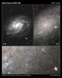
Ground-based image (top left) vs Hubble's image. Click for a larger view. One of the reasons for launching the Hubble Space Telescope in 1990 was to eliminate the filter of the atmosphere that affects earth-bound observations of the night sky. The results speak for themselves: more than 10 000 peer-reviewed papers using Hubble data, around 98% of which have citations (only 70% of all astronomy papers are cited). There are plenty of other filters at work on Hubble's data: the optical system, the electronics of image capture and communication, space weather, and even the experience and perceptive power of the human observer. But it's clear: eliminating one filter changed the way we see the cosmos.

What is a filter? Mathematically, it's a subset of a larger set. In optics, it's a wavelength-selection device. In general, it's a thing or process which removes part of the input, leaving some output which may or may not be useful. For example, in seismic processing we apply filters which we hope remove noise, leaving signal for the interpreter. But if the filters are not under our control, if we don't even know what they are, then the relationship between output and input is not clear.

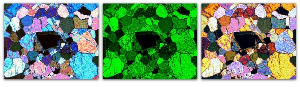
Imagine you fit a green filter to your petrographic microscope. You can't tell the difference between the scene on the left and the one on the right—they have the same amount and distribution of green. Indeed, without the benefit of geological knowledge, the range of possible inputs is infinite. If you could only see a monochrome view, and you didn't know what the filter was, or even if there was one, it's easy to see that the situation would be even worse. 

Like astronomy, the goal of geoscience is to glimpse the objective reality via our subjective observations. All we can do is collect, analyse and interpret filtered data, the sifted ghost of the reality we tried to observe. This is the best we can do. 

What do our filters look like? In the case of seismic reflection data, the filters are mostly familiar: 

  • the design determines the spatial and temporal resolution you can achieve
  • the source system and near-surface conditions determine the wavelet
  • the boundaries and interval properties of the earth filter the wavelet
  • the recording system and conditions affect the image resolution and fidelity
  • the processing flow can destroy or enhance every aspect of the data
  • the data loading process can be a filter, though it should not be
  • the display and interpretation methods control what the interpreter sees
  • the experience and insight of the interpreter decides what comes out of the entire process

Every other piece of data you touch, from wireline logs to point-count analyses, and from pressure plots to production volumes, is a filtered expression of the earth. Do you know your filters? Try making a list—it might surprise you how long it is. Then ask yourself if you can do anything about any of them, and imagine what you might see if you could. 

Hubble image is public domain. Photomicrograph from Flickr user Nagem R., licensed CC-BY-NC-SA. 
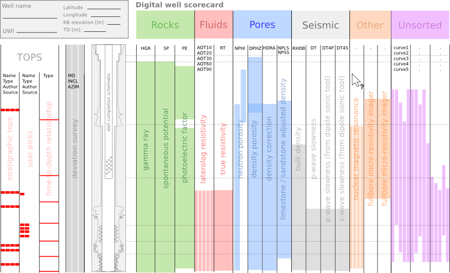
McKelvey's reserves and resources

Vincent McKelvey (right) was chief geologist at the US Geological Survey, and then its director from 1971 until 1977. Rather like Sherman Kent at the CIA, who I wrote about last week, one of his battles was against ambiguity in communication. But rather than worrying about the threat posed by the Soviet Union or North Korea, his concern was the reporting of natural resources in the subsurface of the earth. Today McKelvey's name is associated with a simple device for visualizing levels of uncertainty and risk associated with mineral resources: the McKelvey box.

Here (left) is a modernized version. It helps unravel some oft-heard jargon. The basic idea is that only discovered, commercially-viable deposits get to be called Reserves. Discovered but sub-commercial (with today's technology and pricing) are contingent resources. Potentially producible and viable deposits that we've not yet found are called prospective resources. These are important distinctions, especially if you are a public company or a government.

Over time, this device has been reorganized and subdivided with ever more subtle distinctions and definitions. I was uninspired by the slightly fuzzy graphics in the ongoing multi-part review of reserve reporting in the CSPG Reservoir magazine (Yeo and Derochie, 2011, Reserves and resources series, CSPG Reservoir, starting August 2011). So I decided to draw my own version. To reflect the possiblity that there may yet be undreamt-of plays out there, I added a category for Unimagined resources. One for the dreamers.

You can find the Scalable Vector Graphics file for this figure in SubSurfWiki. If you have ideas about other jargon to add, or ways to represent the uncertainty, please have a go at editing the wiki page, the figure, or drop us a line!