The abstract lead-time problem

On Tuesday I wrote about the generally low quality of abstracts submitted to conferences. In particular, their vagueness and consequent uninterestingness. Three academics pointed out to me that there's an obvious reason.

Brian Romans (Virginia Tech) —

One issue, among many, with conference abstracts is the lead time between abstract submission and presentation (if accepted). AAPG is particularly bad at this and it is, frankly, ridiculous. The conference is >6 months from now! A couple years ago, when it was in Calgary in June, abstracts were due ~9 months prior. This is absurd. It can lead to what you are calling vague abstracts because researchers are attempting to anticipate some of what they will do. People want to present their latest and greatest, and not just recycle the same-old, which leads to some of this anticipatory language.

Chris Jackson (Imperial College London) and Zane Jobe (Colorado School of Mines) both responded on Twitter —

What's the problem?

As I explained last time, most abstracts aren't fun to read. And people seem to be saying that this overlong lead time is to blame. I think they're probably right. So much of my advice was useless: you can't be precise about non-existent science.

In this light, another problem occurs to me. Writing abstracts months in advance seems to me to potentially fuel confirmation bias, as we encourage people to set out their hypothetical stalls before they've done the work. (I know people tend to do this anyway, but let's not throw more flammable material at it.)

So now I'm worried that we don't just have boring abstracts, we may be doing bad science too.

Why is it this way?

I think the scholarly societies' official line might be, "Propose talks on completed work." But let's face it, that's not going to happen, and thank goodness because it would lead to even more boring conferences. Like PowerPoint-only presentations, committees powered by Robert's Rules, and terrible coffee, year-old research is no longer good enough.

What can we do about it?

If we can't trust abstracts, how can we select who gets to present at a conference? I can't think of a way that doesn't introduce all sorts of bias or other unfairness, or is horribly prone to gaming.

So maybe the problem isn't abstracts, it's talks.

Maybe we don't need to select anything. We just need to let the research community take over the process of telling people about their work, in whatever way they want.

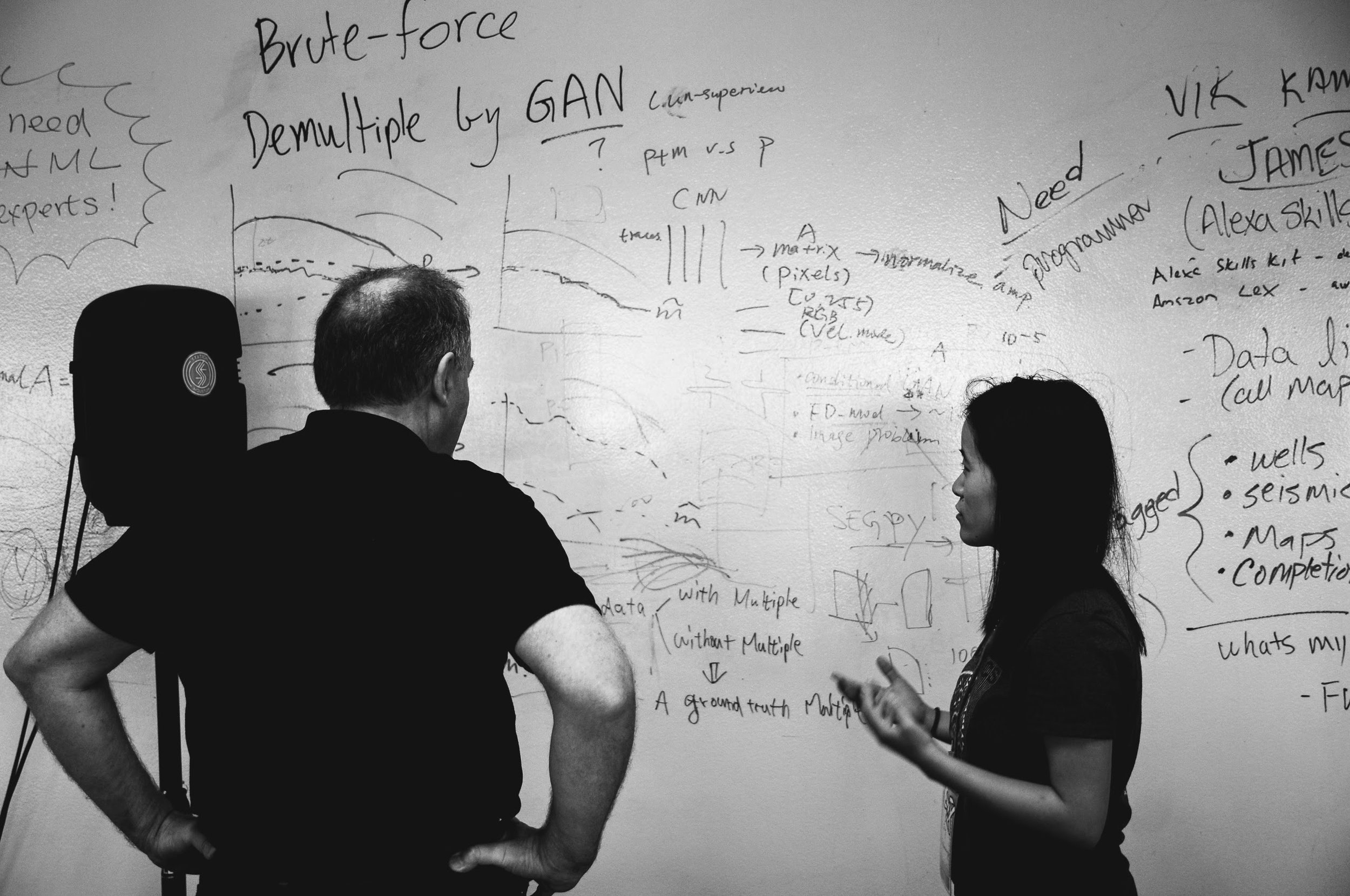
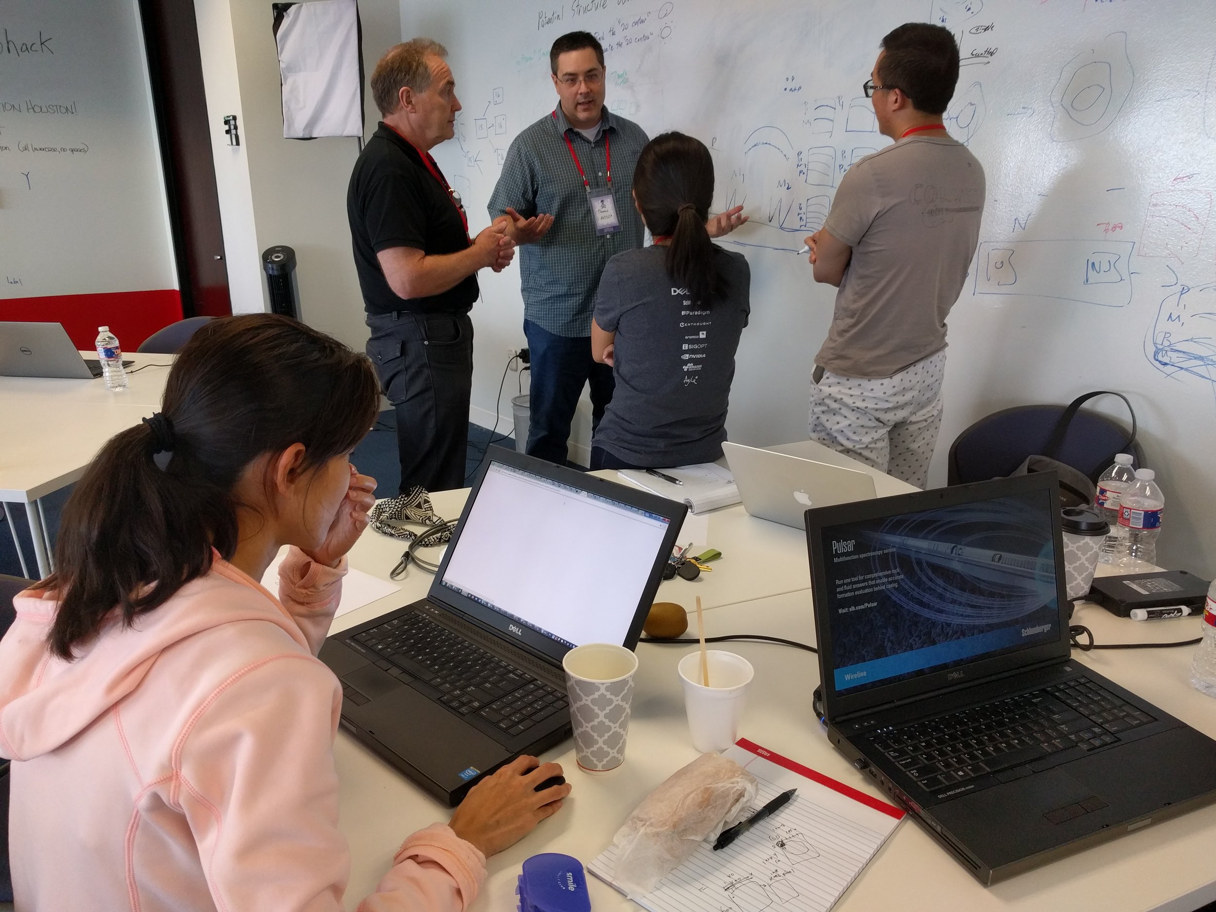
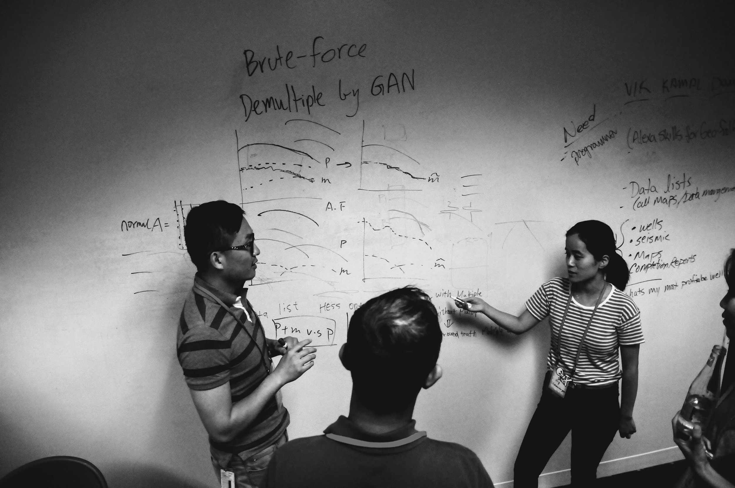
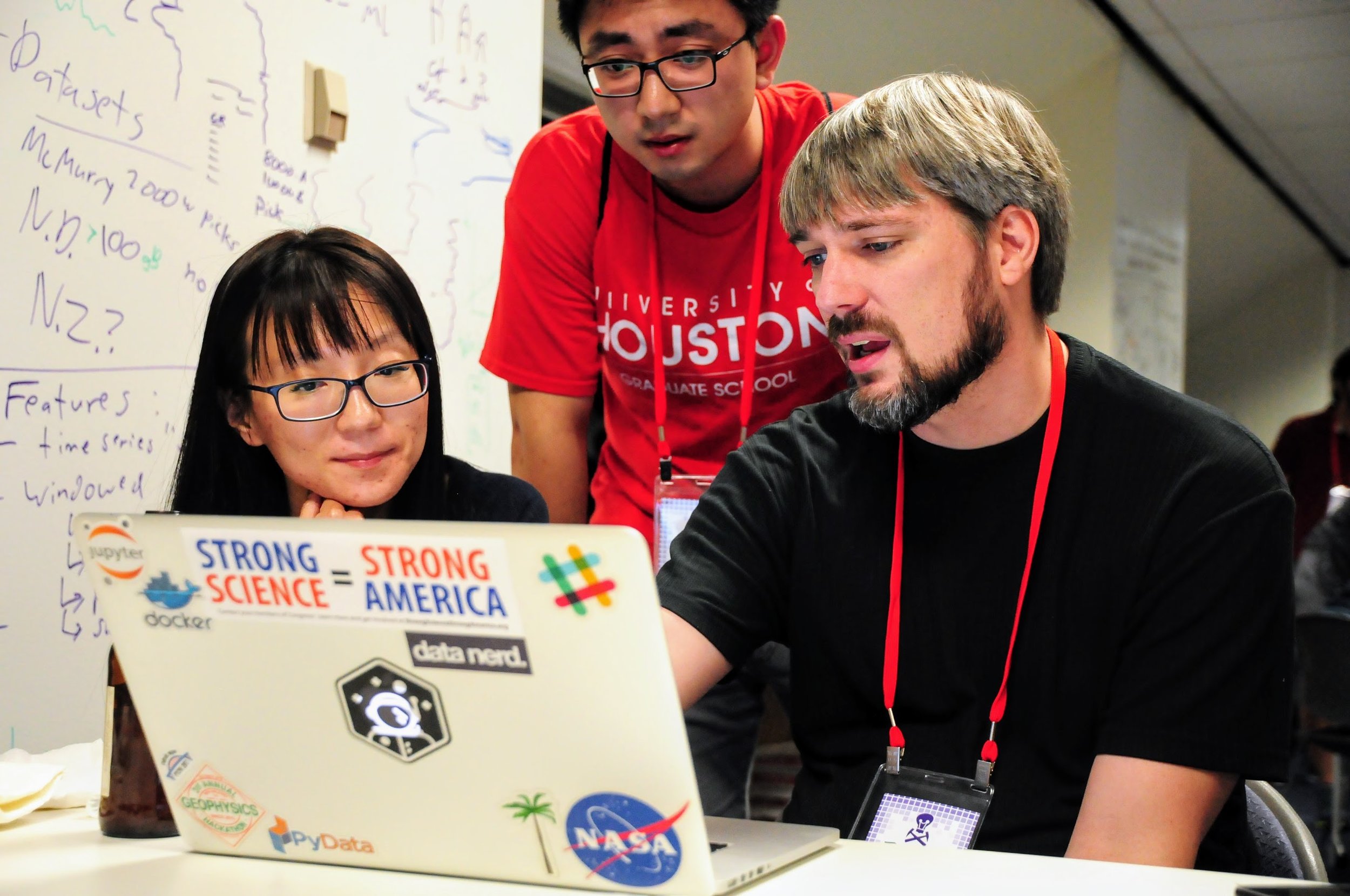
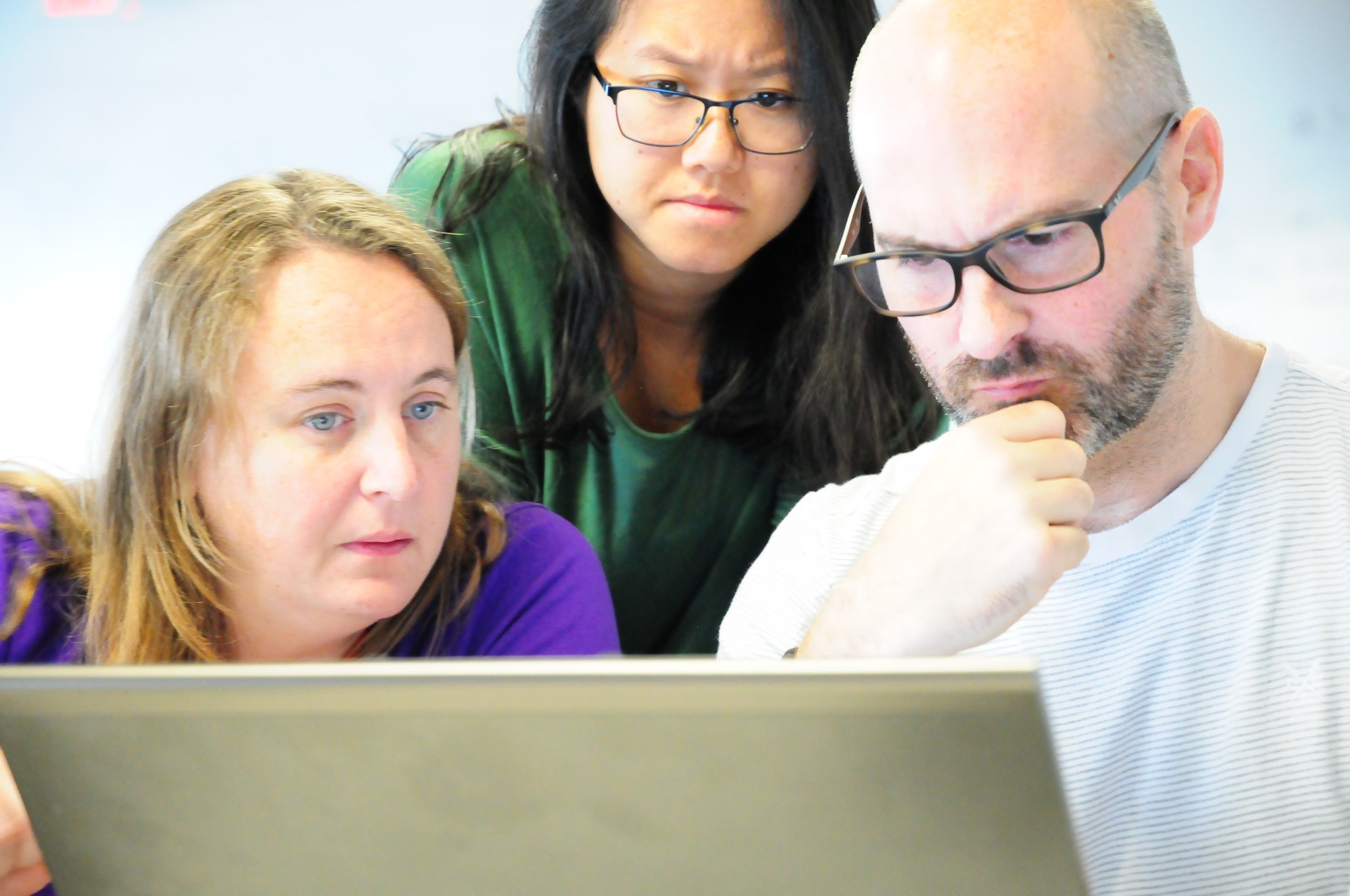
In this alternate reality, the role of the technical society is not to maintain a bunch of clunky processes to 'manage' (but not manage) the community. Instead, their role is to create the conditions for members of the community to dynamically share and progress their work. Research don't need 6 months' lead time, or giant spreadsheets full of abstracts, or broken websites (yes, I'm looking at you, Scholar One). They need an awesome space, whiteboards, Wi-Fi, AV equipment, and good coffee.

In short, maybe this is one of the nudges we need to start talking seriously about unconferences.

Abstract horror

This isn't really a horror story, more of a Grimm fairy tale. Still, I thought it worthy of a Hallowe'eny title.

I've been reviewing abstracts for the 2018 AAPG annual convention. It's fun, because you get to read about new research months ahead of the rest of the world. But it's also not fun because... well, most abstracts aren't that great. I have no idea what proportion of abstracts the conference accepts, but I hope it's not too far above about 50%. (There was some speculation at SEG that there are so many talks now — 18 parallel sessions! — because giving a talk is the only way for many people to get permission to travel to it. I hope this isn't true.)

Some of the abstracts were great; at least 1 in 4 was better than 'good'. So  what's wrong with the others? Here are the three main issues I saw: 

  1. Lots of abstracts were uninteresting.
  2. Even more of them were vague.
  3. Almost all of them were about unreproducible research.

Let's look at each of these in turn and ask what we can do about it.

Uninteresting

Let's face it, not all research is interesting research. That's OK — it might still be useful or otherwise important. I think you can still write an interesting abstract about it. Here are some tips:

  • Don't be vague! Details are interesting. See the next section.
  • Break things up a bit. Use at least 2 paragraphs, maybe 3 or 4. Maybe a list or two. 
  • Use natural, everyday language. Try reading your abstract aloud. 
  • In the first sentence, tell me why I should come to your talk or visit your poster. 

Vague

I scribbled 'Vague' on nearly every abstract. In almost every case, either the method or the results, and usually both, were described in woolly language. For example (this is not a direct quote, but paraphrased):

Machine learning was used to predict the reservoir quality in most of the wells in the area, using millions of training examples and getting good results. The inputs were wireline log data from nearby wells.

This is useless information — which algorithm? How did you optimize it? How much training data did you have, and how many data instances did you validate against? How many features did you use? What kind of validation did you do, and what scores did you achieve? Which competing methods did you compare with? Use numbers, be specific:

We used a 9-dimensional support vector machine, implemented in scikit-learn, to model the permeability. With over 3 million training examples from logs in 150 nearby wells in the training set, and 1 million in cross-validation, we achieved an F1 score of 0.75 or more in 18 of the 20 wells.

A roughly 50% increase in the number of words, but an ∞% increase in the information content.

Unreproducible

Maybe I'm being unfair on this one, because I can't really tell if something is going to be reproducible or not from an abstract... or can I?

I'd venture to say that, if the formations are called A, B, C, and D, and the wells are called 1, 2, 3, and 4, then I'm pretty sure I'm not going to find out much about your research. (I had a long debate with someone in Houston recently about whether this sort of thing even qualifies as science.)

So what can you do to make a more useful abstract? 

  • Name your methods and algorithms. Where did they come from? Which other work did you build on?
  • Name the dataset and tell me where it came from. Don't obfuscate the details — they're what make you interesting! Share as much of the data as you can.
  • Name the software you're using. If it's open source, it's the least you can do. If it's not open source, it's not reproducible, but I'd still like to know how you're doing what you do.

I realize not everyone is in a position to do 100% reproducible research, but you can aim for something over 50%. If your work really is top secret (<50% reproducible), then you might think twice about sharing your work at conferences, since no-one can really learn anything from you. Ask yourself if your paper is really just an advertisement.

So what does a good abstract look like?

Well, I do like this one-word abstract from Gardner & Knopoff (1974), from the Bulletin of the Seismological Society of America:

Is the sequence of earthquakes in Southern California, with aftershocks removed, Poissonian?

Yes.

A classic, but I'm not sure it would get your paper accepted at a conference. I don't collect awesome abstracts — maybe I should — but here are some papers with great abstracts that caught my interest recently:

  • Dean, T (2017). The seismic signature of rain. Geophysics 82 (5). The title is great too; what curious person could resist this paper? 
  • Durkin, P et al. (2017) on their beautiful McMurry Fm interpretation in JSR 27 (10). It could arguably be improved by a snappier first sentence that gives punchline of the paper.
  • Doughty-Jones, G, et al (2017) in AAPG Bulletin 101 (11). There's maybe a bit of an assumption that the reader cares about intraslope minibasins, but the abstract has meat.

Becoming a better abstracter

The number one thing to improve as a writer is probably asking other people — friendly but critical ones — for honest feedback. So start there.

As I mentioned in my post More on brevity way back in March 2011, you should probably read Landes (1966) once every couple of years:

Landes, K (1966). A scrutiny of the abstract II. AAPG Bulletin 50 (9). Available online. (An update to his original 1951 piece, A scrutiny of the abstract, AAPG Bulletin 35, no 7.)

There's also this plea from geophysicist Paul Lowman, to stop turning abstracts into introductions:

Lowman, Paul (1988). The abstract rescrutinized. Geology 16 (12). Available online.

Give those a read — they are very short — and maybe pay extra attention to the next dozen or so abstracts you read. Do they tell you what you need to know? Are they either useful or interesting? Do they paint a vivid picture? Or are they too... abstract?

EarthArXiv wants your preprints

eartharxiv.png

If you're into science, and especially physics, you've heard of arXiv, which has revolutionized how research in physics is shared. BioarXiv, SocArXiv and PaleorXiv followed, among others*.

Well get excited, because today, at last, there is an open preprint server especially for earth science — EarthArXiv has landed! 

I could write a long essay about how great this news is, but the best way to get the full story is to listen to two of the founders — Chris Jackson (Imperial College London and fellow University of Manchester alum) and Tom Narock (University of Maryland, Baltimore) — on Undersampled Radio this morning:

Congratulations to Chris and Tom, and everyone involved in EarthArXiv!

  • Friedrich Hawemann, ETH Zurich, Switzerland
  • Daniel Ibarra, Earth System Science, Standford University, USA
  • Sabine Lengger, University of Plymouth, UK
  • Andelo Pio Rossi, Jacobs University Bremen, Germany
  • Divyesh Varade, Indian Institute of Technology Kanpur, India
  • Chris Waigl, University of Alaska Fairbanks, USA
  • Sara Bosshart, International Water Association, UK
  • Alodie Bubeck, University of Leicester, UK
  • Allison Enright, Rutgers - Newark, USA
  • Jamie Farquharson, Université de Strasbourg, France
  • Alfonso Fernandez, Universidad de Concepcion, Chile
  • Stéphane Girardclos, University of Geneva, Switzerland
  • Surabhi Gupta, UGC, India

Don't underestimate how important this is for earth science. Indeed, there's another new preprint server coming to the earth sciences in 2018, as the AGU — with Wiley! — prepare to launch ESSOAr. Not as a competitor for EarthArXiv (I hope), but as another piece in the rich open-access ecosystem of reproducible geoscience that's developing. (By the way, AAPG, SEG, SPE: you need to support these initiatives. They want to make your content more relevant and accessible!)

It's very, very exciting to see this new piece of infrastructure for open access publishing. I urge you to join in! You can submit all your published work to EarthArXiv — as long as the journal's policy allows it — so you should make sure your research gets into the hands of the people who need it.

I hope every conference from now on has an EarthArXiv Your Papers party. 


* Including snarXiv, don't miss that one!

x lines of Python: load curves from LAS

Welcome to the latest x lines of Python post, in which we have a crack at some fundamental subsurface workflows... in as few lines of code as possible. Ideally, x < 10.

We've met curves once before in the series — in the machine learning edition, in which we cheated by loading the data from a CSV file. Today, we're going to get it from an LAS file — the popular standard for wireline log data.

Just as we previously used the pandas library to load CSVs, we're going to save ourselves a lot of bother by using an existing library — lasio by Kent Inverarity. Indeed, we'll go even further by also using Agile's library welly, which uses lasio behind the scenes.

The actual data loading is only 1 line of Python, so we have plenty of extra lines to try something more ambitious. Here's what I go over in the Jupyter notebook that goes with this post:

  1. Load an LAS file with lasio.
  2. Look at its header.
  3. Look at its curve data.
  4. Inspect the curves as a pandas DataFrame.
  5. Load the LAS file with welly.
  6. Look at welly's Curve objects.
  7. Plot part of a curve.
  8. Smooth a curve.
  9. Export a set of curves as a matrix.
  10. BONUS: fix some broken things in the file header.

Each one of those steps is a single line of Python. Together, I think they cover many of the things we'd like to do with well data once we get our hands on it. Have a play with the notebook and explore what you can do.

Next time we'll take things a step further and dive into some seismic petrophysics.

The norm and simple solutions

Last time I wrote about different ways of calculating distance in a vector space — say, a two-dimensional Euclidean plane like the streets of Portland, Oregon. I showed three ways to reckon the distance, or norm, between two points (i.e. vectors). As a reminder, using the distance between points u and v on the map below this time:

$$ \|\mathbf{u} - \mathbf{v}\|_1 = |u_x - v_x| + |u_y - v_y| $$

$$ \|\mathbf{u} - \mathbf{v}\|_2 = \sqrt{(u_x - v_x)^2 + (u_y - v_y)^2} $$

$$ \|\mathbf{u} - \mathbf{v}\|_\infty = \mathrm{max}(|u_x - v_x|, |u_y - v_y|) $$

Let's think about all the other points on Portland's streets that are the same distance away from u as v is. Again, we have to think about what we mean by distance. If we're walking, or taking a cab, we'll need to think about \(\ell_1\) — the sum of the distances in x and y. This is shown on the left-most map, below.

For simplicity, imagine u is the origin, or (0, 0) in Cartesian coordinates. Then v is (0, 4). The sum of the distances is 4. Looking for points with the same sum, we find the pink points on the map.

If we're thinking about how the crow flies, or \(\ell_2\) norm, then the middle map sums up the situation: the pink points are all equidistant from u. All good: this is what we usually think of as 'distance'.

norms_equidistant_L0.png

The \(\ell_\infty\) norm, on the other hand, only cares about the maximum distance in any direction, or the maximum element in the vector. So all points whose maximum coordinate is 4 meet the criterion: (1, 4), (2, 4), (4, 3) and (4, 0) all work.

You might remember there was also a weird definition for the \(\ell_0\) norm, which basically just counts the non-zero elements of the vector. So, again treating u as the origin for simplicity, we're looking for all the points that, like v, have only one non-zero Cartesian coordinate. These points form an upright cross, like a + sign (right).

So there you have it: four ways to draw a circle.

Wait, what?

A circle is just a set of points that are equidistant from the centre. So, depending on how you define distance, the shapes above are all 'circles'. In particular, if we normalize the (u, v) distance as 1, we have the following unit circles:

It turns out we can define any number of norms (if you like the sound of \(\ell_{2.4}\) or \(\ell_{240}\) or \(\ell_{0.024}\)...) but most of the time, these will suffice. You can probably imagine the shapes of the unit circles defined by these other norms.

What can we do with this stuff?

Let's think about solving equations. Think about solving this:

$$ x + 2y = 8 $$

norms_line.png

I'm sure you can come up with a soluiton in your head, x = 6 and y = 1 maybe. But one equation and two unknowns means that this problem is underdetermined, and consequently has an infinite number of solutions. The solutions can be visualized geometrically as a line in the Euclidean plane (right).

But let's say I don't want solutions like (3.141590, 2.429205) or (2742, –1367). Let's say I want the simplest solution. What's the simplest solution?

norms_line_l2.png

This is a reasonable question, but how we answer it depends how we define 'simple'. One way is to ask for the nearest solution to the origin. Also reasonable... but remember that we have a few different ways to define 'nearest'. Let's start with the everyday definition: the shortest crow-flies distance from the origin. The crow-flies, \(\ell_2\) distances all lie on a circle, so you can imagine starting with a tiny circle at the origin, and 'inflating' it until it touches the line \(x + 2y - 8 = 0\). This is usually called the minimum norm solution, minimized on \(\ell_2\). We can find it in Python like so:

    import numpy.linalg as la
    A = [[1, 2]]
    b = [8]
    la.lstsq(A, b)

The result is the vector (1.6, 3.2). You could almost have worked that out in your head, but imagine having 1000 equations to solve and you start to appreciate numpy.linalg. Admittedly, it's even easier in Octave (or MATLAB if you must) and Julia:

    A = [1 2]
    b = [8]
    A \ b
norms_line_all.png

But remember we have lots of norms. It turns out that minimizing other norms can be really useful. For example, minimizing the \(\ell_1\) norm — growing a diamond out from the origin — results in (0, 4). The \(\ell_0\) norm gives the same sparse* result. Minimizing the \(\ell_\infty\) norm leads to \( x = y = 8/3 \approx 2.67\).

This was the diagram I wanted to get to when I started with the 'how far away is the supermarket' business. So I think I'll stop now... have fun with Norm!


* I won't get into sparsity now, but it's a big deal. People doing big computations are always looking for sparse representations of things. They use less memory, are less expensive to compute with, and are conceptually 'neater'. Sparsity is really important in compressed sensing, which has been a bit of a buzzword in geophysics lately.

The norm: kings, crows and taxicabs

How far away is the supermarket from your house? There are lots of ways of answering this question:

  • As the crow flies. This is the green line from \(\mathbf{a}\) to \(\mathbf{b}\) on the map below.

  • The 'city block' driving distance. If you live on a grid of streets, all possible routes are the same length — represented by the orange lines on the map below.

  • In time, not distance. This is usually a more useful answer... but not one we're going to discuss today.

Don't worry about the mathematical notation on this map just yet. The point is that there's more than one way to think about the distance between two points, or indeed any measure of 'size'.

norms.png

Higher dimensions

The map is obviously two-dimensional, but it's fairly easy to conceive of 'size' in any number of dimensions. This is important, because we often deal with more than the 2 dimensions on a map, or even the 3 dimensions of a seismic stack. For example, we think of raw so-called 3D seismic data as having 5 dimensions (x position, y position, offset, time, and azimuth). We might even formulate a machine learning task with a hundred or more dimensions (or 'features').

Why do we care about measuring distances in high dimensions? When we're dealing with data in these high-dimensional spaces, 'distance' is a useful way to measure the similarity between two points. For example, I might want to select those samples that are close to a particular point of interest. Or, from among the points satisfying some constraint, select the one that's closest to the origin.

Definitions and nomenclature

We'll define norms in the context of linear algebra, which is the study of vector spaces (think of multi-dimensional 'data spaces' like the 5D space of seismic data). A norm is a function that assigns a positive scalar size to a vector \(\mathbf{v}\) , with a size of zero reserved for the zero vector (in the Cartesian plane, the zero vector has coordinates (0, 0) and is usually called the origin). Any norm \(\|\mathbf{v}\|\) of this vector satisfies the following conditions:

  1. Absolutely homogenous. The norm of \(\alpha\mathbf{v}\) is equal to \(|\alpha|\) times the norm of \(\mathbf{v}\).

  2. Subadditive. The norm of \( (\mathbf{u} + \mathbf{v}) \) is less than or equal to the norm of \(\mathbf{u}\) plus the norm of \(\mathbf{v}\). In other words, the norm satisfies the triangle inequality.

  3. Positive. The first two conditions imply that the norm is non-negative.

  4. Definite. Only the zero vector has a norm of 0.

Kings, crows and taxicabs

Let's return to the point about lots of ways to define distance. We'll start with the most familiar definition of distance on a map— the Euclidean distance, aka the \(\ell_2\) or \(L_2\) norm (confusingly, sometimes the two is written as a superscript), the 2-norm, or sometimes just 'the norm' (who says maths has too much jargon?). This is the 'as-the-crow-flies distance' on the map above, and we can calculate it using Pythagoras:

$$ \|\mathbf{v}\|_2 = \sqrt{(a_x - b_x)^2 + (a_y - b_y)^2} $$

You can extend this to an arbitrary number of dimensions, just keep adding the squared elementwise differences. We can also calculate the norm of a single vector in n-space, which is really just the distance between the origin and the vector:

$$ \|\mathbf{u}\|_2 = \sqrt{u_1^2 + u_2^2 + \ldots + u_n^2}  = \sqrt{\mathbf{u} \cdot \mathbf{u}} $$

As shown here, the 2-norm of a vector is the square root of its dot product with itself.

So the crow-flies distance is fairly intuitive... what about that awkward city block distance? This is usually referred to as the Manhattan distance, the taxicab distance, the \(\ell_1\) or \(L_1\) norm, or the 1-norm. As you can see on the map, it's just the sum of the absolute distances in each dimension, x and y in our case:

$$ \|\mathbf{v}\|_1 = |a_x - b_x| + |a_y - b_y| $$

What's this magic number 1 all about? It turns out that the distance metric can be generalized as the so-called p-norm, where p can take any positive value up to infinity. The definition of the p-norm is consistent with the two norms we just met:

$$ \| \mathbf{u} \|_p = \left( \sum_{i=1}^n | u_i | ^p \right)^{1/p} $$

[EDIT, May 2021: This generalized version is sometimes called the Minkowski distance, e.g. in the scipy documentation.]

In practice, I've only ever seen p = 1, 2, or infinity (and 0, but we'll get to that). Let's look at the meaning of the \(\infty\)-norm, aka the \(\ell_\infty\) or \(L_\infty\) norm, which is sometimes called the Chebyshev distance or chessboard distance (because it defines the minimum number of moves for a king to any given square):

$$ \|\mathbf{v}\|_\infty = \mathrm{max}(|a_x - b_x|, |a_y - b_y|) $$

In other words, the Chebyshev distance is simply the maximum element in a given vector. In a nutshell, the infinitieth root of the sum of a bunch of numbers raised to the infinitieth power, is the same as the infinitieth root of the largest of those numbers raised to the infinitieth power — because infinity is weird like that.

What about p = 0?

Infinity is weird, but so is zero sometimes. Taking the zeroeth root of a lot of ones doesn't make a lot of sense, so mathematicians often redefine the \(\ell_0\) or \(L_0\) "norm" (not a true norm) as a simple count of the number of non-zero elements in a vector. In other words, we toss out the 0th root, define \(0^0 := 0 \) and do:

$$ \| \mathbf{u} \|_0 = |u_1|^0 + |u_2|^0 + \cdots + |u_n|^0 $$

(Or, if we're thinking about the points \(\mathbf{a}\) and \(\mathbf{b}\) again, just remember that \(\mathbf{v}\) = \(\mathbf{a}\) - \(\mathbf{b}\).)

Computing norms

Let's take a quick look at computing the norm of some vectors in Python:

 
>>> import numpy as np

>>> a = np.array([1, 1]).T
>>> b = np.array([6, 5]).T

>>> L_0 = np.count_nonzero(a - b)
2

>>> L_1 = np.sum(np.abs(a - b))
9

>>> L_2 = np.sqrt((a - b) @ (a - b))
6.4031242374328485

>>> L_inf = np.max(np.abs(a - b))
5

>>> # Using NumPy's `linalg` module:
>>> import numpy.linalg as la
>>> for p in (0, 1, 2, np.inf):
>>>    print("L_{} norm = {}".format(p, la.norm(a - b, p)))
L_0 norm = 2.0
L_1 norm = 9.0
L_2 norm = 6.4031242374328485
L_inf norm = 5.0

What can we do with all this?

So far, so good. But what's the point of these metrics? How can we use them to solve problems? We'll get into that in a future post, so don't go too far!

For now I'll leave you to play with this little interactive demo of the effect of changing p-norms on a Voronoi triangle tiling — it's by Sarah Greer, a geophysics student at UT Austin. 


UPDATE — The next post is The norm and simple solutions, which looks at how these different norms can be used to solve real-world problems.

Hacking in Houston

geohack_2017_banner.png

Houston 2013
Houston 2014
Denver 2014
Calgary 2015
New Orleans 2015
Vienna 2016
Paris 2017
Houston 2017... The eighth geoscience hackathon landed last weekend!

We spent last weekend in hot, humid Houston, hacking away with a crowd of geoscience and technology enthusiasts. Thirty-eight hackers joined us on the top-floor coworking space, Station Houston, for fun and games and code. And tacos.

Here's a rundown of the teams and what they worked on.

Seismic Imagers

Jingbo Liu (CGG), Zohreh Souri (University of Houston).

Tech — DCGAN in Tensorflow, Amazon AWS EC2 compute.

The team looked for patterns that make seismic data different from other images, using a deep convolutional generative adversarial network (DCGAN). Using a seismic volume and a set of 2D lines, they made 121,000 sub-images (tiles) for their training set.

The Young And The RasLAS

William Sanger (Schlumberger), Chance Sanger (Museum of Fine Arts, Houston), Diego Castañeda (Agile), Suman Gautam (Schlumberger), Lanre Aboaba (University of Arkansas).

State of the art text detection by Google Cloud Vision API

State of the art text detection by Google Cloud Vision API

Tech — Google Cloud Vision API, Python flask web app, Scatteract (sort of). Repo on GitHub.

Digitizing well logs is a common industry task, and current methods require a lot of manual intervention. The team's automated pipeline: convert PDF files to images, perform OCR with Google Cloud Vision API to extract headers and log track labels, pick curves using a CNN in TensorFlow. The team implemented the workflow in a Python flask front-end. Check out their slides.

Hutton Rocks

Kamal Hami-Eddine (Paradigm), Didi Ooi (University of Bristol), James Lowell (GeoTeric), Vikram Sen (Anadarko), Dawn Jobe (Aramco).

hutton.png

Tech — Amazon Echo Dot, Amazon AWS (RDS, Lambda).

The team built Hutton, a cloud-based cognitive assistant for gaining more efficient, better insights from geologic data. Project includes integrated cloud-hosted database, interactive web application for uploading new data, and a cognitive assistant for voice queries. Hutton builds upon existing Amazon Alexa skills. Check out their GitHub repo, and slides.

Big data > Big Lore 

Licheng Zhang (CGG), Zhenzhen Zhong (CGG), Justin Gosses (Valador/NASA), Jonathan Parker (Marathon)

The team used machine learning to predict formation tops on wireline logs, which would allow for rapid generation of structure maps for exploration play evaluation, save man hours and assist in difficuly formation-top correlations. The team used the AER Athabasca open dataset of 2193 wells (yay, open data!).

Tech — Jupyter Notebooks, SciPy, scikit-learn. Repo on GitHub.

Free near surface

free_surface.png

Tien-Huei Wang, Jing Wu, Clement Zhang (Schlumberger).

Multiples are a kind of undesired seismic signal and take expensive modeling to remove. The project used machine learning to identify multiples in seismic images. They attempted to use GAN frameworks, but found it difficult to formulate their problem, turning instead to the simpler problem of binary classification. Check out their slides.

Tech — CNN... I don't know the framework.

The Cowboyz

Mingliang Liu, Mohit Ayani, Xiaozheng Lang, Wei Wang (University of Wyoming), Vidal Gonzalez (Universidad Simón Bolívar, Venezuela).

A tight group of researchers joined us from the University of Wyoming at Laramie, and snagged one of the most enthusiastic hackers at the event, a student from Venezuela called Vidal. The team attempted acceleration of geostatistical seismic inversion using TensorFlow, a central theme in Mingliang's research.

Tech — TensorFlow.

Augur.ai

Altay Sensal (Geokinetics), Yan Zaretskiy (Aramco), Ben Lasscock (Geokinetics), Colin Sturm (Apache), Brendon Hall (Enthought).

augur.ai.JPG

Electrical submersible pumps (ESPs) are critical components for oil production. When they fail, they can cause significant down time. Augur.ai provides tools to analyze pump sensor data to predict when pumps when pump are behaving irregularly. Check out their presentation!

Tech — Amazon AWS EC2 and EFS, Plotly Dash, SigOpt, scikit-learn. Repo on GitHub.

disaster_input.png

The Disaster Masters

Joe Kington (Planet), Brendan Sullivan (Chevron), Matthew Bauer (CSM), Michael Harty (Oxy), Johnathan Fry (Chevron)

Hydrologic models predict floodplain flooding, but not local street flooding. Can we predict street flooding from LiDAR elevation data, conditioned with citizen-reported street and house flooding from U-Flood? Maybe! Check out their slides.

Tech — Python geospatial and machine learning stacks: rasterio, shapely, scipy.ndimage, scikit-learn. Repo on GitHub.

The structure does WHAT?!

Chris Ennen (White Oak), Nanne Hemstra (dGB Earth Sciences), Nate Suurmeyer (Shell), Jacob Foshee (Durwella).

Inspired by the concept of an iPhone 'face ageing' app, Nate recruited a team to poke at applying the concept to maps of the subsurface. Think of a simple map of a structural field early in its life, compared to how it looks after years of interpretation and drilling. Maybe we can preview the 'aged' appearance to help plan where best to drill next to reduce uncertainty!

Tech — OpendTect, Azure ML Studio, C#, self-boosting forest cluster. Repo on GitHub.


Thank you!

Massive thanks to our sponsors — including Pioneer Natural Resources — for their part in bringing the event to life! 

sponsors_tight.png

More thank-yous

Apart from the participants themselves, Evan and I benefitted from a team of technical support, mentors, and judges — huge thanks to all these folks:

  • The indefatigable David Holmes from Dell EMC. The man is a legend.
  • Andrea Cortis from Pioneer Natural Resources.
  • Francois Courteille and Issam Said of NVIDIA.
  • Carlos Castro, Sunny Sunkara, Dennis Cherian, Mike Lapidakis, Jit Biswas, and Rohan Mathews of Amazon AWS.
  • Maneesh Bhide and Steven Tartakovsky of SigOpt.
  • Dave Nichols and Aria Abubakar of Schlumberger.
  • Eric Jones from Enthought.
  • Emmanuel Gringarten from Paradigm.
  • Frances Buhay and Brendon Hall for help with catering and logistics.
  • The team at Station for accommodating us.
  • Frank's Pizza, Tacos-a-Go-Go, Cali Sandwich (banh mi), Abby's Cafe (bagels), and Freebird (burritos) for feeding us.

Finally, megathanks to Gram Ganssle, my Undersampled Radio co-host. Stalwart hack supporter and uber-fixer, Gram came over all the way from New Orleans to help teams make sense of deep learning architectures and generally smooth things over. We recorded an episode of UR at the hackathon, talking to Dawn Jobe, Joe Kington, and Colin Sturm about their respective projects. Check it out!


[Update, 29 Sep & 3 Nov] Some statistics from the event:

  • 39 participants, including 7 women (way too few, but better than 4 out of 63 in Paris)
  • 9 students (and 0 professors!).
  • 12 people from petroleum companies.
  • 18 people from service and technology companies, including 5 from Schlumberger!
  • 13 no-shows, not including folk who cancelled ahead of time; a bit frustrating because we had a long wait list.
  • Furthest travelled: James Lowell from Newcastle, UK — 7560 km!
  • 98 tacos, 67 burritos, 96 slices of pizza, 55 kolaches, and an untold number of banh mi.

Looking ahead to SEG

SEGAM-logo-2017.jpg

The SEG Annual Meeting is coming up. Next week sees the festival of geophysics return to the global energy capital, shaken and damp but undefeated after its recent battle with Hurricane Harvey. Even though Agile will not be at the meeting this year, I wanted to point out some highlights of the week.

The Annual Meeting

The meeting will be big, as usual: 108 talk sessions, and 50 poster and e-presentation sessions. I have no idea how many presentations we're talking about but suffice to say that there's a lot. Naturally, there's a machine learning session, with the following talks:

The Geophysics Hackathon

Even though we're not at the conference, we are in Houston this weekend — for the latest edition of the Geophysics Hackathon! The focus was set to be firmly on 'machine learning', but after the hurricane, we added the theme of 'disaster recovery and mitigation'. People are completely free to choose whatever project they'd like to work on; we'll be ready to help and advise on both topics. We also have some cool gear to play with: a Dell C4130 with 4 x NVIDIA P100s, NVIDIA Jetson TX1s, Amazon Echo Dots, and a Raspberry Shake. Many, many thanks to Dell EMC and Pioneer Natural Resources and all our other sponsors:

sponsors_tight.png

If you're one of the 70 or so people coming to this event, I'm looking forward to seeing you there... if you're not, then I'm looking forward to telling you all about it next week.


Petrel User Group

icons-petrel.png

Jacob Foshee and Durwella are hosting a Petrel User Group meetup at The Dogwood, which is in midtown (not far from downtown). If you're a user of Petrel — power user or beginner, it doesn't matter — and you're interested in making the most of technology, it'd be good to see you there. Apart from anything else, you'll get to meet Jacob, who is one of those people with technology superpowers that you never know when you might need.


Rock Physics Reception

Tuesday If you've never been to the famous Rock Physics Reception, then you're missing out. It's your best shot at bumping into the luminaries of rock physics — Colin Sayers, Stefan Gelinsky, Per Avseth, Marco Perez, Bill Goodway, Tad Smith — you know the sort of thing. If the first thing you think about when you wake up in the morning is Lamé's second parameter, RSVP right now. Hurry: there are only a handful of spots left.


There's more! Don't miss:

  • The Women's Network Breakfast on Wednesday.
  • The Wiki Committee meeting on Wednesday, 8:00 am, Hilton Room 344B.
  • If you're an SEG member, you can go to any committee meeting you like! Find one that matches your interests.

If you know of any other events, please drop them in the comments!


Isn't everything on the internet free?

A couple of weeks ago I wrote about a new publication from Elsevier. The book seems to contain quite a bit of unlicensed copyrighted material, collected without proper permission from public and private groups on LinkedIn, SPE papers, and various websites. I had hoped to have an update for you today, but the company is still "looking into" the matter.

The comments on that post, and on Twitter, raised some interesting views. Like most views, these views usually come in pairs. There is a segment of the community that feels quite enraged by the use of (fully attributed) LinkedIn comments in a book; but many people hold the opposing view, that everything on the Internet is fair game.

I sympathise with this permissive view, to an extent. If you put stuff on the web, people are (one hopes) going to see it, interpret it, and perhaps want to re-use it. If they do re-use it, they may do so in ways you did not expect, or perhaps even disagree with. This is okay — this is how ideas develop. 

I mean, if I can't use a properly attributed LinkedIn post as the basis for a discussion, or a YouTube video to illustrate a point, then what's really the point of those platforms? It would undermine the idea of the web as a place for interaction and collaboration, for cultural or scientific evolution. 

Freely accessible but not free

Not to labour the point, but I think we all understand that what we put on the Internet is 'out there'. Indeed, some security researchers suggest you should assume that every email you type will be in the local newspaper tomorrow morning. This isn't just 'a feeling', it's built into how the web works. most websites are exclusively composed of strictly copyrighted content, but most websites also have conspicuous buttons to share that copyrighted content — Tweet this, Pin that, or whatever. The signals are confusing... do you want me to share this or not? 

One can definitely get carried away with the idea that everything should be free. There's a spectrum of infractions. On the 'everyday abuse' end of things, we have the point of view that grabbing randoms images from the web and putting the URL at the bottom is 'good enough'. Based on papers at conferences, I suspect that most people think this and, as I explained before, it's definitely not true: you usually need permission. 

At the other end of the scale, you end up with Sci-Hub (which sounds like it's under pressure to close at the moment) and various book-sharing sites, both of which I think are retrograde and anti-open-access (as well as illegal). I believe we should respect the copyright of others — even that of supposedly evil academic publishers — if we want others to respect ours.

So what's the problem with a bookful of LinkedIn posts and other dubious content? Leaving aside for now the possibility of more serious plagiarism, I think the main problem is simply that the author went too far — it is a wholesale rip-off of 350 people's work, not especially well done, with no added value, and sold for a hefty sum.

Best practice for re-using stuff on the web

So how do we know what is too far? Is it just a value judgment? How do you re-use stuff on the web properly? My advice:

  • Stop it. Resist the temptation to Google around, grabbing whatever catches your eye.
  • Re-use sparingly, only using one or two of the real gems. Do you really need that picture of a casino on your slide entitled "Risk and reward"? (No, you definitely don't.)
  • Make your own. Ideas are not copyrightable, so it might be easier to copy the idea and make the thing you want yourself (giving credit where it's due, of course).
  • Ask for permission from the creator if you do use someone's stuff. Like I said before, this is only fair and right.
  • Go open! Preferentially share things by people who seem to be into sharing their stuff.
  • Respect the work. Make other people's stuff look awesome. You might even...
  • ...improve the work if you can — redraw a diagram, fix a typo — then share it back to them and the community.
  • Add value. Add real insight, combine things in new ways, surprise and delight the original creators.
  • And finally, if you're not doing any of these things, you better not be trying to profit from it. 

Everything on the Internet is not free. My bet is that you'll be glad of this fact when you start putting your own stuff out there. We can all do our homework and model good practice. This is especially important for those people in influential positions in academia, because their behaviours rub off on so many impressionable people. 


We talked to Fernando Enrique Ziegler on the Undersampled Radio podcast last week. He was embroiled in the 'bad book' furore too, in fact he brought it to many people's attention. So this topic came up in the show, as well as a lot of stuff about pore pressure and hurricanes. Check it out...

x lines of Python: Global seismic data

Today we'll look at finding and analysing global seismology data with Python and the wonderful seismology package ObsPy, from Moritz Beyreuther, Lion Krischer, and others originally at the Geophysical Observatory in Munich.

We've used ObsPy before to load SEG-Y files into Python, but that's not its core purpose. These tools are typically used by global seismologists and earthquake scientists, but we're going to download and analyse data from three non-earthquakes:

  1. A curious landslide and tsunami in Greenland.
  2. The recent nuclear bomb test in North Korea.
  3. Hurricane Irma's passage through the Caribbean.

We'll also look at an actual earthquake. This morning there was a very large earthquake off Mexico, killing at least 15 people. It's the first M8+ earthquake anywhere since the Illapel event, Chile, on 16 September 2015.

Only 4 lines?

Once you have ObsPy, only 4 lines of code (not counting imports) are needed to download and plot a seismic trace. Here's how to instantiate the ObsPy client using the IRIS data service, then get 5 minutes of waveform data from the Mudanjiang or MDJ station on the IC network, the New China Digital Seismograph Network, and finally plot it:

from obspy.clients.fdsn import Client
client = Client("IRIS")

from obspy import UTCDateTime
t = UTCDateTime("2017-09-03_03:30:00")
st = client.get_waveforms("IC", "MDJ", "00", "BHZ", t, t + 5*60)
st.plot()  
ObsPy_IC-MDJ.png

Pretty awesome, right? One day getting seismic and well data will be this simple! LOL


Check out the Jupyter Notebook! I cannot get this notebook to run on Azure Notebooks I'm afraid, so the only way to run it is to set up Python and Jupyter (best way: install Canopy or Anaconda) on your machine. I urge you to give it a go, because what could be more fun than playing around with decades of seismic data from all over the world?