Tuning geology

It's summer! We will be blogging a little less often over July and August, but have lots of great posts lined up so check back often, or subscribe by email to be sure not to miss anything. Our regular news feature will be a little less regular too, until the industry gets going again in September. But for today... here's the motivation behind our latest app for Android devices, Tune*.

Geophysicists like wedges. But why? I can think of only a few geological settings with a triangular shape; a stratigraphic pinchout or an angular unconformity. Is there more behind the ubiquitous geophysicist's wedge than first appears?

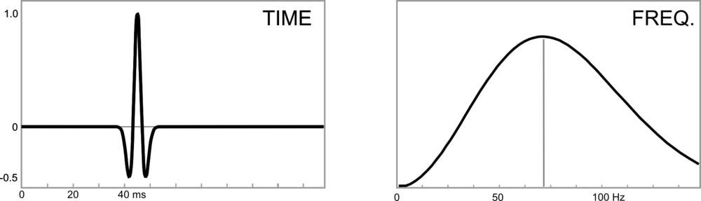
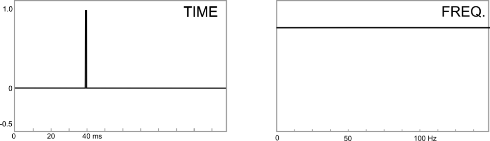
Seismic interpretation is partly the craft of interpreting artifacts, and a wedge model illustrates several examples of artifacts found in seismic data. In Widess' famous paper, How thin is a thin bed? he set out a formula for vertical seismic resolution, and constructed the wedge as an aid for quantitative seismic interpretation. Taken literally, a synthetic seismic wedge has only a few real-world equivalents. But as a purely quantitative model, it can be used to calibrate seismic waveforms and interpret data in any geological environment. In particular, seismic wedge models allow us to study how the seismic response changes as a function of layer thickness. For fans of simplicity, most of the important information from a wedge model can be represented by a single function called a tuning curve.

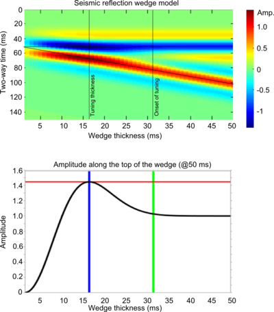
In this figure, a seismic wedge model is shown for a 25 Hz Ricker wavelet. The effects of tuning (or interference) are clearly seen as variations in shape, amplitude, and travel time along the top and base of the wedge. The tuning curve shows the amplitude along the top of the wedge (thin black lines). Interestingly, the apex of the wedge straddles the top and base reflections, an apparent mis-timing of the boundaries.

On a tuning curve there are (at least) two values worth noting; the onset of tuning, and the tuning thickness. The onset of tuning (marked by the green line) is the thickness at which the bottom of the wedge begins to interfere with the top of the wedge, perturbing the amplitude of the reflections, and the tuning thickness (blue line) is the thickness at which amplitude interference is a maximum.

For a Ricker wavelet the amplitude along the top of the wedge is given by:

where R is the reflection coefficient at the boundary, f is the dominant frequency and t is the wedge thickness (in seconds). Building the seismic expression of the wedge helps to verify this analytic solution.

Wedge artifacts

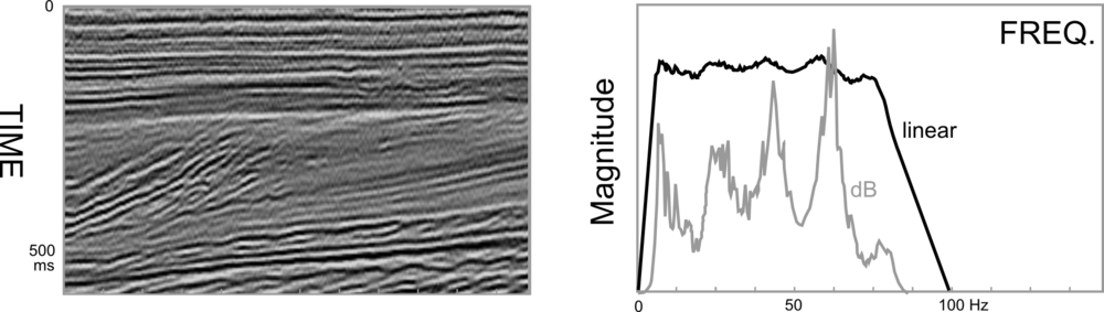
The synthetic seismogram and the tuning curve reveal some important artifacts that the seismic interpreter needs to know about, because they could be pitfalls, or they could provide geological information:

Bright (and dim) spots: A bed thickness equal to the tuning thickness (in this case 15.6 ms) has considerably more reflective power than any other thickness, even though the acoustic properties are constant along the wedge. Below the tuning thickness, the amplitude is approximately proportional to thickness.

Mis-timed events: Below 15 ms the apparent wedge top changes elevation: for a bed below the tuning thickness, and with this wavelet, the apparent elevation of the top of the wedge is actually higher by about 7 ms. If you picked the blue event as the top of the structure, you'd be picking it erroneously too high at the thinnest part of the wedge. Tuning can make it challenging to account for amplitude changes and time shifts simultaneously when picking seismic horizons.

Limit of resolution: For a bed thinner than about 10 ms, the travel time between the absolute reflection maxima—where you would pick the bed boundaries—is not proportional to bed thickness. The bed appears thicker than it actually is.

Bottom line: if you interpret seismic data, and you are mapping beds around 10–20 ms thick, you should take time to study the effects of thin beds. We want to help! On Monday, I'll write about our new app for Android mobile devices, Tune*. 

Reference

Widess, M (1973). How thin is a thin bed? Geophysics, 38, 1176–1180. 

Species identification in the rock kingdom

Like geology, life is studied across a range of scales. Plants and animals come in a bewildering diversity of shapes and sizes. Insects can be microscopic, like fleas, or massive, like horned beetles; redwood trees tower 100 metres tall, and miniature alpine plants fit into a thimble.

In biology, there is an underlying dynamic operating on all organisms that constrain the dimensions and mass of each species. These constraints, or allometric scaling laws, play out everywhere on earth because of the nature and physics of water molecules. The surface tension of water governs the strength of a cell wall, and this in turn mandates the maximum height and width of a body, any possible body.

← The relationship between an organisms size and mass. Click the image to read Kevin Kelly's fascinating take on this subject.

Amazingly, both animal and plant life forms adhere to a steady slope of mass per unit length. Life, rather than being boundless and unlimited in every direction, is bounded and limited in many directions by the nature of matter itself. A few things caught my attention when I saw this graph. If your eye is keenly tuned, you'll see that plants plot in a slightly different space than animals, with the exception of only a few outliers that cause overlap. Even in the elegantly constructed world of the biological kingdom, there are deviations from nature's constraints. Scientists looking at raw data like these might certainly describe the outliers as "noise", but I don't think that's correct in this case; it's just undescribed signal. If this graphical view of the biological kingdom is used as a species identifcation challenge, sometimes a plant can 'look' like an animal, but it really isn't. It's a plant. A type II error may be lurking.

Finally, notice the wishbone pattern in the data. It's reminded me of some Castagna-like trends I have come across in the physics of rocks, and I wonder if this suggests a common end-member source of some kind. I won't dare to elaborate on these patterns in the animal kingdom or plant kingdom, but it's what I strive for in the rock kingdom.

I wonder if this example can serve as an analog for many rock physics relationships, whereby the fundamental properties are governed by some basic building blocks. Life forms have carbon and DNA as their common roots, whereas sedimentary rocks don't necessarily have ubiquitous building blocks; some rocks can be rich in silica, some rocks can have none at all. 

← Gardner's equation: the relationship between acoustic velocity and bulk density for sedimentary rocks. Redrawn from Gardner et al (1974).

For comparison, look at this classic figure from Gardner et al in which they deduced an empirical relationship between seismic P-wave velocity and bulk density. As in the first example, believing that all species fall on this one global average (dotted line) is cursory at best. But, that is exactly what Gardner's equation describes. In fact, it fits more closely to high-velocity dolomites than it does for the sands and silts for which it is typically applied. Here, I think we are seeing the constraints from water impose themselves differently on the formation of different minerals, and depositional elements. Deviations from the global average are meaningful, and density estimation and log editing techniques should (and usually do) take these shifts into account. Even though this figure doesn't have any hard data on it, I am sure you could imagine that, just as with biology, crossovers and clustering would obscure these relatively linear deductions.

← The mudrock line: relationship between shear velocity and compressional velocitiy, modfified from Castagna et al (1985).

The divergence of mudrocks from gas sands that John Castagna et al discovered seems strikingly similar to the divergence seen between plant and animal cells. Even the trend lines suggest a common or indistinguishable end member. Certainly the density and local kinetic energy of moving water has alot to do with the deposition and architecture of sediment bodies. The chemical and physical properties of water affect sediments undergoing burial and compaction, control diagensis, and control pore-fluid interactions. Just as water is the underlying force causing the convergence in biology, water is one (and perhaps not the only) driving force that constrains the physical properties of sedimentary rocks. Any attempts at regression and cluster analyses should be approached with these observations in mind.

References

Kelly, K (2010). What Technology Wants. New York, Viking Penguin.

Gardner, G, L Gardner and A Gregory (1974). Formation velocity and density—the diagnostic basics for stratigraphic traps. Geophysics 39, 770–780.

Castagna, J, M Batzle and R Eastwood (1985). Relationships between compressional-wave and shear-wave velocities in clastic silicate rocks. Geophysics 50, 571–581.

F is for Frequency

Frequency is the number of times an event repeats per unit time. Periodic signals oscillate with a frequency expressed as cycles per second, or hertz: 1 Hz means that an event repeats once every second. The frequency of a light wave determines its color, while the frequency of a sound wave determines its pitch. One of the greatest discoveries of the 18th century is that all signals can be decomposed into a set of simple sines and cosines oscillating at various strengths and frequencies. 

I'll use four toy examples to illustrate some key points about frequency and where it rears its head in seismology. Each example has a time-series representation (on the left) and a frequency spectrum representation (right).

The same signal, served two ways

This sinusoid has a period of 20 ms, which means it oscillates with a frequency of 50 Hz (1/20 ms-1). A sinusoid is composed of a single frequency, and that component displays as a spike in the frequency spectrum. A side note: we won't think about wavelength here, because it is a spatial concept, equal to the product of the period and the velocity of the wave.

In reflection seismology, we don't want things that are of infinitely long duration, like sine curves. We need events to be localized in time, in order for them to be localized in space. For this reason, we like to think of seismic impulses as a wavelet.

The Ricker wavelet is a simple model wavelet, common in geophysics because it has a symmetric shape and it's a relatively easy function to build (it's the second derivative of a Gaussian function). However, the answer to the question "what's the frequency of a Ricker wavelet?" is not straightforward. Wavelets are composed of a range (or band) of frequencies, not one. To put it another way: if you added monotonic sine waves together according to the relative amplitudes in the frequency spectrum on the right, you would produce the time-domain representation on the left. This particular one would be called a 50 Hz Ricker wavelet, because it has the highest spectral magnitude at the 50 Hz mark—the so-called peak frequency

Bandwidth

For a signal even shorter in duration, the frequency band must increase, not just the dominant frequency. What makes this wavelet shorter in duration is not only that it has a higher dominant frequency, but also that it has a higher number of sine waves at the high end of the frequency spectrum. You can imagine that this shorter duration signal traveling through the earth would be sensitive to more changes than the previous one, and would therefore capture more detail, more resolution.

The extreme end member case of infinite resolution is known mathematically as a delta function. Composing a signal of essentially zero time duration (notwithstanding the sample rate of a digital signal) takes not only high frequencies, but all frequencies. This is the ultimate broadband signal, and although it is impossible to reproduce in real-world experiments, it is a useful mathematical construct.

What about seismic data?

Real seismic data, which is acquired by sending wavelets into the earth, also has a representation in the frequency domain. Just as we can look at seismic data in time, we can look at seismic data in frequency. As is typical with all seismic data, the example below set lacks low and high frequencies: it has a bandwidth of 8–80 Hz. Many geophysical processes and algorithms have been developed to boost or widen this frequency band (at both the high and low ends), to increase the time domain resolution of the seismic data. Other methods, such as spectral decomposition, analyse local variations in frequency curves that may be otherwise unrecognizable in the time domain. 

High resolution signals are short in the time domain and wide or broadband in the frequency domain. Geoscientists often equate high resolution with high frequency, but that it not entirely true. The greater the frequency range, the larger the information carrying capacity of the signal.

In future posts we'll elaborate on Fourier transforms, sampling, and frequency domain treatments of data that are useful for seismic interpreters.

For more posts in our Geophysics from A to Z posts, click here.

What is AVO?

I used to be a geologist (but I'm OK now). When I first met seismic data, I took the reflections and geometries quite literally. The reflections come from geology, so it seems reasonable to interpret them as geology. But the reflections are waves, and waves are slippery things: they have to travel through kilometres of imperfectly known geology; they can interfere and diffract; they emanate spherically from the source and get much weaker quickly. This section from the Rockall Basin in the east Atlantic shows this attenuation nicely, as well as spectacular echo reflections from the ocean floor called multiples:

Rockall seismicData from the Virtual Seismic Atlas, contributed by the British Geological Survey.

Impedance is the product of density and velocity. Despite the complexity of seismic reflections, all is not lost. Even geologists interpreting seismic know that the strength of seismic reflections can have real, quantitative, geological meaning. For example, amplitude is related to changes in acoustic impedance Z, which is equal to the product of bulk density ρ and P-wave velocity V, itself related to lithology, fluid, and porosity.

Flawed cartoon of a marine seismic survey. OU, CC-BY-SA-NC.

But when the amplitude versus offset (AVO) behaviour of seismic reflections gets mentioned, most non-geophysicists switch off. If that's your reaction too, don't be put off by the jargon, it's really not that complicated.

The idea that we collect data from different angles is not complicated or scary. Remember the classic cartoon of a seismic survey (right). It's clear that some of the ray paths bounce off the geological strata at relatively small incidence angles, closer to straight down-and-up. Others, arriving at receivers further away from the source, have greater angles of incidence. The distance between the source and an individual receiver is called offset, and is deducible from the seismic field data because the exact location of the source and receivers is always known.

The basic physics behind AVO analysis is that the strength of a reflection does not only depend on the acoustic impedance—it also depends on the angle of incidence. Only when this angle is 0 (a vertical, or zero-offset, ray) does the simple relationship above hold.

Total internal reflection underwater. Source: Mbz1 via Wikimedia Commons.Though it may be unintuitive at first, angle-dependent reflectivity is an idea we all know well. Imagine an ordinary glass window: you can see through it perfectly well when you look straight through it, but when you move to a wide angle it suddenly becomes very reflective (at the so-called critical angle). The interface between water and air is similarly reflective at wide angles, as in this underwater view.

Karl Bernhard Zoeppritz (German, 1881–1908) was the first seismologist to describe the relationship between reflectivity and angle of incidence. In this context, describe means write down the equations for. Not two or three equations, lots of equations.

The Zoeppritz equations are very good model for how seismic waves propagate in the earth. There are some unnatural assumptions about isotropy, total isolation of the interface, and other things, but they work well in many real situations. The problem is that the equations are unwieldy, especially if you are starting from seismic data and trying to extract rock properties—trying to solve the so-called inverse problem. Since we want to be able to do useful things quickly, and since seismic data are inherently approximate anyway, several geophysicists have devised much friendlier models of reflectivity with offset.Google Nexus S

I'll take a look at these more friendly models next time, because I want to tell a bit about how we've implemented them in our soon-to-be-released mobile app, AVO*. No equations, I promise! Well, one or two...

Geophysical stamps 2: Sonic

Recently I bought some stamps on eBay. This isn't something I've done before, but when I saw these stamps I couldn't resist their pure geophysical goodness. They are East German stamps from 1980, and they are unusual because they aren't fanciful illustrations, but precise, technical drawings. Last week I described the gravimeter; today it's the turn of a borehole instrument, the sonic tool.

← The 25 pfennig stamp in the series of four shows a sonic tool, complete with the logged data on the left, and a cross-section on the right. Bohrlochmessung means well-logging; Wassererkundung translates as water exploration. The actual size of the stamp is 43 × 26 mm.

The tool has two components: a transmitter and a recevier. It is lowered to the bottom of the target interval and logs data while being pulled up the hole. In its simplest form, an ultrasound pulse (typically 20–40 kHz) is emitted from the transmitter, travels through the formation, and is recorded at the receiver. The interval transit time is recorded continuously, giving the trace shown on left hand side of the stamp. Transit time is measured in µs/m (or µs/ft if you're old-school), and is generally between 160 µs/m and 550 µs/m (or, in terms of velocity, 1800 m/s to 6250 m/s). Geophysicists often use the transit time to estimate seismic velocities; it's important to correct for the phenomenon called dispersion: lower-frequency seismic waves travel more slowly than the high-frequency waves measured by these tools.

Sonic logs are used for all sorts of other things, for example:

  • Predicting the seismic response (when combined with the bulk density log)
  • Predicting porosity, because of the large difference between velocity in fluids vs minerals
  • Predicting pore pressure, an important safety concern and reservoir property
  • Measuring anisotropy, especially due to oriented fractures (important for permeability)
  • Qualitatively predicting lithology, especially coals (slow), salt (4550 m/s), dolomite (fast)

Image credit: National Energy Technology Lab.Modern tools are not all that different from early sonic tools. They measure the same thing, but with better electronics for improved vertical resolution and noise attenuation. The biggest innovations are dipole sonic tools for accurate shear-wave velocities, multi-azimuth tools for measuring anisotropy, high resolution tools, and high-pressure, high-temperature (HPHT) tools.

Another relatively recent advance is reliable sonic-while-drilling tools such as Schlumberger's sonicVISION™ system, the receiver array of which is shown here (for the 6¾" tool).

The sonic tool may be the most diversely useful of all the borehole logging tools. In a totally contrived scenario where I could only run a single tool, it would have to be the sonic, especially if I had seismic data... What would you choose?

Next time I'll look at the 35 pfennig stamp, which shows a surface geophone. 

Geophysical stamps

About a month ago I tweeted about some great 1980 East German stamps I'd seen on eBay. I impulsively bought them and they arrived a couple of weeks ago. I thought I'd write a bit about them and the science that inspired them. This week: Gravimeter.

East Germany in 1980 was the height of 'consumer socialism' under Chairman & General Secretary Eric Honecker. Part of this movement was a new appreciation for economic growth, and the role of science and technology in the progress of society. Putting the angsts and misdeeds of the Cold War to one side, perhaps these stamps reflect the hopes for modernity and prosperity.

← The 20 pfennig stamp from the set of four 1980 stamps from the German Democratic Republic (Deutsche Demokratische Republik). The illustration shows a relative gravimeter, the profile one might expect over a coal field (top), and a cross section through a coal deposit. Braunkohlenerkundung translates roughly as brown coal survey. Brown coal is lignite, a low-grade, low maturity coal.

There are two types of gravimeter: absolute and relative. Absolute gravimeters usually time the free-fall of a mass in a vacuum. The relative gravimeter is also a simple instrument. It must be level to measure the downward force, hence the adjustable legs. Inside the cylinder, a reference body called a proof mass is held by a spring and an electrostatic restoring force. If the gravitational force on the mass changes, the electrostatic force required to restore its position indicates the change in the gravitational field.

Fundamentally, all gravimeters measure acceleration due to gravity. Surprisingly, geophysicists do not generally use SI units, but the CGS system (centimetre–gram–second system). Thus the standard reporting units for gravimetry are not m/s2 but cm/s2, or gals (sometimes known as galileos, symbol Gal). In this system, the acceleration due to gravity at the earth's surface is approximately 980 Gal. Variations due to elevation and subsurface geology are measured in mGal or even µGal.

Image credit: David Monniaux, from commons.wikimedia.org, licensed under CC-BY-SA

Some uses for gravimeters:

  • Deep crustal structure (given the density of the crust)
  • Mineral exploration (for example, low gravity due to coal, as shown on the stamp)
  • Measuring peak ground acceleration due to natural or induced seismicity
  • Geodesic measurement, for example in defining the geoid and reference ellipsoid
  • Calibration and standards in metrology

Modern relative gravimeters use the same basic engineering, but of course has much better sensitivity, smaller errors, improved robustness, remote operation, and a more user-friendly digital interface. Vibrational noise suppression is also quite advanced, with physical isolation and cunning digital signal processing algorithms. The model shown here is the Autograv CG-5 from Scintrex in Concord, Ontario, Canada. It's designed for portability and ease of use.

Have you ever wielded a gravimeter? I've never met one face to face, but I love tinkering with precision instruments. I bet they pop up on eBay occasionally...

Next time I'll look at the the 25 pfennig stamp, which depicts a sonic borehole  tool.

The core of the conference

Andrew Couch of Statoil answering questions about his oil sands core, standing in front of a tiny fraction of the core collection at the ERCBToday at the CSPG CSEG CWLS convention was day 1 of the core conference. This (unique?) event is always well attended and much talked-about. The beautiful sunshine and industry-sponsored lunch today helped (thanks Weatherford!).

One reason for the good turn-out is the incredible core research facility here in Calgary. This is the core and cuttings storage warehouse and lab of the Energy Resources Conservation Board, Alberta's energy regulator. I haven't been to a huge number of core stores around the world, but this is easily the largest, cleanest, and most efficient one I have visited. The picture gives no real indication of the scale: there are over 1700 km of core here, and cuttings from about 80 000 km of drilling. If you're in Calgary and you've never been, find a way to visit. 

Ross Kukulski of the University of Calgary is one of Stephen Hubbard's current MSc students. Steve's students are consistently high performers, with excellent communication and drafting skills; you can usually spot their posters from a distance. Ross is no exception: his poster on the stratigraphic architecture of the Early Cretaceous Monach Formation of NW Alberta was a gem. Ross has integrated data from about 30 cores, 3300 (!) well logs, and outcrop around Grand Cache. While this is a fairly normal project for Alberta, I was impressed with the strong quantitative elements: his provenance assertions were backed up with Keegan Raines' zircon data, and channel width interpretation was underpinned by Bridge & Tye's empirical work (2000; AAPG Bulletin 84).

The point bar in Willapa Bay where Jesse did his coring. Image from Google Earth. Jesse Schoengut is a MSc student of Murray Gingras, part of the ichnology powerhouse at the University of Alberta. The work is an extension of Murray's long-lived project in Willapa Bay, Washington, USA. Not only had the team collected vibracore along a large point bar, but they had x-rayed these cores, collected seismic profiles across the tidal channel, and integrated everything into the regional dataset of more cores and profiles. The resulting three-dimensional earth model is helping solve problems in fields like the super-giant Athabasca bitumen field of northeast Alberta, where the McMurray Formation is widely interpreted to be a tidal estuary somewhat analogous to Willapa. 

Greg Hu of Tarcore presented his niche business of photographing bitumen core, and applying image processing techniques to complement and enhance traditional core descriptions and analysis. Greg explained that unrecovered core and incomplete sampling programs result in gaps and depth misalignment—a 9 m core barrel can have up to several metres of lost core which can make integrating core information with other subsurface information intractable. To help solve this problem, much of Tarcore's work is depth-correcting images. He uses electrical logs and FMI images to set local datums on centimetre-scale beds, mud clasts, and siderite nodules. Through color balancing, contrast stretching, and image analysis, shale volume (a key parameter in reservoir evaluation) can be computed from photographs. This approach is mostly independent of logs and offers much higher resolution.

It's awesome how petroleum geologists are sharing so openly at this core workshop, and it got us thinking: what would a similar arena look like for geophysics or petrophysics? Imagine wandering through a maze of 3D seismic volumes, where you can touch, feel, ask, and learn.

Don't miss our posts from day 1 of the convention, and from days 2 and 3.

Cracks, energy, and nanoseismic

Following on from our post on Monday, here are some presentations that caught our attention on days 2 and 3 at the CSPG CSEG CWLS convention this week in Calgary. 

On Tuesday, Eric von Lunen of Nexen chose one of the more compelling titles of the conference: What do engineers need from geophysicists in shale resource plays? Describing some of the company's work in the Horn River sub-basin, he emphasized the value of large, multi-faceted teams of subsurface scientists, including geochemists, geologists, geophysicists, petrophysicists, and geo-mechanics. One slightly controversial assertion: Nexen interprets less than 20% of the fractures as vertical, and up to 40% as horizontal. 

Jon Olson is Associate Professor at University of Texas at Austin, shared some numerical modeling and physical experiments that emphasized the relevance of subcritical crack indices for unconventional reservoir exploitation. He presented the results of a benchtop hydrofracking experiment on a cubic foot of gyprock. By tinting frac fluids with red dye, Jon is able to study the fracture patterns directly by slicing the block and taking photographs. It would be curious to perform micro-micro-seismic (is that nanoseismic?) experiments, to make a more complete small-scale analog.

Shawn Maxwell of Schlumberger is Mr Microseismic. We're used to thinking of the spectrum of a seismic trace; he showed the spectrum of a different kind of time series, the well-head pressure during a fracture stimulation. Not surprisingly, most of the energy in this spectrum is below 1 Hz. What's more, if you sum the energy recorded by a typical microseismic array, it amounts to only one millionth of the total energy pumped into the ground. The deficit is probably aseismic, at least certainly outside the seismic band (about 5 Hz to 200 Hz on most jobs). Where is the rest of the pumped energy? Some sinks are: friction losses in the pipe, friction losses in the reservoir, heat, etc.

Image of Horn River shale is licensed CC-BY-SA, from Qyd on Wikimedia Commons. 

Noise, sampling, and the Horn River Basin

Some highlights from day 1 of GeoCon11, the CSPG CSEG CWLS annual convention in Calgary.

Malcolm Lansley of Sercel, with Peter Maxwell of CGGVeritas, presented a fascinating story of a seismic receiver test in a Maginot Line bunker in the Swiss Alps. The goal was to find one of the quietest places on earth to measure the sensitivity to noise at very low frequencies. The result: if signal is poor then analog geophones outperform MEMS accelerometers in the low frequency band, but MEMS are better in high signal:noise situations (for example, if geological contrasts are strong).

Click for the reportWarren Walsh and his co-authors presented their work mapping gas in place for the entire Horn River Basin of northeast British Columbia, Canada. They used a stochastic approach to simulate both free gas (held in the pore space) and adsorbed gas (bound to clays and organic matter). The mean volume: 78 Tcf, approximately the same size as the Hugoton Natural Gas Area in Kansas, Texas, and Oklahoma. Their report (right) is online

RECON Petrotechnologies showed results from an interesting physical experiment to establish the importance of well-log sample rate in characterizing thin beds. They constructed a sandwich of gyprock, between slices of aluminium and magnesium, then pulled a logging tool through a hole in the middle of the sandwich. An accurate density measurement in a 42-cm thick slice of gyprock needed 66 samples per metre, much higher than the traditional 7 samples per metre, and double the so-called 'high resolution' rate of 33 samples per metre. Read their abstract

Carl Reine at Nexen presented Weighing in on seismic scale, exploring the power law relationship of fracture lengths in Horn River shales. He showed that the fracture system has no characteristic scale, and fractures are present at all lengths. Carl used two independent seismic techniques for statistically characterizing fracture lengths and azimuths, which he called direct and indirect. Direct fault picking was aided by coherency (a seismic attribute) and spectral decomposition; indirect fault picking used 3D computations of positive and negative curvature. Integrating these interpretations with borehole and microseismic data allowed him to completely characterize fractures in a reservoir model. (See our post about crossing scales in interpretation.)

Evan and Matt are tweeting from the event, along with some other attendees; follow the #geocon11 hashtag to get the latest.


Seeing red

Temperature is not often a rock property given a lot of attention by geoscientists. Except in oil sands. Bitumen is a heavily biodegraded oil greater than 10 000 cP and less than 10˚API. It is a viscoelastic solid at room temperature, and flows only when sufficiently heated. Operators inject steam (through a process called SAGD), as opposed to hot water, because steam carrys a large portion of its energy as latent heat. When steam condenses against the chamber walls, it transfers heat into the surrounding reservoir. This is akin to the pain you'd feel when you place your hand over a pot of rolling water.

This image is a heat map across 3 well pairs (green dots) at the Underground Test Facility (UTF) in the Early Cretaceous McMurray Formation in the Athabasca oil sands of Alberta. This data is from downhole thermocouple measurements, shown in white dots, the map was made by doing a linear 2D interpolation.

Rather than geek out on the physics and processes taking place, I'd rather talk about why I think this is a nifty graphic.

What I like about this figure

Colour is intiutive – Blue for cold, red for hot, it doesn't get much more intuitive than that. A single black contour line delineates the zone of stable steam and a peripheral zone being heated.  

Unadulterated interpolation – There are many ways of interpolating or filling-in where there is no data. In this set, the precision of each measurement is high, within a degree or two, but the earth is sampled irregularly. There is much higher sampling in the vertical direction than the x,y direction, and this presents, somewhat unsightly, as horizontal edges on the interpolated colours. To smooth the interpolation, or round its slightly jagged edges would, in my opinion, degrade the information contained in the graphic. It's a display of the sparseness of the measurements. 

Sampling is shown – You see exactly how many points make up the data set. Fifteen thermocouples in each of 7 observation wells. It makes the irregularities in the contours okay, meaningful even. I wouldn’t want to smooth it. I think map makers and technical specialists too readily forget about where their data comes from. Recognize the difference between hard data and interpolation, and recognize the difference between observation and interpretation.

Sampling is scale – Imagine what this image would look like if we took the first, third, fifth, and seventh observation well away. Our observations and thus physical interpretation would be dramatically different. Every data point is accurate, but resolution depends on sample density.

Layers of context – Visualizing data enables heightened interpretation. Interpreting the heated zone is a simply a temperature contour (isotherm). Even though this is just a heat map, you can infer that one steam chamber is isolated, and two have joined into one another. Surely, more can be understood by adding more context, by integrating other subsurface observations.

In commercial scale oil sands operations, it is rare to place observation wells so close to each other. But if we did, and recorded the temperature continuously, would we even need time lapse seismic at all? (see right) 

If you are making a map or plot of any kind, I encourage you to display the source data. Both its location and its value. It compels the viewer to ask questions like, Can we make fewer measurements in the next round? Do we need more? Can we drill fewer observation wells and still infer the same resolution? Will this cost reduction change how we monitor the depletion process?