Build an app with Python

Do you have an idea for an app?

Or maybe a useful bit of code you want to share with others, but you’re not sure where to start?

Lots of people come to our Geocomputing class — which is for outright beginners — saying, "I want to build an app". Most of them are thinking of a mobile or desktop app, but most beginners don't know much about the alternatives. Getting useful software into other people’s hands doesn’t necessarily mean making a desktop application. Alternatives include programming libraries, command line tools, and web applications with or without public machine interfacecs (so-called APIs) — and it’s hard to discover and learn about things you don’t know exist.

Now, coming up with a streamlined set of questions to figure out which kind of tool might best match your goals for ‘an app’ is probably impossible. So I gave it a try:

There’s a lot of undocumented nuance in this flowchart. For example:

  • There are a lot of other ways to achieve all of the things I mention in the orange boxes. I picked on some examples, but you could also make a web app — with an API — with Flask or Django. You can make a library or CLI (command line interface) tool with modules from the standard library. There are lots of ways to build a desktop app with a GUI (none of them exactly easy). Indeed, you can run a web app on the desktop in various ways.

  • You might be wondering, “where is ‘Build a mobile app’?” It’s not there. I don’t think building native mobile apps is usually the best idea, especially for relative beginners to Python. Web apps are easier to make, they work on any platform, and are easier to maintain. It helps if you’re online of course, but it is possible to write web apps that work offline too.

  • The main idea is to make something. You want to build the easiest or fastest thing that solves the problem for a few important users and use cases. Because if you can make something they will at least test a few times, you can get some awesome feedback for the next iteration — which might be a completely different thing.

So, take it with a large grain of salt! I hope it’s a tiny bit useful, and at least gives you some things to Google the next time you’re thinking about building ‘an app’.


I tweeted about this flowchart. If you want to adapt it for your own purposes, the original is here.

Thank you to Software Undergrounders Rafael, Lukas, Leo, Kent, Rob, Martin and Evan for helping me improve it. I’m still responsible for its many flaws.

Pick This again, again

Today we're proud to be launching the latest, all new iteration of Pick This!

Last June I told you about some new features we'd added to our social image interpretation tool. This new release is not really about features, but more about architecture. Late in 2015, we were challenged by BG Group, a UK energy company, to port the app to Amazon's cloud (AWS), so that they could run it in their own environment. Once we'd done that, we brought the data over from Google — where it was hosted — and set up the new public site on AWS. It will be much easier for us to add new features to this version.

One notable feature is that you no longer have to have a Google account to log in! This may have been a show-stopper for some people.

The app has been completely re-written from scratch, so there are a few differences. But fundamentally it's the same as before — you can ask your peers questions about images, and they can draw their answers. For example, Don Herron's "Where's the unconformity?" now has over 450 interpretations!

As we improve the tool over the coming weeks, we'll add ways to filter the results down, to attenuate some of the 'interpretation noise'. It's interesting to think about ways to represent this result — what is the 'true interpretation'? Is it the cloud of all opinions? Is there one answer?

Click here to visit the new site. For now it only plays nicely on a desktop computer (mobile is such a headache, but we will get there!). But you should be able to log in, interpret images, and upload new ones. You can let me know about bugs, or tweet @nowpickthis. If you like it, and I really hope you do, please tell your friends!


A quick reminder about the hackathon in Vienna next month. It will be an intense weekend of learning about programming and building some fun projects. I hope you can come, and if you know any geos in central Europe, please let them know!

Moving ahead with social interpretation

After quietly launching Pick This — our social image interpretation tool — in February, we've been busily improving the tool and now we're moving into 2016 with a plan for world domination. I summed up the first year of development in one of the interpretation sessions at SEG 2015. Here's a 13-minute version of my talk:

In 2016 we'll be exploring ways to adapt the tool to in-house corporate use, mainly by adding encryption and private groups. This way, everyone with @awesome.com email addresses, say, would be connected to each other, and their stuff would only be shared among the group, not with the general public.

Some other functionality is on the list of things to do:

  • Other types of interpretation than points, lines and polygons.
  • Ways to find content more easily, for example with tags like 'Seismic' or 'Outcrop'.
  • Ways to follow individuals, or get notifications of new interpretations on an image.
  • More ways to visualize and generally get at the data Pick This produces.

We're always open to suggestions. Please get in touch if you have a neat idea!

A focus on building

We've got some big plans for modelr.io, our online forward modeling tool. They're so big, we're hiring! An exhilarating step for a small company. If you are handy with the JavaScript, or know someone who is, scroll down to read all about it!

Here are some of the cool things in Modelr's roadmap:

Interactive 1D models – to support fluid substitution, we need to handle physical properties of pore fluids as well as rocks. Our prototype (right) supports arbitrary layers, but eventually we'd like to allow uploading well logs too.

Exporting models – imagine creating an earth model of your would-be prospect, and sending it around to your asset team to strengthen it's prognosis. Modelr solves the forward problem, PickThis solves the inverse. We need to link them up. We also need SEG-Y export, so you can see your model next to your real data.

Models from sketches – Want to do a quick sketch of a geologic setting, and see what it would look like under the lens of seismic? At the hackathon last month, Matteo Niccoli and friends showed a path to this dream — sketch a picture, take a photo, and upload it to the the app with your phone (right). 

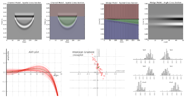
3D models Want to visualize how seismic amplitudes vary according to bed thickness? Build a 2D wedge model and you can analyze a tuning curve. Now, want to explore the same wedge spanning a range of physical properties? That's a job for a 3D wedge model. 

Seismic attributes – Seismic discontinuity attributes, like continuity, or curvature can be ineffective when viewed in cross-section; they're really meant to be shown in time-slices. There is a vast library of attributes and co-rendering technologies we want to provide.

If you get excited about building simple tools on the web for difficult tasks under the ground, we'd love to talk to you. We have an open position for a full-time web developer to help us carry this project forward. Check out the job posting.

Pick This again

Since I last wrote about it, Pick This! has matured. We have continued to improve the tool, which is a collaboration between Agile and the 100% awesome Steve Purves at Euclidity.

Here's some of the new stuff we've added:

  • Multiple lines and polygons for each interpretation. This was a big limitation; now we can pick multiple fault sticks, say.
  • 'Preshows', to show the interpreter some text or an image before they interpret. In beta, talk to us if you want to try it.
  • Interpreter cohorts, with randomized selection, so we can conduct blind trials.  In beta, again, talk to us.
  • Complete picking history, so we can replay the entire act of interpretation. Coming soon: new visualizations of results that use this data.

Some of this, such as replaying the entire picking event, is of interest to researchers who want to know how experts interpret images. Remotely sensed images — whether in geophysics, radiology, astronomy, or forensics — are almost always ambiguous. Look at these faults, for example. How many are there? Where are they exactly? Where are their tips?  

A seismic line from the Browse Basin, offshore western Australia. Data courtesy of CGG and the Virtual Seismic Atlas

A seismic line from the Browse Basin, offshore western Australia. Data courtesy of CGG and the Virtual Seismic Atlas

Most of the challenges on the site are just fun challenges, but some — like the Browse Basin challenge, above — are part of an experiment by researchers Juan Alcalde and Clare Bond at the University of Aberdeen. Please help them with their research by taking part and making an interpretation! It would also be super if you could fill out your profile page — that will help Juan and Clare understand the results. 

If you're at the AAPG conference in Denver then you can win bonus points by stopping by Booth 404 to visit Juan and Clare. Ask them all about their fascinating research, and say hello from us!

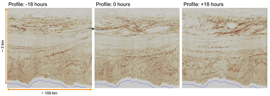
While you're on the site, check out some of the other images — or upload one yourself! This one was a real eye-opener: time-lapse seismic reflections from the water column, revealing dynamic thermohaline stratification. Can you pick this?

Pick This challenge showing time-lapse frames from a marine 3D. The seabed is shown in blue at the bottom of the images.

Pick This challenge showing time-lapse frames from a marine 3D. The seabed is shown in blue at the bottom of the images.

May linkfest

The pick of the links from the last couple of months. We look for the awesome, so you don't have to :)

ICYMI on Pi Day, pimeariver.com wants to check how close river sinuosity comes to pi. (TL;DR — not very.)

If you're into statistics, someone at Imperial College London recently released a nice little app for stochastic simulations of simple calculations. Here's a back-of-the-envelope volumetric calculation by way of example. Good inspiration for our Volume* app.

I love it when people solve problems together on the web. A few days ago Chris Jackson (also at Imperial) posted a question about converting projected coordinates...

I responded with a code snippet that people quickly improved. Chris got several answers to his question, and I learned something about the pyproj library. Open source wins again!

In answering that question, I also discovered that Github now renders most IPython Notebooks. Sweet!

Speaking of notebooks, Beaker looks interesting: individual code blocks support different programming languages within the same notebook and allow you to pass data from one cell to another. For instance, you could do your basic stuff in Python, computationally expensive stuff in Julia, then render a visualization with JavaScript. Here's a simple example from their site.

Python is the language for science, but JavaScript certainly rules the visual side of the web. Taking after JavaScript data-artists like Bret Victor and Mike Bostock, Jack Schaedler has built a fantastic website called Seeing circles, sines, and signals containing visual explanations of signal processing concepts.

If that's not enough for you, there's loads more where that came from: Gallery of Concept Visualization. You're welcome.

My recent notebook about finding small things with 2D seismic grids sparked some chatter on Twitter. People had some great ideas about modeling non-random distributions, like clustered or anisotropic populations. Lots to think about!

Getting help quickly is perhaps social media's most potent capability — though some people do insist on spoiling everything by sharing U might be a genius if u can solve this! posts (gah, stop it!). Earth Science Stack Exchange is still far from being the tool is can be, but there have been some relevant questions on geophysics lately:

A fun thread came up on Reddit too recently: Geophysics software you wish existed. Perfect for inspiring people at hackathons! I'm keeping a list of hacky projects for the next one, by the way.

Not much to say about 3D models in Sketchfab, other than: they're wicked! I mean, check out this annotated anticline. And here's one by R Mahon based on sedimentological experiments by John Shaw and others...

Pick This! Social interpretation

PIck This is a new web app for social image interpretation. Sort of Stack Exchange or Quora (both awesome Q&A sites) meets Flickr. You look for an interesting image and offer your interpretation with a quick drawing. Interpretations earn reputation points. Once you have enough rep, you can upload images and invite others to interpret them. Find out how others would outline that subtle brain tumour on the MRI, or pick that bifurcated fault...

A section from the Penobscot 3D, offshore Nova Scotia, Canada. Overlain on the seismic image is a heatmap of interpretations of the main fault by 26 different interpreters. The distribution of interpretations prompts questions about what is 'the' an…

A section from the Penobscot 3D, offshore Nova Scotia, Canada. Overlain on the seismic image is a heatmap of interpretations of the main fault by 26 different interpreters. The distribution of interpretations prompts questions about what is 'the' answer. Pick this image yourself at pickthis.io.

The app was born at the Geophysics Hackathon in Denver last year. The original team consisted of Ben Bougher, a UBC student and long-time Agile collaborator, Jacob Foshee, a co-founder of Durwella, Chris Chalcraft, a geoscientist at OpenGeoSolutions, Agile's own Evan Bianco of course, and me ordering pizzas and googling domain names. By demo time on Sunday afternoon, we had a rough prototype, good enough for the audience to provide the first seismic interpretations.

Getting from prototype to release

After the hackathon, we were very excited about Pick This, with lots of ideas for new features. We wanted it to be easy to upload an image, being clear about its provenance, and extremely easy to make an interpretation, right in the browser. After some great progress, we ran into trouble bending the drawing library, Raphael.js, to our will. The app languished until Steve Purves, an affable geoscientist–programmer who lives on a volcano in the middle of the Atlantic, came to the rescue a few days ago. Now we have something you can use, and it's fun! For example, how would you pick this unconformity

This data is proprietary to MultiKlient Invest AS. Licensed CC-BY-SA. 

This data is proprietary to MultiKlient Invest AS. Licensed CC-BY-SA. 

This beautiful section is part of this month's Tutorial in SEG's The Leading Edge magazine, and was the original inspiration for the app. The open access essay is by Don Herron, the creator of Interpreter Sam, and describes his approach to interpreting unconformities, using this image as the partially worked example. We wanted a way for readers to try the interpretation themselves, without having to download anything — it's always good to have a use case before building something new. 

What's next for Pick This?

I'm really excited about the possibilities ahead. Apart from the fun of interpreting other people's data, I'm especially excited about what we could learn from the tool — how long do people spend interpreting? How many edits do they make before submitting? And we'd love to add other modes to the tool, like choosing between two image enhancement results, or picking multiple features. And these possibilities only multiply when you think about applications outside earth science, in medical imaging, remote sensing, or astronomy. So much to do, so little time! 

We trust your opinion. Maybe you can help us:

  • Is Pick This at all interesting or fun or useful to you? Is there a use case that occurs to you? 
  • Making the app better will take time and therefore money. If your organization is interested in image enhancement, subjectivity in interpretation, or machine learning, then maybe we can work together. Get in touch!

Whatever you do, please have a look at Pick This and let us know what you think.

Cross sections into seismic sections

We've added to the core functionality of modelr. Instead of creating an arbitrarily shaped wedge (which is plenty useful in its own right), users can now create a synthetic seismogram out of any geology they can think of, or extract from their data.

Turn a geologic-section into an earth model

We implemented a color picker within an image processing scheme, so that each unique colour gets mapped to an editable rock type. Users can create and manage their own rock property catalog, and save models as templates to share and re-use. You can use as many or as few colours as you like, and you'll never run out of rocks.

To give an example, let's use the stratigraphic diagram that Bruce Hart used in making synthetic seismic forward models in his recent Whither seismic stratigraphy article. There are 7 unique colours, so we can generate an earth model by assigning a rock to each of the colours in the image.

If you can imagine it, you can draw it. If you can draw it, you can model it.

Modeling as an interactive experience

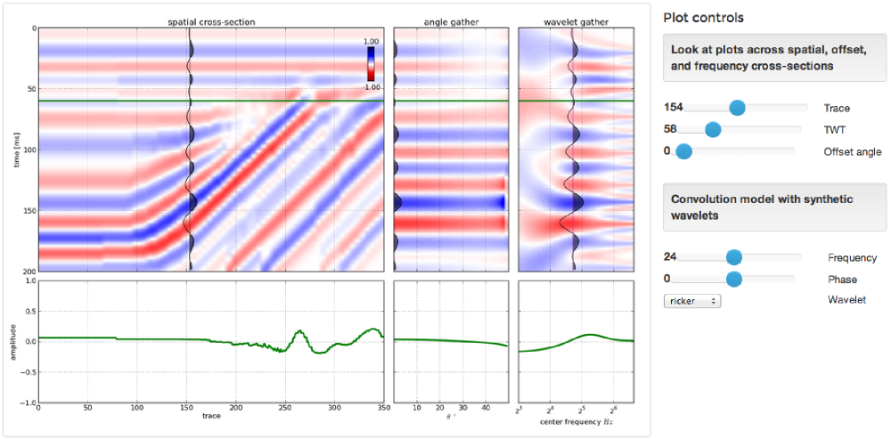
We've exposed parameters in the interface and so you can interact with the multidimensional seismic data space. Why is this important? Well, modeling shouldn't be a one-shot deal. It's an iterative process. A feedback cycle where you turn knobs, pull levers, and learn about the behaviour of a physical system; in this case it is the interplay between geologic units and seismic waves. 

A model isn't just a single image, but a swath of possibilities teased out by varying a multitude of inputs. With modelr, the seismic experiment can be manipulated, so that the gamut of geologic variability can be explored. That process is how we train our ability to see geology in seismic.

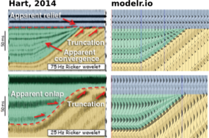
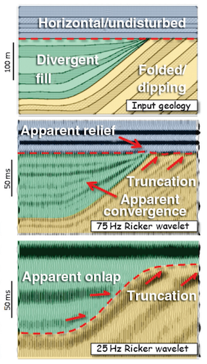
Hart's paper doesn't specifically mention the rock properties used, so it's difficult to match amplitudes, but you can see here how modelr stands up next to Hart's images for high (75 Hz) and low (25 Hz) frequency Ricker wavelets.

There are some cosmetic differences too... I've used fewer wiggle traces to make it easier to see the seismic waveforms. And I think Bruce forgot the blue strata on his 25 Hz model. But I like this display, with the earth model in the background, and the wiggle traces on top — geology and seismic blended in the same graphical space, as they are in the real world, albeit briefly.


Subscribe to the email list to stay in the loop with modelr news, or sign-up at modelr.io and get started today.

This will add you to the email list for the modeling tool. We never share user details with anyone. You can unsubscribe any time.

Seismic models: Hart, BS (2013). Whither seismic stratigraphy? Interpretation, volume 1 (1). The image is copyright of SEG and AAPG.

Transforming geology into seismic

Hart (2013). ©SEG/AAPGForward modeling of seismic data is the most important workflow that nobody does.

Why is it important?

  • Communicate with your team. You know your seismic has a peak frequency of 22 Hz and your target is 15–50 m thick. Modeling can help illustrate the likely resolution limits of your data, and how much better it would be with twice the bandwidth, or half the noise.
  • Calibrate your attributes. Sure, the wells are wet, but what if they had gas in that thick sand? You can predict the effects of changing the lithology, or thickness, or porosity, or anything else, on your seismic data.
  • Calibrate your intuition. Only by predicting the seismic reponse of the geology you think you're dealing with, and comparing this with the response you actually get, can you start to get a feel for what you're really interpreting. Viz Bruce Hart's great review paper we mentioned last year (right).

Why does nobody do it?

Well, not 'nobody'. Most interpreters make 1D forward models — synthetic seismograms — as part of the well tie workflow. Model gathers are common in AVO analysis. But it's very unusual to see other 2D models, and I'm not sure I've ever seen a 3D model outside of an academic environment. Why is this, when there's so much to be gained? I don't know, but I think it has something to do with software.

  • Subsurface software is niche. So vendors are looking at a small group of users for almost any workflow, let alone one that nobody does. So the market isn't very competitive.
  • Modeling workflows aren't rocket surgery, but they are a bit tricky. There's geology, there's signal processing, there's big equations, there's rock physics. Not to mention data wrangling. Who's up for that?
  • Big companies tend to buy one or two licenses of niche software, because it tends to be expensive and there are software committees and gatekeepers to negotiate with. So no-one who needs it has access to it. So you give up and go back to drawing wedges and wavelets in PowerPoint.

Okay, I get it, how is this helping?

We've been busy lately building something we hope will help. We're really, really excited about it. It's on the web, so it runs on any device. It doesn't cost thousands of dollars. And it makes forward models...

That's all I'm saying for now. To be the first to hear when it's out, sign up for news here:

This will add you to the email list for the modeling tool. We never share user details with anyone. You can unsubscribe any time.

Seismic models: Hart, BS (2013). Whither seismic stratigraphy? Interpretation, volume 1 (1). The image is copyright of SEG and AAPG.

Machines can read too

The energy industry has a lot of catching up to do. Humanity is faced with difficult, pressing problems in energy production and usage, yet our industry remains as secretive and proprietary as ever. One rich source of innovation we are seriously under-utilizing is the Internet. You have probably heard of it.

Machine experience design

semantic.jpg

Web sites are just the front-end of the web. Humans have particular needs when they read web pages — attractive design, clear navigation, etc. These needs are researched and described by the rapidly growing field of user experience design, often called UX. (Yes, the ways in which your intranet pages need fixing are well understood, just not by your IT department!)

But the web has a back-end too. Rather than being for human readers, the back-end is for machines. Just like human readers, machines—other computers—also have particular needs: structured data, and a way to make queries. Why do machines need to read the web? Because the web is full of data, and data makes the world go round. 

So website administrators need to think about machine experience design too. As well as providing beautiful web pages for humans to read, they should provide widely-accepted machine-readable format such as JSON or XML, and a way to make queries.

What can we do with the machine-readable web?

The beauty of the machine-readable web, sometimes called the semantic web, or Web 3.0, is that developers can build meta-services on it. For example, a website like hipmunk.com that finds the best flights, wherever they are. Or a service that provides charts, given some data or a function. Or a mobile app that knows where to get the oil price. 

In the machine-readable web, you could do things like:

  • Write a program to analyse bibliographic data from SEG, SPE and AAPG.
  • Build a mobile app to grab log mnemonics info from SLB's, HAL's, and BHI's catalogs.
  • Grab course info from AAPG, PetroSkills, and Nautilus to help people find training they need.

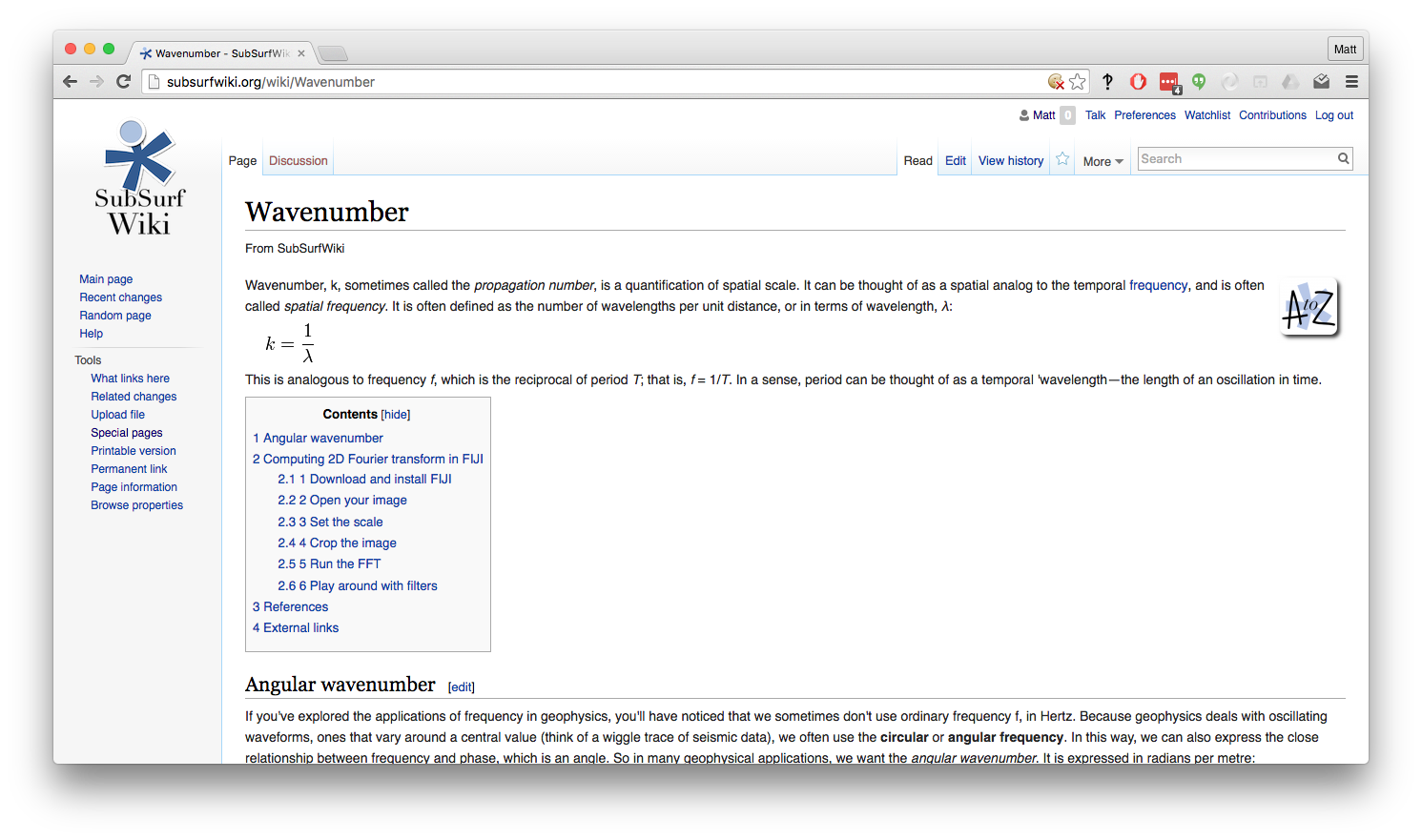
Most wikis have a public application programming interface, giving direct, machine-friendly access to the wiki's database. Here are two views of one wiki page — click on the images to see the pages:

At SEG last year, I suggested to a course provider that they might consider offering machine access to their course catalog—so that developers can build services that use their course information and thus send them more students. They said, "Don't worry, we're building better search tools for our users." Sigh.

In this industry, everyone wants to own their own portal, and tends to be selfish about their data and their users. The problem is that you don't know who your users are, or rather who they could be. You don't know what they will want to do with your data. If you let them, they might create unimagined value for you—as hipmunk.com does for airlines with reasonable prices, good schedules, and in-flight Wi-Fi. 

I can't wait for the Internet revolution to hit this industry. I just hope I'm still alive.