Cracks, energy, and nanoseismic

Following on from our post on Monday, here are some presentations that caught our attention on days 2 and 3 at the CSPG CSEG CWLS convention this week in Calgary. 

On Tuesday, Eric von Lunen of Nexen chose one of the more compelling titles of the conference: What do engineers need from geophysicists in shale resource plays? Describing some of the company's work in the Horn River sub-basin, he emphasized the value of large, multi-faceted teams of subsurface scientists, including geochemists, geologists, geophysicists, petrophysicists, and geo-mechanics. One slightly controversial assertion: Nexen interprets less than 20% of the fractures as vertical, and up to 40% as horizontal. 

Jon Olson is Associate Professor at University of Texas at Austin, shared some numerical modeling and physical experiments that emphasized the relevance of subcritical crack indices for unconventional reservoir exploitation. He presented the results of a benchtop hydrofracking experiment on a cubic foot of gyprock. By tinting frac fluids with red dye, Jon is able to study the fracture patterns directly by slicing the block and taking photographs. It would be curious to perform micro-micro-seismic (is that nanoseismic?) experiments, to make a more complete small-scale analog.

Shawn Maxwell of Schlumberger is Mr Microseismic. We're used to thinking of the spectrum of a seismic trace; he showed the spectrum of a different kind of time series, the well-head pressure during a fracture stimulation. Not surprisingly, most of the energy in this spectrum is below 1 Hz. What's more, if you sum the energy recorded by a typical microseismic array, it amounts to only one millionth of the total energy pumped into the ground. The deficit is probably aseismic, at least certainly outside the seismic band (about 5 Hz to 200 Hz on most jobs). Where is the rest of the pumped energy? Some sinks are: friction losses in the pipe, friction losses in the reservoir, heat, etc.

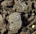
Image of Horn River shale is licensed CC-BY-SA, from Qyd on Wikimedia Commons. 

Noise, sampling, and the Horn River Basin

Some highlights from day 1 of GeoCon11, the CSPG CSEG CWLS annual convention in Calgary.

Malcolm Lansley of Sercel, with Peter Maxwell of CGGVeritas, presented a fascinating story of a seismic receiver test in a Maginot Line bunker in the Swiss Alps. The goal was to find one of the quietest places on earth to measure the sensitivity to noise at very low frequencies. The result: if signal is poor then analog geophones outperform MEMS accelerometers in the low frequency band, but MEMS are better in high signal:noise situations (for example, if geological contrasts are strong).

Click for the reportWarren Walsh and his co-authors presented their work mapping gas in place for the entire Horn River Basin of northeast British Columbia, Canada. They used a stochastic approach to simulate both free gas (held in the pore space) and adsorbed gas (bound to clays and organic matter). The mean volume: 78 Tcf, approximately the same size as the Hugoton Natural Gas Area in Kansas, Texas, and Oklahoma. Their report (right) is online

RECON Petrotechnologies showed results from an interesting physical experiment to establish the importance of well-log sample rate in characterizing thin beds. They constructed a sandwich of gyprock, between slices of aluminium and magnesium, then pulled a logging tool through a hole in the middle of the sandwich. An accurate density measurement in a 42-cm thick slice of gyprock needed 66 samples per metre, much higher than the traditional 7 samples per metre, and double the so-called 'high resolution' rate of 33 samples per metre. Read their abstract

Carl Reine at Nexen presented Weighing in on seismic scale, exploring the power law relationship of fracture lengths in Horn River shales. He showed that the fracture system has no characteristic scale, and fractures are present at all lengths. Carl used two independent seismic techniques for statistically characterizing fracture lengths and azimuths, which he called direct and indirect. Direct fault picking was aided by coherency (a seismic attribute) and spectral decomposition; indirect fault picking used 3D computations of positive and negative curvature. Integrating these interpretations with borehole and microseismic data allowed him to completely characterize fractures in a reservoir model. (See our post about crossing scales in interpretation.)

Evan and Matt are tweeting from the event, along with some other attendees; follow the #geocon11 hashtag to get the latest.


Seeing red

Temperature is not often a rock property given a lot of attention by geoscientists. Except in oil sands. Bitumen is a heavily biodegraded oil greater than 10 000 cP and less than 10˚API. It is a viscoelastic solid at room temperature, and flows only when sufficiently heated. Operators inject steam (through a process called SAGD), as opposed to hot water, because steam carrys a large portion of its energy as latent heat. When steam condenses against the chamber walls, it transfers heat into the surrounding reservoir. This is akin to the pain you'd feel when you place your hand over a pot of rolling water.

This image is a heat map across 3 well pairs (green dots) at the Underground Test Facility (UTF) in the Early Cretaceous McMurray Formation in the Athabasca oil sands of Alberta. This data is from downhole thermocouple measurements, shown in white dots, the map was made by doing a linear 2D interpolation.

Rather than geek out on the physics and processes taking place, I'd rather talk about why I think this is a nifty graphic.

What I like about this figure

Colour is intiutive – Blue for cold, red for hot, it doesn't get much more intuitive than that. A single black contour line delineates the zone of stable steam and a peripheral zone being heated.  

Unadulterated interpolation – There are many ways of interpolating or filling-in where there is no data. In this set, the precision of each measurement is high, within a degree or two, but the earth is sampled irregularly. There is much higher sampling in the vertical direction than the x,y direction, and this presents, somewhat unsightly, as horizontal edges on the interpolated colours. To smooth the interpolation, or round its slightly jagged edges would, in my opinion, degrade the information contained in the graphic. It's a display of the sparseness of the measurements. 

Sampling is shown – You see exactly how many points make up the data set. Fifteen thermocouples in each of 7 observation wells. It makes the irregularities in the contours okay, meaningful even. I wouldn’t want to smooth it. I think map makers and technical specialists too readily forget about where their data comes from. Recognize the difference between hard data and interpolation, and recognize the difference between observation and interpretation.

Sampling is scale – Imagine what this image would look like if we took the first, third, fifth, and seventh observation well away. Our observations and thus physical interpretation would be dramatically different. Every data point is accurate, but resolution depends on sample density.

Layers of context – Visualizing data enables heightened interpretation. Interpreting the heated zone is a simply a temperature contour (isotherm). Even though this is just a heat map, you can infer that one steam chamber is isolated, and two have joined into one another. Surely, more can be understood by adding more context, by integrating other subsurface observations.

In commercial scale oil sands operations, it is rare to place observation wells so close to each other. But if we did, and recorded the temperature continuously, would we even need time lapse seismic at all? (see right) 

If you are making a map or plot of any kind, I encourage you to display the source data. Both its location and its value. It compels the viewer to ask questions like, Can we make fewer measurements in the next round? Do we need more? Can we drill fewer observation wells and still infer the same resolution? Will this cost reduction change how we monitor the depletion process?

Our next experiment: AgileWiki

We're excited to announce AgileWiki, a publicly editable encyclopedia of the subsurface, especially for the energy industry. You are unlikely to find how-to's on seismic interpretation in Wikipedia, or tutorials on basic concepts in Schlumberger's glossary, but this is exactly the sort of thing you'll find in AgileWiki.

If you're thinking: 'Great, but the last thing I need is another wiki...' then, fair enough, we sympathize. But here's why we think AgileWiki should have a role in your professional life:

  • It's only about the subsurface of the earth
  • It's only about the science and industry of energy
  • It's licensed CC-BY, which means you can re-purpose its content however you like, with due credit

We don't want to give the impression that AgileWiki is finished, or even very useful yet — it's very much early days and it has a long way to go. This is the Agile way: release early and update often. We think doing things like this in public is the best way to ensure it is relevant and useful. Evan and I are using the wiki already, so it is already growing organically.

A wiki is really just a website that anyone can edit (after you create an account; I have disabled anonymous edits). Please don't feel like you have to use it just as an encyclopedia. Here are some other ways to use AgileWiki:

  • As a way to share notes: next time you want to share something of general interest and email doesn't quite suit, feel free to document it in the wiki and simply send a URL.
  • As a personal and open notebook: You can store anything you want on your User page, which is automatically created when you create your account. 
  • As a source for non-proprietary content for an in-house or corporate wiki. Feel free to push generic content of your own back to us!

If you're not ready to jump into editing just yet but you'd like to see how this experiment can help you, why not try requesting an article? We're not promising to deliver overnight, but we want to help create content you want. So make a wish-list and let us know about it, on the wiki or in the comments below.

Last thing: please consider the ownership and possible confidentiality of whatever you want to share. By putting your material in the wiki, you agree to share it with others under the terms of its license.

News of the week

New site for seismic related work

There is a new job site for the seismic and geophysical industry called Seismic Works. Search for jobs, post jobs, advertise, or find crews, vendors, or equipment. Still very much in its early days, the site is nicely designed and very full-featured. You can also connect with SeismicWorks on Facebook. We look forward to seeing more sites and social connectors like this in our community.

SonicScope, a new real-time geophysical tool

Schlumberger has introduced a new logging-while-drilling tool called SonicScope that can be run directly behind the bit while drilling. The tool has potential to improve rock mechanics measurements and fracture identification by getting to the borehole wall immediately after penetration, minimizing the effects of washout and invasion. Real-time sonic measurements could enable pore pressure monitoring, time-to-depth information for seismic-well ties, and borehole damage assessment. We hope to see technology like this increase the relevance of rock physics. 

Geophysicist on last shuttle

Fellow geoscientist Andrew Feustel will be flying on space shuttle Endeavour's last trip into orbit. Andrew has an MSc in Geophysics from Purdue University in Indiana, USA, and a PhD in seismology from Queen's University in Ontario, Canada. He's even a fully paid-up member of the American Geophysical Union and the Society of Exploration Geophysicists. In addition to his scientific prowess, Andrew brings considerable mechanical tinkering skills, and will serve as the crew's repairman during the voyage. You can read more about him on his NASA profile page. Good luck, Andrew!

Nexen joins Marathon to explore shale gas in Poland

Canadian based Nexen Inc. will acquire a 40% working interest in ten of Marathon Oil's land agreements in Poland's Palaeozoic shale. Nexen brings experience in unconverntional drilling and completion technologies and shale gas experience from their assets in the Horn River shale in British Columbia, Canada. Europe's development of shale gas resources are complicated by population density, but activty in Poland's shale gas resources is evolving rapidly in the wake of successful shale plays in North America. Read more about the deal.

See all of our News of the week posts.

This regular news feature is for information only. We aren't connected with any of these organizations, and don't necessarily endorse their products or services. Image of Feustel is courtesy of NASA.

Geophysics apps FTW

Google Nexus SI have used an Apple iPhone for several years. It's probably the loveliest technology I've ever owned. But now it's gone, it's over between us, and it will never come back. Because now I've found Android

Last Wednesday I got a Google Nexus S, chosen for its relative purity: built by Samsung, it's a Google-branded phone, so it has less of the carrier's fingerprints on it, and it gets OS updates faster. But it's not the phone I love—it doesn't have the industrial beauty of the iPhone®. It's not even Google's Android™ operating system that I'm besotted with—though it is pretty fantastic. The thing I love is App Inventor. 

If you've never tried programming a computer, you really should give it a try. For me, learning to program transforms a computer from a mere tool into a workshop. Or if you prefer, from an instrument into an orchestra—sounds a bit less utilitarian that way. And I tentatively assert that you will never look at a problem, at least a technical one, in the same way again.

Google App Inventor™ is a programming environment for your phone. You do the programming in a web browser, but the thing you build runs on your phone, or anyone else's phone (as long as it's running Android, natch). Everything is free. And it's easy. Not 'quite easy'. Really easy. If this doesn't sound pretty amazing, you should probably stop reading now. 

Agile Volume app screenshotSince last Friday, I have built four applications, three of which are geoscientiferous:

  • Fold* computes fold and trace density, given a seismic acquisition geometry
  • Elastic* finds all of the elastic parameters, given VP, VS, and density
  • Volume* calculates oil in place, given some reservoir properties (shown)

I had each app working, in a basic way, inside an hour. The only slightly tricky thing is setting up the logic to handle blank fields, weird oilfield units, and that sort of thing. Aesthetics can also be fiddly, especially if you are making custom graphics. But if you skip looks and error handling, perhaps because you don't intend to give the app to anyone else, then you can be done in under an hour. 

Evan and I have barely started to explore the tools available. The language inside App Inventor is based on MIT Scratch, the building-block visual interface with a long history at MIT. The vocabulary is very rich: there are math processes, logical constructs, text handlers. You can access the phone, email, the GPS, and even the accelerometer (for instance, in our apps you can shake the phone to clear the parameters and start over). You can draw interactive graphics, scan barcodes, or build a persistent database.

The only problem we've run into so far is the final hurdle: you cannot (yet—App Inventor is still in beta) easily publish your finished app to the Android Market, so that others can download it. There are non-easy ways, and we hope to have our apps up soon. They will be free, though we may experiment with freemium

Next week I'll write a bit about Volume* and show you how the inside of it looks. In the meantime, give it a try... or if you prefer, let us know if there's a killer geoscience app you'd love to have on your phone. I'm on a roll!

Find out more

The Wikipedia articles on Android and App Inventor are very nice summaries. 

iPhone is a registered trademark of Apple, Inc. Android and App Inventor are trademarks of Google Inc. Agile is not connected in any way with any of these marks or companies.

Your competitive advantage is...

Two weeks ago I explained why I think competitive advantage is often attached to the wrong things. So corporations hide things they would get more benefit from sharing. This week, I offer one opinion on what competitive advantage is, and how to get more of it.

Data are often not even treated as an asset, never mind an advantageI recently happened on a blog by Rob Karel about business process. That sounds a bit dull perhaps, but I liked this:

The "data is an asset" rhetoric doesn't translate to [monetary value], because data in and of itself has no value! The only value data/information has to offer... is in the context of the business processes, decisions, customer experiences, and competitive differentiators it can enable.

So if data are not a competitive advantage, and neither are most of the software and industrial technology we use, and nor yet are industry training courses or consoritum-based research programs, then what is? My list follows after the jump.

Read More

What changes sea-level?

Relative sea-level is complicated. It is measured from some fixed point in the sediment pile, not a fixed point in the earth. So if, for example, global sea-level (eustasy) stays constant but there is local subsidence at a fault, say, then we can say that relative sea-level has increased. Another common cause is isostatic rebound during interglacials, causing a fall in relative sea-level and a seaward regression of the coastline. Because the system didn't build out into the sea by itself, this is sometimes called a forced regression. Here's a nice example of a raised beach formed this way, from Langerstone Point, near Prawle in Devon, UK:

Image: Tony Atkin, licensed under CC-BY-SA-2.0. From Wikimedia Commons

Two weeks ago I wrote about some of the factors affecting relative sea-level, and the scales on which those processes operate. Before that, I had mentioned my undergraduate fascination with Milankovitch cyclicity and its influence on a range of geological processes. Complexity and interaction were favourite subjects of mine, and I built on this a bit in my graduate studies. To try to visualize some of the connectedness of the controls on sea-level, I drew a geophantasmagram that I still refer to occasionally:

Accommodation refers to the underwater space available for sediment deposition; it is closely related to relative sea-level. The end of the story, at least as far as gross stratigraphy is concerned, is the development of stratigraphic package, like a shelf-edge delta or a submarine fan. Systems tracts is just a jargon term for these packages when they are explicitly related to changes in relative sea-level. 

I am drawn to making diagrams like this; I like mind-maps and other network-like graphs. They help me think about complex systems. But I'm not sure they always help anyone other than the creator; I know I find others' efforts harder to read than my own. But if you have suggestions or improvements to offer, I'd love to hear from you.

News of the week

Compared to last week, it's been a little quiet, and we've been a little busy (not working, don't worry). Here's a quick round-up of some things that have caught our eye over the last few days. 

Google takes on enterprise GIS

The biggest news from Google for a while: Google Earth Builder. For several years, the Google Earth virtual globe software has brought GIS-type workflows to everyone. It's been downloaded an incredible 700 million times. Now, for a fee, you can upload and manage your own geospatial data, and share custom layers with your organization... in a tool everyone knows already. This is potentially transformative because GIS, however powerful and popular, has yet to really penetrate any organization I've seen, though ESRI's amazing ArcGIS Explorer and ArcGIS Server offerings are gaining traction. It's typically still fairly niche, with a small community of power users, lots of dabblers, and masses of people who have no idea what it is and make maps by annotating JPEGs in PowerPoint. Yes, that is as scary as it sounds.

New geo-tagging camera add-on

Geo-tagging photos isn't new, even phones do it. But professional-grade GIS, with rapid location fixing, accurate altitude and compass functionality, is often quite expensive and/or bulky. A small US company, Eka Designs, has announced a couple of new products to try to change this: FotoSpot, an entry-level model, and FotoMapr, for professionals. These camera add-ons use WiFi, Bluetooth, or cable, to connect to a variety of regular digital cameras, oncluding models from Nikon, Canon, Panasonic, and Ricoh. You might want to upgrade your camera more often than your GPS, so this sort of peripheral might be a good investment if you spend a lot of time in the field. Certainly beats scratching down map coordinates and filenames in the rain. 

New books... a lot of new books

We took a look at Amazon's new geoscience books, and it turns out that books are nowhere near being dead! It's hard to find recent titles because when you sort by date you have to scroll past about 500 books that won't be published for months, years even. But here are some recent additions that caught our eye, in no particular order:

Book Titles: How The Bit After The Colon Is Getting Too Long: Where Will It End?

This regular news feature is for information only. We aren't connected with any of these organizations, and don't necessarily endorse their products or services. 

Best online geological maps

Fisk map of Mississippi RiverOne of Fisk's beautiful maps of the Mississippi River, near Readland, Arkansas. Click the map to see more detail.Like most earth scientists I know, I love maps. As a child, I pored over the AA Atlas of Britain on long car journeys. As a student, I spent hours making my first geological map. As an orienteer I learned to read maps running through rhododendron bushes in the rain. As a professional geoscientist, my greatest pleasure is still producing a fine map.

When I worked on the McMurray Formation of Alberta, my colleague came across Harold Fisk's incredible maps of the Mississippi River. These maps have to be seen to be believed, and for me they show how far computers have to go before they can be considered to have replaced paper. The effort and commitment is palpable. If I ever produce anything half as beautiful in my career, I will consider myself privileged. Even more marvellously, since they were made by the Army Corps of Engineers, they are all downloadable for free.

This resource made me wonder what other maps are out there on the web. Not surprisingly, there are lots, and some are quite special. Here's a list of my favourites:

No doubt I have missed some. If you have a favourite of your own, please add it to the comments or drop me a line and I'll be happy to post a follow-up.