Silos are a feature, not a bug

If you’ve had the same problem for a long time, maybe it’s not a problem. Maybe it’s a fact.
— Yitzhak Rabin

"Break down the silos" is such a hackneyed phrase that it's probably not even useful any more. But I still hear it all the time — especially in our work in governments and large enterprises. It's the wrong idea — silos are awesome.

The thing is: people like silos. That's why they are there. Whether they are project teams, organizational units, technical communities, or management layers, silos are comfortable. People can speak freely. Everyone shares the same values. There is trust. There is purpose.

The problem is that much of the time — maybe most of the time, for most people — you want silos not to matter. Don't confuse this with not wanting them to exist. They do exist: get used to it. So now make them not matter. Cope don't fix. 

Permeable seals

In the context of groups of humans who want to work together, what do permeable silos look like? I mean really leaky ones.

The answer is: it depends. Here are the features they will have:

  • They serve their organization. The silo must serve the organization or community it's part of. I think a service-oriented mindset gets the best out of people: get them asking "How can I help?". If it is not serving anyone, the silo needs to die.
  • They are internally effective. This is the whole point of the silo, so this had better be true. Make sure people can do a better job because of the efficiencies of the silo. Resources are provided. Responsibilities are understood. The shared purpose must result in great things... if not, the silo needs to die.
  • They are open. This is the leakiness criterion. If someone needs something from the silo, it must be obvious how to get it, and the cost of getting it must be very low. If someone wants to join the silo, it's obvious how to do this, and they are welcomed. If something about the silo needs to change, there is a clear path to making this known.
  • They are transparent. People need to know what the silo is for. If people look in, they can see how things work. Don't build secret clubs, black boxes, or other dark places. Conversely, if people in the silo want to look outside, they can. Importantly: if the silo's level of transparency doesn't make you uncomfortable, you're not doing enough of it.

The openness is key. Ideally, the mechanism for getting things from the silo is the same one that the silo's own inhabitants use. This is by far the simplest, cheapest way to nail it. Think of it as an interface; if you're a programmer, think of it as an API. Indeed, in many cases, it will involve an actual API. If this does not exist, other people will come up with their own solutions, and if this happens often enough, the silo will cease to be useful to the organization. Competition between silos is unhelpful.

Build more silos!

A government agency can be a silo, as long as it has a rich, free interface for other agencies and the general public to access its services. Geophysics can be a silo, as long as it's easy for a wave-curious engineer to join in, and the silo is promoting excellence and professional development amongst its members. An HR department can be a silo, as long as its practices and procedures are transparent and people can openly ask why the heck they still use Myers–Briggs tests.

Go and build a silo. Then make it not matter most of the time.


Image: Silos by Flickr user Guerretto, licensed CC-BY.

x lines of Python: machine learning

You might have noticed that our web address has changed to agilescientific.com, reflecting our continuing journey as a company. Links and emails to agilegeoscience.com will redirect for the foreseeable future, but if you have bookmarks or other links, you might want to change them. If you find anything that's broken, we'd love it if you could let us know.


Artificial intelligence in 10 lines of Python? Is this really the world we live in? Yes. Yes it is.

After reminding you about the SEG machine learning contest just before Christmas, I thought I could show you how you train a model in a supervised learning problem, then use it to make predictions on unseen data. So we'll just break a simple contest entry down into ten easy steps (note that you could do this on anything, doesn't have to be this problem). 

A machine learning primer

Before we start, let's review quickly what a machine learning problem looks like, and introduct a bit of jargon. To begin, we have a dataset (e.g. the 'Old' well in the diagram below). This consists of records, called instances. In this problem, each instance is a depth location. Each instance is a feature vector: a row vector comprising attributes or features, which in our case are wireline log values for GR, ILD, and so on. Each feature vector is a row in a matrix we conventionally call \(X\). Associated with each instance is some target label — the thing we want to predict — which is a continuous quantity in a regression problem, discrete in a classification problem. The vector of labels is usually called \(y\). In the problem below, the labels are integers representing 9 different facies.

You can read much more about the dataset I'm using in Brendon Hall's tutorial (The Leading Edge, October 2016).

The ten steps to glory

Well, maybe not glory, but something. A prediction of facies at two wells, based on measurements made at 10 other wells. You can follow along in the notebook, but all the highlights are included here. We start by loading the data into a 'dataframe', which you can think of like a spreadsheet:

Now we specify the features we want to use, and make the matrix \(X\) and label vector \(y\):

  features = ['GR', 'ILD_log10', 'DeltaPHI', 'PHIND', 'PE']
  X = df[features].values
  y = df.Facies.values

Since this dataset is all we have, we'd like to set aside some data to test our model on. The library we're using, scikit-learn, has functions to do this sort of thing; by default, it'll split \(X\) and \(y\) into train and test datasets, with 25% of the data going into the test part:

  X_train, X_test, y_train, y_test = train_test_split(X, y)

Now we're ready to choose a model, instantiate it (with some parameters if we want), and train the model (i.e. 'fit' the data). I am calling the trained model augur, because I like that word.

  from sklearn.ensemble import ExtraTreesClassifier
  model = ExtraTreesClassifier()
  augur = model.fit(X_train, y_train)

Now we're ready to take the part of the dataset we reserved for validation, X_test, and predict its labels. Then we can compare those with the known labels, y_test, to see how well we did:

  y_pred = augur.predict(X_test)

We can get a quick idea of the quality of prediction with sklearn.metrics.accuracy_score(y_test, y_pred), but it's more interesting to look at the classification report, which shows us the precision and recall for each class, along with their harmonic mean, the F1 score:

  from sklearn.metrics import classification_report
  print(classification_report(y_test, y_pred))
classification_report.png

Each row is a facies (facies 1, facies 2, etc.). The support is the number of instances representing that label. The key number here is 0.63 — we can regard this as an expression of the accuracy of our prediction. If that sounds low to you, I encourage you to enter the machine learning contest! If it sounds high, that's because it is — it's much too high. In fact, the instances of our dataset are not independent: they are spatially correlated (in depth). It would be smarter not to remove some random samples for validation, but to reserve entire wells. After all, this is how we typically collect subsurface data: one well at a time.

But now we're getting into the weeds of data science. I'll let you venture in there on your own...

2016 retrospective

As we see out the year — or rather shove it out, slamming the door firmly behind it, then changing the locks and filing a restraining order — we like to glance back over the blog. We remember the posts that we enjoyed writing, and the ones you seemed to enjoy reading, and record them here for posterity.

The most popular

The great thing about writing on the web, compared to print, is that you quickly find out whether it was any good, or useful, or at least slightly interesting. You can't hide from data. Without adjusting for the age of posts (older ones have had longer to garner readers of course), the most popular posts of the last 12 months — from the 47 we have published — were:

None of these posts comes anywhere near the most popular page on the site, k is for wavenumber, which I wrote in 2012 but still gets about 600 pageviews a month, nearly 4% of the traffic on the site. Other perennials include Well tie workflow, What is anisotropy? and What is SEG Y?

If you gauge popularity by real engagement — comments, which are like diamonds to bloggers — then, apart from the pieces I already mentioned, these were the next most commenty posts:

Where is everybody?

We don't collect data about our readers beyond what's reported by your browser to Google Analytics, most of which is pretty esoteric. But it is interesting to see the geographic distribution of our readers. The top dozen cities from the roughly two thirds of sessions — out of about 9000 monthly sessions — that report this information:

  1. Houston (3,457 users)
  2. Calgary (2,244)
  3. London (1,500)
  4. Perth (723)
  5. Kuala Lumpur (700)
  6. Stavanger
  7. Delhi
  8. Rio de Janeiro
  9. Leeds
  10. Aberdeen
  11. Jakarta
  12. New York

Last thing

You rock! I mean it. This blog would be pretty pointless without your eyeballs. We appreciate every visit, however short, and when you share a post with someone... it really makes our day. I love hearing from readers, even about typos. Especially aobut typos. Anyway, the point is: thank you for stopping by, and being part of this global community of geoscientists.

Whatever festival you celebrate this week, have a peaceful time*. And all the best for 2017!

* Well, maybe squeeze in a bit of writing: it's good for you. 


Previous Retrospective posts... 2011 retrospective •  2012 retrospective • 2013 retrospective • 2014 retrospective

There was no Retrospective in 2015, I was too discombobulated this time last year :(

Burning the surface onto the subsurface

Previously, I described a few of the reasons why we don't get a clean ground surface event on land seismic data like we do the water-bottom in marine seismic. In land data, the worst part of the image is right at the surface. But ground level is not just tricky to see, it's impossible to see. Since the vibe truck is on the ground, there's no reflection from that surface. Even if there was some kind of event there, processors apply a magic eraser to the top of the section — the mute — to erase the early arrivals. So it's not possible to see the ground in land data, and you can't pick what isn't there.  

But I still want to know where the ground is. Why can't we slap a ground-level seismic 'reflection' event on the section? 

What you need

We need the ground level, which is in depth of course, in the time domain of the seismic section. To compute this, let's call it \(t_\mathrm{G}\), we need three pieces of information at every trace location: the ground elevation \(G\), the seismic reference datum (SRD) which I'll call \(D\), and the replacement velocity \(V_\mathrm{r}\). 

$$ t_\mathrm{G} = \frac{2 (G - D)}{V_\mathrm{r}} $$

Ground elevation.  If you're lucky, you'll be able to find the ground elevation corresponding to each trace stored in the trace headers. Ground elevation might be located in bytes 41-44 or 45-48 of the trace header, which correspond to the receiver group elevation and the surface elevation of the source, respectively. These should be the same for a stacked trace, but as with any meta-data to do with SEGY, this info could be hiding somewhere else, or missing altogether. And if you're that unlucky, you might have to comb through processing reports for the missing information. If you are even more unlucky (as I was in this example), you won't have any kind of processing report to fall back on and you'll have to concoct something else. In the accompanying Jupyter notebook, I resorted to interpolating a digitized elevation profile from a JPEG plot of the seismic line. So if you're all out of options, you might find refuge in those legacy plots! 

This profile is particularly wonky, because the seismic reference datum (red) is not the same across the profile

This profile is particularly wonky, because the seismic reference datum (red) is not the same across the profile

Seismic reference datum. And to make life yet more complicated, the seismic reference datum is not flat across the profile. It goes downhill and then flattens out (red line below). Don't ask me what the advantages are of processing data to a variable datum, but whatever they are, I hope they offset the disadvantages of all-to-easily mistaking the datum to be flat.

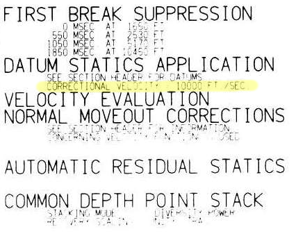
The replacement velocity is given in the sidelabel of the raster image online (shown right). It's 10 000 ft/sec, or 3048 m/s. 

Byte locations 53-56 and 57-60 are the standard trace header placeholders reserved for holding the datum elevation at the receiver group and the datum elevation at source. Again, for a stacked trace, these should be the same value. If these fields are zeros, then check the fields of the Trace Header Extension. If they turn up empty, and if the datum is horizontal, it might be listed in the file's text header. 

Convert elevation to time

By definition, the seismic reference datum is horizontal in the time-domain (red line below). Notice how the ground elevation – in the time domain – plots mostly as negative values (before) time zero. In other words, most of the ground is being cut-off by the top of the section. So, if we want to see it, we need to shift everything down into the field of view. Conceptually, this means adjusting the seismic reference datum so it floats entirely above the ground-level. Computationally, we can achieve this easily enough by padding the top of the data with zeros.

A time-domain representation of the ground-level along the seismic profile. The surface of the earth extends above the start of the seismic data for most of the locations along the profile. 

A time-domain representation of the ground-level along the seismic profile. The surface of the earth extends above the start of the seismic data for most of the locations along the profile. 

Make the ground a pickable event

As a final bit of post-processing, we could actually burn the ground-level into the data as a sort of synthetic seismic event. The reason I like this concept is that it alleviates the need to dig up old-processing reports, puzzle over missing header data, or worse, maintain and munge external text files containing elevation information. I say, let's make it self-contained. Let's put it directly into the data so that it can be treated like any other seismic reflection. Why would I do this?

  • You can see where there might be fold, velocity or other issues related to topography.
  • You can immediately see the polarity of the data. 
  • You could use the bandwidth of the data to make the pseudo-reflector, giving a visual hint to the interpreter.
  • Keeping track of amplitude adjustments and phase rotations would be self-documenting and reversible.
  • you could autotrack it to get a topographic map (or just get this from the processor).
  • It looks cool!
Seismic profile with ground level SYNTHETICALLY SLAPPED ON TOP.  Bandlimited, of course, so you can Autotrack till your hearts content!

Seismic profile with ground level SYNTHETICALLY SLAPPED ON TOP.  Bandlimited, of course, so you can Autotrack till your hearts content!

I've deliberately constructed a band-limited reflection, opposed to placing a sharp spike at ground-level. The problem with a spike is that it has infinite bandwidth. It contains higher frequencies than the image, so as Carl Reine commented on that last post, that might not play nice with seismic attributes. Also, there's the problem of selecting an amplitude value to assign to the spike: we don't want to introduce amplitudes that are ridiculously out of range of the existing data.  

The whole image

I hereby propose that this synthetic ground level trick adopted as the new standard for any land seismic processing and interpretation. The great thing is, it can be done just as easily by interpreters and seismic data technologists, as by the processing companies that create the rest of the image. I realize we're adding stuff to the data that isn't actually signal. We do non-real things to signals all the time. The question is, do the benefits outweigh the artificiality?

Here's the view of the entire section:

The whole section, ground level included.

The whole section, ground level included.

The details of this exercise can be found in the this Jupyter Notebook.

References

The seismic is line 36_77_PR from the USGS data repository.

SEG Y rev 2 Data Exchange Format. SEG Technical Standards Committee. Draft 2.0, January, 2015. 

SEG machine learning contest: there's still time

Have you been looking for an excuse to find out what machine learning is all about? Or maybe learn a bit of Python programming language? If so, you need to check out Brendon Hall's tutorial in the October issue of The Leading Edge. Entitled, "Facies classification using machine learning", it's a walk-through of a basic statistical learning workflow, applied to a small dataset from the Hugoton gas field in Kansas, USA.

But it was also the launch of a strictly fun contest to see who can get the best prediction from the available data. The rules are spelled out in ther contest's README, but in a nutshell, you can use any reproducible workflow you like in Python, R, Julia or Lua, and you must disclose the complete workflow. The idea is that contestants can learn from each other.

Left: crossplots and histograms of wireline log data, coloured by facies — the idea is to highlight possible data issues, such as highly correlated features. Right: true facies (left) and predicted facies (right) in a validation plot. See the rest of the paper for details.

What's it all about?

The task at hand is to predict sedimentological facies from well logs. Such log-derived facies are sometimes called e-facies. This is a familiar task to many development geoscientists, and there are many, many ways to go about it. In the article, Brendon trains a support vector machine to discriminate between facies. It does a fair job, but the accuracy of the result is less than 50%. The challenge of the contest is to do better.

Indeed, people have already done better; here are the current standings:

Team F1 Algorithm Language Solution
1 gccrowther 0.580 Random forest Python Notebook
2 LA_Team 0.568 DNN Python Notebook
3 gganssle 0.561 DNN Lua Notebook
4 MandMs 0.552 SVM Python Notebook
5 thanish 0.551 Random forest R Notebook
6 geoLEARN 0.530 Random forest Python Notebook
7 CannedGeo 0.512 SVM Python Notebook
8 BrendonHall 0.412 SVM Python Initial score in article

As you can see, DNNs (deep neural networks) are, in keeping with the amazing recent advances in the problem-solving capability of this technology, doing very well on this task. Of the 'shallow' methods, random forests are quite prominent, and indeed are a great first-stop for classification problems as they tend to do quite well with little tuning.

How do I enter?

There is still over 6 weeks to enter: you have until 31 January. There is a little overhead — you need to learn a bit about git and GitHub, there's some programming, and of course machine learning is a massive field to get up to speed on — but don't be discouraged. The very first entry was from Bryan Page, a self-described non-programmer who dusted off some basic skills to improve on Brendon's notebook. But you can run the notebook right here in mybinder.org (if it's up today — it's been a bit flaky lately) and a play around with a few parameters yourself.

The contest aspect is definitely low-key. There's no money on the line — just a goody bag of fun prizes and a shedload of kudos that will surely get the winners into some awesome geophysics parties. My hope is that it will encourage you (yes, you) to have fun playing with data and code, trying to do that magical thing: predict geology from geophysical data.


Reference

Hall, B (2016). Facies classification using machine learning. The Leading Edge 35 (10), 906–909. doi: 10.1190/tle35100906.1. (This paper is open access: you don't have to be an SEG member to read it.)

Where is the ground?

This is the upper portion of a land seismic profile in Alaska. Can you pick a horizon where the ground surface is? Have a go at pickthis.io.

Pick the Ground surface at the top of the seismic section at pickthis.io.

Pick the Ground surface at the top of the seismic section at pickthis.io.

Picking the ground surface on land-based seismic data is not straightforward. Picking the seafloor reflection on marine data, on the other hand, is usually a piece of cake, a warm-up pick. You can often auto-track the whole thing with a few seeds.

Seafloor reflection on Penobscot 3D survey, offshore Nova Scotia. from Matt's tutorial in the April 2016 The Leading Edge, The function of interpolation.

Seafloor reflection on Penobscot 3D survey, offshore Nova Scotia. from Matt's tutorial in the April 2016 The Leading Edge, The function of interpolation.

Why aren't interpreters more nervous that we don't know exactly where the surface of the earth is? I'm sure I'm not the only one that would like to have this information while interpreting. Wouldn't it be great if land seismic were more like marine?

Treacherously Jagged TopographY or Near-Surface processing ArtifactS?

Treacherously Jagged TopographY or Near-Surface processing ArtifactS?

If you're new to land-based seismic data, you might notice that there isn't a nice pickable event across the top of the section like we find in marine seismic data. Shot noise at the surface has been muted (deleted) in processing, and the low fold produces an unclean, jagged look at the top of the section. Additionally, the top of the section, time-zero — the seismic reference datum — usually floats somewhere above the land surface — and we can't know where that is unless it can be found in the file header, or looked up in the processing report.

The seismic reference datum, at a two-way time of zero seconds on seismic data, is typically set at mean sea level for offshore data. For land data, it is usually chosen to 'float' above the land surface.

The seismic reference datum, at a two-way time of zero seconds on seismic data, is typically set at mean sea level for offshore data. For land data, it is usually chosen to 'float' above the land surface.

Reframing the question

This challenge is a bit of a trick question. It begs the viewer to recognize that the seemingly simple task of mapping the ground level on a land seismic section is actually a rudimentary velocity modeling or depth conversion exercise in itself. Wouldn't it be nice to have the ground surface expressed as pickable seismic event? Shouldn't we have it always in our images? Baked into our data, so to speak, such that we've always got an unambiguous pick? In the next post, I'll illustrate what I mean and show what's involved in putting it in. 

In the meantime, I challenge you to pick where you think the (currently absent) ground surface is on this profile, so in the next post we can see how well you did.

Le meilleur hackathon du monde

hackathon_2017_calendar.png

Hackathons are short bursts of creative energy, making things that may or may not turn out to be useful. In general, people work in small teams on new projects with no prior planning. The goal is to find a great idea, then manifest that idea as something that (barely) works, but might not do very much, then show it to other people.

Hackathons are intellectually and professionally invigorating. In my opinion, there's no better team-building, networking, or learning event.

The next event will be 10 & 11 June 2017, right before the EAGE Conference & Exhibition in Paris. I hope you can come.

The theme for this event will be machine learning. We had the same theme in New Orleans in 2015, but suffered a bit from a lack of data. This time we will have a collection of open datasets for participants to build off, and we'll prime hackers with a data-and-skills bootcamp on Friday 9 June. We did this once before in Calgary – it was a lot of fun. 

Can you help?

It's my goal to get 52 participants to this edition of the event. But I'll need your help to get there. Please share this post with any friends or colleagues you think might be up for a weekend of messing about with geoscience data and ideas. 

Other than participants, the other thing we always need is sponsors. So far we have three organizations sponsoring the event — Dell EMC is stepping up once again, thanks to the unstoppable David Holmes and his team. And we welcome Sandstone — thank you to Graham Ganssle, my Undersampled Radio co-host, who I did not coerce in any way.

sponsors_so_far.png

If your organization might be awesome enough to help make amazing things happen in our community, I'd love to hear from you. There's info for sponsors here.

If you're still unsure what a hackathon is, or what's so great about them, check out my November article in the Recorder (Hall 2015, CSEG Recorder, vol 40, no 9).

x lines of Python: AVO plot

Amplitude vs offset (or, more properly, angle) analysis is a core component of quantitative interpretation. The AVO method is based on the fact that the reflectivity of a geological interface does not depend only on the acoustic rock properties (velocity and density) on both sides of the interface, but also on the angle of the incident ray. Happily, this angular reflectivity encodes elastic rock property information. Long story short: AVO is awesome.

As you may know, I'm a big fan of forward modeling — predicting the seismic response of an earth model. So let's model the response the interface between a very simple model of only two rock layers. And we'll do it in only a few lines of Python. The workflow is straightforward:

  1. Define the properties of a model shale; this will be the upper layer.
  2. Define a model sandstone with brine in its pores; this will be the lower layer.
  3. Define a gas-saturated sand for comparison with the wet sand. 
  4. Define a range of angles to calculate the response at.
  5. Calculate the brine sand's response at the interface, given the rock properties and the angle range.
  6. For comparison, calculate the gas sand's response with the same parameters.
  7. Plot the brine case.
  8. Plot the gas case.
  9. Add a legend to the plot.

That's it — nine lines! Here's the result:


Once we have rock properties, the key bit is in the middle:

    θ = range(0, 31)
    shuey = bruges.reflection.shuey2(vp0, vs0, ρ0, vp1, vs1, ρ1, θ)

shuey2 is one of the many functions in bruges — here it provides the two-term Shuey approximation, but it contains lots of other useful equations. Virtually everything else in our AVO plotting routine is just accounting and plotting.


As in all these posts, you can follow along with the code in the Jupyter Notebook. You can view this on GitHub, or run it yourself in the increasingly flaky MyBinder (which is down at the time of writing... I'm working on an alternative).

What would you like to see in x lines of Python? Requests welcome!

St Nick's list for the geoscientist

It's that time again. Perhaps you know a geoscientist that needs a tiny gift, carefully wrapped, under a tiny tree. Perhaps that geoscientist has subtly emailed you this blog post, or non-subtly printed it out and left copies of it around your house and/or office and/or person. Perhaps you will finally take the hint and get them something awesomely geological.

Or perhaps 2016 really is the rubbish year everyone says it is, and it's gonna be boring non-geological things for everyone again. You decide.

Science!

I have a feeling science is going to stick around for a while. Get used to it. Better still, do some! You can get started on a fun science project for well under USD 100 — how about these spectrometers from Public Lab? Or these amazing aerial photography kits

All scientists must have a globe. It's compulsory. Nice ones are expensive, and they don't get much nicer than this one (right) from Real World Globes (USD 175 to USD 3000, depending on size). You can even draw on it. Check out their extra-terrestrial globes too: you can have Ganymede for only USD 125!

If you can't decide what kind of science gear to get, you could inspire someone to make their own with a bunch of Arduino accessories from SparkFun. When you need something to power your gadget in the field, get a fuel cell — just add water! Or if it's all just too much, play with some toy science like this UNBELIEVABLE Lego volcano, drone, crystal egg scenario.

Stuff for your house

Just because you're at home doesn't mean you have to stop loving rocks. Relive those idyllic field lunches with this crazy rock sofa that looks exactly like a rock but is not actually a rock (below left). Complete the fieldwork effect with a rainhead shower and some mosquitoes.

No? OK, check out these very cool Livingstone bouldery cushions and seats (below right, EUR 72 to EUR 4750).

If you already have enough rocks and/or sofas to sit on, there are some earth sciencey ceramics out there, like this contour-based coffee cup by Polish designer Kina Gorska, who's based in Oxford, UK. You'll need something to put it on; how about a nice absorbent sandstone coaster?

Wearables

T-shirts can make powerful statements, so don't waste it on tired old tropes like "schist happens" or "it's not my fault". Go for bold design before nerdy puns... check out these beauties: one pretty bold one containing the text to Lyell's Principles of Geology (below left), one celebrating Bob Moog with waveforms (perfect for a geophysicist!), and one featuring the lonely Chrome T-Rex (about her). Or if you don't like those, you can scour Etsy for volcano shirts.

Books

You're probably expecting me to lamely plug our own books, like the new 52 Things you Should Know About Rock Physics, which came out a few weeks ago. Well, you'd be wrong. There are lots of other great books about geoscience out there!

For example, Brian Frehner (a historian at Oklahoma State) has Finding Oil (2016, U Nebraska Press) coming out on Thursday this week. It covers the early history of petroleum geology, and I'm sure it'll be a great read. Or how about a slightly 'deeper history' book the new one from Walter Alvarez (the Alvarez), A Most Improbable Journey: A Big History of Our Planet and Ourselves (2016, WW Norton), which is getting good reviews. Or for something a little lighter, check out my post on scientific comic books — all of which are fantastic — or this book, which I don't think I can describe.

Dry your eyes

If you're still at a loss, you could try poking around in the prehistoric giftological posts from 2011201220132014, or 2015. They contain over a hundred ideas between them, I mean, come on.

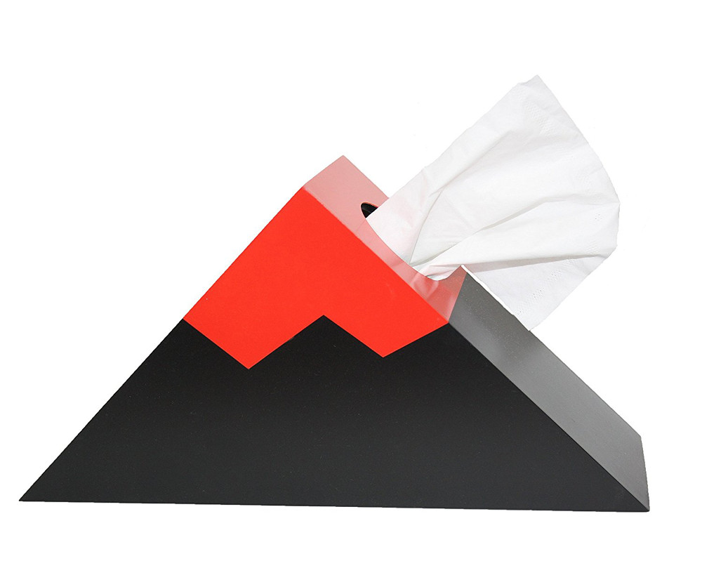
Still nothing? Nevermind, dry your eyes in style with one of these tissue box holders. Paaarp!


The images in this post are all someone else's copyright and are used here under fair use guidelines. I'm hoping the owners are cool with people helping them sell stuff!

The disappearing lake trick

On Sunday 20 November it's the 36th anniversary of the 1980 Lake Peigneur drilling disaster. The shallow lake — almost just a puddle at about 3 m deep — disappeared completely when the Texaco wellbore penetrated the Diamond Crystal Salt Company mine at a depth of about 350 m.

Location, location, location

It's thought that the rig, operated by Wilson Brothers Ltd, was in the wrong place. It seems a calculation error or misunderstanding resulted in the incorrect coordinates being used for the well site. (I'd love to know if anyone knows more about this as the Wikipedia page and the video below offer slightly different versions of this story, one suggesting a CRS error, the other a triangulation error.)

The entire lake sits on top of the Jefferson Island salt dome, but the steep sides of the salt dome, and a bit of bad luck, meant that a few metres were enough to spoil everyone's day. If you have 10 minutes, it's worth watching this video...

Apparently the accident happened at about 0430, and the crew abandoned the subsiding rig before breakfast. The lake was gone by dinner time. Here's how John Warren, a geologist and proprietor of Saltworks, describes the emptying in his book Evaporites (Springer 2006, and repeated on his awesome blog, Salty Matters):

Eyewitnesses all agreed that the lake drained like a giant unplugged bathtub—taking with it trees, two oil rigs [...], eleven barges, a tugboat and a sizeable part of the Live Oak Botanical Garden. It almost took local fisherman Leonce Viator Jr. as well. He was out fishing with his nephew Timmy on his fourteen-foot aluminium boat when the disaster struck. The water drained from the lake so quickly that the boat got stuck in the mud, and they were able to walk away! The drained lake didn’t stay dry for long, within two days it was refilled to its normal level by Gulf of Mexico waters flowing backwards into the lake depression through a connecting bayou...

The other source that seems reliable is Oil Rig Disasters, a nice little collection of data about various accidents. It ends with this:

Federal experts from the Mine Safety and Health Administration were not able to apportion blame due to confusion over whether Texaco was drilling in the wrong place or that the mine’s maps were inaccurate. Of course, all evidence was lost.

If the bit about the location is true, it may be one of the best stories of the perils of data management errors. If anyone (at Chevron?!) can find out more about it, please share!