The machine learning algo zoo

One of the wonderful, but also baffling, things about machine learning is that there are so many ways to do it. At some very high level, most of them do something like this (highlighting some jargon):

  1. The human settles on a task (“Predict lithology”) and finds a bunch of data relevant to that task (say, some well logs A, B, and C). Then the human has to come up with some known instances or examples where these well log data go with those lithology labels.

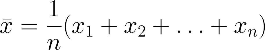
  2. Stuff the logs into an equation. Not an equation like A + B + C, because there’s nothing to tweak in that equation. The equation needs parameters or coefficients, like \(\alpha A + \beta B + \gamma C\). The machine can tweak those Greek letters to change the output. At first, they’ll be random guesses.

  3. See how the output of that equation, which is the machine’s prediction, compares to the known labels. Come up with another equation whose output is a good measure of how far away the predictions are from the known labels. This distance is called the cost, and the equation to compute it the cost function.

  4. Now that the machine has something to guess (the Greek parameters) and a way to know how well its doing (the cost function), it just needs a way to minimize the cost, or to put it another way, optimize the parameters. This optimization process is called learning.

Together, these steps constitute a learning algorithm. An algorithm with a set of optimized weights is usually referred to simply as a model.

All the algorithms

Every piece of this story is worth a whole blog post on its own, but for today let’s stay high-level.

The problem is that the algorithm zoo can be overwhelming. My post last week was an attempt to compare a lot of regression algorithms, in terms of how they make sense of three synthetic datasets.

Today I’m sharing a Big Giant Spreadsheet™ that attempts to compare some of the most popular ‘shallow’ learning algorithms in terms of their most important characteristics. For example, can they predict probabilities? Are they deterministic? What are the key hyperparameters? And so on.

Here’s a small version of the table (see the links below for other versions):

There’s a PDF version here — and here’s the original spreadsheet.

Eventually, I’m visualizing a poster for the wall. I think it would be nice to have some equations on here. Maybe the plots from the various comparisons too (see last weeks post!). And even more advice, like which ones break when you have too many features. What else would you like to see on there?

Does your machine learning smell?

Martin Fowler and Kent Beck popularized the term ‘code smell’ in the book Refactoring. They were describing the subtle signs of deeper trouble in code — signs that a program’s source code might need refactoring (restructuring and rewriting). There are too many aromas to list here, but here are some examples (remember, these things are not necessarily problems in themselves, but they suggest you need to look more closely):

  • Duplicated code.

  • Contrived complexity (also known as showing off).

  • Functions with many arguments, suggesting overwork.

  • Very long functions, which are hard to read.

More recently, data scientist Felienne Hermans applied the principle to the world’s number one programming environment: spreadsheets. The statistics on spreadsheet bugs are quite worrying, and Hermans enumerated the smells that might lead you to them. Here are four of her original five ‘formula’ smells, notice how they correspond to the code smells above:

  • Duplicated formulas.

  • Conditional complexity (e.g. nested IF statements).

  • Multiple references, analogous to the ‘many arguments’ smell.

  • Multiple operations in one cell.

What does a machine learning project smell like?

Most machine learning projects are code projects, so some familiar smells might be emanating from the codebase (if we even have access to it). But machine learning models are themselves functions — machines that map input X to some target y. And even if the statistical model is simple, like a KNN classifier, the workflow is a sort of ‘metamodel’ and can have complexities of its own. So what are the ‘ML smells’ that might alert us to deeper problems in our prediction tools?

I asked this question on Twitter (below) and in the Software Underground

I got some great responses. Here are some ideas adapted from them, with due credit to the people named:

  • Very high accuracy, especially a complex model on a novel task. (Ari Hartikainen, Helsinki and Lukas Mosser, Athens; both mentioned numbers around 0.99 but on earth science problems I start to get suspicious well before that: anything over 0.7 is excellent, and anything over 0.8 suggests ‘special efforts’ have been made.)

  • Excessive precision on hyperparameters might suggest over-tuning. (Chris Dinneen, Perth)

  • Counterintuitive model weights, e.g. known effects have low feature importance. (Reece Hopkins, Anchorage)

  • Unreproducible, non-deterministic code, e.g. not setting random seeds. (Reece Hopkins again)

  • No description of the train–val–test split, or justification for how it was done. Leakage between training and blind data is easy to introduce with random splits in spatially correlated data. (Justin Gosses, Houston)

  • No discussion of ground truth and how the target labels relate to it. (Justin Gosses again)

  • Less than 80% of the effort spent on preparing the data. (Michael Pyrcz, Austin — who actually said 90%)

  • No discussion of the evaluation metric, eg how it was selected or designed (Dan Buscombe, Flagstaff)

  • No consideration of the precision–recall trade-off, especially in a binary classification task. (Dan Buscombe again)

  • Strong class imbalance and no explicit mention of how it was handled. (Dan Buscombe again)

  • Skewed feature importance (on one or two features) might suggest feature leakage. (John Ramey, Austin)

  • Excuses, excuses — “we need more data”, “the labels are bad”, etc. (Hallgrim Ludvigsen, Stavanger)

  • AutoML, e.g. using a black box service, or an exhaustive automated seach of models and hyperparameters.

That’s already a long list, but I’m sure there are others. Or perhaps some of these are really the same thing, or are at least connected. What do you think? What red — or at least yellow — flags do you look out for when reviewing machine learning projects? Let us know in the comments below.


If you enjoyed this post, check out the Machine learning project review checklist I wrote bout last year. I’m currently working on a new version of the checklist that includes some tips for things to look for when going over the checklist. Stay tuned for that.


The thumbnail for this post was generated automatically from text (something like, “a robot smelling a flower”… but I made so many I can’t remember exactly!). Like a lot of unconstrained image generation by AI’s, it’s not great, but I quite like it all the same.

The AI is LXMERT from the Allen Institute. Try it out or read the paper.

download (7).png

The order of stratigraphic sequences

Much of stratigraphic interpretation depends on a simple idea:

Depositional environments that are adjacent in a geographic sense (like the shoreface and the beach, or a tidal channel and tidal mudflats) are adjacent in a stratigraphic sense, unless separated by an unconformity.

Usually, geologists are faced with only the stratigraphic picture, and are challenged with reconstructing the geographic picture.

One interpretation strategy might be to look at which rocks tend to occur together in the stratigraphy. The idea is that rock types tend to be associated with geographic environments — maybe fine sand on the shoreface, coarse sand on the beach; massive silt in the tidal channel, rhythmically laminated mud in the mud-flats. Since if two rocks tend to occur together, their environments were probably adjacent, we can start to understand associations between the rock types, and thus piece together the geographic picture.

So which rock types tend to occur together, and which juxtapositions are spurious — perhaps the result of allocyclic mechanisms like changes in relative sea-level, or sediment supply? To get at this question, some stratigraphers turn to Markov chain analysis.

What is a Markov chain?

Markov chains are sequences of events, or states, resulting from a Markov process. Here’s how Wikipedia describes a Markov process:

A stochastic process that satisfies the Markov property (sometimes characterized as “memorylessness”). Roughly speaking, a process satisfies the Markov property if one can make predictions for the future of the process based solely on its present state just as well as one could knowing the process’s full history, hence independently from such history; i.e., conditional on the present state of the system, its future and past states are independent.

So if we believe that a stratigraphic sequence (I’m using ‘sequence’ here in the most general sense) can be modeled by a process like this — i.e. that its next state depends substantially on its present state — then perhaps we can model it as a Markov chain.

For example, we might have a hunch that we can model a shallow marine system as a sequence like:

offshore mudstone > lower shoreface siltstone > upper shoreface sandstone > foreshore sandstone

Then we might expect to see these transitions occur more often than other, non-successive transitions. In other words — if we compare the transition frequencies we observe to the transition frquencies we would expect from a random sequence of the same beds in the same proportions, then autocyclic or genetic transitions might happen unusually frequently.

The Powers & Easterling method

Several workers have gone down this path. The standard approach seems to be that of Powers & Easterling (1982). Here are the steps they describe:

  • Count the upwards transitions for each rock type. This results in a matrix of counts. Here’s the transition frequency matrix for the example used in the Powers & Easterling paper, in turn taken from Gingerich (1969):

 
data = [[ 0, 37,  3,  2],
        [21,  0, 41, 14],
        [20, 25,  0,  0],
        [ 1, 14,  1,  0]]
  • Compute the expected counts by an iterative process, which usually converges in a few steps. The expected counts represent what Goodman (1968) called a ‘quasi-independence’ model — a random sequence:

 
array([[ 0. , 31.3,  8.2,  2.6],
       [31.3,  0. , 34.1, 10.7],
       [ 8.2, 34. ,  0. ,  2.8],
       [ 2.6, 10.7,  2.8,  0. ]])
  • Now we can compare our observed frequencies with the expected ones in two ways. First, we can inspect the \(\chi^2\) statistic, and compare it with the \(\chi^2\) distribution, given the degrees of freedom (5 in this case). In this example, it’s 35.7, which is beyond the 99.999th percentile of the chi-squared distribution. This rejects the hypothesis of quasi-independence. In other words: the succession appears to be organized. Phew!

  • Secondly, we can compute a matrix of so-called normalized differences. This lets us compare the observed and expected data. By calculating Z-scores, which are approximately normally distributed; since 95% of the distribution falls between −2 and +2, any value greater in magnitude than 2 is ‘fairly unusual’, in the words of Powers & Easterling. In the example, we can see that the large number of transitions from C (third row) to A (first column) is anomalous:


array([[ 0. ,  1. , -1.8, -0.3],
       [-1.8,  0. ,  1.2,  1. ],
       [ 4.1, -1.6,  0. , -1.7],
       [-1. ,  1. , -1.1,  0. ]])
powers_easterling_normdiff.png
  • The normalized difference matrix can also be interpreted as a directed graph, indicating the ‘strengths’ of the connections (edges) between rock types (nodes):

powers_easterling_graph.png

It would be all too easy to over-interpret this graph — B and D seem to go together, as do A and C, and C tends to pass into A, which tends to pass into a B/D system before passing back into C — and one could get carried away. But as a complement to sedimentological interpretation, knowledge of processes and the succession in hand, perhaps inspecting Markov chains can help understand the stratigraphic story.

One last thing… there is another use for Markov chains. We can also use the model to produce stochastic realizations of stratigraphy. These will share the same statistics as the original data, but are otherwise quite random. Here are 20 random beds generated from our model:

 
'ABABCBABABCABDABABCA'

The code to build your own Markov chains is all in this notebook. It’s very much a work in progress. Eventually I hope to merge it into the striplog library, but for now it’s a ‘minimum viable product’. Stay tuned for more on striplog.

Open In Colab   ⇐   Launch the notebook right here in your browser!


References

Gingerich, PD (1969). Markov analysis of cyclic alluvial sediments. Journal of Sedimentary Petrology, 39, p. 330-332. https://doi.org/10.1306/74D71C4E-2B21-11D7-8648000102C1865D

Goodman, LA (1968), The analysis of cross-classified data: independence, quasi-independence, and interactions in contingency tables with or without missing entries. Journal of American Statistical Association 63, p. 1091-1131. https://doi.org/10.2307/2285873

Powers, DW and RG Easterling (1982). Improved methodology for using embedded Markov chains to describe cyclical sediments. Journal of Sedimentary Petrology 52 (3), p. 0913-0923. https://doi.org/10.1306/212F808F-2B24-11D7-8648000102C1865D

x lines of Python: machine learning

You might have noticed that our web address has changed to agilescientific.com, reflecting our continuing journey as a company. Links and emails to agilegeoscience.com will redirect for the foreseeable future, but if you have bookmarks or other links, you might want to change them. If you find anything that's broken, we'd love it if you could let us know.


Artificial intelligence in 10 lines of Python? Is this really the world we live in? Yes. Yes it is.

After reminding you about the SEG machine learning contest just before Christmas, I thought I could show you how you train a model in a supervised learning problem, then use it to make predictions on unseen data. So we'll just break a simple contest entry down into ten easy steps (note that you could do this on anything, doesn't have to be this problem). 

A machine learning primer

Before we start, let's review quickly what a machine learning problem looks like, and introduct a bit of jargon. To begin, we have a dataset (e.g. the 'Old' well in the diagram below). This consists of records, called instances. In this problem, each instance is a depth location. Each instance is a feature vector: a row vector comprising attributes or features, which in our case are wireline log values for GR, ILD, and so on. Each feature vector is a row in a matrix we conventionally call \(X\). Associated with each instance is some target label — the thing we want to predict — which is a continuous quantity in a regression problem, discrete in a classification problem. The vector of labels is usually called \(y\). In the problem below, the labels are integers representing 9 different facies.

You can read much more about the dataset I'm using in Brendon Hall's tutorial (The Leading Edge, October 2016).

The ten steps to glory

Well, maybe not glory, but something. A prediction of facies at two wells, based on measurements made at 10 other wells. You can follow along in the notebook, but all the highlights are included here. We start by loading the data into a 'dataframe', which you can think of like a spreadsheet:

Now we specify the features we want to use, and make the matrix \(X\) and label vector \(y\):

  features = ['GR', 'ILD_log10', 'DeltaPHI', 'PHIND', 'PE']
  X = df[features].values
  y = df.Facies.values

Since this dataset is all we have, we'd like to set aside some data to test our model on. The library we're using, scikit-learn, has functions to do this sort of thing; by default, it'll split \(X\) and \(y\) into train and test datasets, with 25% of the data going into the test part:

  X_train, X_test, y_train, y_test = train_test_split(X, y)

Now we're ready to choose a model, instantiate it (with some parameters if we want), and train the model (i.e. 'fit' the data). I am calling the trained model augur, because I like that word.

  from sklearn.ensemble import ExtraTreesClassifier
  model = ExtraTreesClassifier()
  augur = model.fit(X_train, y_train)

Now we're ready to take the part of the dataset we reserved for validation, X_test, and predict its labels. Then we can compare those with the known labels, y_test, to see how well we did:

  y_pred = augur.predict(X_test)

We can get a quick idea of the quality of prediction with sklearn.metrics.accuracy_score(y_test, y_pred), but it's more interesting to look at the classification report, which shows us the precision and recall for each class, along with their harmonic mean, the F1 score:

  from sklearn.metrics import classification_report
  print(classification_report(y_test, y_pred))
classification_report.png

Each row is a facies (facies 1, facies 2, etc.). The support is the number of instances representing that label. The key number here is 0.63 — we can regard this as an expression of the accuracy of our prediction. If that sounds low to you, I encourage you to enter the machine learning contest! If it sounds high, that's because it is — it's much too high. In fact, the instances of our dataset are not independent: they are spatially correlated (in depth). It would be smarter not to remove some random samples for validation, but to reserve entire wells. After all, this is how we typically collect subsurface data: one well at a time.

But now we're getting into the weeds of data science. I'll let you venture in there on your own...

SEG machine learning contest: there's still time

Have you been looking for an excuse to find out what machine learning is all about? Or maybe learn a bit of Python programming language? If so, you need to check out Brendon Hall's tutorial in the October issue of The Leading Edge. Entitled, "Facies classification using machine learning", it's a walk-through of a basic statistical learning workflow, applied to a small dataset from the Hugoton gas field in Kansas, USA.

But it was also the launch of a strictly fun contest to see who can get the best prediction from the available data. The rules are spelled out in ther contest's README, but in a nutshell, you can use any reproducible workflow you like in Python, R, Julia or Lua, and you must disclose the complete workflow. The idea is that contestants can learn from each other.

Left: crossplots and histograms of wireline log data, coloured by facies — the idea is to highlight possible data issues, such as highly correlated features. Right: true facies (left) and predicted facies (right) in a validation plot. See the rest of the paper for details.

What's it all about?

The task at hand is to predict sedimentological facies from well logs. Such log-derived facies are sometimes called e-facies. This is a familiar task to many development geoscientists, and there are many, many ways to go about it. In the article, Brendon trains a support vector machine to discriminate between facies. It does a fair job, but the accuracy of the result is less than 50%. The challenge of the contest is to do better.

Indeed, people have already done better; here are the current standings:

Team F1 Algorithm Language Solution
1 gccrowther 0.580 Random forest Python Notebook
2 LA_Team 0.568 DNN Python Notebook
3 gganssle 0.561 DNN Lua Notebook
4 MandMs 0.552 SVM Python Notebook
5 thanish 0.551 Random forest R Notebook
6 geoLEARN 0.530 Random forest Python Notebook
7 CannedGeo 0.512 SVM Python Notebook
8 BrendonHall 0.412 SVM Python Initial score in article

As you can see, DNNs (deep neural networks) are, in keeping with the amazing recent advances in the problem-solving capability of this technology, doing very well on this task. Of the 'shallow' methods, random forests are quite prominent, and indeed are a great first-stop for classification problems as they tend to do quite well with little tuning.

How do I enter?

There is still over 6 weeks to enter: you have until 31 January. There is a little overhead — you need to learn a bit about git and GitHub, there's some programming, and of course machine learning is a massive field to get up to speed on — but don't be discouraged. The very first entry was from Bryan Page, a self-described non-programmer who dusted off some basic skills to improve on Brendon's notebook. But you can run the notebook right here in mybinder.org (if it's up today — it's been a bit flaky lately) and a play around with a few parameters yourself.

The contest aspect is definitely low-key. There's no money on the line — just a goody bag of fun prizes and a shedload of kudos that will surely get the winners into some awesome geophysics parties. My hope is that it will encourage you (yes, you) to have fun playing with data and code, trying to do that magical thing: predict geology from geophysical data.


Reference

Hall, B (2016). Facies classification using machine learning. The Leading Edge 35 (10), 906–909. doi: 10.1190/tle35100906.1. (This paper is open access: you don't have to be an SEG member to read it.)

The blind geoscientist

Last time I wrote about using randomized, blind, controlled tests in geoscience. Today, I want to look a bit closer at what such a test or experiment might look like. But before we do anything else, it's worth taking 20 minutes, or at least 4, to watch Ben Goldacre's talk on the subject at Strata in London recently:

How would blind testing work?

It doesn't have to be complicated, or much different from what you already do. Here’s how it could work for the biostrat study I mentioned last time:

  1. Collect the samples as normal. There is plenty of nuance here too: do you sample regularly, or do you target ‘interesting’ zones? Only regular sampling is free from bias, but it’s expensive.
  2. Label the samples with unique identifiers, perhaps well name and depth.
  3. Give the samples to a disinterested, competent person. They repackage the samples and assign different identifiers randomly to the samples.
  4. Send the samples for analysis. Provide no other data. Ask for the most objective analysis possible, without guesswork about sample identification or origin. The samples should all be treated in the same way.
  5. When you get the results, analyse the data for quality issues. Perform any analysis that does not depend on depth or well location — for example, cluster analysis.
  6. If you want to be really thorough, the disinterested party to provide depths only, allowing you to sort by well and by depth but without knowing which wells are which. Perform any analysis that doesn’t depend on spatial location.
  7. Finally, ask for the key that reveals well names. Hopefully, any problems with the data have already revealed themselves. At this point, if something doesn’t fit your expectations, maybe your expectations need adjusting!

Where else could we apply these ideas?

  1. Random selection of some locations in a drilling program, perhaps in contraindicated locations
  2. Blinded, randomized inspection of gathers, for example with different processing parameters
  3. Random selection of wells as blind control for a seismic inversion or attribute analysis
  4. Random selection of realizations from geomodel simulation, for example for flow simulation
  5. Blinded inspection of the results of a 'turkey shoot' or vendor competition (e.g. Hayles et al, 2011)

It strikes me that we often see some of this — one or two wells held back for blind testing, or one well in a program that targets a non-optimal location. But I bet they are rarely selected randomly (more like grudgingly), and blind samples are often peeked at ('just to be sure'). It's easy to argue that "this is a business, not a science experiment", but that's fallacious. It's because it's a business that we must get the science right. Scientific rigour serves the business.

I'm sure there are dozens of other ways to push in this direction. Think about the science you're doing right now. How could you make it a little less prone to bias? How can you make it a shade less likely that you'll pull the wool over your own eyes?

Experimental good practice

Like hitting piñatas, scientific experiments need blindfolds. Image: Juergen. CC-BY.I once sent some samples to a biostratigrapher, who immediately asked for the logs to go with the well. 'Fair enough,' I thought, 'he wants to see where the samples are from'. Later, when we went over the results, I asked about a particular organism. I was surprised it was completely absent from one of the samples. He said, 'oh, it’s in there, it’s just not important in that facies, so I don’t count it.' I was stunned. The data had been interpreted before it had even been collected.

I made up my mind to do a blind test next time, but moved to another project before I got the chance. I haven’t ordered lab analyses since, so haven't put my plan into action. To find out if others already do it, I asked my Twitter friends:

Randomized, blinded, controlled testing should be standard practice in geoscience. I mean, if you can randomize trials of government policy, then rocks should be no problem. If there are multiple experimenters involved, like me and the biostrat guy in the story above, perhaps there’s an argument for double-blinding too.

Designing a good experiment

What should we be doing to make geoscience experiments, and the reported results, less prone to bias and error? I'm no expert on lab procedure, but for what it's worth, here are my seven Rs:

  • Randomized blinding or double-blinding. Look for opportunities to fight confirmation bias. There’s some anecdotal evidence that geochronologists do this, at least informally — can you do it too, or can you do more?
  • Regular instrument calibration, per manufacturer instructions. You should be doing this more often than you think you need to do it.
  • Repeatability tests. Does your method give you the same answer today as yesterday? Does an almost identical sample give you the same answer? Of course it does! Right? Right??
  • Report errors. Error estimates should be based on known problems with the method or the instrument, and on the outcomes of calibration and repeatability tests. What is the expected variance in your result?
  • Report all the data. Unless you know there was an operational problem that invalidated an experiment, report all your data. Don’t weed it, report it. 
  • Report precedents. How do your results compare to others’ work on the same stuff? Most academics do this well, but industrial scientists should report this rigorously too. If your results disagree, why is this? Can you prove it?
  • Release your data. Follow Hjalmar Gislason's advice — use CSV and earn at least 3 Berners-Lee stars. And state the license clearly, preferably a copyfree one. Open data is not altruistic — it's scientific.

Why go to all this trouble? Listen to Richard Feynman:

The first principle is that you must not fool yourself, and you are the easiest person to fool.

Thank you to @ToriHerridge@mammathus@volcan01010 and @ZeticaLtd for the stories about blinded experiments in geoscience. There are at least a few out there. Do you know of others? Have you tried blinding? We'd love to hear from you in the comments! 

What do you mean by average?

I may need some help here. The truth is, while I can tell you what averages are, I can't rigorously explain when to use a particular one. I'll give it a shot, but if you disagree I am happy to be edificated. 

When we compute an average we are measuring the central tendency: a single quantity to represent the dataset. The trouble is, our data can have different distributions, different dimensionality, or different type (to use a computer science term): we may be dealing with lognormal distributions, or rates, or classes. To cope with this, we have different averages. 

Arithmetic mean

Everyone's friend, the plain old mean. The trouble is that it is, statistically speaking, not robust. This means that it's an estimator that is unduly affected by outliers, especially large ones. What are outliers? Data points that depart from some assumption of predictability in your data, from whatever model you have of what your data 'should' look like. Notwithstanding that your model might be wrong! Lots of distributions have important outliers. In exploration, the largest realizations in a gas prospect are critical to know about, even though they're unlikely.

Geometric mean

Like the arithmetic mean, this is one of the classical Pythagorean means. It is always equal to or smaller than the arithmetic mean. It has a simple geometric visualization: the geometric mean of a and b is the side of a square having the same area as the rectangle with sides a and b. Clearly, it is only meaningfully defined for positive numbers. When might you use it? For quantities with exponential distributions — permeability, say. And this is the only mean to use for data that have been normalized to some reference value. 

Harmonic mean

The third and final Pythagorean mean, always equal to or smaller than the geometric mean. It's sometimes (by 'sometimes' I mean 'never') called the subcontrary mean. It tends towards the smaller values in a dataset; if those small numbers are outliers, this is a bug not a feature. Use it for rates: if you drive 10 km at 60 km/hr (10 minutes), then 10 km at 120 km/hr (5 minutes), then your average speed over the 20 km is 80 km/hr, not the 90 km/hr the arithmetic mean might have led you to believe. 

Median average

The median is the central value in the sorted data. In some ways, it's the archetypal average: the middle, with 50% of values being greater and 50% being smaller. If there is an even number of data points, then its the arithmetic mean of the middle two. In a probability distribution, the median is often called the P50. In a positively skewed distribution (the most common one in petroleum geoscience), it is larger than the mode and smaller than the mean:

Mode average

The mode, or most likely, is the most frequent result in the data. We often use it for what are called nominal data: classes or names, rather than the cardinal numbers we've been discussing up to now. For example, the name Smith is not the 'average' name in the US, as such, since most people are called something else. But you might say it's the central tendency of names. One of the commonest applications of the mode is in a simple voting system: the person with the most votes wins. If you are averaging data like facies or waveform classes, say, then the mode is the only average that makes sense. 

Honourable mentions

Most geophysicists know about the root mean square, or quadratic mean, because it's a measure of magnitude independent of sign, so works on sinusoids varying around zero, for example. 

The root mean square equation

Finally, the weighted mean is worth a mention. Sometimes this one seems intuitive: if you want to average two datasets, but they have different populations, for example. If you have a mean porosity of 19% from a set of 90 samples, and another mean of 11% from a set of 10 similar samples, then it's clear you can't simply take their arithmetic average — you have to weight them first: (0.9 × 0.21) + (0.1 × 0.14) = 0.20. But other times, it's not so obvious you need the weighted sum, like when you care about the perception of the data points

Are there other averages you use? Do you see misuse and abuse of averages? Have you ever been caught out? I'm almost certain I have, but it's too late now...

There is an even longer version of this article in the wiki. I just couldn't bring myself to post it all here. 

Confounded paradox

Probabilities are notoriously slippery things to deal with, so it shouldn’t be surprising that proportions, which are really probabilities in disguise, can catch us out too.

Simpson’s paradox is my favourite example of something simple, something we know we understand, indeed have always understood, suddenly turning on us.

Exploration geophysicists often use information extracted from seismic data, called attributes, to help predict rock properties in the subsurface. Suppose you are a geophysicist comparing two new seismic attributes, truth and beauty, each purported to predict fluid type. You compare their hydrocarbon-predicting success rates on 35 discoveries and it’s close, but beauty has an 83% hit rate, while truth manages only 77%. There's not much in it, but since you only need one attribute, all else being equal, beauty it is.

But then someone asks you about predicting oil in particular. You dig out your data and drill down:

Apparently, truth did a little better when you just look at oil. And what about gas, they ask? Well, the data showed that truth was also better than beauty at predicting gas. So truth does a better job at both oil and gas, but somehow beauty edges out overall.

Impossible? Clearly not: these numbers are real and plausible, I haven't done anything sneaky. In this case, hydrocarbon type is a confounding variable, and it’s important to look for such groupings in your data. Improbable? No, it’s quite common in all kinds of data and this trap is well known among statisticians.

How can you avoid it? Be especially wary when the sample size in one or more of the groups you are interested in is much smaller than the others. Be even more alert if group sizes are inconsistent across the variables, as in my example: oil is under-sampled for truth, gas for beauty.

Ultimately, there's no guarantee this effect won’t crop up; that’s just how proportions are. All you can do is make sure you ask your data the questions you care about. 

This post is a version of part of my article The rational geoscientist, The Leading Edge, May 2010