Cross plots: a non-answer

On Monday I asked whether we should make crossplots according to statistical rules or natural rules. There was some fun discussion, and some awesome computation from Henry Herrera, and a couple of gems:

Physics likes math, but math doesn't care about physics — @jeffersonite

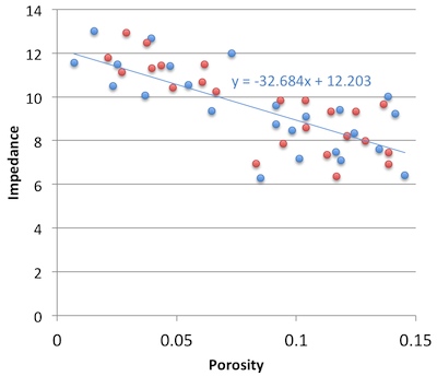
But... when I consider the intercept point I cannot possibly imagine a rock that has high porosity and zero impedance — Matteo Niccoli, aka @My_Carta

I tried asking on Stack Overflow once, but didn’t really get to the bottom of it, or perhaps I just wasn't convinced. The consensus seems to be that the statistical answer is to put porosity on y-axis, because that way you minimize the prediction error on porosity. But I feel—and this is just my flaky intuition talking—like this fails to represent nature (whatever that means) and so maybe that error reduction is spurious somehow.

Reversing the plot to what I think of as the natural, causation-respecting plot may not be that unreasonable. It's effectively the same as reducing the error on what was x (that is, impedance), instead of y. Since impedance is our measured data, we could say this regression respects the measured data more than the statistical, non-causation-respecting plot.

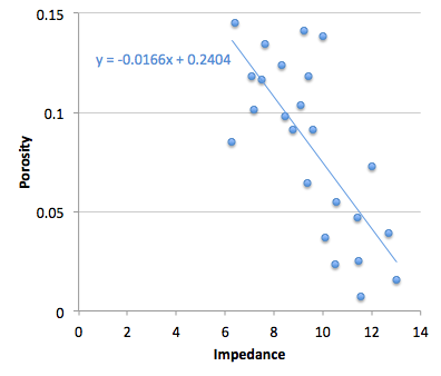
So must we choose? Minimize the error on the prediction, or minimize the error on the predictor. Let's see. In the plot on the right, I used the two methods to predict porosity at the red points from the blue. That is, I did the regression on the blue points; the red points are my blind data (new wells, perhaps). Surprisingly, the statistical method gives an RMS error of 0.034, the natural method 0.023. So my intuition is vindicated! 

Unfortunately if I reverse the datasets and instead model the red points, then predict the blue, the effect is also reversed: the statistical method does better with 0.029 instead of 0.034. So my intuition is wounded once more, and limps off for an early bath.

Irreducible error?

Here's what I think: there's an irreducible error of prediction. We can beg, borrow or steal error from one variable, but then it goes on the other. It's reminiscent of Heisenberg's uncertainty principle, but in this case, we can't have arbitrarily precise forecasts from imperfectly correlated data. So what can we do? Pick a method, justify it to yourself, test your assumptions, and then be consistent. And report your errors at every step. 

I'm reminded of the adage 'Correlation does not equal causation.' Indeed. And, to borrow @jeffersonite's phrase, it seems correlation also does not care about causation.

Cross plot or plot cross?

I am stumped. About once a year, for the last nine years or so, I have failed to figure this out.

What could be simpler than predicting porosity from acoustic impedance? Well, lots of things, but let’s pretend for a minute that it’s easy. Here’s what you do:

1.   Measure impedance at a bunch of wells
2.   Measure the porosity — at seismic scale of course — at those wells
3.   Make a crossplot with porosity on the y-axis and amplitude on the x-axis
4.   Plot the data points and plot the regression line (let’s keep it linear)
5.   Find the equation of the line, which is of the form y = ax + b, or porosity = gradient × impedance + constant
6.   Apply the equation to a map (or volume, if you like) of amplitude, and Bob's your uncle.

Easy!

But, wait a minute. Is Bob your uncle after all? The parameter on the y-axis is also called the dependent variable, and that on the x-axis the independent. In other words, the crossplot represents a relationship of dependency, or causation. Well, porosity certainly does not depend on impedance — it’s the other way around. To put it another way, impedance is not the cause of porosity. So the natural relationship should put impedance, not porosity, on the y-axis. Right?

Therefore we should change some steps:

3.   Make a crossplot with impedance on the y-axis and porosity on the x-axis
4.   Plot the data points and plot the regression line
5a. Find the equation of the line, which is of the form y = ax + b, or impedance = gradient × porosity + constant
5b. Rearrange the equation for what we really want:
porosity = (impedance – constant)/gradient

Not quite as easy! But still easy.

More importantly, this gives a different answer. Bob is not your uncle after all. Bob is your aunt. To be clear: you will compute different porosities with these two approaches. So then we have to ask: which is correct? Or rather, since neither going to give us the ‘correct’ porosity, which is better? Which is more physical? Do we care about physicality?

I genuinely do not know the answer to this question. Do you?

If you're interested in playing with this problem, the data I used are from Imaging reservoir quality seismic signatures of geologic effects, report number DE-FC26-04NT15506 for the US Department of Energy by Gary Mavko et al. at Stanford University. I digitized their figure D-8; you can download the data as a CSV here. I have only plotted half of the data points, so I can use the rest as a blind test. 

Fabric clusters

There are many reasons we might want to use cluster analysis in our work. Geologists might want to sort hundreds of rock samples into a handful of rock types, a petrophysicist might want to group data points from well logs (as shown here), or a curious kitchen dweller may want to digitally classify patterns found in his (or her) linen collection.

Two algorithms worth knowing about when faced with any clustering problem are called k-means and fuzzy c-means clustering. They aren't the right solution for all clustering problems, but they are a good place to start.

k-means clustering — each data point gets assigned to one of k centroids (or centres) according to the centroid it is closest to. In the image shown here, the number of clusters is 2. The pink dots are closest to the left centroid, and the black dots are closest to the right centroid. To see how the classification is done, watch this short step-by-step video. The main disadvantage with this method is that if the clusters are poorly defined, the result seems rather arbitrary.

Fuzzy c-means clustering — each data point belongs to all clusters, but only to a certain degree. Each data point is assigned a probability of belonging to each cluster, and is thus easily assigned the class for which it has a highest probability. If a data point is midway between two clusters, it is still assigned to its closest cluster, but with lower probability. As the bottom image shows, data points on the periphery of cluster groups, such as those shown in grey may be equally likely to belong to both clusters. Fuzzy c-means clustering provides a way of capturing quantitative uncertainty, and even visualizing it.

Some observations fall naturally into clusters. It is just a matter of the observer choosing an adequate combination of attributes to characterize them. In the fabric and seismic examples shown in the previous post, only two of the four Haralick textures are needed to show a diagnostic arrangement of the data for clustering. Does the distribution of these thumbnail sections in the attribute space align with your powers of visual inspection? 

Fabric textures

Beyond the traditional, well-studied attributes that I referred to last time, are a large family of metrics from image processing and robot vision. The idea is to imitate the simple pattern recognition rules our brains intuitively and continuously apply when we look at seismic data: how do the data look? How smooth or irregular are the reflections? If you thought the adjectives I used for my tea towels were ambiguous, I assure you seismic will be much more cryptic.

In three-dimensional data, texture is harder to see, difficult to draw, and impossible to put on a map. So when language fails us, discard words altogether and use numbers instead. While some attributes describe the data at a particular place (as we might describe a photographic pixel as 'red', 'bright', 'saturated'), other attributes describe the character of the data in a small region or kernel ('speckled', 'stripy', 'blurry').

Texture by numbers

I converted the colour image from the previous post to a greyscale image with 256 levels (a bit-depth of 8) to match this notion of scalar seismic data samples in space. The geek speak is that I am computing local grey-level co-occurence matrices (or GLCMs) in a moving window around the image, and then evaluating some statistics of the local GLCM for each point in the image. These statistics are commonly called Haralick textures. Choosing the best kernel size will depend on the scale of the patterns. The Haralick textures are not particularly illustrative when viewed on their own but they can be used for data clustering and classification, which will be the topic of my next post.

  • Step 1: Reduce the image to 256 grey-levels
  • Step 2: For every pixel, compute a co-occurrence matrix from a p by q kernel (p, q = 15 for my tea towel photo)
  • Step 3: For every pixel, compute the Haralick textures (Contrast, Correlation, Energy, Homogeneity) from the GLCM

Textures in seismic data

Here are a few tiles of seismic textures that I have loosely labeled as "high-amplitude continous", "high-amplitude discontinuous", "low-amplitude continuous", etc. You certainly might choose different words to describe them, but each has a unique and objective set of Haralick textures. I have explicitly represented the value of each's texture as a color; using cyan for contrast, magenta for correlation, yellow for energy, and black for homogeneity. Thus, the four Haralick textures span the CMYK color space. Merging these components back together into a single color gives you a sense of the degree of difference across the tiles. For instance, the high-amplitude continuous tile, is characterized by high contrast and high energy, but low correlation, relative to the low-amplitude continuous tile. Their textures are similar, so obviously, they map to similar color values in CMYK color space. Whether or not they are truly discernable is the challenge we offer to data clustering; be it employed by visual inspection or computational force.

Further reading:
Gao, D., 2003, Volume texture extraction for 3D seismic visualization and interpretation, Geophysics, 64, No. 4, 1294-1302
Haralick, R., Shanmugam, K., and Dinstein, I., 1973, Textural features for image classification: IEEE Tran. Systems, Man, and Cybernetics, SMC-3, 610-621.
Mryka Hall-Beyer has a great tutorial at http://www.fp.ucalgary.ca/mhallbey/tutorial.htm for learning more about GLCMs.
Images in this post were made using MATLAB, FIJI and Inkscape.

Fabric attributes

The catch-all term seismic interpretation, often used to refer to the labour of digitizing horizons and faults, is almost always spatially constrained. Picking seismic line-by-line means collapsing complex 3D patterns and volumes onto 2D maps and surfaces. It hurts me to think about what we are discarding. Take a second and imagine looking at a photograph one row of pixels at a time. So much is lost in the simplification.

Attributes, on the other hand, can either quantify the nature of a horizon, probe between horizons, or characterize an entire 3D space. Single-trace attributes can tell us about waveform shape and magnitude which allegedly responds to true physical impedance contrasts. Multi-trace attributes (coherency, curvature, etc.) pull information from neighbouring traces.

The fabric test model

In a spirited act of geeky indulgence, I went to my linen closest, grabbed some tea towels, pulled out my phone (obviously), and captured this scene. A set of four folded tea towels overlapping and spread across my counter top—reverse engineering what I thought to be a suitable analogy for training my seismic inutition. The left (blue) tea towel is a honeycomb texture, the second (green) is speckled like a wash cloth, the third is a high thread-count linen, and the fourth has a grid of alternating cross-hatches and plain print. Don't laugh! It turns out to be quite difficult to verbally describe the patterns in these fabrics. Certainly, you will describe them differently to me, and that is the problem. 

Perhaps image processing can transcend our linguistic limitations. In seismic, as in image processing in general, there are attributes that work on each sample (or trace) independently, and there are attributes that use an ensemble of neighbouring samples in their computation. See if you can think a seismic analogy in the for each of these image attributes.

  • Spectral decomposition shows the component of the RGB color spectrum at each sample location. I subsequently clipped and enhanced the red panel to show curves, wrinkles and boundaries caused by the interplay of light, shadows, and morphology.
  • Spectral filtering extracts or removes hues. In this instance, I have selected all the color triplets that make up the blue tea towel. You could also select a range to say, show where the shadows are.
  • Edge detection, after smoothing, shows sharp edges in white and yellow, soft edges in purple and blue. The wrinkles and subtle folds on the right most fabric have also been detected. 

My question: can you manually draw the morphology, or the blues, or the edges and discontinuities? Manual interpretation is time consuming, prone to error, seldom reproducible, and that makes it flawed. Furthermore, none of these attributes actually tell us about the nature of the textures in the fabric. Indeed, we don't know if any of them are relevant at all. Colour happens to be one proxy for texture in this case, but it fails in delineating the two whitish fabrics.

Artistically and computationally speaking, I submit to you that seismic data are nothing but images. In the next post I will extend this fabric-photograph model to explore the utility of textural attributes. 

Theses images were made using the open source FIJI and the illustrations were done in Inkscape. The attributes were computed in MATLAB and FIJI.

The spectrum of the spectrum

A few weeks ago, I wrote about the notches we see in the spectrums of thin beds, and how they lead to the mysterious quefrency domain. Today I want to delve a bit deeper, borrowing from an article I wrote in 2006.

Why the funny name?

During the Cold War, the United States government was quite concerned with knowing when and where nuclear tests were happening. One method they used was seismic monitoring. To discriminate between detonations and earthquakes, a group of mathematicians from Bell Labs proposed detecting and timing echoes in the seismic recordings. These echoes gave rise to periodic but cryptic notches in the spectrum, the spacing of which was inversely proportional to the timing of the echoes. This is exactly analogous to the seismic response of a thin-bed.

To measure notch spacing, Bogert, Healy and Tukey (1963) invented the cepstrum (an anagram of spectrum and therefore usually pronounced kepstrum). The cepstrum is defined as the Fourier transform of the natural logarithm of the Fourier transform of the signal: in essence, the spectrum of the spectrum. To distinguish this new domain from time, to which is it dimensionally equivalent, they coined several new terms. For example, frequency is transformed to quefrency, phase to saphe, filtering to liftering, even analysis to alanysis.

Today, cepstral analysis is employed extensively in linguistic analysis, especially in connection with voice synthesis. This is because, as I wrote about last time, voiced human speech (consisting of vowel-type sounds that use the vocal chords) has a very different time–frequency signature from unvoiced speech; the difference is easy to quantify with the cepstrum.

What is the cepstrum?

To describe the key properties of the cepstrum, we must look at two fundamental consequences of Fourier theory:

  1. convolution in time is equivalent to multiplication in frequency
  2. the spectrum of an echo contains periodic peaks and notches

Let us look at these in turn. A noise-free seismic trace s can be represented in the time t domain by the convolution of a wavelet w and reflectivity series r thus

convolutional model

Then, in the frequency f domain

In other words, convolution in time becomes multiplication in frequency. The cepstrum is defined as the Fourier transform of the log of the spectrum. Thus, taking logs of the complex moduli

Since the Fourier transform F is a linear operation, the cepstrum is

We can see that the spectrums of the wavelet and reflectivity series are additively combined in the cepstrum. I have tried to show this relationship graphically below. The rows are domains. The columns are the components w, r, and s. Clearly, these thin beds are resolved by this wavelet, but they might not be in the presence of low frequencies and noise. Spectral and cepstral analysis—and alanysis—can help us cut through the seismic and get at the geology. 

Time series (top), spectra (middle), and cepstra (bottom) for a wavelet (left), a reflectivity series containing three 10-ms thin-beds (middle), and the corresponding synthetic trace (right). The band-limited wavelet has a featureless cepstrum, whereas the reflectivity series clearly shows two sets of harmonic peaks, corresponding to the thin- beds (each 10 ms thick) and the thicker composite package.

References

Bogert, B, Healy, M and Tukey, J (1963). The quefrency alanysis of time series for echoes: cepstrum, pseudo-autocovariance, cross- cepstrum, and saphe-cracking. Proceedings of the Symposium on Time Series Analysis, Wiley, 1963.

Hall, M (2006). Predicting stratigraphy with cepstral decomposition. The Leading Edge 25 (2), February 2006 (Special issue on spectral decomposition). doi:10.1190/1.2172313

Greenhouse George image is public domain.

News of the week

The news is back! A few stories have caught our beady geoscientific eyes over the last couple of weeks... If you see anything you think we missed, drop us a line!

Spotfire is free*

*kind of. This is huge. One of the limits on adoption of the amazing Spotfire — the best tools we've ever used for data exploration, and a must-have tool for reservoir engineers — has been cost. But TIBCO is now offering Silver Spotfire, cloud-friendly versions for very reasonable dollars, starting at free! So if you have never tried it, now's your chance. It's very easy: install it, Ctrl-C a data table from MS Excel, and Ctrl-V into Spotfire, and you're away.

World's cheapest Lidar

Most geoscientists are happier holding a pencil than a mouse, so the news of gadgets like tablets coming to subsurface interpretation is always welcome. Though 3D interaction tools like gloves and wands, when they appeared about a decade ago, turned out to be utterly useless, perhaps Microsoft's Kinect can kill the mouse? For example, how about using a sandpit as an input device, like SandyStation?

If you're not sure about that, try this: a glaciologist at the University of California at Santa Cruz used a Kinect as a makeshift Lidar. Though it can only 'see' up to about 5 m, it's extremely fast, accurate, and cheap.

Six years of geo-floss

Geoscientific, free, libre, open source software, or geo-FLOSS, is, like, a 'thing'. The movement continues to grow and blossom at events like the awesome workshop we reported on in June, and the recently announced workshop at the 2012 EAGE Conference and Exhibition next June in Copenhagen. If you work on, use, care about, or are just curious about open source software in exploration geoscience, then we hope to see you there.

This regular news feature is for information only. We aren't connected with any of these organizations, and don't necessarily endorse their products or services. Image of Spotfire considered fair use.

Tuning geology

It's summer! We will be blogging a little less often over July and August, but have lots of great posts lined up so check back often, or subscribe by email to be sure not to miss anything. Our regular news feature will be a little less regular too, until the industry gets going again in September. But for today... here's the motivation behind our latest app for Android devices, Tune*.

Geophysicists like wedges. But why? I can think of only a few geological settings with a triangular shape; a stratigraphic pinchout or an angular unconformity. Is there more behind the ubiquitous geophysicist's wedge than first appears?

Seismic interpretation is partly the craft of interpreting artifacts, and a wedge model illustrates several examples of artifacts found in seismic data. In Widess' famous paper, How thin is a thin bed? he set out a formula for vertical seismic resolution, and constructed the wedge as an aid for quantitative seismic interpretation. Taken literally, a synthetic seismic wedge has only a few real-world equivalents. But as a purely quantitative model, it can be used to calibrate seismic waveforms and interpret data in any geological environment. In particular, seismic wedge models allow us to study how the seismic response changes as a function of layer thickness. For fans of simplicity, most of the important information from a wedge model can be represented by a single function called a tuning curve.

In this figure, a seismic wedge model is shown for a 25 Hz Ricker wavelet. The effects of tuning (or interference) are clearly seen as variations in shape, amplitude, and travel time along the top and base of the wedge. The tuning curve shows the amplitude along the top of the wedge (thin black lines). Interestingly, the apex of the wedge straddles the top and base reflections, an apparent mis-timing of the boundaries.

On a tuning curve there are (at least) two values worth noting; the onset of tuning, and the tuning thickness. The onset of tuning (marked by the green line) is the thickness at which the bottom of the wedge begins to interfere with the top of the wedge, perturbing the amplitude of the reflections, and the tuning thickness (blue line) is the thickness at which amplitude interference is a maximum.

For a Ricker wavelet the amplitude along the top of the wedge is given by:

where R is the reflection coefficient at the boundary, f is the dominant frequency and t is the wedge thickness (in seconds). Building the seismic expression of the wedge helps to verify this analytic solution.

Wedge artifacts

The synthetic seismogram and the tuning curve reveal some important artifacts that the seismic interpreter needs to know about, because they could be pitfalls, or they could provide geological information:

Bright (and dim) spots: A bed thickness equal to the tuning thickness (in this case 15.6 ms) has considerably more reflective power than any other thickness, even though the acoustic properties are constant along the wedge. Below the tuning thickness, the amplitude is approximately proportional to thickness.

Mis-timed events: Below 15 ms the apparent wedge top changes elevation: for a bed below the tuning thickness, and with this wavelet, the apparent elevation of the top of the wedge is actually higher by about 7 ms. If you picked the blue event as the top of the structure, you'd be picking it erroneously too high at the thinnest part of the wedge. Tuning can make it challenging to account for amplitude changes and time shifts simultaneously when picking seismic horizons.

Limit of resolution: For a bed thinner than about 10 ms, the travel time between the absolute reflection maxima—where you would pick the bed boundaries—is not proportional to bed thickness. The bed appears thicker than it actually is.

Bottom line: if you interpret seismic data, and you are mapping beds around 10–20 ms thick, you should take time to study the effects of thin beds. We want to help! On Monday, I'll write about our new app for Android mobile devices, Tune*. 

Reference

Widess, M (1973). How thin is a thin bed? Geophysics, 38, 1176–1180. 

F is for Frequency

Frequency is the number of times an event repeats per unit time. Periodic signals oscillate with a frequency expressed as cycles per second, or hertz: 1 Hz means that an event repeats once every second. The frequency of a light wave determines its color, while the frequency of a sound wave determines its pitch. One of the greatest discoveries of the 18th century is that all signals can be decomposed into a set of simple sines and cosines oscillating at various strengths and frequencies. 

I'll use four toy examples to illustrate some key points about frequency and where it rears its head in seismology. Each example has a time-series representation (on the left) and a frequency spectrum representation (right).

The same signal, served two ways

This sinusoid has a period of 20 ms, which means it oscillates with a frequency of 50 Hz (1/20 ms-1). A sinusoid is composed of a single frequency, and that component displays as a spike in the frequency spectrum. A side note: we won't think about wavelength here, because it is a spatial concept, equal to the product of the period and the velocity of the wave.

In reflection seismology, we don't want things that are of infinitely long duration, like sine curves. We need events to be localized in time, in order for them to be localized in space. For this reason, we like to think of seismic impulses as a wavelet.

The Ricker wavelet is a simple model wavelet, common in geophysics because it has a symmetric shape and it's a relatively easy function to build (it's the second derivative of a Gaussian function). However, the answer to the question "what's the frequency of a Ricker wavelet?" is not straightforward. Wavelets are composed of a range (or band) of frequencies, not one. To put it another way: if you added monotonic sine waves together according to the relative amplitudes in the frequency spectrum on the right, you would produce the time-domain representation on the left. This particular one would be called a 50 Hz Ricker wavelet, because it has the highest spectral magnitude at the 50 Hz mark—the so-called peak frequency

Bandwidth

For a signal even shorter in duration, the frequency band must increase, not just the dominant frequency. What makes this wavelet shorter in duration is not only that it has a higher dominant frequency, but also that it has a higher number of sine waves at the high end of the frequency spectrum. You can imagine that this shorter duration signal traveling through the earth would be sensitive to more changes than the previous one, and would therefore capture more detail, more resolution.

The extreme end member case of infinite resolution is known mathematically as a delta function. Composing a signal of essentially zero time duration (notwithstanding the sample rate of a digital signal) takes not only high frequencies, but all frequencies. This is the ultimate broadband signal, and although it is impossible to reproduce in real-world experiments, it is a useful mathematical construct.

What about seismic data?

Real seismic data, which is acquired by sending wavelets into the earth, also has a representation in the frequency domain. Just as we can look at seismic data in time, we can look at seismic data in frequency. As is typical with all seismic data, the example below set lacks low and high frequencies: it has a bandwidth of 8–80 Hz. Many geophysical processes and algorithms have been developed to boost or widen this frequency band (at both the high and low ends), to increase the time domain resolution of the seismic data. Other methods, such as spectral decomposition, analyse local variations in frequency curves that may be otherwise unrecognizable in the time domain. 

High resolution signals are short in the time domain and wide or broadband in the frequency domain. Geoscientists often equate high resolution with high frequency, but that it not entirely true. The greater the frequency range, the larger the information carrying capacity of the signal.

In future posts we'll elaborate on Fourier transforms, sampling, and frequency domain treatments of data that are useful for seismic interpreters.

For more posts in our Geophysics from A to Z posts, click here.

What is AVO?

I used to be a geologist (but I'm OK now). When I first met seismic data, I took the reflections and geometries quite literally. The reflections come from geology, so it seems reasonable to interpret them as geology. But the reflections are waves, and waves are slippery things: they have to travel through kilometres of imperfectly known geology; they can interfere and diffract; they emanate spherically from the source and get much weaker quickly. This section from the Rockall Basin in the east Atlantic shows this attenuation nicely, as well as spectacular echo reflections from the ocean floor called multiples:

Rockall seismicData from the Virtual Seismic Atlas, contributed by the British Geological Survey.

Impedance is the product of density and velocity. Despite the complexity of seismic reflections, all is not lost. Even geologists interpreting seismic know that the strength of seismic reflections can have real, quantitative, geological meaning. For example, amplitude is related to changes in acoustic impedance Z, which is equal to the product of bulk density ρ and P-wave velocity V, itself related to lithology, fluid, and porosity.

Flawed cartoon of a marine seismic survey. OU, CC-BY-SA-NC.

But when the amplitude versus offset (AVO) behaviour of seismic reflections gets mentioned, most non-geophysicists switch off. If that's your reaction too, don't be put off by the jargon, it's really not that complicated.

The idea that we collect data from different angles is not complicated or scary. Remember the classic cartoon of a seismic survey (right). It's clear that some of the ray paths bounce off the geological strata at relatively small incidence angles, closer to straight down-and-up. Others, arriving at receivers further away from the source, have greater angles of incidence. The distance between the source and an individual receiver is called offset, and is deducible from the seismic field data because the exact location of the source and receivers is always known.

The basic physics behind AVO analysis is that the strength of a reflection does not only depend on the acoustic impedance—it also depends on the angle of incidence. Only when this angle is 0 (a vertical, or zero-offset, ray) does the simple relationship above hold.

Total internal reflection underwater. Source: Mbz1 via Wikimedia Commons.Though it may be unintuitive at first, angle-dependent reflectivity is an idea we all know well. Imagine an ordinary glass window: you can see through it perfectly well when you look straight through it, but when you move to a wide angle it suddenly becomes very reflective (at the so-called critical angle). The interface between water and air is similarly reflective at wide angles, as in this underwater view.

Karl Bernhard Zoeppritz (German, 1881–1908) was the first seismologist to describe the relationship between reflectivity and angle of incidence. In this context, describe means write down the equations for. Not two or three equations, lots of equations.

The Zoeppritz equations are very good model for how seismic waves propagate in the earth. There are some unnatural assumptions about isotropy, total isolation of the interface, and other things, but they work well in many real situations. The problem is that the equations are unwieldy, especially if you are starting from seismic data and trying to extract rock properties—trying to solve the so-called inverse problem. Since we want to be able to do useful things quickly, and since seismic data are inherently approximate anyway, several geophysicists have devised much friendlier models of reflectivity with offset.Google Nexus S

I'll take a look at these more friendly models next time, because I want to tell a bit about how we've implemented them in our soon-to-be-released mobile app, AVO*. No equations, I promise! Well, one or two...