What is shale?

Until four or five years ago, it was enough just to know that shale is that dark grey stuff in between the sands. Being overly fascinated with shale was regarded as a little, well, unconventional. To be sure, seals and source rocks were interesting and sometimes critical, but always took a back seat to reservoir characterization.

Well, now the shale is the reservoir. So how do we characterize shale? We might start by asking: what is shale, really? Is it enough to say, "I don't know, but I know it when I see it"? No: sometimes you need to know what to call something, because it affects how it is perceived, explored for, developed, and even regulated.

Alberta government

Section 1.020(2)(27.1) of the Oil and Gas Conservation Regulations defines shale:

a lithostratigraphic unit having less than 50% by weight organic matter, with less than 10% of the sedimentary clasts having a grain size greater than 62.5 micrometres and more than 10% of the sedimentary clasts having a grain size less than 4 micrometres.
ERCB Bulletin 2009-23

This definition seems quite strict, but it open to interpretation. 'Ten percent of the sedimentary clasts' might be a very small volumetric component of the rock, much less than 10%, if those 'clasts' are small enough. I am sure they meant to write '...10% of the bulk rock volume comprising clasts having a grain size...'.

Read More

D is for Domain

Domain is a term used to describe a variable for which a set of functions or signals are defined.

Time-domain describes functions or signals that change over time; depth-domain describes functions or signal that change over space. The oscillioscope, geophone, and heartrate monitor are tools used to visualize real-world signals in the time domain. The map, photograph, and well log are tools to describe signals in the depth (spatial) domain.

Because seismic waves are recorded in time (jargon: time series), seismic data are naturally presented and interpreted with time as the z-axis. Routinely though, geoscientists must convert data and data objects between the time and depth domain.

Consider the top of a hydrocarbon-bearing reservoir in the time domain (top panel). In this domain, it looks like wells A and B will hit the reservoir at the same elevation and encounter the same amount of pay.

In this example the velocities that enable domain conversion vary from left to right, thereby changing the position of this structure in depth. The velocity model (second panel) linearly decreases from 4000 m/s on the left, to 3500 m/s on the right; this equates to a 12.5% variation in the average velocities in the overburden above the reservoir.

This velocity gradient yields a depth image that is significantly different than the time domain representation. The symmetric time structure bump has been rotated and the spill point shifted from the left side to the right. More importantly, the amount of reservoir underneath the trap has been drastically reduced. 

Have you encountered examples in your work where data domains have been misleading?

Although it is perhaps more intuitive to work with depth-domain data wherever possible, sometimes there are good reasons to work with time. Excessive velocity uncertainty makes depth conversion so ambiguous that you are better off in time-domain. Time-domain signals are recorded at regular sample rates, which is better for signal processing and seismic attributes. Additionally, travel-time itself is an attribute in that it may be recorded or mapped for its physical meaning in some cases, for example time-lapse seismic.

If you think about it, all three of these models are in fact different representations of the same earth. It might be tempting to regard the depth picture as 'reality' but if it's your only perspective, you're kidding yourself. 

The etiology of rivers

The Ordovician was a primitive time. No mammals. No birds. No flowers. Most geologists know this, right? How about this: No meandering rivers.

Recently several geo-bloggers wrote about geological surprises. This was on my shortlist. 

A couple of weeks ago, Evan posted the story of scale-free gravity deformation we heard from Adrian Park and his collaborators at the Atlantic Geological Society's annual Colloquium. My own favourite from the conference was Neil Davies' account of the evolution of river systems:

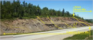
Davies, Neil & Martin Gibling (2011). Pennsylvanian emergence of anabranching fluvial deposits: the parallel rise of arborescent vegetation and fixed-channel floodplains.

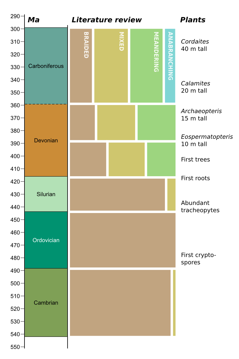
Neil, a post-doctoral researcher at Dalhousie University in Nova Scotia, Canada, started with a literature review. He read dozens of case studies of fluvial geology from all over the world, noting the interpretation of river morphology (fluvotype?). What he found was, to me at least, surprising: there were no reported meandering rivers before the Devonian, and no anabranching rivers before the Carboniferous. 

The idea that rivers have evolved over time, becoming more diverse and complex, is fascinating. At first glance, rivers might seem to be independent of life and other manifestly time-bound phenomena. But if we have learned only one thing in the last couple of decades, it is that the earth's systems are much more intimately related than this, and that life leaves its fingerprint on everything on earth's surface. 

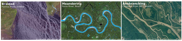
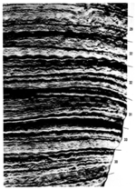
A little terminology: anastomosing, a term I was more familiar with, is not strictly the correct term for these many-branched, fixed-channel rivers. Sedimentologists prefers anabranching. Braided and meandering river types are perhaps more familiar. The fluviotypes I'm showing here might be thought of as end members — most rivers show all of these characteristics through time and space.

What is the cause of this evolution? Davies and Gibling discussed two parallel effects: bank stabilization by soil and roots, and river diversion, technically called avulsion, by fallen trees. The first idea is straightforward: plants colonize river banks and floodplains, thus changing their susceptibility to erosion. The second idea was new to me, but is also simple: as trees got taller, it became more and more likely that fallen trunks would, with time, make avulsion more likely. 

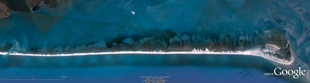
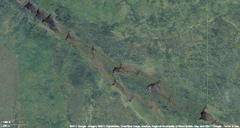
There is another river type we are familiar with in Canada: the string of beaver dams (like this example from near Fort McMurray, Alberta). I don't know for sure, but I bet these first appeared in the Eocene. I have heard that the beaver is second only to man in terms of the magnitude of its effect on the environment. As usual, I suspect that microbes were not considered in this assertion.

All of this makes me wonder: are there other examples of evolution expressing itself in geomorphology like this?

Many thanks to Neil and Martin for allowing us to share this story. Please forgive my deliberate vagueness with some of the details — this work is not yet published; I will post a link to their forthcoming paper when it is published. The science and the data are theirs, any errors or inconsistencies are mine alone. 

How to cheat

Yesterday I posted the rock physics cheatsheet, which is a condensed version of useful seismic reservoir characterization and rock mechanics concepts. It's cheat as in simplify, not cheat as in swindle. 

As Matt discussed on Friday, heuristics can be shortcuts to hone your intuition. Our minds search to use rules of thumb to visualise the invisible and to solve sticky problems. That's where the cheat sheet comes in. You might not find rock physics that intuitive, but let's take a look at the table to see how it reveals some deeper patterns.

The table of elastic parameters is setup based on the fundamental notion that, if you have any two elastic properties previously defined, you can compute all the others. This is a consequence of one of the oldest laws in classical mechanics: Newton's second law, F=ma. In particular one thing I find profound about seismic velocity is that it is wholly determined by a ratio of competing tensional (elastic) forces to inertial (density) forces. To me, it is not immediately obvious that speed, with units of m/s, results from the ratio of pressure to density. 

This simple little equation has had a profound impact on the utility of seismology to the oil and gas industry. It links extrinsic dynamic properties (VP) to intrinsic rock properties (K, μ, ρ). The goal of course, is not just to investigate elastic properties for the sake of it, but to link elastic properties to reservoir and petrophysical properties. This is traditionally done using a rock physics template. The one I find easiest to understand is the VP/VS vs P-impedance template, an example of which is shown on the cheatsheet. You will see others in use, for instance Bill Goodway has pioneered the λρ vs μρ (LMR) template.

In an upcoming post we'll look to deepen the connection between Newtonian mechanics and reservoir characterization. 

Rock physics cheatsheet

Today, I introduce to you the rock physics cheatsheet. It contains useful information for people working on problems in seismic rock physics, inversion, and the mechanical properties of rocks. Admittedly, there are several equations, but I hope they are laid out in a simple and systematic way. This cheatsheet is the third instalment, following up from the geophysics cheatsheet and basic cheatsheet we posted earlier. 

To me, rock physics is the crucial link between earth science and engineering applications, and between reservoir properties and seismic signals. Rocks are, in fact, a lot like springs. Their intrinsic elastic parameters are what control the extrinsic seismic attributes that we collect using seismic waves. With this cheatsheet in hand you will be able to model fluid depletion in a time-lapse sense, and be able to explain to somebody that Young's modulus and brittleness are not the same thing.

So now with 3 cheatsheets at your fingertips, and only two spaces on the inside covers of you notebooks, you've got some rearranging to do! It's impossible to fit the world of seismic rock physics on a single page, so if you feel something is missing or want to discuss anything on this sheet, please leave a comment.

Click to download the PDF (1.5MB)

Confirmation

The first principle is that you must not fool yourself — and you are the easiest person to fool. So you have to be very careful about that. After you've not fooled yourself, it's easy not to fool other scientists.
Richard Feynman, 1974

Suppose that I have done a seismic inversion and have a new seismic attribute volume that predicts Poisson's ratio (a rock property that can help predict fluid type). According to my well calibration and my forward modelling, low Poisson's ratio means Gas. This is my hypothesis; I need to test it.

So here's a game: I have some new wells, represented by double-sided cards. Which cards do I need to turn over to prove the hypothesis that all the cards with Low PR on one side have Gas on the other? Take a moment to look at the four cards and decide which you will flip:

In the course of evolution, our brains have developed heuristics, rules of thumb, for dealing with problems like this one. Our intuition is made of heuristics: we're wary of the outsider with the thick accent; we balk at a garden hose in the grass that could have been a snake. We are programmed to see faces in the topography of Mars (left). The rules are useful to us in urgent matters of survival, letting us take the least risky course of urgent action. But I think they're limiting and misleading when rational decisions are required.

That's why most people, even educated people, get this problem wrong. As scientists we should be especially wary of this, but the fact is that we all tend to seek information that confirms our hypotheses, rather than trying to disprove them. In the problem above, the cards to flip are the Low PR card (of course, it had better have Gas on the other side), and the Water card, because it had better not say Low PR. Most people select the Gas card, but it is not required because its reverse cannot prove our disprove our hypothesis: we don't care if High PR also means Gas sometimes (or even all the time).

Think of a hypothesis you have about the data you are working on right now. Can you think of a test that might disprove it? Would you get funding for a test like this? 

This post is a version of part of my article The rational geoscientist, The Leading Edge, May 2010. I recently read this post on the OpenScience Project blog, and it got me thinking about this again. The image of Mars was created by NASA and the JPL, and is in the public domain.  

C is for clipping

Previously in our A to Z series we covered seismic amplitude and bit depth. Bit depth determines how smooth the amplitude histogram is. Clipping describes what happens when this histogram is truncated. It is often done deliberately to allow more precision for the majority of samples (in the middle of the histogram), but at the cost of no precision at all for extreme values (at the ends of the histogram). One reason to do this, for example, might be when loading 16- or 32-bit data into a software application that can only use 8-bit data (e.g. most volume interpretation software). 

Let's look at an example. Suppose we start with a smooth, unclipped dataset represented by 2-byte integers, as in the top upper image in the figure below. Its histogram, to the right, is a close approximation to a bell curve, with no samples, or very few, at the extreme values. In a 16-bit volume, remember, these extreme values are -32 767 and +32 768. In other words, the data fit entirely within the range allowed by the bit-depth.

 Data from F3 dataset, offshore Netherlands, from the OpendTect Open Seismic Repository.

Now imagine we have to represent this data with 1-byte samples, or a bit-depth of 8. In the lower part of the figure, you see the data after this transformation with its histogram is to the right. Look at the extreme ends of the histogram: there is a big spike of samples there. All of the samples in the tails of the unclipped histogram (shown in red and blue) have been crammed into those two values: -127 and +128. For example, any sample with an amplitude of +10 000 or more in the unclipped data, now has a value of +128. Likewise, amplitudes of –10 000 or less are all now represented by a single amplitude: –127. Any nuance or subtlety in the data in those higher-magnitude samples has gone forever.

Notice the upside though: the contrast of the unclipped data has been boosted, and we might feel like we can see more detail and discriminate more features in this display. Paradoxically, there is less precision, but perhaps it's easier to interpret.

How much data did we affect? We remember to pull out our basic cheatsheet and look at the normal distribution, below. If we clip the data at about two standard deviations from the mean, then we are only affecting 4.2% of the samples in the data. This might include lots of samples of little quantitative interest (the sea-floor, for example), but is also likely to include samples you do care about: bright amplitudes in or near the zone of interest. For this reason, while clipping might not affect how you interpret the structural framework of your earth model, you need to be aware of it in any quantitative work.

Have you ever been tripped up by clipped seismic data? Do you think it should be avoided at all costs, or maybe you have a tip for avoiding severe clipping? Leave a comment!

Unstable at any scale

Rights reserved, Adrian Park, University of New Brunswick

Studying outcrops can be so valuable for deducing geologic processes in the subsurface. Sometimes there is a disconnect between outcrop work and geophysical work, but a talk I saw a few weeks ago communicated nicely to both.

At the 37th Annual Colloquium of the Atlantic Geological Society, held at the Fredericton Inn, Fredericton, New Brunswick, Canada, February 11-12, 2011, Adrian Park gave a talk entitled: 

Adrian Park, Paul Wilson, and David Keighley: Unstable at any scale: slumps, debris flows, and landslides during deposition of the Albert Formation, Tournaisian, southern New Brunswick.

He has granted me permission to summarize his presentation here, which was one of my favorites talks of the conference.

Read More

Shale vs tight

A couple of weeks ago, we looked at definitions of unconventional resources. Two of the most important play types are shale gas and tight gas. They are volumetrically important, technologically important, and therefore economically important. Just last week, for example, Chevron bought an unconventional gas company for over $4B.

The best-known examples of shale gas plays might be the Barnett in Texas, the Marcellus in eastern US, and the Duvernay in Alberta. Tight gas plays arguably had their hyper-popular exploration boom five or so years ago, but are still experiencing huge investment in areas where they are well-understood (and have nice reservoir properties!). Prolific examples include the Bakken of northern US and the Montney of Alberta.

So if we were to generalize, perhaps over-generalize: what's the difference between shale gas plays and tight gas plays?

Shale gas Tight gas
Grain-size Mostly mud Substantially silt or fine sand
Porosity up to 6% up to 8%
TOC up to 10% up to 7%
Permeability up to 0.001 mD up to 1 mD
Source Mostly self-sourced Mostly extra-formation
Trap None Facies and hydrodynamic
Gas Substantially adsorbed Almost all in pore space
Silica Biogenic, crypto-crystalline Detrital quartz
Brittleness From silica From carbonate cement
 

Over-generalization is a problem. Have I gone too far? I have tried to indicate where the average is, but there is a space in the middle which is distinctly grey: a muddy siltstone with high TOC might have many of the characteristics in both columns; the most distal facies in the Montney are like this.

Why does this matter? Broadly speaking, the plays are developed in the same way: horizontal wells and fracture stimulation. The difference is really in how you explore for them.

Accretionary Wedge #31

This is my first contribution to the Accretionary Wedge; the theme this time is 'What geological concept or idea did you hear about that you had no notion of before (and likely surprised you in some way)?' Like most of the entries I've read so far, I could think of quite a few things fitting this description. I find lots of geological concepts surprising or counterintuitive. But in the end, I chose to write about the thing that obsessed me as an undergraduate, right at the beginning of my career:

The Devonian day was 22 hours long

In November I moved to the Atlantic coast of Canada. It's the first time I've lived right at the seaside, but I am originally from the tiny island of Great Britain so never lived too far from the edge. There is a deeply maritime feel to this part of the continent, even in the sheltered Bay of Fundy. The famously macrotidal regime there permeates the culture: artists paint the tidal landscapes; musicians sing about the eerie currents; geologists crawl around on the mud-flats and cliffs. The profound consequences of a 17-metre tidal range and its heartbeat, regular as clockwork.

← Tidal forces shape a bar-built estuary, Pamlico Sound, USA.

It's easy to see the effects of the tide in the geological record. Tidal successions are recognizable from some combination of pin-stripe lamination, mud-drapes, bi-directional ripples, proximity to shore, diagnostic fossils, brackish trace fossil assemblages, and other marvellous sedimentological tools. Less intuitively perhaps, at least for a non-biologist like me, marine animals also express these tidal frequencies in their growth patterns. So a coral, for example, might have a lunar breeding cycle. This periodicity results in growth rings just like a tree, only they record not the seasons but the bi-monthly beat of spring and neap tides. The tides are driven by the relative positions of the sun and moon relative to earth. Celestial bodies created banded coral.

From Scutton (1963): diurnal rings and and monthly bandsColin Scrutton, one of my professors at the University of Durham in the northeast of England, measured the growth ridges of rugose corals of Middle Devonian successions in Michigan, Ontario and Belgium (Scrutton 1964). He was testing the result of a similar experiment by John Wells (1963). The conclusion: the Devonian year contained 13 lunar months, each lunar month contained 30.6 days, so the year was 399 days long. According to what we know about planetary dynamics in the solar system, the year was approximately the same length so Devonian days were shorter by a couple of hours. The reason: the tides themselves, as they move westward around the eastward-spinning earth, are a simple frictional brake. The earth's rotation slows over time as the earth-moon system loses energy to heat, the ultimate entropy. Even more fascinatingly, the torque exerted by the sun is counteractive, introducing further cyclicities as these signals interfere. Day length, therefore, has probably not slowed monotonically though time.

For me, this realization was bound up with an obsession with cyclicity. I could not read enough about Milankovitch cycles: wobbles and ellipticity in the earth's dance through space scratching their pulse into the groove of the stratigraphic record and even influencing sea-floor spreading rates, perhaps even mass extinctions. The implications are profound: terametre-scale mechanics of the universe control the timing of cellular neurochemical functions.

Why anyone needs astrology to connect with this awesome fact is beyond me. 

References

Panella, G, et al (1968). Palaeontological evidence for variation in length of synodic month since late Cambrian. Science 15 (3855), p 792–796, doi: 10.1126/science.162.3855.792.
Scrutton, C (1964). Periodicity in Devonian coral growth. Palaeontology 7 (4), p 552–558, pl 86–87.
Wells, J (1963). Coral growth and geochronometry. Nature 197, p 948–950. doi: 10.1038/197948a0.