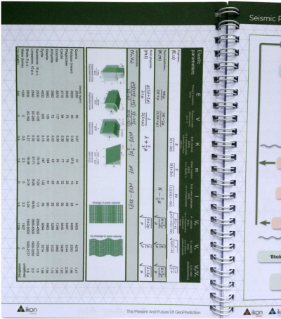
Seismic quality traffic light

We like to think that our data are perfect and limitless, because experiments are expensive and scarce. Only then can our interpretations hope to stand up to even our own scrutiny. It would be great if seismic data was a direct representation of geology, but it never is. Poor data doesn't necessarily mean poor acquisition or processing. Sometimes geology is complex!

In his book First Steps in Seismic Interpretation, Don Herron describes a QC technique of picking a pseudo horizon at three different elevations to correspond to poor, fair, and good data regions. I suppose that will do in a pinch, but I reckon it would take a long time, and it is rather subjective. Surely we can do better?

Computing seismic quality

Conceptually speaking, the ease of interpretation depends on things we can measure (and display), like coherency, bandwidth, amplitude strength, signal-to-noise, and so on. There is no magic combination of filters that will work for all data, but I am convinced that for every seismic dataset there is a weighted function of attributes that can be concocted to serve as a visual indicator of the data complexity:

So one of the first things we do with new data at Agile is a semi-quantitative assessment of the likely ease and reliability of interpretation.

This traffic light display of seismic data quality, corendered here with amplitude, is not only a precursor to interpretation. It should accompany the interpretation, just like an experiment reporting its data with errors. The idea is to show, honestly and objectively, where we can trust eventual interpretations, and where they not well constrained. A common practice is to cherry pick specific segments or orientations that support our arguments, and quietly suppress those that don't. The traffic light display helps us be more honest about what we know and what we don't — where the evidence for our model is clear, and where we are relying more heavily on skill and experience to navigate a model through an area where the data is unclear or unconvincing.

Capturing uncertainty and communicating it in our data displays is not only a scientific endeavour, it is an ethical one. Does it change the way we look at geology if we display our confidence level alongside? 

Reference

Herron, D (2012). First Steps in Seismic Interpretation. Geophysical Monograph Series 16. Society of Exploration Geophysicists, Tulsa, OK.

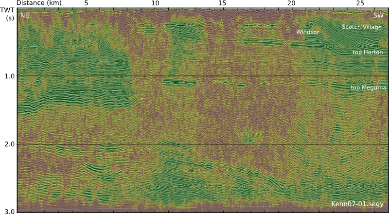
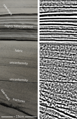
The seismic profile shown in the figure is from the Kennetcook Basin, Nova Scotia. This work was part of a Geological Survey of Canada study, available in this Open File report.

Colouring maps

Over the last fortnight, I've shared five things, and then five more things, about colour. Some of the main points:

  • Our non-linear, heuristic-soaked brains are easily fooled by colour.
  • Lots of the most common colour bars (linear ramps, bright spectrums) are not good choices.
  • You can learn a lot by reading Robert Simmon, Matteo Niccoli, and others.

Last time I finished on two questions:

  1. How many attributes can a seismic interpreter show with colour in a single display?
  2. On thickness maps should the thicks be blue or red?

One attribute, two attributes

The answer to the first question may be a matter of personal preference. Doubtless we could show lots and lots, but the meaning would be lost. Combined red-green-blue displays are a nice way to cram more into a map, but they work best on very closely related attributes, such as seismic amplitude of three particular frequencies

Here's some seismic reflection data — the open F3 dataset, offshore Netherlands, in OpendTect

A horizon — just below the prominent clinoforms — is displayed (below, left) and coloured according to elevation, using one of Matteo's perceptual colour bars (now included in OpendTect!). A colour scale like this varies monotonically in hue and luminance.

Some of the luminance channel (sometimes called brightness or value) is showing elevation, and a little is being used up by the 3D shading on the surface, but not much. I think the brain processes this automatically because the 3D illusion is quite good, especially when the scene is moving. Elevation and shape are sort of the same thing, so we've still only really got one attribute. Adding contours is quite nice (above, middle), and only uses a narrow slice of the luminance channel... but again, it's the same data. Much better to add new data. Similarity (a member of the family that includes coherence, semblance, and so on) is a natural fit: it emphasizes a particular aspect of the shape of the surface, but which was measured independently of the interpretaion, directly from the data itself. And it looks awesome (above, right).

Three attributes, four

OK, we have elevation and/or shape, and similarity. What else can we add? Another intuitive attribute of seismic is amplitude (below, left) — closely related to the strength of the reflected energy. Two things: we don't trust amplitudes in areas with low fold — so we can mask those (below, middle). And we're only really interested in bright spots, so we can edit the opacity profile of the attribute and make low values transparent (below, right). Two more attributes — amplitude (with a cut-off that reflects my opinion of what's interesting — is that an attribute?) and fold.

Since we have only used one hue for the amplitude, and it was not in Matteo's colour bar, we can layer it on the original map without clobbering anything. Unfortunately, there's no easy way for the low fold mask to modulate amplitude without interfering with elevation, because the elevation map needs to be almost completely opaque. What I need is a way to modulate a surface's opacity with an attribute it is not displaying with hue...

Thickness maps

The second question — what to colour thicks — is easy. Thicks should be towards the red end of the spectrum, sometimes not-necessarily-intuitively called 'warm' colours. (As I mentioned before in the comments, a quick Google image poll suggests that about 75% of people agree). If you colour your map otherwise, perhaps because you like the way it suggests palaeobathymetry in some depositional settings, be careful to make this very clear with labels and legends (which you always do anyway, right?). And think about just making a 'palaeobathymetry' map, not a thickness map.

I suspect there are lots of quite personal opinions out there. Like grammar, I do think much of this is a matter of taste. The only real test is clarity. Do you agree? Is there a right and wrong here? 

Five more things about colour

Last time I shared some colourful games, tools, and curiosities, including the weird chromostereopsis effect (right). Today, I've got links to much, much more 'further reading' on the subject of colour...


The provocation for this miniseries was Robert 'Blue Marble' Simmon's terrific blog series on colour, which he's right in the middle of. Robert is a data visualization pro at NASA Earth Observatory, so we should all listen to him. Here's his collection (updated after the original writing of this post):

Perception is everything! One of Agile's best friends is Matteo Niccoli, a quantitative geophysicist in Norway (for now). And one of his favourite subjects is colour — there are loads of great posts on his blog. He also has a fine collection of perceptual colour bars (left) for most seismic interpretation software. If you're still using Spectrum for maps, you need his help.

Dave Green is a physicist at the University of Cambridge. Like Matteo, he has written about the importance of using colour bars which have a linear increase in perceived brightness. His CUBEHELIX scheme (above) adapts easily to your needs — try out his colour bar creator. And if this level of geekiness gets you going, try David Dalrymple or Gregor Aisch.

ColorBrewer is a legendary web app and add-in for ArcGIS. It's worth playing with the various colour schemes, especially if you need a colour bar that is photocopy friendly, or that can still be used by colour blind people. The equally excellent, perhaps even slightly more excellent, i want hue is also worth playing with (thanks to Robert Simmon for that one). 

In scientific publishing, the Nature family of journals has arguably the finest graphics. Nature Methods carries a column called Points of View, which looks at scientific visualization. This mega-post on their Methagora blog links to them all, and covers everything from colour and 3D graphics to broader issues of design and typography. Wonderful stuff.

Since I don't seem to have exhausted the subject yet, we'll save a couple of practical topics for next time:

  1. A thought experiment: How many attributes can a seismic interpreter show with colour in a single display?
  2. Provoked by a reader via email, we'll think about that age old problem for thickness maps — should the thicks be blue or red?

Five things about colour

The fact that colour is a slippery subject is powerfully illustrated by my favourite optical illusion. Look at this:

Squares A and B are the same shade of grey. It's so hard to believe that you might need to see the proof to be convinced. 

Chromostereopsis is a similarly disarming effect that you may have noticed on maps with bright spectrum colour bars. Most people perceive blue and red on different depth planes, so the pseudo-3D effect can work in your favour and make the map 'pop' (This is not a good reason to use a spectrum colour bar, however... more on this next time). I notice that at least one set designer knows about the effect, making William Shatner pop on the TV show Have I Got News For You:

Color is a fun way to test your colour intuition. The game starts easy, but is very hard by the end as you simulatneously match colour tetrads. The first time I played I managed 9.8, which I am not-very-secretly quite pleased about. But I haven't been able to repeat the performance.

X-Rite's Online Color Challenge is also tough. You have to sort the very subtle colours into order. It takes a while to play but is definitely worth it. If your job depends on spotting subtle effects in images (like seismic data, for example) then stand by to learn something about your detection system. 

Color blindness will change how these games work, of course, and should change how we make maps, figures, and slides. Since up to about 5% of a large audience might be colour blind, you might want to think about how your presentations look to them. You can easily check with Vischeck and correct images for colourblind people with the Daltonizer. They can still be beautiful, but you can avoid certain colour combinations and reach a wider audience.

I have lots more links about colour to share in the next post, including some required reading from Rob Simmon and Matteo Niccoli, among others. In the meantime, have you come across any handy colour tools, or has colour ever caught you out? Let us know in the comments.

The image of William Shatner is copyright and courtesy of Hat Trick Productions Ltd, London, UK, and used with permission.

First appearance datum at Green Point

Armed with the Geologic Field Guide of Newfoundland, last week I ventured to one of the most intensely scrutinized outcrops in the world. Green Point in Gros Morne National Park provides continuous exposure to more than 30 million years of sediment accumulation in the Iapetus ocean. The rocks formed in deep water near the base of the ancient continental slope. It was awesome and humbling.

In January 2000, the International Union of Geological Sciences designated Green Point as a Global Stratotype Section and Point (GSSP). That's an official international reference point for the geologic time scale. I learned after the fact that there are only a handful of these in North America.

Researchers and students at Memorial University and elsewhere studied more than 10,000 fossils from Green Point, using tiny conodonts and delicate graptolites to locate the boundary between the Cambrian and Ordovician periods, 488 Ma in the past. They have narrowed it down to a single layer, Bed 23, that contains the first appearance of the conodant species, Iapetognathus fluctivagus.

To the best of my estimatation, I have indicated the location of Bed 23 with the white dashed line in the figure to the right, and with the pointing figure of my *ahem* geologic scale marker in the photograph below.

Snapshots from the Outcrop

Being the massive natural exhibition that it is, there are likely volumes of things to observe and measure at Green Point. I had no agenda whatsoever, but here are four observations that caught my interest:

  1. Cavities from core plugs at regularly spaced intervals. Each piece taken and studied as part of an international scientific experiment, aimed at accurately identifying major turning points in earth's history. 
  2. Small scale fault with some antithetic joints reminiscent of some artifacts I have seen on seismic.
  3. and 4. A faulted limestone conglomerate bed. Shown from two different points of view. I am increasingly curious about the nature of the aperture of deformation zones. Such formidable forces, such a narrow region of strain.

I left with a feeling that I am sure is felt by most geologists leaving a site of extreme interest. Did I make enough observations? Did I collect enough data? I wish I had a GigaPan, or maybe portable LiDAR station. I feel reconnected to the vastness of scales over which earth processes occur, and the heterogeneity caused by well-understood systems playing out over inconceivable expanses of time. 

I'd like to flip the outcrop 120° counterclockwise, and build another stupid seismic model. What could mathematicians, programmers, and geoscientists do at this outcrop? A digital playground for integration awaits.

Great geophysicists #8: d'Alembert


Jean-Baptiste le Rond d'Alembert was a French mathematician, born on 16 or 17 November 1717 in Paris, and died on 29 October 1783, also in Paris. His father was an artillery officer, but his mother was much more interesting. Having been a nun, she sought papal dispensation in 1714 for a new career as a fun-loving socialite, benefiting from the new government banknote printing scheme of John Law. She left her illegitimate child on the steps of Église St Jean Le Rond de Paris, whence he was taken to an orphanage. When his father returned from duty, he arranged for the boy's care.

Perhaps d'Alembert's greatest contribution to the world was helping Denis Diderot 'change the way people think' by editing the great Encyclopédie, ou Dictionnaire raisonné des sciences, des arts et des métiers of 1751. There were many contributors, but d'Alembert was listed as co-editor on the title page (left). This book was an essential ingredient in spreading the Enlightenment across Europe, and d'Alembert was closely involved in the project for at least a decade. 

But that's not why he's in our list of great geophysicists. As I mentioned when I wrote about Euler, d'Alembert substantially progressed the understanding of waves, making his biggest breakthrough in 1747 in his work on vibrating strings. His paper was the first time the wave equation or its solution had appeared in print:

Though Euler and d'Alembert corresponded on waves and other matters, and strongly influenced each other, they eventually fell out. For example, Euler wrote to Lagrange in 1759:

d'Alembert has tried to undermine [my solution to the vibrating strings problem] by various cavils, and that for the sole reason that he did not get it himself... He thinks he can deceive the semi-learned by his eloquence. I doubt whether he is serious, unless perhaps he is thoroughly blinded by self-love. [See Morris Kline, 1972]

D'Alembert did little mathematics after 1760, as he became more involved in other academic matters. Later, ill health gradually took over. He lamented to Lagrange (evidently an Enlightenment agony aunt) in 1777, six years before his death:

What annoys me the most is the fact that geometry, which is the only occupation that truly interests me, is the one thing that I cannot do. [See Thomas Hankins, 1970]

I imagine he died feeling a little hollow about his work on waves, unaware of the future impact it would have—not just in applied geophysics, but in communication, medicine, engineering, and so on. For solving the wave equation, d'Alembert, we salute you.

References

Read more on Wikipedia and The MacTutor History of Mathematics.

D'Alembert, J-B (1747). Recherches sur la courbe que forme une corde tenduë mise en vibration. (Researches on the curve that a tense cord forms [when] set into vibration.) Histoire de l'académie royale des sciences et belles lettres de Berlin, vol. 3, pages 214–219. Read on Google Books, with its sister paper, 'Further researches...'.

Portrait is a pastel by Maurice Quentin de La Tour, 1704–88.

Two ways for Q&A

If you have ever tried to figure something out on your own, you will know that it is a lot harder than doing something that you already know. It is hard because it is new to you. But just because it is new to you, doesn't mean that it is new to everyone else. And now, in a time when it is easier than ever to connect with everyone online, a new kind of scarcity is emerging. Helpfulness.

How not to get an answer to your question

For better or for worse, I follow more than a dozen discussion groups on LinkedIn. Why? I believe that candid discussions are important and enriching, so I sign up eagerly for the action. Signing up to a discussion group is like showing up at a cocktail party. Maybe you will get noticed alongside other people and brands worth noticing. There is hoopla, and echoing, but I don't think there is any real value being created for the members. If anything, it's a constant distraction you put up with to hedge against the fomo

Click to enlargeYet, hoards of users flock to these groups with questions that are clearly more appropriate for technical hot-lines, or at least an honest attempt at reading the manual. Users helping users is a great way to foster brand loyalty, but not if the technical help desk failed them first. On LinkedIn, even on the rare case a question is sufficiently articulated, users can't upload a screen shot or share a snippet of code. Often times I think people are just fishing (not phishing mind you) and haven't put in enough ground work to deserve the attention of helpers.

What is in it for me?

Stack Overflow is a 'language-independent' question and answer site for programmers. If it is not the first place I land on with a google search, it is consistently the place from which I bounce back to the terminal with my answer. Also, nearly everything that I know about open-source GIS has come from other people taking part in Q&A on GIS Stack Exchange. The reason Stack Exchange works is because there is value and incentive for each of the three types of people that show up. Something for the asker, something for answerer, something for the searcher.

It is easy to see what is in it for the asker. They have got a problem, and they are looking for help. Similarly, it's easy to see what is in it for the searcher. They might find something they are looking for, without even having to ask. But what is in it for the answerer? There is no payment, there is no credit, at least not of the monetary kind. The answerer gets practice being helpful. They willingly put themselves into other people's business to put themselves to the test. How awesome is that? The site, in turn helps the helpers by ensuring the questions contain just enough context to garner meaningful answers.

Imagine if applied geoscientists could incorporate a little more of that.

Connection through attribution

Agile's rock physics cheatsheet. Sort of.At EAGE I picked up Ikon Science's latest swag, a coil-bound notebook. On page 8, I found a modified version of our rock physics cheatsheet. "Hey, that's neat, someone thinks it's useful!" But then I thought, "Darn, I wish they'd mentioned us." Like nearly all of the work we do that's online, it's labelled CC-BY. Meaning anyone can use it, however they want, but with attribution

It's incredibly rewarding to see our stuff being used and spreading. That's why we put it out there. And by using a CC-BY license, we hope others will distribute, remix, tweak, and build upon our work, even commercially, as long as they credit us for the original creation. Creators have a choice when they are sharing, and because we want the maximum dissemination possible, we often choose the most accommodating license.

Why don't we completely relinquish our rights and opt out of copyright altogether? Because we want recognition for our work, and the attribution brings us connection

The best people I have met are the ones who are generous, connected, and open. Being diligent with attribution isn't easy, but it plays an important part in being awesome.

A stupid seismic model from core

On the plane back from Calgary, I got an itch to do some image processing on some photographs I took of the wonderful rocks on display at the core convention. Almost inadvertently, I composed a sequence of image filters that imitates a seismic response. And I came to these questions:  

  • Is this a viable way to do forward modeling? 
  • Can we exploit scale invariance to make more accurate forward models?
  • Can we take the fabric from core and put it in a reservoir model?
  • What is the goodness of fit between colour and impedance? 

Click to enlargeAbove all, this image processing excerise shows an unambiguous demonstration of the effects of bandwidth. The most important point, no noise has been added. Here is the sequence, it is three steps: convert to grayscale, compute Laplacian, apply bandpass filter. This is analgous to the convolution of a seismic wavelet and the earth's reflectivity. Strictly speaking, it would be more physically sound to make a forward model using wavelet convolution (simple) or finite difference simulation (less simple), but that level of rigour was beyond the scope of my tinkering.

The two panels help illustrate a few points. First, finely layered heterogeneous stratal packages coalesce into crude seismic events. This is the effect of reducing bandwidth. Second, we can probably argue about what is 'signal' and what is 'noise'. However, there is no noise, per se, just geology that looks noisy. What may be mistaken as noise, might in fact be bonafide interfaces within material properties. 

If the geometry of geology is largely scale invariant, perhaps, just perhaps, images like these can be used at the basin and reservoir scale. I really like the look of the crumbly fractures near the bottom of the image. This type of feature could drive the placement of a borehole, and the production in a well. The patches, speckles, and bands in the image are genuine features of the geology, not issues of quality or noise. 

Do you think there is a role for transforming photographs of rocks into seismic objects?

The developer's mind

Humbled by the aura of the legendary Cavendish Labs sitting in the adjacent building next door, I refrain from expressing the full extent of my awe and reverence for this special place. "Sure", I think, "it's no big deal. Let's get on with it". I came to Cambridge to collaborate with Pietro Berkes. He's building Canopy Geo at Enthought. We spent the day spiking, apparently. Working shoulder to shoulder with Pietro was nearly as responsive as dictating a vision to a painter and watching it emerge before my eyes. He's darn good. During my visit, I took notice of some characteristics and guiding principles that top developers, such as himself and his colleagues, bring to their work.

On whiteboarding

The best way to be understood, to connect, or to teach, is to do it one-on-one in front of a whiteboard. It is fitting that all of the walls of their office space are whiteboard walls. Old marks wiped clean but still visible show remnant algorithms sketched out and stacked up upon each other. A well-worn workshop, where writing on the walls is the cultural norm. And for electronic communication? Some are deliberate to only check emails three times a day: first thing in the morning, midday, and mid afternoon. Any more often, would be disruptive to their flow. Email is the enemy of real work, but instant messaging can be be a good productivity tool. 

On discipline

To build something that is extensible takes a good deal of thoughfulness and discipline. Code will survive long after the project is over and the programmer has moved on. This doesn't just mean leaving an adequate documentation trail behind you, but also building a solid foundation that others can contribute to. Being Agile, it turns out, although not the only choice, also takes discipline and diligence in order to be effective. 

On ownership and responsibilty 

Authority is not given, responsibility is taken. Many of the best developers define themselves by the authorship of code and libraries. So attribution is not only necessary politeness, it is a direct line of communication. What body of work would you stand up and speak for? Someone may find a bug at 9:00 am in a different time zone. Will they wait till 2:00 pm to hear from you? Somehow, this decentralized system of self-appointed responsibilty just works. The longevity of emotional and intellectual labour, particuarly in an open source setting, is a fascinating concept. The work becomes more relevant because the developer never stops caring for it. You can change projects, you can change languages, you can change companies, but your work never leaves you. If that notion excites you, you are making an impact. 

The developer knows that prowess is earned by execution. They thrive in an accepted sub-culture of meritocracy: largely free of politics, organizational hierarchies, and other social drama that get in the way of the real work. With a mind cleared to deal with essential tasks, what emerges is the ego of an artist and a creator with the potential to act on it. "Now that we can build anything, what do we do next?"