Love Python and seismic? You need xarray

If you use Python on a regular basis, you might have noticed that Pandas is eating everything, not just things made out of bamboo.

But one thing Pandas is not useful for is 2-D or 3-D (or more-D) seismic data. Its DataFrames are implicitly two-dimensional tables, and shine when the columns represent all sorts of different quantities, e.g. different well logs. But, the really powerful thing about a DataFrame is its index. Instead of having row 0, row 1, etc, we can use an index that makes sense for the data. For example, we can use depth for the index and have row 13.1400 and row 13.2924, etc. Much easier than trying to figure out which index goes with 13.1400 metres!

Seismic data, on the other hand, does not fit comfortably in a table. But it would certainly be convenient to have real-world coordinates for the data as well as NumPy indices — maybe inline and crossline numbers, or (UTMx, UTMy) position, or the actual time position of the timeslices in milliseconds. With xarray we can.

In essence, xarray brings you Pandas-like indexing for n-dimensional arrays. Let’s see why this is useful.

Make an xarray.DataArray

The DataArray object is analogous to a NumPy array, but with the Pandas-like indexing added to each dimension via a property called coords. Furthermore, each dimension has a name.

Imagine we have a seismic volume called seismic with shape (inlines, xlines, time) and the inlines and crosslines are both numbered like 1000, 1001, 1002, etc. The time samples are 4 ms apart. All we need is an array of numbers representing inlines, another for the xlines, and another for the time samples. Then we can construct the DataArray like so:

 
import xarray as xr

il, xl, ts = seismic.shape  # seismic is a NumPy array.

inlines = np.arange(il) + 1000
xlines = np.arange(xl) + 1000
time = np.arange(ts) * 0.004

da = xr.DataArray(seismic,
                  name='amplitude',
                  coords=[inlines, xlines, time],
                  dims=['inline', 'xline', 'twt'],
                  )

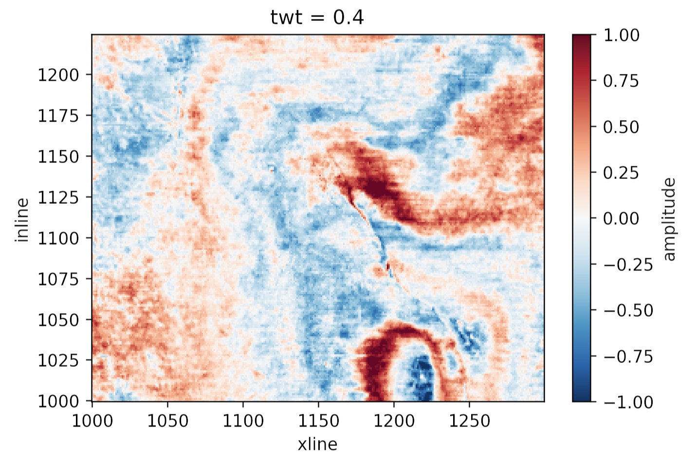
This object da has some nice superpowers. For example, we can visualize the timeslice at 400 ms with a single line:

da.sel(twt=0.400).plot()

to produce this plot:

Plotting the same thing from the NumPy array would require us to figure out which index corresponds to 400 ms, and then write at least 8 lines of matplotlib code. Nice!

What else?

Why else might we prefer this data structure over a simple NumPy array? Here are some reasons:

  • Extracting amplitude (or whatever) on a horizon. In particular, if the horizon is another DataArray with the same dims as the volume, this is a piece of cake.

  • Extracting amplitude along a wellbore (again, use the same dims for the well path).

  • Making an arbitrary line (a view not aligned with the rows/columns) is easier, because interpolation is ‘free’ with xarray.

  • Exchanging data with Pandas DataFrame objects is easy, making reading from certain formats (e.g. OpendTect horizon export, which gives you inline, xline coords, not a grid) much easier. Even better: use our library gio for this! It makes xarray objects for you.

  • If you have multiple attributes, then xarray.Dataset is a nice data structure to keep things straight. You can think of it as a dictionary of DataArray objects, but it’s a lot more than that.

  • You can store arbitrary metadata in xarray objects, so it’s easy to attach things you’d like to retain like data rights and permissions, seismic attribute parameters, data acquisition details, and so on.

  • Adding more dimensions is easy, e.g. offset or frequency, because you can just add more dims and associated coords. It can get hard to keep these straight in NumPy (was time on the 3rd or 4th axis?).

  • Taking advantage of Dask, which gives you access to parallel processing and out-of-core operations.

All in all, definitely worth a look for anyone who uses NumPy arrays to represent data with real-world coordinates.


Do you already use xarray? What kind of data does it help you with? What are your reasons? Did I miss anything from my list? Let us know in the comments!

Rocks in the Playground

It’s debatable whether neural networks should feature in an introductory course on machine learning. But it’s hard to avoid at least mentioning them, and many people are attracted to machine learning courses because they have heard so much about deep learning. So, reluctantly, we almost always get into neural nets in our Machine learning for geoscientists classes.

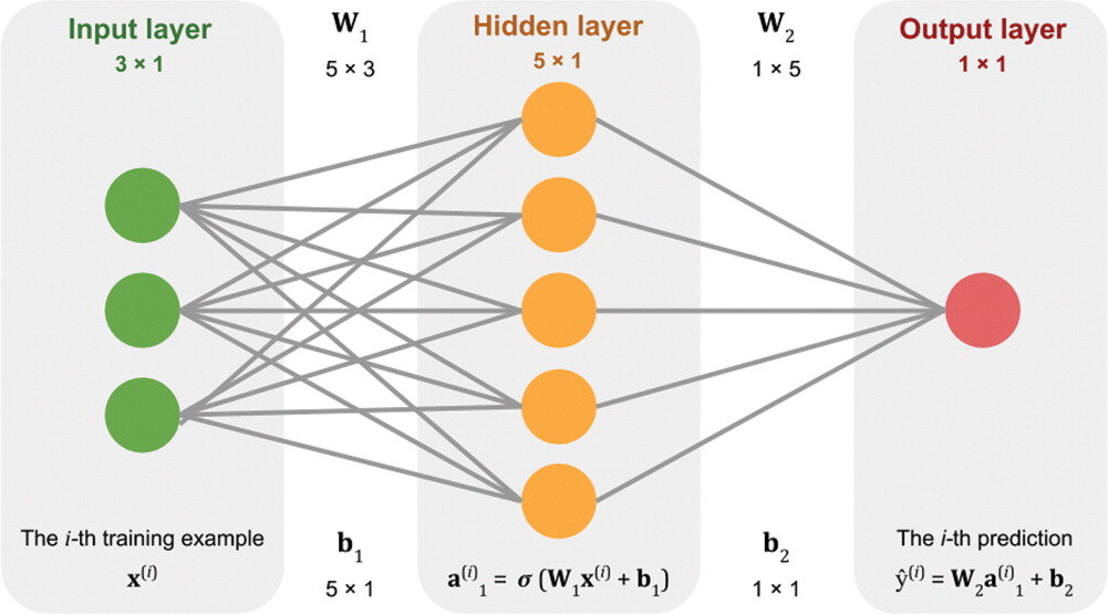
Our approach is to build a neural network from scratch, using only standard Python and NumPy data structures — that is, without using a specialist deep-learning framework. The code is all adapted from Gram Ganssle’s awesome Leading Edge tutorial from 2018. I like it because it lays out the components — the data, the activation function, the cost function, the forward pass, and all the steps involved in backpropagation — then combines them into a working neural network.

Figure 2 from Gram Ganssle’s 2018 tutorial in the Leading Edge. Licensed CC BY.

Figure 2 from Gram Ganssle’s 2018 tutorial in the Leading Edge. Licensed CC BY.

One drawback of our approach is that it would be quite fiddly to change some aspects of the network. For example, adding regularization, which almost all networks use, or even just adding another layer, are both beyond the scope of the class. So I like to follow it up with getting the students to build the same network using the scikit-learn library’s multilayer perceptron model. Then we build the same network using the PyTorch framework. (And one could do it in TensorFlow too, of course.) All of these libraries make it easier to play with the various options.

Introducing the Rocky Playground

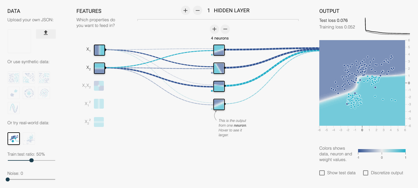
Now we have another tool — one that makes it even easier to change parameters, add layers, use regularization, and so on. The students don’t even have to write any code! I invite you to play with it too — check out the Rocky Playground, an interactive deep neural network you can see inside.

Part of the user interface. Click on the image to visit the site.

Part of the user interface. Click on the image to visit the site.

This tool is a fork of Google’s well-known Neural Network Playground, as described at the bottom of our tool’s page. We made a few changes:

  • Added several new real and synthetic datasets, with descriptions.

  • There are more activation functions to try, including ELU and Swish.

  • You can change the regularization during training and watch the weights.

  • Anyone can upload their own dataset! (These stay on your computer, they are not uploaded anywhere.)

  • We added an the expression of the network in Python code.

One of the datasets we added is the same shear-sonic prediction dataset we use in the neural network class. So students can watch the same neural net they built (more or less) learn the task in real time. It’s really very cool.

I’ve written before about different expressions of mathematical ideas — words, symbols, annotations, code, etc. — and this is really just a natural extension of that thought. When people can hear and see the same idea in three — or five, or ten — different ways, it sticks. Or at least has a better chance of sticking.

What do you think? Do this tool help you? Could you use it for teaching? If you have suggestions feel free to drop them here in the comments, or submit an issue to the tool’s repo. We’d love your help to make it even more useful.

The hacks are back

We ran the first geoscience hackathon over 7 years ago in Houston. Since then we’ve hosted another 26 subsurface hackathons — that’s 175 projects, and over 900 hackers. Last year, 10 of the 11 hackathons that Agile* facilitated were in-house.

This is exciting. It means that grass-roots, creative, high-speed collaboration and technology development is possible inside large corporations. But it came at the cost of reducing our public events… and we want to bring the hackathon experience to everyone!

So this year, as well as helping execute a dozen or so in-house hackathons, we’ll be running and supporting more public hackathons too. So if you’ve been waiting for a chance to learn to code or try a social coding event, or just hang out with a lot of nerdy geoscientists and engineers — here’s your chance!


May: Geothermal Hackathon

The first event of the year is a new one for us. We’ll be at the World Geothermal Congress in Reykjavik, Iceland, in the last week of April. The second weekend, 2 and 3 May, we’ll be running a hackathon on machine learning for geothermal subsurface applications. Iceland is only a short flight from the rest of Europe and many places in North America, so if you fancy something completely different, this is for you! Find out more and sign up.

[An earlier version of this post had the event on the previous weekend.]


June: Subsurface Hackathon (USA)

We’re back in Houston in June! The AAPG ACE is there — clashing with EAGE unfortunately — and we’ll be holding a (completely unrelated) hackathon on the weekend before: 5 to 7 June. Enthought is hosting the event in their beautiful new Houston digs, and Dell EMC is there too as a major sponsor. The theme is Tools… It’s going to be a big one! Find out more and sign up.

We are running two public Python classes before this event. Check them out.

houston-2020-sponsors.png
 

June: Amstel Hack (Europe)

The brilliant Filippo Broggini (ETHZ) is running a European hackathon again this year, again right before EAGE — and therefore the same weekend as the Houston event: 6 and 7 June. The event is being hosted at Shell’s Technology Centre in Amsterdam, and is guaranteed to be awesome. If you’re going to EAGE, it’s a no-brainer. Find out more and sign up.

We are also running a public Python class before this event. Check it out.

amstel-2020-sponsors.png
 

That’s it for now… I hope you can come to one of these events. If you’re just starting out on your technology journey, have no fear — these events are friendly and welcoming. If you can’t make any of them, don’t worry: there will be more in the autumn, so stay tuned. Or, if you want help making one happen at your company, get in touch.

Superpowers for striplogs

In between recent courses and hackathons, I’ve been chipping away at some new features in striplog. An open-source Python package, striplog handles irregularly sampled data, like lithologic intervals, chronostratigraphic zones, or anything that isn’t regularly sampled like, say, a well log. Instead of defining what is present at every depth location, you define intervals with a top and a base. The interval can contain whatever you like: names of rocks, images, or special core analyses, or anything at all.

You can read about all of the newer features in the changelog, but let’s look at a couple of the more interesting ones…

Binary morphology filters

Sometimes we’d like to simplify a striplog a bit, for example by ‘weeding out’ the thin beds. The tool has long had a method prune to systematically remove all intervals (e.g. beds) thinner than some cutoff; one can then optionally anneal the gaps, and merge the resulting striplog to combine similar neighbours. The result of this sequence of operations (prune, anneal, merge, or ‘PAM’) is shown below on the left.

striplog_binary_ops.png

If the intervals of a striplog have at least one property of a binary nature — with only two states, like sand and shale, or pay and non-pay — one can also use binary morphological operations. This well-known image processing technique aims to simplify data by eliminating small things. The result of opening vs closing operations is shown above.

Markov chains

I wrote about Markov chains earlier this year; they offer a way to identify bias in the order of units in a stratigraphic column. I’ve now put all the code into striplog — albeit not in a very fancy way. You can import the Markov_chain class from striplog.markov, then use it in exactly the same way as in the notebook I shared in that Markov chain post:

I started with some pseudorandom data (top) representing a known succession of Mudstone (M), Siltstone (S), Fine Sandstone (F) and coarse sandstone (C). Then I generate a Markov chain model of the succession. The chi-squared test indicates that the succession is highly unlikely to be unordered. We can look at the normalized difference matrix, generate a synthetic sequence of lithologies, or plot the difference matrix as a heatmap or a directed graph. The graph illustrates the order we originally imposed: M-S-F-C.

There is one additional feature compared to the original implementation: multi-step Markov chains. Previously, I was only looking at immediately adjacent intervals (beds or whatever). Now you can look at actual vs expected transition frequencies for next-but-one interval, or next-but-two. Don’t ask me how to interpret that information though…

Other new things

  • New ways to anneal. Now the user can choose whether the gaps in the log are filled in by flooding upwards (that is, by extending the interval below the gap upwards), flooding downwards (extending the upper interval), or flooding symmetrically into the middle from both above and below, meeting in the middle. (Note, you can also fill gaps with another component, using the fill() method.)

  • New merging strategies. Now you can merge overlapping intervals by precedence, rather than by blending the contents of the intervals. Precedence is defined however you like; for example, you can choose to keep the thickest interval in all overlaps, or if intervals have a date, you could keep the latest interval.

  • Improved bar charts. The histogram is easier to use, and there is a new bar chart summary of intervals. The bars can be sorted by any property you like.

Try it out and help add new stuff

You can install the latest version of striplog using pip. It’s as easy as:

pip install striplog

Start by checking out the tutorial notebooks in the repo, especially Striplog_basics.ipynb. Let me know how you get on, or jump on the Software Underground Slack to ask for help.

Here are some things I’d like striplog to support in the future:

  • Stratigraphic prediction.

  • Well-to-well correlation.

  • More interactions with well logs.

What ideas do you have? Or maybe you can help define how these things should work? Either way, do get in touch or check out the Striplog repository on GitHub.

The right writing tools

Scientists write, it's part of the job. If writing feels laborious, it might be because you haven't found the right tools yet. 

The wrong tools <cough>Word</cough> feel like a lot of work. You spend a lot of time fiddling with font sizes and not being sure whether to use italic or bold. You're constantly renumbering sections after edits. Everything moves around when you resize a figure. Tables are a headache. Table of contents? LOL.

If this sounds familiar, check out the following tools — arranged more or less in order of complexity.

Markdown

If you've never experienced writing with a markup language, you're in for a treat. At first it might feel clunky, but it quickly gets out of the way, leaving you to focus on the writing. Markdown was invented by John Gruber in about 2004; it is now almost ubiquitous in tools for developers. It's very lightweight, but compatible with HTML and LaTeX math, so it has plenty of features. Styling is absent from the document itself, being applied enitrely in post-production, as it were. With help from pandoc, you can compile Markdown documents to almost any format (e.g. PDF or Word). As a result, Markdown is sufficient for at least 70% of my writing projects. Here's a sampling of Markdown markup, rendered on the right with no styling:

Markdown_raw.png
Markdown_render.png

Jupyter Notebook

If you've been following along with our X Lines of Python series, or any of our other code-centric content, you'll have come across Jupyter Notebooks. These documents combine Markdown with code (in more or less any language you can think of) and the outputs of code — data, charts, images, etc. More than containing code, a so-called kernel can also run the code: Notebooks are fully computable documents. Not only could you write a paper or book in a Notebook, many people use them to give presentations with fully interactive, live code blocks and widgets.

Notebook_example.png
latex_folder___by_missyobo-d3azzbh.png

LaTeX

I discovered LaTeX in about 1993 and it was love at first sight. I've always been a bit of a typography nerd, and LaTeX — like TeX, around which LaTeX is wrapped — really cares about typography. So you get ligatures, hyphenation, sentence spacing, and kerning for free. It also cares about mathematics, cross-references, bibliographies, page numbering, tables of contents, and everything else you need for publication-ready documents.

You can install LaTeX locally, but there are several ways to use LaTeX online, without installing anything — and you get the best of both worlds: markup with WYSIWYG editing. OverleafShareLaTex (which is merging with Overleaf), Authorea, and Papeeria are all worth a look, especially if you write scientific papers.

When WYSISYG works

Sometimes you just want a couple of headings and some text, or you need to share a document with others. I often go for WYSISYG in those situations too — Google Docs is the best WYSIWYG editor I've used. When it supports Markdown too, which is surely only a matter of time, it will be perfect.

What about you, do you have a favourite writing tool? Share it in the comments.

Organizing spreadsheets

A couple of weeks ago I alluded to ill-formed spreadsheets in my post Murphy's Law for Excel. Spreadsheets are clearly indispensable, and are definitely great for storing data and checking CSV files. But some spreadsheets need to die a horrible death. I'm talking about spreadsheets that look like this (click here for the entire sheet):

Bad_spreadsheet_3.png

This spreadsheet has several problems. Among them:

  • The position of a piece of data changes how I interpret it. E.g. a blank row means 'new sheet' or 'new well'.
  • The cells contain a mixture of information (e.g. 'Site' and the actual data) and appear in varying units.
  • Some information is encoded by styles (e.g. using red to denote a mineral species). If you store your sheet as a CSV (which you should), this information will be lost.
  • Columns are hidden, there are footnotes, it's just a bit gross.

Using this spreadsheet to make plots, or reading it with software, with be a horrible experience. I will probably swear at my computer, suffer a repetitive strain injury, and go home early with a headache, cursing the muppet that made the spreadsheet in the first place. (Admittedly, I am the muppet that made this spreadsheet in this case, but I promise I did not invent these pathologies. I have seen them all.)

Let's make the world a better place

Consider making separate sheets for the following:

  • Raw data. This is important. See below.
  • Computed columns. There may be good reasons to keep these with the data.
  • Charts.
  • 'Tabulated' data, like my bad spreadsheet above, with tables meant for summarization or printing.
  • Some metadata, either in the file properties or a separate sheet. Explain the purpose of the dataset, any major sources, important assumptions, and your contact details.
  • A rich description of each column, with its caveats and assumptions.

The all-important data sheet has its own special requirements. Here's my guide for a pain-free experience:

  • No computed fields or plots in the data sheet.
  • No hidden columns.
  • No semantic meaning in formatting (e.g. highlighting cells or bolding values).
  • Headers in the first row, only data in all the other rows.
  • The column headers should contain only a unique name and [units], e.g. Depth [m], Porosity [v/v].
  • Only one type of data per column: text OR numbers, discrete categories OR continuous scalars.
  • No units in numeric data cells, only quantities. Record depth as 500, not 500 m.
  • Avoid keys or abbreviations: use Sandstone, Limestone, Shale, not Ss, Ls, Sh.
  • Zero means zero, empty cell means no data.
  • Only one unit per column. (You only use SI units right?)
  • Attribution! Include a citation or citations for every record.
  • If you have two distinct types or sources of data, e.g. grain size from sieve analysis and grain size from photomicrographs, then use two different columns.
  • Personally, I like the data sheet to be the first sheet in the file, but maybe that's just me.
  • Check that it turns into a valid CSV so you can use this awesome format.

      After all that, here's what we have (click here for the entire sheet):

    The same data as the first image, but improved. The long strings in columns 3 and 4 are troublesome, but we can tolerate them. Click to enlarge.

    Maybe the 'clean' analysis-friendly sheet looks boring to you, but to me it looks awesome. Above all, it's easy to use for SCIENCE! And I won't have to go home with a headache.


    The data in this post came from this Cretaceous shale dataset [XLS file] from the government of Manitoba. Their spreadsheet is pretty good and only breaks a couple of my golden rules. Here's my version with the broken and fixed spreadsheets shown here. Let me know if you spot something else that should be fixed!

    Murphy's Law for Excel

    Where would scientists and engineers be without Excel? Far, far behind where they are now, I reckon. Whether it's a quick calculation, or making charts for a thesis, or building elaborate numerical models, Microsoft Excel is there for you. And it has been there for 32 years, since Douglas Klunder — now a lawyer at ACLU — gave it to us (well, some of us: the first version was Mac only!).

    We can speculate about reasons for its popularity:

    • It's relatively easy to use, and most people started long enough ago that they don't have to think too hard about it.
    • You have access to it, and you know that your collaborators (boss, colleagues, future self) have access to it.
    • It's flexible enough that it can do almost anything.
    Figure 1 from 'Predicting bed thickness with cepstral decomposition'.

    Figure 1 from 'Predicting bed thickness with cepstral decomposition'.

    For instance, all the computation and graphics for my two 2006 articles on signal processing were done in Excel (plus the FFT add-on). I've seen reservoir simulators, complete with elaborate user interfaces, in Excel. An infinity of business-critical documents are stored in Excel (I just filled out a vendor registration form for a gigantic multinational in an Excel spreadsheet). John Nelson at ESRI made a heatmap in Excel. You can even play Pac Man.

    Maybe it's gone too far:


    So what's wrong with Excel?

    Nothing is wrong with it, but it's not the best tool for every number-crunching task. Why?

    • Excel files are just that — files. Sometimes you want to do analysis across datasets, and a pool of data (a database) becomes more useful. And sometimes you wish nine different people didn't have nine different versions of your spreadsheet, each emailing their version to nine other people...
    • The charts are rather clunky and static. They don't do well with large datasets, or in data you'd like to filter or slice dynamically.
    • In large datasets, scrolling around a spreadsheet gets old pretty quickly.
    • The tool is so flexible that people get carried away with pretty tables, annotating their sheets in ways that make the printed page look nice, but analysis impossible.

    What are the alternatives?

    Excel is a wonder-tool, but it's not the only tool. There are alternatives, and you should at least know about them.

    For everyday spreadsheeting needs, I now use Google Sheets. Collaboration is built-in. Being able to view and edit a sheet at the same time as someone else is a must-have (probably Office 365 does this now too, so if you're stuck with Excel I urge you to check). Version control — another thing I'm not sure I can live without — is built in. For real nerds, there's even a complete API. I also really like the native 'webbiness' of Google Docs, for example being able to use web API calls natively, for example getting the current CAD–USD exchange rate with GoogleFinance("CURRENCY:CADUSD").

    If it's graphical analysis you want, try Tableau or Spotfire. I'm especially looking at you, reservoir engineers — you are seriously missing out if you're stuck in Excel, especially if you have a lot of columns of different types (time series, categories and continuous variables for example). The good news is that the fastest way to get data into Spotfire is... Excel. So it's easy to get started.

    If you're gathering information from people, like registering the financial details of vendors for instance, then a web form is your best bet. You can set one up in Google Forms in minutes, and there are lots of similar services. If you want to use your own servers, no problem: any dev worth their wages can throw one together in a few hours.

    If you're doing geoscience in Excel, like my 2006 self — filtering logs, or generating synthetics, or computing spectrums — your mind will be blown by spending a few hours learning a programming language. Your first day in Python (or Julia or Octave or R) will change your quantitative life forever.

    Excel is great at some things, but for most things, there's a better way. Take some time to explore them the next time you have some slack in your schedule.

    References

    Hall, M (2006). Resolution and uncertainty in spectral decomposition. First Break 24, December 2006, p 43–47.

    Hall, M (2006). Predicting stratigraphy with cepstral decomposition. The Leading Edge 25 (2, Special Issue on Spectral Decomposition). doi:10.1190/1.2172313


    UPDATE

    As a follow-up example, I couldn't resist sharing this recent story about an artist that draws anime characters in Excel.

    x lines of Python: read and write SEG-Y

    Reading SEG-Y files comes up a lot in the geophysicist's workflow. Writing, less often, but it does come up occasionally. As long as we're mostly concerned with trace data and not location, both of these tasks can be fairly easily accomplished with ObsPy. 

    Today we'll load some seismic, compute an attribute on it, and save a new SEG-Y, in 10 lines of Python.


    ObsPy is a rare thing. It demonstrates what a research group can accomplish with a little planning and a lot of perseverance (cf my whinging earlier this year about certain consortiums in our field). It's an open source Python package from the geophysicists at the University of Munich — Karl Bernhard Zoeppritz studied there for a while, so you know it's legit. The tool serves their research in earthquake and global seismology needs, and also happens to handle SEG-Y files quite nicely.

    Aside: I think SixtyNorth's segpy is actually the way to go for reading and writing SEG-Y; ObsPy is probably overkill for most applications — it's about 80 times the size for one thing. I just happen to be familiar with it and it's super easy to install: conda install obspy. So, since minimalism is kind of the point here, look out for a future x lines of Python using that library.

    The sentences

    As before, we'd like to express the process in just a few sentences of plain English. Assuming we just want to read the data into a NumPy array, look at it, do something to it, and write a new file, here's what we're doing:

    1. Read (or really index) the file as an ObsPy Stream object.
    2. Stack (in the NumPy sense) the Trace objects into a single NumPy array. We have data!
    3. Get the 99th percentile of the amplitudes to make plotting easier.
    4. Plot the data so we can see it.
    5. Get the sample interval of the data from a trace header.
    6. Compute the similarity attribute using our library bruges.
    7. Make a new Stream object to hold the outbound data.
    8. Add a Stats object, which holds the header, and recycle some header info.
    9. Append info about our data to the header.
    10. Write a new SEG-Y file with our computed data in it!

    There's a bit more in the Jupyter Notebook (examining the file and trace headers, for example, and a few more plots) which, remember, you can run right in your browser! You don't need to install a thing. Please give it a look! Quick tip: Just keep hitting Shift+Enter to run the cells.

    If you like this sort of thing, and are planning to be at the SEG Annual Meeting in Dallas next month, you might like to know that we'll be teaching our Creative Geocomputing class there. It's basically two days of this sort of thing, only with friends to learn with and us to help. Come and learn some new skills!

    The seismic data used in this post is from the NPRA seismic repository of the USGS. The data is in the public domain.

    You'd better read this

    The clean white front cover of this month's Bloomberg Businessweek carries a few lines of Python code, and two lines of English as a footnote... If you can't read that, then you'd better read this. The entire issue is a single essay written by Paul Ford. It was an impeccable coincidence: I picked up a copy before boarding the plane to Austin for SciPy 2015. This issue is a grand achievement; it could be the best thing I've ever read. Go out an buy as many copies as you can, and give them to your friends. Or read it online right now.

    Not your grandfather's notebook

    Jess Hamrick is a cognitive scientist at UC Berkeley who makes computational models of human behaviour. In her talk, she described how she built a multi-user server for Jupyter notebooks to administer course content, assign homework, even do auto-grading for a class with 220 undergrads. During her talk, she invited the audience to list their GitHub usernames on an Etherpad. Minutes after she stood down from her podium, she granted access, so we could all come inside and see how it was done.

    Dangerous defaults

    I wrote a while ago about the dangers of defaults, and as Matteo Niccoli highlighted in his 52 Things essay, How to choose a colourmap, default colourmaps can be especially harmful. Matplotlib has long been criticized for its nasty default colourmap, but today redeemed itself with a new default. Hear all about it from Stefan van der Walt:

    Sound advice

    Allen Downey of Olin College gave a wonderful talk this afternoon about teaching digital signal processing to students using fun and intuitive audio signals as the hook. Watch it yourself, it's well worth the 20 minutes or so:

    If you're really into musical and audio applications, there was another talk on the subject, by Brian McFee (Librosa project). 

    More tomorrow as we head into Day 2 of the conference. 

    Introducing Striplog

    Last week I mentioned we'd been working on a project called striplog. I told you it was "a new Python library for manipulating well data, especially irregularly sampled, interval-based, qualitative data like cuttings descriptions"... but that's all. I thought I'd tell you a bit more about it — why we built it, what it does, and how you can use it yourself.

    The problem we were trying to solve

    The project was conceived with the Nova Scotia Department of Energy, who had a lot of cuttings and core descriptions that they wanted to digitize, visualize, and archive. They also had some hand-drawn striplog images — similar to the one on the right — that needed to be digitized in the same way. So there were a few problems to solve:

    • Read a striplog image and a legend, turn the striplog into tops, bases, and 'descriptions', and finally save the data to an archive-friendly LAS file.
    • Parse natural language 'descriptions', converting them into structured data via an arbitrary lexicon. The lexicon determines how we interpret the words 'sandstone' or 'fine grained'.
    • Plot striplogs with minimal effort, and keep plotting parameters separate from data. It should be easy to globally change the appearance of a particular lithology.
    • Make all of this completely agnostic to the data type, so 'descriptions' might be almost anything you can think of: special core analyses, palaeontological datums, chronostratigraphic intervals...

    The usual workaround, I mean solution, to this problem is to convert the descriptions into some sort of code, e.g. sandstone = 1, siltstone = 2, shale = 3, limestone = 4. Then you make a log, and plot it alongside your other curves or make your crossplots. But this is rather clunky, and if you lose the mapping, the log is useless. And we still have the other problems: reading images, parsing descriptions, plotting...

    What we built

    One of the project requirements was a Python library, so don't look for a pretty GUI or fancy web app. (This project took about 6 person-weeks; user interfaces take much longer to craft.) Our approach is always to try to cope with chaos, not fix it. So we tried to design something that would let the user bring whatever data they have: XLS, CSV, LAS, images.

    The library has tools to, for example, read a bunch of cuttings descriptions (e.g. "Fine red sandstone with greenish shale flakes"), and convert them into Rocks — structured data with attributes like 'lithology' and 'colour', or whatever you like: 'species', 'sample number', 'seismic facies'. Then you can gather Rocks into Intervals (basically a list of one or more Rocks, with a top and base depth, height, or age). Then you can gather Intervals into a Striplog, which can, with the help of a Legend if you wish, plot itself or write itself to a CSV or LAS file.

    The Striplog object has some useful features. For example, it's iterable in Python, so it's trivial to step over every unit and perform some query or analysis. Some tasks are built-in: Striplogs can summarize their own statistics, for example, and searching for 'sandstone' returns another Striplog object containing only those units matching the query.

      >>> striplog.find('sandstone')
      Striplog(4 Intervals, start=230.328820116, stop=255.435203095)

    We can also do a reverse lookup, and see what's at some arbitrary depth:

      >>> striplog.depth(260).primary  # 'primary' gives the first component
      Rock("colour":"grey", "lithology":"siltstone")

    You can read more in the documentation. And here's Striplog in a picture:

    An attempt to represent striplog's objects, more or less arranged according to a workflow.

    Where to get it

    For the time being, the tool is only available as a Python library, for you to use on the command line, or in IPython Notebooks (follow along here). You can install striplog very easily:

      pip install striplog

    Or you can clone the repo on GitHub. 

    As a new project, it has some rough edges. In particular, the Well object is rather rough. The natural language processing could be much more sophisticated. The plotting could be cuter. If and when we unearth more use cases, we'll be hacking some more on it. In the meantime, we would welcome code or docs contributions of any kind, of course.

    And if you think you have a use for it, give us a call. We'd love to help.


    Postscript

    I think it's awesome that the government reached out to a small, Nova Scotia-based company to do this work, keeping tax dollars in the province. But even more impressive is that they had the conviction not only to allow allow but even to encourage us to open source it. This is exactly how it should be. In contrast, I was contacted recently by a company that is building a commercial plug-in for Petrel. They had received funding from the federal government to do this. I find this... odd.