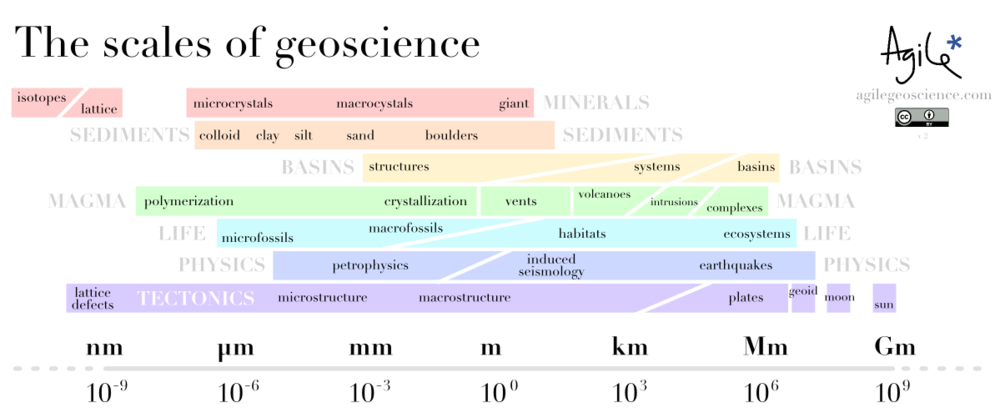
The scales of geoscience

Helicopter at Mount St Helens in 2007. Image: USGS.Geoscientists' brains are necessarily helicoptery. They can quickly climb and descend, hover or fly. This ability to zoom in and out, changing scale and range, develops with experience. Thinking and talking about scales, especially those outside your usual realm of thought, are good ways to develop your aptitude and intuition. Intuition especially is bound to the realms of your experience: millimetres to kilometres, seconds to decades. 

Being helicoptery is important because processes can manifest themselves in different ways at different scales. Currents, for example, can result in sorting and rounding of grains, but you can often only see this with a hand-lens (unless the grains are automobiles). The same environment might produce ripples at the centimetre scale, dunes at the decametre scale, channels at the kilometre scale, and an entire fluvial basin at another couple of orders of magnitude beyond that. In moments of true clarity, a geologist might think across 10 or 15 orders of magnitude in one thought, perhaps even more.

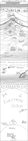
A couple of years ago, the brilliant web comic artist xkcd drew a couple of beautiful infographics depicting scale. Entitled height and depth (left), they showed the entire universe in a logarithmic scale space. More recently, a couple of amazing visualizations have offered different visions of the same theme: the wonderful Scale of the Universe, which looks at spatial scale, and the utterly magic ChronoZoom, which does a similar thing with geologic time. Wonderful.

These creations inspired me to try to map geological disciplines onto scale space. You can see how I did below. I do like the idea but I am not very keen on my execution. I think I will add a time dimension and have another go, but I thought I'd share it at this stage. I might even try drawing the next one freehand, but I ain't no Randall Munroe.

I'd be very happy to receive any feedback about improving this, or please post your own attempts!

What's hot in geophysics?

Two weeks ago I visited Long Beach, California, attending a conference called Mathematical and Computational Issues in the Geosciences, organized by the Society of Industrial and Applied Mathematicians. I wanted to exercise my cross-thinking skills. 

As expected, the week was very educational for me. Well, some of it was. Some of it was like being beaten about the head with a big bag of math. Anyone for quasi-monotone advection? What about semi-implicit, semi-Lagrangian, P-adaptive discontinuous Galerkin methods then?

Notwithstanding my apparent learning disability, I heard about some fascinating new things. Here are three highlights.

Read More

Great geophysicists #3

Today is a historic day for greatness: Rene Descartes was born exactly 415 years ago, and Isaac Newton died 284 years ago. They both contributed to our understanding of physical phenomena and the natural world and, while not exactly geophysicists, they changed how scientists think about waves in general, and light in particular.

Unweaving the rainbow

Scientists of the day recognized two types of colour. Apparent colours were those seen in prisms and rainbows, where light itself was refracted into colours. Real colours, on the other hand, were a property of bodies, disclosed by light but not produced by that light. Descartes studied refraction in raindrops and helped propagate Snell’s law in his 1637 paper, Dioptrica. His work severed this apparent–real dichotomy: all colours are apparent, and the colour of an object depends on the light you shine on it.

Newton began to work seriously with crystalline prisms around 1666. He was the first to demonstrate that white light is a scrambled superposition of wavelengths; a visual cacophony of information. Not only does a ray bend in relation to the wave speed of the material it is entering (read the post on Snellius), but Newton made one more connection. The intrinsic wave speed of the material, in turn depends on the frequency of the wave. This phenomenon is known as dispersion; different frequency components are slowed by different amounts, angling onto different paths.

What does all this mean for seismic data?

Seismic pulses, which strut and fret through the earth, reflecting and transmitting through its myriad contrasts, make for a more complicated type of prism-dispersion experiment. Compared to visible light, the effects of dispersion are subtle, negligible even, in the seismic band 2–200 Hz. However, we may measure a rock to have a wave speed of 3000 m/s at 50 Hz, and 3500 m/s at 20 kHz (logging frequencies), and 4000 m/s at 10 MHz (core laboratory frequencies). On one hand, this should be incredibly disconcerting for subsurface scientists: it keeps us from bridging the integration gap empirically. It is also a reason why geophysicists get away with haphazardly stretching and squeezing travel time measurements taken at different scales to tie wells to seismic. Is dispersion the interpreters’ fudge-factor when our multi-scale data don’t corroborate?

Chris Liner, blogging at Seismos, points out

...so much of classical seismology and wave theory is nondispersive: basic theory of P and S waves, Rayleigh waves in a half-space, geometric spreading, reflection and transmission coefficients, head waves, etc. Yet when we look at real data, strong dispersion abounds. The development of spectral decomposition has served to highlight this fact.

We should think about studying dispersion more, not just as a nuisance for what is lost (as it has been traditionally viewed), but as a colourful, scale-dependant property of the earth whose stories we seek to hear.

What is shale?

Until four or five years ago, it was enough just to know that shale is that dark grey stuff in between the sands. Being overly fascinated with shale was regarded as a little, well, unconventional. To be sure, seals and source rocks were interesting and sometimes critical, but always took a back seat to reservoir characterization.

Well, now the shale is the reservoir. So how do we characterize shale? We might start by asking: what is shale, really? Is it enough to say, "I don't know, but I know it when I see it"? No: sometimes you need to know what to call something, because it affects how it is perceived, explored for, developed, and even regulated.

Alberta government

Section 1.020(2)(27.1) of the Oil and Gas Conservation Regulations defines shale:

a lithostratigraphic unit having less than 50% by weight organic matter, with less than 10% of the sedimentary clasts having a grain size greater than 62.5 micrometres and more than 10% of the sedimentary clasts having a grain size less than 4 micrometres.
ERCB Bulletin 2009-23

This definition seems quite strict, but it open to interpretation. 'Ten percent of the sedimentary clasts' might be a very small volumetric component of the rock, much less than 10%, if those 'clasts' are small enough. I am sure they meant to write '...10% of the bulk rock volume comprising clasts having a grain size...'.

Read More

D is for Domain

Domain is a term used to describe a variable for which a set of functions or signals are defined.

Time-domain describes functions or signals that change over time; depth-domain describes functions or signal that change over space. The oscillioscope, geophone, and heartrate monitor are tools used to visualize real-world signals in the time domain. The map, photograph, and well log are tools to describe signals in the depth (spatial) domain.

Because seismic waves are recorded in time (jargon: time series), seismic data are naturally presented and interpreted with time as the z-axis. Routinely though, geoscientists must convert data and data objects between the time and depth domain.

Consider the top of a hydrocarbon-bearing reservoir in the time domain (top panel). In this domain, it looks like wells A and B will hit the reservoir at the same elevation and encounter the same amount of pay.

In this example the velocities that enable domain conversion vary from left to right, thereby changing the position of this structure in depth. The velocity model (second panel) linearly decreases from 4000 m/s on the left, to 3500 m/s on the right; this equates to a 12.5% variation in the average velocities in the overburden above the reservoir.

This velocity gradient yields a depth image that is significantly different than the time domain representation. The symmetric time structure bump has been rotated and the spill point shifted from the left side to the right. More importantly, the amount of reservoir underneath the trap has been drastically reduced. 

Have you encountered examples in your work where data domains have been misleading?

Although it is perhaps more intuitive to work with depth-domain data wherever possible, sometimes there are good reasons to work with time. Excessive velocity uncertainty makes depth conversion so ambiguous that you are better off in time-domain. Time-domain signals are recorded at regular sample rates, which is better for signal processing and seismic attributes. Additionally, travel-time itself is an attribute in that it may be recorded or mapped for its physical meaning in some cases, for example time-lapse seismic.

If you think about it, all three of these models are in fact different representations of the same earth. It might be tempting to regard the depth picture as 'reality' but if it's your only perspective, you're kidding yourself. 

The etiology of rivers

The Ordovician was a primitive time. No mammals. No birds. No flowers. Most geologists know this, right? How about this: No meandering rivers.

Recently several geo-bloggers wrote about geological surprises. This was on my shortlist. 

A couple of weeks ago, Evan posted the story of scale-free gravity deformation we heard from Adrian Park and his collaborators at the Atlantic Geological Society's annual Colloquium. My own favourite from the conference was Neil Davies' account of the evolution of river systems:

Davies, Neil & Martin Gibling (2011). Pennsylvanian emergence of anabranching fluvial deposits: the parallel rise of arborescent vegetation and fixed-channel floodplains.

Neil, a post-doctoral researcher at Dalhousie University in Nova Scotia, Canada, started with a literature review. He read dozens of case studies of fluvial geology from all over the world, noting the interpretation of river morphology (fluvotype?). What he found was, to me at least, surprising: there were no reported meandering rivers before the Devonian, and no anabranching rivers before the Carboniferous. 

The idea that rivers have evolved over time, becoming more diverse and complex, is fascinating. At first glance, rivers might seem to be independent of life and other manifestly time-bound phenomena. But if we have learned only one thing in the last couple of decades, it is that the earth's systems are much more intimately related than this, and that life leaves its fingerprint on everything on earth's surface. 

A little terminology: anastomosing, a term I was more familiar with, is not strictly the correct term for these many-branched, fixed-channel rivers. Sedimentologists prefers anabranching. Braided and meandering river types are perhaps more familiar. The fluviotypes I'm showing here might be thought of as end members — most rivers show all of these characteristics through time and space.

What is the cause of this evolution? Davies and Gibling discussed two parallel effects: bank stabilization by soil and roots, and river diversion, technically called avulsion, by fallen trees. The first idea is straightforward: plants colonize river banks and floodplains, thus changing their susceptibility to erosion. The second idea was new to me, but is also simple: as trees got taller, it became more and more likely that fallen trunks would, with time, make avulsion more likely. 

There is another river type we are familiar with in Canada: the string of beaver dams (like this example from near Fort McMurray, Alberta). I don't know for sure, but I bet these first appeared in the Eocene. I have heard that the beaver is second only to man in terms of the magnitude of its effect on the environment. As usual, I suspect that microbes were not considered in this assertion.

All of this makes me wonder: are there other examples of evolution expressing itself in geomorphology like this?

Many thanks to Neil and Martin for allowing us to share this story. Please forgive my deliberate vagueness with some of the details — this work is not yet published; I will post a link to their forthcoming paper when it is published. The science and the data are theirs, any errors or inconsistencies are mine alone. 

How to cheat

Yesterday I posted the rock physics cheatsheet, which is a condensed version of useful seismic reservoir characterization and rock mechanics concepts. It's cheat as in simplify, not cheat as in swindle. 

As Matt discussed on Friday, heuristics can be shortcuts to hone your intuition. Our minds search to use rules of thumb to visualise the invisible and to solve sticky problems. That's where the cheat sheet comes in. You might not find rock physics that intuitive, but let's take a look at the table to see how it reveals some deeper patterns.

The table of elastic parameters is setup based on the fundamental notion that, if you have any two elastic properties previously defined, you can compute all the others. This is a consequence of one of the oldest laws in classical mechanics: Newton's second law, F=ma. In particular one thing I find profound about seismic velocity is that it is wholly determined by a ratio of competing tensional (elastic) forces to inertial (density) forces. To me, it is not immediately obvious that speed, with units of m/s, results from the ratio of pressure to density. 

This simple little equation has had a profound impact on the utility of seismology to the oil and gas industry. It links extrinsic dynamic properties (VP) to intrinsic rock properties (K, μ, ρ). The goal of course, is not just to investigate elastic properties for the sake of it, but to link elastic properties to reservoir and petrophysical properties. This is traditionally done using a rock physics template. The one I find easiest to understand is the VP/VS vs P-impedance template, an example of which is shown on the cheatsheet. You will see others in use, for instance Bill Goodway has pioneered the λρ vs μρ (LMR) template.

In an upcoming post we'll look to deepen the connection between Newtonian mechanics and reservoir characterization. 

Rock physics cheatsheet

Today, I introduce to you the rock physics cheatsheet. It contains useful information for people working on problems in seismic rock physics, inversion, and the mechanical properties of rocks. Admittedly, there are several equations, but I hope they are laid out in a simple and systematic way. This cheatsheet is the third instalment, following up from the geophysics cheatsheet and basic cheatsheet we posted earlier. 

To me, rock physics is the crucial link between earth science and engineering applications, and between reservoir properties and seismic signals. Rocks are, in fact, a lot like springs. Their intrinsic elastic parameters are what control the extrinsic seismic attributes that we collect using seismic waves. With this cheatsheet in hand you will be able to model fluid depletion in a time-lapse sense, and be able to explain to somebody that Young's modulus and brittleness are not the same thing.

So now with 3 cheatsheets at your fingertips, and only two spaces on the inside covers of you notebooks, you've got some rearranging to do! It's impossible to fit the world of seismic rock physics on a single page, so if you feel something is missing or want to discuss anything on this sheet, please leave a comment.

Click to download the PDF (1.5MB)

Confirmation

The first principle is that you must not fool yourself — and you are the easiest person to fool. So you have to be very careful about that. After you've not fooled yourself, it's easy not to fool other scientists.
Richard Feynman, 1974

Suppose that I have done a seismic inversion and have a new seismic attribute volume that predicts Poisson's ratio (a rock property that can help predict fluid type). According to my well calibration and my forward modelling, low Poisson's ratio means Gas. This is my hypothesis; I need to test it.

So here's a game: I have some new wells, represented by double-sided cards. Which cards do I need to turn over to prove the hypothesis that all the cards with Low PR on one side have Gas on the other? Take a moment to look at the four cards and decide which you will flip:

In the course of evolution, our brains have developed heuristics, rules of thumb, for dealing with problems like this one. Our intuition is made of heuristics: we're wary of the outsider with the thick accent; we balk at a garden hose in the grass that could have been a snake. We are programmed to see faces in the topography of Mars (left). The rules are useful to us in urgent matters of survival, letting us take the least risky course of urgent action. But I think they're limiting and misleading when rational decisions are required.

That's why most people, even educated people, get this problem wrong. As scientists we should be especially wary of this, but the fact is that we all tend to seek information that confirms our hypotheses, rather than trying to disprove them. In the problem above, the cards to flip are the Low PR card (of course, it had better have Gas on the other side), and the Water card, because it had better not say Low PR. Most people select the Gas card, but it is not required because its reverse cannot prove our disprove our hypothesis: we don't care if High PR also means Gas sometimes (or even all the time).

Think of a hypothesis you have about the data you are working on right now. Can you think of a test that might disprove it? Would you get funding for a test like this? 

This post is a version of part of my article The rational geoscientist, The Leading Edge, May 2010. I recently read this post on the OpenScience Project blog, and it got me thinking about this again. The image of Mars was created by NASA and the JPL, and is in the public domain.  

C is for clipping

Previously in our A to Z series we covered seismic amplitude and bit depth. Bit depth determines how smooth the amplitude histogram is. Clipping describes what happens when this histogram is truncated. It is often done deliberately to allow more precision for the majority of samples (in the middle of the histogram), but at the cost of no precision at all for extreme values (at the ends of the histogram). One reason to do this, for example, might be when loading 16- or 32-bit data into a software application that can only use 8-bit data (e.g. most volume interpretation software). 

Let's look at an example. Suppose we start with a smooth, unclipped dataset represented by 2-byte integers, as in the top upper image in the figure below. Its histogram, to the right, is a close approximation to a bell curve, with no samples, or very few, at the extreme values. In a 16-bit volume, remember, these extreme values are -32 767 and +32 768. In other words, the data fit entirely within the range allowed by the bit-depth.

 Data from F3 dataset, offshore Netherlands, from the OpendTect Open Seismic Repository.

Now imagine we have to represent this data with 1-byte samples, or a bit-depth of 8. In the lower part of the figure, you see the data after this transformation with its histogram is to the right. Look at the extreme ends of the histogram: there is a big spike of samples there. All of the samples in the tails of the unclipped histogram (shown in red and blue) have been crammed into those two values: -127 and +128. For example, any sample with an amplitude of +10 000 or more in the unclipped data, now has a value of +128. Likewise, amplitudes of –10 000 or less are all now represented by a single amplitude: –127. Any nuance or subtlety in the data in those higher-magnitude samples has gone forever.

Notice the upside though: the contrast of the unclipped data has been boosted, and we might feel like we can see more detail and discriminate more features in this display. Paradoxically, there is less precision, but perhaps it's easier to interpret.

How much data did we affect? We remember to pull out our basic cheatsheet and look at the normal distribution, below. If we clip the data at about two standard deviations from the mean, then we are only affecting 4.2% of the samples in the data. This might include lots of samples of little quantitative interest (the sea-floor, for example), but is also likely to include samples you do care about: bright amplitudes in or near the zone of interest. For this reason, while clipping might not affect how you interpret the structural framework of your earth model, you need to be aware of it in any quantitative work.

Have you ever been tripped up by clipped seismic data? Do you think it should be avoided at all costs, or maybe you have a tip for avoiding severe clipping? Leave a comment!