Your child is dense for her age

Alan Cohen, veteran geophysicist and Chief Scientist at RSI, secured the role of provacateur by posting this question on the rock physics group on LinkedIn. He has shown that the simplest concepts are worthy of debate.

From a group of 1973 members, 44 comments ensued over the 23 days since he posted it. This has got to be a record for this community (trust me I've checked). It turns out the community is polarized, and heated emotions surround the topic. The responses that emerged are a fascinating narrative of niche and tacit assumptions seldomly articulated.

Any two will do

Why are two dimensions used, instead of one, three, four, or more? Well for one, it is hard to look at scatter plots in 3D. More fundamentally, a key learning from the wave equation and continuum mechanics is that, given any two elastic properties, any other two can be computed. In other words, for any seismically elastic material, there are two degrees of freedom. Two parameters to describe it.

  • P- and S-wave velocities
  • P-impedance and S-impedance
  • Acoustic and elastic impedance
  • R0 and G, the normal-incidence reflectivity and the AVO gradient
  • Lamé's parameters, λ and μ 

Each pair has its time and place, and as far as I can tell there are reasons that you might want to re-parameterize like this:

  1. one set of parameters contains discriminating evidence, not visible in other sets;
  2. one set of parameters is a more intuitive or more physical description of the rock—it is easier to understand;
  3. measurement errors and uncertainties can be elucidated better for one of the choices. 

Something missing from this thread, though, is the utility of empirical templates to makes sense of the data, whichever domain is adopted.

Measurements with a backdrop

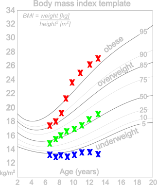
In child development, body mass index (BMI) is plotted versus age to characterize a child's physical properties using the backdrop of an empirically derived template sampled from a large population. It is not so interesting to say, "13 year old Miranda has a BMI of 27", it is much more telling to learn that Miranda is above the 95th percentile for her age. But BMI, which is defined as weight divided by height squared, in not particularity intuitive. If kids were rocks, we'd submerge them Archimedes style into a bathtub, measure their volume, and determine their density. That would be the ultimate description. "Whoa, your child is dense for her age!" 

We do the same things with rocks. We algebraically manipulate measured variables in various ways to show trends, correlations, or clustering. So this notion of a template is very important, albeit local in scope. Just as a BMI template for Icelandic children might not be relevant for the pygmies in Paupa New Guinea, rock physics templates are seldom transferrable outside their respective geographic regions. 

For reference see the rock physics cheatsheet.

Thermogeophysics, whuh?

Earlier this month I spent an enlightening week in Colorado at a peer review meeting hosted by the US Department of Energy. Well-attended by about 300 people from organizations like Lawerence Livermore Labs, Berkeley, Stanford, Sandia National Labs, and *ahem* Agile, delegates heard about a wide range of cost-shared projects in the Geothermal Technologies Program. Approximately 170 projects were presented, representing a total US Department of Energy investment of $340 million.

I was at the meeting because we've been working on some geothermal projects in California's Imperial Valley since last October. It's fascinating, energizing work. Challenging too, as 3D seismic is not a routine technology for geothermal, but it is emerging. What is clear is that geothermal exploration requires a range of technologies and knowledge. It pulls from all of the tools you could dream up; active seismic, passive seismic, magnetotellurics, resistivity, LiDAR, hyperspectral imaging, not to mention the borehole and drilling technologies. The industry has an incredible learning curve ahead of them if Enhanced Geothermal Systems (EGS) are going to be viable and scalable.

The highlights of the event for me were not the talks that I saw, but the people I met during coffee breaks:

John McLennan & Joseph Moore at the the University of Utah have done some amazing laboratory experiments on large blocks of granite. They constructed a "proppant sandwich", pumped fluid through it, and applied polyaxial stress to study geochemical and stress effects on fracture development and permeability pathways. Hydrothermal fluids alter the proppant and gave rise to wormhole-like collapse structures, similar to those in the CHOPS process. They incorporated diagnostic imaging (CT-scans, acoustic emission tomography, x-rays), with sophisticated numerical simulations. A sign that geothermal practitioners are working to keep science up to date with engineering.

Stephen Richards bumped into me in the corridor after lunch after he overheard me talking about the geospatial work that I did with the Nova Scotia Petroleum database. It wasn't five minutes that passed before he rolled up his sleeves, took over my laptop, and was hacking away. He connected the WMS extension that he built as part of the State Geothermal Data to QGIS on my machine, and showed me some of the common file formats and data interchange content models for curating geothermal data on a continental scale. The hard part isn't nessecarily the implementation, the hard part is curating the data. And it was a thrill to see it thrown together, in minutes, on my machine. A sign that there is a huge amount of work to be done around opening data.

Dan Getman - Geospatial Section lead at NREL gave a live demo of the fresh prospector interface he built that is accesible through OpenEI. I mentioned OpenEI briefly in the poster presentation that I gave in Golden last year, and I can't believe how much it has improved since then. Dan once again confirmed this notion that the implementation wasn't rocket science, (surely any geophysicist could figure it out), and in doing so renewed my motivation for extending the local petroleum database in my backyard. A sign that geospatial methods are at the core of exploration and discovery.

There was an undercurrent of openness surrounding this event. By and large, the US DOE is paying for half of the research, so full disclosure is practically one of the terms of service. Not surprisingly, it feels more like science going on here, where innovation is being subsidized and intentionally accelerated because there is a demand. Makes me think that activity is a nessecary but not sufficient metric for innovation.

K is for Wavenumber

Wavenumber, sometimes called the propagation number, is in broad terms a measure of spatial scale. It can be thought of as a spatial analog to the temporal frequency, and is often called spatial frequency. It is often defined as the number of wavelengths per unit distance, or in terms of wavelength, λ:

$$k = \frac{1}{\lambda}$$

The units are \(\mathrm{m}^{–1}\), which are nameless in the International System, though \(\mathrm{cm}^{–1}\) are called kaysers in the cgs system. The concept is analogous to frequency \(f\), measured in \(\mathrm{s}^{–1}\) or Hertz, which is the reciprocal of period \(T\); that is, \(f = 1/T\). In a sense, period can be thought of as a temporal 'wavelength' — the length of an oscillation in time.

If you've explored the applications of frequency in geophysics, you'll have noticed that we sometimes don't use ordinary frequency f, in Hertz. Because geophysics deals with oscillating waveforms, ones that vary around a central value (think of a wiggle trace of seismic data), we often use the angular frequency. This way we can also express the close relationship between frequency and phase, which is an angle. So in many geophysical applications, we want the angular wavenumber. It is expressed in radians per metre:

$$k = \frac{2\pi}{\lambda}$$

The relationship between angular wavenumber and angular frequency is analogous to that between wavelength and ordinary frequency — they are related by the velocity V:

$$k = \frac{\omega}{V}$$

It's unfortunate that there are two definitions of wavenumber. Some people reserve the term spatial frequency for the ordinary wavenumber, or use ν (that's a Greek nu, not a vee — another potential source of confusion!), or even σ for it. But just as many call it the wavenumber and use k, so the only sure way through the jargon is to specify what you mean by the terms you use. As usual!

Just as for temporal frequency, the portal to wavenumber is the Fourier transform, computed along each spatial axis. Here are two images and their 2D spectra — a photo of some ripples, a binary image of some particles, and their fast Fourier transforms. Notice how the more organized image has a more organized spectrum (as well as some artifacts from post-processing on the image), while the noisy image's spectrum is nearly 'white':

Explore our other posts about scale.

The particle image is from the sample images in FIJI. The FFTs were produced in FIJI.

Update

on 2012-05-03 16:41 by Matt Hall

Following up on Brian's suggesstion in the comments, I added a brief workflow to the SubSurfWiki page on wavenumber. Please feel free to add to it or correct it if I messed anything up. 

Opening data in Nova Scotia

When it comes to data, open doesn't mean part of the public relations campaign. Open must be put to work. And making open data work can take a lot of work, by a number of contributors across organizations.

Also, open data should be accesible by more than the privileged few in the right location at the right time, or with the right connections. The better way to connect is by digital data stewardship.

I will be speaking about the state of the onshore Nova Scotia petroleum database Nova Scotia Energy R&D Forum in Halifax on 16 & 17 May, and the direction this might head for the collective benefit of regulators, researchers, explorationists, and the general public. Here's the abstract for the talk:

Read More

Source rocks from seismic

A couple of years ago, Statoil's head of exploration research, Ole Martinsen, told AAPG Explorer magazine about a new seismic analysis method. Not just another way to discriminate between sand and shale, or water and gas, this was a way to assess source rock potential. Very useful in under-explored basins, and Statoil developed it for that purpose, but only the very last sentence of the Explorer article hints at its real utility today: shale gas exploration.

Calling the method Source Rocks from Seismic, Martinsen was cagey about details, but the article made it clear that it's not rocket surgery: “We’re using technology that would normally be used, say, to predict sandstone and fluid content in sandstone,” said Marita Gading, a Statoil researcher. Last October Helge Løseth, along with Gading and others, published a complete account of the method (Løseth et al, 2011).

Because they are actively generating hydrocarbons, source rocks are usually overpressured. Geophysicists have used this fact to explore for overpressured zones and even shale before. For example, Mukerji et al (2002) outlined the rock physics basis for low velocities in overpressured zones. Applying the physics to shales, Liu et al (2007) suggested a three-step process for evaluating source rock potential in new basins: 1 Sequence stratigraphic interpretation; 2 Seismic velocity analysis to determine source rock thickness; 3 Source rock maturity prediction from seismic. Their method is also a little hazy, but the point is that people are looking for ways to get at source rock potential via seismic data. 

The Løseth et al article was exciting to see because it was the first explanation of the method that Statoil had offered. This was exciting enough that the publication was even covered by Greenwire, by Paul Voosen (@voooos on Twitter). It turns out to be fairly straightforward: acoustic impedance (AI) is inversely and non-linearly correlated with total organic carbon (TOC) in shales, though the relationship is rather noisy in the paper's examples (Kimmeridge Clay and Hekkingen Shale). This means that an AI inversion can be transformed to TOC, if the local relationship is known—local calibration is a must. This is similar to how companies estimate bitumen potential in the Athabasca oil sands (e.g. Dumitrescu 2009). 

Figure 6 from Løseth et al (2011). A Seismic section. B Acoustic impedance. C Inverted seismic section where source rock interval is converted to total organic carbon (TOC) percent. Seismically derived TOC percent values in source rock intervals can be imported to basin modeling software to evaluate hydrocarbon generation potential of a basin. Click for full size..The result is that thick rich source rocks tend to have strong negative amplitude at the top, at least in subsiding mud-rich basins like the North Sea and the Gulf of Mexico. Of course, amplitudes also depend on stratigraphy, tuning, and so on. The authors expect amplitudes to dim with offset, because of elastic and anisotropic effects, giving a Class 4 AVO response.

This is a nice piece of work and should find application worldwide. There's a twist though: if you're interested in trying it out yourself, you might be interested to know that it is patent-pending: 

WO/2011/026996
INVENTORS:  Løseth,  H;  Wensaas, L; Gading, M; Duffaut, K; Springer, HM
Method of assessing hydrocarbon source rock candidate
A method of assessing a hydrocarbon source rock candidate uses seismic data for a region of the Earth. The data are analysed to determine the presence, thickness and lateral extent of candidate source rock based on the knowledge of the seismic behaviour of hydrocarbon source rocks. An estimate is provided of the organic content of the candidate source rock from acoustic impedance. An estimate of the hydrocarbon generation potential of the candidate source rock is then provided from the thickness and lateral extent of the candidate source rock and from the estimate of the organic content.

References

Dumitrescu, C (2009). Case study of a heavy oil reservoir interpretation using Vp/Vs ratio and other seismic attributes. Proceedings of SEG Annual Meeting, Houston. Abstract is online

Liu, Z, M Chang, Y Zhang, Y Li, and H Shen (2007). Method of early prediction on source rocks in basins with low exploration activity. Earth Science Frontiers 14 (4), p 159–167. DOI 10.1016/S1872-5791(07)60031-1

Løseth, H, L Wensaas, M Gading, K Duffaut, and M Springer (2011). Can hydrocarbon source rocks be identified on seismic data? Geology 39 (12) p 1167–1170. First published online 21 October 2011. DOI 10.1130/​G32328.1

Mukerji, T, Dutta, M Prasad, J Dvorkin (2002). Seismic detection and estimation of overpressures. CSEG Recorder, September 2002. Part 1 and Part 2 (Dutta et al, same issue). 

The figure is reproduced from Løseth et al (2011) according to The Geological Society of America's fair use guidelines. Thank you GSA! The flaming Kimmeridge Clay photograph is public domain. 

Location, location, location

A quiz: how many pieces of information do you need to accurately and unambiguously locate a spot on the earth?

It depends a bit if we're talking about locations on a globe, in which case we can use latitude and longitude, or locations on a map, in which case we will need coordinates and a projection too. Since maps are flat, we need a transformation from the curved globe into flatland — a projection

So how many pieces of information do we need?

The answer is surprising to many people. Unless you deal with spatial data a lot, you may not realize that latitude and longitude are not enough to locate you on the earth. Likewise for a map, an easting (or x coordinate) and northing (y) are insufficient, even if you also give the projection, such as the Universal Transverse Mercator zone (20T for Nova Scotia). In each case, the missing information is the datum. 

Why do we need a datum? It's similar to the problem of measuring elevation. Where will you measure it from? You can use 'sea-level', but the sea moves up and down in complicated tidal rhythms that vary geographically and temporally. So we concoct synthetic datums like Mean Sea Level, or Mean High Water, or Mean Higher High Water, or... there are 17 to choose from! To try to simplify things, there are standards like the North American Vertical Datum of 1988, but it's important to recognize that these are human constructs: sea-level is simply not static, spatially or temporally.

To give coordinates faithfully, we need a standard grid. Cartesian coordinates plotted on a piece of paper are straightforward: the paper is flat and smooth. But the earth's sphere is not flat or smooth at any scale. So we construct a reference ellipsoid, and then locate that ellipsoid on the earth. Together, these references make a geodetic datum. When we give coordinates, whether it's geographic lat–long or cartographic xy, we must also give the datum. Without it, the coordinates are ambiguous. 

How ambiguous are they? It depends how much accuracy you need! If you're trying to locate a city, the differences are small — two important datums, NAD27 and NAD83, are different by up to about 80 m for most of North America. But 80 m is a long way when you're shooting seismic or drilling a well.

What are these datums then? In North America, especially in the energy business, we need to know three:

NAD27 — North American Datum of 1927, Based on the Clarke 1866 ellipsoid and fixed on Meades Ranch, Kansas. This datum is very commonly used in the oilfield, even today. The complexity and cost of moving to NAD83 is very large, and will probably happen v e r y  s l o w l y. In case you need it, here's an awesome tool for converting between datums. 

NAD83 — North American Datum of 1983, based on the GRS 80 ellipsoid and fixed using a gravity field model. This datum is also commonly seen in modern survey data — watch out if the rest of your project is NAD27! Since most people don't know the datum is important and therefore don't report it, you may never know the datum for some of your data. 

WGS84 — World Geodetic System of 1984, based on the 1996 Earth Gravitational Model. It's the only global datum, and the current standard in most geospatial contexts. The Global Positioning System uses this datum, and coordinates you find in places like Wikipedia and Google Earth use it. It is very, very close to NAD83, with less than 2 m difference in most of North America; but it gets a little worse every year, thanks to plate tectonics!

OK, that's enough about datums. To sum up: always ask for the datum. If you're generating geospatial information, always give the datum. You might not care too much about it today, but Evan and I have spent the better part of two days trying to unravel the locations of wells in Nova Scotia so trust me when I say that one day, you will care!

Disclaimer: we are not geodesy specialists, we just happen to be neck-deep in it at the moment. If you think we've got something wrong, please tell us! Map licensed CC-BY by Wikipedia user Alexrk2 — thank you! Public domain image of Earth from Apollo 17. 

The spectrum of the spectrum

A few weeks ago, I wrote about the notches we see in the spectrums of thin beds, and how they lead to the mysterious quefrency domain. Today I want to delve a bit deeper, borrowing from an article I wrote in 2006.

Why the funny name?

During the Cold War, the United States government was quite concerned with knowing when and where nuclear tests were happening. One method they used was seismic monitoring. To discriminate between detonations and earthquakes, a group of mathematicians from Bell Labs proposed detecting and timing echoes in the seismic recordings. These echoes gave rise to periodic but cryptic notches in the spectrum, the spacing of which was inversely proportional to the timing of the echoes. This is exactly analogous to the seismic response of a thin-bed.

To measure notch spacing, Bogert, Healy and Tukey (1963) invented the cepstrum (an anagram of spectrum and therefore usually pronounced kepstrum). The cepstrum is defined as the Fourier transform of the natural logarithm of the Fourier transform of the signal: in essence, the spectrum of the spectrum. To distinguish this new domain from time, to which is it dimensionally equivalent, they coined several new terms. For example, frequency is transformed to quefrency, phase to saphe, filtering to liftering, even analysis to alanysis.

Today, cepstral analysis is employed extensively in linguistic analysis, especially in connection with voice synthesis. This is because, as I wrote about last time, voiced human speech (consisting of vowel-type sounds that use the vocal chords) has a very different time–frequency signature from unvoiced speech; the difference is easy to quantify with the cepstrum.

What is the cepstrum?

To describe the key properties of the cepstrum, we must look at two fundamental consequences of Fourier theory:

  1. convolution in time is equivalent to multiplication in frequency
  2. the spectrum of an echo contains periodic peaks and notches

Let us look at these in turn. A noise-free seismic trace s can be represented in the time t domain by the convolution of a wavelet w and reflectivity series r thus

convolutional model

Then, in the frequency f domain

In other words, convolution in time becomes multiplication in frequency. The cepstrum is defined as the Fourier transform of the log of the spectrum. Thus, taking logs of the complex moduli

Since the Fourier transform F is a linear operation, the cepstrum is

We can see that the spectrums of the wavelet and reflectivity series are additively combined in the cepstrum. I have tried to show this relationship graphically below. The rows are domains. The columns are the components w, r, and s. Clearly, these thin beds are resolved by this wavelet, but they might not be in the presence of low frequencies and noise. Spectral and cepstral analysis—and alanysis—can help us cut through the seismic and get at the geology. 

Time series (top), spectra (middle), and cepstra (bottom) for a wavelet (left), a reflectivity series containing three 10-ms thin-beds (middle), and the corresponding synthetic trace (right). The band-limited wavelet has a featureless cepstrum, whereas the reflectivity series clearly shows two sets of harmonic peaks, corresponding to the thin- beds (each 10 ms thick) and the thicker composite package.

References

Bogert, B, Healy, M and Tukey, J (1963). The quefrency alanysis of time series for echoes: cepstrum, pseudo-autocovariance, cross- cepstrum, and saphe-cracking. Proceedings of the Symposium on Time Series Analysis, Wiley, 1963.

Hall, M (2006). Predicting stratigraphy with cepstral decomposition. The Leading Edge 25 (2), February 2006 (Special issue on spectral decomposition). doi:10.1190/1.2172313

Greenhouse George image is public domain.

Shooting into the dark

Part of what makes uncertainty such a slippery subject is that it conflates several concepts that are better kept apart: precision, accuracy, and repeatability. People often mention the first two, less often the third.

It's clear that precision and accuracy are different things. If someone's shooting at you, for instance, it's better that they are inaccurate but precise so that every bullet whizzes exactly 1 metre over your head. But, though the idea of one-off repeatability is built in to the concept of multiple 'readings', scientists often repeat experiments and this wholesale repeatability also needs to be captured. Hence the third drawing. 

One of the things I really like in Peter Copeland's book Communicating Rocks is the accuracy-precision-repeatability figure (here's my review). He captured this concept very nicely, and gives a good description too. There are two weaknesses though, I think, in these classic target figures. First, they portray two dimensions (spatial, in this case), when really each measurement we make is on a single axis. So I tried re-drawing the figure, but on one axis:

The second thing that bothers me is that there is an implied 'correct answer'—the middle of the target. This seems reasonable: we are trying to measure some external reality, after all. The problem is that when we make our measurements, we do not know where the middle of the target is. We are blind.

If we don't know where the bullseye is, we cannot tell the difference between precise and imprecise. But if we don't know the size of the bullseye, we also do not know how accurate we are, or how repeatable our experiments are. Both of these things are entirely relative to the nature of the target. 

What can we do? Sound statistical methods can help us, but most of us don't know what we're doing with statistics (be honest). Do we just need more data? No. More expensive analysis equipment? No.

No, none of this will help. You cannot beat uncertainty. You just have to deal with it.

This is based on an article of mine in the February issue of the CSEG Recorder. Rather woolly, even for me, it's the beginning of a thought experiment about doing a better job dealing with uncertainty. See Hall, M (2012). Do you know what you think you know? CSEG Recorder, February 2012. Online in May. Figures are here. 

A mixing board for the seismic symphony

Seismic processing is busy chasing its tail. OK, maybe an over-generalization, but researchers in the field are very skilled at finding incremental—and sometimes great—improvements in imaging algorithms, geometric corrections, and fidelity. But I don't want any of these things. Or, to be more precise: I don't need any more. 

Reflection seismic data are infested with filters. We don't know what most of these filters look like, and we've trained ourselves to accept and ignore them. We filter out the filters with our intuition. And you know where intuition gets us.

Mixing boardIf I don't want reverse-time, curved-ray migration, or 7-dimensional interpolation, what do I want? Easy: I want to see the filters. I want them perturbed and examined and exposed. Instead of soaking up whatever is left of Moore's Law with cluster-hogging precision, I would prefer to see more of the imprecise stuff. I think we've pushed the precision envelope to somewhere beyond the net uncertainty of our subsurface data, so that quality and sharpness of the seismic image is not, in most cases, the weak point of an integrated interpretation.

So I don't want any more processing products. I want a mixing board for seismic data.

To fully appreciate my point of view, you need to have experienced a large seismic processing project. It's hard enough to process seismic, but if there is enough at stake—traces, deadlines, decisions, or just money—then it is almost impossible to iterate the solution. This is rather ironic, and unfortunate. Every decision, from migration aperture to anisotropic parameters, is considered, tested, and made... and then left behind, never to be revisited.

Linear seismic processing flow

But this linear model, in which each decision is cemented onto the ones before it, seems unlikely to land on the optimal solution. Our fateful string of choices may lead us to a lovely spot, with a picnic area and clean toilets, but the chances that it is the global maximum, which might lie in a distant corner of the solution space, seem slim. What if the spherical divergence was off? Perhaps we should have interpolated to a regularized geometry. Did we leave some ground roll in the data? 

Seismic processing mixing boardLook, I don't know the answer. But I know what it would look like. Instead of spending three months generating the best-ever migration, we'd spend three months (maybe less) generating a universe of good-enough migrations. Then I could sit at my desk and—at least with first order precision—change the spherical divergence, or see if less aggressive noise attenuation helps. A different migration algorithm, perhaps. Maybe my multiples weren't gone after all: more radon!

Instead of looking along the tunnel of the processing flow, I want the bird's eye view of all the possiblities. 

If this sounds impossible, that's because it is impossible, with today's approach: process in full, then view. Why not just do this swath? Ray trace on the graphics card. Do everything in memory and make me buy 256GB of RAM. The Magic Earth mentality of 2001—remember that?

Am I wrong? Maybe we're not even close to good-enough, and we should continue honing, at all costs. But what if the gains to be made in exploring the solution space are bigger than whatever is left for image quality?

I think I can see another local maximum just over there...

Mixing board image: iStockphoto.

The map that changed the man

This is my contribution to the Accretionary Wedge geoblogfest, number 43: My Favourite Geological Illustration. You can read all about it, and see the full list of entries, at In the Company of Plants and Rocks. To quote Hollis:

All types of geological illustrations qualify — drawings, paintings, maps, charts, graphs, cross-sections, diagrams, etc., but not photographs.  You might choose something because of its impact, its beauty, its humor, its clear message or perhaps because of a special role it played in your life.  Let us know the reasons for your choice!

The map that changed the man

In 1987, at the age of 16, I became a geologist wannabe. A week on Rùm (called Rhum at the time) with volcanologist Steve Sparks convinced me that it was the most complete science of nature, being a satisfying stew of physics, chemistry, geomorphology, cosmology, fluid dynamics, and single malt whisky. One afternoon, he showed me cross-beds in the Torridonian sandstones on the shore of Loch Scresort, and identical cross-beds in the world-famous layered gabbros in the magma chamber of a Palaeogene volcano. 

View of Rum image by Southside Images, see below for credit.

But I was just a wannabe. So I studied hard at school and went off to the University of Durham. The usual studying and non-studying ensued, during which I discovered which parts of the science drew me in. There were awesome field trips, boring crystallography lectures, and tough structural geology labs. And at the end of the second year, there was the 6-week independent mapping project

As far as I know, independent mapping projects sensu stricto are a British phenomenon. I hope they still exist. Two groups decided the UK, while offering incredible basemaps and rich geological literature, was too soggy. One group went to the French Alps, where carbonates legend Maurice Tucker would be vacationing and available for advice, the other group decided that was too easy and went off to the wild mountains of northern Spain and the thrust front of the Pyrenees, where no-one was vacationing and no-one would be available for anything. Guess which group I was in. 

To say we were green would be like saying geologists think beer is OK. I hitchhiked there (but only had one creepy ride). We lived in tents (but in a peach orchard). It was July, and 35 degrees Celsius on a cool day (but there was a lake). We had no money (but lots of coloured pencils). It wasn't so bad. We all fell in love with Spain. 

Anyway, long story short, I made this map. It's no good, but that's not the point. It's my map. It's the map that turned me from wannabe into actual (if poor). It doesn't really need any commentary. It took hours and hours of scratching with Rotring Rapidographs on drawing film, then colouring the Diazo print by hand. This sounds like ancient history, but the methods I used to create it were already on the verge of extinction—the following year I started using Adobe Illustrator for draughting, and now I use Inkscape. And while some field tools have changed (of course we were not armed with laptops, Google Earth, GPS, or digital cameras), others are pure and true and timeless. Whack, whack,...

The ring of my hammer on Late Cretaceous limestones is still echoing through the Pyrenees. 

Geological map of the Embaase de Santa Ana, Alfarras, Spain; click to enlarge.

My map of the geology around the Embalse de Santa Ana. Hand-drawn by me in 1992, though I admit it looks like it's from 1892. Click for a larger view. View of Rùm by flickr user Southside Images, licensed CC-BY-NC-SA.