Polarity cartoons

...it is good practice to state polarity explicitly in discussions of seismic data, with some phrase such as: 'increase in impedance downwards gives rise to a red (or blue, or black) loop.'

Bacon, Simm & Redshaw (2003), 3D Seismic Interpretation, Cambridge

Good practice, but what a mouthful. And perhaps because it is such a cumbersome convention, it is often ignored, assumed, or skipped. We'd like to change that. Polarity is important, everyone needs to know what the wiggles (or colours) of seismic data mean.

Two important things

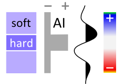
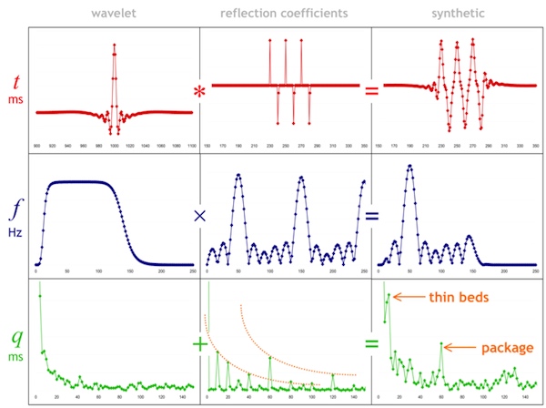
    Click the image to find your favorite colorbarSeismic data is about contrasts. The data are an abstraction of geological contrasts in the earth. To connect the data to the geology, there are two important things you need to know about your data:

  1. What do the colours mean in terms of digits?

  2. What do the digits mean in terms of impedance?

So whenever you show seismic to someone, you need to answers these questions for them. Show the colourbar, and the sign of the digits (the magnitude of the digits is not very important; amplitude are relative). Show the relationship between the sign of the digits and impedance.

Really useful

To help you show these things, we have created a table of polarity cartoons for some common colour scales.

  1. Decide if you want to use the American–Canadian convention of a downwards increase in impedance resulting in a positive amplitude, or the opposite European–Australian convention. Sometimes people talk about SEG Normal polarity — the de facto SEG standard is the American convention.

  2. Choose whether you want to show a high impedance layer sandwiched between low impedance ones, or vice versa. To make this decision, inspect your well ties or plot impedance against lithology. For example, if your sands are relatively fast and dense, you may want to choose the hard layer option.

  3. Select a colourmap that matches your displays. If you need another, you can download and edit the SVG file, or email us and we'll add it for you.

  4. Right-click on a thumbnail, copy it to your clipboard, and paste it into the corner of your section or timeslice in PowerPoint, Word, or wherever. If the thumbnail is too small or pixelated, click the thumbnail for higher resolution.

With so many options to choose from, we hope this little tool can help make your seismic discussions a little more transparent. What's more, if you see a seismic section without a legend like this, then are you sure the presenter knows about the polarity of their data? Perhaps they do, but it is an oversight to assume that you should know as well. 

What do you make your audience assume?


UPDATE [2020] — we built a small web app to serve up fresh polarity cartoons, whenever you need them! Check it out.

Source rocks from seismic

A couple of years ago, Statoil's head of exploration research, Ole Martinsen, told AAPG Explorer magazine about a new seismic analysis method. Not just another way to discriminate between sand and shale, or water and gas, this was a way to assess source rock potential. Very useful in under-explored basins, and Statoil developed it for that purpose, but only the very last sentence of the Explorer article hints at its real utility today: shale gas exploration.

Calling the method Source Rocks from Seismic, Martinsen was cagey about details, but the article made it clear that it's not rocket surgery: “We’re using technology that would normally be used, say, to predict sandstone and fluid content in sandstone,” said Marita Gading, a Statoil researcher. Last October Helge Løseth, along with Gading and others, published a complete account of the method (Løseth et al, 2011).

Because they are actively generating hydrocarbons, source rocks are usually overpressured. Geophysicists have used this fact to explore for overpressured zones and even shale before. For example, Mukerji et al (2002) outlined the rock physics basis for low velocities in overpressured zones. Applying the physics to shales, Liu et al (2007) suggested a three-step process for evaluating source rock potential in new basins: 1 Sequence stratigraphic interpretation; 2 Seismic velocity analysis to determine source rock thickness; 3 Source rock maturity prediction from seismic. Their method is also a little hazy, but the point is that people are looking for ways to get at source rock potential via seismic data. 

The Løseth et al article was exciting to see because it was the first explanation of the method that Statoil had offered. This was exciting enough that the publication was even covered by Greenwire, by Paul Voosen (@voooos on Twitter). It turns out to be fairly straightforward: acoustic impedance (AI) is inversely and non-linearly correlated with total organic carbon (TOC) in shales, though the relationship is rather noisy in the paper's examples (Kimmeridge Clay and Hekkingen Shale). This means that an AI inversion can be transformed to TOC, if the local relationship is known—local calibration is a must. This is similar to how companies estimate bitumen potential in the Athabasca oil sands (e.g. Dumitrescu 2009). 

Figure 6 from Løseth et al (2011). A Seismic section. B Acoustic impedance. C Inverted seismic section where source rock interval is converted to total organic carbon (TOC) percent. Seismically derived TOC percent values in source rock intervals can be imported to basin modeling software to evaluate hydrocarbon generation potential of a basin. Click for full size..The result is that thick rich source rocks tend to have strong negative amplitude at the top, at least in subsiding mud-rich basins like the North Sea and the Gulf of Mexico. Of course, amplitudes also depend on stratigraphy, tuning, and so on. The authors expect amplitudes to dim with offset, because of elastic and anisotropic effects, giving a Class 4 AVO response.

This is a nice piece of work and should find application worldwide. There's a twist though: if you're interested in trying it out yourself, you might be interested to know that it is patent-pending: 

WO/2011/026996
INVENTORS:  Løseth,  H;  Wensaas, L; Gading, M; Duffaut, K; Springer, HM
Method of assessing hydrocarbon source rock candidate
A method of assessing a hydrocarbon source rock candidate uses seismic data for a region of the Earth. The data are analysed to determine the presence, thickness and lateral extent of candidate source rock based on the knowledge of the seismic behaviour of hydrocarbon source rocks. An estimate is provided of the organic content of the candidate source rock from acoustic impedance. An estimate of the hydrocarbon generation potential of the candidate source rock is then provided from the thickness and lateral extent of the candidate source rock and from the estimate of the organic content.

References

Dumitrescu, C (2009). Case study of a heavy oil reservoir interpretation using Vp/Vs ratio and other seismic attributes. Proceedings of SEG Annual Meeting, Houston. Abstract is online

Liu, Z, M Chang, Y Zhang, Y Li, and H Shen (2007). Method of early prediction on source rocks in basins with low exploration activity. Earth Science Frontiers 14 (4), p 159–167. DOI 10.1016/S1872-5791(07)60031-1

Løseth, H, L Wensaas, M Gading, K Duffaut, and M Springer (2011). Can hydrocarbon source rocks be identified on seismic data? Geology 39 (12) p 1167–1170. First published online 21 October 2011. DOI 10.1130/​G32328.1

Mukerji, T, Dutta, M Prasad, J Dvorkin (2002). Seismic detection and estimation of overpressures. CSEG Recorder, September 2002. Part 1 and Part 2 (Dutta et al, same issue). 

The figure is reproduced from Løseth et al (2011) according to The Geological Society of America's fair use guidelines. Thank you GSA! The flaming Kimmeridge Clay photograph is public domain. 

Location, location, location

A quiz: how many pieces of information do you need to accurately and unambiguously locate a spot on the earth?

It depends a bit if we're talking about locations on a globe, in which case we can use latitude and longitude, or locations on a map, in which case we will need coordinates and a projection too. Since maps are flat, we need a transformation from the curved globe into flatland — a projection

So how many pieces of information do we need?

The answer is surprising to many people. Unless you deal with spatial data a lot, you may not realize that latitude and longitude are not enough to locate you on the earth. Likewise for a map, an easting (or x coordinate) and northing (y) are insufficient, even if you also give the projection, such as the Universal Transverse Mercator zone (20T for Nova Scotia). In each case, the missing information is the datum. 

Why do we need a datum? It's similar to the problem of measuring elevation. Where will you measure it from? You can use 'sea-level', but the sea moves up and down in complicated tidal rhythms that vary geographically and temporally. So we concoct synthetic datums like Mean Sea Level, or Mean High Water, or Mean Higher High Water, or... there are 17 to choose from! To try to simplify things, there are standards like the North American Vertical Datum of 1988, but it's important to recognize that these are human constructs: sea-level is simply not static, spatially or temporally.

To give coordinates faithfully, we need a standard grid. Cartesian coordinates plotted on a piece of paper are straightforward: the paper is flat and smooth. But the earth's sphere is not flat or smooth at any scale. So we construct a reference ellipsoid, and then locate that ellipsoid on the earth. Together, these references make a geodetic datum. When we give coordinates, whether it's geographic lat–long or cartographic xy, we must also give the datum. Without it, the coordinates are ambiguous. 

How ambiguous are they? It depends how much accuracy you need! If you're trying to locate a city, the differences are small — two important datums, NAD27 and NAD83, are different by up to about 80 m for most of North America. But 80 m is a long way when you're shooting seismic or drilling a well.

What are these datums then? In North America, especially in the energy business, we need to know three:

NAD27 — North American Datum of 1927, Based on the Clarke 1866 ellipsoid and fixed on Meades Ranch, Kansas. This datum is very commonly used in the oilfield, even today. The complexity and cost of moving to NAD83 is very large, and will probably happen v e r y  s l o w l y. In case you need it, here's an awesome tool for converting between datums. 

NAD83 — North American Datum of 1983, based on the GRS 80 ellipsoid and fixed using a gravity field model. This datum is also commonly seen in modern survey data — watch out if the rest of your project is NAD27! Since most people don't know the datum is important and therefore don't report it, you may never know the datum for some of your data. 

WGS84 — World Geodetic System of 1984, based on the 1996 Earth Gravitational Model. It's the only global datum, and the current standard in most geospatial contexts. The Global Positioning System uses this datum, and coordinates you find in places like Wikipedia and Google Earth use it. It is very, very close to NAD83, with less than 2 m difference in most of North America; but it gets a little worse every year, thanks to plate tectonics!

OK, that's enough about datums. To sum up: always ask for the datum. If you're generating geospatial information, always give the datum. You might not care too much about it today, but Evan and I have spent the better part of two days trying to unravel the locations of wells in Nova Scotia so trust me when I say that one day, you will care!

Disclaimer: we are not geodesy specialists, we just happen to be neck-deep in it at the moment. If you think we've got something wrong, please tell us! Map licensed CC-BY by Wikipedia user Alexrk2 — thank you! Public domain image of Earth from Apollo 17. 

The spectrum of the spectrum

A few weeks ago, I wrote about the notches we see in the spectrums of thin beds, and how they lead to the mysterious quefrency domain. Today I want to delve a bit deeper, borrowing from an article I wrote in 2006.

Why the funny name?

During the Cold War, the United States government was quite concerned with knowing when and where nuclear tests were happening. One method they used was seismic monitoring. To discriminate between detonations and earthquakes, a group of mathematicians from Bell Labs proposed detecting and timing echoes in the seismic recordings. These echoes gave rise to periodic but cryptic notches in the spectrum, the spacing of which was inversely proportional to the timing of the echoes. This is exactly analogous to the seismic response of a thin-bed.

To measure notch spacing, Bogert, Healy and Tukey (1963) invented the cepstrum (an anagram of spectrum and therefore usually pronounced kepstrum). The cepstrum is defined as the Fourier transform of the natural logarithm of the Fourier transform of the signal: in essence, the spectrum of the spectrum. To distinguish this new domain from time, to which is it dimensionally equivalent, they coined several new terms. For example, frequency is transformed to quefrency, phase to saphe, filtering to liftering, even analysis to alanysis.

Today, cepstral analysis is employed extensively in linguistic analysis, especially in connection with voice synthesis. This is because, as I wrote about last time, voiced human speech (consisting of vowel-type sounds that use the vocal chords) has a very different time–frequency signature from unvoiced speech; the difference is easy to quantify with the cepstrum.

What is the cepstrum?

To describe the key properties of the cepstrum, we must look at two fundamental consequences of Fourier theory:

  1. convolution in time is equivalent to multiplication in frequency
  2. the spectrum of an echo contains periodic peaks and notches

Let us look at these in turn. A noise-free seismic trace s can be represented in the time t domain by the convolution of a wavelet w and reflectivity series r thus

convolutional model

Then, in the frequency f domain

In other words, convolution in time becomes multiplication in frequency. The cepstrum is defined as the Fourier transform of the log of the spectrum. Thus, taking logs of the complex moduli

Since the Fourier transform F is a linear operation, the cepstrum is

We can see that the spectrums of the wavelet and reflectivity series are additively combined in the cepstrum. I have tried to show this relationship graphically below. The rows are domains. The columns are the components w, r, and s. Clearly, these thin beds are resolved by this wavelet, but they might not be in the presence of low frequencies and noise. Spectral and cepstral analysis—and alanysis—can help us cut through the seismic and get at the geology. 

Time series (top), spectra (middle), and cepstra (bottom) for a wavelet (left), a reflectivity series containing three 10-ms thin-beds (middle), and the corresponding synthetic trace (right). The band-limited wavelet has a featureless cepstrum, whereas the reflectivity series clearly shows two sets of harmonic peaks, corresponding to the thin- beds (each 10 ms thick) and the thicker composite package.

References

Bogert, B, Healy, M and Tukey, J (1963). The quefrency alanysis of time series for echoes: cepstrum, pseudo-autocovariance, cross- cepstrum, and saphe-cracking. Proceedings of the Symposium on Time Series Analysis, Wiley, 1963.

Hall, M (2006). Predicting stratigraphy with cepstral decomposition. The Leading Edge 25 (2), February 2006 (Special issue on spectral decomposition). doi:10.1190/1.2172313

Greenhouse George image is public domain.

J is for Journal

I'm aware of a few round-ups of journals for geologists, but none for those of us with more geophysical leanings. So here's a list of some of the publications that used to be on my reading list back when I used to actually read things. I've tried to categorize them a bit, but this turned out to be trickier than I thought it would be; I hope my buckets make some sense.

Journals with mirrored content at GeoScienceWorld are indicated by GSW

Peer-reviewed journals

Technical magazines

  • First Break — indispensible news from EAGE and the global petroleum scene, and a beautifully produced periodical to boot. No RSS feed, though. Boo. Subscription only.
  • The Leading EdgeGSWRSS — SEG's classic monthly that You Must Read. But... subscription only.
  • Recorder is brilliant value for money, even if it doesn't have an RSS feed. It is also publicly accessible after three months, which is rare to see in our field. Yay, CSEG!

Other petroleum geoscience readables

  • SPE Journal of Petroleum Technology — all the news you need from SPE. It's all online if you can bear the e-reader interface. Mostly manages to tread the marketing-as-article line that some other magazines transgress more often (none of those here; you know what they are).
  • CWLS InSite — openly accessible and often has excellent articles, though it only comes out twice a year now. Its sister organisation, SPWLA, allegedly has a journal called Petrophysics, but I've never seen it and can't find it online. Anyone?
  • Elsevier publish a number of excellent journals, but as you may know, a large part of the scientific community is pressuring the Dutch publishing giant to adopt a less exclusive distribution and pricing model for its content. So I am not reading them any more, or linking to them today. This might seem churlish, but consider that it's not uncommon to be asked for $40 per article, even if the research was publicly funded.

General interest magazines

  • IEEE SpectrumRSS — a terrific monthly from 'the world's largest association for the advancement of technology'. They also publish some awesome niche titles like the unbelievably geeky Signal Processing — RSS. You can subscribe to print issues of Spectrum without joining IEEE, and it's free to read online. My favourite.
  • Royal Statistical Society SignificanceRSS (seems to be empty) — another fantastic cross-disciplinary read. [Updated: You don't have to join the society to get it, and you can read everything online for free]. I've happily paid for this for many years.

How do I read all this stuff?

The easiest way is to grab the RSS feed addresses (right-click and Copy Link Address, or words to that effect) and put them in a feed reader like Google Reader. (Confused? What the heck is RSS?). If you prefer to get things in your email inbox, you can send RSS feeds to email.

If you read other publications that help you stay informed and inspired as an exploration geophysicist — or as any kind of subsurface scientist — let us know what's in your mailbox or RSS feed!

The cover images are copyright of CSEG, CWLS and IEEE. I'm claiming 'fair use' for these low-res images. More A to Z posts...

Shooting into the dark

Part of what makes uncertainty such a slippery subject is that it conflates several concepts that are better kept apart: precision, accuracy, and repeatability. People often mention the first two, less often the third.

It's clear that precision and accuracy are different things. If someone's shooting at you, for instance, it's better that they are inaccurate but precise so that every bullet whizzes exactly 1 metre over your head. But, though the idea of one-off repeatability is built in to the concept of multiple 'readings', scientists often repeat experiments and this wholesale repeatability also needs to be captured. Hence the third drawing. 

One of the things I really like in Peter Copeland's book Communicating Rocks is the accuracy-precision-repeatability figure (here's my review). He captured this concept very nicely, and gives a good description too. There are two weaknesses though, I think, in these classic target figures. First, they portray two dimensions (spatial, in this case), when really each measurement we make is on a single axis. So I tried re-drawing the figure, but on one axis:

The second thing that bothers me is that there is an implied 'correct answer'—the middle of the target. This seems reasonable: we are trying to measure some external reality, after all. The problem is that when we make our measurements, we do not know where the middle of the target is. We are blind.

If we don't know where the bullseye is, we cannot tell the difference between precise and imprecise. But if we don't know the size of the bullseye, we also do not know how accurate we are, or how repeatable our experiments are. Both of these things are entirely relative to the nature of the target. 

What can we do? Sound statistical methods can help us, but most of us don't know what we're doing with statistics (be honest). Do we just need more data? No. More expensive analysis equipment? No.

No, none of this will help. You cannot beat uncertainty. You just have to deal with it.

This is based on an article of mine in the February issue of the CSEG Recorder. Rather woolly, even for me, it's the beginning of a thought experiment about doing a better job dealing with uncertainty. See Hall, M (2012). Do you know what you think you know? CSEG Recorder, February 2012. Online in May. Figures are here. 

News of the month

News of the week was maybe a little ambitious, so we're going to scale back to a monthly post. The same sort of news — technology with subsurface application. Whatever catches our beady eyes, really. Seen something cool? Tip us off.

First, a quick plug. Matt's writing course is on offer again at the CSPG-CSEG-CWLS GeoConvention in Calgary in May. It's a technical writing course, but it's not really about technical writing—it's about get more people writing more stuff. For fun, for science, for whatever. See the conspicuous ad (right) for more info. 

OK, two quick plugs. Dropbox just updated their web interface. If you're not a Dropbox user already, you are missing out on an amazing file storage and transfer tool. Files are accessible from anywhere, and can be shared with a simple web link. We use it every single day for personal and project stuff. Get an account here or click on the illusion.

The technology is coming

A few weeks ago we posted a video of a new augmented reality monocle. Now, news is growing that Google's mysterious X lab is developing some similar-sounding glasses. The general idea is that they connect to your Android phone for communications services, and sit on your face labeling things in the real world, in real time. Labeling with ads, presumably.

As the new iPad now totes a screen with more pixels than the monitor you’re looking at, it’s clear that mobile devices are changing everything there is to change about computing. 

Another SGI ICE, NASA's Pleiades is one of the top ten clusters in the world at 1.4 Pflops. It has a staggering 191TB of memory. Image: NASA.

Not a total flop

Remember SGI? You know, giant blue refrigeratory thing with 12GB of RAM in the back of the viz room, cost about $1M? Completely wiped out by the Linux PC about 10 years ago? Well, not completely: SGI just sold to  Total E&P a giant computer. Much bigger than a refrigerator, and much more expensive than $1M. At 2.3 petaflops (quadrillion floating-point operations per second) this new ICE X machine will be easily one of the most powerful computers in the world.

If the press release is anything to go by, and it probably isn't, Total seems to have reservoir modeling in mind, not just seismic processing. I wonder if they have a mixing board yet? 

Nova Scotia deepwater on fire

Not literally, but there's a small new flame at any rate. Shell Canada went large in January's bid round on four deepwater blocks off Nova Scotia, committing to almost $1B in exploration expenditures over the next five years. They won parcels 1 to 4 for $1.8M, $303M, $235M, $430M respectively, totalling $970M. This is terrific news for Nova Scotia, and for Canada.

This regular news feature is for information only. We aren't connected with any of these organizations, and don't necessarily endorse their products or services. SGI and ICE X are registered trademarks of Silicon Graphics International Corp. The psychobox illusion is a trademark of Dropbox.com. Offshore Nova Scotia map modified from CNSOPB.

A mixing board for the seismic symphony

Seismic processing is busy chasing its tail. OK, maybe an over-generalization, but researchers in the field are very skilled at finding incremental—and sometimes great—improvements in imaging algorithms, geometric corrections, and fidelity. But I don't want any of these things. Or, to be more precise: I don't need any more. 

Reflection seismic data are infested with filters. We don't know what most of these filters look like, and we've trained ourselves to accept and ignore them. We filter out the filters with our intuition. And you know where intuition gets us.

Mixing boardIf I don't want reverse-time, curved-ray migration, or 7-dimensional interpolation, what do I want? Easy: I want to see the filters. I want them perturbed and examined and exposed. Instead of soaking up whatever is left of Moore's Law with cluster-hogging precision, I would prefer to see more of the imprecise stuff. I think we've pushed the precision envelope to somewhere beyond the net uncertainty of our subsurface data, so that quality and sharpness of the seismic image is not, in most cases, the weak point of an integrated interpretation.

So I don't want any more processing products. I want a mixing board for seismic data.

To fully appreciate my point of view, you need to have experienced a large seismic processing project. It's hard enough to process seismic, but if there is enough at stake—traces, deadlines, decisions, or just money—then it is almost impossible to iterate the solution. This is rather ironic, and unfortunate. Every decision, from migration aperture to anisotropic parameters, is considered, tested, and made... and then left behind, never to be revisited.

Linear seismic processing flow

But this linear model, in which each decision is cemented onto the ones before it, seems unlikely to land on the optimal solution. Our fateful string of choices may lead us to a lovely spot, with a picnic area and clean toilets, but the chances that it is the global maximum, which might lie in a distant corner of the solution space, seem slim. What if the spherical divergence was off? Perhaps we should have interpolated to a regularized geometry. Did we leave some ground roll in the data? 

Seismic processing mixing boardLook, I don't know the answer. But I know what it would look like. Instead of spending three months generating the best-ever migration, we'd spend three months (maybe less) generating a universe of good-enough migrations. Then I could sit at my desk and—at least with first order precision—change the spherical divergence, or see if less aggressive noise attenuation helps. A different migration algorithm, perhaps. Maybe my multiples weren't gone after all: more radon!

Instead of looking along the tunnel of the processing flow, I want the bird's eye view of all the possiblities. 

If this sounds impossible, that's because it is impossible, with today's approach: process in full, then view. Why not just do this swath? Ray trace on the graphics card. Do everything in memory and make me buy 256GB of RAM. The Magic Earth mentality of 2001—remember that?

Am I wrong? Maybe we're not even close to good-enough, and we should continue honing, at all costs. But what if the gains to be made in exploring the solution space are bigger than whatever is left for image quality?

I think I can see another local maximum just over there...

Mixing board image: iStockphoto.

The map that changed the man

This is my contribution to the Accretionary Wedge geoblogfest, number 43: My Favourite Geological Illustration. You can read all about it, and see the full list of entries, at In the Company of Plants and Rocks. To quote Hollis:

All types of geological illustrations qualify — drawings, paintings, maps, charts, graphs, cross-sections, diagrams, etc., but not photographs.  You might choose something because of its impact, its beauty, its humor, its clear message or perhaps because of a special role it played in your life.  Let us know the reasons for your choice!

The map that changed the man

In 1987, at the age of 16, I became a geologist wannabe. A week on Rùm (called Rhum at the time) with volcanologist Steve Sparks convinced me that it was the most complete science of nature, being a satisfying stew of physics, chemistry, geomorphology, cosmology, fluid dynamics, and single malt whisky. One afternoon, he showed me cross-beds in the Torridonian sandstones on the shore of Loch Scresort, and identical cross-beds in the world-famous layered gabbros in the magma chamber of a Palaeogene volcano. 

View of Rum image by Southside Images, see below for credit.

But I was just a wannabe. So I studied hard at school and went off to the University of Durham. The usual studying and non-studying ensued, during which I discovered which parts of the science drew me in. There were awesome field trips, boring crystallography lectures, and tough structural geology labs. And at the end of the second year, there was the 6-week independent mapping project

As far as I know, independent mapping projects sensu stricto are a British phenomenon. I hope they still exist. Two groups decided the UK, while offering incredible basemaps and rich geological literature, was too soggy. One group went to the French Alps, where carbonates legend Maurice Tucker would be vacationing and available for advice, the other group decided that was too easy and went off to the wild mountains of northern Spain and the thrust front of the Pyrenees, where no-one was vacationing and no-one would be available for anything. Guess which group I was in. 

To say we were green would be like saying geologists think beer is OK. I hitchhiked there (but only had one creepy ride). We lived in tents (but in a peach orchard). It was July, and 35 degrees Celsius on a cool day (but there was a lake). We had no money (but lots of coloured pencils). It wasn't so bad. We all fell in love with Spain. 

Anyway, long story short, I made this map. It's no good, but that's not the point. It's my map. It's the map that turned me from wannabe into actual (if poor). It doesn't really need any commentary. It took hours and hours of scratching with Rotring Rapidographs on drawing film, then colouring the Diazo print by hand. This sounds like ancient history, but the methods I used to create it were already on the verge of extinction—the following year I started using Adobe Illustrator for draughting, and now I use Inkscape. And while some field tools have changed (of course we were not armed with laptops, Google Earth, GPS, or digital cameras), others are pure and true and timeless. Whack, whack,...

The ring of my hammer on Late Cretaceous limestones is still echoing through the Pyrenees. 

Geological map of the Embaase de Santa Ana, Alfarras, Spain; click to enlarge.

My map of the geology around the Embalse de Santa Ana. Hand-drawn by me in 1992, though I admit it looks like it's from 1892. Click for a larger view. View of Rùm by flickr user Southside Images, licensed CC-BY-NC-SA.

Please sir, may I have some processing products?

Just like your petrophysicist, your seismic processor has some awesome stuff that you want for your interpretation. She has velocities, fold maps, and loads of data. For some reason, processors almost never offer them up — you have to ask. Here is my processing product checklist:

A beautiful seismic volume to interpret. Of course you need a volume to tie to wells and pick horizons on. These days, you usually want a prestack time migration. Depth migration may or may not be something you want to pay for. But there's little point in stopping at poststack migration because if you ever want to do seismic analysis (like AVO for example), you're going to need a prestack time migration. The processor can smooth or enhance this volume if they want to (with your input, of course). 

Unfiltered, attribute-friendly data. Processors like to smooth things with filters like fxy and fk. They can make your data look nicer, and easier to pick. But they mix traces and smooth potentially important information out—they are filters after all. So always ask for the unfiltered data, and use it for attributes, especially for computing semblance and any kind of frequency-based attribute. You can always smooth the output if you want.

Limited-angle stacks. You may or may not want the migrated gathers too—sometimes these are noisy, and they can be cumbersome for non-specialists to manipulate. But limited-angle stacks are just like the full stack, except with fewer traces. If you did prestack migration they won't be expensive, get them exported while you have the processor's attention and your wallet open. Which angle ranges you ask for depends on your data and your needs, but get at least three volumes, and be careful when you get past about 35˚ of offset. 

Rich, informative headers. Ask to see the SEG-Y file header before the final files are generated. Ensure it contains all the information you need: acquisition basics, processing flow and parameters, replacement velocity, time datum, geometry details, and geographic coordinates and datums of the dataset. You will not regret this and the data loader will thank you.

Processing report. Often, they don't write this until they are finished, which is a shame. You might consider asking them to write up a shared Google Docs or a private wiki as they go. That way, you can ensure you stay engaged and informed, and can even help with the documentation. Make sure it includes all the acquisition parameters as well as all the processing decisions. Those who come after you need this information!

Parameter volumes. If you used any adaptive or spatially varying parameters, like anisotropy coefficients for example, make sure you have maps or volumes of these. Don't forget time-varying filters. Even if it was a simple function, get it exported as a volume. You can visualize it with the stacked data as part of your QC. Other parameters to ask for are offset and azimuth diversity.

Migration velocity field (get to know velocities). Ask for a SEG-Y volume, because then you can visualize it right away. It's a good idea to get the actual velocity functions as well, since they are just small text files. You may or may not use these for anything, but they can be helpful as part of an integrated velocity modeling effort, and for flagging potential overpressure. Use with care—these velocities are processing velocities, not earth measurements.

The SEG's salt model, with velocities. Image:Sandia National Labs.Surface elevation map. If you're on land, or the sea floor, this comes from the survey and should be very reliable. It's a nice thing to add to fancy 3D displays of your data. Ask for it in depth and in time. The elevations are often tucked away in the SEG-Y headers too—you may already have them.

Fold data. Ask for fold or trace density maps at important depths, or just get a cube of all the fold data. While not as illuminating as illumination maps, fold is nevertheless a useful thing to know and can help you make some nice displays. You should use this as part of your uncertainty analysis, especially if you are sending difficult interpretations on to geomodelers, for example. 

I bet I have missed something... is there anything you always ask for, or forget and then have to extract or generate yourself? What's on your checklist?