Productive chaos

Wednesday was a good day.

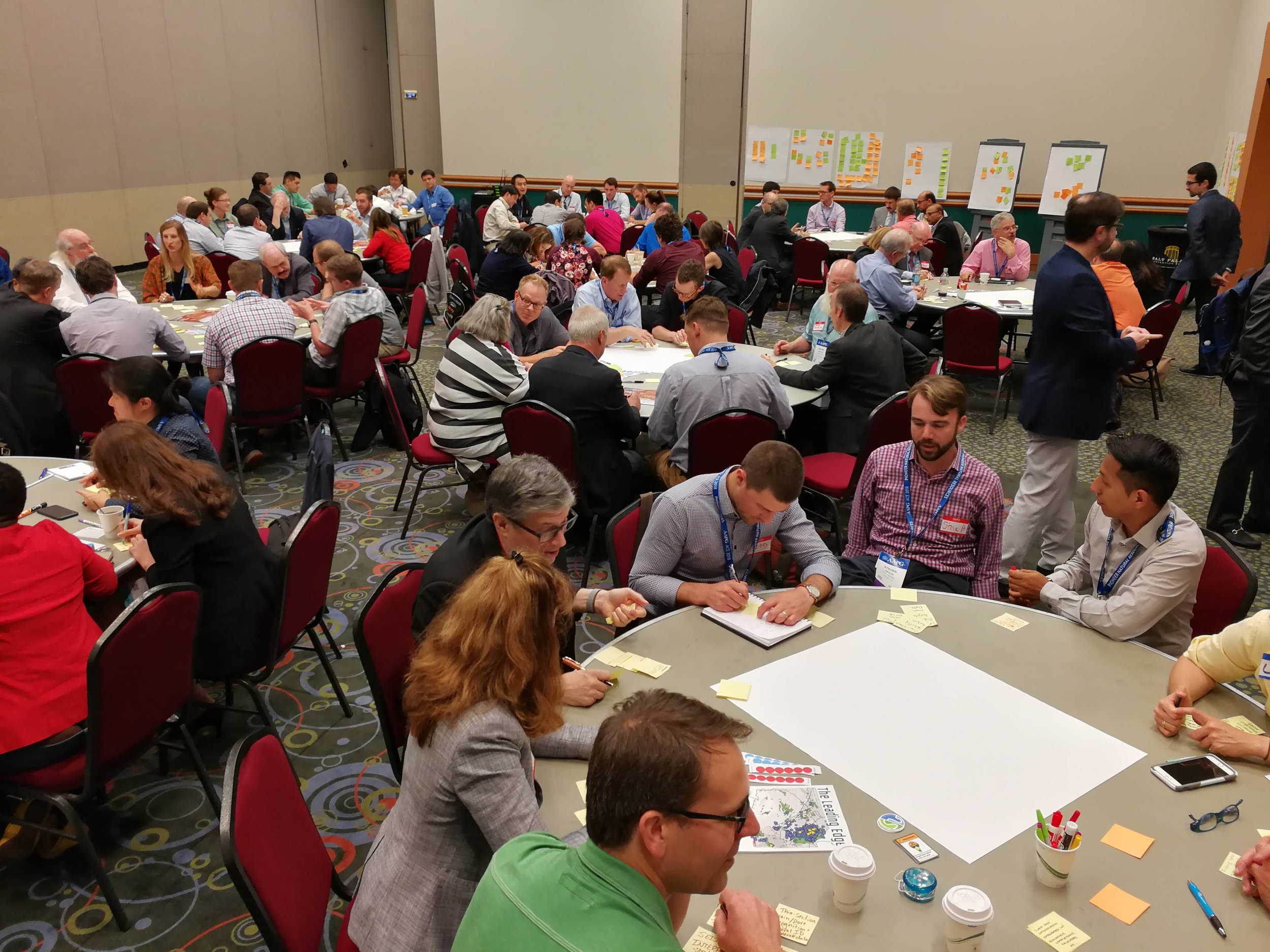
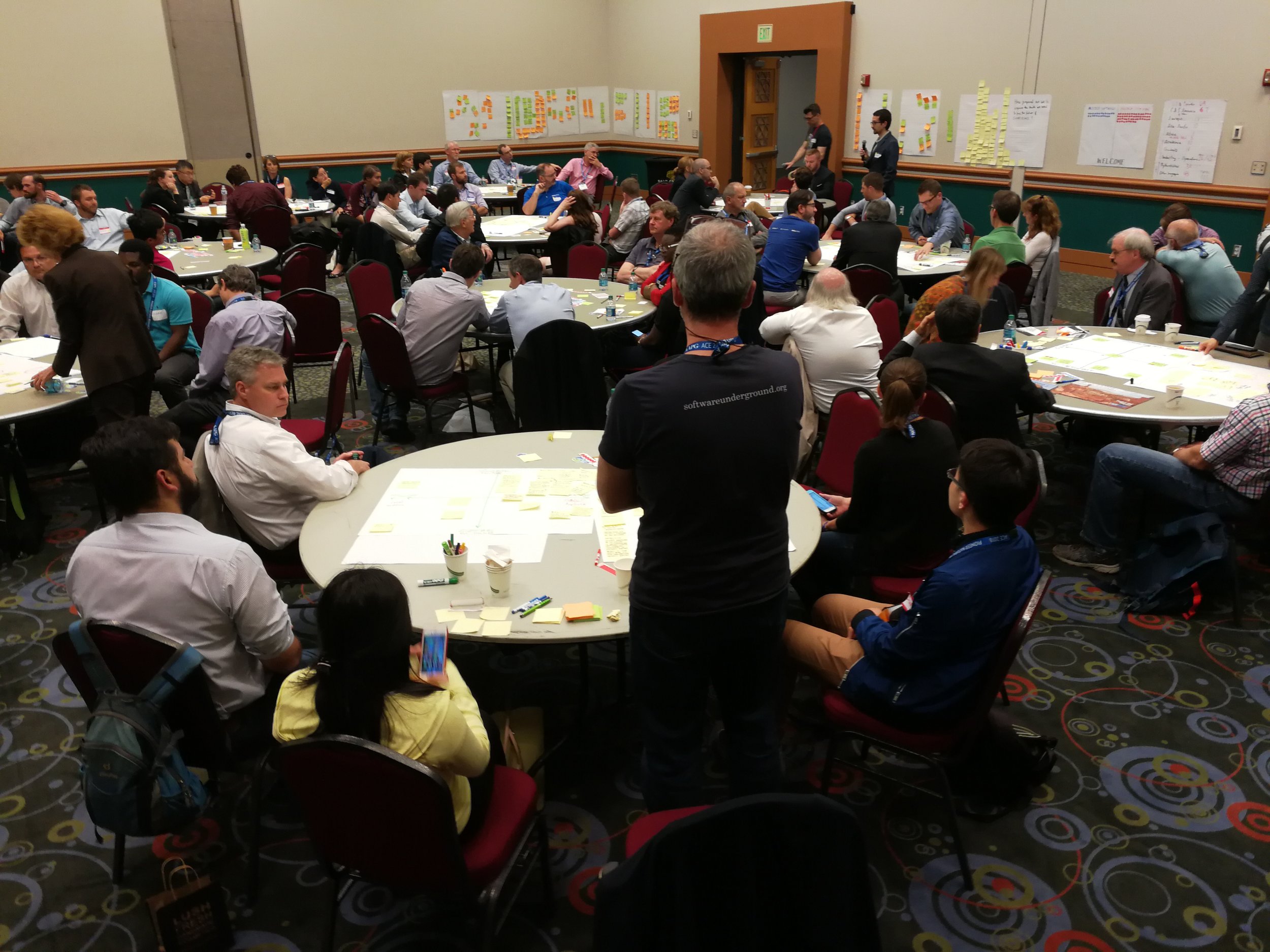
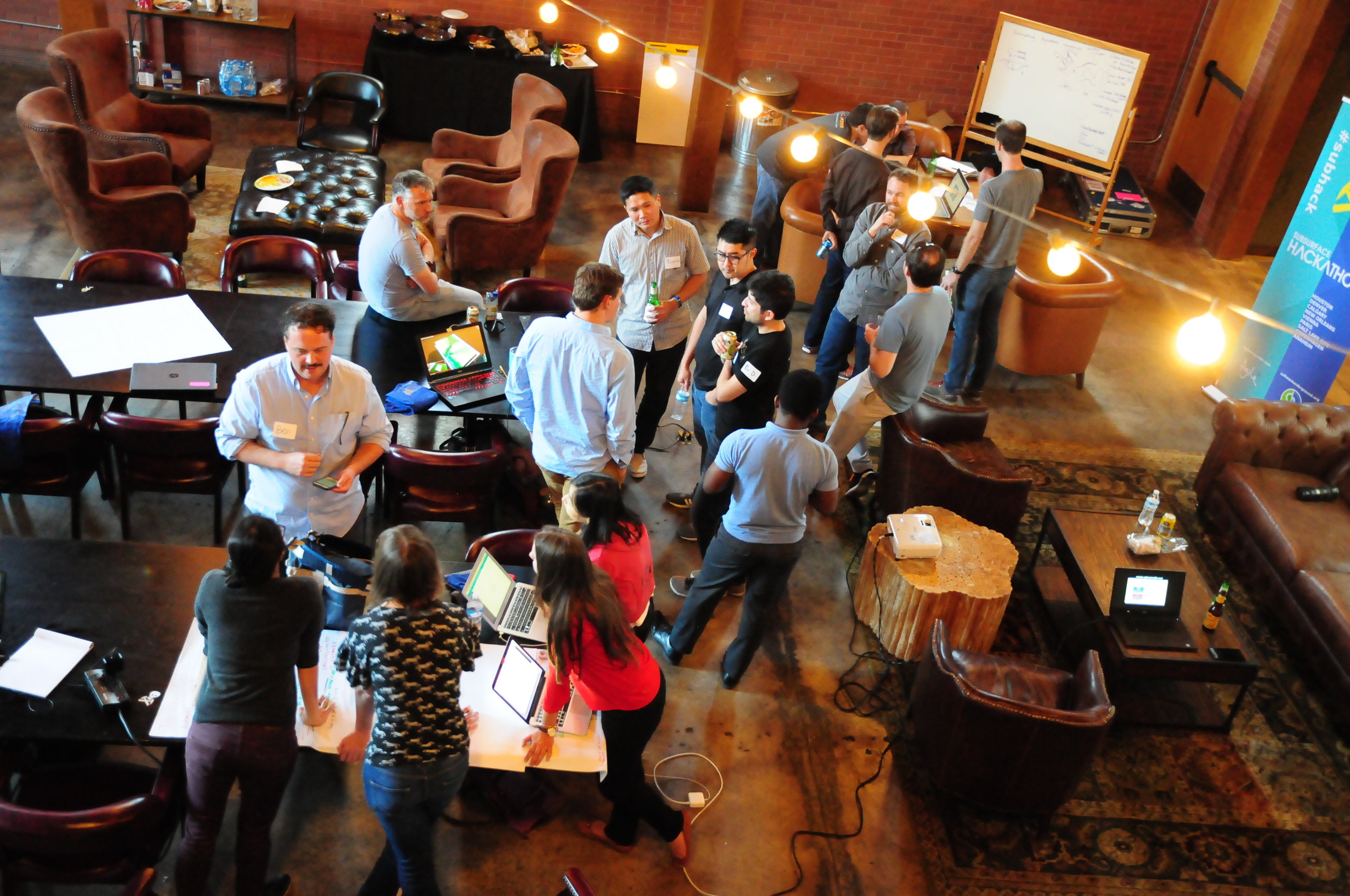
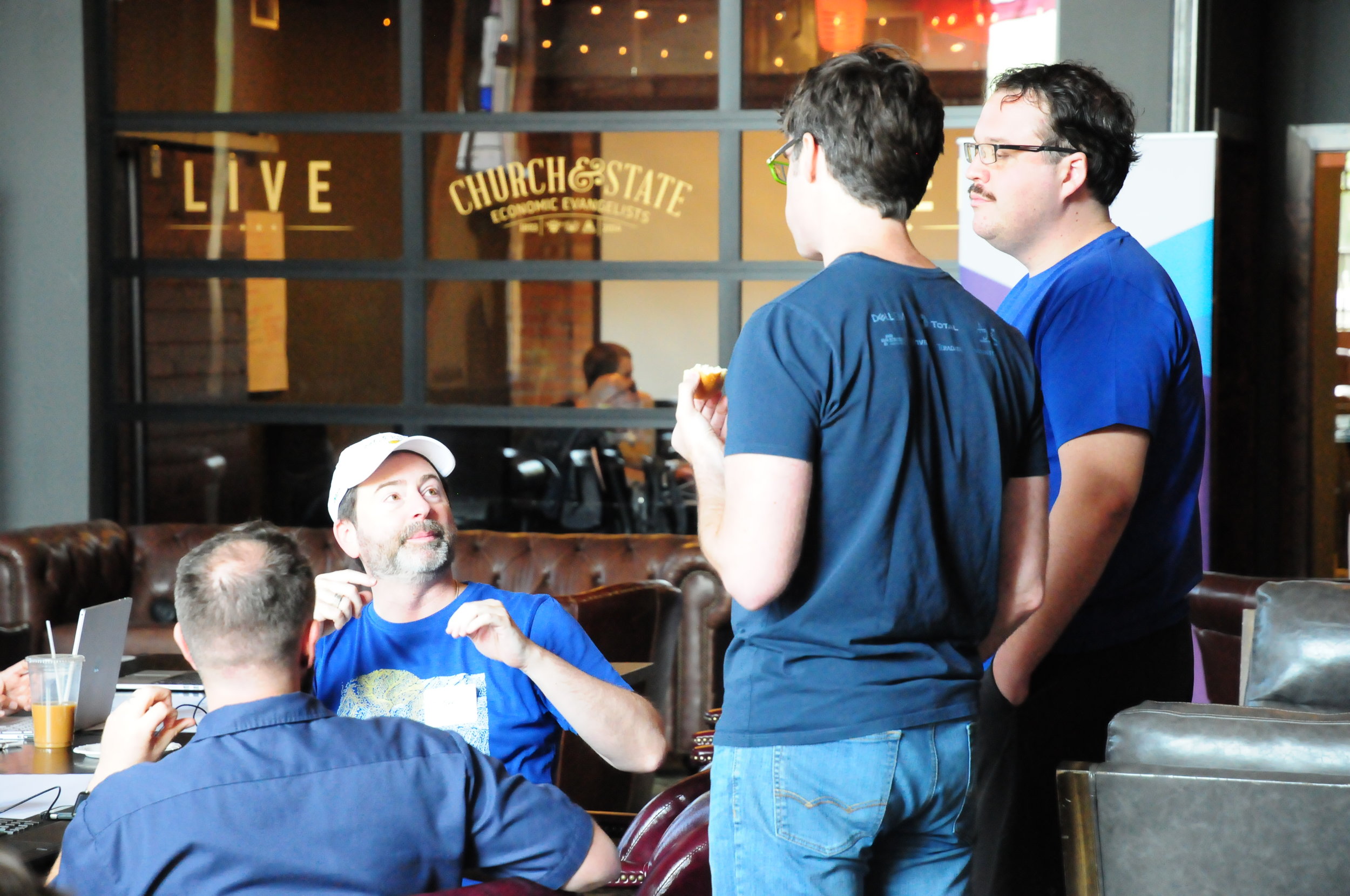
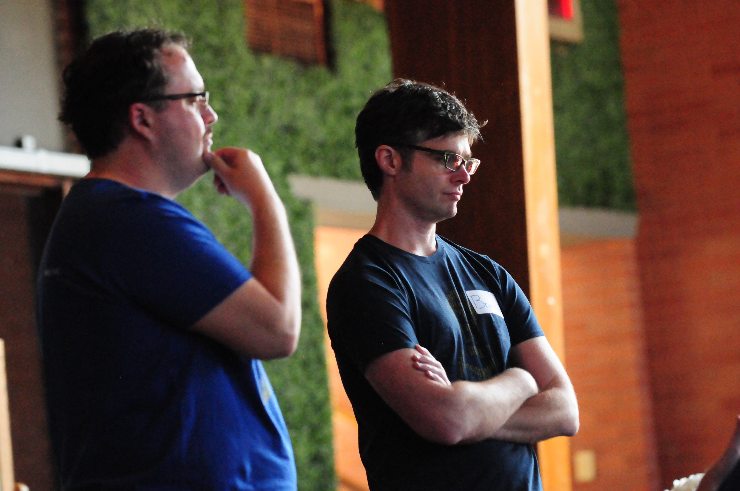
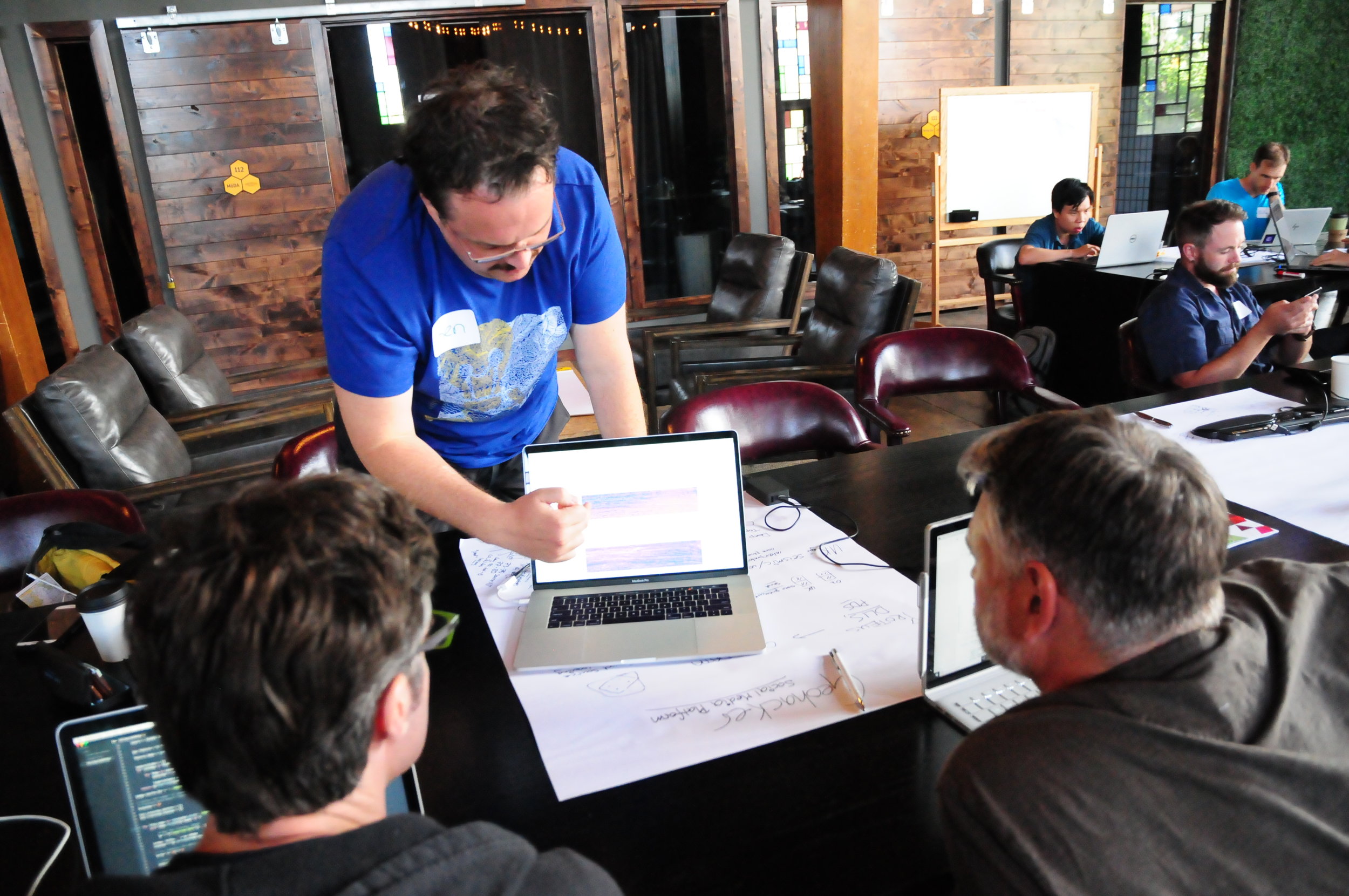
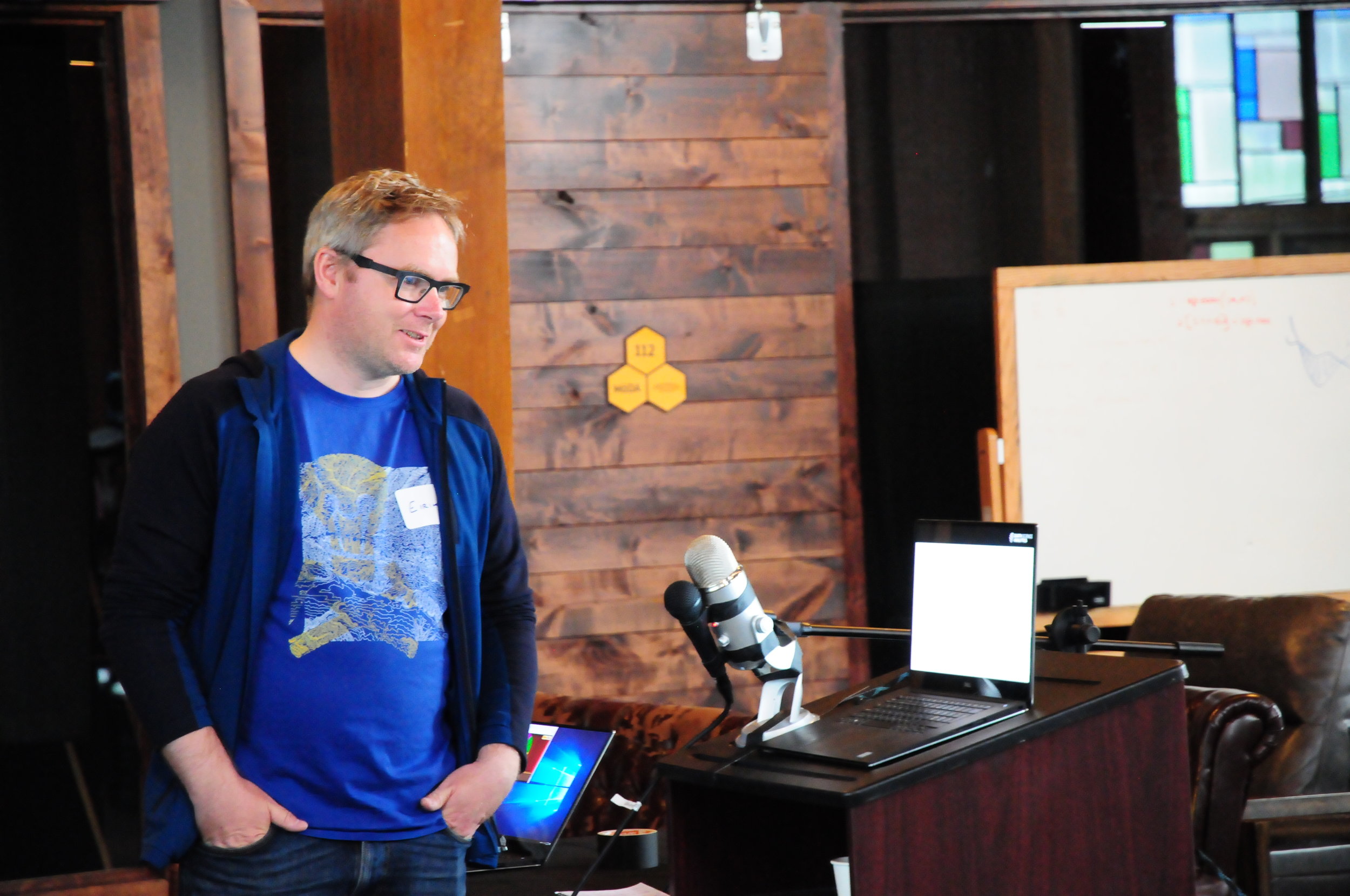
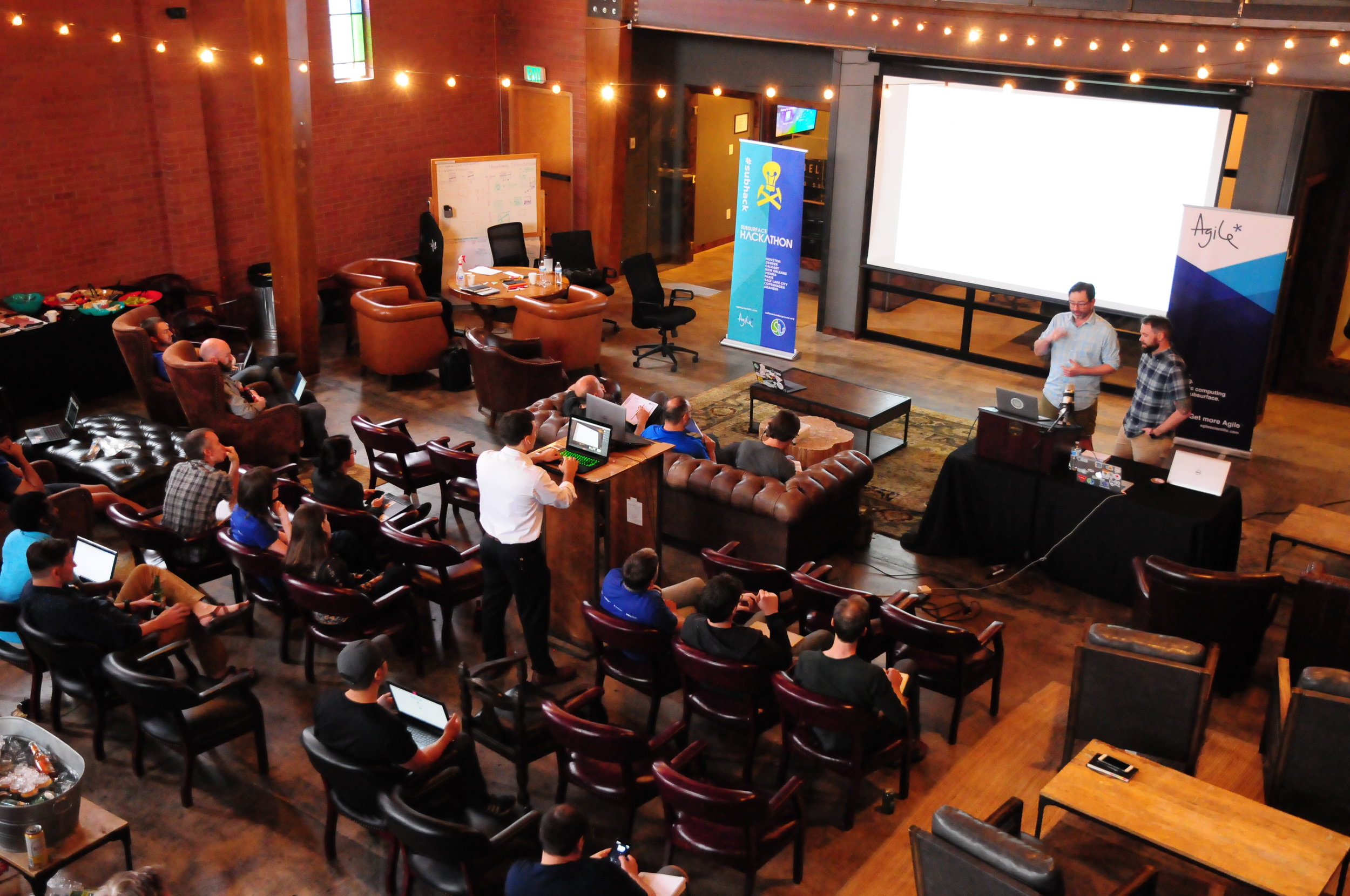
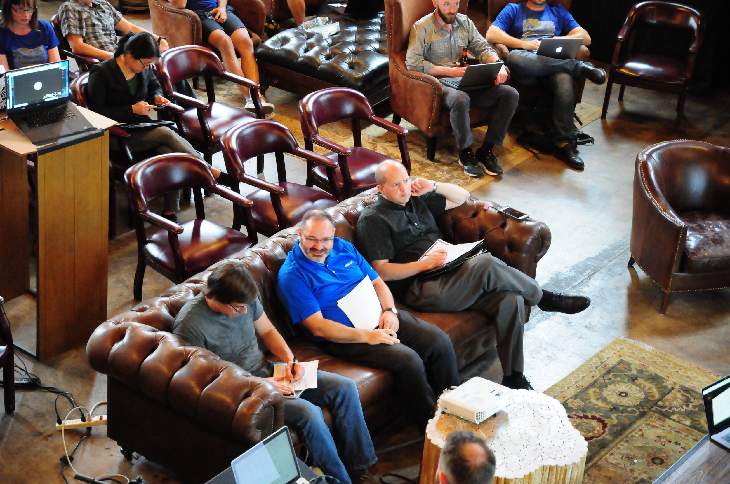
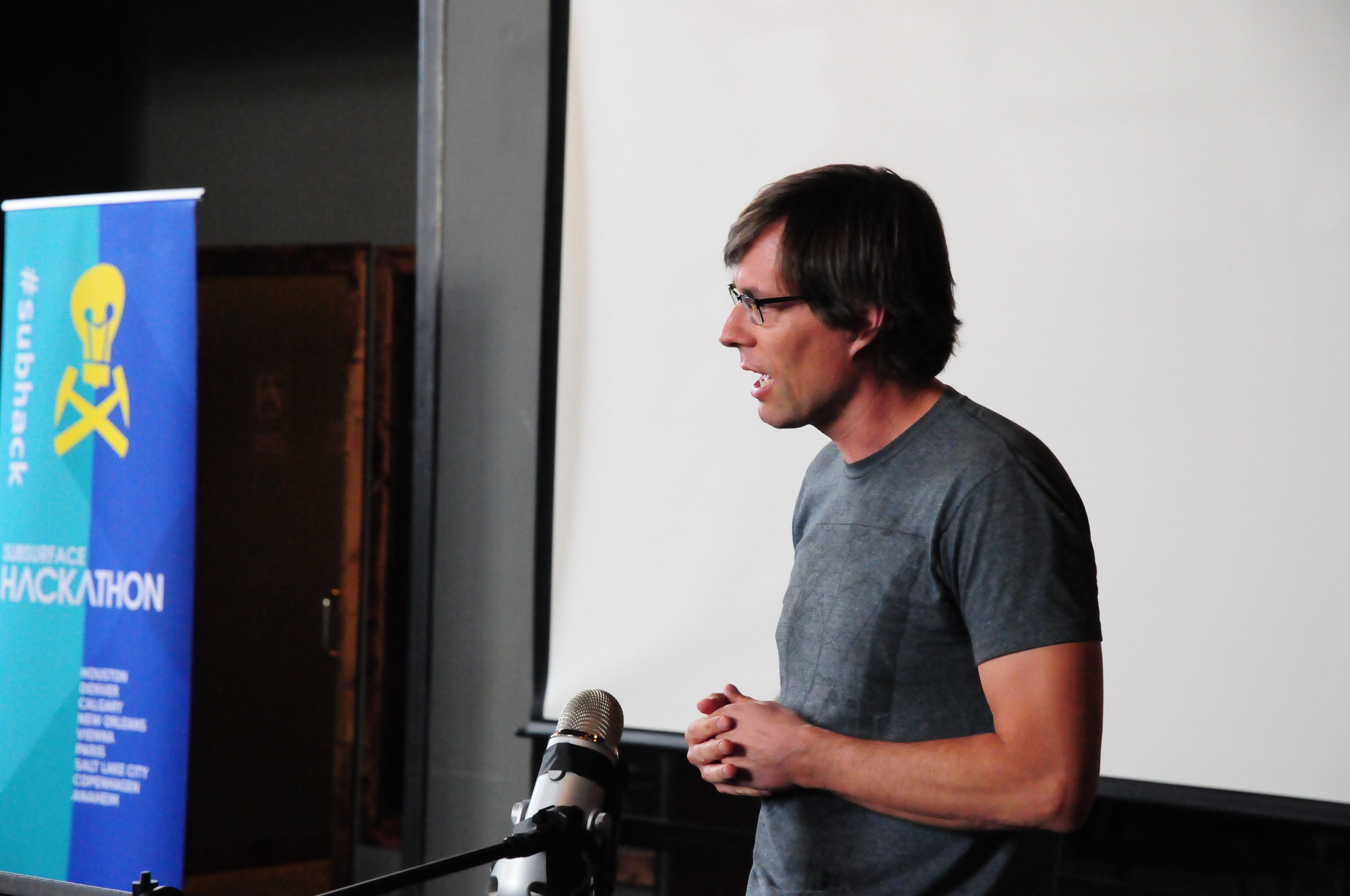
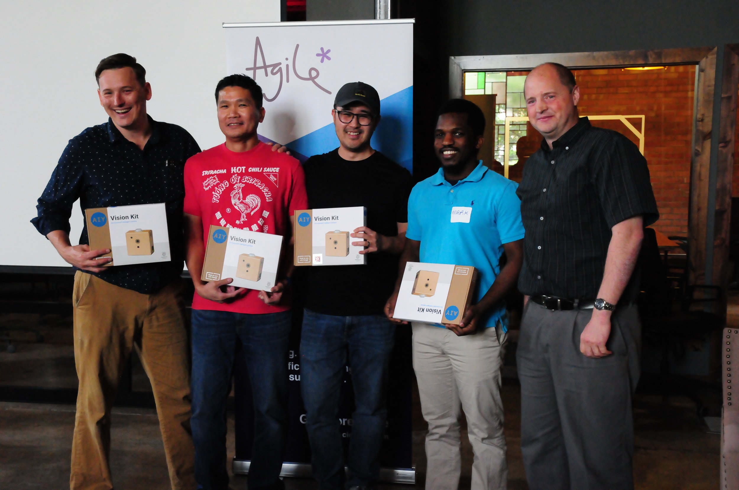
Over 150 participants came to Room 251 for all or part of the first 'unsession' at the AAPG Annual Conference and Exhibition in Salt Lake City. I was one of the hosts of the event, and emceed the afternoon.

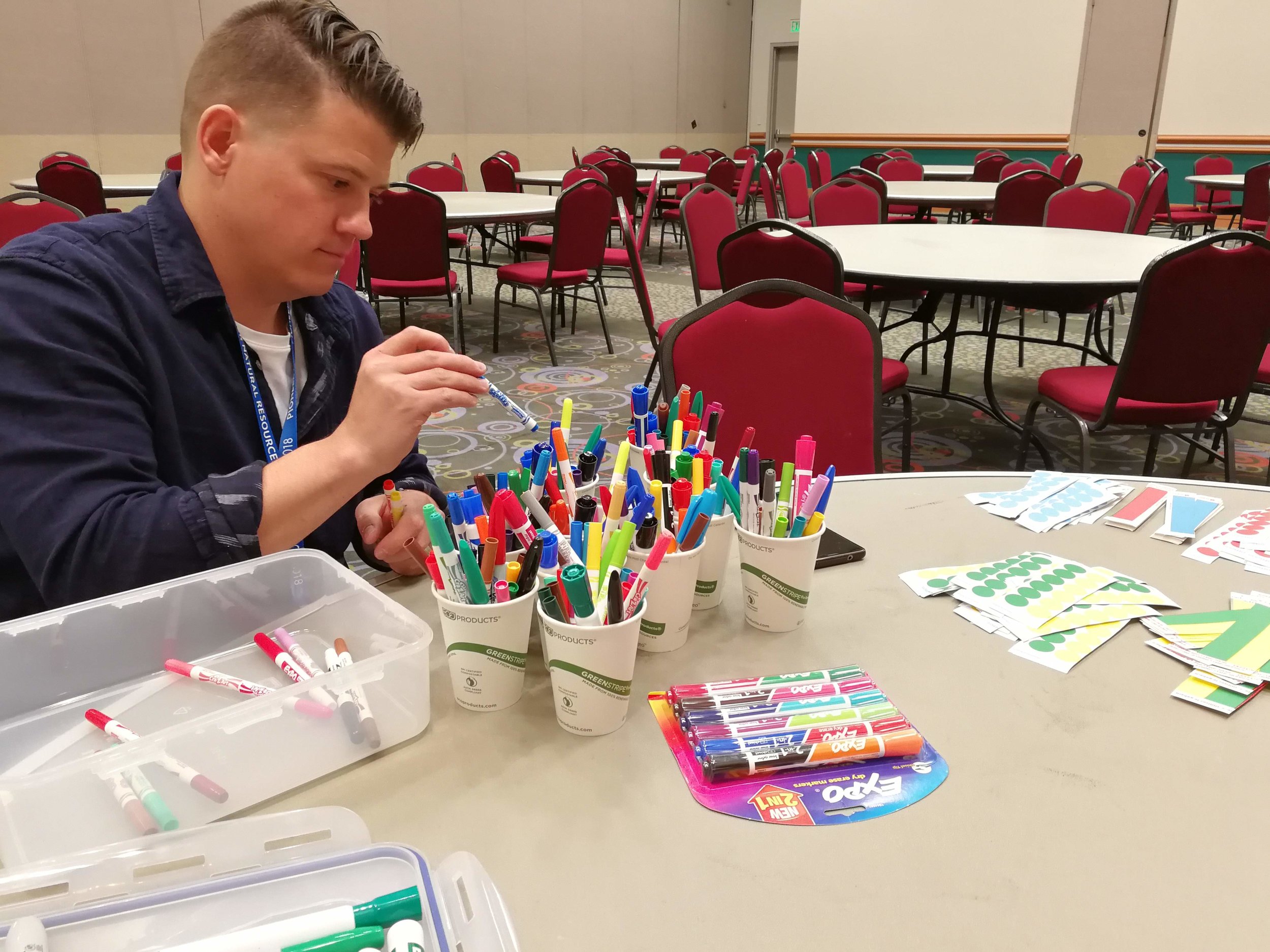
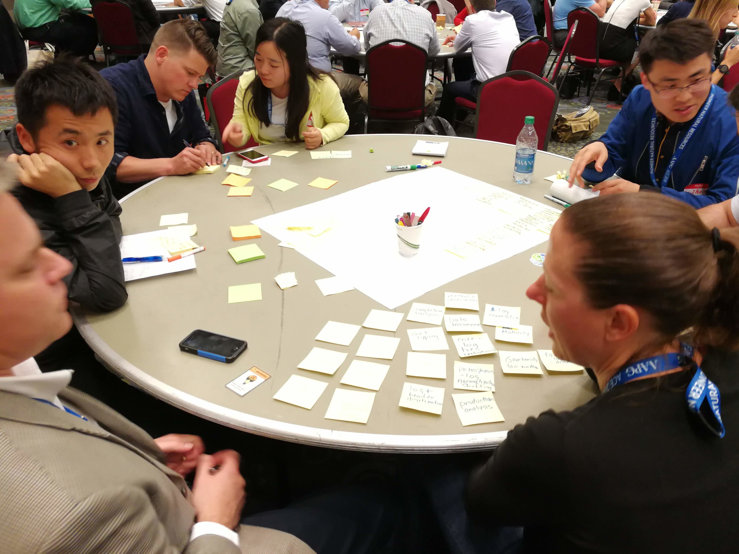
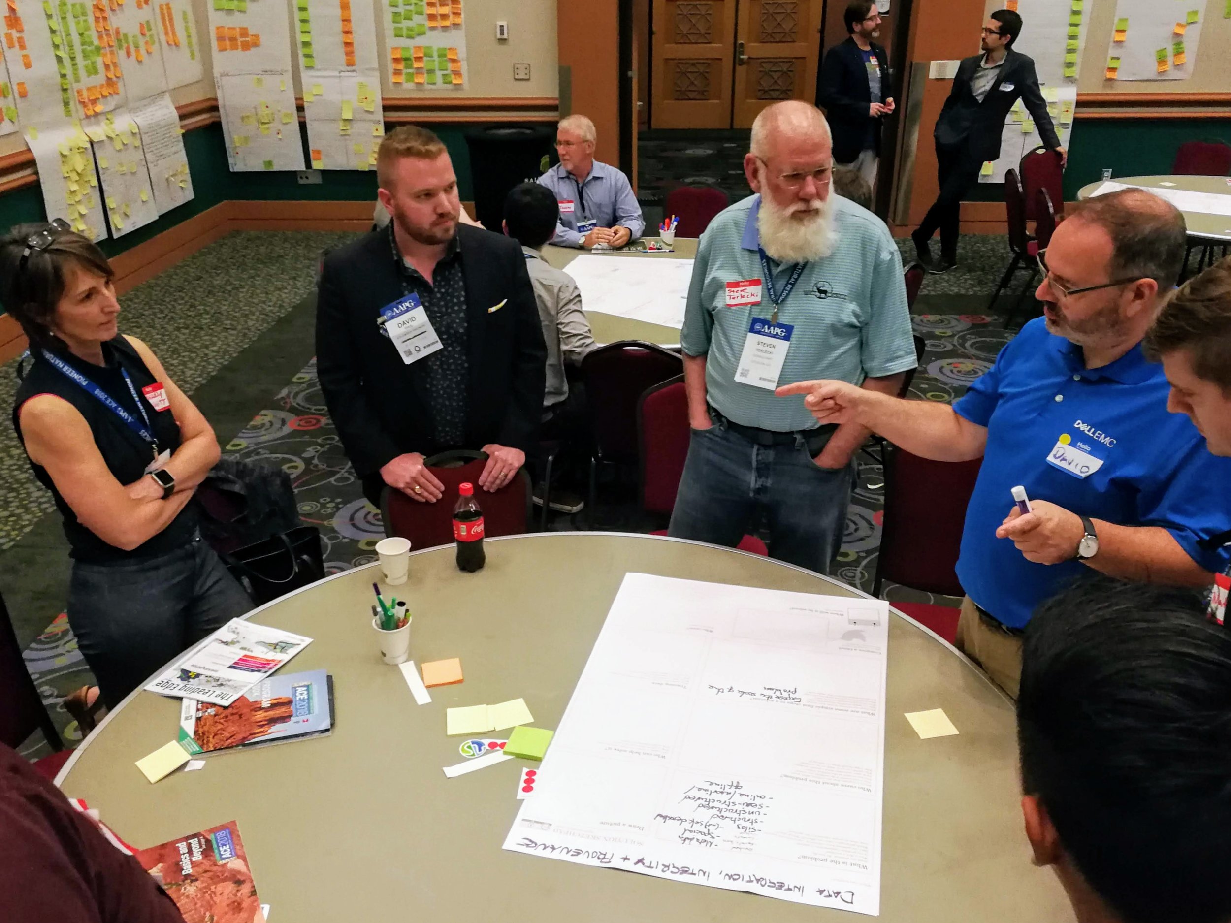
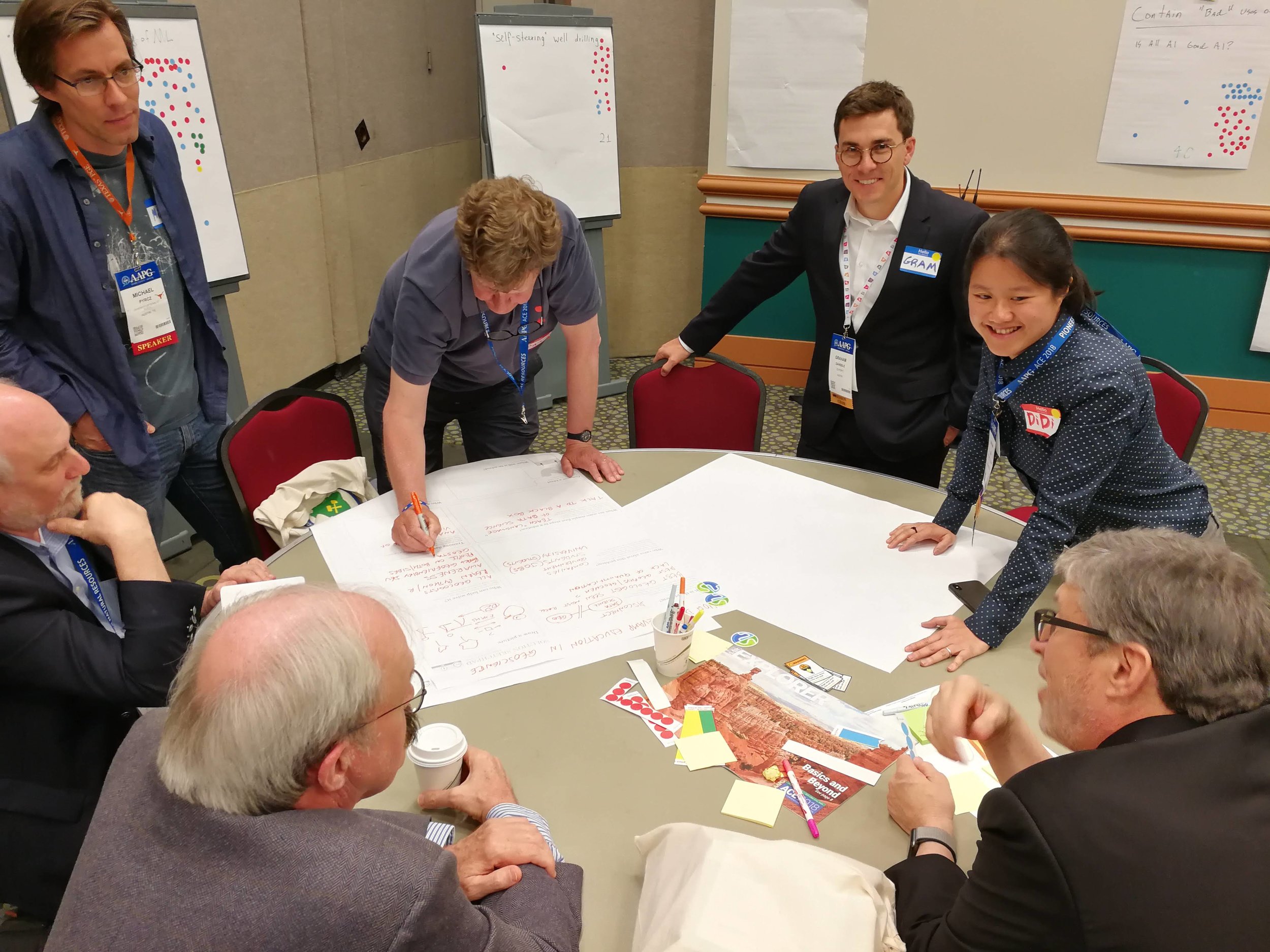
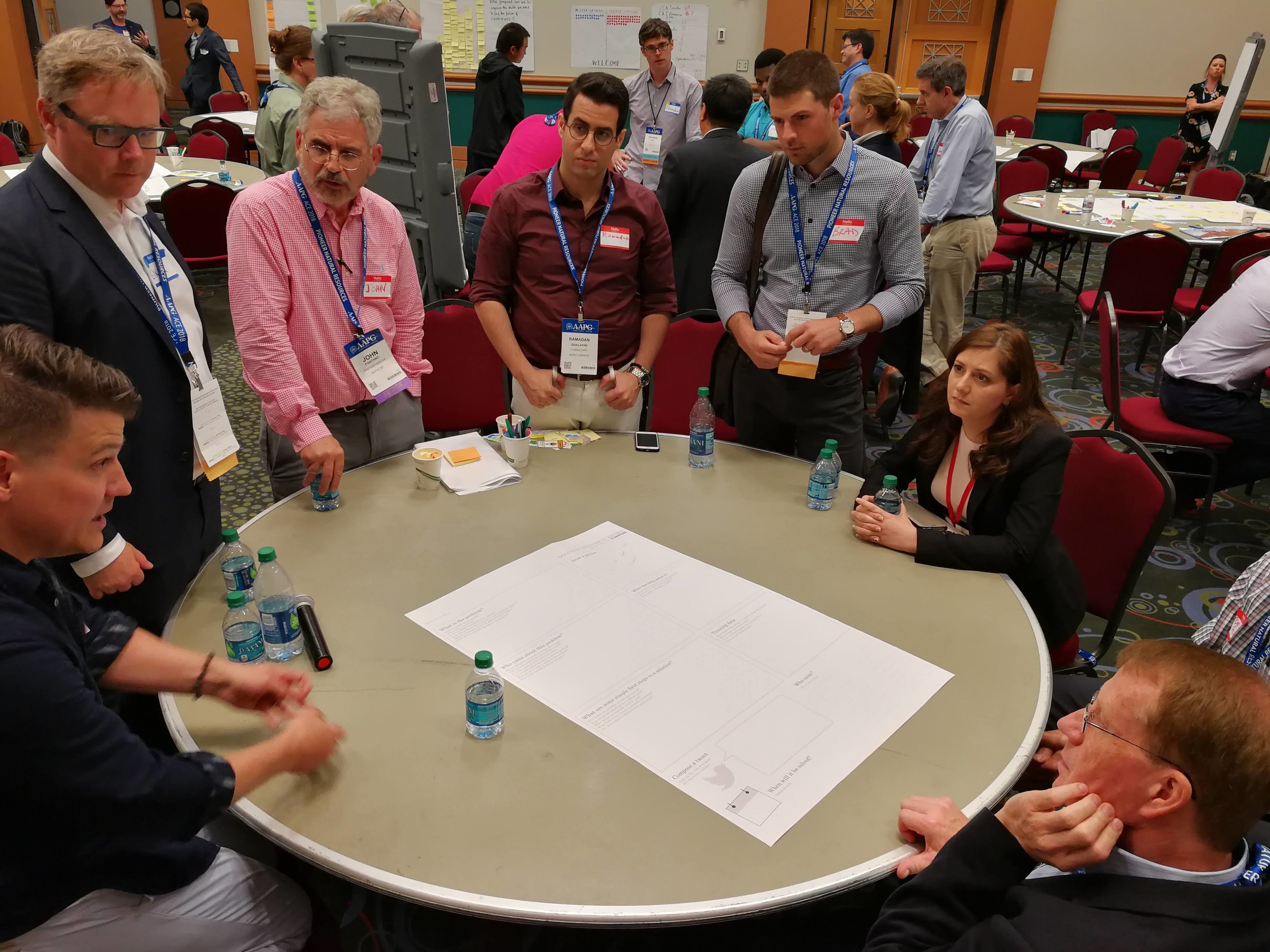
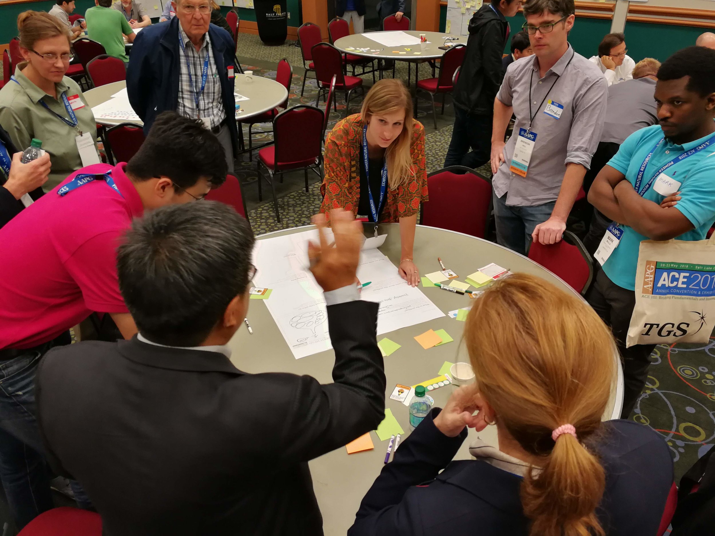
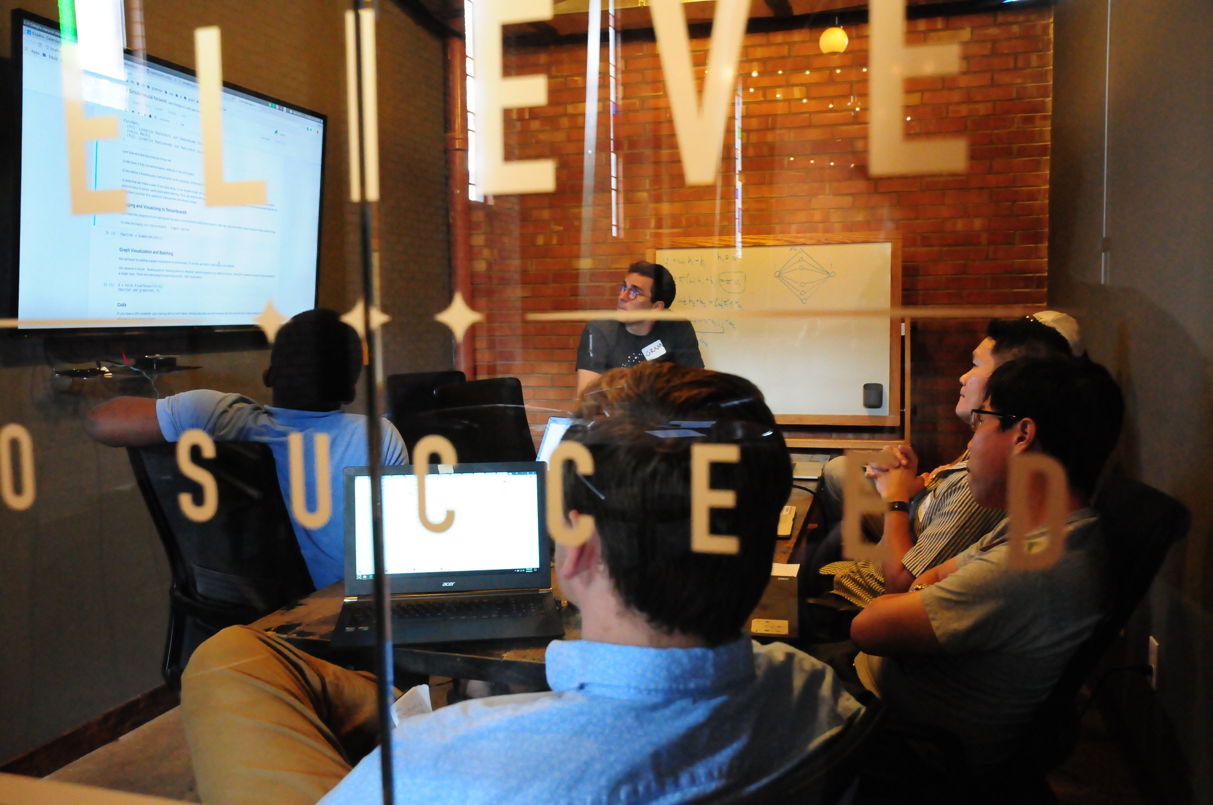
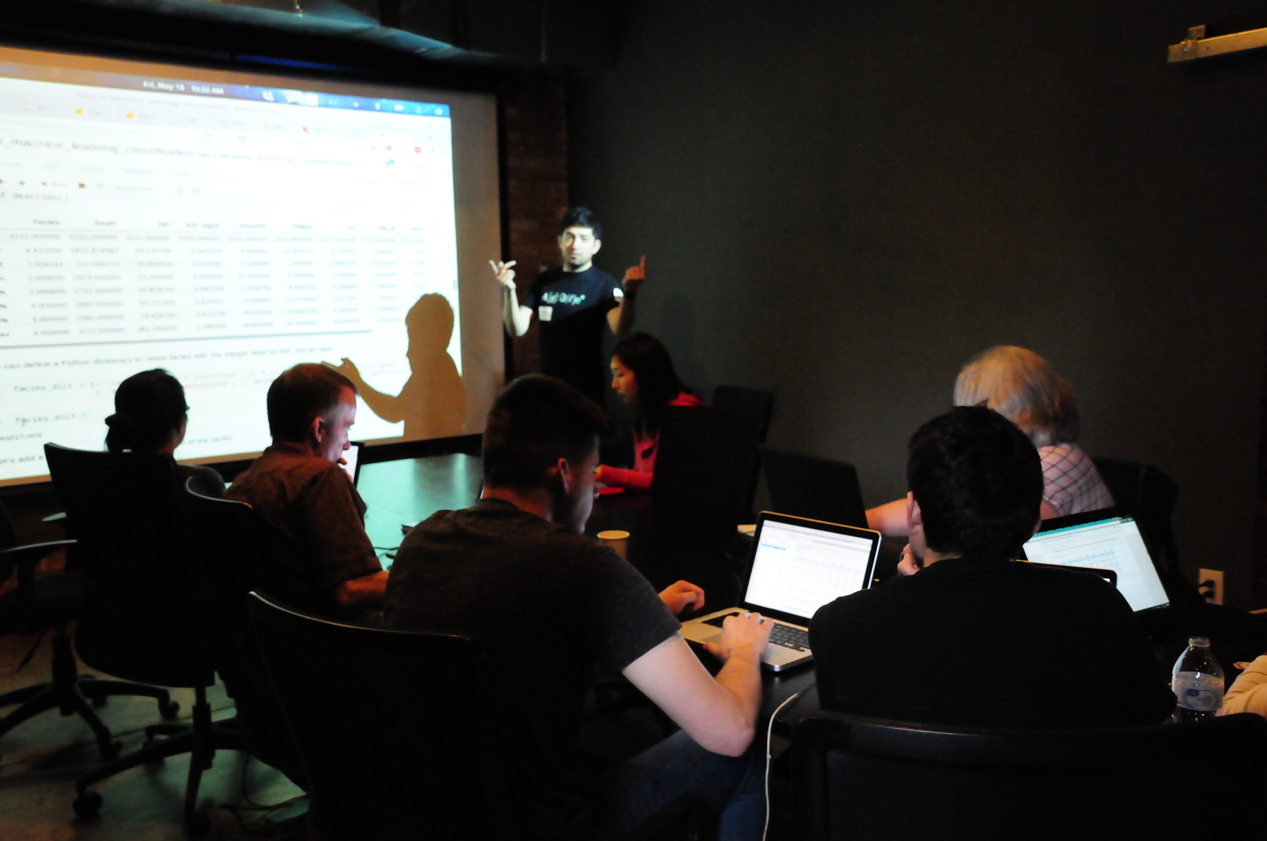
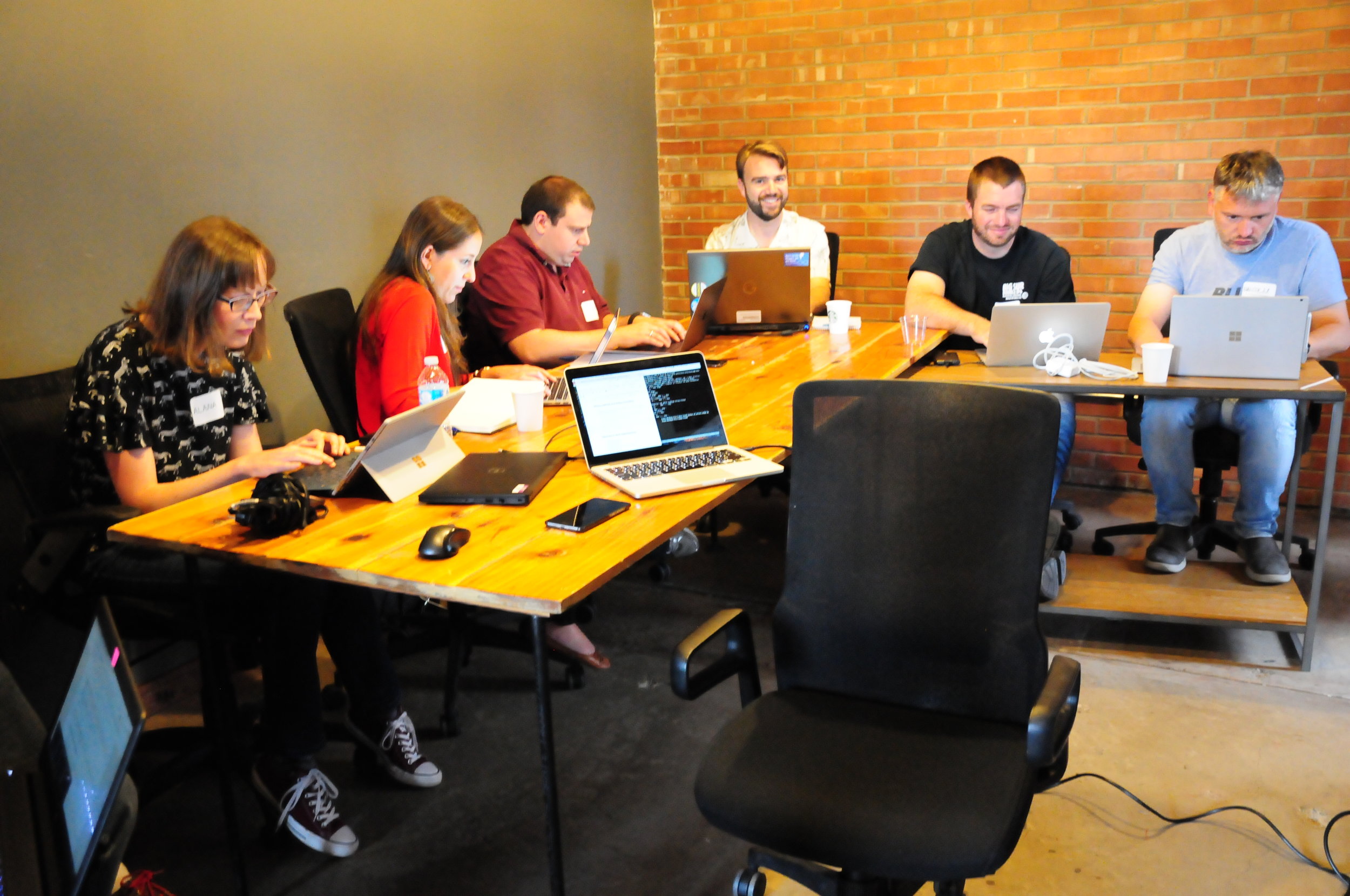
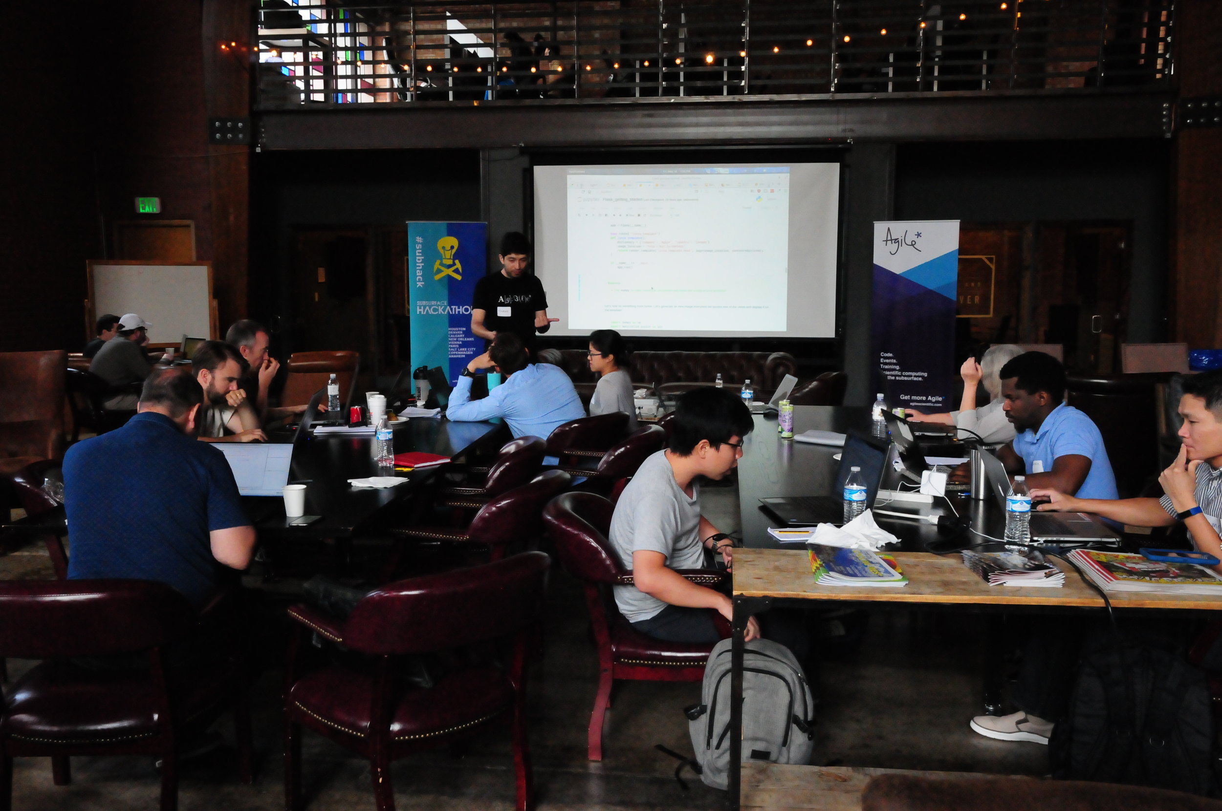
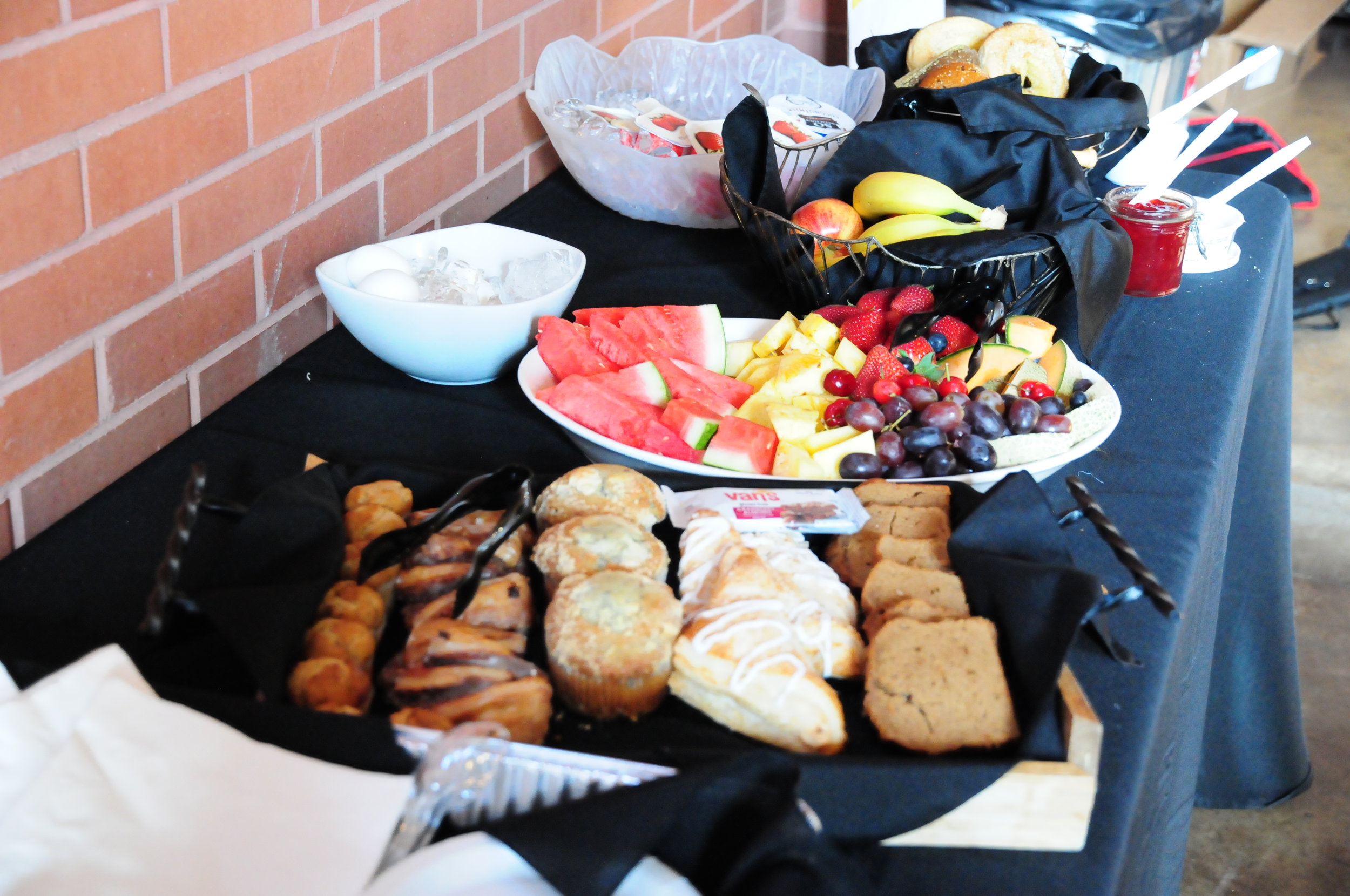
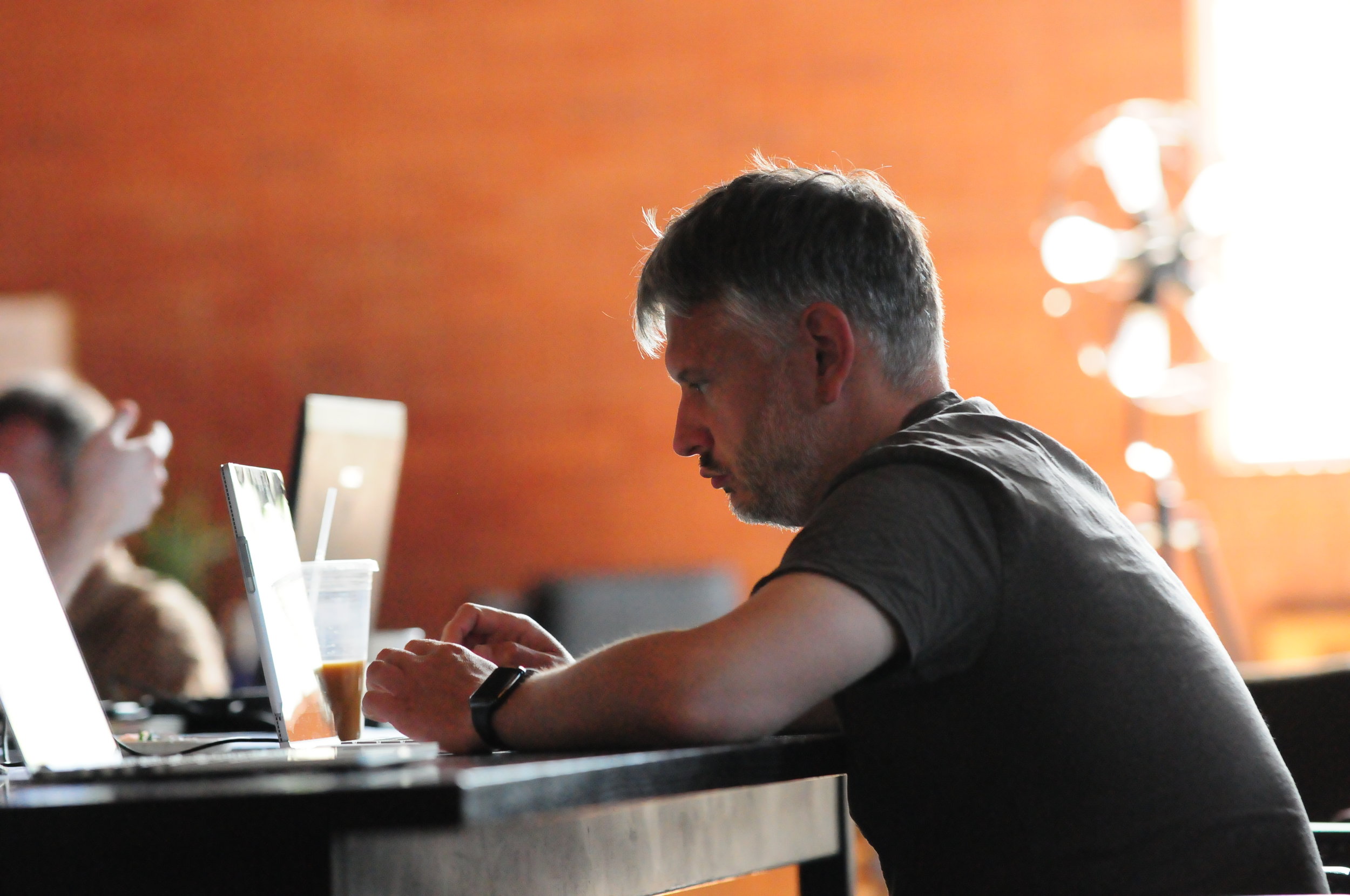
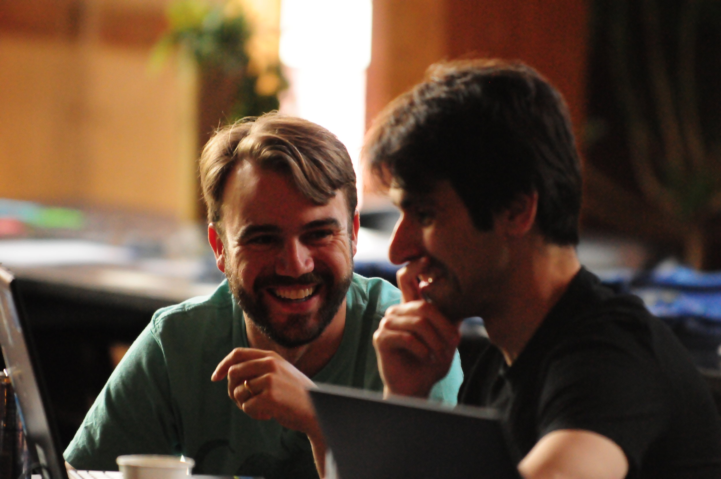
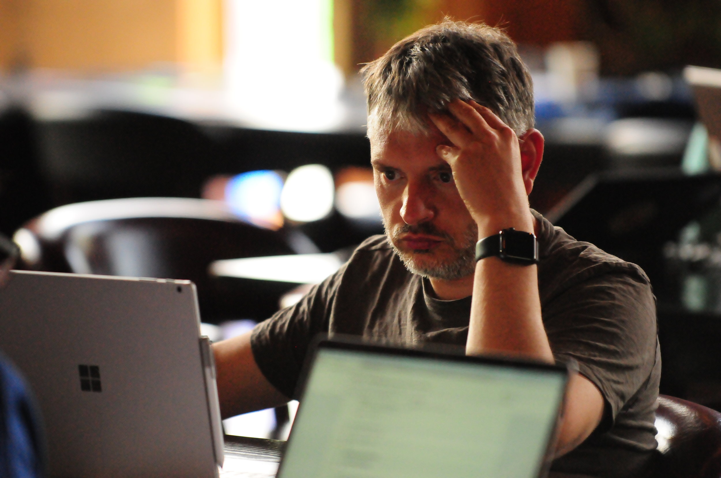
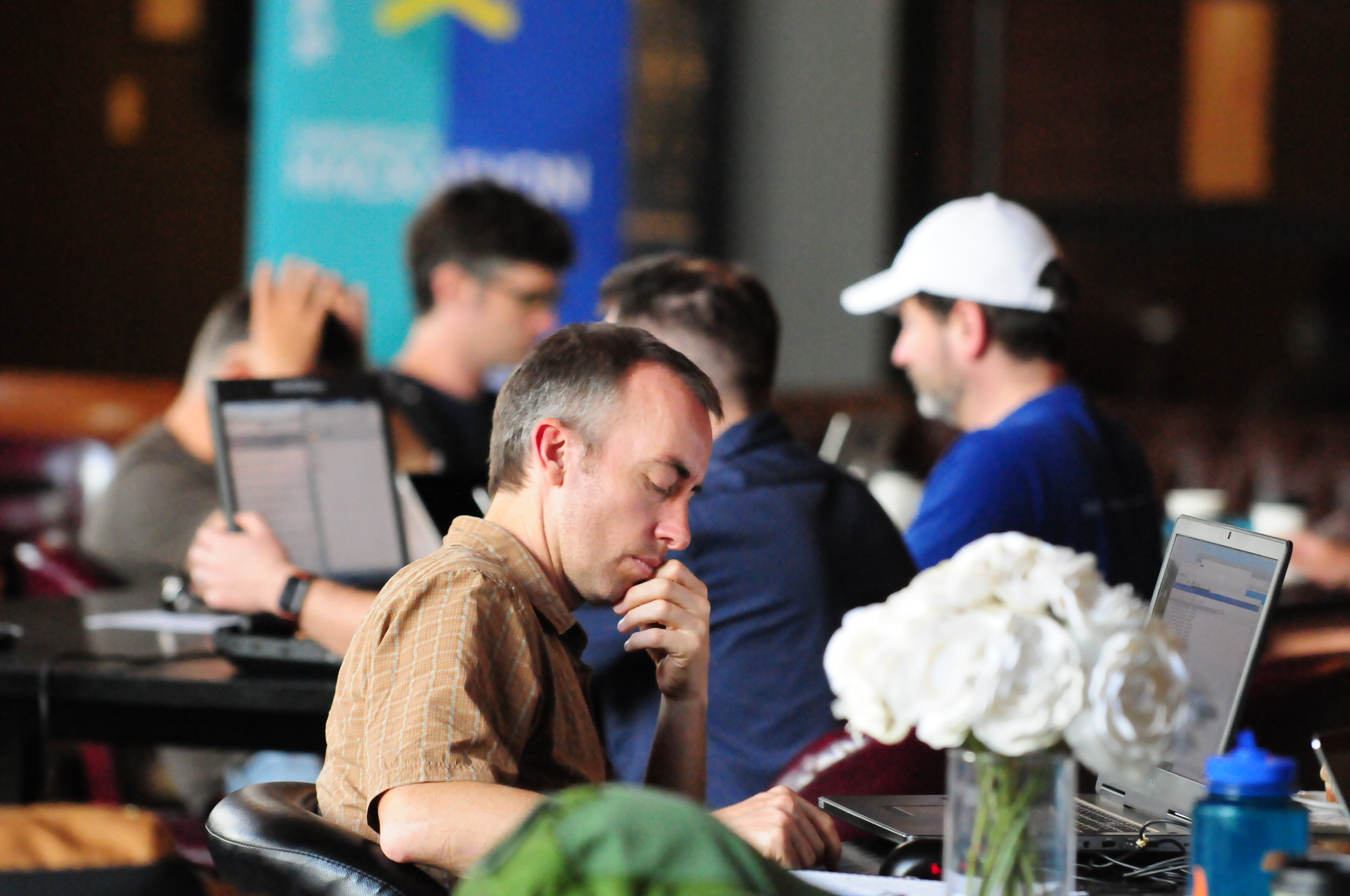
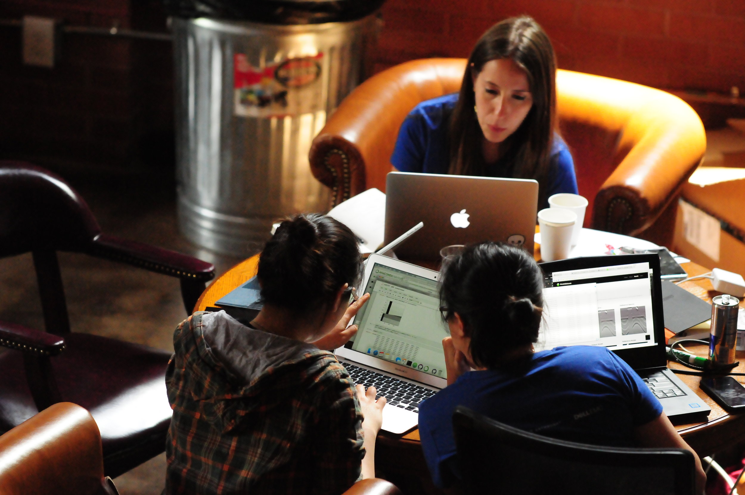
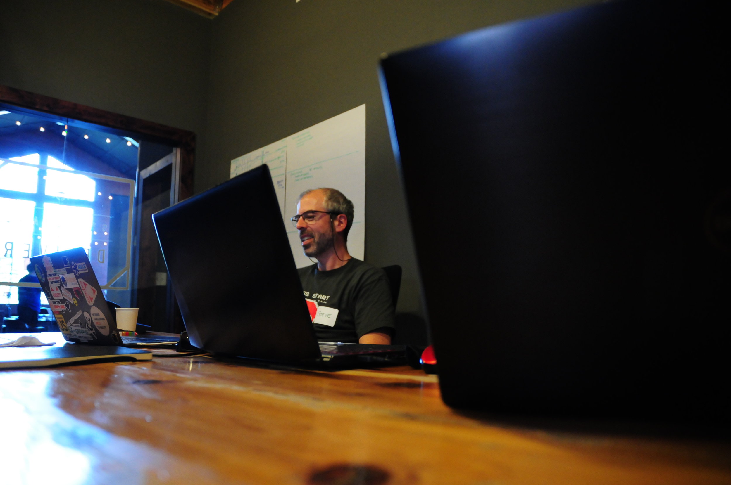
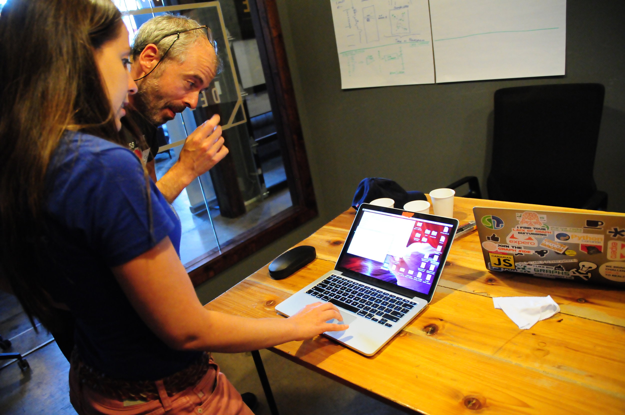
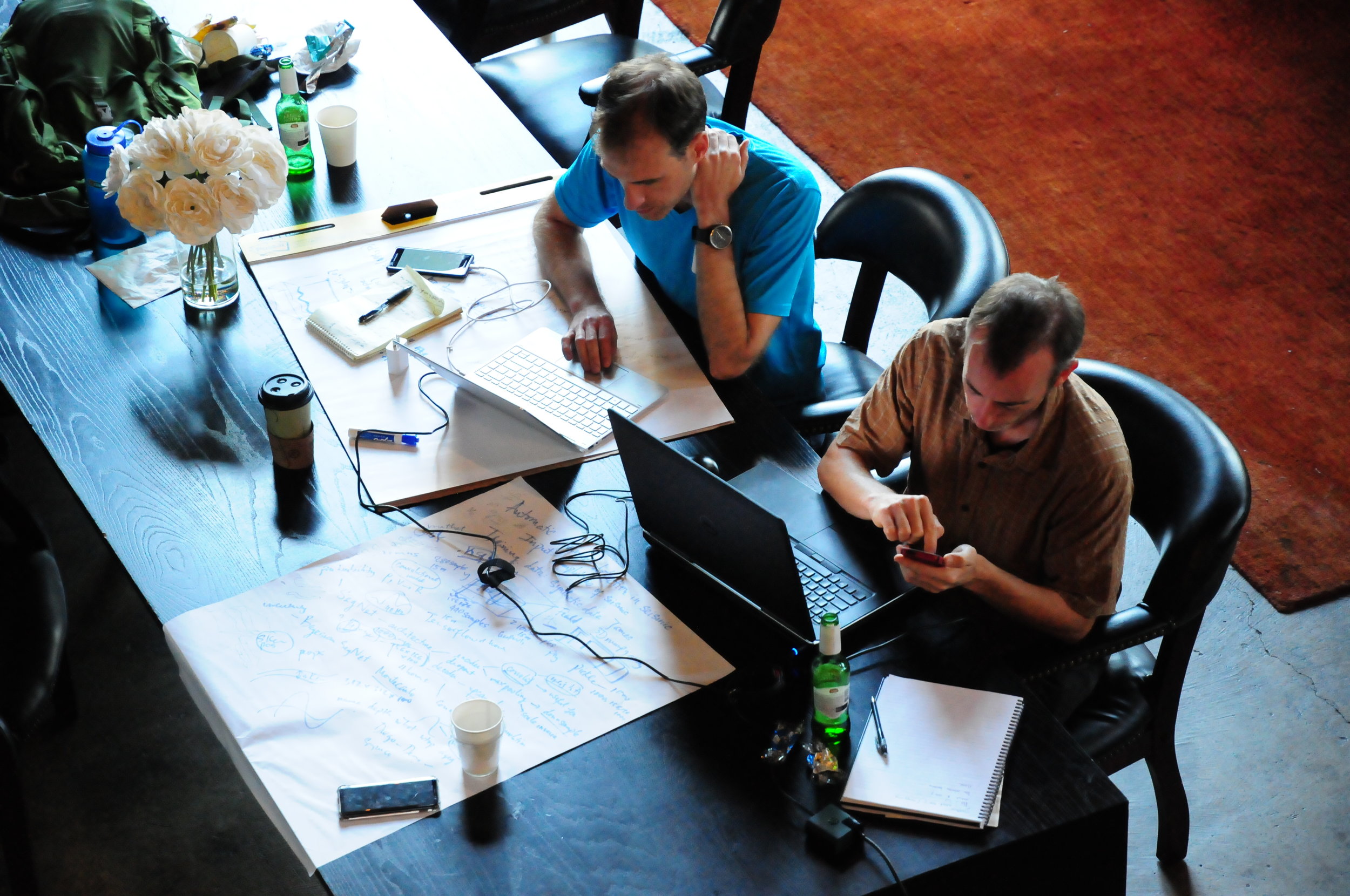
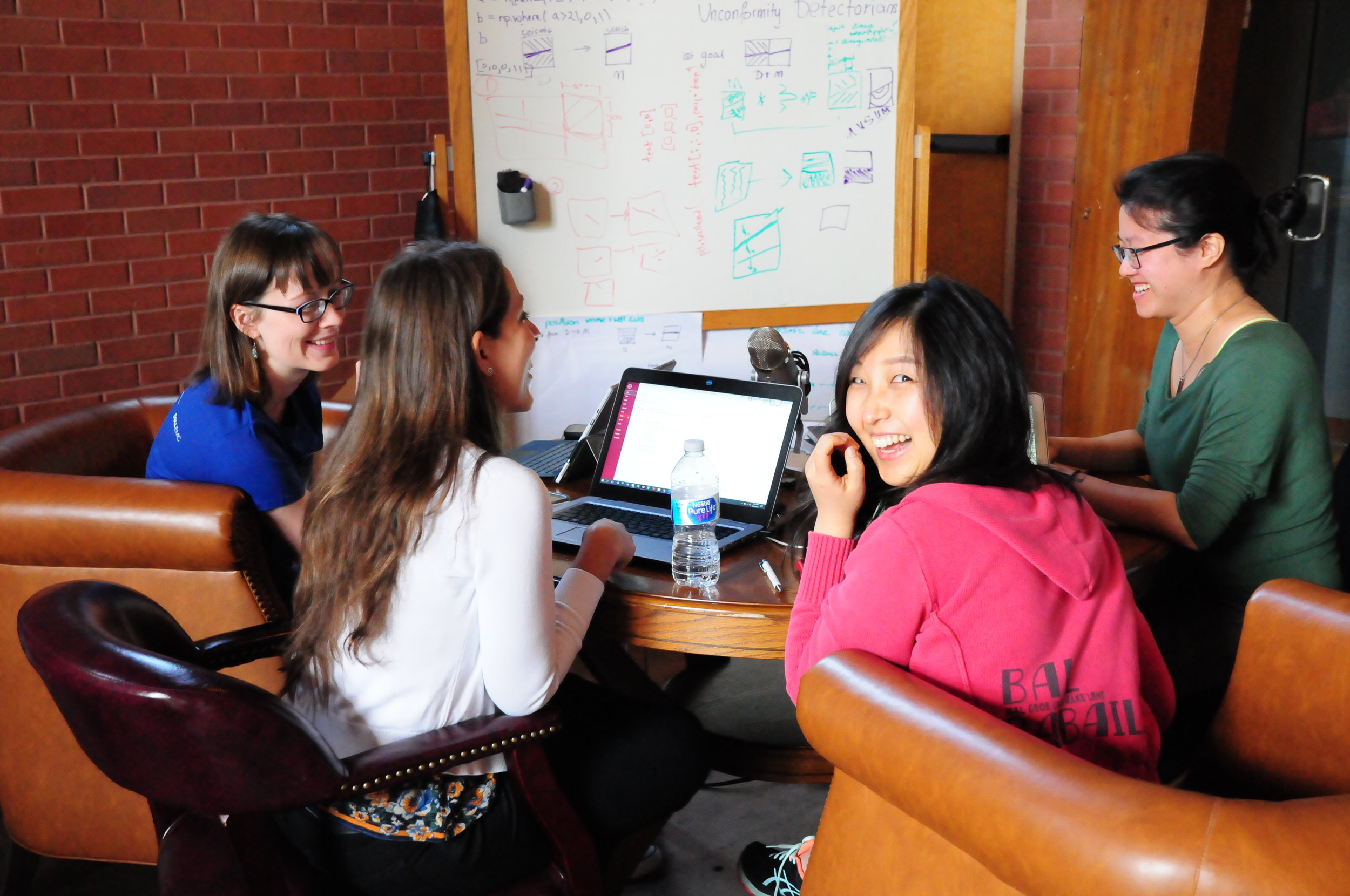
In a nutshell, it was awesome. I have facilitated unsessions before, but this event was on a new scale. Twelve tables of 8–10 seats — covered in sticky notes, stickers, coloured pens, and large sheets of paper — quickly filled up. Together, we burned about 10 person-weeks of human productivity, raising the temperature in the room by several degrees in the process.

Diversity means good conversation

On the way in, people self-identified as mostly software (blue name tags) or mostly soft rocks (red), as a non-serious way to get a handle on how many data scientists we had vs how many people are focused on the rocks themselves — without, I hope, any kind of value judgment. The ratio was about 1:2.

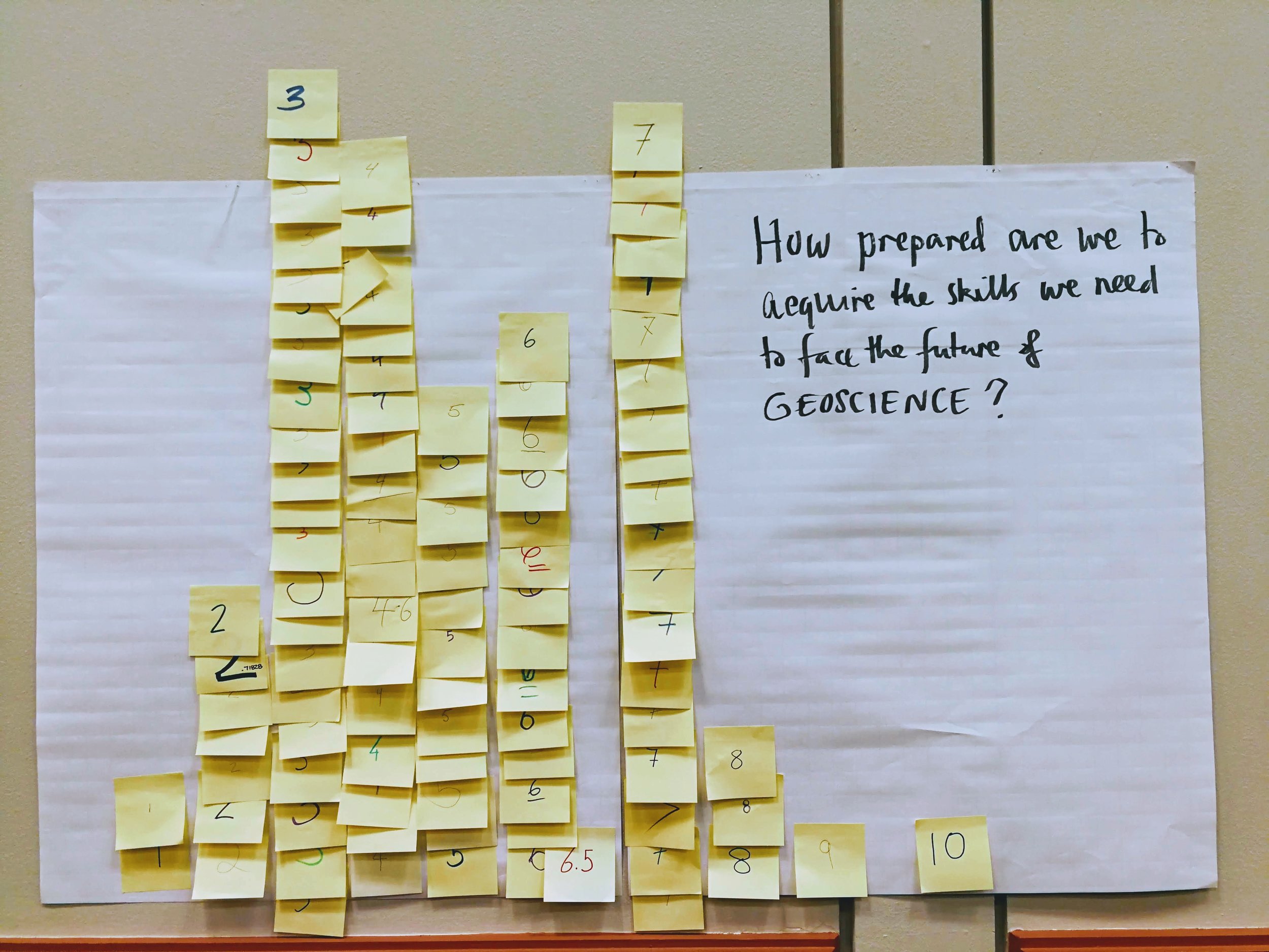
As people continued to drift in, we counted people identifying with various categories, to get a very rough idea of who was in the room. The results are shown here. In addition, I counted 24 women present at the start. Part of the point here is to introduce participants to each other, but there's another purpose too. AAPG, like many scientific organizations, is grappling with diversity today. Like others, it needs to do much better. A small part of the solution is, I think, to name it and measure how we're doing at every opportunity. It's one way to pay more attention.

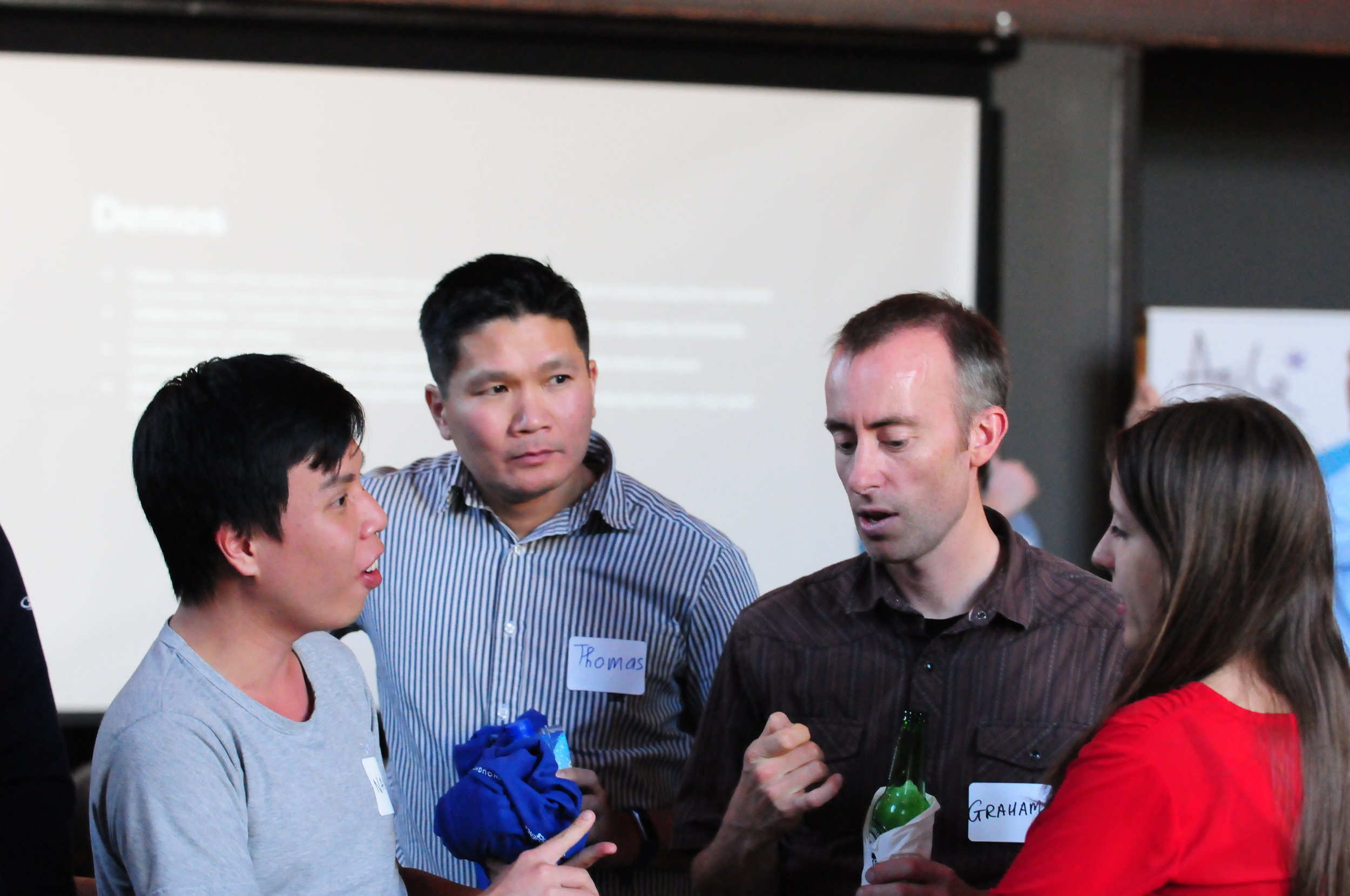
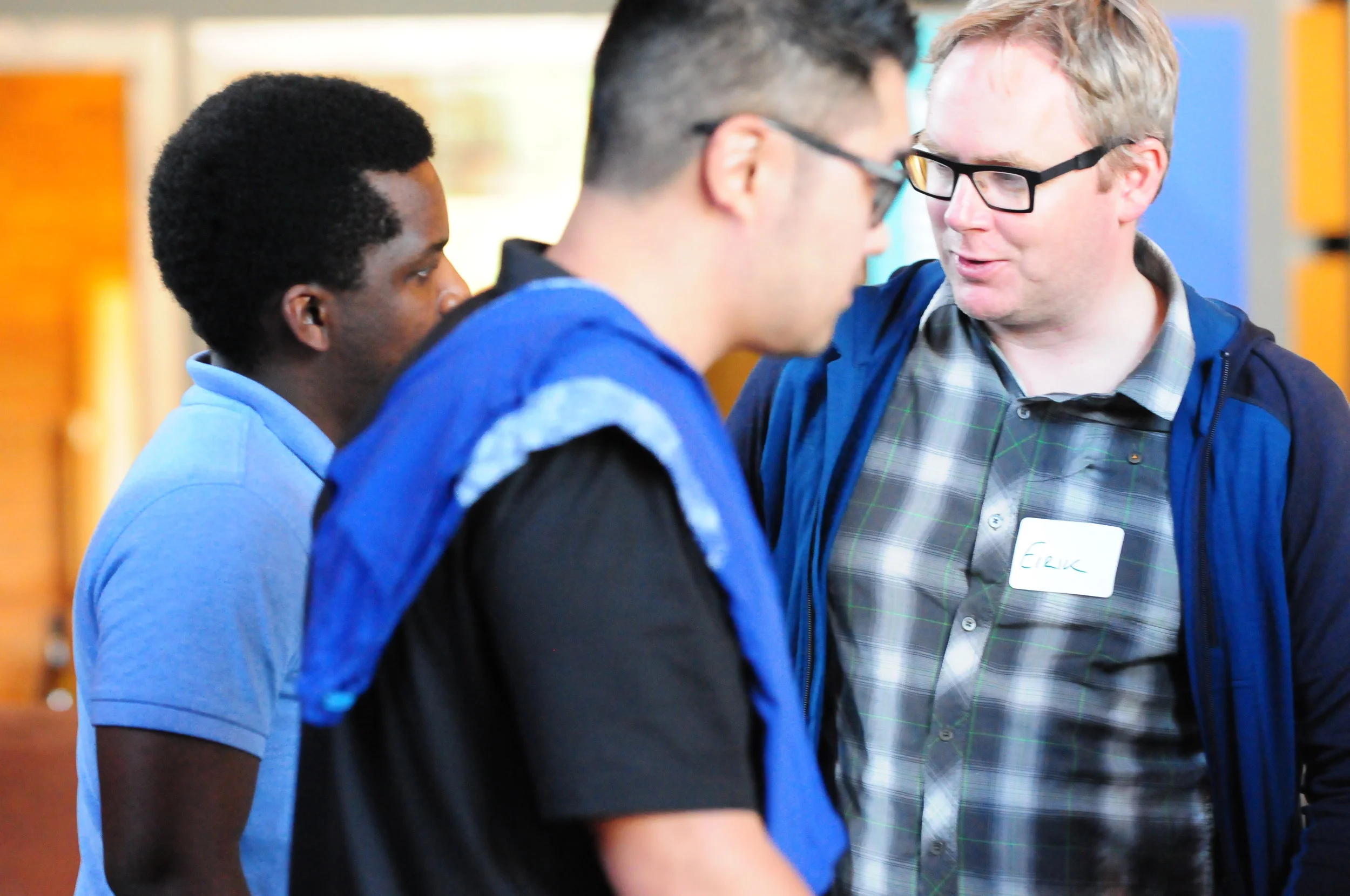
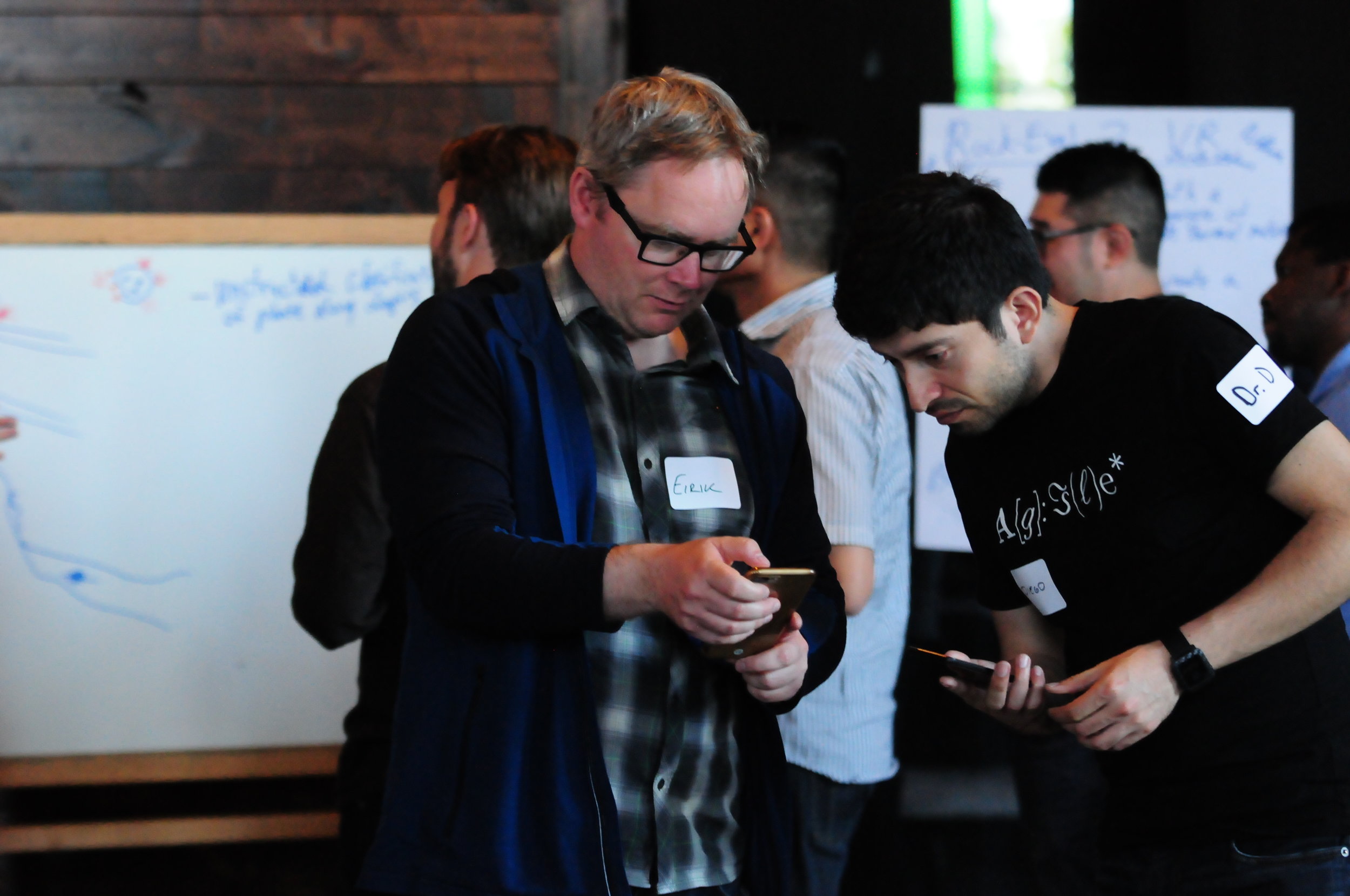
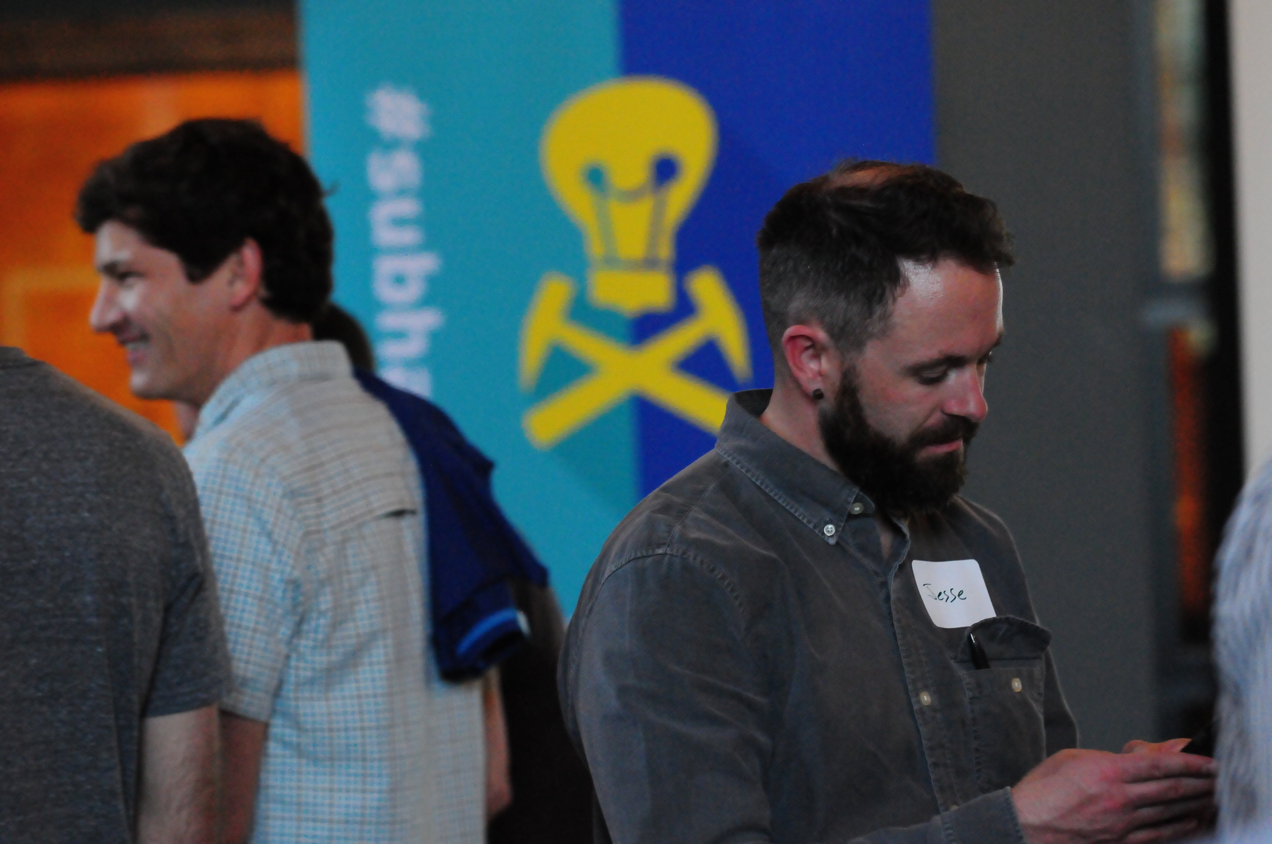
Harder to capture is the profound level of job diversity. People responsible for billion-dollar budgets sat with graduate students, AAPG medal winners with SEC executives. We even had a venture capitalist and a physician.

Look at all these lovely people:

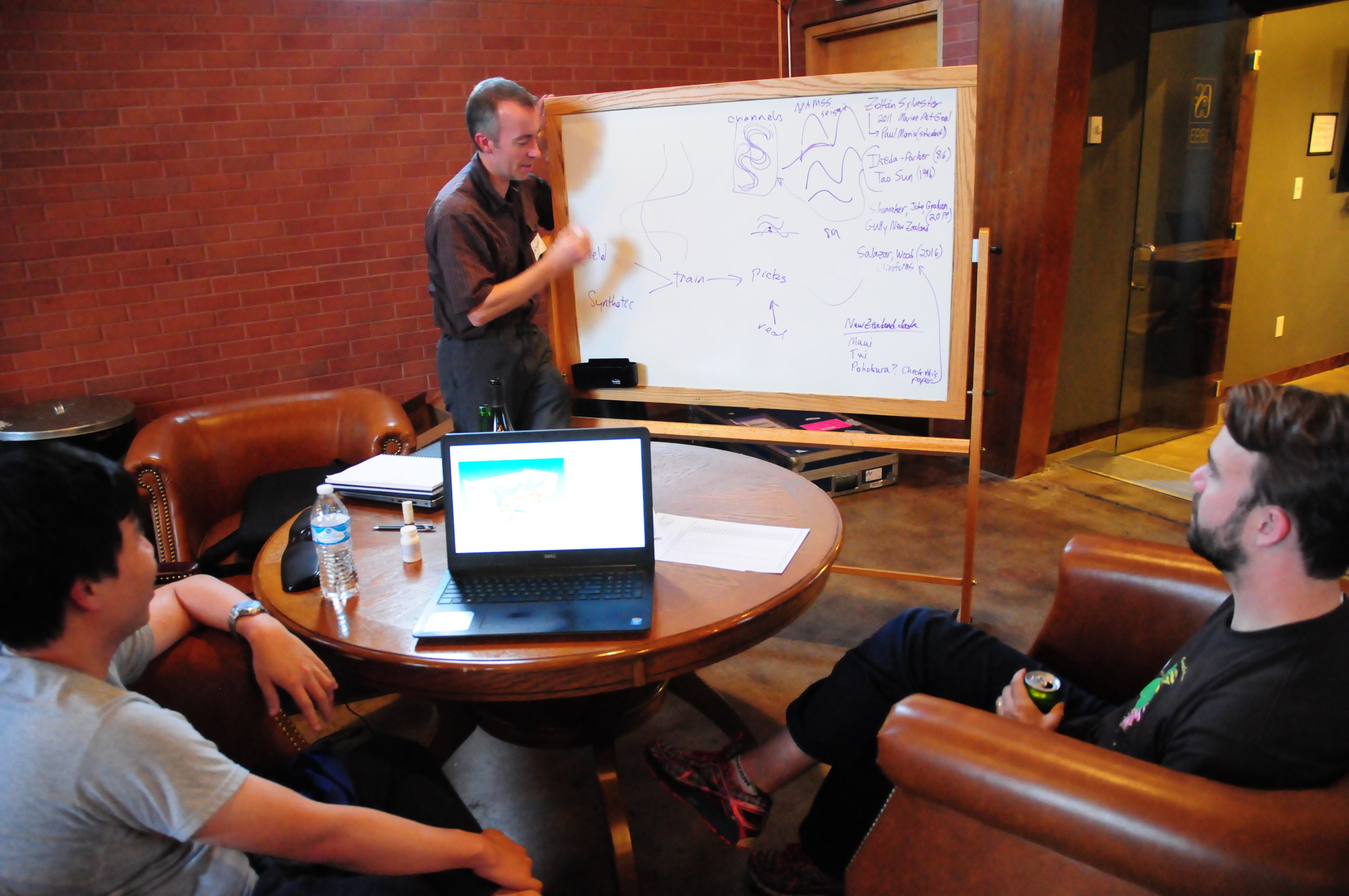
Tangible and intangible output

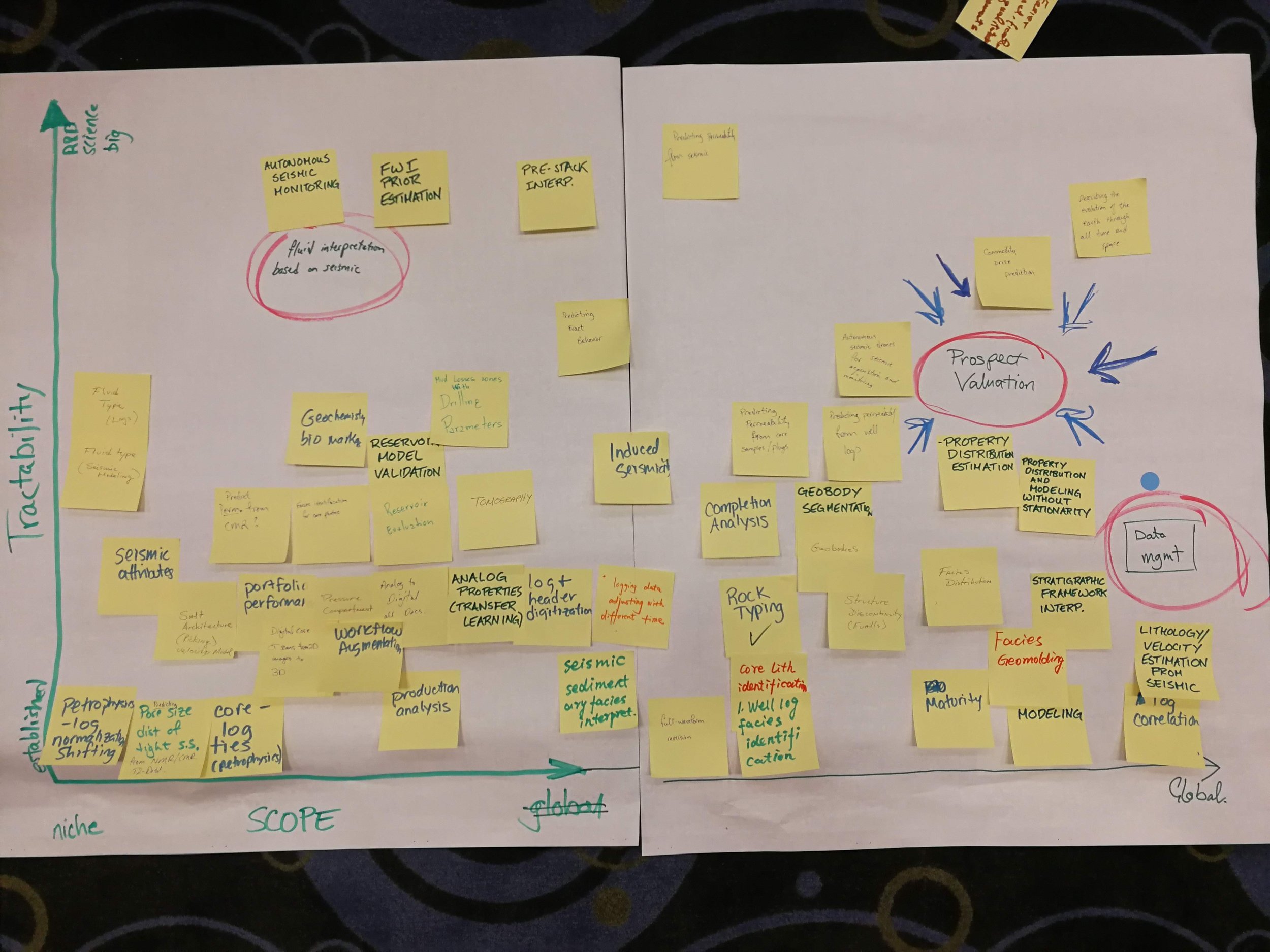
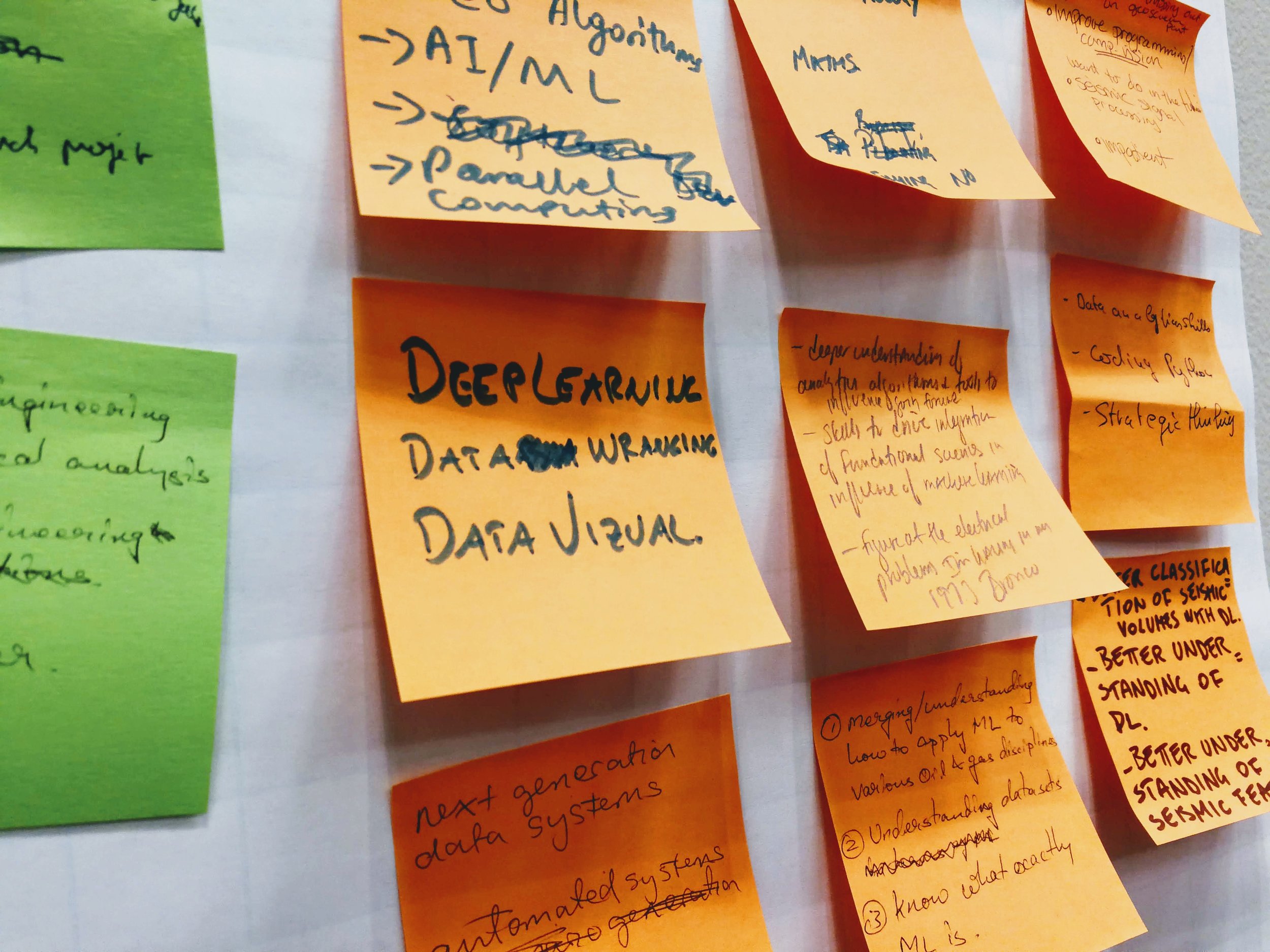
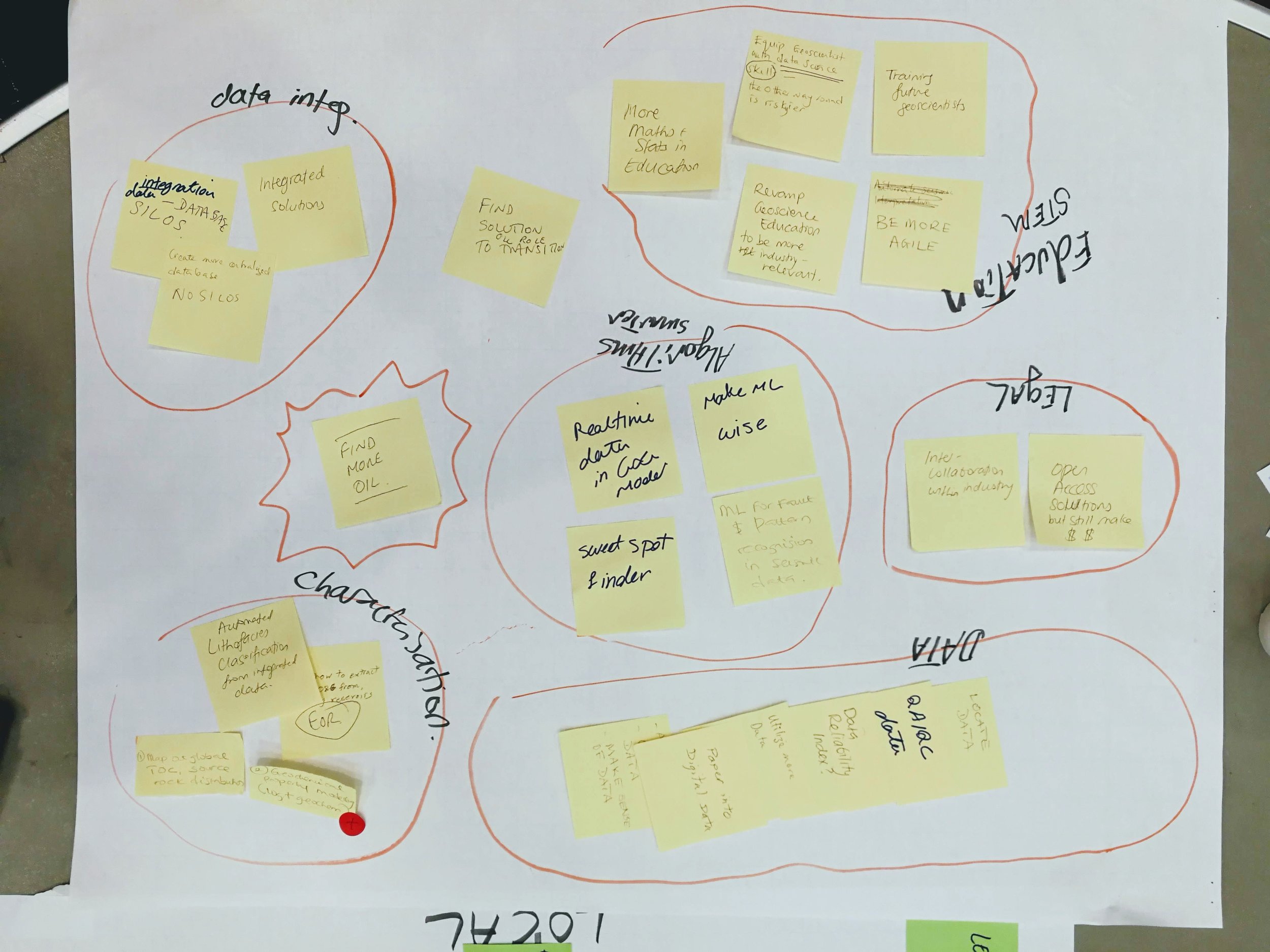
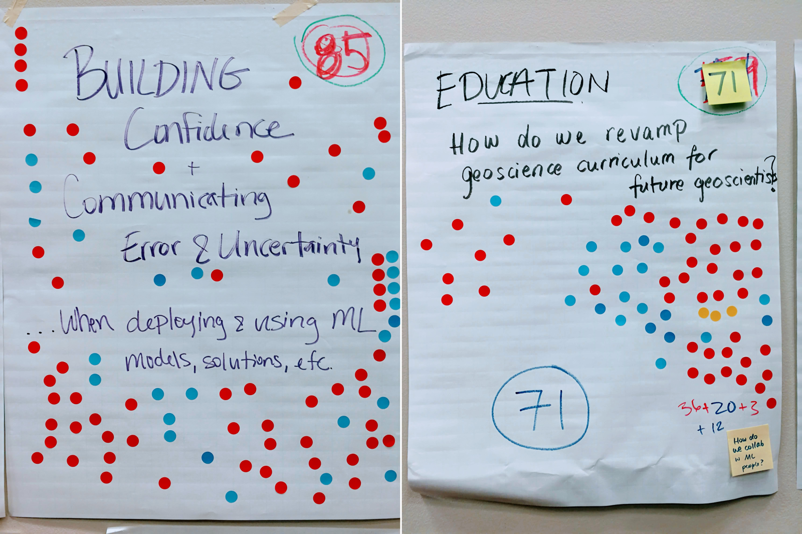
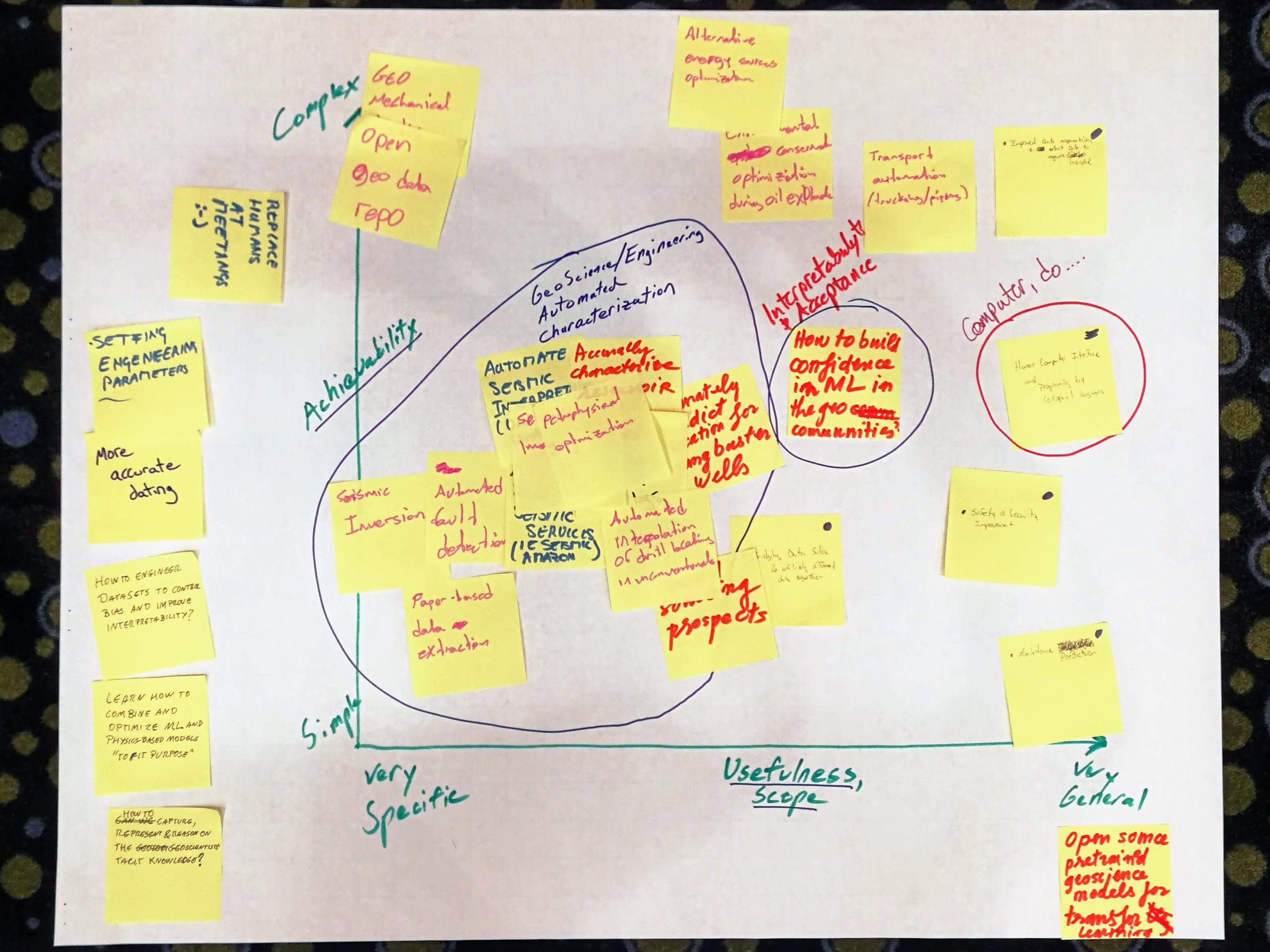
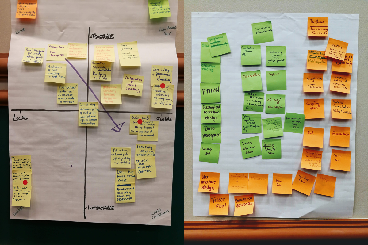
At the start of the session, I told the room I wanted to fill the walls with things we made — with data. We easily achieved this, producing a survey of the skills geoscientists will need in the future, hundreds of high-value machine learning tasks in geoscience, a ranked list of the most interesting of these, and even some problem analysis of some of them. None of this was definitive, but I hope it will provide grist for the mill of future conversations about machine learning in geoscience.

As well as these tangible products, each person in the room walked away with new connections and new ideas — about machine learning, about collaboration, and about what scientific meetings can be like.

Acknowledgments

A lot of people contributed to making this event happen.

My unsession co-chairs, Brendon Hall and Yan Zaretskiy of Enthought — spent several hours on the phone with me over the last few weeks, shaping the content and flow of an event that was a bit, er, fuzzy.

We seeded the tables with some of the Software Underground crowd who were in town for the hackathon and AAPG. This ensures that there's no failure case: twelve people are definitely coming. And in the unlikely event that 100 people come, there are twelve allies to manage some of the chaos. Heartfelt thanks to the table hosts:

  • Didi Ooi of the University of Bristol
  • Graham Ganssle of Expero
  • Lisa Stright of Colorado State University
  • Thomas Martin of Colorado School of Mines
  • Tom Creech of ExxonMobil
  • David Holmes of Dell EMC
  • Steve Purves of Euclidity
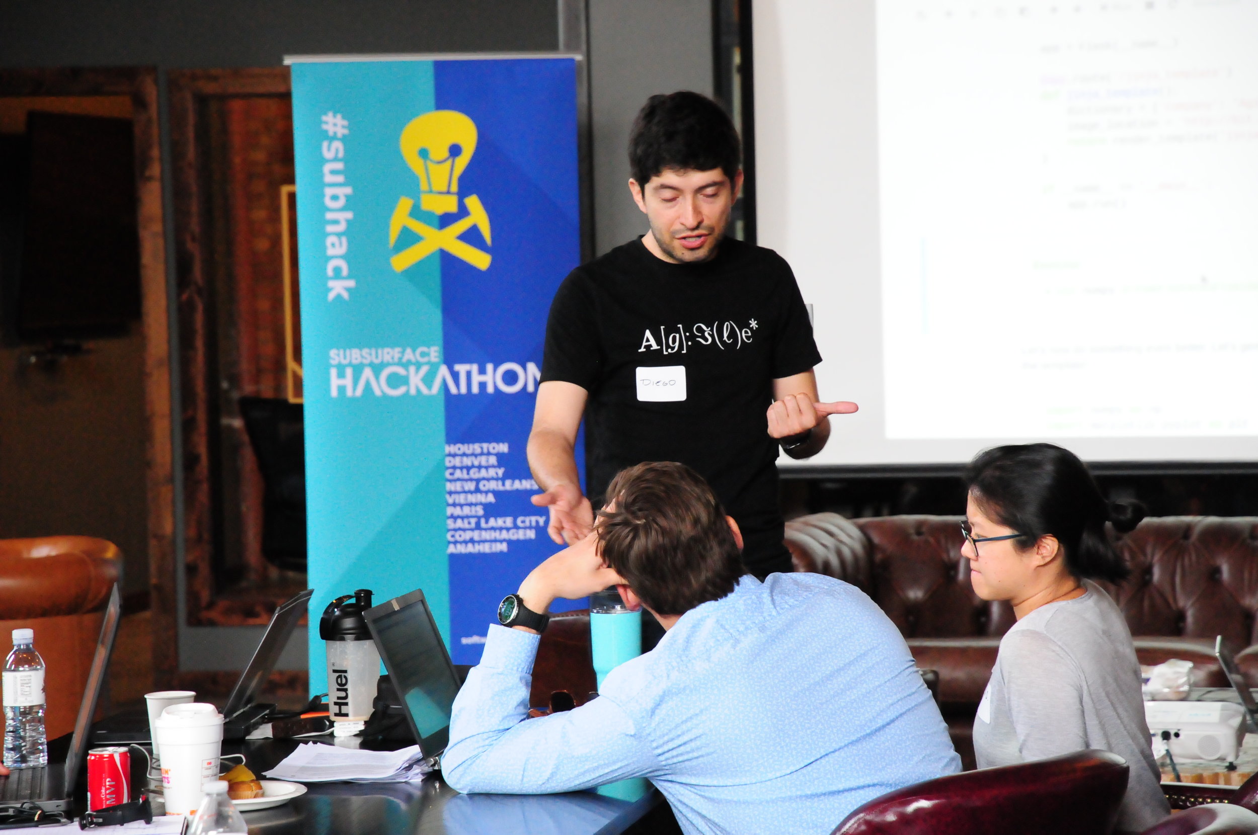
  • Diego Castaneda of Agile
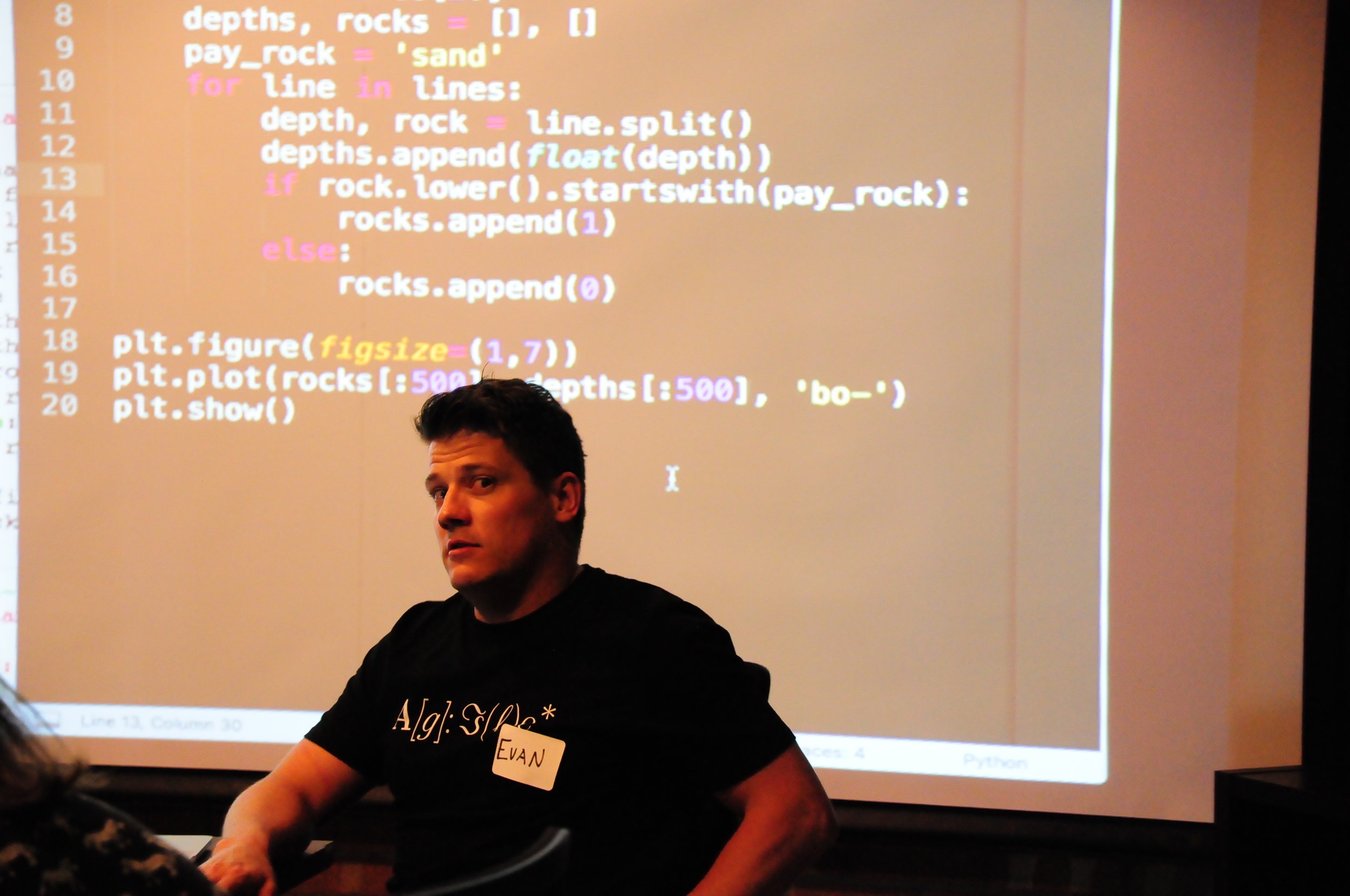
  • Evan Bianco of Agile

Jenny Cole of SEG came along to observe the session and I appreciated her enthusiastic help as it became clear we were in for more than the usual amount of entropy in the room. Theresa Curry of AAPG did an amazing job getting the venue set up, providing refreshments, and ensuring the photographers were there to capture some of the action. The ACE 2018 organizing committee, especially Zane Jobe and Lauren Birgenheier, did their part by agreeing to supprt including such a weird-sounding thing in the program.

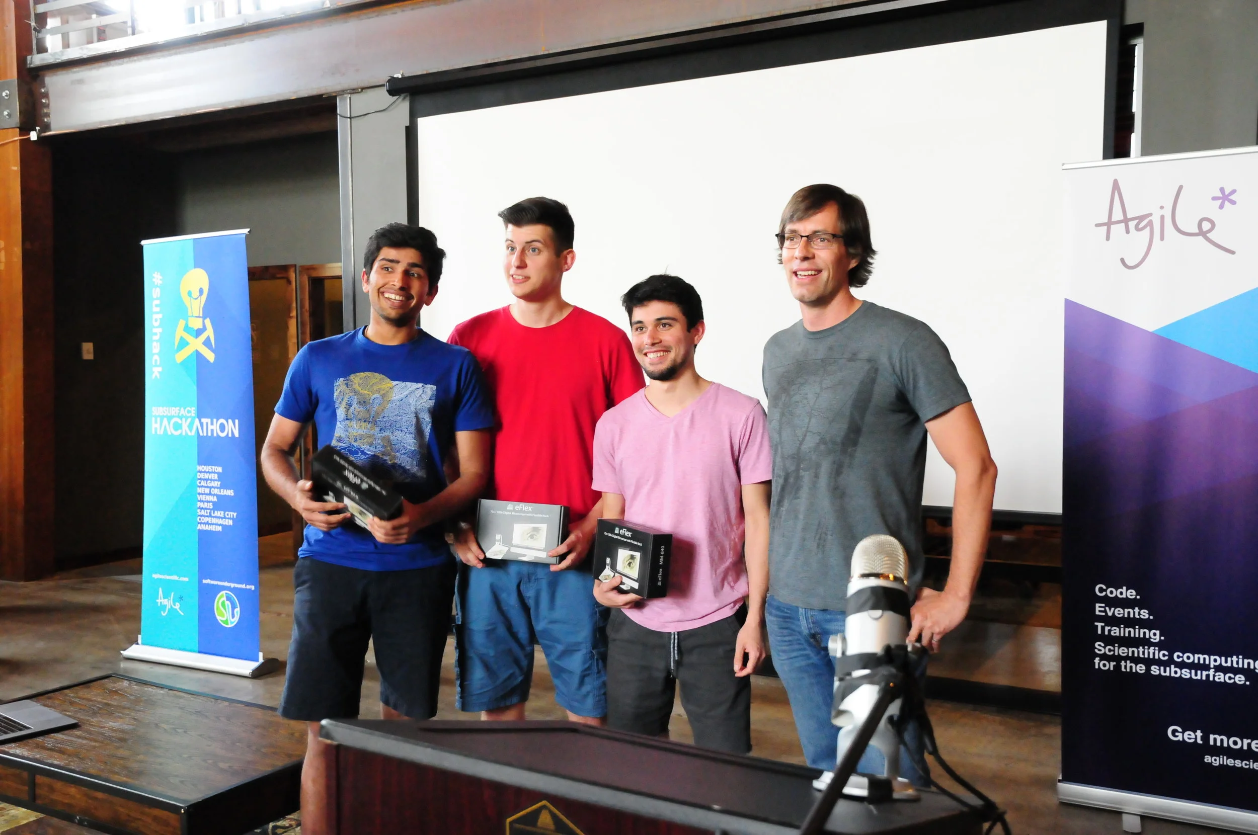
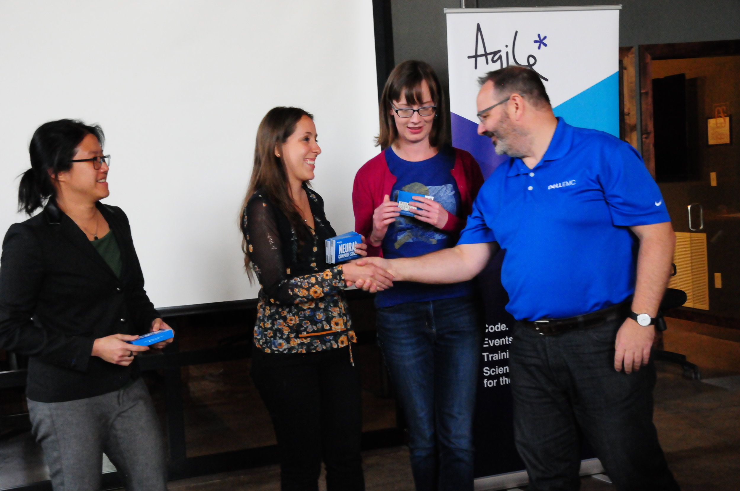
Finally, thank you to the 100+ scientists that came to the event, not knowing at all what to expect. It was a privilege to receive your enthusiastic participation and thoughtful contributions. Let's do it again some time!


We will digitize the ideas and products of the unsession over the coming weeks. They will be released under an open license. Watch this space for updates.

If you're interested in the methodology we use for these events, check out Proceedings of an unsession in CSEG Recorder, November 2013. If you'd like help running an event like this, get in touch.

Woo yeah perfect: hacking in Salt Lake City

Thirty geoscientist-coders swarmed into Salt Lake City this past weekend to hack at Church & State, a co-working space in a converted church. There, we spent two days appealing to the almighty power of machine learning.

Nine teams worked on the usual rich variety of projects around the theme. Projects included AIs that pick unconformities, natural language processing to describe stratigraphy, and designing an open data platform in service of machine learning. 

I'll do a run-down of the projects soon, but if you can't wait until then for my summary, you can watch the demos here; the first presentation starts at the 38 minute mark of the video. And you can check out some pictures from the event:

Pictures can say a lot but a few simple words, chosen at the right time, can speak volumes too. Shortly before we launched the demos, we asked the participants to choose words that best described how they were feeling. Here's what we got:

word_cloud_menti_SLC.png

Each participant was able to submit three responses, and although we aren't able to tell who said what, we were able to scrape the data and look at each person's chosen triplet of words. A couple of noteworthy ones were: educated, naptimeinspired and the expressive woo, yeah, perfect. But my personal favorite, by far, has to be the combination of: dead, defeated, inspired.

The creative process can be a rollercoaster of emotions. It's not easy. It's not always comfortable. Things don't always work out. But that's entirely ok. Indeed, facing up to this discomfort, as individuals and as organizations, is a necesary step in the path to digital transformation.

Enough Zen! To all the participants who put in the hard work this weekend, and to our wonderful sponsors who brought all kinds of support, I thank you and I salute you.

sponsors.png

An invitation to start something

Most sessions at your average conference are about results — the conclusions and insights from completed research projects. But at AAPG this year, there's another kind of session, about beginnings. The 'Unsession' is back!

   Machine Learning Unsession
   Room 251 B/C, 1:15 pm, Wednesday 23 May

The topic is machine learning in geoscience. My hope is that there's a lot of emphasis on geological problems, especially in stratigraphy. But we don't know exactly where it will go, because the participants themselves will determine the topic and direction of the session.

Importantly, most of the session will not involve technical discussion. It's not a computational geology session. It's a session for everyone — we absolutely need input from anyone who's interested in how computers can help us do geoscience.

What to expect

Echoing our previous unconference-style sessions, here's the vibe my co-hosts (Brendon Hall and Yan Zaretskiy of Enthought) and I are going for:

  • Conferences are too one-way, too passive. We want more action, more tangible outcomes.
  • We want open, honest, inclusive conversations about our science, and our technical challenges. Bring your most courageous, opinionated, candid self. The stuff you’re scared to mention, or you’d normally only talk about over a beer? Bring that.
  • Listen with an open mind. The minute you think you’re right, you’ve checked out of the conversation.
  • Whoever shows up — they are the right people. (This is a rule of Open Space Technology.)
  • What happens is the only thing that could have happened. (This is a rule of Open Space Technology.)
  • There is no finish line; when it's over, it's over.
  • What we are doing is not definitive. It's just a thing that we're doing.

The session is an experiment. Failure is most definitely an option, just the least desirable one. Conversely, perfection is the least likely outcome.

If you're going to AAPG this year, I hope you'll come along to this conversation. Bring a friend!


Here's a reminder of the very first Unsession that Evan and I facilitated, way back in 2013. Argh, that's 5 years ago...

The geospatial sport

An orienteer leaving a control site. 

If you love studying maps or solving puzzles, and you love being outside, then orienteering — the thinking runner's sport — might be the sport you've been looking for.

There are many, many flavours of orienteering (on foot, on skis, in kayaks, etc), but here's how it generally works:

  • Competitors make their way to an event, perhaps on a weekday evening, maybe a weekend morning.
  • Several courses are offered, varying in length (usually 2 to 12 km) and difficulty (from walk-in-the-park to he's-still-not-back-call-search-and-rescue).
  • A course consists of about 20 or so 'controls', which must be visited in order. Visits are recorded on an electronic 'dibber' carried by the orienteer, or by shapes punched on a card.
  • Each person chooses a course , and is allotted a start time.
  • You can't see your course — or the map — until you start. You have 0 seconds to prepare.
  • You walk or run or ski or bike around the controls, at various speeds and in various (occasionally incorrect) directions.
  • After making it to the finish, everyone engages in at least 30 minutes of analysis and dissection of route choices and split times, while eating everything in sight.

The catch is that your navigation system is entirely analog: you are only allowed a paper map and an analog compass, plus a whistle for safety. The only digital components are the timing system and the map-making process — which starts with LiDAR and ends in a software package like OCAD or OOM.

Orienteering maps are especially awesome. They are usually made especially for the sport, typically at 1:5000 or 1:7500, with a 2.5 m or 5 m contour interval. Many small features are mapped, for example walls and fences, small pits and mounds, and even individual trees and boulders.

The sample orienteering map from the Open Orienteering Mapper software, licensed GNU GPL. White areas correspond to open, runnable (high velocity) woodland, with darker shades of green indicating slower running. Yellow areas are open. Olive green ar…

The sample orienteering map from the Open Orienteering Mapper software, licensed GNU GPL. White areas correspond to open, runnable (high velocity) woodland, with darker shades of green indicating slower running. Yellow areas are open. Olive green areas are out of bounds.

Other than the contours and paths, the most salient feature is usually the vegetation, which is always carefully mapped. Geophysicists will like this: the colours correspond more to the speed with which you can run than to the type of vegetation. Orienteering maps are velocity maps!

Here's part of another map, this one from Debert, Nova Scotia:

bluenose-map-debert.png

So, sporty cartophile friends, I urge you to get out and give it a try. My family loves it because it's something we can do together — we all get to compete on our own terms, with our own peers, and there's a course for everyone. I'm coming up on 26 years in the sport, and every event is still a new adventure!


World Orienteering Day — really a whole week — is in the last week in May. It's a great time to give orienteering a try. There are events all over the world, but especially in Europe. If you can't find one near you, track down your national organization and check for events near you.

It's Dynamic Range Day!

OK signal processing nerds, which side are you on in the Loudness War?

If you haven't heard of the Loudness War, you have some catching up to do! This little video by Matt Mayfield is kinda low-res but it's the shortest and best explanation I've been able to find. Watch it, then choose sides >>>>

There's a similar-but-slightly-different war going on in photography: high-dynamic-range or HDR photography is, according to some purists, an existential threat to photography. I'm not going to say any more about it today, but these HDR disasters speak volumes.

True amplitudes

The ideology at the heart of the Loudness War is that music production should be 'pure'. It's analogous to the notion that amplitudes in seismic images should be 'true', and just as nuanced. For some, the idea could be to get as close as possible to a live performance, for others it might be to create a completely synthetic auditory experience; for a record company the main point is to be noticed and then purchased (or at least searched for on Spotify). It reminds me a bit of the aesthetically

For a couple of decades, mainstream producers succumbed to the misconception that driving up the loudness — by increasing the mean amplitude, in turn by reducing the peaks and boosting the quiet passages — was the solution. But this seems to be changing. Through his tireless dedication to the cause, engineer Ian Shepherd has been a key figure in unpeeling this idée fixe. As part of his campaigning, he instituted Dynamic Range Day, and tomorrow is the 8th edition. 

If you want to hear examples of well-produced, dynamic music, check out the previous winners and runners up of the Dynamic Range Day Award — including tunes by Daft Punk, The XX, Kendrick Lamar, and at the risk of dating myself, Orbital.

The end is in sight

I'll warn you right now — this Loudness War thing is a bit of a YouTube rabbithole. But if you still haven't had enough, it's worth listening to the legendary Bob Katz talking about the weapons of war.

My takeaway: the war is not over, but battles are being won. For example, Spotify last year reduced its target output levels, encouraging producers to make more dynamic records. Katz ends his video with "2020 will be like 1980" — which is a good thing, in terms of audio engineering — and most people seem to think the Loudness War will be over.

The right writing tools

Scientists write, it's part of the job. If writing feels laborious, it might be because you haven't found the right tools yet. 

The wrong tools <cough>Word</cough> feel like a lot of work. You spend a lot of time fiddling with font sizes and not being sure whether to use italic or bold. You're constantly renumbering sections after edits. Everything moves around when you resize a figure. Tables are a headache. Table of contents? LOL.

If this sounds familiar, check out the following tools — arranged more or less in order of complexity.

Markdown

If you've never experienced writing with a markup language, you're in for a treat. At first it might feel clunky, but it quickly gets out of the way, leaving you to focus on the writing. Markdown was invented by John Gruber in about 2004; it is now almost ubiquitous in tools for developers. It's very lightweight, but compatible with HTML and LaTeX math, so it has plenty of features. Styling is absent from the document itself, being applied enitrely in post-production, as it were. With help from pandoc, you can compile Markdown documents to almost any format (e.g. PDF or Word). As a result, Markdown is sufficient for at least 70% of my writing projects. Here's a sampling of Markdown markup, rendered on the right with no styling:

Markdown_raw.png
Markdown_render.png

Jupyter Notebook

If you've been following along with our X Lines of Python series, or any of our other code-centric content, you'll have come across Jupyter Notebooks. These documents combine Markdown with code (in more or less any language you can think of) and the outputs of code — data, charts, images, etc. More than containing code, a so-called kernel can also run the code: Notebooks are fully computable documents. Not only could you write a paper or book in a Notebook, many people use them to give presentations with fully interactive, live code blocks and widgets.

Notebook_example.png
latex_folder___by_missyobo-d3azzbh.png

LaTeX

I discovered LaTeX in about 1993 and it was love at first sight. I've always been a bit of a typography nerd, and LaTeX — like TeX, around which LaTeX is wrapped — really cares about typography. So you get ligatures, hyphenation, sentence spacing, and kerning for free. It also cares about mathematics, cross-references, bibliographies, page numbering, tables of contents, and everything else you need for publication-ready documents.

You can install LaTeX locally, but there are several ways to use LaTeX online, without installing anything — and you get the best of both worlds: markup with WYSIWYG editing. OverleafShareLaTex (which is merging with Overleaf), Authorea, and Papeeria are all worth a look, especially if you write scientific papers.

When WYSISYG works

Sometimes you just want a couple of headings and some text, or you need to share a document with others. I often go for WYSISYG in those situations too — Google Docs is the best WYSIWYG editor I've used. When it supports Markdown too, which is surely only a matter of time, it will be perfect.

What about you, do you have a favourite writing tool? Share it in the comments.

Is geolocation the new lat-long?

location_pick-up.png

If I want to hail a ride-sharing service I can give an address as my location. Unless I am at the rear of the building or in the parking lot across the street, in which case I need to fiddle about with a pin on a slippy map. No problem, I can usually eyeball it and then just look out for the driver.

But there are other situations where an address won't do, and fiddling with pins isn't an option either. Telling the pizza company exactly where the delivery drone should land. Calling an ambulance to a remote area. Specifying a well location in the desert. Doing almost anything in the desert.

Wait, isn't this what latitude and longitude are for?

Sort of. I mean, it is what lat and long are for, but they aren't all that good at it. For one thing, there's the annoying problem of datums, which is even more annoying because hardly anyone realizes it's a problem.

Then there's the fact that to get better than 10 metre accuracy, you need 5 decimal places (or 1 decimal place in the seconds if we're talking DMS). So, even without the all-important datum, your average lat-long pair in N America would need at least 18 characters in decimal notation: 44.44845N64.37565W. This is not terribly user-friendly.

What are the alternatives?

In the last ten years or so, several alternatives to addresses and lat-longs have emerged. For example, one interesting geocoding system — geohash.org — encodes locations as strings of letters and digits. The location of my fictional 'pick up point' would be dxfhz5e4fxs. A bit of a mouthful perhaps but the system helpfully omits some easily confused characters, like lower-case L, and is case-insensitive. Another really nice feature: the string is big-endian so you can remove characters from the right to get a bit less precision.

In 2013, what3words burst onto the geolocation scene with an ingenious proprietary algorithm uniquely transforms the location of every 3 x 3 m square on Earth into three pronounceable words. My pick-up location becomes a cryptic crossword clue: dreadlocks.boarded.pageant. One feature of the scheme is that similar-sounding locations are not neighbours, avoiding near-miss confusion. For example, the square to the west of mine is called lawmakers.sieves.breezes, and the similar-sounding deadlock.boarded.pageant is in the middle of a field in New South Wales. Mercedes and Dominoes Pizza are experimenting with what3words.

More recently still, Open Location Codes have got some traction. Also called plus codes — a clue that they were invented by Google — they are a really nice example of a well-executed open standard, with fully open code, reference implementations in lots of languages, a public-facing website, and great documentation. My location's plus code is 87PQCJXF+9Q. Like the geohash, it can be shortened — but only in particular ways, for example, I could give the code as CJXF+9Q, Mahone Bay. Unlike what3words, Open Location Codes are free to use. My guess is that we'll be seeing them all over the place as self-driving cars and drones become more widespread.

Mapcodes, developed in about 2001, are yet another implementation of geocodes. Their main feature is the use of very short codes for densely populated places. However, there are some problems. For example, codes can be specified with or without country and region codes — but the different versions do not resemble each other.

For comparison, here's how I might describe my pick up location on the map at the top of this post:

 
geocodes_again.png
 

Useful for geoscience?

They certainly seem easier to wield that lat-long, and you don't need to worry about datums anymore, but perhaps they feel too new or ephemeral to catch on for some geospatial practitioners. I also wonder why no-one seems to have thought about the 3D problem yet... Which floor of the apartment building is this pizza going to? How far down this mine is the heart attack victim? At exactly what depth in this lake was the wreckage of the self-driving car found?

What do you think? will any of these schemes gain traction? Might any of them be useful in science or engineering applications? Will you be experimenting with them?


I can't leave the subject of geolocation codes without mentioning geohashing — a sort of cross between geocaching and professional nerdism. Invented in 2008 by xkcd creator, Randall Munroe, geohashing involves generating random locations via an MD5 hash, then visiting that location without getting lost or beaten up.

Update: You can access this algorithm right from Python: from antigravity import geohash

On principles and creativity

I recently heard a quote that resonated with me:

 
Bernbach_principles.png
 

I grapple with this sentiment whenever I feel the selfish twinge of hesitation to donate money to Wikipedia or QGIS, or pay page fees for open access to an article, or otherwise cough up for my convictions.

Curious about who had uttered this wisdom, I looked it up. Turns out it was Bill Bernbach, celebrated advertiser, and supposedly an inspiration for the Don Draper character in Mad Men.

Bernbach_beetle_small.png

One of the founders of Doyle Dane Bernbach, now known as DDB, he brought bare-faced truth to the forefront in advertising, calling VW Beetles 'small', and proudly declaring Avis 'number 2'. He basically invented Apple's entire aesthetic in the late 50's , about four decades before Apple started to 'Think Different'.

He said some other true things. This could be about scientific communication:

The truth isn't the truth until people believe you, and they can't believe you if they don't know what you're saying, and they can't know what you're saying if they don't listen to you, and they won't listen to you if you're not interesting, and you won't be interesting unless you say things imaginatively, originally, freshly.

Now 'science' and 'truth' are not the same thing, so I don't want to try to claim that this sums things up perfectly, but I think the general point is important and we'll be better scientists if we live by it.

And I like this one too:

 
Bernbach_creativity.png
 

Too many organizations, and individuals, think their advantage must come from money, or secrecy, or patents, or other obvious, easily copied, things. But thinking about your creative edge first makes you take care of important things, and stop worrying about unimportant things.

I think this is an important idea, because creativity is, almost by definition, uncopyable. It feels like a slippery thing to build a company on or strategize about because while there's a limitless supply of the stuff, it's hard to maintain — and exploit. Creativity for its own sake is almost useless, but combined with a "Just ship it!" mentality, it's an unstoppable force.


The image of Bill Bernbach and the VW Beetle ad are both copyright of DDB Worldwide Communications Group and low-res images are used here in accordance with fair use rules. 

Real and apparent seismic frequency

There's a Jupyter Notebook for you to follow along with this tutorial. You can run it right here in your browser.


We often use Ricker wavelets to model seismic, for example when making a synthetic seismogram with which to help tie a well. One simple way to guesstimate the peak or central frequency of the wavelet that will model a particlar seismic section is to count the peaks per unit time in the seismic. But this tends to overestimate the actual frequency because the maximum frequency of a Ricker wavelet is more than the peak frequency. The question is, how much more?

To investigate, let's make a Ricker wavelet and see what it looks like in the time and frequency domains.

>>> T, dt, f = 0.256, 0.001, 25

>>> import bruges
>>> w, t = bruges.filters.ricker(T, dt, f, return_t=True)

>>> import scipy.signal
>>> f_W, W = scipy.signal.welch(w, fs=1/dt, nperseg=256)
The_frequency_of_a_Ricker_2_0.png

When we count the peaks in a section, the assumption is that this apparent frequency — that is, the reciprocal of apparent period or distance between the extrema — tells us the dominant or peak frequency.

To help see why this assumption is wrong, let's compare the Ricker with a signal whose apparent frequency does match its peak frequency: a pure cosine:

>>> c = np.cos(2 * 25 * np.pi * t)
>>> f_C, C = scipy.signal.welch(c, fs=1/dt, nperseg=256)
The_frequency_of_a_Ricker_4_0.png

Notice that the signal is much narrower in bandwidth. If we allowed more oscillations, it would be even narrower. If it lasted forever, it would be a spike in the frequency domain.

Let's overlay the signals to get a picture of the difference in the relative periods:

The_frequency_of_a_Ricker_6_1.png

The practical consequence of this is that if we estimate the peak frequency to be \(f\ \mathrm{Hz}\), then we need to reduce \(f\) by some factor if we want to design a wavelet to match the data. To get this factor, we need to know the apparent period of the Ricker function, as given by the time difference between the two minima.

Let's look at a couple of different ways to find those minima: numerically and analytically.

Find minima numerically

We'll use scipy.optimize.minimize to find a numerical solution. In order to use it, we'll need a slightly different expression for the Ricker function — casting it in terms of a time basis t. We'll also keep f as a variable, rather than hard-coding it in the expression, to give us the flexibility of computing the minima for different values of f.

Here's the equation we're implementing:

$$ w(t, f) = (1 - 2\pi^2 f^2 t^2)\ e^{-\pi^2 f^2 t^2} $$

In Python:

>>> def ricker(t, f):
>>>     return (1 - 2*(np.pi*f*t)**2) * np.exp(-(np.pi*f*t)**2)

Check that the wavelet looks like it did before, by comparing the output of this function when f is 25 with the wavelet w we were using before:

>>> f = 25
>>> np.allclose(w, ricker(t, f=25))
True

Now we call SciPy's minimize function on our ricker function. It itertively searches for a minimum solution, then gives us the x (which is really t in our case) at that minimum:

>>> import scipy.optimize
>>> f = 25
>>> scipy.optimize.minimize(ricker, x0=0, args=(f))

fun: -0.4462603202963996
 hess_inv: array([[1]])
      jac: array([-2.19792128e-07])
  message: 'Optimization terminated successfully.'
     nfev: 30
      nit: 1
     njev: 10
   status: 0
  success: True
        x: array([0.01559393])

So the minimum amplitude, given by fun, is -0.44626 and it occurs at an x (time) of \(\pm 0.01559\ \mathrm{s}\).

In comparison, the minima of the cosine function occur at a time of \(\pm 0.02\ \mathrm{s}\). In other words, the period appears to be \(0.02 - 0.01559 = 0.00441\ \mathrm{s}\) shorter than the pure waveform, which is...

>>> (0.02 - 0.01559) / 0.02
0.22050000000000003

...about 22% shorter. This means that if we naively estimate frequency by counting peaks or zero crossings, we'll tend to overestimate the peak frequency of the wavelet by about 22% — assuming it is approximately Ricker-like; if it isn't we can use the same method to estimate the error for other functions.

This is good to know, but it would be interesting to know if this parameter depends on frequency, and also to have a more precise way to describe it than a decimal. To get at these questions, we need an analytic solution.

Find minima analytically

Python's SymPy package is a bit like Maple — it understands math symbolically. We'll use sympy.solve to find an analytic solution. It turns out that it needs the Ricker function writing in yet another way, using SymPy symbols and expressions for \(\mathrm{e}\) and \(\pi\).

import sympy as sp
t, f = sp.Symbol('t'), sp.Symbol('f')
r = (1 - 2*(sp.pi*f*t)**2) * sp.exp(-(sp.pi*f*t)**2)

Now we can easily find the solutions to the Ricker equation, that is, the times at which the function is equal to zero:

>>> sp.solvers.solve(r, t)
[-sqrt(2)/(2*pi*f), sqrt(2)/(2*pi*f)]

But this is not quite what we want. We need the minima, not the zero-crossings.

Maybe there's a better way to do this, but here's one way. Note that the gradient (slope or derivative) of the Ricker function is zero at the minima, so let's just solve the first time derivative of the Ricker function. That will give us the three times at which the function has a gradient of zero.

>>> dwdt = sp.diff(r, t)
>>> sp.solvers.solve(dwdt, t)
[0, -sqrt(6)/(2*pi*f), sqrt(6)/(2*pi*f)]

In other words, the non-zero minima of the Ricker function are at:

$$ \pm \frac{\sqrt{6}}{2\pi f} $$

Let's just check that this evaluates to the same answer we got from scipy.optimize, which was 0.01559.

>>> np.sqrt(6) / (2 * np.pi * 25)
0.015593936024673521

The solutions agree.

While we're looking at this, we can also compute the analytic solution to the amplitude of the minima, which SciPy calculated as -0.446. We just plug one of the expressions for the minimum time into the expression for r:

>>> r.subs({t: sp.sqrt(6)/(2*sp.pi*f)})
-2*exp(-3/2)

Apparent frequency

So what's the result of all this? What's the correction we need to make?

The minima of the Ricker wavelet are \(\sqrt{6}\ /\ \pi f_\mathrm{actual}\ \mathrm{s}\) apart — this is the apparent period. If we're assuming a pure tone, this period corresponds to an apparent frequency of \(\pi f_\mathrm{actual}\ /\ \sqrt{6}\ \mathrm{Hz}\). For \(f = 25\ \mathrm{Hz}\), this apparent frequency is:

>>> (np.pi * 25) / np.sqrt(6)
32.06374575404661

If we were to try to model the data with a Ricker of 32 Hz, the frequency will be too high. We need to multiply the frequency by a factor of \(\sqrt{6} / \pi\), like so:

>>> 32.064 * np.sqrt(6) / (np.pi)
25.00019823475659

This gives the correct frequency of 25 Hz.

To sum up, rearranging the expression above:

$$ f_\mathrm{actual} = f_\mathrm{apparent} \frac{\sqrt{6}}{\pi} $$

Expressed as a decimal, the factor we were seeking is therefore \(\sqrt{6}\ /\ \pi\):

>>> np.sqrt(6) / np.pi
0.779696801233676

That is, the reduction factor is 22%.


Curious coincidence: in the recent Pi Day post, I mentioned the Riemann zeta function of 2 as a way to compute \(\pi\). It evaluates to \((\pi / \sqrt{6})^2\). Is there a million-dollar connection between the humble Ricker wavelet and the Riemann hypothesis?

I doubt it.


Happy π day, Einstein

It's Pi Day today, and also Einstein's 139th birthday. MIT celebrates it at 6:28 pm — in honour of pi's arch enemy, tau — by sending out its admission notices.

And Stephen Hawking died today. He will leave a great, black hole in modern science. I saw him lecture in London not long after A Brief History of Time came out. It was one of the events that inspired me along my path to science. I recall he got more laughs than a lot of stand-ups I've seen.

But I can't really get behind 3/14. The weird American way of writing dates, mixed-endian style, really irks me. As a result, I have previously boycotted Pi Day, instead celebrating it on 31/4, aka 31 April, aka 1 May. Admittedly, this takes the edge off the whole experience a bit, so I've decided to go full big-endian and adopt ISO-8601 from now on, which means Pi Day is on 3141-5-9. Expect an epic blog post that day.

Transcendence

Anyway, I will transcend the bickering over dates (pausing only to reject 22/7 and 6/28 entirely so don't even start) to get back to pi. It so happens that Pi Day is of great interest in our house this year because my middle child, Evie (10), is a bit obsessed with pi at the moment. Obsessed enough to be writing a book about it (she writes a lot of books; some previous topics: zebras, Switzerland, octopuses, and Settlers of Catan fan fiction, if that's even a thing).

I helped her find some ways to generate pi numerically. My favourite one uses Riemann's zeta function, which we'd recently watched a Numberphile video about. It's the sum of the reciprocals of the natural numbers raised to increasing powers:

$$\zeta(s) = \sum_{n=1}^\infty \frac{1}{n^s}$$

Leonhard Euler solved the Basel problem in 1734, proving that \(\zeta(2) = \pi^2 / 6\), so you can compute pi slowly with a naive implementation of the zeta function:

 
def zeta(s, terms=1000):
    z = 0
    for t in range(1, int(terms)):
        z += 1 / t**s
    return z

(6 * zeta(2, terms=1e7))**0.5

Which returns pi, correct to 6 places:

 
3.141592558095893

Or you can use one of the various optimized versions of the zeta function, for example this one from the floating point math library mpmath (which I got from this awesome list of 100 ways to compute pi):

 
>>> from mpmath import *
>>> mp.dps = 50
>>> mp.pretty = True
>>>
>>> sqrt(6*zeta(2))
3.1415926535897932384626433832795028841971693993751068

...which is correct to 50 decimal places.

Here's the bit of Evie's book where she explains a bit about transcendental numbers.

Evie's book shows the relationships between the sets of natural numbers (N), integers (Z), rationals (Q), algebraic numbers (A), and real numbers (R). Transcendental numbers are real, but not algebraic. (Some definitions also let them be complex.)

Evie's book shows the relationships between the sets of natural numbers (N), integers (Z), rationals (Q), algebraic numbers (A), and real numbers (R). Transcendental numbers are real, but not algebraic. (Some definitions also let them be complex.)

I was interested in this, because while I 'knew' that pi is transcendental, I couldn't really articulate what that really meant, and why (say) √2, which is also irrational, is not also transcendental. Succinctly, transcendental means 'non-algebraic' (equivalent to being non-constructible). Since √2 is obviously the solution to \(x^2 - 2 = 0\), it is algebraic and therefore not transcendental. 

Weirdly, although hardly any numbers are known to be transcendental, almost all real numbers are. Isn't maths awesome?

Have a transcendental pi day!


The xkcd comic is by Randall Munroe and licensed CC-BY-NC.