Big open data... or is it?

Huge news for data scientists and educators. Equinor, the company formerly known as Statoil, has taken a bold step into the open data arena. On Thursday last week, it 'disclosed' all of its subsurface and production data for the Volve oil field, located in the North Sea. 

What's in the data package?

A lot! The 40,000-file package contains 5TB of data, that's 5,000GB!

volve_data.png

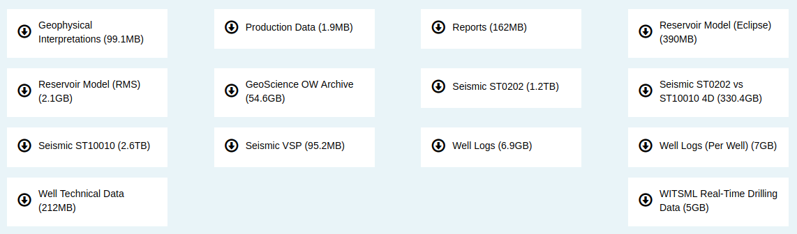
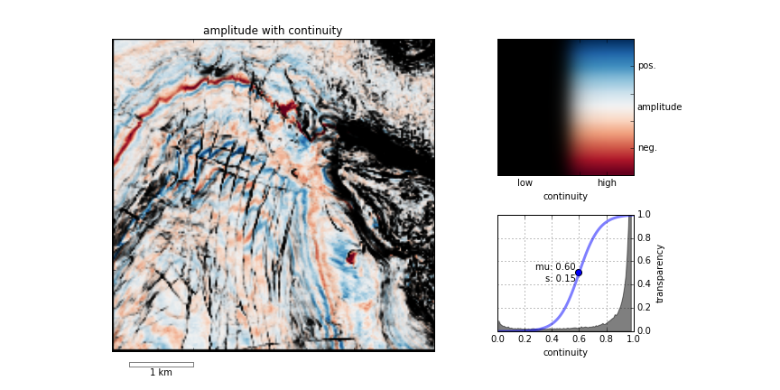
This collection is substantially larger, both deeper and broader, than any other open subsurface dataset I know of. Most excitingly, Equinor has released a broad range of data types, from reports to reservoir models: 3D and 4D seismic, well logs and real-time drilling records, and everything in between. The only slight problem is that the seismic data are bundled in very large files at the moment; we've asked for them to be split up.

Questions about usage rights

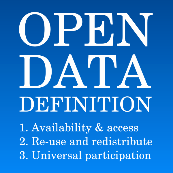
Regular readers of this blog will know that I like open data. One of the cornerstones of open data is access, and there's no doubt that Equinor have done something incredible here. It would be preferable not to have to register at all, but free access to this dataset — which I'm guessing cost more than USD500 million to acquire — is an absolutely amazing gift to the subsurface community.

Another cornerstone is the right to use the data for any purpose. This involves the owner granting certain privileges, such as the right to redistribute the data (say, for a class exercise) or to share derived products (say, in a paper). I'm almost certain that Equinor intends the data to be used this way, but I can't find anything actually granting those rights. Unfortunately, if they aren't explicitly granted, the only safe assumption is that you cannot share or adapt the data.

For reference, here's the language in the CC-BY 4.0 licence:


Subject to the terms and conditions of this Public License, the Licensor hereby grants You a worldwide, royalty-free, non-sublicensable, non-exclusive, irrevocable license to exercise the Licensed Rights in the Licensed Material to:

  1. reproduce and Share the Licensed Material, in whole or in part; and
  2. produce, reproduce, and Share Adapted Material.
 

You can dig further into the requirements for open data in the Open Data Handbook.

The last thing we need is yet another industry dataset with unclear terms, so I hope Equinor attaches a clear licence to this dataset soon. Or, better still, just uses a well-known licence such as CC-BY (this is what I'd recommend). This will clear up the matter and we can get on with making the most of this amazing resource.

More about Volve

The Volve field was discovered in 1993, but not developed until 15 years later. It produced oil and gas for 8.5 years, starting on 12 February 2008 and ending on 17 September 2016, though about half of that came in the first 2 years (see below). The facility was the Maersk Inspirer jack-up rig, standing in 80 m of water, with an oil storage vessel in attendance. Gas was piped to Sleipner A. In all, the field produced 10 million Sm³ (63 million barrels) of oil, so is small by most standards, with a peak rate of 56,000 barrels per day.

Volve production over time in standard m³ (i.e. at 20°C). Multiply by 6.29 for barrels.

Volve production over time in standard m³ (i.e. at 20°C). Multiply by 6.29 for barrels.

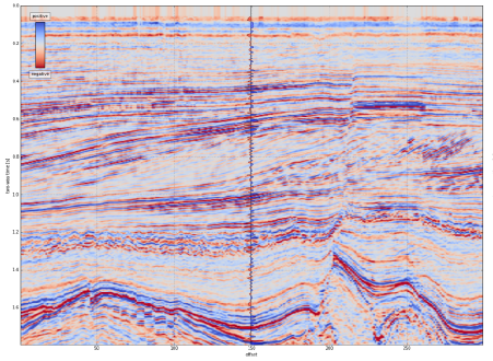
The production was from the Jurassic Hugin Formation, a shallow-marine sandstone with good reservoir properties, at a depth of about 3000 m. The top reservoir depth map from the discovery report in the data package is shown here. (I joined Statoil in 1997, not long after this report was written, and the sight of this page brings back a lot of memories.)


The top reservoir depth map from the discovery report. The Volve field (my label) is the small closure directly north of Sleipner East, with 15/9-19 well on it.


Get the data

To explore the dataset, you must register in the 'data village', which Equinor has committed to maintaining for 2 years. It only takes a moment. You can get to it through this link.

Let us know in the comments what you think of this move, and do share what you get up to with the data!

Why Python beats MATLAB for geophysics

MATLAB — the scientific computing environment which includes a programming language — is amazing. It has probably done as much for the development of new geophysical methods, and for the teaching and learning of geophysics, as any other tool or language. A purely anecdotal assertion, but it's rare to meet a geophysicist who has not at least dabbled in MATLAB, and it is used daily in geophysics labs and classrooms. Geophysics <3 MATLAB.

It's easy to see why — MATLAB definitely has some advantages.

Advantages of MATLAB

  • Matrices. MATLAB implicitly treats arrays as matrices (the name means 'matrix laboratory'). As a result, notation is quite intuitive for mathematicians. For example, a*b means standard matrix multiplication, the dot product. (Slightly confusingly, to get Python-style element-wise multiplication, add a dot: a.*b).
  • Lots of functions. MATLAB has been around for over 30 years, so there are many, many useful functions. Find them either in the core product, in one of the toolboxes, or in MATLAB Central.
  • Simulink. This block-based system design and simulation engine is much-loved by engineers. It allows users to model physical systems in an intuitive, graphical environment.
  • Easy to install. The MATLAB environment is a desktop application, so it is instantly familiar and can be managed under the same processes other software in your machine or organization is managed.
  • MATLAB is widespread in academia. Thanks to one of those generous schemes where software corporations give free software to universities, just because they're awesome and definitely not for any other reason, students and profs have easy and free access to MATLAB. Outside academia, however, you're looking at tens of thousands of dollars.

So far so good, but it's time for geophysics to switch to Python. On the face of it, the language has a lot in common with MATLAB: they're both easy to learn, and both have broad ecosystems that make things like image processing, statistics, and signal processing easy. But Python has some special features that make it a fantastic platform for scientific computing...

Advantages of Python

  • Free and open. Thanks to one of those generous schemes where people make software and let anyone use it for any purpose for free, Python is free! Not only is it free of charge, you are free to inspect and modify the code. Open is awesome. (There are other free alternatives to MATLAB, notably GNU Octave and SciLab.)
  • General purpose. One of the things I love about Python is its flexibility. You can use it in the shell on microtasks, or interactively, or in scripts, or to write server software, or to build enterprise software with GUIs.
  • Namespaces. Everything in MATLAB lives in the main namespace, whereas Python keeps things inherently modular. To access NumPy, say, you have to import it and then use its namespace to get at its contents: numpy.ndarray([1, 2, 3]). This has various advantages, including flexibility, readability, learnability, and portability.
  • Introspection. A powerful idea in Python, introspection means that you (or your code) can see inside every module, class, and function. You can use access private variables, or write code that 'knows' about other objects' interfaces.
  • Portable. You can run your Python code on any architecture, whereas to run MATLAB code you either need all the MATLAB licenses the software uses, or another pricey toolbox to make executables.
  • Popular. Python is the 7th most popular tag in Stack Overflow, whereas MATLAB is the 58th. While programming is not a popularity contest, think of your career, or the careers of your students. Once they graduate, Python will serve them better than MATLAB. There are over 300 jobs for Pythonistas on Stack Overflow Jobs right now. MATLAB jobs? Nine.

So there you have it. It's time to switch to Python. If you're new to programming, there's no contest. I suppose if you're productive in MATLAB, and have access to all the toolboxes, then admittedly it's hard to say you should switch.

But I'll still say it.


I was inspired to write this post after talking to a geophysicist about using programming languages in the classroom, and by the lists in this nice post on pyzo.org. It would be interesting to hear what you use in the classroom — as an instructor or as a student. I know geophysics is being taught with the help of MATLAB (in many places), Java (e.g. at Colorado School of Mines), Mathematica (e.g. by Chris Liner). I wonder if there's anyone using JavaScript, which wouldn't be a terrible choice. Or C++? Or Fortran?? Let us know in the comments!

A coding kitchen in Stavanger

Last week, I travelled to Norway and held a two day session of our Agile Geocomputing Training. We convened at the newly constructed Innovation Dock in Stavanger, and set up shop in an oversized, swanky kitchen. Despite the industry-wide squeeze on spending, the event still drew a modest turnout of seven geoscientists. That's way more traction then we've had in North America lately, so thumbs up to Norway! And, since our training is designed to be very active, a group of seven is plenty comfortable. 

A few of the participants had some prior experience writing code in languages such as Perl, Visual Basic, and C, but the majority showed up without any significant programming experience at all. 

Skills start with syntax and structures 

The first day we covered basic principles or programming, but because Python is awesome, we dive into live coding right from the start. As an instructor, I find that doing live coding has two hidden benefits: it stops me from racing ahead, and making mistakes in the open gives students permission to do the same. 

Using geoscience data right from the start, students learn about key data structures: lists, dicts, tuples, and sets, and for a given job, why they might chose between them. They wrote their own mini-module containing functions and classes for getting stratigraphic tops from a text file. 

Since syntax is rather dry and unsexy, I see the instructor's main role to inspire and motivate through examples that connect to things that learners already know well. The ideal containers for stratigraphic picks is a dictionary. Logs, surfaces, and seismic, are best cast into 1-, 2, and 3-dimensional NumPy arrays, respectively. And so on.

Notebooks inspire learning

We've seen it time and time again. People really like the format of Jupyter Notebooks (formerly IPython Notebooks). It's like there is something fittingly scientific about them: narrative, code, output, repeat. As a learning document, they aren't static — in fact they're meant to be edited. But they aren't so open-ended that learners fail to launch. Professional software developers may not 'get it', but scientists really subscribe do. Start at the start, end at the end, and you've got a complete record of your work. 

You don't get that with the black-box, GUI-heavy software applications we're used to. Maybe, all legitimate work should be reserved for notebooks: self-contained, fully-reproducible, and extensible. Maybe notebooks, in their modularity and granularity, will be the new go-to software for technical work.

Outcomes and feedback

By the end of day two, folks were parsing stratigraphic and petrophysical data from text files, then rendering and stylizing illustrations. A few were even building interactive animations on 3D seismic volumes.  One recommendation was to create a sort of FAQ or cookbook: "How do I read a log?", "How do I read SEGY?", "How do I calculate elastic properties from a well log?". A couple of people of remarked that they would have liked even more coached exercises, maybe even an extra day; a recognition of the virtue of sustained and structured practice.


Want training too?

Head to our courses page for a list of upcoming courses, or more details on how you can train your team


Photographs in this post are courtesy of Alessandro Amato del Monte via aadm on Flickr

On answering questions

On Tuesday I wrote about asking better questions. One of the easiest ways to ask better questions is to hang back a little. In a lecture, the answer to your question may be imminent. Even if it isn't, some thinking or research will help. It's the same with answering questions. Better to think about the question, and maybe ask clarifying questions, than to jump right in with "Let me explain".

Here's a slightly edited example from Earth Science Stack Exchange

I suppose natural gas underground caverns on Earth have substantial volume and gas is in gaseous form there. I wonder how it would look like inside such cavern (with artificial light of course). Will one see a rocky sky at big distance?

The first answer was rather terse:

What is a good answer?

This answer, addressing the apparent misunderstanding the OP (original poster) has about gas being predominantly found in caverns, was the first thing that occurred to me too. But it's incomplete, and has other problems:

  • It's not very patient, and comes across as rather dismissive. Not very welcoming for this new user.
  • The reference is far from being an appropriate one, and seems to have been chosen randomly.
  • It only addresses sandstone reservoirs, and even then only 'typical' ones.

In my own answer to the question, I tried to give a more complete answer. I tried to write down my principles, which are somewhat aligned with the advice given on the Stack Exchange site:

  1. Assume the OP is smart and interested. They were smart and curious enough to track down a forum and ask a question that you're interested enough in to answer, so give them some credit. 
  2. No bluffing! If you find yourself typing something like, "I don't know a lot about this, but..." then stop writing immediately. Instead, send the question to someone you know that can give a better answer then you.
  3. If possible, answer directly and clearly in the first sentence. I usually write it in bold. This should be the closest you can get to a one-word answer, especially if it was a direct question. 
  4. Illustrate the answer with an example. A picture or a numerical example — if possible with working code in an accessible, open source language — go a long way to helping someone get further. 
  5. Be brief but thorough. Round out your answer with some different angles on the question, especially if there's nuance in your answer. There's no need for an essay, so instead give links and references if the OP wants to know more.
  6. Make connections. If there are people in your community or organization who should be connected, connect them.

It's remarkable how much effort people are willing to put into a great answer. A question about detecting dog paw-prints on a pressure pad, posted to the programming community Stack Overflow, elicited some great answers.

The thread didn't end there. Check out these two answers by Joe Kington, a programmer–geoscientist in Houston:

  • One epic answer with code and animated GIFs, showing how to make a time-series of pawprints.
  • A second answer, with more code, introducing the concept of eigenpaws to improve paw recognition.

A final tip: writing informative answers might be best done on Wikipedia or your corporate wiki. Instead of writing a long response to the post, think about writing it somewhere more accessible, and instead posting a link to your answer. 

What do you think makes a good answer to a question? Have you ever received an answer that went beyond helpful? 

On asking questions

If I had only one hour to solve a problem, I would spend up to two-thirds of that hour in attempting to define what the problem is. — Anonymous Yale professor (often wrongly attributed to Einstein)

Asking questions is a core skill for professionals. Asking questions to know, to understand, to probe, to test. Anyone can feel exposed asking questions, because they feel like they should know or understand already. If novices and 'experts' alike have trouble asking questions, if your community or organization does not foster a culture of asking, then there's a problem.

What is a good question?

There are naive questions, tedious questions, ill-phrased questions, questions put after inadequate self-criticism. But every question is a cry to understand the world. There is no such thing as a dumb question. — Carl Sagan

Asking good questions is the best way to avoid the problem of feeling silly or — worse — being thought silly. Here are some tips from my experience in Q&A forums at work and on the Internet:

  1. Do some research. Go beyond a quick Google search — try Google Scholar, ask one or two colleagues for help, look in the index of a couple of books. If you have time, stew on it for a day or two. Do enough to make sure the answer isn't widely known or trivial to find. Once you've decided to ask a network...
  2. Ask your question in the right forum. You will save yourself a lot of time by going taking the trouble to find the right place — the place where the people most likely to be able to help you are. Avoid the shotgun approach: it's not considered good form to cross-post in multiple related forums.
  3. Make the subject or headline a direct question, with some relevant detail. This is how most people will see your question and decide whether to even read the rest of it. So "Help please" or "Interpretation question" are hopeless. Much better is something like "How do I choose seismic attribute parameters?" or "What does 'replacement velocity' mean?".
  4. Provide some detail, and ideally an image. A bit of background helps. If you have a software or programming problem, just enough information needed to reproduce the problem is critical. Tell people what you've read and where your assumptions are coming from. Tell people what you think is going on.
  5. Manage the question. Make sure early comments or answers seem to get your drift. Edit your question or respond to comments to help people help you. Follow up with new questions if you need clarification, but make a whole new thread if you're moving into new territory. When you have your answer, thank those who helped you and make it clear if and how your problem was solved. If you solved your own problem, post your own answer. Let the community know what happened in the end.

If you really want to cultivate your skills of inquiry, here is some more writing on the subject...

Supply and demand

Knowledge sharing networks like Stack Exchange, or whatever you use at work, often focus too much on answers. Capturing lessons learned, for example. But you can't just push knowledge at people — the supply and demand equation has two sides — there has to be a pull too. The pull comes from questions, and an organization or community that pulls, learns.

Do you ask questions on knowledge networks? Do you have any advice for the curious? 


Don't miss the next post, On answering questions.

Corendering attributes and 2D colourmaps

The reason we use colourmaps is to facilitate the human eye in interpreting the morphology of the data. There are no hard and fast rules when it comes to choosing a good colourmap, but a poorly chosen colourmap can make you see features in your data that don't actually exist. 

Colourmaps are typically implemented in visualization software as 1D lookup tables. Given a value, what colour should I plot it? But most spatial data is multi-dimensional, and it's useful to look at more than one aspect of the data at one time. Previously, Matt asked, "how many attributes can a seismic interpreter show with colour on a single display?" He did this by stacking up a series of semi-opaque layers, each one assigned its own 1D colourbar. 

Another way to add more dimensions to the display is corendering. This effectively adds another dimension to the colourmap itself: instead of a 1D colour line for a single attribute, for two attributes we're defining a colour square; for 3 attributes, a colour cube, and so on.

Let's illustrate this by looking at a time-slice through a portion of the F3 seismic volume. A simple way of displaying two attributes is to decrease the opacity of one, and lay it on top of the other. In the figure below, I'm setting the opacity of the continuity to 75% in the third panel. At first glance, this looks pretty good; you can see both attributes, and because they have different hues, they complement each other without competing for visual bandwidth. But the approach is flawed. The vividness of each dataset is diminished; we don't see the same range of colours as we do in the colour palette shown above.

Overlaying one map on top of the other is one way to look at multiple attributes within a scene. It's not ideal however.

Overlaying one map on top of the other is one way to look at multiple attributes within a scene. It's not ideal however.

Instead of overlaying maps, we can improve the result by modulating the lightness of the amplitude image according to the magnitude of the continuity attribute. This time the corendered result is one image, instead of two. I prefer it, because it preserves the original colours we see in the amplitude image. If anything, it seems to deepen the contrast:

The lightness value of the seismic amplitude time slice has been modulated by the continuity attribute.&nbsp;

The lightness value of the seismic amplitude time slice has been modulated by the continuity attribute. 

Such a composite display needs a two-dimensional colormap for a legend. Just as a 1D colourbar, it's also a lookup table; each position in the scene corresponds to a unique pair of values in the colourmap plane.

We can go one step further. Say we want to emphasize only the largest discontinuities in the data. We can modulate the opacity with a non-linear function. In this example, I'm using a sigmoid function:

In order to achieve this effect in most conventional software, you usually have to copy the attribute, colour it black, apply an opacity curve, then position it just above the base amplitude layer. Software companies call this workaround a 'workflow'. 

Are there data visualizations you want to create, but you're stuck with software limitations? In a future post, I'll recreate some cool co-rendering effects; like bump-mapping, and hill-shading.

To view and run the code that I used in creating the images for this post, grab the iPython/Jupyter Notebook.


You can do it too!

If you're in Calgary, Houston, New Orleans, or Stavanger, listen up!

If you'd like to gear up on coding skills and explore the benefits of scientific computing, we're going to be running the 2-day version of the Geocomputing Course several times this fall in select cities. To buy tickets or for more information about our courses, check out the courses page.

None of these times or locations good for you? Consider rounding up your colleagues for an in-house training option. We'll come to your turf, we can spend more than 2 days, and customize the content to suit your team's needs. Get in touch.

Once is never

Image by&nbsp;ZEEVVEEZ&nbsp;on Flickr, licensed CC-BY. Ten points if you can tell what it is...


Image by ZEEVVEEZ on Flickr, licensed CC-BY. Ten points if you can tell what it is...

My eldest daughter is in grade 5, so she's getting into some fun things at school. This week the class paired off to meet a challenge: build a container to keep hot water hot. Cool!

The teams built their contraptions over the weekend, doubtless with varying degrees of rule interpretation (my daughter's involved HotHands hand warmers, which I would not have thought of), and the results were established with a side-by-side comparison. Someone (not my daughter) won. Kudos was achieved.

But this should not be the end of the exercise. So far, no-one has really learned anything. Stopping here is like grinding wheat but not making bread. Or making dough, but not baking it. Or baking it, but not making it into toast, buttering it, and covering it in Marmite...

Great, now I'm hungry.

The rest of the exercise

How could this experiment be improved?

For starters, there was a critical component missing: control. Adding a vacuum flask at one end, and an uninsulated beaker at the other would have set some useful benchmarks.

There was a piece missing from the end too: analysis. A teardown of the winning and losing efforts would have been quite instructive. Followed by a conversation about the relative merits of different insulators, say. I can even imagine building on the experience. How about a light introduction to thermodynamic theory, or a stab at simple numerical modeling? Or a design contest? Or a marketing plan?

But most important missing piece of all, the secret weapon of learning, is iteration. The crucial next step is to send the class off to do it again, better this time. The goal: to beat the best previous attempt, perhaps even to beat the vacuum flask. The reward: $20k in seed funding and a retail distribution deal. Or a house point for Griffindor.

Einmal ist keinmal, as they say in Germany: Once is never. What can you iterate today?

Minecraft for geoscience

The Isle of Wight, complete with geology. ©Crown copyright.&nbsp;

The Isle of Wight, complete with geology. ©Crown copyright. 

You might have heard of Minecraft. If you live with any children, then you definitely have. It's a computer game, but it's a little unusual — there isn't really a score, and the gameplay has no particular goal or narrative, leaving everything to the player or players. It's more like playing with Lego than, say, playing chess or tennis or paintball. The game was created by Swede Markus Persson and then marketed by his company Mojang. Microsoft bought Mojang in September last year for $2.5 billion. 

What does this have to do with geoscience?

Apart from being played by 100 million people, the game has attracted a lot of attention from geospatial nerds over the last 12–18 months. Or rather, the Minecraft environment has. The game chiefly consists of fabricating, placing and breaking 1-m-cubed blocks of various materials. Even in normal use, people create remarkable structures, and I don't just mean 'big' or 'cool', I mean truly remarkable. So the attention from the British Geological Survey and the Danish Geodata Agency. If you've spent any time building geocellular models, then the process of constructing elaborate digital models is familiar to you. And perhaps it's not too big a leap to see how the virtual world of Minecraft could be an interesting way to model the subsurface. 

Still I was surprised when, chatting to Thomas Rapstine at the Geophysics Hackathon in Denver, he mentioned Joe Capriotti and Yaoguo Li, fellow researchers at Colorado School of Mines. Faced with the problem of building 3D earth models for simulating geophysical experiments — a problem we've faced with modelr.io — they hit on the idea of adapting Minecraft models. This is not just a gimmick, because Minecraft is specifically designed for simulating and manipulating landscapes.

The Minecraft model (left) and synthetic gravity data (right).&nbsp;Image ©2014 SEG and Capriotti &amp; Li. Used in acordance with SEG's permissions.&nbsp;

The Minecraft model (left) and synthetic gravity data (right). Image ©2014 SEG and Capriotti & Li. Used in acordance with SEG's permissions

If you'd like to dabble in geospatial Minecraft yourself, the FME software from Safe now has a standardized way to get Minecraft data into and out of the environment. Essentially they treat the blocks as point clouds (e.g. as you might get from Lidar or a laser scan), so they can do conventional operations, such as differences or filtering, with the software. They recorded a webinar on the subject yesterday.

Minecraft is here to stay

There are two other important angles to Minecraft, both good reasons why it will probably be around for a while, and probably both something to do with why Microsoft bought Mojang...

  1. It is a programming gateway drug. Like web coding, and image processing, Minecraft might be another way to get people, especially young people, interested in computing. The tiny Linux machine Raspberry Pi comes with a version of the game with a full Python API, so you can control the game programmatically.  
  2. Its potential beyond programming as a STEM teaching aid and engagement tool. Here's another example. Indeed, the United Nations is involved in Block By Block, an effort around collaborative public space design echoing the Blockholm project, an early attempt to explore social city planning in the tool.

All of which is enough to make me more curious about the crazy-sounding world my kids have built, with its Houston-like city planning: house, school, house, Home Sense, house, rocket launch pad...

References

Capriotti, J and Yaoguo Li (2014) Gravity and gravity gradient data: Understanding their information content through joint inversions. SEG Technical Program Expanded Abstracts 2014: pp. 1329-1333. DOI 10.1190/segam2014-1581.1 

The thumbnail image is from an image by Terry Madeley.

UPDATE: Thank you to Andy for pointing out that Yaoguo Li is a prof, not a student.

Six books about seismic analysis

Last year, I did a round-up of six books about seismic interpretation. A raft of new geophysics books recently, mostly from Cambridge, prompts this look at six volumes on seismic analysis — the more quantitative side of interpretation. We seem to be a bit hopeless at full-blown book reviews, and I certainly haven't read all of these books from cover to cover, but I thought I could at least mention them, and give you my first impressions.

If you have read any of these books, I'd love to hear what you think of them! Please leave a comment. 

Observation: none of these volumes mention compressive sensing, borehole seismic, microseismic, tight gas, or source rock plays. So I guess we can look forward to another batch in a year or two, when Cambridge realizes that people will probably buy anything with 3 or more of those words in the title. Even at $75 a go.


Quantitative Seismic Interpretation

Per Avseth, Tapan Mukerji and Gary Mavko (2005). Cambridge University Press, 408 pages, ISBN 978-0-521-15135-1. List price USD 91, $81.90 at Amazon.com, £45.79 at Amazon.co.uk

You have this book, right?

Every seismic interpreter that's thinking about rock properties, AVO, inversion, or anything beyond pure basin-scale geological interpretation needs this book. And the MATLAB scripts.

Rock Physics Handbook

Gary Mavko, Tapan Mukerji & Jack Dvorkin (2009). Cambridge University Press, 511 pages, ISBN 978-0-521-19910-0. List price USD 100, $92.41 at Amazon.com, £40.50 at Amazon.co.uk

If QSI is the book for quantitative interpreters, this is the book for people helping those interpreters. It's the Aki & Richards of rock physics. So if you like sums, and QSI left you feeling unsatisifed, buy this too. It also has lots of MATLAB scripts.

Seismic Reflections of Rock Properties

Jack Dvorkin, Mario Gutierrez & Dario Grana (2014). Cambridge University Press, 365 pages, ISBN 978-0-521-89919-2. List price USD 75, $67.50 at Amazon.com, £40.50 at Amazon.co.uk

This book seems to be a companion to The Rock Physics Handbook. It feels quite academic, though it doesn't contain too much maths. Instead, it's more like a systematic catalog of log models — exploring the full range of seismic responses to rock properies.

Practical Seismic Data Analysis

Hua-Wei Zhou (2014). Cambridge University Press, 496 pages, ISBN 978-0-521-19910-0. List price USD 75, $67.50 at Amazon.com, £40.50 at Amazon.co.uk

Zhou is a professor at the University of Houston. His book leans towards imaging and velocity analysis — it's not really about interpretation. If you're into signal processing and tomography, this is the book for you. Mostly black and white, the book has lots of exercises (no solutions though).

Seismic Amplitude: An Interpreter's Handbook

Rob Simm & Mike Bacon (2014). Cambridge University Press, 279 pages, ISBN 978-1-107-01150-2 (hardback). List price USD 80, $72 at Amazon.com, £40.50 at Amazon.co.uk

Simm is a legend in quantitative interpretation and the similarly lauded Bacon is at Ikon, the pre-eminent rock physics company. These guys know their stuff, and they've filled this superbly illustrated book with the essentials. It belongs on every interpreter's desk.

Seismic Data Analysis Techniques...

Enwenode Onajite (2013). Elsevier. 256 pages, ISBN 978-0124200234. List price USD 130, $113.40 at Amazon.com. £74.91 at Amazon.co.uk.

This is the only book of the collection I don't have. From the preview I'd say it's aimed at undergraduates. It starts with a petroleum geology primer, then covers seismic acquisition, and seems to focus on processing, with a little on interpretation. The figures look rather weak, compared to the other books here. Not recommended, not at this price.

NOTE These prices are Amazon's discounted prices and are subject to change. The links contain a tag that gets us commission, but does not change the price to you. You can almost certainly buy these books elsewhere. 

How much rock was erupted from Mt St Helens?

One of the reasons we struggle when learning a new skill is not necessarily because this thing is inherently hard, or that we are dim. We just don't yet have enough context for all the connecting ideas to, well, connect. With this in mind I wrote this introductory demo for my Creative Geocomputing class, and tried it out in the garage attached to START Houston, when we ran the course there a few weeks ago.

I walked through the process of transforming USGS text files to data graphics. The motivation was to try to answer the question: How much rock was erupted from Mount St Helens?

This gorgeous data set can be reworked to serve a lot of programming and data manipulation practice, and just have fun solving problems. My goal was to maintain a coherent stream of instructions, especially for folks who have never written a line of code before. The challenge, I found, is anticipating when words, phrases, and syntax are being heard like a foriegn language (as indeed they are), and to cope by augmenting with spoken narrative.

Text file to 3D plot

To start, we'll import a code library called NumPy that's great for crunching numbers, and we'll abbreviate it with the nickname np:

>>> import numpy as np

Then we can use one of its functions to load the text file into an array we'll call data:

>>> data = np.loadtxt('z_after.txt')

The variable data is a 2-dimensional array (matrix) of numbers. It has an attribute that we can call upon, called shape, that holds the number of elements it has in each dimension,

>>> data.shape
(1370, 949)

If we want to make a plot of this data, we might want to take a look at the range of the elements in the array, we can call the peak-to-peak method on data,

>>> data.ptp()
41134.0

Whoa, something's not right, there's not a surface on earth that has a min to max elevation that large. Let's dig a little deeper. The highest point on the surface is,

>>> np.amax(data)
8367.0

Which looks to the adequately trained eye like a reasonable elevation value with units of feet. Let's look at the minimum value of the array,

>>> np.amin(data)
-32767.0 

OK, here's the problem. GIS people might recognize this as a null value for elevation data, but since we aren't assuming any knowledge of GIS formats and data standards, we can simply replace the values in the array with not-a-number (NaN), so they won't contaminate our plot.

>>> data[data==-32767.0] = np.nan

To view this surface in 3D we can import the mlab module from Mayavi

>>> from mayavi import mlab

Finally we call the surface function from mlab, and pass the input data, and a colormap keyword to activate a geographically inspired colormap, and a vertical scale coefficient.

>>> mlab.surf(data,
              colormap='gist_earth',
              warp_scale=0.05)

After applying the same procedure to the pre-eruption digits, we're ready to do some calculations and visualize the result to reveal the output and its fascinating characteristics. Read more in the IPython Notebook.

If this 10 minute introduction is compelling and you'd like to learn how to wrangle data like this, sign up for the two-day version of this course next week in Calgary. 

Eventbrite - Agile Geocomputing