
Feel superhuman: learning and teaching geocomputing
/
Diego teaching in Houston in 2018.
It’s five years since we started teaching Python to geoscientists. To be honest, it might have been premature. At the time, Evan and I were maybe only two years into serious, daily use of Python. But the first class, at the Atlantic Geological Society’s annual meeting in February 2014, was free so the pressure was not too high. And it turns out that only being a step or two ahead of your students can be an advantage. Your ‘expert blind spot’ is partially sighted not completely blind, because you can clearly remember being a noob.
Being a noob is a weird, sometimes very uncomfortable, even scary, feeling for some people. Many of us are used to feeling like experts, at least some of the time. Happy, feeling like a noob is a core competency in programming. Learning new things is a more or less hourly experience for coders. Even a mature language like Python evolves fast enough that it’s hard to keep up. Instead of feeling threatened or exhausted by this, I think the best strategy is to enjoy it. You’ll never be done, there are (way) more questions than answers, and you can learn forever!

One of the bootcamp groups at the Copenhagen hackathon in 2018
This week we’re teaching our 40th course. Last year alone we gave digital superpowers to 325 people, mostly geoscientists, Not all of them learned to code, as such — some people already could, and some found out theydidn’t like it… coding really isn’t for everyone. But I think all of them learned something new about technology, and how it can serve them and their science. I hope all of them look at spreadsheets, and Petrel, and websites differently now. I think most of them want, at some point, to learn more. And everyone is excited about machine learning.
The expanding community of quantitative earth scientists
This year we’ve already spent 50 days teaching, and taught 174 people. Imagine that! I get emotional when I think about what these hundreds of new digital geoscientists and engineers will go and do with their new skills. I get really excited when I see what they are already doing — when they come to hackathons, send us screenshots, or write papers with beautiful figures. If the joy of sharing code and collaborating with peers has also rubbed off on them, there’s no telling where it could lead.

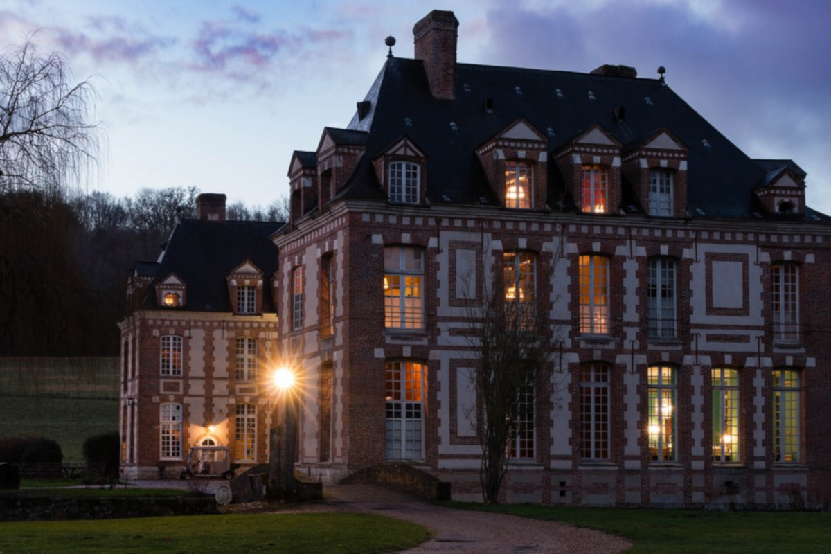
Matt teaching in Aberdeen in October 2018
The last nine months or so have been an adventure. Teaching is not supposed to be what Agile is about. We’re a consulting company, a technology company. But for now we’re mostly a training company — it’s where we’re needed. And it makes sense... Programming is fundamentally about knowledge sharing. Teaching is about helping, collaborating. It’s perfect for us.
Besides, it’s a privilege and a thrill to meet all these fantastically smart, motivated people and to hear about their projects and their plans. Sometimes I wish it didn’t mean leaving my family in Nova Scotia and flying to Houston and London and Kuala Lumpur and Kalamazoo… but mostly I wish we could do more of it. Especially when we get comments like these:
“Given how ‘dry’ programming can be, it was DYNAMIC.”
”Excellent teachers with geoscience background.”
”Great instructors, so so approachable, even for newbies like me.”
”Great course [...] Made me realize what could be done in a short time.”
”My only regret was not taking a class like this sooner.”
”Very positive, feel superhuman.”
How many times have you felt superhuman at work recently?
The courses we teach are evolving and expanding in scope. But they all come back to the same thing: growing digital skills in our profession. This is critical because using computers for earth science is really hard. Why? The earth is weird. We’ve spent hundreds of years honing conceptual models, understanding deep time, and figuring out complex spatial relationships.
If data science eats the subsurface without us, we’re all going to get indigestion. Society needs to better understand the earth — for all sorts of reasons — and it’s our duty to build and adopt the most powerful analytical tools available so that we can help.
Learning resources
If you can’t wait to get started, here are some suggestions:
learnpython.org is a really nice resource for beginners, with interactive tutorials — and not just in Python!
I took the Udacity CS 101 class with Dave Evans in 2012, and I loved it. I’ve since done other Udacity courses.
If you’re the book type, Learning With Python by Allen P. Downey is supposed to be great, and it’s free.
Our X lines of Python blog series has several beginner-friendly lessons. My favourite is the one about wedges. You should also check out the Geophysical Tutorials series in The Leading Edge.
You might like to get on the public, free Slack Software Underground — there are lots of geo-Python folks there.
Classroom courses are a big investment in dollars and time, but they can get you a long way really quickly. Our courses are built especially for subsurface scientists and engineers. As far as I know, they are the only ones of their kind. If you think you’d like to take one, talk to us, or look out for a public course. You can find out more or sign up for email alerts here >> https://agilescientific.com/training/
Last thing: I suggest avoiding DataCamp, because of sexual misconduct by an executive, compounded by total inaction, dishonest obfuscation, and basically failing spectacularly. Even their own trainers have boycotted them. Steer clear.


 Except where noted, this content is licensed