Introducing Bruges

bruges_rooves.png

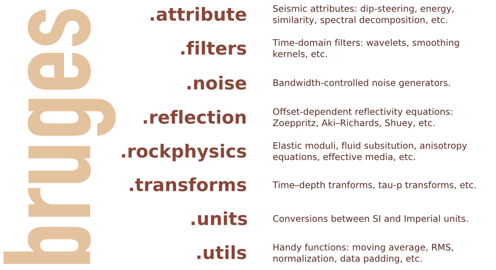
Welcome to Bruges, a Python library (previously known as agilegeo) that contains a variety of geophysical equations used in processing, modeling and analysing seismic reflection and well log data. Here's what's in the box so far, with new stuff being added every week:


Simple AVO example

VP [m/s] VS [m/s] ρ [kg/m3]
Rock 1 3300 1500 2400
Rock 2 3050 1400 2075

Imagine we're studying the interface between the two layers whose rock properties are shown here...

To compute the zero-offset reflection coefficient at zero offset, we pass our rock properties into the Aki-Richards equation and set the incident angle to zero:

 >>> import bruges as b
 >>> b.reflection.akirichards(vp1, vs1, rho1, vp2, vs2, rho2, theta1=0)
 -0.111995777064

Similarly, compute the reflection coefficient at 30 degrees:

 >>> b.reflection.akirichards(vp1, vs1, rho1, vp2, vs2, rho2, theta1=30)
 -0.0965206980095

To calculate the reflection coefficients for a series of angles, we can pass in a list:

 >>> b.reflection.akirichards(vp1, vs1, rho1, vp2, vs2, rho2, theta1=[0,10,20,30])
 [-0.11199578 -0.10982911 -0.10398651 -0.0965207 ]

Similarly, we could compute all the reflection coefficients for all incidence angles from 0 to 70 degrees, in one degree increments, by passing in a range:

 >>> b.reflection.akirichards(vp1, vs1, rho1, vp2, vs2, rho2, theta1=range(70))
 [-0.11199578 -0.11197358 -0.11190703 ... -0.16646998 -0.17619878 -0.18696428]

A few more lines of code, shown in the Jupyter notebook, and we can make some plots:


Elastic moduli calculations

With the same set of rocks in the table above we could quickly calculate the Lamé parameters λ and µ, say for the first rock, like so (in SI units),

 >>> b.rockphysics.lam(vp1, vs1, rho1), b.rockphysics.mu(vp1, vs1, rho1)
 15336000000.0 5400000000.0

Sure, the equations for λ and µ in terms of P-wave velocity, S-wave velocity, and density are pretty straightforward: 


but there are many other elastic moduli formulations that aren't. Bruges knows all of them, even the weird ones in terms of E and λ.


All of these examples, and lots of others — Backus averaging,  examples are available in this Jupyter notebook, if you'd like to work through them on your own.


Bruges is a...

It is very much early days for Bruges, but the goal is to expose all the geophysical equations that geophysicists like us depend on in their daily work. If you can't find what you're looking for, tell us what's missing, and together, we'll make it grow.

What's a handy geophysical equation that you employ in your work? Let us know in the comments!

Seismic inception

A month ago, some engineers at Google blogged about how they had turned a deep learning network in on itself and produced some fascinating and/or disturbing images:

One of the images produced by the team at Google. Click to see a larger version. Read more. CC-BY.

The basic recipe, which Google later open sourced, involves training a deep learning network (basically a multi-layer neural network) on some labeled images, animals maybe, then searching for matching patterns in a target image, like these clouds. If it finds something, it emphasizes it — given the data, it tries to construct an animal. Then do it again.

Or, here's how a Google programmer puts it (one of my favourite sentences ever)...

Making the "dream" images is very simple. Essentially it is just a gradient ascent process that tries to maximize the L2 norm of activations of a particular DNN layer. 

That's all! Anyway, the point is that you get utter weirdness:

OK, cool... what happens if you feed it seismic?

That was my first thought, I'm sure it was yours too. The second thing I thought, and the third, and the fourth, was: wow, this software is hard to compile. I spent an unreasonable amount of time getting caffe, the Berkeley Vision & Learning Centre's deep learning software, working. But on Friday I cracked it, so today I got to satisfy my curiosity.

The short answer is: reptiles. These weirdos were 8 levels down, which takes about 20 minutes to reach on my iMac.

Seismic data from the Virtual Seismic Atlas, courtesy of Fugro. 

THE DEEPDREAM TREATMENT. Mostly reptiles.

Er, right... what's the point in all this?

That's a good question. It's just a bit of fun really. But it makes you wonder:

  • What if we train the network on seismic facies? I think this could be very interesting.
  • Better yet, what if we train it on geology? Probably spurious: seismic is not geology.
  • Does this mean learning networks are just dumb machines, or can they see more than us? Tough one — human vision is highly fallible. There are endless illusions to prove this. But computers only do what we tell them, at least for now. I think if we're careful what we ask for, we can use these highly non-linear data-crunching algorithms for good.
  • Are we out of a job? Definitely not. How do you think machines will know what to learn? The challenge here is to make this work, and then figure out how it can help change, or at least accelerate, our understanding of the subsurface.

This deep learning stuff — of which the University of Toronto was a major pioneer during its emergence in about 2010 — is part of the machine learning revolution that you are, like it or not, experiencing. It will take time, and it will make awful mistakes, but the indications are that machine learning will eat every analytical method for breakfast. Customer behaviour prediction, computer vision, natural language processing, all this stuff is reeling from the relatively sudden and widespread availability of inexpensive computer intelligence. 

So what are we going to do with that?

           Okay, one more. from Paige Bailey's Twitter feed.

           Okay, one more. from Paige Bailey's Twitter feed.

Ask your employer about being more awesome

Opensource.gif

Open source software needs money to survive. If you work at a corporation with a positive bottom line, and you use open source software to help you maintain it, I'd urge you to consider asking your organization to help out. You can't imagine the difference it makes — these projects take serious resources to run: server hardware, infrastructure maintenance, professional developers, research and development, legal and marketing functions, educational outreach, work in developing countries,... just like commercial, closed-source, black-or-at-least-dark-grey-box software. 

(Come to think of it, the only thing they don't have is sales personnel driving to golf courses in a BMW 5 series. How many of those have you paid for with those license fees?)

Which projects need your company's help?

There are some fundamental projects, but they tend to be quite well funded already, both financially and in-kind. For example, software engineers at companies like IBM and Google make substantial contributions to the Linux kernel. Still, your company definitely depends on technology from the following projects:

  1. The Linux Foundation — responsible for the kernel of the Linux operating system.
  2. Free Software Foundation — the umbrella for a ridiculous number of software tools.
  3. The Apache Foundation — maintainers of the eponymous web server, and forerunners of the ongoing big data and machine learning revolutions and the tools that power them. 

These higher-level projects are closer to my heart, and do great working supporting the work of scientists:

  1. The Mozilla Foundation — check out the Mozilla Science Lab and Software Carpentry
  2. The WikiMedia Foundation — for Wikipedia, and the MediaWiki software that powers it (as well as AAPG's and SEG's wikis)
  3. NumFOCUS Foundation — all the better to help you wield scientific Python!

If money really isn't an option, consider working somewhere where it is an option. If that's not an option either, then there are plenty of other ways to make a difference:

  1. Use and champion open source software at your place of work.
  2. Submit tickets for the software you use, and engage with the community.
  3. If you can code, submit patches, documentation, or whatever you can.

Now, if we only had an Open Geoscience Foundation to help fund projects in geoscience...

Geophysics at SciPy 2015

Yesterday was the geoscience day at SciPy 2015 in Austin.

At lunchtime, Paige Bailey (Chevron) organized a Birds of a Feather on GIS. This was a much-needed meetup for anyone interested in spatial data. It was useful to hear about the tools the fifty-or-so participants  use every day, and a great chance to air some frustrations like Why is it so hard to install a geospatial stack? And questions like How do people make attractive maps with the toolset?

One way to make attractive maps is go beyond the screen and 3D print them. Almost any subsurface dataset could seem more tangible and believable as a 3D object, and Joe Kington (Chevron) showed us how to make data into objects. Just watch:

Matteus Ueckermann followed up with some virtual elevation models, showing how Python can process not just a few tiles of data, but can handle hydrology modeling for the entire world:

Nicola Creati (OGS, Trieste) showed us the PyGmod package, a new and fully parallel geodynamic simulation tool for HPC nuts. So now you can make more plate tectonic models before most people are out of bed!

We also heard from Lindsey Heagy and Gudnir Rosenkjaer from UBC, talking about various applications of Rowan Cockett's awesome SimPEG package to their work. As at the hackathon in Denver, it's very clear that this group's investment in and passion for a well-architected, integrated package is well worth the work, giving everyone who works with it superpowers. And, as we all know, superpowers are awesome. Especially geophysical ones.

Last up, I talked about striplog, a small package for handling interval and point data in logs, core, and other 1D datasets. It's still very immature, but almost ready for real-world users, so if you think you have a use case, I'd love to hear from you.

Today is the last day of the conference part, before we head into the coding sprints tomorrow. Stay tuned for more, or follow the #scipy2015 hashtag to keep up. See all the videos, which go up almost right after talks, on YouTube.

You'd better read this

The clean white front cover of this month's Bloomberg Businessweek carries a few lines of Python code, and two lines of English as a footnote... If you can't read that, then you'd better read this. The entire issue is a single essay written by Paul Ford. It was an impeccable coincidence: I picked up a copy before boarding the plane to Austin for SciPy 2015. This issue is a grand achievement; it could be the best thing I've ever read. Go out an buy as many copies as you can, and give them to your friends. Or read it online right now.

Not your grandfather's notebook

Jess Hamrick is a cognitive scientist at UC Berkeley who makes computational models of human behaviour. In her talk, she described how she built a multi-user server for Jupyter notebooks to administer course content, assign homework, even do auto-grading for a class with 220 undergrads. During her talk, she invited the audience to list their GitHub usernames on an Etherpad. Minutes after she stood down from her podium, she granted access, so we could all come inside and see how it was done.

Dangerous defaults

I wrote a while ago about the dangers of defaults, and as Matteo Niccoli highlighted in his 52 Things essay, How to choose a colourmap, default colourmaps can be especially harmful. Matplotlib has long been criticized for its nasty default colourmap, but today redeemed itself with a new default. Hear all about it from Stefan van der Walt:

Sound advice

Allen Downey of Olin College gave a wonderful talk this afternoon about teaching digital signal processing to students using fun and intuitive audio signals as the hook. Watch it yourself, it's well worth the 20 minutes or so:

If you're really into musical and audio applications, there was another talk on the subject, by Brian McFee (Librosa project). 

More tomorrow as we head into Day 2 of the conference. 

Pick This again

Since I last wrote about it, Pick This! has matured. We have continued to improve the tool, which is a collaboration between Agile and the 100% awesome Steve Purves at Euclidity.

Here's some of the new stuff we've added:

  • Multiple lines and polygons for each interpretation. This was a big limitation; now we can pick multiple fault sticks, say.
  • 'Preshows', to show the interpreter some text or an image before they interpret. In beta, talk to us if you want to try it.
  • Interpreter cohorts, with randomized selection, so we can conduct blind trials.  In beta, again, talk to us.
  • Complete picking history, so we can replay the entire act of interpretation. Coming soon: new visualizations of results that use this data.

Some of this, such as replaying the entire picking event, is of interest to researchers who want to know how experts interpret images. Remotely sensed images — whether in geophysics, radiology, astronomy, or forensics — are almost always ambiguous. Look at these faults, for example. How many are there? Where are they exactly? Where are their tips?  

A seismic line from the Browse Basin, offshore western Australia. Data courtesy of CGG and the Virtual Seismic Atlas

A seismic line from the Browse Basin, offshore western Australia. Data courtesy of CGG and the Virtual Seismic Atlas

Most of the challenges on the site are just fun challenges, but some — like the Browse Basin challenge, above — are part of an experiment by researchers Juan Alcalde and Clare Bond at the University of Aberdeen. Please help them with their research by taking part and making an interpretation! It would also be super if you could fill out your profile page — that will help Juan and Clare understand the results. 

If you're at the AAPG conference in Denver then you can win bonus points by stopping by Booth 404 to visit Juan and Clare. Ask them all about their fascinating research, and say hello from us!

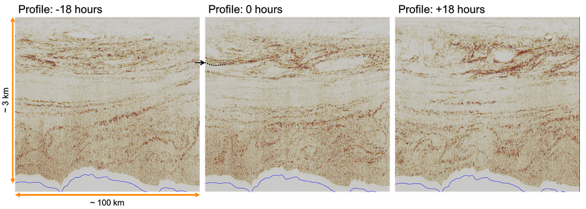
While you're on the site, check out some of the other images — or upload one yourself! This one was a real eye-opener: time-lapse seismic reflections from the water column, revealing dynamic thermohaline stratification. Can you pick this?

Pick This challenge showing time-lapse frames from a marine 3D. The seabed is shown in blue at the bottom of the images.

Pick This challenge showing time-lapse frames from a marine 3D. The seabed is shown in blue at the bottom of the images.

Corendering attributes and 2D colourmaps

The reason we use colourmaps is to facilitate the human eye in interpreting the morphology of the data. There are no hard and fast rules when it comes to choosing a good colourmap, but a poorly chosen colourmap can make you see features in your data that don't actually exist. 

Colourmaps are typically implemented in visualization software as 1D lookup tables. Given a value, what colour should I plot it? But most spatial data is multi-dimensional, and it's useful to look at more than one aspect of the data at one time. Previously, Matt asked, "how many attributes can a seismic interpreter show with colour on a single display?" He did this by stacking up a series of semi-opaque layers, each one assigned its own 1D colourbar. 

Another way to add more dimensions to the display is corendering. This effectively adds another dimension to the colourmap itself: instead of a 1D colour line for a single attribute, for two attributes we're defining a colour square; for 3 attributes, a colour cube, and so on.

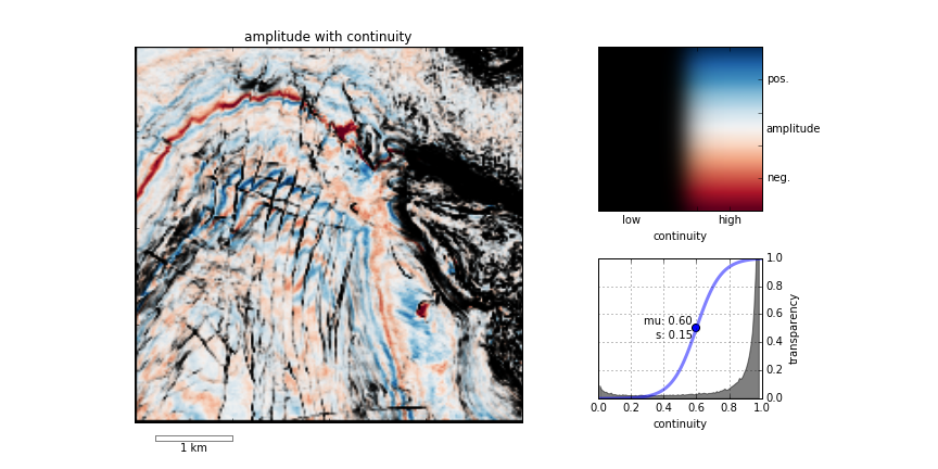
Let's illustrate this by looking at a time-slice through a portion of the F3 seismic volume. A simple way of displaying two attributes is to decrease the opacity of one, and lay it on top of the other. In the figure below, I'm setting the opacity of the continuity to 75% in the third panel. At first glance, this looks pretty good; you can see both attributes, and because they have different hues, they complement each other without competing for visual bandwidth. But the approach is flawed. The vividness of each dataset is diminished; we don't see the same range of colours as we do in the colour palette shown above.

Overlaying one map on top of the other is one way to look at multiple attributes within a scene. It's not ideal however.

Overlaying one map on top of the other is one way to look at multiple attributes within a scene. It's not ideal however.

Instead of overlaying maps, we can improve the result by modulating the lightness of the amplitude image according to the magnitude of the continuity attribute. This time the corendered result is one image, instead of two. I prefer it, because it preserves the original colours we see in the amplitude image. If anything, it seems to deepen the contrast:

The lightness value of the seismic amplitude time slice has been modulated by the continuity attribute. 

The lightness value of the seismic amplitude time slice has been modulated by the continuity attribute. 

Such a composite display needs a two-dimensional colormap for a legend. Just as a 1D colourbar, it's also a lookup table; each position in the scene corresponds to a unique pair of values in the colourmap plane.

We can go one step further. Say we want to emphasize only the largest discontinuities in the data. We can modulate the opacity with a non-linear function. In this example, I'm using a sigmoid function:

In order to achieve this effect in most conventional software, you usually have to copy the attribute, colour it black, apply an opacity curve, then position it just above the base amplitude layer. Software companies call this workaround a 'workflow'. 

Are there data visualizations you want to create, but you're stuck with software limitations? In a future post, I'll recreate some cool co-rendering effects; like bump-mapping, and hill-shading.

To view and run the code that I used in creating the images for this post, grab the iPython/Jupyter Notebook.


You can do it too!

If you're in Calgary, Houston, New Orleans, or Stavanger, listen up!

If you'd like to gear up on coding skills and explore the benefits of scientific computing, we're going to be running the 2-day version of the Geocomputing Course several times this fall in select cities. To buy tickets or for more information about our courses, check out the courses page.

None of these times or locations good for you? Consider rounding up your colleagues for an in-house training option. We'll come to your turf, we can spend more than 2 days, and customize the content to suit your team's needs. Get in touch.

Canadian codeshow

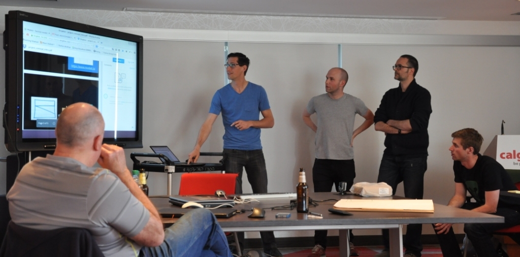
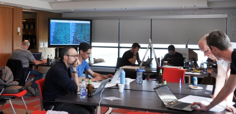
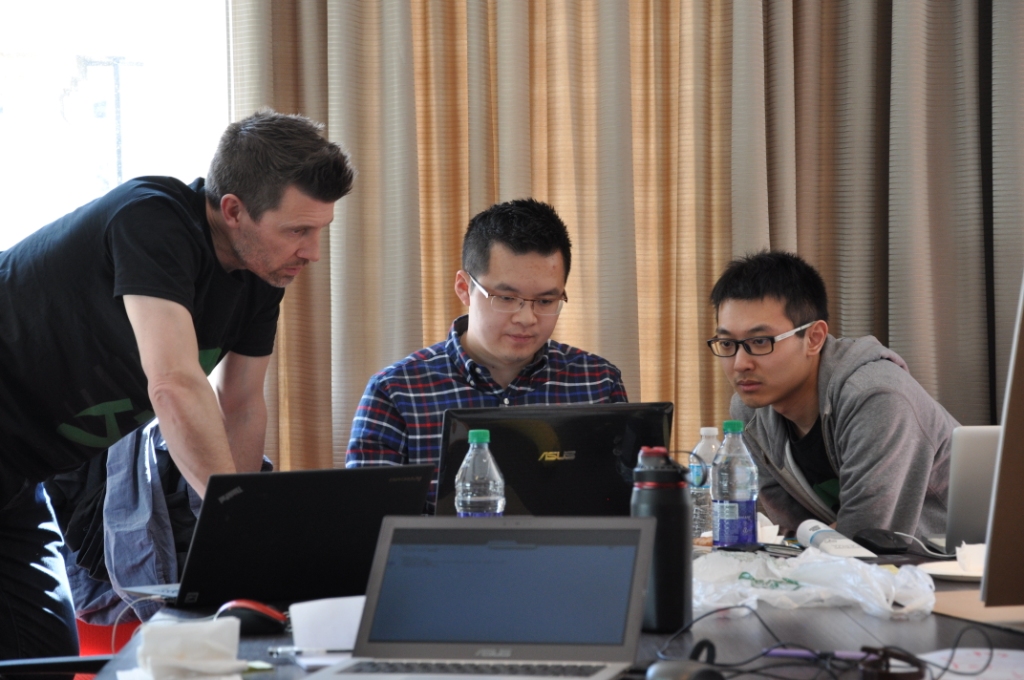
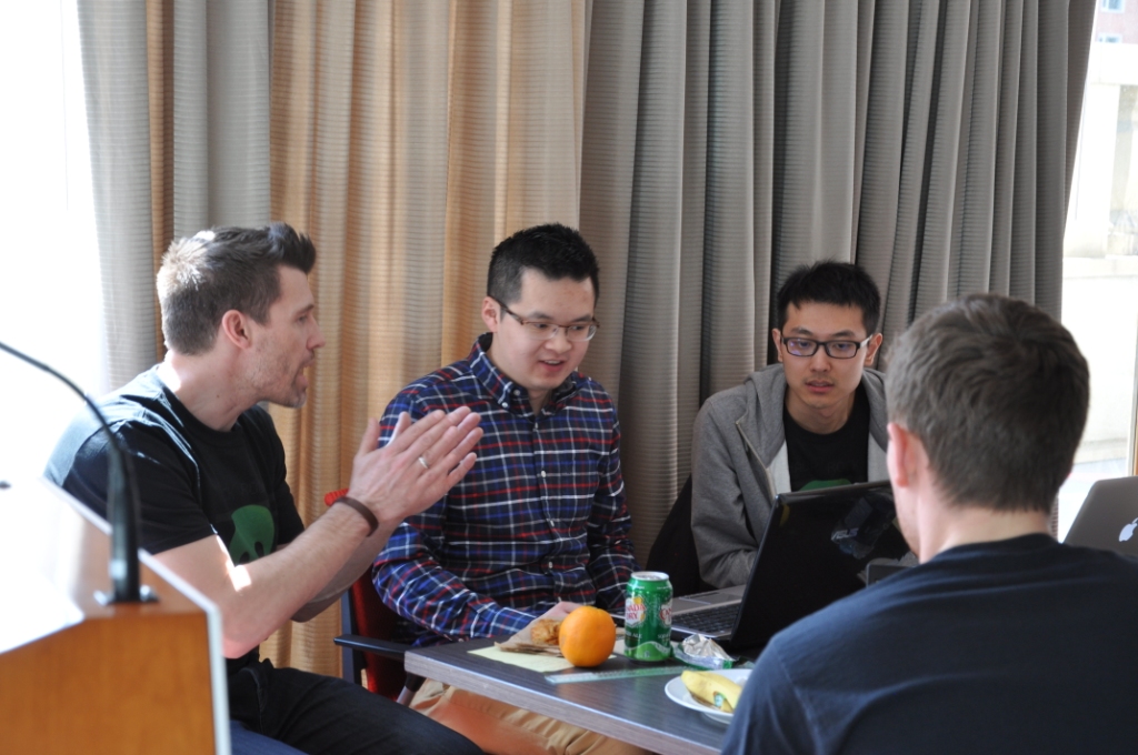
Earlier this month we brought the world-famous geoscience hackathon to Calgary, tacking on a geocomputing bootcamp for good measure. Fourteen creative geoscientists came and honed their skills, leaving 4 varied projects in their wake. So varied in fact that this event had the most diversity of all the hackathons so far. 

Thank you to Raquel Theodoro and Penny Colton for all the great photographs. You both did a great job of capturing what went on. Cheers!

Thank you as well to our generous and generally awesome sponsors. These events would not be possible without them.

Bootcamp

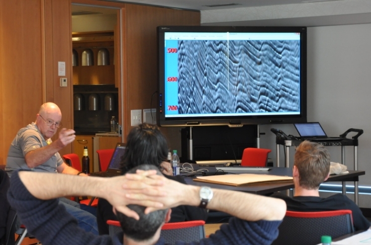
The bootcamp was a big experiment. We have taught beginner classes before, but this time we also invited beyond-novice programmers to come and learn together. Rather than making it a classroom experience, we were trying to make a friendly space where people could learn from us, from each other, or from books or the web. After some group discussion about hackathons and dream projects (captured here), we split into two groups: beginners and 'other'. The beginners got an introduction to scientific Python; the others got a web application masterclass from Ben Bougher (UBC master's student and Agile code ninja). During the day, we harvested a pretty awesome list of potential future hackathon projects. 

Hackathon

The hackathon itself yielded four very cool projects, fuelled this time not by tacos but by bánh mì and pizza (separately):

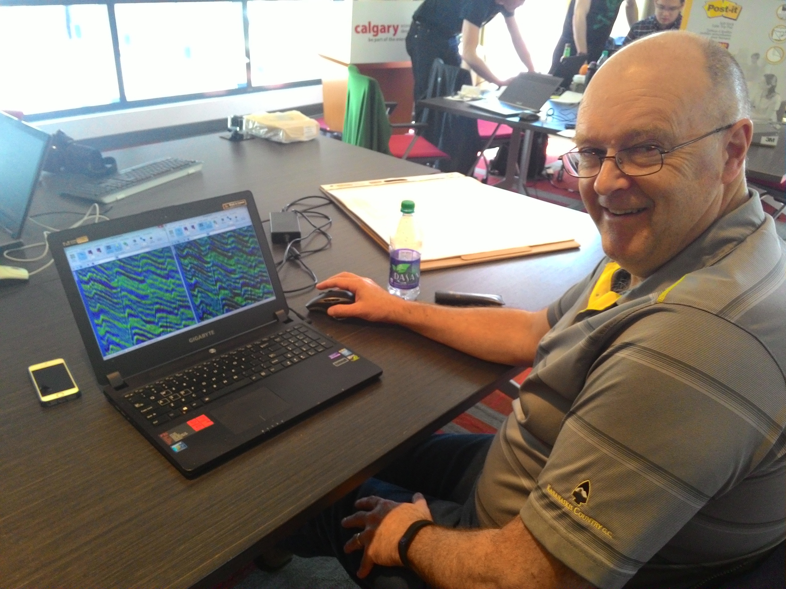
  1. Hacking data inside Seismic Terrain Explorer, by Steve Lynch of Calgary
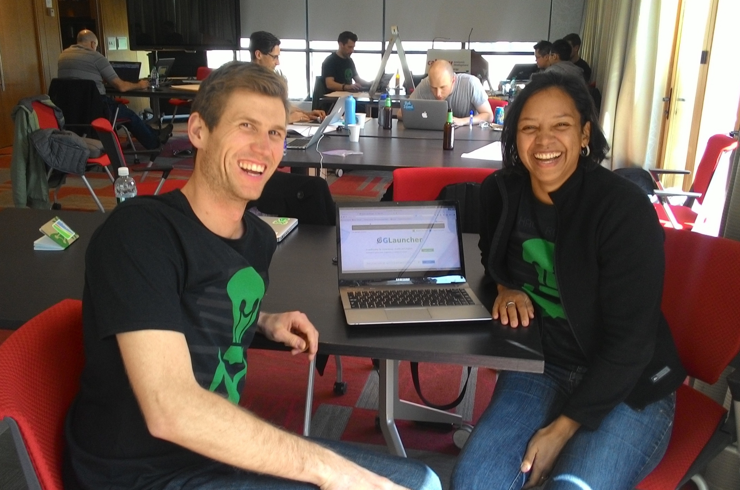
  2. Launching GLauncher, a crowdfunding tool, by Raquel Theodoro of Rio de Janeiro and Ben Bougher of UBC
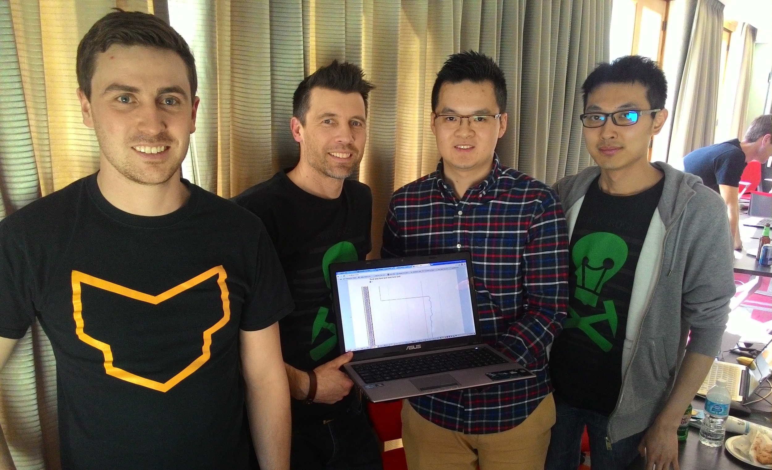
  3. Hacksaw: A quick-look for LAS files in a web app, by Gord Foo, Gerry Cao, Yongxin Liu of Calgary, plus me
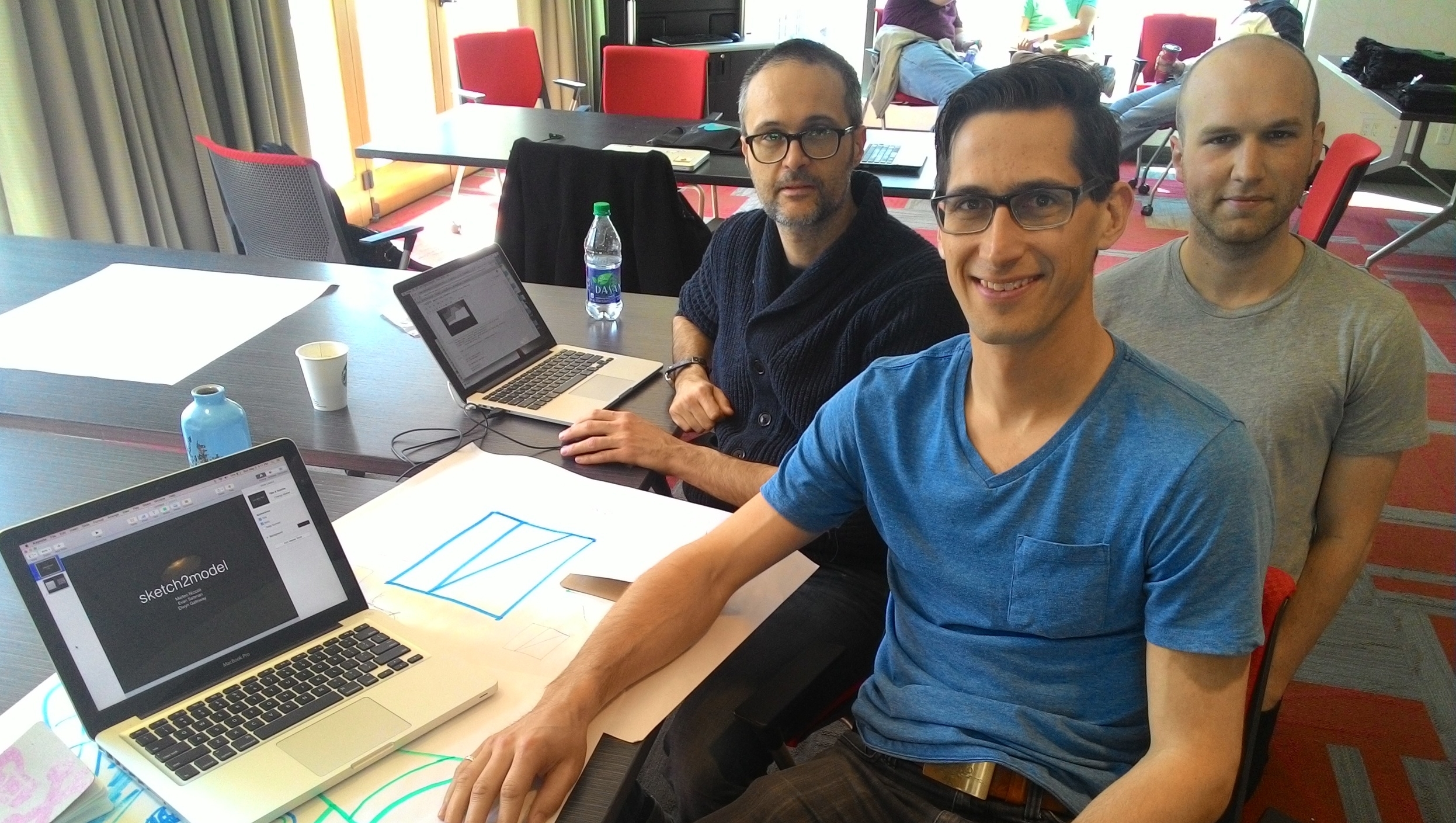
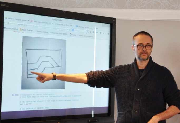
  4. Turning sketches in to models, by Evan Saltman, Elwyn Galloway, and Matteo Niccoli of Calgary, and Ben again

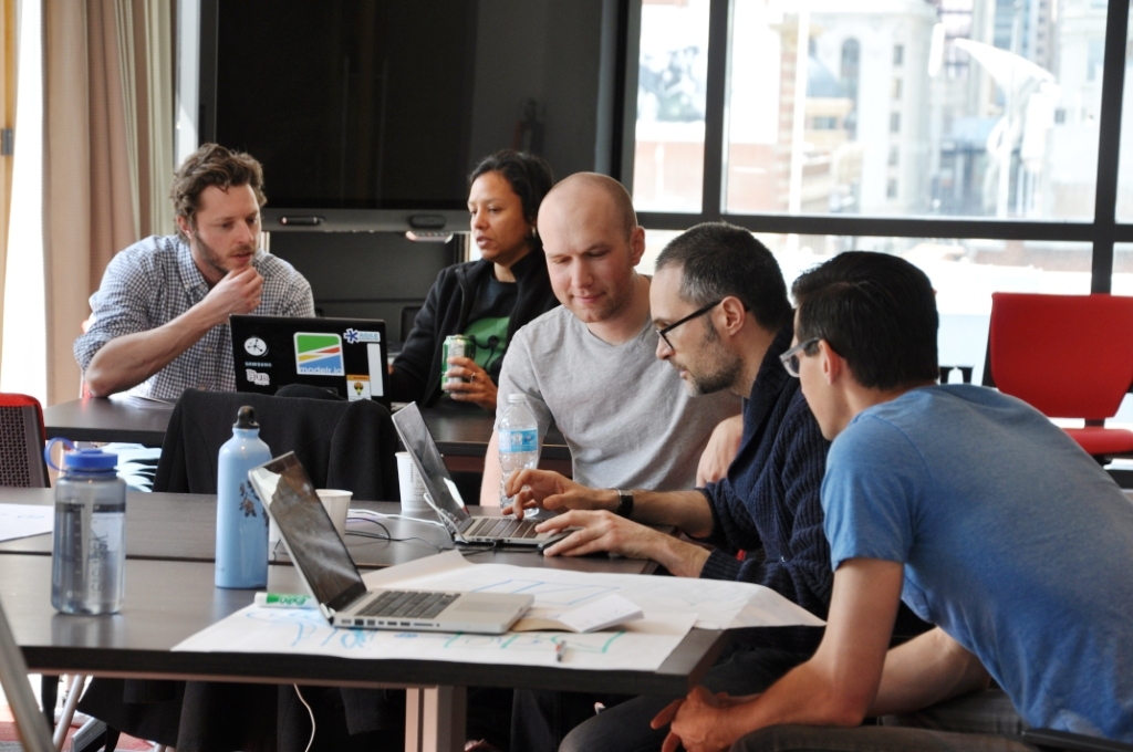
Sketch2model was remarkable for a few reasons: it was the first hackathon for most of the team, they had not worked together before, Elwyn dreamt up the idea more or less on the spot, and they seemed to nail it with a minimum of fuss. Matteo quietly got on with the image processing magic, Evan and Ben modified modelr.io to do the modeling bit, and Elwyn orchestrated the project, providing a large number of example sketches to keep the others from getting too cocky.

We'll be doing it all again in New Orleans this fall. Get it in your calendar now!

Introducing Striplog

Last week I mentioned we'd been working on a project called striplog. I told you it was "a new Python library for manipulating well data, especially irregularly sampled, interval-based, qualitative data like cuttings descriptions"... but that's all. I thought I'd tell you a bit more about it — why we built it, what it does, and how you can use it yourself.

The problem we were trying to solve

The project was conceived with the Nova Scotia Department of Energy, who had a lot of cuttings and core descriptions that they wanted to digitize, visualize, and archive. They also had some hand-drawn striplog images — similar to the one on the right — that needed to be digitized in the same way. So there were a few problems to solve:

  • Read a striplog image and a legend, turn the striplog into tops, bases, and 'descriptions', and finally save the data to an archive-friendly LAS file.
  • Parse natural language 'descriptions', converting them into structured data via an arbitrary lexicon. The lexicon determines how we interpret the words 'sandstone' or 'fine grained'.
  • Plot striplogs with minimal effort, and keep plotting parameters separate from data. It should be easy to globally change the appearance of a particular lithology.
  • Make all of this completely agnostic to the data type, so 'descriptions' might be almost anything you can think of: special core analyses, palaeontological datums, chronostratigraphic intervals...

The usual workaround, I mean solution, to this problem is to convert the descriptions into some sort of code, e.g. sandstone = 1, siltstone = 2, shale = 3, limestone = 4. Then you make a log, and plot it alongside your other curves or make your crossplots. But this is rather clunky, and if you lose the mapping, the log is useless. And we still have the other problems: reading images, parsing descriptions, plotting...

What we built

One of the project requirements was a Python library, so don't look for a pretty GUI or fancy web app. (This project took about 6 person-weeks; user interfaces take much longer to craft.) Our approach is always to try to cope with chaos, not fix it. So we tried to design something that would let the user bring whatever data they have: XLS, CSV, LAS, images.

The library has tools to, for example, read a bunch of cuttings descriptions (e.g. "Fine red sandstone with greenish shale flakes"), and convert them into Rocks — structured data with attributes like 'lithology' and 'colour', or whatever you like: 'species', 'sample number', 'seismic facies'. Then you can gather Rocks into Intervals (basically a list of one or more Rocks, with a top and base depth, height, or age). Then you can gather Intervals into a Striplog, which can, with the help of a Legend if you wish, plot itself or write itself to a CSV or LAS file.

The Striplog object has some useful features. For example, it's iterable in Python, so it's trivial to step over every unit and perform some query or analysis. Some tasks are built-in: Striplogs can summarize their own statistics, for example, and searching for 'sandstone' returns another Striplog object containing only those units matching the query.

  >>> striplog.find('sandstone')
  Striplog(4 Intervals, start=230.328820116, stop=255.435203095)

We can also do a reverse lookup, and see what's at some arbitrary depth:

  >>> striplog.depth(260).primary  # 'primary' gives the first component
  Rock("colour":"grey", "lithology":"siltstone")

You can read more in the documentation. And here's Striplog in a picture:

An attempt to represent striplog's objects, more or less arranged according to a workflow.

Where to get it

For the time being, the tool is only available as a Python library, for you to use on the command line, or in IPython Notebooks (follow along here). You can install striplog very easily:

  pip install striplog

Or you can clone the repo on GitHub. 

As a new project, it has some rough edges. In particular, the Well object is rather rough. The natural language processing could be much more sophisticated. The plotting could be cuter. If and when we unearth more use cases, we'll be hacking some more on it. In the meantime, we would welcome code or docs contributions of any kind, of course.

And if you think you have a use for it, give us a call. We'd love to help.


Postscript

I think it's awesome that the government reached out to a small, Nova Scotia-based company to do this work, keeping tax dollars in the province. But even more impressive is that they had the conviction not only to allow allow but even to encourage us to open source it. This is exactly how it should be. In contrast, I was contacted recently by a company that is building a commercial plug-in for Petrel. They had received funding from the federal government to do this. I find this... odd.

The perfect storm

Since starting Agile late in 2010, I have never not been busy. Like everyone else... there's always a lot going on. But March was unusual. Spinning plates started wobbling. One or three fell. One of those that fell was the blog. (Why is it always your favourite plate that smashes?)

But I'm back, feeling somewhat refreshed after my accidental quadrennial sabbatical and large amounts of Easter chocolate. And I thought a cathartic way to return might be to share with you what I've been up to.

Writing code for other people

We've always written code to support our consulting practice. We've written seismic facies algorithms, document transformation routines (for AAPG Wiki), seismic acquisition tools, and dozens of other things besides. But until January we'd never been contracted to build software as an end in itself.

Unfortunately for my sanity, the projects had to be finished by the end of March. The usual end-of-project crunch came along, as we tried to add features, fix bugs, remove cruft, and compile documentation without breaking anything. And we just about survived it, thanks to a lot of help from long-time Agile contributor, Ben Bougher. One of the products was striplog, a new Python library for manipulating well data, especially irregularly sampled, interval-based, qualitative data like cuttings descriptions. With some care and feeding, I think it might be really useful one day.

The HUB is moving

Alongside the fun with geoscience, we're in the midst of a fairly huge renovation. As you may know, I co-founded The HUB South Shore in my town in 2013. It's where I do my Agile work, day-to-day. It's been growing steadily and last year we ran out of space to accept new members. So we're moving down to the Main Street in Mahone Bay, right under the town's only pub. It's a great space, but it turns out that painting a 200 m² warehouse takes absolutely ages. Luckily, painting is easy for geologists, since it's basically just a lot of arm-waving. Anyway, that's where I'm spending my free time these days. [Pics.]

MAder's Wharf, by the frozen ocean.

MAder's Wharf, by the frozen ocean.

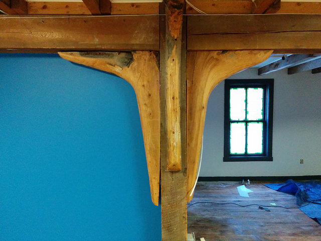
The ship's knees

The ship's knees

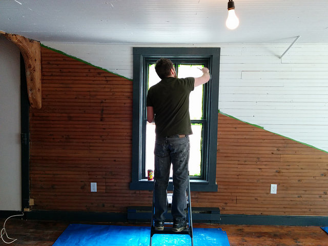
Co-founder Dave painting trim

Co-founder Dave painting trim

Shovelling snow

What my house has looked like for the last 8 weeks.

What my house has looked like for the last 8 weeks.

Seriously, it just will. Not. Stop. It's snowing now, for goodness sake. I'm pretty sure we have glaciers.

What does this have to do with work? Well, we're not talking about Calgary-style pixie dust here. We ain't nipping out with the shovel for a few minutes of peaceful exercise. We're talking about 90 minutes of the hardest workout you've ever endured, pointlessly pushing wet snow around because you ran out of places to put it three weeks ago. At the end, when you've finished and/or given up, Jack Frost tosses a silver coin to see if your reward will be a hot shower and a course of physiotherapy, or sudden cardiac arrest and a ride in the air ambulance.

Events

There is lots of good techno-geophysics to look forward to. We're running the Geoscience Hackathon in Calgary at the beginning of May. You can sign up here... If you're not sure, sign up anyway: I guarantee you'll have fun. There's a bootcamp too, if you're just starting out or want some tips for hacking geophysics. Thank you to our awesome sponsors:

There's also the geophysics mini-symposium at SciPy in Austin in July (deadline approaching!). That should be fun. And I'm hoping the hackathon right before SEG in New Orleans will be even more epic than last year's event. The theme: Games.

Evan is out there somewhere

Normally when things at Agile World Headquarters get crazy, we can adapt and cope. But it wasn't so easy this time: Evan is on leave and in the middle of an epic world tour with his wife Tara. I don't actually know where he is right now. He was in Bali a couple of weeks ago... If you see him say Hi!


As I restart the engines on All The Things, I want to thank anyone who's been waiting for an email reply, or — in the case of the 52 Things... Rock Physics authors — a book, for their patience. Sometimes it all hits at once.

Onwards and upwards!