10 ways to improve your data store

When I look at the industry's struggle with the data mess, I see a parallel with science's struggle with open data. I've written lots about that before, but the basic idea is simple: scientists need discoverable, accessible, documented, usable data. Does that sound familiar?

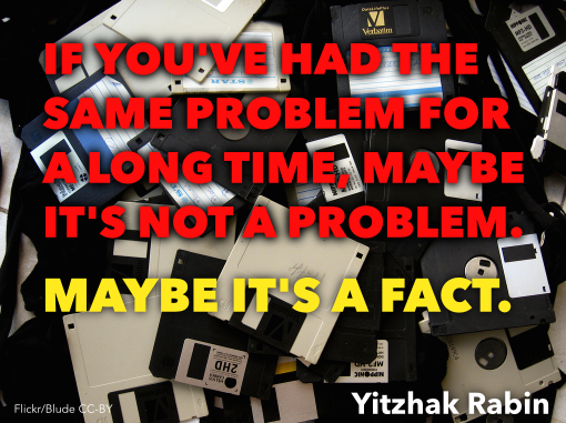
I wrote yesterday that I think we have to get away from the idea that we can manage data like we might manage a production line. Instead, we need to think about more organic, flexible strategies that cope with and even thrive on chaos. I like, or liked until yesterday, the word 'curation', because it implies ongoing care and a focus on the future. But my friend Eric Marchand was right in his comment yesterday — the dusty connotation is too strong, and dust is bad for data. I like his supermarket analogy: packaged, categorized items, each with a cost of production and a price. A more lively, slightly chaotic market might match my vision better — multiple vendors maintaining their own realms. One can get carried away with analogies, but I like this better than a library or museum.

The good news is that lots of energetic and cunning people have been working on this idea of open data markets. So there are plenty of strategies we can try, alongside the current strategy of giving giant service companies millions of dollars for their TechCloud® Integrated ProSIGHT™ Data Management Solutions.

Serve your customer:

  • Above all else, build what people need. It's amazing that this needs to be said, but ask almost anyone what they think of IT at their company and you will know that it is not how it works today. Everything you build should be in response to the business pulling. 
  • This means you have to get out of the building and talk to your customers. In person, one-one-one. Watch them use your systems. Listen to them. Respond to them. 

Knock down the data walls:

  • Learn and implement open data practices inside the organization. Focus on discoverability, accessiblity, documentation of good-enough data, not on building The One True Database. 
  • Encourage and fund open data practices among providers of public data. There is a big role here for our technical societies, I believe, but I don't think they have seen it yet.

I've said it before: hire loads of geeks:

  • The web (well, intranet) is your pipeline. Build and maintain proper machine interfaces (APIs and web APIs) for data. What, you don't know how to do this? I know; it means hiring web-savvy data-obsessed programmers.
  • Bring back the hacker technologists that I think I remember from the nineties. Maybe it's a myth memory, but sprinkled around big companies there used to be super-geeks with degrees in astrophysics, mad UNIX skills, and the Oracle admin password. Now it's all data managers with Petroleum Technology certificates who couldn't write an awk script if your data depended on it (it does). 
  • Institute proper data wrangling and analysis training for scientists. I think this is pretty urgent. Anecdotal evidence: the top data integration tools in our business is PowerPoint... or an Excel chart with two y-axes if we're talking about engineers. (What does E&P mean?)

Three more things:

  • Let data live where it wants to live (databases, spreadsheets, wikis, SharePoint if you must). Focus on connecting data with APIs and data translators. It's pointless trying to move data to where you want it to be — you're just making it worse. ("Oh, you moved my spreadsheet? Fine, I will copy my spreadsheet.")
  • Get out of the company and find out what other people are doing. Not the other industry people struggling with data — they are just as clueless as we are. Find out what the people who are doing amazing things with data are doing: Google, Twitter, Facebook, data.gov, Wikipedia, Digital Science, The New York Times, The Guardian,... there are so many to choose from. We should invite these people to our conferences; they can help us.
  • If you only do one thing, fix search in your company. Stop tinkering with semantic ontologies and smart catalogs, just buy Google Search Appliance and fix it. You can get this one done by Christmas.

Last thing. If there's one mindset that will really get in the way, it's the project mindset. If we want to go beyond coping with the data mess, far beyond it to thriving on it, then we have to get comfortable with the idea that this is not a project. The word is banned, along with 'initiative', 'governance', and Gantt charts. The requirements you write on the back of a napkin with three colleagues will be just as useful as the ones you get back from three months of focus groups.

No, this is the rest of your career. This is never done, next year there are better ideas, more flexible libraries, faster hardware, and new needs. It's like getting fit: this ain't an 8-week get-fit program, it's an eternity of crunches.

The photograph of Covent Market in London, Ontario is from Boris Kasimov on Flickr.

Data management fairy tales

On Tuesday I read this refreshing post in LinkedIn by Jeffrey Maskell of Westheimer Energy Consultants. It's a pretty damning assessment of the current state of data management in the petroleum industry:

The fact is that no major technology advances have been seen in the DM sector for some 20 years. The [data management] gap between acquisition and processing/interpretation is now a void and is impacting the industry across the board...

I agree with him. But I don't think he goes far enough on the subject of what we should do about it. Maskell is, I believe, advocating more effort (and more budget) developing what the data management crowd have been pushing for years. In a nutshell:

I agree that standards, process, procedures, workflows, data models are all important; I also agree that DM certification is a long term desirable outcome. 

These words make me sad. I'd go so far as to say that it's the pursuit of these mythical ideas that's brought about today's pitiful scene. If you need proof, just look around you. Go look at your shared drive. Go ask someone for a well file. Go and (a) find then (b) read your IT policies and workflow documents — they're all fairy tales.

Maskell acknowledges at least that these are not enough; he goes on:

However I believe the KEY to achieving a breakthrough is to prove positively that data management can make a difference and that the cost of good quality data management is but a very small price to pay...

No, the key to achieving a breakthrough is a change of plan. Another value of information study just adds to the misery.

Here's what I think: 'data management' is an impossible fiction. A fairy tale.

You can't manage data

I'm talking to you, big-company-data-management-person.

Data is a mess, and it's distributed across your organization (and your partners, and your government, and your data vendors), and it's full of inconsistencies, and people store local copies of everything because of your broken SharePoint permissions, and... data is a mess.

The terrible truth you're fighting is that subsurface data wants to be a mess. Subsurface geoscience is not accounting. It's multi-dimensional. It's interdependent. Some of it is analog. There are dozens, maybe hundreds of formats, many of which are proprietary. Every single thing is unquantifiably uncertain. There are dozens of units. Interpretation generates more data, often iteratively. Your organization won't fund anything to do with IT properly — "We're an oil company, not a technology company!" — but it's OK because VPs only last 2 years. Well, subsurface facts last for decades.

You can't manage data. Try something else.

The principle here is: cope don't fix.

People earnestly trying to manage data reminds me of Yahoo trying to catalog the Internet in 1995. Bizarrely, they're still doing it... for 3 more months anyway. But we all know there's only one way to find things on the web today: search. Search transcends the catalog. 

So what transcends data management? I've got my own ideas, but first I really, really want to know what you think. What's one thing we could do — or stop doing — to make things a bit better?

Not picking parameters

I like socks. Bright ones. I've liked bright socks since Grade 6. They were the only visible garment not governed by school uniform, or at least not enforced, and I think that was probably the start of it. The tough boys wore white socks, and I wore odd red and green socks. These days, my favourites are Cole & Parker, and the only problem is: how to choose?

Last Tuesday I wrote about choosing parameters for geophysical algorithms — window lengths, velocities, noise levels, and so on. Like choosing socks, it's subjective, and it's hard to find a pair for every occasion. The comments from Matteo, Toastar, and GuyM raised an interesting question: maybe the best way to pick parameters is to not pick them? I'm not talking about automatically optimizing parameters, because that's still choosing. I'm talking about not choosing at all.

How many ways can we think of to implement this non-choice? I can think of four approaches, but I'm not 100% sure they're all different, or if I can even describe them...

Is the result really optimal, or just a hard-to-interpret patchwork?

Adaptivity

Well, okay, we still choose, but we choose a different value everywhere depending on local conditions. A black pair for a formal function, white for tennis, green for work, and polka dots for special occasions. We can adapt to any property (rather like automatic optimization), along any dimension of our data: spatially, azimuthally,  temporally, or frequentially (there's a word you don't see every day).

Imagine computing seismic continuity. At each sample, we might evaluate some local function — such as contrast — for a range of window sizes. Or, when smoothing, we might specifiy some minimum signal loss compared to the original. We end up using a different value everywhere, and expect an optimal result.

One problem is that we still have to choose a cost function. And to be at all useful, we would need to produce two new data products, besides the actual result: a map of the parameter's value, and a map of the residual cost, so to speak. In other words, we need a way to know what was chosen, and how satisfactory the choice was.

Stochastic shotgun

We could fall back on that geostatistical favourite and pick the parameter values stochastically, grabbing socks at random out of the drawer. This works, but I need a lot of socks to have a chance of getting even a local maximum. And we run into the old problem of really not knowing what to do with all the realizations. Common approaches are to take the P50, P10, and P90, or to average them. Both of these approaches make me want to ask: Why did I generate all those realizations?

Experimental design methods

The design of experiments is a big deal in the life sciences,  but for some reason rarely (never?) talked about in geoscience. Applying a cost function, or even just visual judgment, to a single parameter is perhaps trivial, but what if you have two variables? Three? What if they are non-linear and covariant? Then the optimization process amounts to a sticky inverse problem.

Fortunately, lots of clever people have thought about these problems. I've even seen them implemented in subsurface software. Cool-sounding combinatorial reduction techniques like Greco-Latin squares, or Latin hypercubes offer ways to intelligently sample the parameter space and organize the results. We could do the same with socks, evaluating pattern and toe colour separately...

The mixing board

There is another option: the mixing board. Like a music producer, a film editor, or the Lytro camera, I can leave the raw data in place, and always work from the masters. Given the right tools, I can make myself just the right pair of socks whenever I like.

This way we can navigate the parameter space, applying views, processes, or other tools on the fly. Clearly this would mean changing everything about the way we work. We'd need a totally different approach not just to interpretation, but to the entire subsurface characterization workflow.

Are there other ways to avoid choosing? What are people using in other industries, or other sciences? I think we need to invite some experimental design and machine learning people to SEG...

Cole & Parker socks are awesomeThe quilt image is by missvancamp on Flickr and licensed CC-BY. The spools are by surfzone on Flickr, licensed CC-BY. Many thanks to Cole & Parker for permission to use the sock images, despite not knowing what on earth I was going to do with them. Buy their socks! They're Canadian and everything.

Picking parameters

One of the reasons I got interested in programming was to get smarter about broken workflows like this one from a generic seismic interpretation tool (I'm thinking of Poststack-PAL, but does that even exist any more?)...

  1. I want to make a coherence volume, which requires me to choose a window length.
  2. I use the default on a single line and see how it looks, then try some other values at random.
  3. I can't remember what I did so I get systematic: I try 8 ms, 16 ms, 32 ms, and 64 ms, saving each one as a result with _XXms appended so I can remember what I did
  4. I display them side by side but the windows are annoying to line up and resize, so instead I do it once, display them one at a time, grab screenshots, and import the images into PowerPoint because let's face it I'll need that slide eventually anyway
  5. I can't decide between 16 ms and 32 ms so I try 20 ms, 24 ms, and 28 ms as well, and do it all again, and gaaah I HATE THIS STUPID SOFTWARE

There has to be a better way.

Stumbling towards optimization

Regular readers will know that this is the time to break out the IPython Notebook. Fear not: I will focus on the outcomes here — for the real meat, go to the Notebook. Or click on these images to see larger versions, and code.

Let's run through using the Canny edge detector in scikit-image, a brilliant image processing Python library. The algo uses the derivative of a Gaussian to compute gradient, and I have to choose 3 parameters. First, we'll try to optimize 'sigma', the width of the Gaussian. Let's try the default value of 1:

Clearly, there is too much noise in the result. Let's try the interval method that drove me crazy in desktop software:

Well, I think something between 8 and 16 might work. I could compute the average intensity of each image, choose a value in between them, and then use the sigma that gives that result. OK, it's a horrible hack, but turns out to be 10:

But the whole point of scientific computing is the efficient application of informed human judgment. So let's try adding some interactivity — then we can explore the 3D parameter space in a near-parallel instead of purely serial way:

I finally feel like we're getting somewhere... But it still feels a bit arbitrary. I still don't know I'm getting the optimal result.

What can I try next? I could try to extend the 'goal seek' option, and come up with a more sophisticated cost function. If I could define something well enough — for edge detection, like coherence, I might be interested in contrast — then I could potentially just find the best answers, in much the same way that a digital camera autofocuses (indeed, many of them look for the highest contrast image). But goal seeking, if the cost function is too literal, in a way begs the question. I mean, you sort of have to know the answer — or something about the answer — before you find it.

Social machines

Social machines are the hot new thing in computing (Big Data is so 2013). Perhaps instead I can turn to other humans, in my social and professional networks. I could...

  • Ask my colleagues — perhaps my company has a knowledge sharing network I can go to.
  • Ask t'Internet — I could ask Twitter, or my friends on Facebook, or a seismic interpretation group in LinkedIn. Better yet, Earth Science Stack Exchange!
  • What if the software I was using just told me what other people had used for these parameters? Maybe this is only one step up from the programmer's default... especially if most people just use the programmer's default.
  • But what if people could rate the outcome of the algorithm? What if their colleagues or managers could rate the outcome? Then I could weight the results with these ratings.
  • What if there was a game that involved optimizing images (OK, maybe a bit of a stretch... maybe more like a Mechanical Turk). Then we might have a vast crowd of people all interested in really pushing the edge of what is intuitively reasonable, and maybe exploring the part of the parameter space I'm most interested in.

What if I could combine the best of all these approaches? Interactive exploration, with guided optimization, constrained by some cost function or other expectation. That could be interesting, but unfortunately I have absolutely no idea how that would work. I do think the optimization workflow of the future will contain all of these elements.

What do you think? Do you have an awesome way to optimize the parameters of seismic attributes? Do you have a vision for how it could be better? It occurs to me this could be a great topic for a future hackathon...

ipynb_icon.png
Click here for an IPython Notebook version of this blog post. If you don't have it, IPython is easy to install. The easiest way is to install all of scientific Python, or use Canopy or Anaconda.

Well tie calculus

As Matt wrote in March, he is editing a regular Tutorial column in SEG's The Leading Edge. I contributed the June edition, entitled Well-tie calculus. This is a brief synopsis only; if you have any questions about the workflow, or how to get started in Python, get in touch or come to my course.


Synthetic seismograms can be created by doing basic calculus on traveltime functions. Integrating slowness (the reciprocal of velocity) yields a time-depth relationship. Differentiating acoustic impedance (velocity times density) yields a reflectivity function along the borehole. In effect, the integral tells us where a rock interface is positioned in the time domain, whereas the derivative tells us how the seismic wavelet will be scaled.

This tutorial starts from nothing more than sonic and density well logs, and some seismic trace data (from the #opendata Penobscot dataset in dGB's awesome Open Seismic Repository). It steps through a simple well-tie workflow, showing every step in an IPython Notebook:

  1. Loading data with the brilliant LASReader
  2. Dealing with incomplete, noisy logs
  3. Computing the time-to-depth relationship
  4. Computing acoustic impedance and reflection coefficients
  5. Converting the logs to 2-way travel time
  6. Creating a Ricker wavelet
  7. Convolving the reflection coefficients with the wavelet to get a synthetic
  8. Making an awesome plot, like so...

Final thoughts

If you find yourself stretching or squeezing a time-depth relationship to make synthetic events align better with seismic events, take the time to compute the implied corrections to the well logs. Differentiate the new time-depth curve. How much have the interval velocities changed? Are the rock properties still reasonable? Synthetic seismograms should adhere to the simple laws of calculus — and not imply unphysical versions of the earth.


Matt is looking for tutorial ideas and offers to write them. Here are the author instructions. If you have an idea for something, please drop him a line.

Saving time with code

A year or so ago I wrote that...

...every team should have a coder. Not to build software, not exactly. But to help build quick, thin solutions to everyday problems — in a smart way. Developers are special people. They are good at solving problems in flexible, reusable, scalable ways.

Since writing that, I've written more code than ever. I'm not ready to say that my starry-eyed vision of a perfect world of techs-cum-coders, but now I see that the path to nimble teams is probably paved with long cycle times, and never-ending iterations of fixing bugs and writing documentation.

So potentially we replace the time saved, three times over, with a tool that now needs documenting, maintaining, and enhancing. This may not be a problem if it scales to lots of users with the same problem, but of course having lots of users just adds to the maintaining. And if you want to get paid, you can add 'selling' and 'marketing' to the list. Pfff, it's a wonder anybody ever makes anthing!

At least xkcd has some advice on how long we should spend on this sort of thing...

All of the comics in this post were drawn by and are copyright of the nonpareil of geek cartoonery, Randall Munroe, aka xkcd. You should subscribe to his comics and his What If series. All his work is licensed under the terms of Creative Commons Attribution Noncommercial.

How much rock was erupted from Mt St Helens?

One of the reasons we struggle when learning a new skill is not necessarily because this thing is inherently hard, or that we are dim. We just don't yet have enough context for all the connecting ideas to, well, connect. With this in mind I wrote this introductory demo for my Creative Geocomputing class, and tried it out in the garage attached to START Houston, when we ran the course there a few weeks ago.

I walked through the process of transforming USGS text files to data graphics. The motivation was to try to answer the question: How much rock was erupted from Mount St Helens?

This gorgeous data set can be reworked to serve a lot of programming and data manipulation practice, and just have fun solving problems. My goal was to maintain a coherent stream of instructions, especially for folks who have never written a line of code before. The challenge, I found, is anticipating when words, phrases, and syntax are being heard like a foriegn language (as indeed they are), and to cope by augmenting with spoken narrative.

Text file to 3D plot

To start, we'll import a code library called NumPy that's great for crunching numbers, and we'll abbreviate it with the nickname np:

>>> import numpy as np

Then we can use one of its functions to load the text file into an array we'll call data:

>>> data = np.loadtxt('z_after.txt')

The variable data is a 2-dimensional array (matrix) of numbers. It has an attribute that we can call upon, called shape, that holds the number of elements it has in each dimension,

>>> data.shape
(1370, 949)

If we want to make a plot of this data, we might want to take a look at the range of the elements in the array, we can call the peak-to-peak method on data,

>>> data.ptp()
41134.0

Whoa, something's not right, there's not a surface on earth that has a min to max elevation that large. Let's dig a little deeper. The highest point on the surface is,

>>> np.amax(data)
8367.0

Which looks to the adequately trained eye like a reasonable elevation value with units of feet. Let's look at the minimum value of the array,

>>> np.amin(data)
-32767.0 

OK, here's the problem. GIS people might recognize this as a null value for elevation data, but since we aren't assuming any knowledge of GIS formats and data standards, we can simply replace the values in the array with not-a-number (NaN), so they won't contaminate our plot.

>>> data[data==-32767.0] = np.nan

To view this surface in 3D we can import the mlab module from Mayavi

>>> from mayavi import mlab

Finally we call the surface function from mlab, and pass the input data, and a colormap keyword to activate a geographically inspired colormap, and a vertical scale coefficient.

>>> mlab.surf(data,
              colormap='gist_earth',
              warp_scale=0.05)

After applying the same procedure to the pre-eruption digits, we're ready to do some calculations and visualize the result to reveal the output and its fascinating characteristics. Read more in the IPython Notebook.

If this 10 minute introduction is compelling and you'd like to learn how to wrangle data like this, sign up for the two-day version of this course next week in Calgary. 

Eventbrite - Agile Geocomputing

How to load SEG-Y data

Yesterday I looked at the anatomy of SEG-Y files. But it's pathology we're really interested in. Three times in the last year, I've heard from frustrated people. In each case, the frustration stemmed from the same problem. The epic email trails led directly to these posts. Next time I can just send a URL!

In a nutshell, the specific problem these people experienced was missing or bad trace location data. Because I've run into this so many times before, I never trust location data in a SEG-Y file. You just don't know where it's been, or what has happened to it along the way — what's the datum? What are the units? And so on. So all you really want to get from the SEG-Y are the trace numbers, which you can then match to a trustworthy source for the geometry.

Easy as 1-2-3, er, 4

This is my standard approach to loading data. Your mileage will vary, depending on your software and your data. 

  1. Find the survey geometry information. For 2D data the geometry is usually in a separate navigation ('nav') file. For 3D you are just looking for cornerpoints, and something indicating how the lines and crosslines are numbered (they might not start at 1, and might not be oriented how you expect). This information may be in the processing report or, less reliably, in the EBCDIC text header of the SEG-Y file.
  2. Now define the survey geometry. You need a location for every trace for a 2D, and the survey's cornerpoints for a 3D. The geometry is a description of where the line goes on the earth, in surface coordinates, and where the starting trace is, how many traces there are, and what the trace spacing is. In other words, the geometry tells you where the traces go. It's variously called 'navigation', 'survey', or some other synonym.
  3. Finally, load the traces into their homes, one vintage (survey and processing cohort) at a time for 2D. The cross-reference between the geometry and the SEG-Y file is the trace or CDP number for a 2D, and the line and crossline numbers for a 3D.
  4. Check everything twice. Does the map look right? Is the survey the right shape and size? Is the line spacing right? Do timeslices look OK?

Where to get the geometry data?

So, where to find cornerpoints, line spacings, and so on? Sadly, the header cannot be trusted, even in newly-processed data. If you have it, the processing report is a better bet. It often helps to talk to someone involved in the acquisition and processing too. If you can corroborate with data from the acqusition planning (line spacings, station intervals, and so on), so much the better — but remember that some acquisition parameters may have changed during the job.

Of vital importance is some independent corroboration— a map, ideally —of the geometry and the shape and orientation of the survey. I can't count the number of back-to-front surveys I've seen. I even saw one upside-down (in the z dimension) once, but that's another story.

Next time, I'll break down the loading process a bit more, with some step-by-step for loading the data somewhere you can see it.

What is SEG-Y?

The confusion starts with the name, but whether you write SEGY, SEG Y, or SEG-Y, it's probably definitely pronounced 'segg why'. So what is this strange substance?

SEG-Y means seismic data. For many of us, it's the only type of seismic file we have much to do with — we might handle others, but for the most part they are closed, proprietary formats that 'just work' in the application they belong to (Landmark's brick files, say, or OpendTect's CBVS files). Processors care about other kinds of data — the SEG has defined formats for field data (SEG-D) and positional data (SEG-P), for example. But SEG-Y is the seismic file for everyone. Kind of.

The open SEG-Y "standard" (those air quotes are an important feature of the standard) was defined by SEG in 1975. The first revision, Rev 1, was published in 2002. The second revision, Rev 2, was announced by the SEG Technical Standards Committee at the SEG Annual Meeting in 2013 and I imagine we'll start to see people using it in 2014. 

What's in a SEG-Y file?

SEG-Y files have lots of parts:

The important bits are the EBCDIC header (green) and the traces (light and dark blue).

The EBCDIC text header is a rich source of accurate information that provides everything you need to load your data without problems. Yay standards!

Oh, wait. The EBCDIC header doesn't say what the coordinate system is. Oh, and the datum is different from the processing report. And the dates look wrong, and the trace length is definitely wrong, and... aargh, standards!

The other important bit — the point of the whole file really — is the traces themselves. They also have two parts: a header (light blue, above) and the actual data (darker blue). The data are stored on the file in (usually) 4-byte 'words'. Each word has its own address, or 'byte location' (a number), and a meaning. The headers map the meaning to the location, e.g. the crossline number is stored in byte 21. Usually. Well, sometimes. OK, it was one time.

According to the standard, here's where the important stuff is supposed to be:

I won't go into the unpleasantness of poking around in SEG-Y files right now — I'll save that for next time. Suffice to say that it's often messy, and if you have access to a data-loading guru, treat them exceptionally well. When they look sad — and they will look sad — give them hugs and hot tea. 

What's so great about Rev 2?

The big news in the seismic standards world is Revision 2. According to this useful presentation by Jill Lewis (Troika International) at the Standards Leadership Council last month, here are the main features:

  • Allow 240 byte trace header extensions.
  • Support up to 231 (that's 2.1 billion!) samples per trace and traces per ensemble.
  • Permit arbitrarily large and small sample intervals.
  • Support 3-byte and 8-byte sample formats.
  • Support microsecond date and time stamps.
  • Provide for additional precision in coordinates, depths, elevations.
  • Synchronize coordinate reference system specification with SEG-D Rev 3.
  • Backward compatible with Rev 1, as long as undefined fields were filled with binary zeros.

Two billion samples at µs intervals is over 30 minutes Clearly, the standard is aimed at <ahem> Big Data, and accommodating the massive amounts of data coming from techniques like variable timing acquisition, permanent 4D monitoring arrays, and microseismic. 

Next time, we'll look at loading one of these things. Not for the squeamish.

The most important thing nobody does

A couple of weeks ago, we told you we were up to something. Today, we're excited to announce modelr.io — a new seismic forward modeling tool for interpreters and the seismically inclined.

Modelr is a web app, so it runs in the browser, on any device. You don't need permission to try it, and there's never anything to install. No licenses, no dongles, no not being able to run it at home, or on the train.

Later this week, we'll look at some of the things Modelr can do. In the meantime, please have a play with it.
Just go to modelr.io and hit Demo, or click on the screenshot below. If you like what you see, then think about signing up — the more support we get, the faster we can make it into the awesome tool we believe it can be. And tell your friends!

If you're intrigued but unconvinced, sign up for occasional news about Modelr:

This will add you to the email list for the modeling tool. We never share user details with anyone. You can unsubscribe any time.