Great geophysicists #4: Fermat
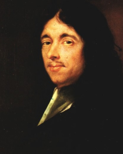
This Friday is Pierre de Fermat's 411th birthday. The great mathematician was born on 17 August 1601 in Beaumont-de-Lomagne, France, and died on 12 January 1665 in Castres, at the age of 63. While not a geophysicist sensu stricto, Fermat made a vast number of important discoveries that we use every day, including the principle of least time, and the foundations of probability theory. 

Fermat built on Heron of Alexandria's idea that light takes the shortest path, proposing instead that light takes the path of least time. These ideas might seem equivalent, but think about anisotropic and inhomogenous media. Fermat continued by deriving Snell's law. Let's see how that works.

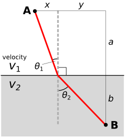
We start by computing the time taken along a path:

Then we differentiate with respect to space. This effectively gives us the slope of the graph of time vs distance.

We want to minimize the time taken, which happens at the minimum on the time vs distance graph. At the minimum, the derivative is zero. The result is instantly recognizable as Snell's law:

Maupertuis's generalization

The principle is a core component of the principle of least action in classical mechanics, first proposed by Pierre Louis Maupertuis (1698–1759), another Frenchman. Indeed, it was Fermat's handling of Snell's law that Maupertuis objected to: he didn't like Fermat giving preference to least time over least distance.

Maupertuis's generalization of Fermat's principle was an important step. By the application of the calculus of variations, one can derive the equations of motion for any system. These are the equations at the heart of Newton's laws and Hooke's law, which underlie all of the physics of the seismic experiment. So, you know, quite useful.

Probably very clever

It's so hard to appreciate fundamental discoveries in hindsight. Together with Blaise Pascal, he solved basic problems in practical gambling that seem quite straightforward today. For example, Antoine Gombaud, the Chevalier de Méré, asked Pascal: why is it a good idea to bet on getting a 1 in four dice rolls, but not on a double-1 in twenty-four? But at the time, when no-one had thought about analysing problems in terms of permutations and combinations before, the solutions were revolutionary. And profitable.

For setting Snell's law on a firm theoretical footing, and introducing probability into the world, we say Pierre de Fermat (pictured here) is indeed a father of geophysics.

How to choose an image format

Choosing a file format for scientific images can be tricky. It seems simple enough on the outside, but the details turn out to be full of nuance and gotchas. Plenty of papers and presentations are spoiled by low quality images. Don't let yours be one! Get to know your image editor (I recommend GIMP), and your formats.

What determines quality?

The factors determining the quality of an image are:

  • The number of pixels in the image (aim for 1 million)
  • The size of the image (large images need more pixels)
  • If the image is compressed, e.g. a JPG, the fidelity of the compression (use 90% or more)
  • If the image is indexed, e.g. a GIF, the number of colours available (the bit-depth)

Beware: what really matters is the lowest-quality version of the image file over its entire history. In other words, it doesn't matter if you have a 1200 × 800 TIF today, if this same file was previously saved as a 600 × 400 GIF with 16 colours. You will never get the lost pixels or bit-depth back, though you can try to mitigate the quality loss with filters and careful editing. This seems obvious, but I have seen it catch people out.

JPG is only for photographs

Click on the image to see some artifacts.The problem with JPG is that the lossy compression can bite you, even if you're careful. What is lossy compression? The JPEG algorithm makes files much smaller by throwing some of the data away. It 'decides' which data to discard based on the smoothness of the image in the wavenumber domain, in which the algorithm looks for a property called sparseness. Once discarded, the data cannot be recovered. In discontinuous data — images with lots of variance or hard edges — you might see artifacts (e.g. see How to cheat at spot the difference). Bottom line: only use JPG for photographs with lots of pixels.

Formats in a nutshell

Rather than list advantages and disadvantages exhaustively, I've tried to summarize everything you need to know in the table below. There are lots of other formats, but you can do almost anything with the ones I've listed... except BMP, which you should just avoid completely. A couple of footnotes: PGM is strictly for geeks only; GIF is alone in supporting animation (animations are easy to make in GIMP). 

All this advice could have been much shorter: use PNG for everything. Unless file size is your main concern, or you need special features like animation or georeferencing, you really can't go wrong.

There's a version of this post on SubSurfWiki. Feel free to edit it!

Turning students into maniacs

In Matt's previous post, he urged people to subscribe to Jimmy Wales' vision of expanding collective intelligence. And it got me thinking about why the numbers aren't as high as they could be (should be), and why they might be dropping. Here are a few excuses that I have plucked from the university-student mindset and I submit them as a micro-model of this problem. And let's face it, we are all students, in a loose sense of the word.

STUDENT EXCUSES

  • I don't know where to start: Students, those most adequately positioned to give back to the knowledge base of which they are at the forefront, don't know where to start. Looking out towards the vast sea of what already exists, it is hard to imagine what is missing. Walking up to a blank page, pen in hand, is way harder than being handed an outline, a rough sketch that needs some filling in and filling out. 
  • I didn't sign up to be a volunteer: Being a student has always been, and always will be, a selfish endeavour. To do anything outside what is expected is essentially volunteering. Most students, don't see it as their job, their problem, or haven't yet learned the benefits and advantages it brings.
  • Someone else is better than me: Sounds timid and insecure, which I suppose may require some creative coaxing. Surely, there is probably somebody else out there more suited to draw seismic polarity cartoons than I, but volunteers don't wait for someone else to volunteer, if that were the case, there would be no volunteering at all. 
  • Institutions stomped out my collabortive spirit: It might not be spoken this way, but the student has a number of forces acting against the survival of their natural collaborative and creative tendencies. You'd think they would be the first to "get it", but the student mindset (bright, ambitious, curious, tech-savvy, etc) has been ratcheted into one of discipline and conformance to the academic status quo. One filled with traditional notions of text books, unaffordable publication subscriptions, bureacratic funding and research processes.
  • Peer review is better than the commons: Students are not allowed to use Wikipedia in their research. Instead, it is reinforced that a handful of expert editors set the standards of academic diligence, which is supposedly superior to thousands of editors in the fray of the wiki. I say we place too much confidence in too few peer reviewers. Sure wikis have trust issues, but that may be deservedly detrimental to those who are too credulous. Has anyone been massively led astray by incorrect or sabotaged Wikipedia content? I doubt it.

Making maniacs

Of these excuses, all of them but the first have to do with the culture of traditional learning. But for the first, for people who want to get involved but really don't know how, maybe all they need is to be handed a few stubs. Give me a stub! Imagine a questionaire or widget that takes a user profile, and quasi-intelligently suggests sparse pages in need of work. This stub needs chippers, and you fit the profile. Like a dating site that matches you not with another person, but with gaps in the content web.

It occurs to me that the notion of studentship will transform—for those who want it. For some it will be a choice, and a privilege, to act less like a student, and more like a maniac.

Fabric facies

I set out to detect patterns in images, with the conviction that they are diagnostic of more telling physical properties of the media. Tea towel textures can indicate absorbency, durability, state of wear and tear, etc. Seismic textures can indicate things like depositional environment, degree of deformation, lithologic content, and so on:

Facies: A rock or stratified body distinguished from others by its appearance or composition.

Facies are clusters distinguishable in all visual media. Geophysicists shouldn't be afraid of using the word normally reserved by geologists—seismic facies. In the seismic case, instead of lithology, grain size, bedding patterns, and so on, we are using attributes such as amplitude, energy, coherency, and Haralick textures for classification.

The brain is good at pattern recognition and picking out subtleties. I can assign facies to the input data (A), based on on hues (B), or patterns (C). I can also count objects (D), interpret boundaries (E), and identify poorly resolved regions of an image (F) caused by shadows or noise. I can even painstakingly draw the pockmarks or divets in the right hand teatowel (G). All of these elements can be simultaneously held in the mind of the viewer and comprise what we naturally perceive as the properties of visual media. Isolating, extracting, and illustrating these visual features by hand remains tedious.

I am not interested in robot vision so computers can replace geophysical interpreters, but I am interested in how image classification can be used to facilitate, enrich, and expedite the interpretive process. You can probably already think of attributes we can use to coincide with this human interpretation from the examples I gave in a previous post.

Identifying absorbency

Let's set an arbitrary goal of classifying the ability to soak up water, or absorbency. Surely a property of interest to anyone studying porous media. Because absorbency is a media-property, not an optical property (like colour) or a boundary property (like edges), it makes sense to use texture classification. From the input image, I can count 5 different materials, each with a distinct pattern. The least tractable might be the rightmost fabric which has alternating waffle-dimple segments, troublesome shadows and contours, and patterns at two different scales. The test of success is seeing how this texture classification compares to the standard approach of visual inspection and manual picking. 

I landed on using 7 classes for this problem. Two for the white tea-towels, two for the green tea-towel, one for the blue, and one that seems to be detecting shadows (shown in dark grey). Interestingly, the counter top on the far left falls into the same texture class as the green tea-towel. Evidence that texture alone isn't a foolproof proxy for absorbency. To improve the classification, I would need to allow more classes (likely 8 or 9). 

It seems to me that the manual picks match the classification quite well. The picks lack detail, as with any interpretation, but they also lack noise. On the contrary, there are some locations where the classification has failed. It stuggles in low-light and over-exposed regions. 

If you are asking, "is one approach better than the other?", you are asking the wrong question. These are not mutually exclusive approaches. The ideal scenario is one which uses these methods in concert for detecting geologic features in the fabric of seismic data. 

Fabric clusters

There are many reasons we might want to use cluster analysis in our work. Geologists might want to sort hundreds of rock samples into a handful of rock types, a petrophysicist might want to group data points from well logs (as shown here), or a curious kitchen dweller may want to digitally classify patterns found in his (or her) linen collection.

Two algorithms worth knowing about when faced with any clustering problem are called k-means and fuzzy c-means clustering. They aren't the right solution for all clustering problems, but they are a good place to start.

k-means clustering — each data point gets assigned to one of k centroids (or centres) according to the centroid it is closest to. In the image shown here, the number of clusters is 2. The pink dots are closest to the left centroid, and the black dots are closest to the right centroid. To see how the classification is done, watch this short step-by-step video. The main disadvantage with this method is that if the clusters are poorly defined, the result seems rather arbitrary.

Fuzzy c-means clustering — each data point belongs to all clusters, but only to a certain degree. Each data point is assigned a probability of belonging to each cluster, and is thus easily assigned the class for which it has a highest probability. If a data point is midway between two clusters, it is still assigned to its closest cluster, but with lower probability. As the bottom image shows, data points on the periphery of cluster groups, such as those shown in grey may be equally likely to belong to both clusters. Fuzzy c-means clustering provides a way of capturing quantitative uncertainty, and even visualizing it.

Some observations fall naturally into clusters. It is just a matter of the observer choosing an adequate combination of attributes to characterize them. In the fabric and seismic examples shown in the previous post, only two of the four Haralick textures are needed to show a diagnostic arrangement of the data for clustering. Does the distribution of these thumbnail sections in the attribute space align with your powers of visual inspection? 

Fabric textures

Beyond the traditional, well-studied attributes that I referred to last time, are a large family of metrics from image processing and robot vision. The idea is to imitate the simple pattern recognition rules our brains intuitively and continuously apply when we look at seismic data: how do the data look? How smooth or irregular are the reflections? If you thought the adjectives I used for my tea towels were ambiguous, I assure you seismic will be much more cryptic.

In three-dimensional data, texture is harder to see, difficult to draw, and impossible to put on a map. So when language fails us, discard words altogether and use numbers instead. While some attributes describe the data at a particular place (as we might describe a photographic pixel as 'red', 'bright', 'saturated'), other attributes describe the character of the data in a small region or kernel ('speckled', 'stripy', 'blurry').

Texture by numbers

I converted the colour image from the previous post to a greyscale image with 256 levels (a bit-depth of 8) to match this notion of scalar seismic data samples in space. The geek speak is that I am computing local grey-level co-occurence matrices (or GLCMs) in a moving window around the image, and then evaluating some statistics of the local GLCM for each point in the image. These statistics are commonly called Haralick textures. Choosing the best kernel size will depend on the scale of the patterns. The Haralick textures are not particularly illustrative when viewed on their own but they can be used for data clustering and classification, which will be the topic of my next post.

  • Step 1: Reduce the image to 256 grey-levels
  • Step 2: For every pixel, compute a co-occurrence matrix from a p by q kernel (p, q = 15 for my tea towel photo)
  • Step 3: For every pixel, compute the Haralick textures (Contrast, Correlation, Energy, Homogeneity) from the GLCM

Textures in seismic data

Here are a few tiles of seismic textures that I have loosely labeled as "high-amplitude continous", "high-amplitude discontinuous", "low-amplitude continuous", etc. You certainly might choose different words to describe them, but each has a unique and objective set of Haralick textures. I have explicitly represented the value of each's texture as a color; using cyan for contrast, magenta for correlation, yellow for energy, and black for homogeneity. Thus, the four Haralick textures span the CMYK color space. Merging these components back together into a single color gives you a sense of the degree of difference across the tiles. For instance, the high-amplitude continuous tile, is characterized by high contrast and high energy, but low correlation, relative to the low-amplitude continuous tile. Their textures are similar, so obviously, they map to similar color values in CMYK color space. Whether or not they are truly discernable is the challenge we offer to data clustering; be it employed by visual inspection or computational force.

Further reading:
Gao, D., 2003, Volume texture extraction for 3D seismic visualization and interpretation, Geophysics, 64, No. 4, 1294-1302
Haralick, R., Shanmugam, K., and Dinstein, I., 1973, Textural features for image classification: IEEE Tran. Systems, Man, and Cybernetics, SMC-3, 610-621.
Mryka Hall-Beyer has a great tutorial at http://www.fp.ucalgary.ca/mhallbey/tutorial.htm for learning more about GLCMs.
Images in this post were made using MATLAB, FIJI and Inkscape.

Fabric attributes

The catch-all term seismic interpretation, often used to refer to the labour of digitizing horizons and faults, is almost always spatially constrained. Picking seismic line-by-line means collapsing complex 3D patterns and volumes onto 2D maps and surfaces. It hurts me to think about what we are discarding. Take a second and imagine looking at a photograph one row of pixels at a time. So much is lost in the simplification.

Attributes, on the other hand, can either quantify the nature of a horizon, probe between horizons, or characterize an entire 3D space. Single-trace attributes can tell us about waveform shape and magnitude which allegedly responds to true physical impedance contrasts. Multi-trace attributes (coherency, curvature, etc.) pull information from neighbouring traces.

The fabric test model

In a spirited act of geeky indulgence, I went to my linen closest, grabbed some tea towels, pulled out my phone (obviously), and captured this scene. A set of four folded tea towels overlapping and spread across my counter top—reverse engineering what I thought to be a suitable analogy for training my seismic inutition. The left (blue) tea towel is a honeycomb texture, the second (green) is speckled like a wash cloth, the third is a high thread-count linen, and the fourth has a grid of alternating cross-hatches and plain print. Don't laugh! It turns out to be quite difficult to verbally describe the patterns in these fabrics. Certainly, you will describe them differently to me, and that is the problem. 

Perhaps image processing can transcend our linguistic limitations. In seismic, as in image processing in general, there are attributes that work on each sample (or trace) independently, and there are attributes that use an ensemble of neighbouring samples in their computation. See if you can think a seismic analogy in the for each of these image attributes.

  • Spectral decomposition shows the component of the RGB color spectrum at each sample location. I subsequently clipped and enhanced the red panel to show curves, wrinkles and boundaries caused by the interplay of light, shadows, and morphology.
  • Spectral filtering extracts or removes hues. In this instance, I have selected all the color triplets that make up the blue tea towel. You could also select a range to say, show where the shadows are.
  • Edge detection, after smoothing, shows sharp edges in white and yellow, soft edges in purple and blue. The wrinkles and subtle folds on the right most fabric have also been detected. 

My question: can you manually draw the morphology, or the blues, or the edges and discontinuities? Manual interpretation is time consuming, prone to error, seldom reproducible, and that makes it flawed. Furthermore, none of these attributes actually tell us about the nature of the textures in the fabric. Indeed, we don't know if any of them are relevant at all. Colour happens to be one proxy for texture in this case, but it fails in delineating the two whitish fabrics.

Artistically and computationally speaking, I submit to you that seismic data are nothing but images. In the next post I will extend this fabric-photograph model to explore the utility of textural attributes. 

Theses images were made using the open source FIJI and the illustrations were done in Inkscape. The attributes were computed in MATLAB and FIJI.

Two decades of geophysics freedom

This year is the 20th anniversary of the release of Seismic Un*x as free software. It is six years since the first open software workshop at EAGE. And it is one year since the PTTC open source geoscience workshop in Houston, where I first met Karl Schleicher, Joe Dellinger, and a host of other open source advocates and developers. The EAGE workshop on Friday looked back on all of this, surveyed the current landscape, and looked forward to an ever-increasing rate of invention and implementation of free and open geophysics software.

Rather than attempting any deep commentary, here's a rundown of the entire day. Please read on...

Read More

The science of things we don't understand

I am at the EAGE Conference & Exhibition in Copenhagen. Yesterday I wrote up my highlights from Day 2. Today it's, yep, Day 3!

Amusingly, and depressingly, the highlight of the morning was the accidental five minute gap between talks in the land seismic acquisition session. Ralf Ferber and Felix Herrmann began spontaneously debating the sparsity of seismic data (Ferber doubting it, Herrmann convinced of it), and there was a palpable energy in the room. I know from experience that it is difficult to start conversations like this on purpose, but conferences need more of this.

There was some good stuff in Ralf's two talks as well. I am getting out of my depth when it comes to non-uniform sampling (and the related concept of compressive sensing), but I am a closet signal analyst and I get a kick out of trying to follow along. The main idea is that you want to break aliasing, a type of coherent noise and a harmful artifact, arising from regular sampling (right). The way to break it is to introduce randomness and irregularity—essentially to deliberately introduce errors in the data. Ralf's paper suggested randomly reversing the polarity of receivers, but there are other ways. The trick is that we know what errors we introduced.

Geothermal in Canada. Image: GSC. As Evan mentioned recently, we've been doing a lot of interpretation on geothermal projects recently. And we both worked in the past on oil sands projects. Today I saw a new world of possiblity open up as Simon Weides of GFZ Potsdam gave his paper, Geothermal exploration of Paleozoic formations in central Alberta, Canada. He has assessed two areas: the Edmonton Peace River regions, but only described the former today. While not hot enough for electricity generation, the temperature in the Cambrian (81°–89°C) is suitable for so-called district heating projects, though it's so tight it would need fraccing. The Devonian is cooler, at 36°–59°C, but still potentially useful for greenhouses and domestic heat. The industrial applications in Alberta, where drilling is easy and inexpensive, are manifold.

I wandered in at the end of what seemed to be the most popular geophysics talk of the conferece: Guus Berkhout's Full wavefield migration — utilization of multiples in seismic migration. While I missed the talk, I was in time to catch a remark of his that resonated with me:

Perhaps we don't need the science of signals, but the science of noise. The science of noise is the science of things we don't understand, and that is the best kind of science. 

Yes! We, as scientists in the service of man, must get better at thinking about, worrying about, and talking about the things we don't understand. If I was feeling provocative, I might even say this: the things we understand are boring.

The brick image shows spatial aliasing resulting from poor sampling. Source: Wikipedian cburnett, under GFDL.

Geophysics bliss

For the first time in over 20 years, the EAGE Conference and Exhibition is in Copenhagen, Denmark. Since it's one of my favourite cities, and since there is an open source software workshop on Friday, and since I was in Europe anyway, I decided to come along. It's my first EAGE since 2005 (Madrid).

Sunday and Monday saw ten workshops on a smörgåsbord of topics from broadband seismic to simulation and risk. The breadth of subject matter is a reminder that this is the largest integrated event in our business: geoscientists and engineers mingle in almost every session of the conference. I got here last night, having missed the first day of sessions. But I made up for it today, catching 14 out of the 208 talks on offer, and missing 100% of the posters. If I thought about it too long, this would make me a bit sad, but I saw some great presentations so I've no reason to be glum. Here are some highlights...

One talk this afternoon left an impression. Roberto Herrera of the BLind Identification of Seismic Signals (BLISS, what else?) project at the University of Alberta, provoked the audience with talk of Automated seismic-to-well ties. Skeptical glances were widely exchanged, but what followed was an elegant description of cross-correlation, and why it fails to correlate across changes in scale or varying time-shifts. The solution: Dynamic Time Warping, an innovation that computes the Euclidean distance between every possible pair of samples. This process results in a matrix of cross-correlations, the minimal cost path across this matrix is the optimal correlation. Because this path does not necessarily correlate time-equivalent samples, time is effectively warped. Brilliant. 

I always enjoy hearing about small, grass-roots efforts at the fringes. Johannes Amtmann of Joanneum Research Resources showed us the foundations of a new online resource for interpreters (Seismic attribute database for time-effective literature search). Though not yet online, seismic-attribute.info will soon allow anyone to search a hand-picked catalog of more than 750 papers on seismic attributes (29% of which are from The Leading Edge, 13% from Geophysics, 10% from First Break, and the rest from other journals and conferences). Tagged with 152 keywords, papers can be filtered for, say, papers on curvature attributes and channel interpretation. We love Mendeley for managing references, but this sounds like a terrific way to jump-start an interpretation project. If there's a way for the community at large to help curate the project, or even take it in new directions, it could be very exciting.

One of the most enticing titles was from Jan Bakke of Schlumberger: Seismic DNA — a novel seismic feature extraction method using non-local and multi-attribute sets. Jan explained that auto-tracking usually only uses data from the immediate vicinity of the current pick, but human interpreters look at the stacking pattern to decide where to pick. To try to emulate this, Jan's approach is to use the simple-but-effective approach of regular expression matching. This involves thresholding the data so that it can be represented by discrete classes (a, b, c, for example). The interpreter then builds regex rules, which Jan calls nucleotides, to determine what constitutes a good pick. The rules operate over a variable time window, thus the 'non-local' label. Many volumes can influence the outcome as concurrent expressions are combined with a logical AND. It would be interesting to compare the approach to ordinary trace correlation, which also accounts for wave shape in an interval.

SV reflectivity with offset. Notice the zero-crossing at about 24° and the multiple critical angles. The first talk of the day was a mind-bending (for me) exploration of the implications of Brewster's angle — a well-understood effect in optics — for seismic waves in elastic media. In Physical insight into the elastic Brewster's angleBob Tatham (University of Texas at Austin) had fun with shear wave ray paths for shear waves, applying some of Aki and Richards's equations to see what happens to reflectivity with offset. Just as light is polarized at Brewster's angle (hence Polaroid sunglasses, which exploit this effect), the reflectivity of SV waves drops to zero at relatively short offsets. Interestingly, the angle (the Tatham angle?) is relatively invariant with Vp/Vs ratio. Explore the effect yourself with the CREWES Zoeppritz Explorer.

That's it for highlights. I found most talks were relatively free from marketing. Most were on time, though sometimes left little time for questions. I'm looking forward to tomorrow.

If you were there today, I'd love to hear about talks you enjoyed. Use the comments to share.