Cross plot or plot cross?

I am stumped. About once a year, for the last nine years or so, I have failed to figure this out.

What could be simpler than predicting porosity from acoustic impedance? Well, lots of things, but let’s pretend for a minute that it’s easy. Here’s what you do:

1.   Measure impedance at a bunch of wells
2.   Measure the porosity — at seismic scale of course — at those wells
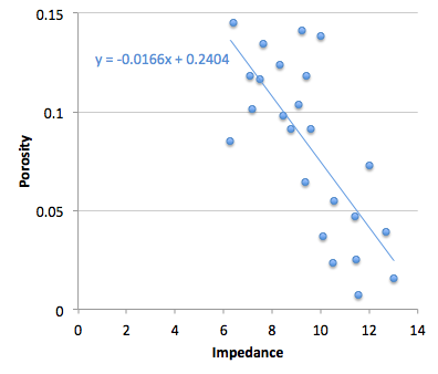
3.   Make a crossplot with porosity on the y-axis and amplitude on the x-axis
4.   Plot the data points and plot the regression line (let’s keep it linear)
5.   Find the equation of the line, which is of the form y = ax + b, or porosity = gradient × impedance + constant
6.   Apply the equation to a map (or volume, if you like) of amplitude, and Bob's your uncle.

Easy!

But, wait a minute. Is Bob your uncle after all? The parameter on the y-axis is also called the dependent variable, and that on the x-axis the independent. In other words, the crossplot represents a relationship of dependency, or causation. Well, porosity certainly does not depend on impedance — it’s the other way around. To put it another way, impedance is not the cause of porosity. So the natural relationship should put impedance, not porosity, on the y-axis. Right?

Therefore we should change some steps:

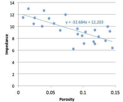
3.   Make a crossplot with impedance on the y-axis and porosity on the x-axis
4.   Plot the data points and plot the regression line
5a. Find the equation of the line, which is of the form y = ax + b, or impedance = gradient × porosity + constant
5b. Rearrange the equation for what we really want:
porosity = (impedance – constant)/gradient

Not quite as easy! But still easy.

More importantly, this gives a different answer. Bob is not your uncle after all. Bob is your aunt. To be clear: you will compute different porosities with these two approaches. So then we have to ask: which is correct? Or rather, since neither going to give us the ‘correct’ porosity, which is better? Which is more physical? Do we care about physicality?

I genuinely do not know the answer to this question. Do you?

If you're interested in playing with this problem, the data I used are from Imaging reservoir quality seismic signatures of geologic effects, report number DE-FC26-04NT15506 for the US Department of Energy by Gary Mavko et al. at Stanford University. I digitized their figure D-8; you can download the data as a CSV here. I have only plotted half of the data points, so I can use the rest as a blind test. 

Great geophysicists #5: Huygens

Christiaan Huygens was a Dutch physicist. He was born in The Hague on 14 April 1629, and died there on 8 July 1695. It's fun to imagine these times: he was a little older than Newton (born 1643), a little younger than Fermat (1601), and about the same age as Hooke (1635). He lived in England and France and must have met these men.

It's also fun to imagine the intellectual wonder life must have held for a wealthy, educated person in these protolithic Enlightenment years. Everyone, it seems, was a polymath: Huygens made substantial contributions to probability, mechanics, astronomy, optics, and horology. He was the first to describe Saturn's rings. He invented the pendulum clock. 

Then again, he also tried to build a combustion engine that ran on gunpowder. 

Geophysicists (and most other physicists) know him for his work on wave theory, which prevailed over Newton's corpuscles—at least until quantum theory. In his Treatise on Light, Huygens described a model for light waves that predicted the effects of reflection and refraction. Interference has to wait 38 years till Fresnel. He even explained birefringence, the anisotropy that gives rise to the double-refraction in calcite.

The model that we call the Huygens–Fresnel principle consists of spherical waves emanating from every point in a light source, such as a candle's flame. The sum of these manifold wavefronts predicts the distribution of the wave everywhere and at all times in the future. It's a sort of infinitesimal calculus for waves. I bet Newton secretly wished he'd thought of it.

Fold for sale

A few weeks ago I wrote a bit about seismic fold, and why it's important for seeing through noise. But how do you figure out the fold of a seismic survey?

The first thing you need to read is Norm Cooper's terrific two-part land seismic tutorial. One of his main points is that it's not really fold we should worry about, it's trace density. Essentially, this normalizes the fold by the area of the natural bins (the areal patches into which we will gather traces for the stack). Computing trace density, given effective maximum offset Xmax (or depth, in a pinch), source and receiver line spacings S and R, and source and receiver station intervals s and r:

Cooper helpfully gave ballpark ranges for increasingly hard imaging problems. I've augmented it, based on my own experience. Your mileage may vary! (Edit this table)

Traces cost money

So we want more traces. The trouble is, traces cost money. The chart below reflects my experiences in the bitumen sands of northern Alberta (as related in Hall 2007). The model I'm using is a square land 3D with an orthogonal geometry and no overlaps (that is, a single swath), and 2007 prices. A trace density of 50 traces/km2 is equivalent to a fold of 5 at 500 m depth. As you see, the cost of seismic increases as we buy more traces for the stack. Fun fact: at a density of about 160 000 traces/km2, the cost is exactly $1 per trace. The good news is that it increases with the square root (more or less), so the incremental cost of adding more traces gets progressively cheaper:

Given that you have limited resources, your best strategy for hitting the 'sweet spot'—if there is one—is lots and lots of testing. Keep careful track of what things cost, so you can compute the probable cost benefit of, say, halving the trace density. With good processing, you'll be amazed what you can get away with, but of course you risk coping badly with unexpected problems in the near surface.

What do you think? How do you make decisions about seismic geometry and trace density?

References

Cooper, N (2004). A world of reality—Designing land 3D programs for signal, noise, and prestack migration, Parts 1 and 2. The Leading Edge. October and December, 2004. 

Hall, M (2007). Cost-effective, fit-for-purpose, lease-wide 3D seismic at Surmont. SEG Development and Production Forum, Edmonton, Canada, July 2007.

Geothermal facies from seismic

Here is a condensed video of the talk I gave at the SEG IQ Earth Forum in Colorado. Much like the tea-towel mock-ups I blogged about in July, this method illuminates physical features in seismic by exposing hidden signals and textures. 

This approach is useful for photographs of rocks and core, for satellite photography, or any geophysical data set, when there is more information to be had than rectangular and isolated arrangements of pixel values.

Click to download slides with notes!Interpretation has become an empty word in geoscience. Like so many other buzzwords, instead of being descriptive and specific jargon, it seems that everyone has their own definition or (mis)use of the word. If interpretation is the art and process of making mindful leaps between unknowns in data, I say, let's quantify to the best of our ability the data we have. Your interpretation should be iteratable, it should be systematic, and it should be cast as an algorithm. It should be verifiable, it should be reproducible. In a word, scientific.  

You can download a copy of the presentation with speaking notes, and access the clustering and texture codes on GitHub

Quantifying the earth

I am in Avon, Colorado, this week attending the SEG IQ Earth Forum. IQ (integrative and quantitative) Earth is a new SEG committee formed in reponse to a $1M monetary donation by Statoil to build a publicly available, industrial strength dataset for the petroleum community. In addition to hosting a standard conference format of podiums and Q and A's, the SEG is using the forum to ask delegates for opinions on how to run the committee. There are 12 people in attendance from consulting & software firms, 11 from service companies, 13 who work for operators, and 7 from SEG and academia. There's lively discussionafter each presentation, which has twice been cut short by adherence to the all important 2 hour lunch break. That's a shame. I wish the energy was left to linger. Here is a recap of the talks that have stood out for me so far:

Yesterday, Peter Wang from WesternGeco presented 3 mini-talks in 20 minutes showcasing novel treatments of uncertainty. In the first talk he did a stochastic map migration of 500 equally probable anisotropic velocity models that translated a fault plane within a 800 foot lateral uncertainty corridor. The result was even more startling on structure maps. Picking a single horizon or fault is wrong, and he showed by how much. Secondly, he showed a stocastic inversion using core, logs and seismic. He again showed the results of hundreds of non-unique but equally probable inversion realizations, each exactly fit the well logs. His point: one solution isn't enough. Only when we compute the range of possible answers can we quantify risk and capture our unknowns. Third, he showed an example from a North American resource shale, a setting where seismic methods are routinely under-utilized, and ironically, a setting where 70% of the production comes from less than 30% of the completed intervals. The geomechanical facies classification showed compelling frac barriers and non reservoir classes, coupled to an all-important error cube, showing the probability of each classification, the confidence of the method.

Ron Masters, from a software company called Headwave, presented a pre-recorded video demonstration of his software in action. Applause goes to him for a pseudo-interactive presentation. He used horizons as a boundary for scuplting away peripheral data for 3D AVO visualizations. He demostrated the technique of rotating a color wheel in the intercept-gradient domain, such that any and all linear combinations of AVO parameters can be mapped to a particular hue. No more need for hard polygons. Instead, with gradational crossplot color classes, the AVO signal doesn't get suddenly clipped out, unless there is a real change in fluid and lithology effects. Exposing AVO gathers in this interactive environment guards against imposing false distinctions that aren’t really there. 

The session today consisted of five talks from WesternGeco / Schlumberger, a powerhouse of technology who stepped up to show their heft. Their full occupancy of the podium today, gives a new meaning to the rhyming quip; all-day Schlumberger. Despite having the bias of an internal company conference, it was still very entertaining, and informative. 

Andy Hawthorn showed how seismic images can be re-migrated around the borehole (almost) in real time by taking velocity measurements while drilling. The new measurements help drillers adjust trajectories and mud weights entering hazardous high pressure which has remarkable safety and cost benefits. He showed a case where a fault was repositioned by 1000 vertical feet; huge implications for wellbore stability, placing casing shoes, and other such mechanical considerations. His premise is that the only problem worth our attention is the following: it is expensive to drill and produce wells. Science should not be done for the sake of it; but to build usable models for drillers. 

In a characteristically enthusiastic talk, Ran Bachrach showed how he incorporated a compacting shale anisotropic rock physics model with borehole temperature and porosity measurements to expedite empirical hypothesis testing of imaging conditions. His talk, like many before him throughout the Forum, touched on the notion of generating many solutions, as fast as possible. Asking questions of the data, and being able to iterate. 

At the end of the first day, Peter Wang stepped boldy back to the to the microphone while others has started packing their bags, getting ready to leave the room. He commented that what an "integrated and quantitative" earth model desperately needs are financial models and simulations. They are what drive this industry; making money. As scientists and technologists we must work harder to demonstrate the cost savings and value of these techniques. We aren't getting the word out fast enough, and we aren't as relevant as we could be. It's time to make the economic case clear.

The power of stack

Multiplicity is a basic principle of seismic acquisition. Our goal is to acquite lots of traces—lots of spatial samples—with plenty of redundancy. We can then exploit the redundancy, by mixing traces, sacrificing some spatial resolution for increased signal:noise. When we add two traces, the repeatable signal adds constructively, reinforcing and clarifying. The noise, on the other hand, is spread evenly about zero and close to random, and tends to cancel itself. This is why you sometimes hear geophysicists refer to 'the power of stack'. 

Here's an example. There are 20 'traces' of 100-digit-long sequences of random numbers (white noise). The numbers range between –1 and +1. I added some signal to samples 20, 40, 60 and 80. The signals have amplitude 0.25, 0.5, 0.75, and 1. You can't see them in the traces, because these tiny amplitudes are completely hidden by noise. The stacked trace on the right is the sum of the 20 noisy traces. We see mostly noise, but the signal emerges. A signal of just 0.5—half the peak amplitude of the noise—is resolved by this stack of 20 traces; the 0.75 signal stands out beautifully.

Here's another example, but with real data. This is part of Figure 3 from Liu, G, S Fomel, L Jin, and X Chen (2009). Stacking seismic data using local correlation. Geophysics 74 (2) V43–V48. On the left is an NMO-corrected (flattened) common mid-point gather from a 2D synthetic model with Gaussian noise added. These 12 traces each came from a single receiver, though in this synthetic case the receiver was a virtual one. Now we can add the 12 traces to get a single trace, which has much stronger signal, relative to the background noise, than any of the input traces. This is the power of stack. In the paper, Liu et al. improve on the simple sum by weighting the traces adaptively. Click to enlarge.

The number of traces available for the stack is called fold. The examples above have folds of 20 and 12. Geophysicists like fold. Fold works. Let's look at another example.

Above, I've made a single digit 1 with 1% opacity — it's almost invisible. If I stack two 2s, with a little random jitter, the situation is still desperate. When I have five digits, I can at least see the hidden image with some fidelity. However, if I add random noise to the image, a fold of 5 is no longer enough. I need at least 10, and ideally more like 20 images stacked up to see any signal. So it is for seismic data: to see through the noise, we need fold.

Now you know a bit about why we want more traces from the field, next time I'll look at how much those traces cost, and how to figure out how many you need. 

Thank you to Stuart Mitchell of Calgary for the awesome analogy for seismic fold.  

Great geophysicists #4: Fermat

This Friday is Pierre de Fermat's 411th birthday. The great mathematician was born on 17 August 1601 in Beaumont-de-Lomagne, France, and died on 12 January 1665 in Castres, at the age of 63. While not a geophysicist sensu stricto, Fermat made a vast number of important discoveries that we use every day, including the principle of least time, and the foundations of probability theory. 

Fermat built on Heron of Alexandria's idea that light takes the shortest path, proposing instead that light takes the path of least time. These ideas might seem equivalent, but think about anisotropic and inhomogenous media. Fermat continued by deriving Snell's law. Let's see how that works.

We start by computing the time taken along a path:

Then we differentiate with respect to space. This effectively gives us the slope of the graph of time vs distance.

We want to minimize the time taken, which happens at the minimum on the time vs distance graph. At the minimum, the derivative is zero. The result is instantly recognizable as Snell's law:

Maupertuis's generalization

The principle is a core component of the principle of least action in classical mechanics, first proposed by Pierre Louis Maupertuis (1698–1759), another Frenchman. Indeed, it was Fermat's handling of Snell's law that Maupertuis objected to: he didn't like Fermat giving preference to least time over least distance.

Maupertuis's generalization of Fermat's principle was an important step. By the application of the calculus of variations, one can derive the equations of motion for any system. These are the equations at the heart of Newton's laws and Hooke's law, which underlie all of the physics of the seismic experiment. So, you know, quite useful.

Probably very clever

It's so hard to appreciate fundamental discoveries in hindsight. Together with Blaise Pascal, he solved basic problems in practical gambling that seem quite straightforward today. For example, Antoine Gombaud, the Chevalier de Méré, asked Pascal: why is it a good idea to bet on getting a 1 in four dice rolls, but not on a double-1 in twenty-four? But at the time, when no-one had thought about analysing problems in terms of permutations and combinations before, the solutions were revolutionary. And profitable.

For setting Snell's law on a firm theoretical footing, and introducing probability into the world, we say Pierre de Fermat (pictured here) is indeed a father of geophysics.

How to choose an image format

Choosing a file format for scientific images can be tricky. It seems simple enough on the outside, but the details turn out to be full of nuance and gotchas. Plenty of papers and presentations are spoiled by low quality images. Don't let yours be one! Get to know your image editor (I recommend GIMP), and your formats.

What determines quality?

The factors determining the quality of an image are:

  • The number of pixels in the image (aim for 1 million)
  • The size of the image (large images need more pixels)
  • If the image is compressed, e.g. a JPG, the fidelity of the compression (use 90% or more)
  • If the image is indexed, e.g. a GIF, the number of colours available (the bit-depth)

Beware: what really matters is the lowest-quality version of the image file over its entire history. In other words, it doesn't matter if you have a 1200 × 800 TIF today, if this same file was previously saved as a 600 × 400 GIF with 16 colours. You will never get the lost pixels or bit-depth back, though you can try to mitigate the quality loss with filters and careful editing. This seems obvious, but I have seen it catch people out.

JPG is only for photographs

Click on the image to see some artifacts.The problem with JPG is that the lossy compression can bite you, even if you're careful. What is lossy compression? The JPEG algorithm makes files much smaller by throwing some of the data away. It 'decides' which data to discard based on the smoothness of the image in the wavenumber domain, in which the algorithm looks for a property called sparseness. Once discarded, the data cannot be recovered. In discontinuous data — images with lots of variance or hard edges — you might see artifacts (e.g. see How to cheat at spot the difference). Bottom line: only use JPG for photographs with lots of pixels.

Formats in a nutshell

Rather than list advantages and disadvantages exhaustively, I've tried to summarize everything you need to know in the table below. There are lots of other formats, but you can do almost anything with the ones I've listed... except BMP, which you should just avoid completely. A couple of footnotes: PGM is strictly for geeks only; GIF is alone in supporting animation (animations are easy to make in GIMP). 

All this advice could have been much shorter: use PNG for everything. Unless file size is your main concern, or you need special features like animation or georeferencing, you really can't go wrong.

There's a version of this post on SubSurfWiki. Feel free to edit it!

Turning students into maniacs

In Matt's previous post, he urged people to subscribe to Jimmy Wales' vision of expanding collective intelligence. And it got me thinking about why the numbers aren't as high as they could be (should be), and why they might be dropping. Here are a few excuses that I have plucked from the university-student mindset and I submit them as a micro-model of this problem. And let's face it, we are all students, in a loose sense of the word.

STUDENT EXCUSES

  • I don't know where to start: Students, those most adequately positioned to give back to the knowledge base of which they are at the forefront, don't know where to start. Looking out towards the vast sea of what already exists, it is hard to imagine what is missing. Walking up to a blank page, pen in hand, is way harder than being handed an outline, a rough sketch that needs some filling in and filling out. 
  • I didn't sign up to be a volunteer: Being a student has always been, and always will be, a selfish endeavour. To do anything outside what is expected is essentially volunteering. Most students, don't see it as their job, their problem, or haven't yet learned the benefits and advantages it brings.
  • Someone else is better than me: Sounds timid and insecure, which I suppose may require some creative coaxing. Surely, there is probably somebody else out there more suited to draw seismic polarity cartoons than I, but volunteers don't wait for someone else to volunteer, if that were the case, there would be no volunteering at all. 
  • Institutions stomped out my collabortive spirit: It might not be spoken this way, but the student has a number of forces acting against the survival of their natural collaborative and creative tendencies. You'd think they would be the first to "get it", but the student mindset (bright, ambitious, curious, tech-savvy, etc) has been ratcheted into one of discipline and conformance to the academic status quo. One filled with traditional notions of text books, unaffordable publication subscriptions, bureacratic funding and research processes.
  • Peer review is better than the commons: Students are not allowed to use Wikipedia in their research. Instead, it is reinforced that a handful of expert editors set the standards of academic diligence, which is supposedly superior to thousands of editors in the fray of the wiki. I say we place too much confidence in too few peer reviewers. Sure wikis have trust issues, but that may be deservedly detrimental to those who are too credulous. Has anyone been massively led astray by incorrect or sabotaged Wikipedia content? I doubt it.

Making maniacs

Of these excuses, all of them but the first have to do with the culture of traditional learning. But for the first, for people who want to get involved but really don't know how, maybe all they need is to be handed a few stubs. Give me a stub! Imagine a questionaire or widget that takes a user profile, and quasi-intelligently suggests sparse pages in need of work. This stub needs chippers, and you fit the profile. Like a dating site that matches you not with another person, but with gaps in the content web.

It occurs to me that the notion of studentship will transform—for those who want it. For some it will be a choice, and a privilege, to act less like a student, and more like a maniac.

Fabric facies

I set out to detect patterns in images, with the conviction that they are diagnostic of more telling physical properties of the media. Tea towel textures can indicate absorbency, durability, state of wear and tear, etc. Seismic textures can indicate things like depositional environment, degree of deformation, lithologic content, and so on:

Facies: A rock or stratified body distinguished from others by its appearance or composition.

Facies are clusters distinguishable in all visual media. Geophysicists shouldn't be afraid of using the word normally reserved by geologists—seismic facies. In the seismic case, instead of lithology, grain size, bedding patterns, and so on, we are using attributes such as amplitude, energy, coherency, and Haralick textures for classification.

The brain is good at pattern recognition and picking out subtleties. I can assign facies to the input data (A), based on on hues (B), or patterns (C). I can also count objects (D), interpret boundaries (E), and identify poorly resolved regions of an image (F) caused by shadows or noise. I can even painstakingly draw the pockmarks or divets in the right hand teatowel (G). All of these elements can be simultaneously held in the mind of the viewer and comprise what we naturally perceive as the properties of visual media. Isolating, extracting, and illustrating these visual features by hand remains tedious.

I am not interested in robot vision so computers can replace geophysical interpreters, but I am interested in how image classification can be used to facilitate, enrich, and expedite the interpretive process. You can probably already think of attributes we can use to coincide with this human interpretation from the examples I gave in a previous post.

Identifying absorbency

Let's set an arbitrary goal of classifying the ability to soak up water, or absorbency. Surely a property of interest to anyone studying porous media. Because absorbency is a media-property, not an optical property (like colour) or a boundary property (like edges), it makes sense to use texture classification. From the input image, I can count 5 different materials, each with a distinct pattern. The least tractable might be the rightmost fabric which has alternating waffle-dimple segments, troublesome shadows and contours, and patterns at two different scales. The test of success is seeing how this texture classification compares to the standard approach of visual inspection and manual picking. 

I landed on using 7 classes for this problem. Two for the white tea-towels, two for the green tea-towel, one for the blue, and one that seems to be detecting shadows (shown in dark grey). Interestingly, the counter top on the far left falls into the same texture class as the green tea-towel. Evidence that texture alone isn't a foolproof proxy for absorbency. To improve the classification, I would need to allow more classes (likely 8 or 9). 

It seems to me that the manual picks match the classification quite well. The picks lack detail, as with any interpretation, but they also lack noise. On the contrary, there are some locations where the classification has failed. It stuggles in low-light and over-exposed regions. 

If you are asking, "is one approach better than the other?", you are asking the wrong question. These are not mutually exclusive approaches. The ideal scenario is one which uses these methods in concert for detecting geologic features in the fabric of seismic data.