6 questions about seismic interpretation

This interview is part of a series of conversations between Satinder Chopra and the authors of the book 52 Things You Should Know About Geophysics (Agile Libre, 2012). The first three appeared in the October 2013 issue of the CSEG Recorder, the Canadian applied geophysics magazine, which graciously agreed to publish them under a CC-BY license.


Satinder Chopra: Seismic data contain massive amounts of information, which has to be extracted using the right tools and knowhow, a task usually entrusted to the seismic interpreter. This would entail isolating the anomalous patterns on the wiggles and understanding the implied subsurface properties, etc. What do you think are the challenges for a seismic interpreter?

Evan Bianco: The challenge is to not lose anything in the abstraction.

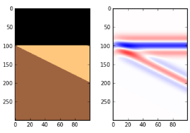
The notion that we take terabytes of prestack data, migrate it into gigabyte-sized cubes, and reduce that further to digitized surfaces that are hundreds of kilobytes in size, sounds like a dangerous discarding of information. That's at least 6 orders of magnitude! The challenge for the interpreter, then, is to be darn sure that this is all you need out of your data, and if it isn't (and it probably isn't), knowing how to go back for more.

SC: How do you think some these challenges can be addressed?

EB: I have a big vision and a small vision. Both have to do with documentation and record keeping. If you imagine the entire seismic experiment upon a sort of conceptual mixing board, instead of as a linear sequence of steps, elements could be revisited and modified at any time. In theory nothing would be lost in translation. The connections between inputs and outputs could be maintained, even studied, all in place. In that view, the configuration of the mixing board itself becomes a comprehensive and complete history for the data — what's been done to it, and what has been extracted from it.

The smaller vision: there are plenty of data management solutions for geospatial information, but broadcasting the context that we bring to bear is a whole other challenge. Any tool that allows people to preserve the link between data and model should be used to transfer the implicit along with the explicit. Take auto-tracking a horizon as an example. It would be valuable if an interpreter could embed some context into an object while digitizing. Something that could later inform the geocellular modeler to proceed with caution or certainty.

SC: One of the important tasks that a seismic interpreter faces is the prediction about the location of the hydrocarbons in the subsurface.  Having come up with a hypothesis, how do you think this can be made more convincing and presented to fellow colleagues?

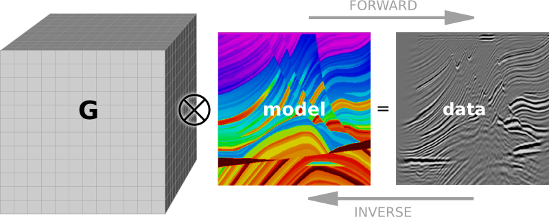
EB: Coming up with a hypothesis (that is, a model) is solving an inverse problem. So there is a lot of convincing power in completing the loop. If all you have done is the inverse problem, know that you could go further. There are a lot of service companies who are in the business of solving inverse problems, not so many completing the loop with the forward problem. It's the only way to test hypotheses without a drill bit, and gives a better handle on methodological and technological limitations.

SC: You mention "absolving us of responsibility" in your article.  Could you elaborate on this a little more? Do you think there is accountability of sorts practiced in our industry?

EB: I see accountability from a data-centric perspective. For example, think of all the ways that a digitized fault plane can be used. It could become a polygon cutting through a surface on map. It could be a wall within a geocellular model. It could be a node in a drilling prognosis. Now, if the fault is mis-picked by even one bin, this could show up hundreds of metres away, depending on the dip of the fault, compared to the prognosis. Practically speaking, accounting for mismatches like this is hard, and is usually done in an ad hoc way, if at all. What caused the error? Was it the migration or was it the picking? Or what about the error in the measurement of the drill-bit? I think accountability is loosely practised at best because we don't know how to reconcile all these competing errors.

Until data can have a memory, being accountable means being diligent with documentation. But it is time-consuming, and there aren’t as many standards as there are data formats.

SC: Declaring your work to be in progress could allow you to embrace iteration.  I like that. However, there is usually a finite time to complete a given interpretation task; but as more and more wells are drilled, the interpretation could be updated. Do you think this practice would suit small companies that need to ensure each new well is productive or they are doomed?

EB: The size of the company shouldn't have anything to do with it. Iteration is something that needs to happen after you get new information. The question is not, "do I need to iterate now that we have drilled a few more wells?", but "how does this new information change my previous work?" Perhaps the interpretation was too rigid — too precise — to begin with. If the interpreter sees her work as something that evolves towards a more complete picture, she needn't be afraid of changing her mind if new information proves us to be incorrect. Depth migration, for example, exemplifies this approach. Hopefully more conceptual and qualitative aspects of subsurface work can adopt it as well.

SC: The present day workflows for seismic interpretation for unconventional resources demand more than the usual practices followed for the conventional exploration and development.  Could you comment on how these are changing?

EB: With unconventionals, seismic interpreters are looking for different things. They aren't looking for reservoirs, they are looking for suitable locations to create reservoirs. Seismic technologies that estimate the state of stress will become increasingly important, and interpreters will need to work in close contact to geomechanics. Also, microseismic monitoring and time-lapse technologies tend to push interpreters into the thick of the operations, which allow them to study how the properties of the earth change according to operations. What a perfect place for iterative workflows.


You can read the other interviews and Evan's essay in the magazine, or buy the book! (You'll find it in Amazon's stores too.) It's a great introduction to who applied geophysicists are, and what sort of problems they work on. Read more about it. 

Join CSEG to catch more of these interviews as they come out. 

Save the samples

A long while ago I wrote about how to choose an image format, and then followed that up with a look at vector vs raster graphics. Today I wanted to revisit rasters (you might think of them as bitmaps, images, or photographs). Because a question that seems to come up a lot is 'what resolution should my images be?' 

Forget DPI

When writing for print, it is common to be asked for a certain number of dots per inch, or dpi (or, equivalently, pixels per inch or ppi). For example, I've been asked by journal editors for images 'at least 200 dpi'. However, image files do not have an inherent resolution — they only have pixels. The resolution depends on the reproduction size you choose. So, if your image is 800 pixels wide, and will be reproduced in a 2-inch-wide column of print, then the final image is 400 dpi, and adequate for any purpose. The same image, however, will look horrible at 4 dpi on a 16-foot-wide projection screen.

Rule of thumb: for an ordinary computer screen or projector, aim for enough pixels to give about 100 pixels per display inch. For print purposes, or for hi-res mobile devices, aim for about 300 ppi. If it really matters, or your printer is especially good, you are safer with 600 ppi.

The effect of reducing the number of pixels in an image is more obvious in images with a lot of edges. It's clear in the example that downsampling a sharp image (a to c) is much more obvious than downsampling the same image after smoothing it with a 25-pixel Gaussian filter (b to d). In this example, the top images have 512 × 512 samples, and the downsampled ones underneath have only 1% of the information, at 51 × 51 samples (downsampling is a type of lossy compression).

Careful with those screenshots

The other conundrum is how to get an image of, say, a seismic section or a map.

What could be easier than a quick grab of your window? Well, often it just doesn't cut it, especially for data. Remember that you're only grabbing the pixels on the screen — if your monitor is small (or perhaps you're using a non-HD projector), or the window is small, then there aren't many pixels to grab. If you can, try to avoid a screengrab by exporting an image from one of the application's menus.

For seismic data, you'd like to capture sample as a pixel. This is not possible for very long or deep lines, because they don't fit on your screen. Since CGM files are the devil's work, I've used SEGY2ASCII (USGS Open File 2005–1311) with good results, converting the result to a PGM file and loading into Gimp

Large seismic lines are hard to capture without decimating the data. Rockall Basin. Image: BGS + Virtual Seismic Atlas.If you have no choice, make the image as large as possible. For example, if you're grabbing a view from your browser, maximize the window, turn off the bookmarks and other junk, and get as many pixels as you can. If you're really stuck, grab two or more views and stitch them together in Gimp or Inkscape

When you've got the view you want, crop the window junk that no-one wants to see (frames, icons, menus, etc.) and save as a PNG. Then bring the image into a vector graphics editor, and add scales, colourbars, labels, annotation, and other details. My advice is to do this right away, before you forget. The number of times I've had to go and grab a screenshot again because I forgot the colourbar...

The Lenna image is from Hall, M (2006). Resolution and uncertainty in spectral decomposition. First Break 24, December 2006, p 43-47.

What is the Gabor uncertainty principle?

This post is adapted from the introduction to my article Hall, M (2006), Resolution and uncertainty in spectral decomposition. First Break 24, December 2006. DOI: 10.3997/1365-2397.2006027. I'm planning to delve into this a bit, partly as a way to get up to speed on signal processing in Python. Stay tuned.


Spectral decomposition is a powerful way to get more from seismic reflection data, unweaving the seismic rainbow.There are lots of ways of doing it — short-time Fourier transform, S transform, wavelet transforms, and so on. If you hang around spectral decomposition bods, you'll hear frequent mention of the ‘resolution’ of the various techniques. Perhaps surprisingly, Heisenberg’s uncertainty principle is sometimes cited as a basis for one technique having better resolution than another. Cool! But... what on earth has quantum theory got to do with it?

A property of nature

Heisenberg’s uncertainty principle is a consequence of the classical Cauchy–Schwartz inequality and is one of the cornerstones of quantum theory. Here’s how he put it:

At the instant of time when the position is determined, that is, at the instant when the photon is scattered by the electron, the electron undergoes a discontinuous change in momen- tum. This change is the greater the smaller the wavelength of the light employed, i.e. the more exact the determination of the position. At the instant at which the position of the electron is known, its momentum therefore can be known only up to magnitudes which correspond to that discontinuous change; thus, the more precisely the position is determined, the less precisely the momentum is known, and conversely. — Heisenberg (1927), p 174-5.

The most important thing about the uncertainty principle is that, while it was originally expressed in terms of observation and measurement, it is not a consequence of any limitations of our measuring equipment or the mathematics we use to describe our results. The uncertainty principle does not limit what we can know, it describes the way things actually are: an electron does not possess arbitrarily precise position and momentum simultaneously. This troubling insight is the heart of the so-called Copenhagen Interpretation of quantum theory, which Einstein was so famously upset by (and wrong about).

Dennis Gabor (1946), inventor of the hologram, was the first to realize that the uncertainty principle applies to signals. Thanks to wave-particle duality, signals turn out to be exactly analogous to quantum systems. As a result, the exact time and frequency of a signal can never be known simultaneously: a signal cannot plot as a point on the time-frequency plane. Crucially, this uncertainty is a property of signals, not a limitation of mathematics.

Getting quantitative

You know we like the numbers. Heisenberg’s uncertainty principle is usually written in terms of the standard deviation of position σx, the standard deviation of momentum σp, and the Planck constant h:

In other words, the product of the uncertainties of position and momentum is small, but not zero. For signals, we don't need Planck’s constant to scale the relationship to quantum dimensions, but the form is the same. If the standard deviations of the time and frequency estimates are σt and σf respectively, then we can write Gabor’s uncertainty principle thus:

So the product of the standard deviations of time, in milliseconds, and frequency, in Hertz, must be at least 80 ms.Hz, or millicycles. (A millicycle is a sort of bicycle, but with 1000 wheels.)

The bottom line

Signals do not have arbitrarily precise time and frequency localization. It doesn’t matter how you compute a spectrum, if you want time information, you must pay for it with frequency information. Specifically, the product of time uncertainty and frequency uncertainty must be at least 1/4π. So how certain is your decomposition?

References

Heisenberg, W (1927). Über den anschaulichen Inhalt der quantentheoretischen Kinematik und Mechanik, Zeitschrift für Physik 43, 172–198. English translation: Quantum Theory and Measurement, J. Wheeler and H. Zurek (1983). Princeton University Press, Princeton.

Gabor, D (1946). Theory of communication. Journal of the Institute of Electrical Engineering 93, 429–457.

The image of Werner Heisenberg in 1927, at the age of 25, is public domain as far as I can tell. The low res image of First Break is fair use. The bird hologram is form a photograph licensed CC-BY by Flickr user Dominic Alves

Try an outernship

In my experience, consortiums under-deliver. We can get the best of both worlds by making the industry–academia interface more permeable.

At one of my clients, I have the pleasure of working with two smart, energetic young geologists. One recently finished, and the other recently started, a 14-month super-internship. Neither one had more than a BSc in geology when they started, and both are going on to do a postgraduate degree after they finish with this multinational petroleum company.

This is 100% brilliant — for them and for the company. After this gap-year-on-steroids, what they accomplish in their postgraduate studies will be that much more relevant, to them, to industry, and to the science. And corporate life, the good bits anyway, can teach smart and energetic people about time management, communication, and collaboration. So by holding back for a year, I think they've actually got a head-start.

The academia–industry interface

Chatting to these young professionals, it struck me that there's a bigger picture. Industry could get much better at interfacing with academia. Today, it tends to happen at a few key relationships, in recruitment, and in a few long-lasting joint industry projects (often referred to as JIPs or consortiums). Most of these interactions happen on an annual timescale, and strictly via presentations and research reports. In a distributed company, most of the relationships are through R&D or corporate headquarters, so the benefits to the other 75% or more of the company are quite limited.

Less secrecy, free the data! This worksheet is from the Unsolved Problems Unsession in 2013.Instead, I think the interface should be more permeable and dynamic. I've sat through several JIP meetings as researchers have shown work of dubious relevance, using poor or incomplete data, with little understanding of the implications or practical possibilities of their insights. This isn't their fault — the petroleum industry sucks at sharing its goals, methods, uncertainties, and data (a great unsolved problem!).

Increasing permeability

Here's my solution: ordinary human collaboration. Send researchers to intern alongside industry scientists for a month or two. Let them experience the incredible data and the difficult problems first hand. But don't stop there. Send the industry scientists to outern (yes, that is probably a word) alongside the academics, even if only for a week or two. Let them experience the freedom of sitting in a laboratory playground all day, working on problems with brilliant researchers. Let's help  people help each other with real side-by-side collaboration, building trust and understanding in the process. A boring JIP meeting once a year is not knowledge sharing.

Have you seen good examples of industry, government, or academia striving for more permeability? How do the high-functioning JIPs do it? Let us know in the comments.


If you liked this, check out some of my other posts on collaboration and knowledge sharing...

Ternary diagrams

I like spectrums (or spectra, if you must). It's not just because I like signals and Fourier transforms, or because I think frequency content is the most under-appreciated attribute of seismic data. They're also an important thinking tool. They represent a continuum between two end-member states, both rare or unlikely; in between there are shades of ambiguity, and this is usually where nature lives.

Take the sport–game continuum. Sports are pure competition — a test of strength and endurance, with few rules and unequivocal outcomes. Surely marathon running is pure sport. Contrast that with a pure game, like darts: no fitness, pure technique. (Establishing where various pastimes lie on this continuum is a good way to start an argument in a pub.)

There's a science purity continuum too, with mathematics at one end and social sciences somewhere near the other. I wonder where geology and geophysics lie...

Degrees of freedom 

The thing about a spectrum is that it's two-dimensional, like a scatter plot, but it has only one degree of freedom, so we can map it onto one dimension: a line.

The three-dimensional equivalent of the spectrum is the ternary diagram: 3-parameter space mapped onto 2D. Not a projection, like a 3D scatter plot, because there are only two degrees of freedom — the parameters of a ternary diagram cannot be independent. This works well for volume fractions, which must sum to one. Hence their popularity for the results of point-count data, like this Folk classification from Hulk & Heubeck (2010).

We can go a step further, natch. You can always go a step further. How about four parameters with three degrees of freedom mapped onto a tetrahedron? Fun to make, not so fun to look at. But not as bad as a pentachoron.

How to make one

The only tools I've used on the battlefield, so to speak are Trinity, for ternary plots, and TetLab, for tetrahedrons (yes, I went there), both Mac OS X only, and both from Peter Appel of Christian-Albrechts-Universität zu Kiel. But there are more...

Do you use ternary plots, or are they nothing more than a cute way to show some boring data? How do you make them? Care to share any? 

The cartoon is from xkcd.com, licensed CC-BY-NC. The example diagram and example data are from Hulka, C and C Heubeck (2010). Composition and provenance history of Late Cenozoic sediments in southeastern Bolivia: Implications for Chaco foreland basin evolution and Andean uplift. Journal of Sedimentary Research 80, 288–299. DOI: 10.2110/jsr.2010.029 and available online from the authors. 

To make up microseismic

I am not a proponent of making up fictitious data, but for the purposes of demonstrating technology, why not? This post is the third in a three-part follow-up from the private beta I did in Calgary a few weeks ago. You can check out the IPython Notebook version too. If you want more of this in person, sign up at the bottom or drop us a line. We want these examples to be easily readable, especially if you aren't a coder, so please let us know how we are doing.

Start by importing some packages that you'll need into the workspace,

%pylab inline
import numpy as np
from scipy.interpolate import splprep, splev
import matplotlib.pyplot as plt
import mayavi.mlab as mplt
from mpl_toolkits.mplot3d import Axes3D

Define a borehole path

We define the trajectory of a borehole, using a series of x, y, z points, and make each component of the borehole an array. If we had a real well, we load the numbers from the deviation survey just the same.

trajectory = np.array([[   0,   0,    0],
                       [   0,   0, -100],
                       [   0,   0, -200],
                       [   5,   0, -300],
                       [  10,  10, -400],
                       [  20,  20, -500],
                       [  40,  80, -650],
                       [ 160, 160, -700],
                       [ 600, 400, -800],
                       [1500, 960, -800]])
x = trajectory[:,0]
y = trajectory[:,1]
z = trajectory[:,2]

But since we want the borehole to be continuous and smoothly shaped, we can up-sample the borehole by finding the B-spline representation of the well path,

smoothness = 3.0
spline_order = 3
nest = -1 # estimate of number of knots needed (-1 = maximal)
knot_points, u = splprep([x,y,z], s=smoothness, k=spline_order, nest=-1)

# Evaluate spline, including interpolated points
x_int, y_int, z_int = splev(np.linspace(0, 1, 400), knot_points)

plt.gca(projection='3d')
plt.plot(x_int, y_int, z_int, color='grey', lw=3, alpha=0.75)
plt.show()

Define frac ports

Let's define a completion program so that our wellbore has 6 frac stages,

number_of_fracs = 6

and let's make it so that each one emanates from equally spaced frac ports spanning the bottom two-thirds of the well.

x_frac, y_frac, z_frac = splev(np.linspace(0.33, 1, number_of_fracs), knot_points)

Make a set of 3D axes, so we can plot the well path and the frac ports.

ax = plt.axes(projection='3d')
ax.plot(x_int, y_int, z_int, color='grey',
        lw=3, alpha=0.75)
ax.scatter(x_frac, y_frac, z_frac,
        s=100, c='grey')
plt.show()

Set a colour for each stage by cycling through red, green, and blue,

stage_color = []
for i in np.arange(number_of_fracs):
    color = (1.0, 0.1, 0.1)
    stage_color.append(np.roll(color, i))
stage_color = tuple(map(tuple, stage_color))

Define microseismic points

One approach is to create some dimensions for each frac stage and generate 100 points randomly within each zone. Each frac has an x half-length, y half-length, and z half-length. Let's also vary these randomly for each of the 6 stages. Define the dimensions for each stage:

frac_dims = []
half_extents = [500, 1000, 250]
for i in range(number_of_fracs):
    for j in range(len(half_extents)):
        dim = np.random.rand(3)[j] * half_extents[j]
        frac_dims.append(dim)  
frac_dims = np.reshape(frac_dims, (number_of_fracs, 3))

Plot microseismic point clouds with 100 points for each stage. The following code should launch a 3D viewer scene in its own window:

size_scalar = 100000
mplt.plot3d(x_int, y_int, z_int, tube_radius=10)
for i in range(number_of_fracs):
    x_cloud = frac_dims[i,0] * (np.random.rand(100) - 0.5)
    y_cloud = frac_dims[i,1] * (np.random.rand(100) - 0.5)
    z_cloud = frac_dims[i,2] * (np.random.rand(100) - 0.5)

    x_event = x_frac[i] + x_cloud
    y_event = y_frac[i] + y_cloud     
    z_event = z_frac[i] + z_cloud
    
    # Let's make the size of each point inversely proportional 
    # to the distance from the frac port
    size = size_scalar / ((x_cloud**2 + y_cloud**2 + z_cloud**2)**0.002)
    
    mplt.points3d(x_event, y_event, z_event, size, mode='sphere', colormap='jet')

You can swap out the last line in the code block above with mplt.points3d(x_event, y_event, z_event, size, mode='sphere', color=stage_color[i]) to colour each event by its corresponding stage.

A day of geocomputing

I will be in Calgary in the new year and running a one-day version of this new course. To start building your own tools, pick a date and sign up:

Eventbrite - Agile Geocomputing    Eventbrite - Agile Geocomputing

To make a wedge

We'll need a wavelet like the one we made last time. We could import it, if we've made one, but SciPy also has one so we can save ourselves the trouble. Remember to put %pylab inline at the top if using IPython notebook.

import numpy as np
from scipy.signal import ricker
import matplotlib.pyplot as plt

Now we need to make a physical earth model with three rock layers. In this example, let's make an acoustic impedance earth model. To keep it simple, let's define the earth model with two-way-travel time along the vertical axis (as opposed to depth). There are number of ways you could describe a wedge using math, and you could probably come up with a way that is better than mine. Here's a way:

nsamps, ntraces = [600, 500]
rock_names = ['shale 1', 'sand', 'shale 2']
rock_grid = np.zeros((n_samples, n_traces))

def make_wedge(n_samples, n_traces, layer_1_thickness, start_wedge, end_wedge):
    for j in np.arange(n_traces): 
        for i in np.arange(n_samples):      
            if i <= layer_1_thickness:      
rock_grid[i][j] = 1 if i > layer_1_thickness:
rock_grid[i][j] = 3 if j >= start_wedge and i - layer_1_thickness < j-start_wedge:
rock_grid[i][j] = 2 if j >= end_wedge and i > layer_1_thickness+(end_wedge-start_wedge):
rock_grid[i][j] = 3 return rock_grid

Let's insert some numbers into our wedge function and make a particular geometry.

layer_1_thickness = 200
start_wedge = 50
end_wedge = 250
rock_grid = make_wedge(n_samples, n_traces, 
            layer_1_thickness, start_wedge, 
            end_wedge)

plt.imshow(rock_grid, cmap='copper_r')

Now we can give each layer in the wedge properties.

vp = np.array([3300., 3200., 3300.]) 
rho = np.array([2600., 2550., 2650.]) 
AI = vp*rho
AI = AI / 10e6 # re-scale (optional step)

Then assign values assign them accordingly to every sample in the rock model.

model = np.copy(rock_grid)
model[rock_grid == 1] = AI[0]
model[rock_grid == 2] = AI[1]
model[rock_grid == 3] = AI[2]
plt.imshow(model, cmap='Spectral')
plt.colorbar()
plt.title('Impedances')

Now we can compute the reflection coefficients. I have left out a plot of the reflection coefficients, but you can check it out in the full version in the nbviewer

upper = model[:-1][:]
lower = model[1:][:]
rc = (lower - upper) / (lower + upper)
maxrc = abs(np.amax(rc))

Now we make the wavelet interact with the model using convolution. The convolution function already exists in the SciPy signal library, so we can just import it.

from scipy.signal import convolve
def make_synth(f):
    synth = np.zeros((n_samples+len(t)-2, n_traces))
    wavelet = ricker(512, 1e3/(4.*f))
    wavelet = wavelet / max(wavelet)   # normalize
    for k in range(n_traces):
        synth[:,k] = convolve(rc[:,k], wavelet)
    synth = synth[ np.ceil(len(wavelet))/2 : -np.ceil(len(wavelet))/2, : ]
    return synth

Finally, we plot the results.

frequencies = array([5, 10, 15]) plt.figure(figsize = (15, 4)) for i in np.arange(len(frequencies)): this_plot = make_synth(frequencies[i]) plt.subplot(1, len(frequencies), i+1) plt.imshow(this_plot, cmap='RdBu', vmax=maxrc, vmin=-maxrc, aspect=1) plt.title( '%d Hz wavelet' % freqs[i] ) plt.grid() plt.axis('tight') # Add some labels for i, names in enumerate(rock_names): plt.text(400, 100+((end_wedge-start_wedge)*i+1), names, fontsize=14, color='gray', horizontalalignment='center', verticalalignment='center')


That's it. As you can see, the marriage of building mathematical functions and plotting them can be a really powerful tool you can apply to almost any physical problem you happen to find yourself working on.

You can access the full version in the nbviewer. It has a few more figures than what is shown in this post.

A day of geocomputing

I will be in Calgary in the new year and running a one-day version of this new course. To start building your own tools, pick a date and sign up:

Eventbrite - Agile Geocomputing    Eventbrite - Agile Geocomputing

To plot a wavelet

As I mentioned last time, a good starting point for geophysical computing is to write a mathematical function describing a seismic pulse. The IPython Notebook is designed to be used seamlessly with Matplotlib, which is nice because we can throw our function on graph and see if we were right. When you start your own notebook, type

ipython notebook --pylab inline

We'll make use of a few functions within NumPy, a workhorse to do the computational heavy-lifting, and Matplotlib, a plotting library.

import numpy as np
import matplotlib.pyplot as plt

Next, we can write some code that defines a function called ricker. It computes a Ricker wavelet for a range of discrete time-values t and dominant frequencies, f:

def ricker(f, length=0.512, dt=0.001):
    t = np.linspace(-length/2, (length-dt)/2, length/dt)
    y = (1.-2.*(np.pi**2)*(f**2)*(t**2))*np.exp(-(np.pi**2)*(f**2)*(t**2))
    return t, y

Here the function needs 3 input parameters; frequency, f, the length of time over which we want it to be defined, and the sample rate of the signal, dt. Calling the function returns two arrays, the time axis t, and the value of the function, y.

To create a 5 Hz Ricker wavelet, assign the value of 5 to the variable f, and pass it into the function like so,

f = 5
t, y = ricker (f)

To plot the result,

plt.plot(t, y)

But with a few more commands, we can improve the cosmetics,

plt.figure(figsize=(7,4))
plt.plot( t, y, lw=2, color='black', alpha=0.5)
plt.fill_between(t, y, 0,  y > 0.0, interpolate=False, hold=True, color='blue', alpha = 0.5)
plt.fill_between(t, y, 0, y < 0.0, interpolate=False, hold=True, color='red', alpha = 0.5)

# Axes configuration and settings (optional)
plt.title('%d Hz Ricker wavelet' %f, fontsize = 16 )
plt.xlabel( 'two-way time (s)', fontsize = 14)
plt.ylabel('amplitude', fontsize = 14)
plt.ylim((-1.1,1.1))
plt.xlim((min(t),max(t)))
plt.grid()
plt.show()

Next up, we'll make this wavelet interact with a model of the earth using some math. Let me know if you get this up and running on your own.

Let's do it

It's short notice, but I'll be in Calgary again early in the new year, and I will be running a one-day version of this new course. To start building your own tools, pick a date and sign up:

Eventbrite - Agile Geocomputing    Eventbrite - Agile Geocomputing

Coding to tell stories

Last week, I was in Calgary on family business, but I took an afternoon to host a 'private beta' for a short course that I am creating for geoscience computing. I invited about twelve familiar faces who would be provide gentle and constuctive feedback. In the end, thirteen geophysicists turned up, seven of whom I hadn't met before. So much for familiarity.

I spent about two and half hours stepping through the basics of the Python programming language, which I consider essential material — getting set up with Python via Enthought Canopy, basic syntax, and so on. In the last hour of the afternoon, I steamed through a number of geoscientific examples to showcase exercises for this would-be course. 

Here are three that went over well. Next week, I'll reveal the code for making these images. I might even have a go at converting some of my teaching materials from IPython Notebook to HTML:

To plot a wavelet

The Ricker wavelet is a simple analytic function that is used throughout seismology. This curvaceous waveform is easily described by a single variable, the dominant frequency of its many contituents frequencies. Every geophysicist and their cat should know how to plot one: 

To make a wedge

Once you can build a wavelet, the next step is to make that wavelet interact with the earth. The convolution of the wavelet with this 3-layer impedance model yields a synthetic seismogram suitable for calibrating seismic signals to subtle stratigraphic geometries. Every interpreter should know how to build a wedge, with site-specific estimates of wavelet shape and impedance contrasts. Wedge models are important in all instances of dipping and truncated layers at or below the limit of seismic resolution. So basically they are useful all of the time. 

To make a 3D viewer

The capacity of Python to create stunning graphical displays with merely a few (thoughtful) lines of code seemed to resonate with people. But make no mistake, it is not easy to wade through the hundreds of function arguments to access this power and richness. It takes practice. It appears to me that practicing and training to search for and then read documentation, is the bridge that carries people from the mundane to the empowered.

This dry-run suggested to me that there are at least two markets for training here. One is a place for showing what's possible — "Here's what we can do, now let’s go and build it". The other, more arduous path is the coaching, support, and resources to motivate students through the hard graft that follows. The former is centered on problem solving, the latter is on problem finding, where the work and creativity and sweat is. 

Would you take this course? What would you want to learn? What problem would you bring to solve?

Which brittleness index?

A few weeks ago I looked at the concept — or concepts — of brittleness. There turned out to be lots of ways of looking at it. We decided to call it a rock behaviour rather than a property. And we determined to look more closely at some different ways to define it. Here they are...

Some brittleness indices

There are lots of 'definitions' of brittleness in the literature. Several of them capture the relationship between compressive and tensile strength, σC and σT respectively. This is potentially useful, because we measure uniaxial compressive strength in the standard triaxial rig tests that have become routine in shale studies... but we don't usually find the tensile strength, because it's much harder to measure. This is unfortunate, because hydraulic fracturing is initially a tensile failure (though reactivation and other failure modes do occur — see Williams-Stroud et al. 2012).

Altindag (2003) gave the following three examples of different brittleness indices. In turn, they are the strength ratio, a sort of relative strength contrast, and the mean strength (his favourite):

This is just the start, once you start digging, you'll find lots of others. Like Hucka & Das's (1974) round-up I wrote about last time, one thing they have in common is that they capture some characteristic of rock failure. That is, they do not rely on implicit rock properties.

Another point to note. Bažant & Kazemi (1990) gave a way to de-scale empirical brittleness measures to account for sample size — not surprisingly, this sort of 'real world adjustment' starts to make things quite complicated. Not so linear after all.

What not to do

The prevailing view among many interpreters is that brittleness is proportional to Young's modulus and/or Poisson's ratio, and/or a linear combination of these. We've reported a couple of times on what Lev Vernik (Marathon) thinks of the prevailing view: we need to question our assumptions about isotropy and linear strain, and computing shale brittleness from elastic properties is not physically meaningful. For one thing, you'll note that elastic moduli don't have anything to do with rock failure.

The Young–Poisson brittleness myth started with Rickman et al. 2008, SPE 115258, who presented a rather ugly representation of a linear relationship (I gather this is how petrophysicists like to write equations). You can see the tightness of the relationship for yourself in the data.

If I understand  the notation, this is the same as writing B = 7.14E – 200ν + 72.9, where E is (static) Young's modulus and ν is (static) Poisson's ratio. It's an empirical relationship, based on the data shown, and is perhaps useful in the Barnett (or wherever the data are from, we aren't told). But, as with any kind of inversion, the onus is on you to check the quality of the calibration in your rocks. 

What's left?

Here's Altindag (2003) again:

Brittleness, defined differently from author to author, is an important mechanical property of rocks, but there is no universally accepted brittleness concept or measurement method...

This leaves us free to worry less about brittleness, whatever it is, and focus on things we really care about, like organic matter content or frackability (not unrelated). The thing is to collect good data, examine it carefully with proper tools (Spotfire, Tableau, R, Python...) and find relationships you can use, and prove, in your rocks.

References

Altindag, R (2003). Correlation of specific energy with rock brittleness concepts on rock cutting. The Journal of The South African Institute of Mining and Metallurgy. April 2003, p 163ff. Available online.

Hucka V, B Das (1974). Brittleness determination of rocks by different methods. Int J Rock Mech Min Sci Geomech Abstr 10 (11), 389–92. DOI:10.1016/0148-9062(74)91109-7.

Rickman, R, M Mullen, E Petre, B Grieser, and D Kundert (2008). A practical use of shale petrophysics for stimulation design optimization: all shale plays are not clones of the Barnett Shale. SPE 115258, DOI: 10.2118/115258-MS.

Williams-Stroud, S, W Barker, and K Smith (2012). Induced hydraulic fractures or reactivated natural fractures? Modeling the response of natural fracture networks to stimulation treatments. American Rock Mechanics Association 12–667. Available online.