Well-tie workflow

We've had a couple of emails recently about well ties. Ever since my days as a Landmark workflow consultant, I've thought the process of calibrating seismic data to well data was one of the rockiest parts of the interpretation workflow—and not just because of SynTool. One might almost call the variety of approaches an unsolved problem.

Tying wells usually involves forward modeling a synthetic seismogram from sonic and density logs, then matching that synthetic to the seismic reflection data, thus producing a relationship between the logs (measured in depth) and the seismic (measured in travel time). Problems arise for all sorts of reasons: the quality of the logs, the quality of the seismic, confusion about handling the shallow section, confusion about integrating checkshots, confusion about wavelets, and the usability of the software. Like much of the rest of interpretation, there is science and judgment in equal measure. 

Synthetic seismogram (right) from the reservoir section of the giant bitumen field Surmont, northern Alberta. The reservoir is only about 450 m deep, and about 70 m thick. From Hall (2009), Calgary GeoConvention. 

Synthetic seismogram (right) from the reservoir section of the giant bitumen field Surmont, northern Alberta. The reservoir is only about 450 m deep, and about 70 m thick. From Hall (2009), Calgary GeoConvention

I'd go so far as to say that I think tying wells robustly is one of the unsolved problems of subsurface geoscience. How else can we explain the fact that any reasonably mature exploration project has at least 17 time-depth curves per well, with names like JLS_2002_fstk01_edit_cks_R24Hz_final?

My top tips

First, read up. White & Simm (2003) in First Break21 (10) is excellent. Rachel Newrick's essays in 52 Things are essential. Next, think about the seismic volume you are trying to tie to. Keep it to the nears if possible (don't use a full-angle stack unless it's all you have). Use a volume with less filtering if you have it (and you should be asking for it). And get your datums straight, especially if you are on land: make certain your seismic datum is correct. Ask people, look at SEGY headers, but don't be satisfied with one data point.

Once that stuff is ironed out:

  1. Chop any casing velocities or other non-data off the top of your log.
  2. Edit as gently and objectively as possible. Some of those spikes might be geology.
  3. Look at the bandwidth of your seismic and make an equivalent zero-phase wavelet.
  4. Don't extract a wavelet till you have a few good ties with a zero-phase wavelet, then extract from several wells and average. Extracting wavelets is a whole other post...
  5. Bulk shift the synthetic (e.g. by varying the replacement velocity) to make a good shallow event tie.
  6. Stretch (or, less commonly, squeeze) the bottom of the log to match the deepest event you can. 
  7. If possible, don't add any more tie points unless you really can't help yourself. Definitely no more than 5 tie points per well, and no closer than a couple of hundred milliseconds.
  8. Capture all the relevant data for every well as you go (screenshot, replacement velocity, cross-correlation coefficient, residual phase, apparent frequency content).
  9. Be careful with deviated wells; you might want to avoid tying the deviated section entirely and use verticals instead. If you go ahead, read your software's manual. Twice.
  10. Do not trust any checkshot data you find in your project — always go back to the original survey (they are almost always loaded incorrectly, mainly because the datums are really confusing).
  11. Get help before trying to load or interpret a VSP unless you really know what you are doing.

I could add some don'ts too...

  • Don't tie wells to 2D seismic lines you have not balanced yet, unless you're doing it as part of the process of deciding how to balance the seismic. 
  • Don't create multiple, undocumented, obscurely named copies or almost-copies of well logs and synthetics, unless you want your seismic interpretation project to look like every seismic interpretation project I've ever seen (you don't).

Well ties are one of those things that get in the way of 'real' (i.e. fun) interpretation so they sometimes get brushed aside, left till later, rushed, or otherwise glossed over. Resist at all costs. If you mess them up and don't find out till later, you will be very sad, but not as sad as your exploration manager.

Update

on 2013-04-27 13:25 by Matt Hall

Can't resist posting this most excellent well tie. Possibly the best you'll ever see.

Picture by Maitri, licensed CC-BY-NC-SA

Update

on 2014-07-04 13:53 by Matt Hall

Evan has written a deconstructed well-tie workflow, complete with IPython Notebook for you to follow along with, for The Leading Edge. Read Well-tie calculus here.

The elements of seismic interpretation

I dislike the term seismic interpretation. There. I said it. Not the activity itself, (which I love), just the term. Why? Well, I find it's too broad to describe all of the skills and techniques of those who make prospects. Like most jargon, it paradoxically confuses more than it conveys. Instead, use one of these three terms to describe what you are actually doing. Note: these tasks may be performed in series, but not in parallel.

Visualizing

To visualize is to 'make something visible to the eye'. That definition fits pretty well in what we want to do. We want to see our data. It sounds easy, but it is routinely done poorly. We need context for our data. Being able to change the way our data looks, exploring and exaggerating different perspectives and scales, symbolizing it with perceptually pleasant colors, displaying it alongside other relevant information, and so on.

Visualizing also means using seismic attributes. Being clever enough to judge which ones might be helpful, and analytical enough to evaluate from the range of choices. Even more broadly, visualizing is something that starts with acquisition and survey planning. In fact, the sum of processes that comprise the seismic experiment is to make the unseen visible to the eye. I think there is a lot of room left for bettering our techniques of visualization. Steve Lynch is leading the way on that.

Digitizing

One definition of digitizing is along the lines of 'converting pictures or sound into numbers for processing in a computer'. In seismic interpretation, this usually means capturing and annotating lines, points, and polygons, for making maps. The seismic interpreter may spend the majority of their time picking horizons; a kind of computer-assisted drawing. Seismic digitization, however, is both guided and biased by human labor in order to delineate geologic features requiring further visualization. 

Whether you call it picking, tracking, correlating or digitizing, seismic interpretation always involves some kind of drawing. Drawing is a skill that should be celebrated and practised often. Draw, sketch, illustrate what you see, and do it often. Even if your software doesn't let you draw it the way an artist should.

Modeling

The ultimate goal of the seismic interpreter, if not all geoscientists, is to unambiguously parameterize the present-day state of the earth. There is after all, only one true geologic reality manifested along only one timeline of events.

Even though we are teased by the sparse relics that comprise the rock record, the earth's dynamic history is unknowable. So what we do as interpreters is construct models that reflect the dynamic earth arriving at its current state.

Modeling is another potentially dangerous jargon word that has been tainted by ambiguity. But in the strictest sense, modeling defines the creative act of bringing geologic context to bear on visual and digital elements. Modeling is literally the process of constructing physical parameters of the earth that agree with all available observations, both visualized and digitized. It is the cognitive equivalent of solving a mathematical inverse problem. Yes, interpreters do inversions all the time, in their heads.

Good seismic interpretation requires practising each of these three elements. But indispensable seismic interpretation is achieved only when they are masterfully woven together.

Recommended reading
Steve Lynch's series of posts on wavefield visualization at 3rd Science is a good place to begin.

Making images or making prospects?

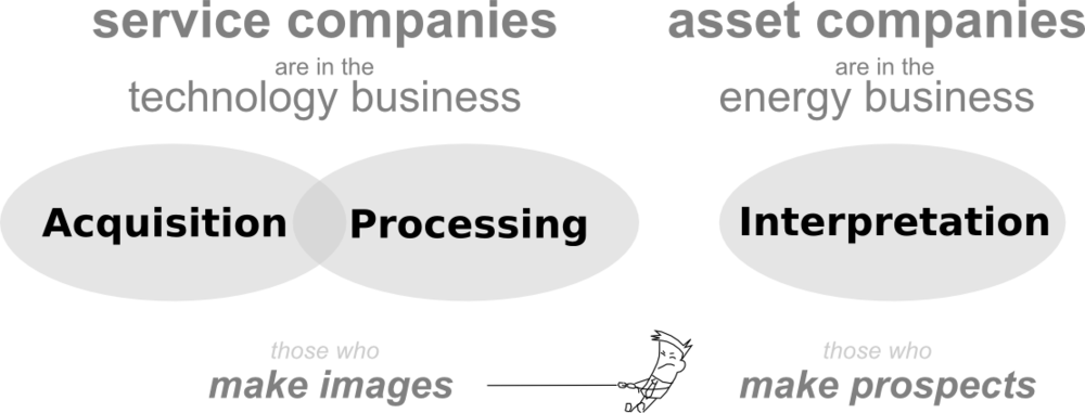
Well-rounded geophysicists will have experience in each of the following three areas: acquisition, processing, and interpretation. Generally speaking, these three areas make up the seismic method, each requiring highly specified knowledge and tools. Historically, energy companies used to control the entire spectrum, owning the technology, the know-how and the risk, but that is no longer the case. Now, service companies do the acquisition and the processing. Interpretation is largely hosted within E & P companies, the ones who buy land and drill wells. Not only has it become unreasonable for a single geophysicist to be proficient across the board, but organizational structures constrain any particular technical viewpoint. 

Aligning with the industry's strategy, if you are a geophysicist, you likely fall into one of two camps: those who make images, or those who make prospects. One set of people to make the data, one set of people to do the interpretation.

This seems very un-scientific to me.

Where does science fit in?

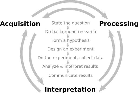
Science, the standard approach of rational inquiry and accruing knowledge, is largely vacant from the applied geophysical business landscape. But, when science is used as a model, making images and making prospects are inseperable.

Can applied geophysics use scientific behaviour as a central anchor across disciplines?

There is a significant amount of science that is needed in the way that we produce observations, in the way that we make images. But the business landscape built on linear procedures leaves no wiggle room for additional testing and refinement. How do processors get better if they don't hear about their results? As a way of compensating, processing has deflected away from being a science of questioning, testing, and analysis, and moved more towards, well,... a process.

The sure-fire way to build knowledge and decrease uncertainty, is through experimentation and testing. In this sense this notion of selling 'solutions', is incompatible with scientific behavior. Science doesn't claim to give solutions, science doesn't claim to give answers, but it does promise to address uncertainty; to tell you what you know.

In studying the earth, we have to accept a lack of clarity in our data, but we must not accept mistakes, errors, or mediocrity due to shortcomings in our shared methodologies.

We need a new balance. We need more connectors across these organizational and disciplinary divides. That's where value will be made as industry encounters increasingly tougher problems. Will you be a connector? Will you be a subscriber to science?

Hall, M (2012). Do you know what you think you know? CSEG Recorder 37 (2), February 2012, p 26–30. Free to download from CSEG. 

5 ways to kickstart an interpretation project

Last Friday, teams around the world started receiving external hard drives containing this year's datasets for the AAPG's Imperial Barrel Award (IBA for short). I competed in the IBA in 2008 when I was a graduate student at the University of Alberta. We were coached by the awesome Dr Murray Gingras (@MurrayGingras), we won the Canadian division, and we placed 4th in the global finals. I was the only geophysical specialist on the team alongside four geology graduate students.

Five things to do

Whether you are a staff geoscientist, a contractor, or competitor, it can help to do these things first:

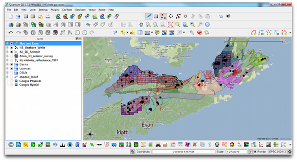
  1. Make a data availability map (preferably in QGIS or ArcGIS). A graphic and geospatial representation of what you have been given.
  2. Make well scorecards: as a means to demonstrate not only that you have wells, but what information you have within the wells.
  3. Make tables, diagrams, maps of data quality and confidence. Indicate if you have doubts about data origins, data quality, interpretability, etc.
  4. Background search: The key word is search, not research. Use Mendeley to organize, tag, and search through the array of literature
  5. Use Time-Scale Creator to make your own stratigraphic column. You can manipulate the vector graphic, and make it your own. Much better than copying an old published figure. But use it for reference.

All of these things can be done before assigning roles, before saying who needs to do what. All of this needs to be done before the geoscience and the prospecting can happen. To skirt around it is missing the real work, and being complacent. Instead of being a hammer looking for a nail, lay out your materials, get a sense of what you can build. This will enable educated conversations about how you can spend your geoscientific manpower, division of labour, resources, time, etc.

Read more, then go apply it 

In addition to these tips for launching out of the blocks, I have also selected and categorized blog posts that I think might be most relevant and useful. We hope they are helpful to all geoscientists, but especially for students. Visit the Agile blog highlights list on SubSurfWiki.

I wish a happy and exciting IBA competition to all participants, and their supporting university departments. If you are competing, say hi in the comments and tell us where you hail from. 

Swimming in acronym soup

In a few rare instances, an abbreviation can become so well-known that it is adopted into everyday language; more familar than the words it used to stand for. It's embarrasing, but I needed to actually look up LASER, and you might feel the same way with SONAR. These acronyms are the exception. Most are obscure barriers to entry in technical conversations. They can be constructs for wielding authority and exclusivity. Welcome to the club, if you know the password.

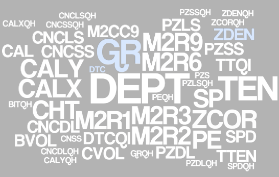
No domain of subsurface technology is riddled with more acronyms than well log analysis and formation evaluation. This is a big part of — perhaps too much of a part of — why petrophysics is hard. Last week, I came across a well. It has an extended suite of logs, and I wanted make a synthetic. Have a glance at the image and see which curve names you recognize (the size represents the frequency the names are encountered across many files of the same well).

I felt like I was being spoken to by some earlier deliquent: I got yer well logs right here buddy. Have fun sorting this mess out.

The log ASCII standard (*.LAS file) file format goes a long way to exposing descriptive information in the header. But this information is often incomplete, missing, and says nothing about the quality or completeness of the data. I had to scan 5 files to compile this soup. A micro-travesty and a failure, in my opinion. How does one turn this into meaningful information for geoscience?

Whose job is it to sort this out? The service company that collected the data? The operator that paid for it? A third party down the road?

What I need is not only an acronym look-up table, but also a data range tool to show me what I've got in the file (or files), and at which locations and depths I've got it. A database to give me more information about these acronyms would be nice too, and a feature that allows me to compare multiple files, wells, and directories at once. It would be like a life preserver. Maybe we should build it.

I made the word cloud by pasting text into wordle.net. I extracted the text from the data files using the wonderful LASReader written by Warren Weckesser. Yay, open source!

Touring vs tunnel vision

My experience with software started, and still largely sits, at the user end. More often than not, interacting with another's design. One thing I have learned from the user experience is that truly great interfaces are engineered to stay out of the way. The interface is only a skin atop the real work that software does underneath — taking inputs, applying operations, producing outputs. I'd say most users of computers don't know how to compute without an interface. I'm trying to break free from that camp. 

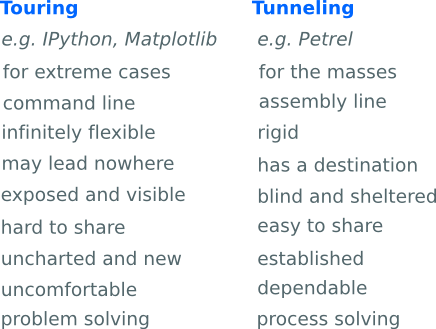
In The dangers of default disdain, I wrote about the power and control that the technology designer has over his users. A kind of tunnel is imposed that restricts the choices for interacting with data. And for me, maybe for you as well, the tunnel has been a welcome structure, directing my focus towards that distant point; the narrow aperture invokes at least some forward motion. I've unknowingly embraced the tunnel vision as a means of interacting without substantial choices, without risk, without wavering digressions. I think it's fair to say that without this tunnel, most travellers would find themselves stuck, incapacitated by the hard graft of touring over or around the mountain.

Tour guides instead of tunnels

But there is nothing to do inside the tunnel, no scenery to observe, just a black void between input and output. For some tasks, taking the tunnel is the only obvious and economic choice — all you want is to get stuff done. But choosing the tunnel means you will be missing things along the way. It's a trade off.

For getting from A to B, there are engineers to build tunnels, there are travellers to travel the tunnels, and there is a third kind of person altogether: tour guides take the scenic route. Building your own tunnel is a grand task, only worthwhile if you can find enough passengers to use it. The scenic route isn't just a casual lackadaisical approach. It's necessary for understanding the landscape; by taking it the traveler becomes connected with the territory. The challenge for software and technology companies is to expose people to the richness of their environment while moving them through at an acceptable pace. Is it possible to have a tunnel with windows?

Oil and gas operating companies are good at purchasing the tunnel access pass, but are not very good at building a robust set of tools to navigate the landscape of their data environment. After all, that is the thing that we travellers need to be in constant contact with. Touring or tunneling? The two approaches may or may not arrive at the same destination and they have different costs along the way, making it different business.

Geothermal facies from seismic

Here is a condensed video of the talk I gave at the SEG IQ Earth Forum in Colorado. Much like the tea-towel mock-ups I blogged about in July, this method illuminates physical features in seismic by exposing hidden signals and textures. 

This approach is useful for photographs of rocks and core, for satellite photography, or any geophysical data set, when there is more information to be had than rectangular and isolated arrangements of pixel values.

Click to download slides with notes!Interpretation has become an empty word in geoscience. Like so many other buzzwords, instead of being descriptive and specific jargon, it seems that everyone has their own definition or (mis)use of the word. If interpretation is the art and process of making mindful leaps between unknowns in data, I say, let's quantify to the best of our ability the data we have. Your interpretation should be iteratable, it should be systematic, and it should be cast as an algorithm. It should be verifiable, it should be reproducible. In a word, scientific.  

You can download a copy of the presentation with speaking notes, and access the clustering and texture codes on GitHub

What technology?

This is my first contribution to the Accretionary Wedge geology themed community blog. Charles Carrigan over at Earth-like Planet is hosting this months topic where he posts the question, "how do you perceive technology impacting the work that you do?" My perception of technology has matured, and will likely continue to change, but here are a few ways in which technology works for us at Agile. 

My superpower

I was at a session in December where one of the activities was to come up with one (and only one) defining superpower. A comic-bookification of my identity. What is the thing that defines you? The thing that you are or will be known for? It was an awkward experience for most, a bold introspection to quickly pull out a memorable, but not too cheesy, superpower that fit our life. I contemplated my superhuman intelligence, and freakish strength... too immodest. The right choice was invisibility. That's my superpower. Transparency, WYSIWYG, nakedness, openness. And I realize now that my superpower is, not coincidentally, aligned with Agile's approach to technology. 

For some, technology is the conspicuous interface between us and our work. But conspicuous technology constrains your work, ordains it even. The real challenge is to use technology in a way that makes it invisible. Matt reminds me that how I did it isn't as important as what I did. Making the technology seem invisible means the user must be invisible as well. Ultimately, tools don't matter—they should slip away into the whitespace. Successful technology implementation is camouflaged. 

I is for iterate

Technology is not a source of ideas or insights, such as you'd find in the mind of an experienced explorationist or in a detailed cross-section or map. I'm sure you could draw a better map by hand. Technology is only a vehicle that can deliver the mind's inner constructs; it's not a replacement for vision or wisdom. Language or vocabulary has nothing to do with it. Technology is the enabler of iteration. 

So why don't we iterate more in our scientific work? Because it takes too long? Maybe that's true for a hand-drawn contour map, but technology is reducing the burden of iteration. Because we have never been taught humility? Maybe that stems from the way we learned to learn: homework assignments have exact solutions (and are done only once), and re-writing an exam is unheard of (unless you flunked it the first time around).

What about writing an exam twice to demonstrate mastery? What about reading a book twice, in two different ways? Once passively in your head, and once actively—at a slower pace, taking notes. I believe the more ways you can interact with your media, data, or content, the better work will be done. Students assume that the cost required to iterate outweighs the benefits, but that is no longer the case with digital workflows. Embracing technology's capacity to iterate seemlessly and reliably is what a makes a grand impact in our work.

What do we use?

Agile strives to be open as a matter of principle, so when it comes to software we go for open source by default. Matt wrote recently about the applications and workstations that we use. 

Checklists for everyone

Avoidable failures are common and persistent, not to mention demoralizing and frustrating, across many fields — from medicine to finance, business to government. And the reason is increasingly evident: the volume and complexity of what we know has exceeded our individual ability to deliver its benefits correctly, safely, or reliably. Knowledge has both saved and burdened us.

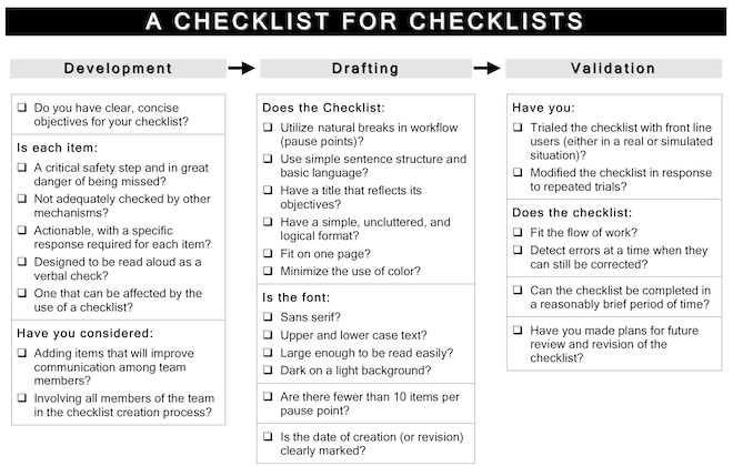
I first learned about Atul Gawande from Bill Murphy's talk at the 1IWRP conference last August, where he offered the surgeon's research model for all imperfect sciences; casting the spectrum of problems in a simple–complicated–complex ternary space. In The Checklist Manifesto, Gawande writes about a topic that is relevant to all all geoscience: the problem of extreme complexity. And I have been batting around the related ideas of cookbooks, flowcharts, recipes, and to-do lists for maximizing professional excellence ever since. After all, it is challenging and takes a great deal of wisdom to cut through the chaff, and reduce a problem to its irreducible and essential bits. Then I finally read this book.

The creation of the now heralded 19-item surgical checklist found its roots in three places — the aviation industry, restaurant kitchens, and building construction:

Thinking about averting plane crashes in 1935, or stopping infections in central lines in 2003, or rescuing drowning victims today, I realized that the key problem in each instance was essentially a simple one, despite the number of contributing factors. One needed only to focus attention on the rudder and elevator controls in the first case, to maintain sterility in the second, and to be prepared for cardiac bypass in the third. All were amenable, as a result, to what engineers call "forcing functions": relatively straightforward solutions that force the necessary behavior — solutions like checklists.

What is amazing is that it took more than two years, and a global project sponsored by the World Health Organization, to devise such a seemingly simple piece of paper. But what a change it has had. Major complications fell by 36%, and deaths fells by 47%. Would you adopt a technology that had a 36% improvement in outcomes, or a 36% reduction in complications? Most would without batting an eye.

But the checklist paradigm is not without skeptics. There is resistance to the introduction of the checklist because it threatens our autonomy as professionals, our ego and intelligence that we have trained hard to attain. An individual must surrender being the virtuoso. It enables teamwork and communication, which engages subordinates and empowers them at crucial points in the activity. The secret is that a checklist, done right, is more than just tick marks on a piece of paper — it is a vehicle for delivering behavioural change.

I can imagine huge potential for checklists in the problems we face in petroleum geoscience. But what would such checklists look like? Do you know of any in use today?

Polarity cartoons

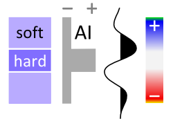
...it is good practice to state polarity explicitly in discussions of seismic data, with some phrase such as: 'increase in impedance downwards gives rise to a red (or blue, or black) loop.'

Bacon, Simm & Redshaw (2003), 3D Seismic Interpretation, Cambridge

Good practice, but what a mouthful. And perhaps because it is such a cumbersome convention, it is often ignored, assumed, or skipped. We'd like to change that. Polarity is important, everyone needs to know what the wiggles (or colours) of seismic data mean.

Two important things

    Click the image to find your favorite colorbarSeismic data is about contrasts. The data are an abstraction of geological contrasts in the earth. To connect the data to the geology, there are two important things you need to know about your data:

  1. What do the colours mean in terms of digits?

  2. What do the digits mean in terms of impedance?

So whenever you show seismic to someone, you need to answers these questions for them. Show the colourbar, and the sign of the digits (the magnitude of the digits is not very important; amplitude are relative). Show the relationship between the sign of the digits and impedance.

Really useful

To help you show these things, we have created a table of polarity cartoons for some common colour scales.

  1. Decide if you want to use the American–Canadian convention of a downwards increase in impedance resulting in a positive amplitude, or the opposite European–Australian convention. Sometimes people talk about SEG Normal polarity — the de facto SEG standard is the American convention.

  2. Choose whether you want to show a high impedance layer sandwiched between low impedance ones, or vice versa. To make this decision, inspect your well ties or plot impedance against lithology. For example, if your sands are relatively fast and dense, you may want to choose the hard layer option.

  3. Select a colourmap that matches your displays. If you need another, you can download and edit the SVG file, or email us and we'll add it for you.

  4. Right-click on a thumbnail, copy it to your clipboard, and paste it into the corner of your section or timeslice in PowerPoint, Word, or wherever. If the thumbnail is too small or pixelated, click the thumbnail for higher resolution.

With so many options to choose from, we hope this little tool can help make your seismic discussions a little more transparent. What's more, if you see a seismic section without a legend like this, then are you sure the presenter knows about the polarity of their data? Perhaps they do, but it is an oversight to assume that you should know as well. 

What do you make your audience assume?


UPDATE [2020] — we built a small web app to serve up fresh polarity cartoons, whenever you need them! Check it out.