Wiki world of geoscience

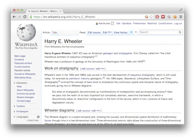
This weekend, I noticed that there was no Wikipedia article about Harry Wheeler, one of the founders of theoretical stratigraphy. So I started one. This brings the number of biographies I've started to 3:

  • Karl Zoeppritz — described waves almost perfectly, but died at the age of 26
  • Johannes Walther — started as a biologist, but later preferred rocks
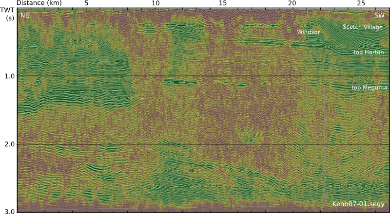
  • Harry Wheeler — if anyone has a Wheeler diagram to share, please add it!

Many biographies of notable geoscientists are still missing (there are hundreds, but here are three): 

  • Larry Sloss — another pioneer of modern stratigraphy
  • Oz Yilmaz — prolific seismic theoretician and practioner
  • Brian Russell — entrepreneur and champion of seismic analysis

It's funny, Wikipedia always seems so good — it has deep and wide content on everything imaginable. I think I must visit it 20 or 30 times a day. But when you look closely, especially at a subject you know a bit about, there are lots of gaps (I wonder if this is one of the reasons people sometimes deride it?). There is a notability requirement for biographies, but for some reason this doesn't seem to apply to athletes or celebrities. 

I was surprised the Wheeler page didn't exist, but once you start reading, there are lots of surprises:

I run a geoscience wiki, but this is intended for highly esoteric topics that probably don't really belong in Wikipedia, e.g. setting parameters for seismic autopickers, or critical reviews of subsurface software (both on my wish list). I am currently working on a wiki for AAPG — is that the place for 'deep' petroleum geoscience? I also spend time on SEG Wiki... With all these wikis, I worry that we risk spreading ourselves too thinly? What do you think?

In the meantime, can you give 10 minutes to improve a geoscience article in Wikipedia? Or perhaps you have a classful of students to unleash on an assignment?

Tomorrow, I'll tell you about an easy way to help improve some geophysics content.

Seismic quality traffic light

We like to think that our data are perfect and limitless, because experiments are expensive and scarce. Only then can our interpretations hope to stand up to even our own scrutiny. It would be great if seismic data was a direct representation of geology, but it never is. Poor data doesn't necessarily mean poor acquisition or processing. Sometimes geology is complex!

In his book First Steps in Seismic Interpretation, Don Herron describes a QC technique of picking a pseudo horizon at three different elevations to correspond to poor, fair, and good data regions. I suppose that will do in a pinch, but I reckon it would take a long time, and it is rather subjective. Surely we can do better?

Computing seismic quality

Conceptually speaking, the ease of interpretation depends on things we can measure (and display), like coherency, bandwidth, amplitude strength, signal-to-noise, and so on. There is no magic combination of filters that will work for all data, but I am convinced that for every seismic dataset there is a weighted function of attributes that can be concocted to serve as a visual indicator of the data complexity:

So one of the first things we do with new data at Agile is a semi-quantitative assessment of the likely ease and reliability of interpretation.

This traffic light display of seismic data quality, corendered here with amplitude, is not only a precursor to interpretation. It should accompany the interpretation, just like an experiment reporting its data with errors. The idea is to show, honestly and objectively, where we can trust eventual interpretations, and where they not well constrained. A common practice is to cherry pick specific segments or orientations that support our arguments, and quietly suppress those that don't. The traffic light display helps us be more honest about what we know and what we don't — where the evidence for our model is clear, and where we are relying more heavily on skill and experience to navigate a model through an area where the data is unclear or unconvincing.

Capturing uncertainty and communicating it in our data displays is not only a scientific endeavour, it is an ethical one. Does it change the way we look at geology if we display our confidence level alongside? 

Reference

Herron, D (2012). First Steps in Seismic Interpretation. Geophysical Monograph Series 16. Society of Exploration Geophysicists, Tulsa, OK.

The seismic profile shown in the figure is from the Kennetcook Basin, Nova Scotia. This work was part of a Geological Survey of Canada study, available in this Open File report.

What is Creative Commons?

Not a comprehensive answer either, but much more brilliantI just found myself typing a long email in reply to the question, "What is a Creative Commons license and how do I use it?" Instead, I thought I'd post it here. Note: I am not a lawyer, and this is not a comprehensive answer.

Creative Commons depends on copyright

There is no relinquishment of copyright. This is important. In the case of 52 Things, Agile Geoscience is the copyright holder. In the case of an article, it's the authors themselves, unless the publisher gets them to sign a form relinquishing it. Copyright is an automatic, moral right (under the Berne Convention), and boils down to the right to be identified as the authors of the work ('attribution').

Most copyright holders grant licenses to re-use their work. For instance, you can pay hundreds of dollars to reproduce a couple of pages from an SPE manual for a classroom of students (if you are insane). You can reprint material from a book or journal article — again, usually for a fee. These licenses are usually non-exclusive, non-transferable, and use-specific. And the licensee must (a) ask and (b) pay the licensor (that is, the copyright holder). This is 'the traditional model'.

Obscurity is a greater threat than piracy

Some copyright holders are even more awesome. They recognize that (a) it's a hassle to always have to ask, and (b) they'd rather have the work spread than charge for it and stop it spreading. They wish to publish 'open' content. It's exactly like open source software. Creative Commons is one, very widespread, license you can apply to your work that means (a) they don't have to ask to re-use it, and (b) they don't have to pay. You can impose various restrictions if you must.

Creative Commons licenses are everywhere. You can apply Creative Commons licenses at will, to anything you like. For example, you can CC-license your YouTube videos or Flickr photos. We CC-license our blog posts. Almost everything in Wikipedia is CC-licensed. You could CC-license a single article in a magazine (in fact, I somewhat sneakily did this last February). You could even CC-license a scientific journal (imagine!). Just look at all the open content in the world!

Creative Commons licenses are easy to use. Using the license is very easy: you just tell people. There is no cost or process. Look at the footer of this very page, for example. In print, you might just add the line This article is licensed under a Creative Commons Attribution license. You may re-use this work without permission. See http://creativecommons.org/licenses/by/3.0/ for details. (If you choose another license, you'd use different wording.)

Creative_Commons.jpg

I recommend CC-BY licenses. There are lots of open licenses, but CC-BY strikes a good balance between being well-documented and trusted, and being truly open (though it is not recognized as such, on a technicality, by copyfree.org). The main point is that they are very open, allowing anyone to use the work in any way, provided they attribute it to the author and copyright holder — it's just like scientific citation, in a way.

Do you openly license your work? Or do you wish more people did? Do you notice open licenses?

Creative Commons graphic by Flickr user Michael Porter. The cartoon is from Nerdson, and licensed CC-BY. 'Obscurity is a greater threat than piracy' is paraphrased from a quote by Tim O'Reilly, publishing 2.0 legend. 

Back to work

This post first appeared as a chapter in 52 Things You Should Know About Geophysics (Agile Libre, 2012 — also at Amazon). To follow up on Back to school on Tuesday, I thought I'd share it here on the blog. It's aimed at young professionals, but to be honest, I could do with re-reading it myself now and again...


Five things I wish I'd known

For years I struggled under some misconceptions about scientific careers and professionalism. Maybe I’m not particularly enlightened, and haven't really woken up to them yet, and it's all obvious to everyone else, but just in case I am, I have, and it's not, here are five things I wish I'd known at the start of my career.

Always go the extra inch. You don't need to go the extra mile — there often isn't time and there's a risk that no one will notice anyway. An inch is almost always enough. When you do something, like work for someone or give a presentation, people only really remember two things: the best thing you did, and the last thing you did. So make sure those are awesome. It helps to do something unexpected, or something no one has seen before. It is not as hard as you'd think — read a little around the edges of your subject and you'll find something. Which brings me to...

Read, listen, and learn. Subscribe to some periodicals, preferably ones you will actually enjoy reading. You can see my favourites in J is for Journal. Go to talks and conferences, as often as you reasonably can. But, and this is critical, don't just go — take part. Write notes, ask questions, talk to presenters, discuss with others afterwards. And learn: do take courses, but choose them wisely. In my experience, most courses are not memorable or especially effective. So ask for recommendations from your colleagues, and make sure there is plenty of hands-on interaction in the course, preferably on computers or in the field. Good: Dan Hampson talking you through AVO analysis on real data. Bad: sitting in a classroom watching someone derive equations.

Write, talk, and teach. The complement to read, listen, and learn. It's never too early in your career to start — don't fall into the trap of thinking no one will be interested in what you do, or that you have nothing to share. Even new graduates have something in their experience that nobody else has. Technical conference organizers are desperate for stories from the trenches, to dilute the blue-sky research and pseudo-marketing that most conferences are saturated with. Volunteer to help with courses. Organize workshops and lunch-and-learns. Write articles for Recorder, First Break, or The Leading Edge. Be part of your science! You'll grow from the experience, and it will help you to...

Network, inside and outside your organization. Networking is almost a dirty word to some people, but it doesn’t mean taking people to hockey games or connecting with them on LinkedIn. By far the best way to network is to help people. Help people often, for free, and for fun, and it will make you memorable and get you connected. And it's easy: at least 50 percent of the time, the person just needs a sounding board and they quickly solve their own problem. The rest of the time, chances are good that you can help, or know someone who can. Thanks to the Matthew Effect, whereby the rich get richer, your network can grow exponentially this way. And one thing is certain in this business: one day you will need your network.

Learn to program. You don't need to turn yourself into a programmer, but my greatest regret of my first five years out of university is that I didn't learn to read, re-use, and write code. Read Learn to program to find out why, and how.


Do you have any advice for new geoscientists starting out in their careers? What do you wish you'd known on Day 1?

Back to school

My children go back to school this week. One daughter is going into Grade 4, another is starting kindergarten, and my son is starting pre-school at the local Steiner school. Exciting times.

I go all misty-eyed at this time of year. I absolutely loved school. Mostly the learning part. I realize now there are lots of things I was never taught (anything to do with computers, anything to do with innovation or entrepreneurship, anything to do with blogging), but what we did cover, I loved. I'm not even sure it's learning I like so much — my retention of facts and even concepts is actually quite bad — it's the process of studying.

Lifelong learning

Naturally, the idea of studying now, as a grown-up and professional, appeals to me. But I stopped tracking courses I've taken years ago, and actually now have stopped doing them, because most of them are not very good. I've found many successful (that is, long running) industry courses to be disappointingly bad — long-running course often seems to mean getting a tired instructor and dated materials for your $500 per day. (Sure, you said the course was good when you sis the assessment, but what did you think a week later? A month, a year later? If you even remember it.) I imagine it's all part of the 'grumpy old man' phase I seem to have reached when I hit 40.

But I am grumpy no longer! Because awesome courses are back...

So many courses

Last year Evan and I took three high quality, and completely free, massive online open courses, or MOOCs:

There aren't a lot of courses out there for earth scientists yet. If you're looking for something specific, RedHoop is a good way to scan everything at once.

The future

These are the gold rush days, the exciting claim-staking pioneer days, of massive online open courses. Some trends:

There are new and profound opportunities here for everyone from high school students to postgraduates, and from young professionals to new retirees. Whether you're into teaching, or learning, or both, I recommend trying a MOOC or two, and asking yourself what the future of education and training looks like in your world.

The questions is, what will you try first? Is there a dream course you're looking for?

Colouring maps

Over the last fortnight, I've shared five things, and then five more things, about colour. Some of the main points:

  • Our non-linear, heuristic-soaked brains are easily fooled by colour.
  • Lots of the most common colour bars (linear ramps, bright spectrums) are not good choices.
  • You can learn a lot by reading Robert Simmon, Matteo Niccoli, and others.

Last time I finished on two questions:

  1. How many attributes can a seismic interpreter show with colour in a single display?
  2. On thickness maps should the thicks be blue or red?

One attribute, two attributes

The answer to the first question may be a matter of personal preference. Doubtless we could show lots and lots, but the meaning would be lost. Combined red-green-blue displays are a nice way to cram more into a map, but they work best on very closely related attributes, such as seismic amplitude of three particular frequencies

Here's some seismic reflection data — the open F3 dataset, offshore Netherlands, in OpendTect

A horizon — just below the prominent clinoforms — is displayed (below, left) and coloured according to elevation, using one of Matteo's perceptual colour bars (now included in OpendTect!). A colour scale like this varies monotonically in hue and luminance.

Some of the luminance channel (sometimes called brightness or value) is showing elevation, and a little is being used up by the 3D shading on the surface, but not much. I think the brain processes this automatically because the 3D illusion is quite good, especially when the scene is moving. Elevation and shape are sort of the same thing, so we've still only really got one attribute. Adding contours is quite nice (above, middle), and only uses a narrow slice of the luminance channel... but again, it's the same data. Much better to add new data. Similarity (a member of the family that includes coherence, semblance, and so on) is a natural fit: it emphasizes a particular aspect of the shape of the surface, but which was measured independently of the interpretaion, directly from the data itself. And it looks awesome (above, right).

Three attributes, four

OK, we have elevation and/or shape, and similarity. What else can we add? Another intuitive attribute of seismic is amplitude (below, left) — closely related to the strength of the reflected energy. Two things: we don't trust amplitudes in areas with low fold — so we can mask those (below, middle). And we're only really interested in bright spots, so we can edit the opacity profile of the attribute and make low values transparent (below, right). Two more attributes — amplitude (with a cut-off that reflects my opinion of what's interesting — is that an attribute?) and fold.

Since we have only used one hue for the amplitude, and it was not in Matteo's colour bar, we can layer it on the original map without clobbering anything. Unfortunately, there's no easy way for the low fold mask to modulate amplitude without interfering with elevation, because the elevation map needs to be almost completely opaque. What I need is a way to modulate a surface's opacity with an attribute it is not displaying with hue...

Thickness maps

The second question — what to colour thicks — is easy. Thicks should be towards the red end of the spectrum, sometimes not-necessarily-intuitively called 'warm' colours. (As I mentioned before in the comments, a quick Google image poll suggests that about 75% of people agree). If you colour your map otherwise, perhaps because you like the way it suggests palaeobathymetry in some depositional settings, be careful to make this very clear with labels and legends (which you always do anyway, right?). And think about just making a 'palaeobathymetry' map, not a thickness map.

I suspect there are lots of quite personal opinions out there. Like grammar, I do think much of this is a matter of taste. The only real test is clarity. Do you agree? Is there a right and wrong here? 

Make some geophysics!

Last month we announced the Geophysics Hackathon. It's one month away today, so I thought I'd post a quick update with the latest developments.

First: good news. The event will be completely free to attend.

Second, I wanted to clear something up. The hackathon is not about hacking, as in gaining illicit access to other people's computers. That would be bad. Today, 'hacking' has reverted to its original MIT meaning, and tends to mean rapid prototyping and tool creation — playing! — with software, with hardware, or with life in general

START Houston

We'll be camped out at START Houston, a progressive co-working and incubation space in the East Downtown area of Houston. This is exciting because START is plugged right in to the most innovative, fast-moving, energetic people in Houston. Some of them even work in the energy business! 

What you can hack

You can come to the hackathon and do anything you like — closed or open source, on your own or in a team, web or mobile or desktop or mainframe. But we are holding a contest, for those that are interested. The contest has some rules. But the first rule of the day is, you don't have to enter the contest. If you prefer, just come and learn something new — I will be there to get you started. Stuck for ideas? There are loads on the wiki page.

Prizes

I'm rather excited about the prizes. I don't want to let the cat completely out of the bag, but we have some Nexus 7 tablets to give away, some Raspberry Pi kits, lots of must-read books, and several years' worth of access to MyBalsamiq — a cloud-based user-interface design tool.

Huge thanks to Enthought and Balsamiq for helping to make all this awesome happen.

Join us! Sign up...

As of right now, there are 16 people coming to the two days. Can you help us get to 25? Send this post to someone you know would be into it... and come along yourself. If you know geophysics or seismic interpretation, or you have a good head for business, or you like math and stats, or you know how to code — you'll fit right in. See you there!

Five more things about colour

Last time I shared some colourful games, tools, and curiosities, including the weird chromostereopsis effect (right). Today, I've got links to much, much more 'further reading' on the subject of colour...


The provocation for this miniseries was Robert 'Blue Marble' Simmon's terrific blog series on colour, which he's right in the middle of. Robert is a data visualization pro at NASA Earth Observatory, so we should all listen to him. Here's his collection (updated after the original writing of this post):

Perception is everything! One of Agile's best friends is Matteo Niccoli, a quantitative geophysicist in Norway (for now). And one of his favourite subjects is colour — there are loads of great posts on his blog. He also has a fine collection of perceptual colour bars (left) for most seismic interpretation software. If you're still using Spectrum for maps, you need his help.

Dave Green is a physicist at the University of Cambridge. Like Matteo, he has written about the importance of using colour bars which have a linear increase in perceived brightness. His CUBEHELIX scheme (above) adapts easily to your needs — try out his colour bar creator. And if this level of geekiness gets you going, try David Dalrymple or Gregor Aisch.

ColorBrewer is a legendary web app and add-in for ArcGIS. It's worth playing with the various colour schemes, especially if you need a colour bar that is photocopy friendly, or that can still be used by colour blind people. The equally excellent, perhaps even slightly more excellent, i want hue is also worth playing with (thanks to Robert Simmon for that one). 

In scientific publishing, the Nature family of journals has arguably the finest graphics. Nature Methods carries a column called Points of View, which looks at scientific visualization. This mega-post on their Methagora blog links to them all, and covers everything from colour and 3D graphics to broader issues of design and typography. Wonderful stuff.

Since I don't seem to have exhausted the subject yet, we'll save a couple of practical topics for next time:

  1. A thought experiment: How many attributes can a seismic interpreter show with colour in a single display?
  2. Provoked by a reader via email, we'll think about that age old problem for thickness maps — should the thicks be blue or red?

Five things about colour

The fact that colour is a slippery subject is powerfully illustrated by my favourite optical illusion. Look at this:

Squares A and B are the same shade of grey. It's so hard to believe that you might need to see the proof to be convinced. 

Chromostereopsis is a similarly disarming effect that you may have noticed on maps with bright spectrum colour bars. Most people perceive blue and red on different depth planes, so the pseudo-3D effect can work in your favour and make the map 'pop' (This is not a good reason to use a spectrum colour bar, however... more on this next time). I notice that at least one set designer knows about the effect, making William Shatner pop on the TV show Have I Got News For You:

Color is a fun way to test your colour intuition. The game starts easy, but is very hard by the end as you simulatneously match colour tetrads. The first time I played I managed 9.8, which I am not-very-secretly quite pleased about. But I haven't been able to repeat the performance.

X-Rite's Online Color Challenge is also tough. You have to sort the very subtle colours into order. It takes a while to play but is definitely worth it. If your job depends on spotting subtle effects in images (like seismic data, for example) then stand by to learn something about your detection system. 

Color blindness will change how these games work, of course, and should change how we make maps, figures, and slides. Since up to about 5% of a large audience might be colour blind, you might want to think about how your presentations look to them. You can easily check with Vischeck and correct images for colourblind people with the Daltonizer. They can still be beautiful, but you can avoid certain colour combinations and reach a wider audience.

I have lots more links about colour to share in the next post, including some required reading from Rob Simmon and Matteo Niccoli, among others. In the meantime, have you come across any handy colour tools, or has colour ever caught you out? Let us know in the comments.

The image of William Shatner is copyright and courtesy of Hat Trick Productions Ltd, London, UK, and used with permission.

First appearance datum at Green Point

Armed with the Geologic Field Guide of Newfoundland, last week I ventured to one of the most intensely scrutinized outcrops in the world. Green Point in Gros Morne National Park provides continuous exposure to more than 30 million years of sediment accumulation in the Iapetus ocean. The rocks formed in deep water near the base of the ancient continental slope. It was awesome and humbling.

In January 2000, the International Union of Geological Sciences designated Green Point as a Global Stratotype Section and Point (GSSP). That's an official international reference point for the geologic time scale. I learned after the fact that there are only a handful of these in North America.

Researchers and students at Memorial University and elsewhere studied more than 10,000 fossils from Green Point, using tiny conodonts and delicate graptolites to locate the boundary between the Cambrian and Ordovician periods, 488 Ma in the past. They have narrowed it down to a single layer, Bed 23, that contains the first appearance of the conodant species, Iapetognathus fluctivagus.

To the best of my estimatation, I have indicated the location of Bed 23 with the white dashed line in the figure to the right, and with the pointing figure of my *ahem* geologic scale marker in the photograph below.

Snapshots from the Outcrop

Being the massive natural exhibition that it is, there are likely volumes of things to observe and measure at Green Point. I had no agenda whatsoever, but here are four observations that caught my interest:

  1. Cavities from core plugs at regularly spaced intervals. Each piece taken and studied as part of an international scientific experiment, aimed at accurately identifying major turning points in earth's history. 
  2. Small scale fault with some antithetic joints reminiscent of some artifacts I have seen on seismic.
  3. and 4. A faulted limestone conglomerate bed. Shown from two different points of view. I am increasingly curious about the nature of the aperture of deformation zones. Such formidable forces, such a narrow region of strain.

I left with a feeling that I am sure is felt by most geologists leaving a site of extreme interest. Did I make enough observations? Did I collect enough data? I wish I had a GigaPan, or maybe portable LiDAR station. I feel reconnected to the vastness of scales over which earth processes occur, and the heterogeneity caused by well-understood systems playing out over inconceivable expanses of time. 

I'd like to flip the outcrop 120° counterclockwise, and build another stupid seismic model. What could mathematicians, programmers, and geoscientists do at this outcrop? A digital playground for integration awaits.