A long weekend of Atlantic geology

The Atlantic Geoscience Society Colloquium was hosted by Acadia University in Wolfville, Nova Scotia, this past weekend. It was the 50th Anniversay meeting, and attracted a crowd of about 175 geoscientists. A few members were able to reflect and tell stories first-hand of the first meeting in 1964.

It depends which way you slice it

Nova Scotia is one of the best places for John Waldron to study deformed sedimentary rocks of continental margins and orogenic belts. Being the anniversary, John traced the timeline of tectonic hypotheses over the last 50 years. From his kinematic measurements of Nova Scotia rocks, John showed the complexity of transtensional tectonics. It is easy to be fooled: you will see contraction features in one direction, and extension structures in another direction. It all depends which way you slice it. John is a leader in visualizing geometric complexity; just look at this animation of piecing together a coal mine in Stellarton. Oh, and he has a cut and fold exercise so that you can make your own Grand Canyon! 

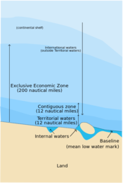
The application of the Law of the Sea

In September 2012 the Bedford Institute of Oceanography acquired some multibeam bathymetric data and applied geomorphology equations to extend Canada's boundaries in the Atlantic Ocean. Calvin Campbell described the cruise as like puttering from Halifax to Victoria and back at 20 km per hour, sending a chirp out once a minute, each time waiting for it to go out 20 kilometres and come back.

The United Nation's Convention on the Law of the Sea (UNCLOS) was established to define the rights and responsibilities of nations in their use of the world's oceans, establishing guidelines for businesses, the environment, and the management of marine natural resources. A country is automatically entitled to any natural resources found within a 200 nautical mile limit of its coastlines, but can claim a little bit more if they can prove they have sedimentary basins beyond that. 

Practicing the tools of the trade

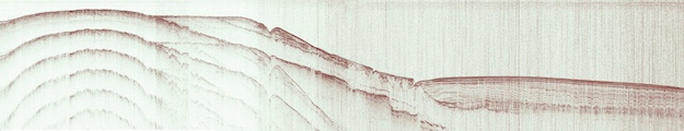
Taylor Campbell, applied a post-stack seismic inversion workflow to the Penobscot 3D survey and wells. Compared to other software talks I have seen in industry, Taylor's was a quality piece of integrated technical work. This is even more commendable considering she is an undergraduate student at Dalhousie. My only criticism, which I shared with her after the talk was over, was that the work lacked a probing question. It would have served as an anchor for the work, and I think is one of the critical distinctions between scientific pursuits and engineering.

Image courtesy of Justin Drummond, 2014, personal communication, from his expanded abstract presented at GSA 2013.

Practicing rational inquiry

Justin Drummond's work, on the other hand, started with a nugget of curiosity: How did the biogeochemical cycling of phosphorite change during the Neoproterozoic? Justin's anchoring question came first, only then could he think about the methods, technologies and tools he needed to employ, applying sedimentology, sequence stratigraphy, and petrology to investigate phosphorite accumulation in the Sete Lagoas Formation. He won the award for Best Graduate Student presentation at the conference.

It is hard to know if he won because his work was so good, or if it was because of his impressive vocabulary. He put me in mind of what Rex Murphy would sound like if he were a geologist.

The UNCLOS illustration is licensed CC-BY-SA, by Wikipedia users historicair and MJSmit.

Atlantic geology hits Wikipedia

WikiProject Geology is one of the gathering places for geoscientists in Wikipedia.Regular readers of this blog know that we're committed to open scientific communication, and that we're champions of wikis as one of the venues for that communication, and that we want to see more funky stuff happen at conferences. In this spirit, we hosted a Wikipedia editing session at the Atlantic Geoscience Society Colloquium in Wolfville, Nova Scotia, this past weekend. 

As typically happens with these funky sessions, it wasn't bursting at the seams: The Island of Misfit Toys is not overcrowded. There were only 7 of us: three Agilistas, another consultant, a professor, a government geologist, and a student. But it's not the numbers that matter (I hope), it's the spirit of the thing. We were a keen bunch and we got quite a bit done. Here are the articles we started or built upon:

The birth of the Atlantic Geoscience Society page gave the group an interesting insight into Wikipedia's quality control machine. Within 10 minutes of publishing it, the article was tagged for speedy deletion by an administrator. This sort of thing is always a bit off-putting to noobs, because Wikipedia editors can be a bit, er, brash, or at least impersonal. This is not that surprising when you consider that new pages are created at a rate of about one a minute some days. Just now I resurrected a stripped-down version of the article, and it has already been reviewed. Moral: don't let anyone tell you that Wikipedia is a free-for-all.

All of these pages are still (and always will be) works in progress. But we added 5 new pages and a substantial amount of material with our 28 or so hours of labour. Considering most of those who came had never edited a wiki before, I'm happy to call this a resounding success. 

Much of my notes from the event could be adapted to any geoscience wiki editing session — use them as a springboard to get some champions of open-access science together at your next gathering. If you'd like our help, get in touch.

Rock Hack 2014

We're hosting another hackathon! This time, we're inviting geologists in all their colourful guises to come and help dream up cool tools, find new datasets, and build useful stuff. Mark your calendar: 5 & 6 April, right before AAPG.

On 4 April there's the added fun of a Creative geocomputing course. So you can learn some skills, then put them into practice right away. More on the course next week.

What's a hackathon?

It's not as scary — or as illegal — as it sounds! And it's not just for coders. It's just a roomful of creative geologists and friendly programmers figuring out two things together:

  1. What tools would help us in our work?
  2. How can we build those tools?

So for example, we might think about problems like these:

  • A sequence stratigraphy calibration app to tie events to absolute geologic time
  • Wireline log 'attributes'
  • Automatic well-to-well correlation
  • Facies recognition from core
  • Automatic photomicrograph interpretation: grain size, porosity, sorting, and so on
  • A mobile app for finding and capturing data about outcrops
  • Sedimentation rate analysis, accounting for unconformities, compaction, and grain size

I bet you can think of something you'd like to build — add it to the list!

Still not sure? Check out what we did at the Geophysics Hackathon last autumn...

How do I sign up?

You can sign up for the creative geocomputing course at Eventbrite.

If you think Rock Hack sounds like a fun way to spend a weekend, please drop us a line or sign up at Hacker League. If you're not sure, please come anyway! We love visitors.

If you think you know someone who'd be up for it, let them know with the sharing buttons below.

The poster image is from an original work by Flickr user selkovjr.

January linkfest

Time for the quarterly linkfest! Got stories for next time? Contact us.

BP's new supercomputer, reportedly capable of about 2.2 petaflops, is about as fast as Total's Pangea machine in Paris, which booted up almost a year ago. These machines are pretty amazing — Pangea has over 110,000 cores, and 442 terabytes of memory — but BP claims to have bested that with 1 petabyte of RAM. Remarkable. 

Leo Uieda's open-source modeling tool Fatiando a Terra got an upgrade recently and hit version 0.2. Here's Leo himself demonstrating a forward seismic model:

I'm a geoscientst, get me out of here is a fun-sounding new educational program from the European Geosciences Union, which has recently been the very model of a progressive technical society (along with the AGU is another great example). It's based on the British outreach program, I'm a scientist, get me out of here, and if you're an EGU member (or want to be), I think you should go for it! The deadline: 17 March, St Patrick's Day.

Darren Wilkinson writes a great blog about some of the geekier aspects of geoscience. You should add it to your reader (I'm using The Old Reader to keep up with blogs since Google Reader was marched out of the building). He wrote recently about this cool tool — an iPad controller for desktop apps. I have yet to try it, but it seems a good fit for tools like ArcGIS, Adobe Illustrator.

Speaking of big software, check out Joe Kington's Python library for GeoProbe volumes — I wish I'd had this a few years ago. Brilliant.

And speaking of cool tools, check out this great new book by technology commentator and philosopher Kevin Kelly. Self-published and crowd-sourced... and drawn from his blog, which you can obviously read online if you don't like paper. 

If you're in Atlantic Canada, and coming to the Colloquium next weekend, you might like to know about the wikithon on Sunday 9 February. We'll be looking for articles relevant to geoscientists in Atlantic Canada to improve. Tim Sherry offers some inspiration. I would tell you about Evan's geocomputing course too... but it's sold out.

Heard about any cool geostuff lately? Let us know in the comments. 

6 questions about seismic interpretation

This interview is part of a series of conversations between Satinder Chopra and the authors of the book 52 Things You Should Know About Geophysics (Agile Libre, 2012). The first three appeared in the October 2013 issue of the CSEG Recorder, the Canadian applied geophysics magazine, which graciously agreed to publish them under a CC-BY license.


Satinder Chopra: Seismic data contain massive amounts of information, which has to be extracted using the right tools and knowhow, a task usually entrusted to the seismic interpreter. This would entail isolating the anomalous patterns on the wiggles and understanding the implied subsurface properties, etc. What do you think are the challenges for a seismic interpreter?

Evan Bianco: The challenge is to not lose anything in the abstraction.

The notion that we take terabytes of prestack data, migrate it into gigabyte-sized cubes, and reduce that further to digitized surfaces that are hundreds of kilobytes in size, sounds like a dangerous discarding of information. That's at least 6 orders of magnitude! The challenge for the interpreter, then, is to be darn sure that this is all you need out of your data, and if it isn't (and it probably isn't), knowing how to go back for more.

SC: How do you think some these challenges can be addressed?

EB: I have a big vision and a small vision. Both have to do with documentation and record keeping. If you imagine the entire seismic experiment upon a sort of conceptual mixing board, instead of as a linear sequence of steps, elements could be revisited and modified at any time. In theory nothing would be lost in translation. The connections between inputs and outputs could be maintained, even studied, all in place. In that view, the configuration of the mixing board itself becomes a comprehensive and complete history for the data — what's been done to it, and what has been extracted from it.

The smaller vision: there are plenty of data management solutions for geospatial information, but broadcasting the context that we bring to bear is a whole other challenge. Any tool that allows people to preserve the link between data and model should be used to transfer the implicit along with the explicit. Take auto-tracking a horizon as an example. It would be valuable if an interpreter could embed some context into an object while digitizing. Something that could later inform the geocellular modeler to proceed with caution or certainty.

SC: One of the important tasks that a seismic interpreter faces is the prediction about the location of the hydrocarbons in the subsurface.  Having come up with a hypothesis, how do you think this can be made more convincing and presented to fellow colleagues?

EB: Coming up with a hypothesis (that is, a model) is solving an inverse problem. So there is a lot of convincing power in completing the loop. If all you have done is the inverse problem, know that you could go further. There are a lot of service companies who are in the business of solving inverse problems, not so many completing the loop with the forward problem. It's the only way to test hypotheses without a drill bit, and gives a better handle on methodological and technological limitations.

SC: You mention "absolving us of responsibility" in your article.  Could you elaborate on this a little more? Do you think there is accountability of sorts practiced in our industry?

EB: I see accountability from a data-centric perspective. For example, think of all the ways that a digitized fault plane can be used. It could become a polygon cutting through a surface on map. It could be a wall within a geocellular model. It could be a node in a drilling prognosis. Now, if the fault is mis-picked by even one bin, this could show up hundreds of metres away, depending on the dip of the fault, compared to the prognosis. Practically speaking, accounting for mismatches like this is hard, and is usually done in an ad hoc way, if at all. What caused the error? Was it the migration or was it the picking? Or what about the error in the measurement of the drill-bit? I think accountability is loosely practised at best because we don't know how to reconcile all these competing errors.

Until data can have a memory, being accountable means being diligent with documentation. But it is time-consuming, and there aren’t as many standards as there are data formats.

SC: Declaring your work to be in progress could allow you to embrace iteration.  I like that. However, there is usually a finite time to complete a given interpretation task; but as more and more wells are drilled, the interpretation could be updated. Do you think this practice would suit small companies that need to ensure each new well is productive or they are doomed?

EB: The size of the company shouldn't have anything to do with it. Iteration is something that needs to happen after you get new information. The question is not, "do I need to iterate now that we have drilled a few more wells?", but "how does this new information change my previous work?" Perhaps the interpretation was too rigid — too precise — to begin with. If the interpreter sees her work as something that evolves towards a more complete picture, she needn't be afraid of changing her mind if new information proves us to be incorrect. Depth migration, for example, exemplifies this approach. Hopefully more conceptual and qualitative aspects of subsurface work can adopt it as well.

SC: The present day workflows for seismic interpretation for unconventional resources demand more than the usual practices followed for the conventional exploration and development.  Could you comment on how these are changing?

EB: With unconventionals, seismic interpreters are looking for different things. They aren't looking for reservoirs, they are looking for suitable locations to create reservoirs. Seismic technologies that estimate the state of stress will become increasingly important, and interpreters will need to work in close contact to geomechanics. Also, microseismic monitoring and time-lapse technologies tend to push interpreters into the thick of the operations, which allow them to study how the properties of the earth change according to operations. What a perfect place for iterative workflows.


You can read the other interviews and Evan's essay in the magazine, or buy the book! (You'll find it in Amazon's stores too.) It's a great introduction to who applied geophysicists are, and what sort of problems they work on. Read more about it. 

Join CSEG to catch more of these interviews as they come out. 

Save the samples

A long while ago I wrote about how to choose an image format, and then followed that up with a look at vector vs raster graphics. Today I wanted to revisit rasters (you might think of them as bitmaps, images, or photographs). Because a question that seems to come up a lot is 'what resolution should my images be?' 

Forget DPI

When writing for print, it is common to be asked for a certain number of dots per inch, or dpi (or, equivalently, pixels per inch or ppi). For example, I've been asked by journal editors for images 'at least 200 dpi'. However, image files do not have an inherent resolution — they only have pixels. The resolution depends on the reproduction size you choose. So, if your image is 800 pixels wide, and will be reproduced in a 2-inch-wide column of print, then the final image is 400 dpi, and adequate for any purpose. The same image, however, will look horrible at 4 dpi on a 16-foot-wide projection screen.

Rule of thumb: for an ordinary computer screen or projector, aim for enough pixels to give about 100 pixels per display inch. For print purposes, or for hi-res mobile devices, aim for about 300 ppi. If it really matters, or your printer is especially good, you are safer with 600 ppi.

The effect of reducing the number of pixels in an image is more obvious in images with a lot of edges. It's clear in the example that downsampling a sharp image (a to c) is much more obvious than downsampling the same image after smoothing it with a 25-pixel Gaussian filter (b to d). In this example, the top images have 512 × 512 samples, and the downsampled ones underneath have only 1% of the information, at 51 × 51 samples (downsampling is a type of lossy compression).

Careful with those screenshots

The other conundrum is how to get an image of, say, a seismic section or a map.

What could be easier than a quick grab of your window? Well, often it just doesn't cut it, especially for data. Remember that you're only grabbing the pixels on the screen — if your monitor is small (or perhaps you're using a non-HD projector), or the window is small, then there aren't many pixels to grab. If you can, try to avoid a screengrab by exporting an image from one of the application's menus.

For seismic data, you'd like to capture sample as a pixel. This is not possible for very long or deep lines, because they don't fit on your screen. Since CGM files are the devil's work, I've used SEGY2ASCII (USGS Open File 2005–1311) with good results, converting the result to a PGM file and loading into Gimp

Large seismic lines are hard to capture without decimating the data. Rockall Basin. Image: BGS + Virtual Seismic Atlas.If you have no choice, make the image as large as possible. For example, if you're grabbing a view from your browser, maximize the window, turn off the bookmarks and other junk, and get as many pixels as you can. If you're really stuck, grab two or more views and stitch them together in Gimp or Inkscape

When you've got the view you want, crop the window junk that no-one wants to see (frames, icons, menus, etc.) and save as a PNG. Then bring the image into a vector graphics editor, and add scales, colourbars, labels, annotation, and other details. My advice is to do this right away, before you forget. The number of times I've had to go and grab a screenshot again because I forgot the colourbar...

The Lenna image is from Hall, M (2006). Resolution and uncertainty in spectral decomposition. First Break 24, December 2006, p 43-47.

What is the Gabor uncertainty principle?

This post is adapted from the introduction to my article Hall, M (2006), Resolution and uncertainty in spectral decomposition. First Break 24, December 2006. DOI: 10.3997/1365-2397.2006027. I'm planning to delve into this a bit, partly as a way to get up to speed on signal processing in Python. Stay tuned.


Spectral decomposition is a powerful way to get more from seismic reflection data, unweaving the seismic rainbow.There are lots of ways of doing it — short-time Fourier transform, S transform, wavelet transforms, and so on. If you hang around spectral decomposition bods, you'll hear frequent mention of the ‘resolution’ of the various techniques. Perhaps surprisingly, Heisenberg’s uncertainty principle is sometimes cited as a basis for one technique having better resolution than another. Cool! But... what on earth has quantum theory got to do with it?

A property of nature

Heisenberg’s uncertainty principle is a consequence of the classical Cauchy–Schwartz inequality and is one of the cornerstones of quantum theory. Here’s how he put it:

At the instant of time when the position is determined, that is, at the instant when the photon is scattered by the electron, the electron undergoes a discontinuous change in momen- tum. This change is the greater the smaller the wavelength of the light employed, i.e. the more exact the determination of the position. At the instant at which the position of the electron is known, its momentum therefore can be known only up to magnitudes which correspond to that discontinuous change; thus, the more precisely the position is determined, the less precisely the momentum is known, and conversely. — Heisenberg (1927), p 174-5.

The most important thing about the uncertainty principle is that, while it was originally expressed in terms of observation and measurement, it is not a consequence of any limitations of our measuring equipment or the mathematics we use to describe our results. The uncertainty principle does not limit what we can know, it describes the way things actually are: an electron does not possess arbitrarily precise position and momentum simultaneously. This troubling insight is the heart of the so-called Copenhagen Interpretation of quantum theory, which Einstein was so famously upset by (and wrong about).

Dennis Gabor (1946), inventor of the hologram, was the first to realize that the uncertainty principle applies to signals. Thanks to wave-particle duality, signals turn out to be exactly analogous to quantum systems. As a result, the exact time and frequency of a signal can never be known simultaneously: a signal cannot plot as a point on the time-frequency plane. Crucially, this uncertainty is a property of signals, not a limitation of mathematics.

Getting quantitative

You know we like the numbers. Heisenberg’s uncertainty principle is usually written in terms of the standard deviation of position σx, the standard deviation of momentum σp, and the Planck constant h:

In other words, the product of the uncertainties of position and momentum is small, but not zero. For signals, we don't need Planck’s constant to scale the relationship to quantum dimensions, but the form is the same. If the standard deviations of the time and frequency estimates are σt and σf respectively, then we can write Gabor’s uncertainty principle thus:

So the product of the standard deviations of time, in milliseconds, and frequency, in Hertz, must be at least 80 ms.Hz, or millicycles. (A millicycle is a sort of bicycle, but with 1000 wheels.)

The bottom line

Signals do not have arbitrarily precise time and frequency localization. It doesn’t matter how you compute a spectrum, if you want time information, you must pay for it with frequency information. Specifically, the product of time uncertainty and frequency uncertainty must be at least 1/4π. So how certain is your decomposition?

References

Heisenberg, W (1927). Über den anschaulichen Inhalt der quantentheoretischen Kinematik und Mechanik, Zeitschrift für Physik 43, 172–198. English translation: Quantum Theory and Measurement, J. Wheeler and H. Zurek (1983). Princeton University Press, Princeton.

Gabor, D (1946). Theory of communication. Journal of the Institute of Electrical Engineering 93, 429–457.

The image of Werner Heisenberg in 1927, at the age of 25, is public domain as far as I can tell. The low res image of First Break is fair use. The bird hologram is form a photograph licensed CC-BY by Flickr user Dominic Alves

Try an outernship

In my experience, consortiums under-deliver. We can get the best of both worlds by making the industry–academia interface more permeable.

At one of my clients, I have the pleasure of working with two smart, energetic young geologists. One recently finished, and the other recently started, a 14-month super-internship. Neither one had more than a BSc in geology when they started, and both are going on to do a postgraduate degree after they finish with this multinational petroleum company.

This is 100% brilliant — for them and for the company. After this gap-year-on-steroids, what they accomplish in their postgraduate studies will be that much more relevant, to them, to industry, and to the science. And corporate life, the good bits anyway, can teach smart and energetic people about time management, communication, and collaboration. So by holding back for a year, I think they've actually got a head-start.

The academia–industry interface

Chatting to these young professionals, it struck me that there's a bigger picture. Industry could get much better at interfacing with academia. Today, it tends to happen at a few key relationships, in recruitment, and in a few long-lasting joint industry projects (often referred to as JIPs or consortiums). Most of these interactions happen on an annual timescale, and strictly via presentations and research reports. In a distributed company, most of the relationships are through R&D or corporate headquarters, so the benefits to the other 75% or more of the company are quite limited.

Less secrecy, free the data! This worksheet is from the Unsolved Problems Unsession in 2013.Instead, I think the interface should be more permeable and dynamic. I've sat through several JIP meetings as researchers have shown work of dubious relevance, using poor or incomplete data, with little understanding of the implications or practical possibilities of their insights. This isn't their fault — the petroleum industry sucks at sharing its goals, methods, uncertainties, and data (a great unsolved problem!).

Increasing permeability

Here's my solution: ordinary human collaboration. Send researchers to intern alongside industry scientists for a month or two. Let them experience the incredible data and the difficult problems first hand. But don't stop there. Send the industry scientists to outern (yes, that is probably a word) alongside the academics, even if only for a week or two. Let them experience the freedom of sitting in a laboratory playground all day, working on problems with brilliant researchers. Let's help  people help each other with real side-by-side collaboration, building trust and understanding in the process. A boring JIP meeting once a year is not knowledge sharing.

Have you seen good examples of industry, government, or academia striving for more permeability? How do the high-functioning JIPs do it? Let us know in the comments.


If you liked this, check out some of my other posts on collaboration and knowledge sharing...

Ternary diagrams

I like spectrums (or spectra, if you must). It's not just because I like signals and Fourier transforms, or because I think frequency content is the most under-appreciated attribute of seismic data. They're also an important thinking tool. They represent a continuum between two end-member states, both rare or unlikely; in between there are shades of ambiguity, and this is usually where nature lives.

Take the sport–game continuum. Sports are pure competition — a test of strength and endurance, with few rules and unequivocal outcomes. Surely marathon running is pure sport. Contrast that with a pure game, like darts: no fitness, pure technique. (Establishing where various pastimes lie on this continuum is a good way to start an argument in a pub.)

There's a science purity continuum too, with mathematics at one end and social sciences somewhere near the other. I wonder where geology and geophysics lie...

Degrees of freedom 

The thing about a spectrum is that it's two-dimensional, like a scatter plot, but it has only one degree of freedom, so we can map it onto one dimension: a line.

The three-dimensional equivalent of the spectrum is the ternary diagram: 3-parameter space mapped onto 2D. Not a projection, like a 3D scatter plot, because there are only two degrees of freedom — the parameters of a ternary diagram cannot be independent. This works well for volume fractions, which must sum to one. Hence their popularity for the results of point-count data, like this Folk classification from Hulk & Heubeck (2010).

We can go a step further, natch. You can always go a step further. How about four parameters with three degrees of freedom mapped onto a tetrahedron? Fun to make, not so fun to look at. But not as bad as a pentachoron.

How to make one

The only tools I've used on the battlefield, so to speak are Trinity, for ternary plots, and TetLab, for tetrahedrons (yes, I went there), both Mac OS X only, and both from Peter Appel of Christian-Albrechts-Universität zu Kiel. But there are more...

Do you use ternary plots, or are they nothing more than a cute way to show some boring data? How do you make them? Care to share any? 

The cartoon is from xkcd.com, licensed CC-BY-NC. The example diagram and example data are from Hulka, C and C Heubeck (2010). Composition and provenance history of Late Cenozoic sediments in southeastern Bolivia: Implications for Chaco foreland basin evolution and Andean uplift. Journal of Sedimentary Research 80, 288–299. DOI: 10.2110/jsr.2010.029 and available online from the authors. 

Free software tips

Open source software is often called 'free' software. 'Free as in freedom, not free as in beer', goes the slogan (undoubtedly a strange way to put it, since beer is rarely free). But something we must not forget about free and open software: someone, a human, had to build it.

It's not just open source software — a lot of stuff is free to use these days. Here are a few of the things I use regularly that are free:

Wow. That list was easy to write; I bet I've barely scratched the surface.

It's clear that some of this stuff is not free, strictly speaking. The adage 'if you're not paying for it, then you're the product' is often true — Google places ads in my Gmail web view, Facebook is similarly ad driven, your LinkedIn account provides valuable data and a prospect to paying members, mostly in human resources. 

But it's also clear that a few individuals in the world are creating massive, almost unmeasurable (if you think about Linux or Wikipedia), value in the world... and then giving it away. Think about that. Think about what that enables in the world. It's remarkable, especially when I think about all the physical junk I pay for. 

Give something back

I won't pretend to be consistent or rigorous about this, but since I started Agile I've tried to pay people for the awesome things that I use every day. I donate to Wikimedia, Mozilla and Creative Commons, I pay for the (free) Ubuntu Linux distribution, I buy the paid version of apps, and I buy the basic level of freemium apps rather than using the free one. If some freeware helps me, I send the developer $25 (or whatever) via PayPal.

I wonder how many corporations donate to Wikipedia to reflect the huge contribution it makes to their employees' ability to perform their work? How would it compare with how much it spends on tipping restaurant servers and cab drivers every year in the US, even when the service was mediocre?

There are lots of ways for developers and other creators to get paid for work they might otherwise have done for free, or at great personal expense or risk. For example, Kickstarter and Indiegogo are popular crowdfunding platforms. And I recently read about a Drupal developer's success with Gittip, a new tipping protocol.

Next time you get real value from something that cost you nothing, think about supporting the human being that put it together. 

The image is CC-BY-SA and created by Wikimedia Commons user JIP.