Corendering attributes and 2D colourmaps

The reason we use colourmaps is to facilitate the human eye in interpreting the morphology of the data. There are no hard and fast rules when it comes to choosing a good colourmap, but a poorly chosen colourmap can make you see features in your data that don't actually exist. 

Colourmaps are typically implemented in visualization software as 1D lookup tables. Given a value, what colour should I plot it? But most spatial data is multi-dimensional, and it's useful to look at more than one aspect of the data at one time. Previously, Matt asked, "how many attributes can a seismic interpreter show with colour on a single display?" He did this by stacking up a series of semi-opaque layers, each one assigned its own 1D colourbar. 

Another way to add more dimensions to the display is corendering. This effectively adds another dimension to the colourmap itself: instead of a 1D colour line for a single attribute, for two attributes we're defining a colour square; for 3 attributes, a colour cube, and so on.

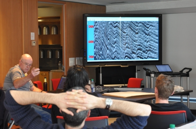
Let's illustrate this by looking at a time-slice through a portion of the F3 seismic volume. A simple way of displaying two attributes is to decrease the opacity of one, and lay it on top of the other. In the figure below, I'm setting the opacity of the continuity to 75% in the third panel. At first glance, this looks pretty good; you can see both attributes, and because they have different hues, they complement each other without competing for visual bandwidth. But the approach is flawed. The vividness of each dataset is diminished; we don't see the same range of colours as we do in the colour palette shown above.

Overlaying one map on top of the other is one way to look at multiple attributes within a scene. It's not ideal however.

Overlaying one map on top of the other is one way to look at multiple attributes within a scene. It's not ideal however.

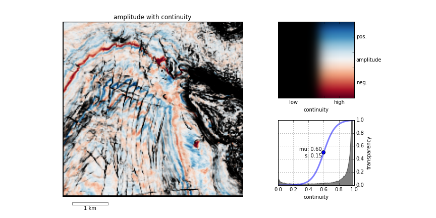
Instead of overlaying maps, we can improve the result by modulating the lightness of the amplitude image according to the magnitude of the continuity attribute. This time the corendered result is one image, instead of two. I prefer it, because it preserves the original colours we see in the amplitude image. If anything, it seems to deepen the contrast:

The lightness value of the seismic amplitude time slice has been modulated by the continuity attribute. 

The lightness value of the seismic amplitude time slice has been modulated by the continuity attribute. 

Such a composite display needs a two-dimensional colormap for a legend. Just as a 1D colourbar, it's also a lookup table; each position in the scene corresponds to a unique pair of values in the colourmap plane.

We can go one step further. Say we want to emphasize only the largest discontinuities in the data. We can modulate the opacity with a non-linear function. In this example, I'm using a sigmoid function:

In order to achieve this effect in most conventional software, you usually have to copy the attribute, colour it black, apply an opacity curve, then position it just above the base amplitude layer. Software companies call this workaround a 'workflow'. 

Are there data visualizations you want to create, but you're stuck with software limitations? In a future post, I'll recreate some cool co-rendering effects; like bump-mapping, and hill-shading.

To view and run the code that I used in creating the images for this post, grab the iPython/Jupyter Notebook.


You can do it too!

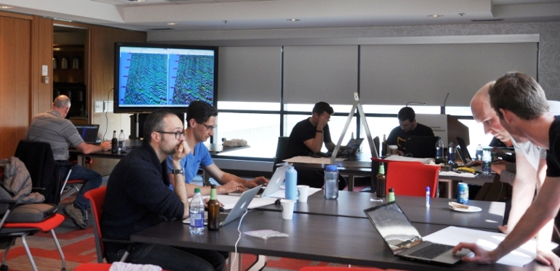
If you're in Calgary, Houston, New Orleans, or Stavanger, listen up!

If you'd like to gear up on coding skills and explore the benefits of scientific computing, we're going to be running the 2-day version of the Geocomputing Course several times this fall in select cities. To buy tickets or for more information about our courses, check out the courses page.

None of these times or locations good for you? Consider rounding up your colleagues for an in-house training option. We'll come to your turf, we can spend more than 2 days, and customize the content to suit your team's needs. Get in touch.

The curse of hunting rare things

What are the chances of intersecting features with a grid of cross-sections? I often wonder about this when interpreting 2D seismic data, but I think it also applies to outcrops, or any other transects. I want to know:

  1. If there are only a few of these features, how many should I see?
  2. What's the probability of the lines missing them all? 
  3. Conversely, if I interpret x of them, then how many are there really?
  4. How is the detectability affected by the reliability of the data or my skills?

I used to have a spreadsheet for computing all this stuff, but spreadsheets are dead to me so here's an IPython Notebook :)

An example

I'm interpreting seep locations on 2D data at the moment. So I'm looking for subvertical pipes and chimneys, mud volcanos, seafloor pockmarks and pingos, that sort of thing (see Løseth et al., 2009 for a great overview). Here are some similar features from the Norwegian continental shelf from Hustoft et al., 2010:

Figure 3 from hustoft et al. (2010) showing the 3D expression of some hydrocarbon leakage features in Norway. © The Authors.

As Hustoft et al. show, these can be rather small features — most pockmarks are in the 100–800 m diameter range, so let's call it 500 m. The dataset I have is an orthogonal grid of decent quality 2D lines with a 3 km spacing. The area is about 120,000 km². For the sake of argument (and a forward model), let's imagine there are 120 features I'm interested in — one per 1000 km². Here's a zoomed-in view showing a subset of the problem:

Zoomed-in view of part of my example. A grid of 2D seismic lines, 3 km apart, and randomly distributed features, each 500 m in diameter. If a feature's centre falls inside a grey square, then the feature is not intersected by the data. The grey squa…

Zoomed-in view of part of my example. A grid of 2D seismic lines, 3 km apart, and randomly distributed features, each 500 m in diameter. If a feature's centre falls inside a grey square, then the feature is not intersected by the data. The grey squares are 2.5 km across.

According to my calculations...

  1. Of the 120 features in the area, we expect 37 to be intersected by the data. Of course, some of those intersections might be very subtle, if they are right at the edge of the feature.
  2. The probability of intersecting a given feature is 0.31. There are 120 features, so the probability of the whole dataset intersecting at least one is essentially 1 (certain). That's good! Conversely, the probability of missing them all is effectively 0. (If there were only 5 features, then there'd be about a 16% chance of missing them all.)
  3. Clearly, if I interpret 37 features, there are about 120 in total (that was my a priori). It's a linear relationship, so if I interpret 10 features, I can expect there to be about 33 altogether, and if I see 100 then I can expect that there are almost 330 in total. (I think the probability distribution would be log-normal, but would appreciate others' insights here.)
  4. Reliability? That sounds like a job for Bayes' theorem...

It's far from certain that I will interpret everything the data intersects, for all sorts of reasons:

  • I am human and therefore inconsistent, biased, and fallible.
  • The feature may be cryptic in the section , because of how it was intersected.
  • The data may be poor quality at that point, or everywhere.

Let's assume that if a feature has been intersected by the data, then I have a 75% chance of actually interpreting it. Bayes' theorem tells us how to update the prior probability of 0.31 (for a given feature; point 2 above) to get a posterior probability. Here's the table:

Interpreted Not interpreted
Intersected by a 2D line 28 9
Not intersected by any lines 21 63

What do the numbers mean?

  • Of the 37 intersected features, I interpret 28.
  • I fail to interpret 9 features that are intersected by the data. These are Type II errors, false negatives.
  • I interpret another 21 features which are not real! These are Type I errors: false positives. 
  • Therefore I interpret 48 features, of which only 57% are real. This seems like a lot, but it's a function of my imperfect reliability (75%) and the poor sampling, resulting in a large number of 'missed' features.

Interestingly, my 75% reliability translates into a 57% chance of being right about the existence of a feature. We've seen this effect before — it's the curse of hunting rare things: with imperfect knowledge, we are often wrong


References

Hustoft, S, S Bünz, and J Mienart (2010). Three-dimensional seismic analysis of the morphology and spatial distribution of chimneys beneath the Nyegga pockmark field, offshore mid-Norway. Basin Research 22, 465–480. DOI 10.1111/j.1365-2117.2010.00486.x 

Løseth, H, M Gading, and L Wensaas (2009). Hydrocarbon leakage interpreted on seismic data. Marine & Petroleum Geology 26, 1304–1319. DOI 10.1016/j.marpetgeo.2008.09.008 

Six comic books about science

Ever since reading my dad's old Tintin books late into the night as a kid, I've loved comics and graphic novels. I've never been into the usual Marvel and DC stuff — superheroes aren't my thing. But I often re-read Tintin, I think I've read every Astérix, and since moving to Canada I've been a big fan of Seth and Chester Brown.

Last year in France I bought an album of Léonard, an amusing imagining of da Vinci's exploits as an inventor... Almost but not quite about science. These six books, on the other hand, show meticulous research and a love of natural philosophy. Enjoy!


The Thrilling Adventures of Lovelace and Babbage

Sydney Padua, 2015. New York, USA: Pantheon. List price USD 28.95.

I just finished devouring this terrific book by Padua, a young Canadian animator. It's an amazing mish-mash of writing and drawing, science and story, computing and history, fiction and non-fiction. This book has gone straight into my top 10 favourite books ever. It's really, really good.

Author — Amazon — Google — Pantheon

T-Minus: The Race to the Moon

Jim Ottaviani, Zander Cannon, Kevin Cannon, 2009. GT Labs. List price USD 15.99.

Who doesn't love books about space exploration? This is a relatively short exposition, aimed primarily at kids, but is thoroughly researched and suspenseful enough for anyone. The black and white artwork bounces between the USA and USSR, visualizing this unique time in history.

Amazon — GoogleGT Labs

Feynman

Jim Ottaviani, Leland Myrick, 2011. First Second Books. List price USD 19.99.

A 248-page colour biography of the great physicist, whose personality was almost as remarkable as his work. The book covers the period 1923 to 1986 — almost birth to death — and is neither overly critical of Feynman's flaws, nor hero-worshipping. Just well-researched, and skillfully told.

AmazonGoogleFirst Second.

A Wrinkle in Time

Hope Larson, Madeleine L'Engle, 2012. New York, USA: Farrar, Straus & Giroux. List price USD 19.99

A graphic adaptation of L'Engle's young adult novel, first published in 1963. The story is pretty wacky, and the science is far from literal, so perhaps not for all tastes — but if you or your kids enjoy Doctor Who and Red Dwarf, then I predict you'll enjoy this. Warning: sentimental in places.

Amazon — MacmillanAuthor 

Destination Moon and Explorers on the Moon

Hergé, 1953, 1954. Tournai, Belgium: Casterman (English: 1959, Methuen). List price USD 24.95.

These remarkable books show what Hergé was capable of imagining — and drawing — at his peak. The iconic ligne claire artwork depicts space travel and lunar exploration over a decade before Apollo. There is the usual espionage subplot and Thom(p)son-based humour, but it's the story that thrills.

AmazonGoogle


What about you? Have you read anything good lately?

Canadian codeshow

Earlier this month we brought the world-famous geoscience hackathon to Calgary, tacking on a geocomputing bootcamp for good measure. Fourteen creative geoscientists came and honed their skills, leaving 4 varied projects in their wake. So varied in fact that this event had the most diversity of all the hackathons so far. 

Thank you to Raquel Theodoro and Penny Colton for all the great photographs. You both did a great job of capturing what went on. Cheers!

Thank you as well to our generous and generally awesome sponsors. These events would not be possible without them.

Bootcamp

The bootcamp was a big experiment. We have taught beginner classes before, but this time we also invited beyond-novice programmers to come and learn together. Rather than making it a classroom experience, we were trying to make a friendly space where people could learn from us, from each other, or from books or the web. After some group discussion about hackathons and dream projects (captured here), we split into two groups: beginners and 'other'. The beginners got an introduction to scientific Python; the others got a web application masterclass from Ben Bougher (UBC master's student and Agile code ninja). During the day, we harvested a pretty awesome list of potential future hackathon projects. 

Hackathon

The hackathon itself yielded four very cool projects, fuelled this time not by tacos but by bánh mì and pizza (separately):

  1. Hacking data inside Seismic Terrain Explorer, by Steve Lynch of Calgary
  2. Launching GLauncher, a crowdfunding tool, by Raquel Theodoro of Rio de Janeiro and Ben Bougher of UBC
  3. Hacksaw: A quick-look for LAS files in a web app, by Gord Foo, Gerry Cao, Yongxin Liu of Calgary, plus me
  4. Turning sketches in to models, by Evan Saltman, Elwyn Galloway, and Matteo Niccoli of Calgary, and Ben again

Sketch2model was remarkable for a few reasons: it was the first hackathon for most of the team, they had not worked together before, Elwyn dreamt up the idea more or less on the spot, and they seemed to nail it with a minimum of fuss. Matteo quietly got on with the image processing magic, Evan and Ben modified modelr.io to do the modeling bit, and Elwyn orchestrated the project, providing a large number of example sketches to keep the others from getting too cocky.

We'll be doing it all again in New Orleans this fall. Get it in your calendar now!

Once is never

Image by ZEEVVEEZ on Flickr, licensed CC-BY. Ten points if you can tell what it is...


Image by ZEEVVEEZ on Flickr, licensed CC-BY. Ten points if you can tell what it is...

My eldest daughter is in grade 5, so she's getting into some fun things at school. This week the class paired off to meet a challenge: build a container to keep hot water hot. Cool!

The teams built their contraptions over the weekend, doubtless with varying degrees of rule interpretation (my daughter's involved HotHands hand warmers, which I would not have thought of), and the results were established with a side-by-side comparison. Someone (not my daughter) won. Kudos was achieved.

But this should not be the end of the exercise. So far, no-one has really learned anything. Stopping here is like grinding wheat but not making bread. Or making dough, but not baking it. Or baking it, but not making it into toast, buttering it, and covering it in Marmite...

Great, now I'm hungry.

The rest of the exercise

How could this experiment be improved?

For starters, there was a critical component missing: control. Adding a vacuum flask at one end, and an uninsulated beaker at the other would have set some useful benchmarks.

There was a piece missing from the end too: analysis. A teardown of the winning and losing efforts would have been quite instructive. Followed by a conversation about the relative merits of different insulators, say. I can even imagine building on the experience. How about a light introduction to thermodynamic theory, or a stab at simple numerical modeling? Or a design contest? Or a marketing plan?

But most important missing piece of all, the secret weapon of learning, is iteration. The crucial next step is to send the class off to do it again, better this time. The goal: to beat the best previous attempt, perhaps even to beat the vacuum flask. The reward: $20k in seed funding and a retail distribution deal. Or a house point for Griffindor.

Einmal ist keinmal, as they say in Germany: Once is never. What can you iterate today?

Introducing Striplog

Last week I mentioned we'd been working on a project called striplog. I told you it was "a new Python library for manipulating well data, especially irregularly sampled, interval-based, qualitative data like cuttings descriptions"... but that's all. I thought I'd tell you a bit more about it — why we built it, what it does, and how you can use it yourself.

The problem we were trying to solve

The project was conceived with the Nova Scotia Department of Energy, who had a lot of cuttings and core descriptions that they wanted to digitize, visualize, and archive. They also had some hand-drawn striplog images — similar to the one on the right — that needed to be digitized in the same way. So there were a few problems to solve:

  • Read a striplog image and a legend, turn the striplog into tops, bases, and 'descriptions', and finally save the data to an archive-friendly LAS file.
  • Parse natural language 'descriptions', converting them into structured data via an arbitrary lexicon. The lexicon determines how we interpret the words 'sandstone' or 'fine grained'.
  • Plot striplogs with minimal effort, and keep plotting parameters separate from data. It should be easy to globally change the appearance of a particular lithology.
  • Make all of this completely agnostic to the data type, so 'descriptions' might be almost anything you can think of: special core analyses, palaeontological datums, chronostratigraphic intervals...

The usual workaround, I mean solution, to this problem is to convert the descriptions into some sort of code, e.g. sandstone = 1, siltstone = 2, shale = 3, limestone = 4. Then you make a log, and plot it alongside your other curves or make your crossplots. But this is rather clunky, and if you lose the mapping, the log is useless. And we still have the other problems: reading images, parsing descriptions, plotting...

What we built

One of the project requirements was a Python library, so don't look for a pretty GUI or fancy web app. (This project took about 6 person-weeks; user interfaces take much longer to craft.) Our approach is always to try to cope with chaos, not fix it. So we tried to design something that would let the user bring whatever data they have: XLS, CSV, LAS, images.

The library has tools to, for example, read a bunch of cuttings descriptions (e.g. "Fine red sandstone with greenish shale flakes"), and convert them into Rocks — structured data with attributes like 'lithology' and 'colour', or whatever you like: 'species', 'sample number', 'seismic facies'. Then you can gather Rocks into Intervals (basically a list of one or more Rocks, with a top and base depth, height, or age). Then you can gather Intervals into a Striplog, which can, with the help of a Legend if you wish, plot itself or write itself to a CSV or LAS file.

The Striplog object has some useful features. For example, it's iterable in Python, so it's trivial to step over every unit and perform some query or analysis. Some tasks are built-in: Striplogs can summarize their own statistics, for example, and searching for 'sandstone' returns another Striplog object containing only those units matching the query.

  >>> striplog.find('sandstone')
  Striplog(4 Intervals, start=230.328820116, stop=255.435203095)

We can also do a reverse lookup, and see what's at some arbitrary depth:

  >>> striplog.depth(260).primary  # 'primary' gives the first component
  Rock("colour":"grey", "lithology":"siltstone")

You can read more in the documentation. And here's Striplog in a picture:

An attempt to represent striplog's objects, more or less arranged according to a workflow.

Where to get it

For the time being, the tool is only available as a Python library, for you to use on the command line, or in IPython Notebooks (follow along here). You can install striplog very easily:

  pip install striplog

Or you can clone the repo on GitHub. 

As a new project, it has some rough edges. In particular, the Well object is rather rough. The natural language processing could be much more sophisticated. The plotting could be cuter. If and when we unearth more use cases, we'll be hacking some more on it. In the meantime, we would welcome code or docs contributions of any kind, of course.

And if you think you have a use for it, give us a call. We'd love to help.


Postscript

I think it's awesome that the government reached out to a small, Nova Scotia-based company to do this work, keeping tax dollars in the province. But even more impressive is that they had the conviction not only to allow allow but even to encourage us to open source it. This is exactly how it should be. In contrast, I was contacted recently by a company that is building a commercial plug-in for Petrel. They had received funding from the federal government to do this. I find this... odd.

The perfect storm

Since starting Agile late in 2010, I have never not been busy. Like everyone else... there's always a lot going on. But March was unusual. Spinning plates started wobbling. One or three fell. One of those that fell was the blog. (Why is it always your favourite plate that smashes?)

But I'm back, feeling somewhat refreshed after my accidental quadrennial sabbatical and large amounts of Easter chocolate. And I thought a cathartic way to return might be to share with you what I've been up to.

Writing code for other people

We've always written code to support our consulting practice. We've written seismic facies algorithms, document transformation routines (for AAPG Wiki), seismic acquisition tools, and dozens of other things besides. But until January we'd never been contracted to build software as an end in itself.

Unfortunately for my sanity, the projects had to be finished by the end of March. The usual end-of-project crunch came along, as we tried to add features, fix bugs, remove cruft, and compile documentation without breaking anything. And we just about survived it, thanks to a lot of help from long-time Agile contributor, Ben Bougher. One of the products was striplog, a new Python library for manipulating well data, especially irregularly sampled, interval-based, qualitative data like cuttings descriptions. With some care and feeding, I think it might be really useful one day.

The HUB is moving

Alongside the fun with geoscience, we're in the midst of a fairly huge renovation. As you may know, I co-founded The HUB South Shore in my town in 2013. It's where I do my Agile work, day-to-day. It's been growing steadily and last year we ran out of space to accept new members. So we're moving down to the Main Street in Mahone Bay, right under the town's only pub. It's a great space, but it turns out that painting a 200 m² warehouse takes absolutely ages. Luckily, painting is easy for geologists, since it's basically just a lot of arm-waving. Anyway, that's where I'm spending my free time these days. [Pics.]

MAder's Wharf, by the frozen ocean.

MAder's Wharf, by the frozen ocean.

The ship's knees

The ship's knees

Co-founder Dave painting trim

Co-founder Dave painting trim

Shovelling snow

What my house has looked like for the last 8 weeks.

What my house has looked like for the last 8 weeks.

Seriously, it just will. Not. Stop. It's snowing now, for goodness sake. I'm pretty sure we have glaciers.

What does this have to do with work? Well, we're not talking about Calgary-style pixie dust here. We ain't nipping out with the shovel for a few minutes of peaceful exercise. We're talking about 90 minutes of the hardest workout you've ever endured, pointlessly pushing wet snow around because you ran out of places to put it three weeks ago. At the end, when you've finished and/or given up, Jack Frost tosses a silver coin to see if your reward will be a hot shower and a course of physiotherapy, or sudden cardiac arrest and a ride in the air ambulance.

Events

There is lots of good techno-geophysics to look forward to. We're running the Geoscience Hackathon in Calgary at the beginning of May. You can sign up here... If you're not sure, sign up anyway: I guarantee you'll have fun. There's a bootcamp too, if you're just starting out or want some tips for hacking geophysics. Thank you to our awesome sponsors:

There's also the geophysics mini-symposium at SciPy in Austin in July (deadline approaching!). That should be fun. And I'm hoping the hackathon right before SEG in New Orleans will be even more epic than last year's event. The theme: Games.

Evan is out there somewhere

Normally when things at Agile World Headquarters get crazy, we can adapt and cope. But it wasn't so easy this time: Evan is on leave and in the middle of an epic world tour with his wife Tara. I don't actually know where he is right now. He was in Bali a couple of weeks ago... If you see him say Hi!


As I restart the engines on All The Things, I want to thank anyone who's been waiting for an email reply, or — in the case of the 52 Things... Rock Physics authors — a book, for their patience. Sometimes it all hits at once.

Onwards and upwards!

The hackathon is coming to Calgary

Before you stop reading and surf away thinking hackathons are not for you, stop. They are most definitely for you. If you still read this blog after me wittering on about Minecraft, anisotropy, and Python practically every week — then I'm convinced you'll have fun at a hackathon. And we're doing an new event this year for newbies.

For its fourth edition, the hackathon is coming to Calgary. The city is home to thousands of highly motivated and very creative geoscience nuts, so it should be just as epic as the last edition in Denver. The hackathon will be the weekend before the GeoConvention — 2 and 3 May. The location is the Global Business Centre, which is part of the Telus Convention Centre on 8th Avenue. The space is large and bright; it should be perfect, once it smells of coffee...

Now's the time to carpe diem and go sign up. You won't regret it. 

On the Friday before the hackathon, 1 May, we're trying something new. We'll be running a one-day bootcamp. you can sign up for the bootcamp here on the site. It's an easy, low-key way to experience the technology and goings-on of a hackathon. We'll be doing some gentle introductions to scientific computing for those who want it, and for the more seasoned hackers, we'll be looking at some previous projects, useful libraries, and tips and tricks for building a software tool in less than 2 days.

The event would definitely not be possible without the help of progressive people who want to see more creativity and invention in our industry and our science. These companies and the people that work there deserve your attention. 

Last quick thing: if you know a geeky geoscientist in Calgary, I'd love it if you forwarded this post to them right now. 


UPDATE
Great new: Ikon Science are joining our existing sponsors, dGB Earth Sciences and OpenGeoSolutions — both long-time supporters of the hackathon events — to help make something awesome happen. We're grateful for the support!


UPDATE
More good news: Geomodeling have joined the event as a sponsor. Thank you for being awesome! Wouldn't a geomodel hackathon be fun? Hmm...

February linkfest

The linkfest is back! All the best bits from the news feed. Tips? Get in touch.

The latest QGIS — the free and open-source GIS we use — dropped last week. QGIS v2.8 'Wien' has lots of new features like expressions in property fields, better legends, and colour palettes.

On the subject of new open-source software, I've mentioned Wayne Mogg's OpendTect plug-ins before. This time he's outdone himself, with an epic new plug-in providing an easy way to write OpendTect attributes in Python. This means we can write seismic attribute algorithms in Python, using OpendTect for I/O,project management, visualization, and interpretation. 

It's not open source, but Google Earth Pro is now free! The free version was pretty great, but Pro has a few nice features, like better measuring tools, higher resolution screen-grabs, movies, and ESRI shapefile import. Great for scoping field areas.

Speaking of fieldwork, is this the most amazing outcrop you've ever seen? Those are house-sized blocks floating around in a mass-transport deposit. If you want to know more, you're in luck, because Zane Jobe blogged about it recently.  (You do follow his blog, right?)

By the way, if sedimentology is your thing, for some laboratory eye-candy, follow SedimentExp on Twitter. (Zane's on Twitter too!)

If you like to look after your figures, Rougier et al. recently offered 10 simple rules for making them better. Not only is the article open access (more amazing: it's public domain), the authors provide Python code for all their figures. Inspiring.

Open, even interactive, code will — it's clear — be de rigueur before the decade is out. Even Nature is at it. (Well, I shouldn't say 'even', because Nature is a progressive publishing hose, at the same time as being part of 'the establishment'.) Take a few minutes to play with it... it's pretty cool. We have published lots of static notebooks, as has SEG; interactivity is coming!

A question came up recently on the Earth Science Stack Exchange that made me stop and think: why do geophysicists use \(V_\mathrm{P}/V_\mathrm{S}\) ratio, and not \(V_\mathrm{S}/V_\mathrm{P}\) ratio, which is naturally bounded. (Or is it? Are there any materials for which \(V_\mathrm{S} > V_\mathrm{P}\)?) I think it's tradition, but maybe you have a better answer?

On the subject of geophysics, I think this is the best paper title I've seen for a while: A current look at geophysical detection of illicit tunnels (Steve Sloan in The Leading Edge, February 2015). Rather topical just now too.

At the SEG Annual Meeting in Denver, I recorded an interview with SEG's Isaac Farley about wikis and knowledge sharing...

OK, well if this is just going to turn into blatant self-promotion, I might as well ask you to check out Pick This, now with over 600 interpretations! Please be patient with it, we have a lot of optimization to do...

Rock property catalog

RPC.png

One of the first things I do on a new play is to start building a Big Giant Spreadsheet. What goes in the big giant spreadsheet? Everything — XRD results, petrography, geochemistry, curve values, elastic parameters, core photo attributes (e.g. RGB triples), and so on. If you're working in the Athabasca or the Eagle Ford then one thing you have is heaps of wells. So the spreadsheet is Big. And Giant. 

But other people's spreadsheets are hard to use. There's no documentation, no references. And how to share them? Email just generates obsolete duplicates and data chaos. And while XLS files are not hard to put on the intranet or Internet,  it's hard to do it in a way that doesn't involve asking people to download the entire spreadsheet — duplicates again. So spreadsheets are not the best choice for collaboration or open science. But wikis might be...

The wiki as database

Regular readers will know that I'm a big fan of MediaWiki. One of the most interesting extensions for the software is Semantic MediaWiki (SMW), which essentially turns a wiki into a database — I've written about it before. Of course we can read any wiki page over the web, but you can query an SMW-powered wiki, which means you can, for example, ask for the elastic properties of a rock, such as this Mesaverde sandstone from Thomsen (1986). And the wiki will send you this JSON string:

{u'exists': True,
 u'fulltext': u'Mesaverde immature sandstone 3 (Kelly 1983)',
 u'fullurl': u'http://subsurfwiki.org/wiki/Mesaverde_immature_sandstone_3_(Kelly_1983)',
 u'namespace': 0,
 u'printouts': {
    u'Lithology': [{u'exists': True,
      u'fulltext': u'Sandstone',
      u'fullurl': u'http://www.subsurfwiki.org/wiki/Sandstone',
      u'namespace': 0}],
    u'Delta': [0.148],
    u'Epsilon': [0.091],
    u'Rho': [{u'unit': u'kg/m\xb3', u'value': 2460}],
    u'Vp': [{u'unit': u'm/s', u'value': 4349}],
    u'Vs': [{u'unit': u'm/s', u'value': 2571}]
  }
}

This might look horrendous at first, or even at last, but it's actually perfectly legible to Python. A little bit of data wrangling and we end up with data we can easily plot. It takes no more than a few lines of code to read the wiki's data, and construct this plot of \(V_\text{P}\) vs \(V_\text{S}\) for all the rocks I have so far put in the wiki — grouped by gross lithology:

A page from the Rock Property Catalog in Subsurfwiki.org. Very much an experiment, rocks contain only a few key properties today.

A page from the Rock Property Catalog in Subsurfwiki.org. Very much an experiment, rocks contain only a few key properties today.

If you're interested in seeing how to make these queries, have a look at this IPython Notebook. It takes you through reading the data from my embryonic catalogue on Subsurfwiki, processing the JSON response from the wiki, and making the plot. Once you see how easy it is, I hope you can imagine a day when people are publishing open data on the web, and sharing tools to query and visualize it.

Imagine it, then figure out how you can help build it!


References

Thomsen, L (1986). Weak elastic anisotropy. Geophysics 51 (10), 1954–1966. DOI 10.1190/1.1442051.