Software, stats, and tidal energy

Today was the last day of the conference part of SciPy 2015 in Austin. Almost all the talks at this conference have been inspiring and/or enlightening. This makes it all the more wonderful that the organizers get the talks online within a couple of hours (!), so you can see everything (compared to about 5% maximum coverage at SEG).

Jake Vanderplas, a young astronomer and data scientist at UW's eScience Institute, gave the keynote this morning. He eloquently reviewed the history and state-of-the-art of the so-called SciPy stack, the collection of tools that Pythonistic scientists use to get their research done. If you're just getting started in this world, it's about the best intro you could ask for:

Chris Fonnesbeck treated the room to what might as well have been a second keynote, so well did he express his convictions. Beautiful slides, and a big message: statistics matters.

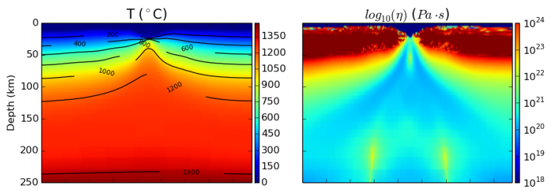
Kristen Thyng, an energetic contributor to the conference, gave a fantastic talk about tidal energy, her main field, as well as one about perceptual colourmaps, which is more of a hobby. The work includes some very nice visualizations of tidal currents in my home province...

Finally, I highly recommend watching the lightning talks. Apart from being filled with some mind-blowing ideas, many of them eliciting spontaneous applause (imagine that!), I doubt you will ever witness a more effective exercise in building a community of passionate professionals. It's remarkable. (If you don't have an hour these three are awesome.)

Next we'll be enjoying the 'sprints', a weekend of coding on open source projects. We'll be back to geophysics blogging next week :)

Geophysics at SciPy 2015

Yesterday was the geoscience day at SciPy 2015 in Austin.

At lunchtime, Paige Bailey (Chevron) organized a Birds of a Feather on GIS. This was a much-needed meetup for anyone interested in spatial data. It was useful to hear about the tools the fifty-or-so participants  use every day, and a great chance to air some frustrations like Why is it so hard to install a geospatial stack? And questions like How do people make attractive maps with the toolset?

One way to make attractive maps is go beyond the screen and 3D print them. Almost any subsurface dataset could seem more tangible and believable as a 3D object, and Joe Kington (Chevron) showed us how to make data into objects. Just watch:

Matteus Ueckermann followed up with some virtual elevation models, showing how Python can process not just a few tiles of data, but can handle hydrology modeling for the entire world:

Nicola Creati (OGS, Trieste) showed us the PyGmod package, a new and fully parallel geodynamic simulation tool for HPC nuts. So now you can make more plate tectonic models before most people are out of bed!

We also heard from Lindsey Heagy and Gudnir Rosenkjaer from UBC, talking about various applications of Rowan Cockett's awesome SimPEG package to their work. As at the hackathon in Denver, it's very clear that this group's investment in and passion for a well-architected, integrated package is well worth the work, giving everyone who works with it superpowers. And, as we all know, superpowers are awesome. Especially geophysical ones.

Last up, I talked about striplog, a small package for handling interval and point data in logs, core, and other 1D datasets. It's still very immature, but almost ready for real-world users, so if you think you have a use case, I'd love to hear from you.

Today is the last day of the conference part, before we head into the coding sprints tomorrow. Stay tuned for more, or follow the #scipy2015 hashtag to keep up. See all the videos, which go up almost right after talks, on YouTube.

You'd better read this

The clean white front cover of this month's Bloomberg Businessweek carries a few lines of Python code, and two lines of English as a footnote... If you can't read that, then you'd better read this. The entire issue is a single essay written by Paul Ford. It was an impeccable coincidence: I picked up a copy before boarding the plane to Austin for SciPy 2015. This issue is a grand achievement; it could be the best thing I've ever read. Go out an buy as many copies as you can, and give them to your friends. Or read it online right now.

Not your grandfather's notebook

Jess Hamrick is a cognitive scientist at UC Berkeley who makes computational models of human behaviour. In her talk, she described how she built a multi-user server for Jupyter notebooks to administer course content, assign homework, even do auto-grading for a class with 220 undergrads. During her talk, she invited the audience to list their GitHub usernames on an Etherpad. Minutes after she stood down from her podium, she granted access, so we could all come inside and see how it was done.

Dangerous defaults

I wrote a while ago about the dangers of defaults, and as Matteo Niccoli highlighted in his 52 Things essay, How to choose a colourmap, default colourmaps can be especially harmful. Matplotlib has long been criticized for its nasty default colourmap, but today redeemed itself with a new default. Hear all about it from Stefan van der Walt:

Sound advice

Allen Downey of Olin College gave a wonderful talk this afternoon about teaching digital signal processing to students using fun and intuitive audio signals as the hook. Watch it yourself, it's well worth the 20 minutes or so:

If you're really into musical and audio applications, there was another talk on the subject, by Brian McFee (Librosa project). 

More tomorrow as we head into Day 2 of the conference. 

Attribute analysis and statistics

Last week I wrote a basic introduction to attribute analysis. The post focused on the different ways of thinking about sampling and intervals, and on how instantaneous attributes have to be interpolated from the discrete data. This week, I want to look more closely at those interval attributes. We'd often like to summarize the attributes of an interval info a single number, perhaps to make a map.

Before thinking about amplitudes and seismic traces, it's worth reminding ourselves about different kinds of average. This table from SubSurfWiki might help... 

A peculiar feature of seismic data. from a statistical point of view, is the lack of the very low frequencies needed to give it a trend. Because of this, it oscillates around zero, so the average amplitude over a window tends to zero — seismic data has a mean value of zero. So not only do we have to think about interpolation issues when we extract attributes, we also have to think about statistics.

Fortunately, once we understand the issue it's easy to come up with ways around it. Look at the trace (black line) below:

The mean is, as expected, close to zero. So I've applied some other statistics to represent the amplitude values, shown as black dots, in the window (the length of the plot):

  • Average absolute amplitude (light green) — treat all values as positive and take the mean.
  • Root-mean-square amplitude (dark green) — tends to emphasize large values, so it's a bit higher.
  • Average energy (magenta) — the mean of the magnitude of the complex trace, or the envelope, shown in grey.
  • Maximum amplitude (blue) — the absolute maximum value encountered, which is higher than the actual sample values (which are all integers in this fake dataset) because of interpolation.
  • Maximum energy (purple) — the maximum value of the envelope, which is higher still because it is phase independent.

There are other statistics besides these, of course. We could compute the median average, or some other mean. We could take the strongest trough, or the maximum derivative (steepest slope). The options are really only limited by your imagination, and the physical relationship with geology that you expect.

We'll return to this series over the summer, asking questions like How do you know what to expect? and Does a physically realistic relationship even matter? 


To view and run the code that I used in creating the figures for this post, grab the iPython/Jupyter Notebook.

How do I become a quantitative interpreter?

TLDR: start doing quantitative interpretation.

I just saw this question on reddit/r/geophysics

I always feel a bit sad when I read this sort of question, which is even more common on LinkedIn, because it reminds me that we (in the energy industry at least) have built recruiting patterns and HR practices that make it look as if professionals have career tracks or have to build CVs to impress people or get permission to train in a new area. This is all wrong.

Or, to be more precise, we can treat this as all wrong and have a lot more fun in the process.

If you are a 'geologist' or 'geophysicist', then you are in control of your own career and what you apply yourself to. No-one is telling you what to do, they are only telling you what they need. How you do it, the methods you apply, the products you build — all this is completely up to you. This is almost the whole point of being a professional.

The replies to Timbledon's question include this one:

I disagree with Schwa88. Poor Timbledon doesn't need another degree. Rock physics is not a market, and not new. There are no linear tracks. And there is no clear or useful distinction between rock physics and quantitative interpretation (or petrophysics, or seismic geophysics) — I bet there are no two self-identifying quantitative interpreters with identical, or even similar, job or educational histories.

As for 'now is not the time'... I can't even... 'Now' is the only time you can do anything about, so work with it.

OK, enough ranting, what should Timbledon do?

It's easy! The best way to pursue quantitative interpretation, or pretty much anything except pediatric cardiology, is to just start doing it. It really is that simple. My advice is to use quantitative methods in every project you touch, and in doing so you will immediately outperform most interpreters. Talk to anyone and everyone about your interest and share your insights. Volunteer for projects. Go to talks. Give talks. To help you find your passion, take the time to learn about some big things:

  • Rock physics, e.g. the difference between static and dynamic elasticity.
  • Seismic processing, e.g. what surface consistent deconvolution and trim statics are.
  • Seismic interpretation, e.g. seismic geomorphology and seismic stratigraphy.
  • Seismic analysis, e.g. the difference between Zoeppritz, Fatti, and Shuey.
  • Statistics, e.g. when you need multilinear regression, or K-means clustering.

Those are just examples. If you're more into X-ray diffraction in clays, or the physics of crystalline rocks, or fluid properties, or wellbore seismic, or time-lapse effects, or whatever — learn about those things instead.

Whatever you do, Timbledon, don't listen to anybody ;)

An attribute analysis primer

A question on Stack Exchange the other day reminded me of the black magic feeling I used to have about attribute analysis. It was all very meta: statistics of combinations of attributes, with shifted windows and crazy colourbars. I realized I haven't written much about the subject, despite the fact that many of us spend a lot of time trying to make sense of attributes.

Time slices, horizon slices, and windows

One of the first questions a new attribute-analyser has is, "Where should the window be?" Like most things in geoscience: it depends. There are lots of ways of doing it, so think about what you're after...

  • Timeslice. Often the most basic top-down view is a timeslice, because they are so easy to make. This is often where attribute analysis begins, but since timeslices cut across stratigraphy, not usually where it ends.
  • Horizon. If you're interested in the properties of a strong reflector, such as a hard, karsted unconformity, maybe you just want the instantaneous attribute from the horizon itself.
  • Zone. If the horizon was hard to interpret, or is known to be a gradual facies transition, you may want to gather statistics from a zone around it. Or perhaps you couldn't interpret the thing you really wanted, but only that nice strong reflection right above it... maybe you can bootstrap yourself from there. 
  • Interval. If you're interested in a stratigraphic interval, you can bookend it with existing horizons, perhaps with a constant shift on one or both of them.
  • Proportional. If seismic geomorphology is your game, then you might get the most reasonable inter-horizon slices from proportionally slicing in between stratigraphic surface. Most volume interpretation software supports this. 

There are some caveats to simply choosing the stratigraphic interval you are after. Beware of choosing an interval that strong reflectors come into and out of. They may have an unduly large effect on most statistics, and could look 'geological'. And if you're after spectral attributes, do remember that the Fourier transform needs time! The only way to get good frequency resolution is to provide long windows: a 100 ms window gives you frequency information every 10 Hz.

Extraction depends on sample interpolation

When you extract an attribute, say amplitude, from a trace, it's easy to forget that the software has to do some approximation to give you an answer. This is because seismic traces are not continuous curves, but discrete series, with samples typically every 1, 2, or 4 milliseconds. Asking for the amplitude at some arbitrary time, like the point at which a horizon crosses a trace, means the software has to interpolate between samples somehow. Different software do this in different ways (linear, spline, polynomial, etc), and the methods give quite different results in some parts of the trace. Here are some samples interpolated with a spline (black curve) and linearly (blue). The nearest sample gives the 'no interpolation' result.

As well as deciding how to handle non-sampled parts of the trace, we have to decide how to represent attributes operating over many samples. In a future post, we'll give some guidance for using statistics to extract information about the entire window. What options are available and how do we choose? Do we take the average? The maximum? Something else?

There's a lot more to come!

As I wrote this post, I realized that this is a massive subject. Here are some aspects I have not covered today:

  • Calibration is a gaping void in many published workflows. How can we move past "that red blob looks like a point bar so I drew a line around it in PowerPoint" to "there's a 70% chance of finding reservoir quality sand at that location"?
  • This article was about  single-trace attributes at single instants or over static windows. Multi-trace and volume attributes, like semblance, curvature, and spectral decomposition, need a post of their own.
  • There are a million attributes (though only a few that count, just ask Art Barnes) so choosing which ones to use can be a challenge. Criteria range from what software licenses you have to what is physically reasonable.
  • Because there are a million attributes, the art of combining attributes with statistical methods like principal component analysis or multi-linear regression needs a look. This gets into seismic inversion.

We'll return to these ideas over the next few weeks. If you have specific questions or workflows to share, please leave a comment below, or get in touch by email or Twitter.

To view and run the code that I used in creating the figures for this post, grab the iPython/Jupyter Notebook.

Corendering more attributes

My recent post on multi-attribute data visualization painted two seismic attributes from on a timeslice. Let's look now at corendering attributes extracted on a seismic horizon. I'll reproduce the example Matt gave in his post on colouring maps.

Although colour choices come down to personal preference, there are some points to keep in mind:

  • Data that varies relatively gradually across the canvas — e.g. elevation here — should use a colour scale that varies monotonically in hue and luminance, e.g. CubeHelix or Matteo Niccoli's colourmaps.
  • Data that varies relatively quickly across the canvas — e.g. my similarity data, (a member of the family that includes coherencesemblance, and so on) — should use a monochromatic colour scale, e.g. black–white. 
  • If we've chosen our colourmaps wisely, there should be some unused hues for rendering other additional attributes. In this case, there are no red hues in the elevation colourmap, so we can map redness to instantaneous amplitude.

Adding a light source

Without wanting to get too gimmicky, we can sometimes enliven the appearance of an attribute, accentuating its texture, by simulating a bumpy surface and shining a virtual light onto it. This isn't the same as casting a light source on the composite display. We can make our light source act on only one of our attributes and leave the others unchanged. 

Similarity attribute Displayed using a Greyscale Colourbar (left). Bump mapping of similarity attribute using a lightsource positioned at azimuth 350 degrees, inclination 20 degrees. 

The technique is called hill-shading. The terrain doesn't have to be a physical surface; it can be a slice. And unlike physical bumps, we're not actually making a new surface with relief, we are merely modifying the surface's luminance from an artificial light source. The result is a more pronounced texture.

One view, two dimensions, three attributes

Constructing this display takes a bit of trial an error. It wasn't immediately clear where to position the light source to get the most pronounced view. Furthermore, the amplitude extraction looked quite noisy, so I softened it a little bit using a Gaussian filter. Plus, I wanted to show only the brightest of the bright spots, so that all took a bit of fiddling.

Even though 3D data visualization is relatively common, my assertion is that it is much harder to get 3D visualization right, than for 2D. Looking at the 3 colour-bars that I've placed in the legend. I'm reminded of this difficulty of adding a third dimension; it's much harder to produce a colour-cube in the legend than a series of colour-bars. Maybe the best we can achieve is a colour-square like last time, with a colour-bar for the overlay on the side.

Check out the IPython notebook for the code used to create these figures.

A focus on building

We've got some big plans for modelr.io, our online forward modeling tool. They're so big, we're hiring! An exhilarating step for a small company. If you are handy with the JavaScript, or know someone who is, scroll down to read all about it!

Here are some of the cool things in Modelr's roadmap:

Interactive 1D models – to support fluid substitution, we need to handle physical properties of pore fluids as well as rocks. Our prototype (right) supports arbitrary layers, but eventually we'd like to allow uploading well logs too.

Exporting models – imagine creating an earth model of your would-be prospect, and sending it around to your asset team to strengthen it's prognosis. Modelr solves the forward problem, PickThis solves the inverse. We need to link them up. We also need SEG-Y export, so you can see your model next to your real data.

Models from sketches – Want to do a quick sketch of a geologic setting, and see what it would look like under the lens of seismic? At the hackathon last month, Matteo Niccoli and friends showed a path to this dream — sketch a picture, take a photo, and upload it to the the app with your phone (right). 

3D models Want to visualize how seismic amplitudes vary according to bed thickness? Build a 2D wedge model and you can analyze a tuning curve. Now, want to explore the same wedge spanning a range of physical properties? That's a job for a 3D wedge model. 

Seismic attributes – Seismic discontinuity attributes, like continuity, or curvature can be ineffective when viewed in cross-section; they're really meant to be shown in time-slices. There is a vast library of attributes and co-rendering technologies we want to provide.

If you get excited about building simple tools on the web for difficult tasks under the ground, we'd love to talk to you. We have an open position for a full-time web developer to help us carry this project forward. Check out the job posting.

Pick This again

Since I last wrote about it, Pick This! has matured. We have continued to improve the tool, which is a collaboration between Agile and the 100% awesome Steve Purves at Euclidity.

Here's some of the new stuff we've added:

  • Multiple lines and polygons for each interpretation. This was a big limitation; now we can pick multiple fault sticks, say.
  • 'Preshows', to show the interpreter some text or an image before they interpret. In beta, talk to us if you want to try it.
  • Interpreter cohorts, with randomized selection, so we can conduct blind trials.  In beta, again, talk to us.
  • Complete picking history, so we can replay the entire act of interpretation. Coming soon: new visualizations of results that use this data.

Some of this, such as replaying the entire picking event, is of interest to researchers who want to know how experts interpret images. Remotely sensed images — whether in geophysics, radiology, astronomy, or forensics — are almost always ambiguous. Look at these faults, for example. How many are there? Where are they exactly? Where are their tips?  

A seismic line from the Browse Basin, offshore western Australia. Data courtesy of CGG and the Virtual Seismic Atlas

A seismic line from the Browse Basin, offshore western Australia. Data courtesy of CGG and the Virtual Seismic Atlas

Most of the challenges on the site are just fun challenges, but some — like the Browse Basin challenge, above — are part of an experiment by researchers Juan Alcalde and Clare Bond at the University of Aberdeen. Please help them with their research by taking part and making an interpretation! It would also be super if you could fill out your profile page — that will help Juan and Clare understand the results. 

If you're at the AAPG conference in Denver then you can win bonus points by stopping by Booth 404 to visit Juan and Clare. Ask them all about their fascinating research, and say hello from us!

While you're on the site, check out some of the other images — or upload one yourself! This one was a real eye-opener: time-lapse seismic reflections from the water column, revealing dynamic thermohaline stratification. Can you pick this?

Pick This challenge showing time-lapse frames from a marine 3D. The seabed is shown in blue at the bottom of the images.

Pick This challenge showing time-lapse frames from a marine 3D. The seabed is shown in blue at the bottom of the images.

May linkfest

The pick of the links from the last couple of months. We look for the awesome, so you don't have to :)

ICYMI on Pi Day, pimeariver.com wants to check how close river sinuosity comes to pi. (TL;DR — not very.)

If you're into statistics, someone at Imperial College London recently released a nice little app for stochastic simulations of simple calculations. Here's a back-of-the-envelope volumetric calculation by way of example. Good inspiration for our Volume* app.

I love it when people solve problems together on the web. A few days ago Chris Jackson (also at Imperial) posted a question about converting projected coordinates...

I responded with a code snippet that people quickly improved. Chris got several answers to his question, and I learned something about the pyproj library. Open source wins again!

In answering that question, I also discovered that Github now renders most IPython Notebooks. Sweet!

Speaking of notebooks, Beaker looks interesting: individual code blocks support different programming languages within the same notebook and allow you to pass data from one cell to another. For instance, you could do your basic stuff in Python, computationally expensive stuff in Julia, then render a visualization with JavaScript. Here's a simple example from their site.

Python is the language for science, but JavaScript certainly rules the visual side of the web. Taking after JavaScript data-artists like Bret Victor and Mike Bostock, Jack Schaedler has built a fantastic website called Seeing circles, sines, and signals containing visual explanations of signal processing concepts.

If that's not enough for you, there's loads more where that came from: Gallery of Concept Visualization. You're welcome.

My recent notebook about finding small things with 2D seismic grids sparked some chatter on Twitter. People had some great ideas about modeling non-random distributions, like clustered or anisotropic populations. Lots to think about!

Getting help quickly is perhaps social media's most potent capability — though some people do insist on spoiling everything by sharing U might be a genius if u can solve this! posts (gah, stop it!). Earth Science Stack Exchange is still far from being the tool is can be, but there have been some relevant questions on geophysics lately:

A fun thread came up on Reddit too recently: Geophysics software you wish existed. Perfect for inspiring people at hackathons! I'm keeping a list of hacky projects for the next one, by the way.

Not much to say about 3D models in Sketchfab, other than: they're wicked! I mean, check out this annotated anticline. And here's one by R Mahon based on sedimentological experiments by John Shaw and others...