Finding Big Bertha with a hot wire

mcnaughton-canada-war-museum.jpg

Sunday will be the 131st birthday of General Andrew McNaughton, a Canadian electrical engineer who served in the Canadian Expeditionary Force in the First World War. He was eventually appointed commander of the Canadian Corps Heavy Artillery and went on to serve in the Second World War as well.

So what is a professional soldier doing on a blog about geoscience? Well, McNaughton was part of the revolution of applied acoustics and geophysics that emerged right before and after the First World War.

Along with eminent British physicist Lawrence Bragg, engineer William Sansome Tucker, and physicist Charles Galton Darwin (the other Charles Darwin's grandson), among others, McNaughton applied physics to the big problem of finding the big noisy things that were trying to blow everyone up. They were involved in an arms race of their own — German surveyor Ludger Mintrop was trying to achieve the same goal from the other side of the trenches.

Big_Bertha.jpg

After gaining experience as a gunner, McNaughton became one of a handful of scientists and engineers involved in counter-battery operations. Using novel ranging techniques, these scientists gave the allied forces a substantial advantage over the enemy. Counter-battery fire became an weapon at pivotal battles like Vimy Ridge, and certainly helped expedite the end of the war.

If all this sounds like a marginal way to win a battle, stop think for a second about these artillery. The German howitzer, known as 'Big Bertha' (left), could toss an 820 kg (1800 lb) shell about 12.5 km (7.8 miles). In other words, it was incredibly annoying.


Combining technologies

Localization accuracy on the order of 5–10 m on the large majority of gun positions was eventually achieved by the coordinated use of several technologies, including espionage, cartography, aerial reconnaissance photography, and the new counter-measures of flash spotting and sound ranging.

Flash spotting was more or less just what it sounds like: teams of spotters recording the azimuth of artillery flashes, then triangulating artillery positions from multiple observations. The only real trick was in reporting the timing of flashes to help establish that the flashes came from the same gun.

Sound ranging, on the other hand, is a tad more complicated. It seems that Lawrence Bragg was the first to realize that the low frequency sound of artillery fire — which he said lifted him off the privy seat in the outhouse at his lodgings — might be a useful signal. However, microphones were not up to the task of detecting such low frequencies. Furthermore, the signal was masked by the (audible) sonic boom of the shell, as well as the shockwaves of passing shells.

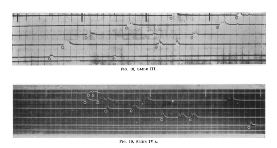
Elsewhere in Belgium, William Tucker had another revelation. Lying inside a shack with holes in its walls, he realized that the 20 Hz pressure wave from the gun created tiny puffs of air through the holes. So he looked for a way to detect this pulse, and came up with a heated platinum wire in a rum jar. The filament's resistance dropped when cooled by the wavefront's arrival through an aperture. The wire was unaffected by the high-frequency shell wave. Later, moving-coil 'microphones' (geophones, essentially) were also used, as well as calibration for wind and temperature. The receivers were coupled with a 5-channel string galvanometer, invented by French engineers, to record traces onto 35-mm film bearing timing marks:

sound-ranging-traces.png

McNaughton continued to develop these technologies through the war, and by the end was successfully locating the large majority of enemy artillery locations, and was even able to specify the calibre of the guns and their probable intended targets. Erster Generalquartiermeister Erich Ludendorff commented at one point in the war: 

According to a captured English document the English have a well- developed system of sound-ranging which in theory corresponds to our own. Precautions are accordingly to be taken to camouflage the sound: e.g. registration when the wind is contrary, and when there is considerable artillery activity, many batteries firing at the same time, simultaneous firing from false positions, etc.

An acoustic arsenal

Denge_acoustic_mirrors_March-2005_Paul-Russon.jpg

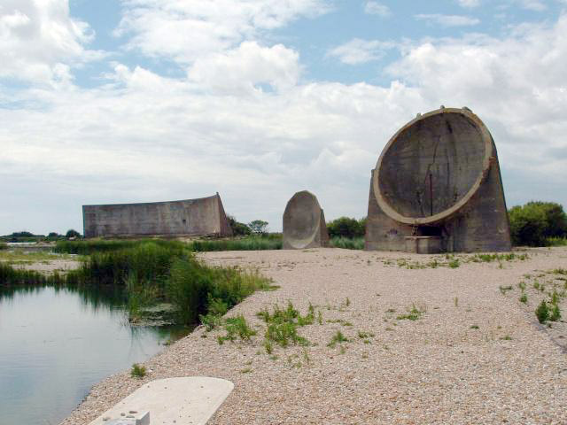
The hot-wire artillery detector was not Tucker's only acoustic innovation. He also pioneered the use of acoustic mirrors for aircraft detection. Several of these were built around the UK's east coast, starting around 1915 — the three shown here are at Denge in Kent. They were rendered obselete by the invention of radar around the beginning of World War Two.

Acoustic and seismic devices are still used today in military and security applications, though they are rarely mentioned in applied geophysics textbooks. If you know about any interesting contemporary uses, tell us about it in the comments.


According to Crown Copyright terms, the image of McNaughton is out of copyright. The acoustic mirror image is by Paul Russon, licensed CC-BY-SA. The uncredited/unlicensed galvanometer trace is from the excellent Stop, hey, what's that sound article on the geographical imaginations blog; I assume it is out of copyright. The howitzer image is out of copyright.

This post on Target acquisition and counter battery is very informative and has lots of technical details, though most of it pertains to later technology. The Boom! Sounding out the enemy article on ScienceNews for Students is also very nice, with lots of images. 

Unsolved problems in applied geoscience

I like unsolved problems. I first wrote about them way back in late 2010 — Unsolved problems was the eleventh post on this blog. I touched on the theme again in 2013, before and after the first 'unsession' at the GeoConvention, which itself was dedicated to finding the most pressing questions in exploration geoscience. As we turn towards the unsession at AAPG in Salt Lake City in May, I find myself thinking again about unsolved problems. Specifically, what are they? How can we find them? And what can we do to make them easier to solve?

It turns out lots of people have asked these questions before.

unsolved_problems.png

I've compiled a list of various attempts by geoscientists to list he big questions in the field. The only one I was previous aware of was Milo Backus's challenges in applied seismic geophysics, laid out in his president's column in GEOPHYSICS in 1980 and highlighted later by Larry Lines as part of the SEG's 75th anniversary. Here are some notable attempts:

  • John William Dawson, 1883 — Nova Scotia's most famous geologist listed unsolved problems in geology in his presidential address to the American Association for the Advancement of Science. They included the Cambrian Explosion, and the origin of the Antarctic icecap. 
  • Leason Heberling Adams, 1947 — One of the first experimental rock physicists, Adams made the first list I can find in geophysics, which was less than 30 years old at the time. He included the origin of the geomagnetic field, and the temperature of the earth's interior.
  • Milo Backus, 1980 — The list included direct hydrocarbon detection, seismic imaging, attenuation, and anisotropy.  
  • Mary Lou Zoback, 2000 — As her presidential address to the GSA, Zoback kept things quite high-level, asking questions about finding signal indynamic systems, defining mass flux and energy balance, identifying feedback loops, and communicating uncertainty and risk. This last one pops up in almost every list since.
  • Calgary's geoscience community, 2013 — The 2013 unsession unearthed a list of questions from about 50 geoscientists. They included: open data, improving seismic resolution, dealing with error and uncertainty, and global water management.
  • Daniel Garcia-Castellanos, 2014 — The Retos Terrícolas blog listed 49 problems in 7 categories, ranging from the early solar system to the earth's interior, plate tectonics, oceans, and climate. The list is still maintained by Daniel and pops up occasionally on other blogs and on Wikipedia.

The list continues — you can see them all in this presentation I made for a talk (online) at the Bureau of Economic Geology last week (thank you to Sergey Fomel for hosting me!). During the talk, I took the opportunity to ask those present what their unsolved problems are, especially the ones in their own fields. Here are a few of what we got (the rest are in the preso):

1-what-are-the-biggest-unsolved-problems-in-your-field-1.jpg

What are your unsolved problems in applied geoscience? Share them in the comments!


If you have about 50 minutes to spare, you can watch the talk here, courtesy of BEG's streaming service.

Click here to watch the talk >>>

Easier, better, faster, stronger

bruges_preview_1.png

Yesterday I pushed a new release of bruges to Python's main package repository, PyPi.  Version 0.3.3 might not sound like an especially auspicious version perhaps, but I'm excited about the new things we've added recently. It has come a long way since we announced it back in 2015, so if you haven't checked it out lately, now's a good time to take another look.

What is bruges again?

Bruges is a...

In other words, nothing fancy — just equations. It is free, open source software. It's aimed at geophysicists who use Python.

How do you install it? The short answer is pip:

    pip install bruges

So what's new?

Here are the highlights of what's been improved and added in the last few months:

  • The reflectivity equations in reflection module now work on arrays for the Vp, Vs, and rho values, as well as the theta values. This is about 10 times faster than running a loop over elements; the Zoeppritz solution is 100× faster.
  • The various Zoeppritz solutions and the Aki–Richards approximations now return the complex reflectivity and therefore show post-critical amplitudes correctly.
  • A new reflection coefficient series function, reflection.reflectivity(), makes it easier to compute offset reflectivities from logs.
  • Several new linear and non-linear filters are in bruges.filters, including median (good for seismic horizons), mode (good for waveform classification), symmetric nearest-neighbours or snn, and kuwahara.
  • The wavelets ricker(), sweep() (aka Klauder) and ormsby() wavelet now all work for a sequence of frequencies, returning a wavelet bank. Also added a sinc() wavelet, with a taper option to attenuate the sidelobes.
  • Added inverse_gardner, and other density and velocity transforms, to petrophysics.
  • Added transform.v_rms() (RMS velocity), transform.v_avg() (average velocity) and transform.v_bac() (naïve Backus average). These all operate in a 'cumulative' average-down-to sense.
  • Added a coordinate transformation to translate between arbitrarily oriented (x,y) and (inline, line) coordinates.

Want to try using it right now, with no installation? Give it a spin in My Binder! See how easy it is to compute elastic moduli, or offset reflection coefficients, or convert a log to time.  

bruges_preview_2.png

Want to support the development of open source geophysics software? Here's how:

  • Use it! This is the main thing we care about.
  • Report problems on the project's Issue page.
  • Fork the project and make your own changes, then share them back.
  • Pay us for the development of functionality you need.

This year's social coding events

If you've always wondered what goes on at our hackathons, make 2018 the year you find out. There'll be plenty of opportunities. We'll be popping up in Salt Lake City, right before the AAPG annual meeting, then again in Copenhagen, before EAGE. We're also running events at the AAPG and EAGE meetings. Later, in the autumn, we'll be making some things happen around SEG too. 

If you just want to go sign up right now, head to the Events page. If you want more deets first, read on.

Salt Lake City in May: machine learning and stratigraphy

This will be one of our 'traditional' hackathons. We're looking for 7 or 8 teams of four to come and dream up, then hack on, new ideas in geostatistics and machine learning, especially around the theme of stratigraphy. Not a coder? No worries! Come along to the bootcamp on Friday 18 May and acquire some new skills. Or just show up and be a brainstormer, tester, designer, or presenter.

Thank you to Earth Analytics for sponsoring this event. If you'd like to sponsor it too, check out your options. The bottom line is that these events cost about $20,000 to put on, so we appreciate all the help we can get. 

It doesn't stop with the hackathon demos on Sunday. At the AAPG ACE, Matt is part of the team bringing you the Machine Learning Unsession on Wednesday afternoon. If you're interested in the future of computation and geoscience, come along and be heard. It wouldn't be the same without you.

Copenhagen in June: visualization and interaction

After events in Vienna in 2016 and Paris in 2017, we're looking forward to being back in Europe in June. The weekend before the EAGE conference, we'll be hosting the Subsurface Hackathon once again. Partnering with Dell EMC and Total E&P, as last year, we'll be gathering 60 eager geoscientists to explore data visualization, from plotting to virtual reality. I can't wait.

In the EAGE Exhibition itself, we're cooking up something else entirely. The Codeshow is a new kind of conference event, mixing coding tutorials with demos from the hackathon and even some mini-hackathon projects to get you started on your own. It's 100% experimental, just the way we like it.

Anaheim in October: something exciting

We'll be at SEG in Anaheim this year, in the middle of October. No idea what exactly we'll be up to, but there'll be a hackathon for sure (sign up for alerts here). And tacos, lots of those. 

You can get tickets to most of these events on the Event page. If you have ideas for future events, or questions about them, drop us a line or leave a comment on this post!


I'll leave you with a short and belated look at the hackathon in Paris last year...

A quick look at the Subsurface Hackathon in Paris, June 2017. 

What is scientific computing?

I started my career in sequence stratigraphy, so I know a futile discussion about semantics when I see one. But humour me for a second.

As you may know, we offer a multi-day course on 'geocomputing'. Somebody just asked me: what is this mysterious, made-up-sounding discipline? Swiftly followed by: can you really teach people how to do computational geoscience in a few days? And then: can YOU really teach people anything??

Good questions

You can come at the same kind of question from different angles. For example, sometimes professional programmers get jumpy about programming courses and the whole "learn to code" movement. I think the objection is that programming is a profession, like other kinds of engineering, and no-one would dream of offering a 3-day course on, say, dentistry for beginners.

These concerns are valid, sort of.

  1. No, you can't learn to be a computational scientist in 3 days. But you can make a start. A really good one at that.
  2. And no, we're not programmers. But we're scientists who get things done with code. And we're here to help.
  3. And definitely no, we're not trying to teach people to be software engineers. We want to see more computational geoscientists, which is a different thing entirely.

So what's geocomputing then?

Words seem inadequate for nuanced discussion. Let's instead use the language of ternary diagrams. Here's how I think 'scientific computing' stacks up against 'computer science' and 'software engineering'...

If you think these are confusing, just be glad I didn't go for tetrahedrons.

These are silly, of course. We could argue about them for hours I'm sure. Where would IT fit? ("It's all about the business" or something like that.) Where does Agile fit? (I've caricatured our journey, or tried to.) Where do you fit? 

x lines of Python: contour maps

Difficulty rating: EASY

Following on from the post a couple of weeks ago about colourmaps, I wanted to poke into contour maps a little more. Ostensibly, making a contour plot in matplotlib is a one-liner:

plt.contour(data)

But making a contour plot look nice takes a little more work than most of matplotlib's other plotting functions. For example, to change the contour levels you need to make an array containing the levels you want... another line of code. Adding index contours needs another line. And then there's all the other plotty stuff.

Here's what we'll do:

  1. Load the data from a binary NumPy file.
  2. Check the data looks OK.
  3. Get the min and max values from the map.
  4. Generate the contour levels.
  5. Make a filled contour map and overlay contour lines.
  6. Make a map with index contours and contour labels.

The accompanying notebook sets out all the code you will need. You can even run the code right in your browser, no installation required.

Here's the guts of the notebook:

 
import numpy as np
import matplotlib.pyplot as plt

seabed = np.load('../data/Penobscot_Seabed.npy')
seabed *= -1
mi, ma = np.floor(np.nanmin(seabed)), np.ceil(np.nanmax(seabed))
step = 2
levels = np.arange(10*(mi//10), ma+step, step)
lws = [0.5 if level % 10 else 1 for level in levels]

# Make the plot
fig = plt.figure(figsize=(12, 8))
ax = fig.add_subplot(1,1,1)
im = ax.imshow(seabed, cmap='GnBu_r', aspect=0.5, origin='lower')
cb = plt.colorbar(im, label="TWT [ms]")
cb.set_clim(mi, ma)
params = dict(linestyles='solid', colors=['black'], alpha=0.4)
cs = ax.contour(seabed, levels=levels, linewidths=lws, **params)
ax.clabel(cs, fmt='%d')
plt.show()

This produces the following plot:

my_map.png

2017 retrospective

Another year pulls on its winter boots and prepares to hurry through the frigid night to wherever old years go to die. From a purely Agile point of view, putting aside all the odious nonsense going on in the world for a moment, it was a good year here at Agile, and I hope it was for you too. If not — if you were unduly affected by any of the manifold calamities in 2017 — then we wish you the best and hope life bounces back with renewed vigour in 2018.


>>>
A reproducible festive card for you, made from a well-
log and a bunch of random numbers. Make your own. 


agile_star_2016_sq_256px.png

It's that time when I like to self-indulgently glance back over the last twelve months — both on the blog and elsewhere in the Agile universe. Let's start with the blog...

The most popular posts

We should top 52 posts this year (there's just something about the number 52). Some of them do little more than transmit news, events and such, but we try to bring you entertainment and education too. Just no sport or weather. These were our most visited posts in this year:

As usual though, the most popular page on the site is k is for wavenumber, the 2012 post that keeps on giving. The other perennials are Well tie workflowWhat is anisotropy? and What is SEG Y? 

Engagement

We love getting comments! Most people tend to chime in via Twitter or LinkedIn, but we get quite a few on the blog. Indeed, the posts listed above got more than 60 comments between them. The following were the next most commented upon:

Agile_demographic_2017.png

Where is everybody?

  1. Houston (about 6.6% of you)
  2. Calgary (4.8%)
  3. London (3.3%)
  4. Perth (1.8%)
  5. Moscow (1.3%)
  6. Stavanger (1.2%)
  7. Rio de Janiero (1.1%)
  8. Kuala Lumpur (1.0%)
  9. Paris (1.0%)
  10. Aberdeen (0.9%)

Work

We're fortunate to have had a good year at Agile. I won't beat our drum too hard, but here's a bit of what we've been up to:

  • We're doing a machine learning project on GPR interpretation.
  • We finished a machine learning lithology prediction project for Canstrat.
  • Matt did more seep and DHI mapping on Canada's Atlantic margin.
  • It was a good year for hackathons, with over 100 people taking part in 2017.
  • Agile Libre brought out a new book, 52 More Things... Palaeontology.
  • We hired awesome data scientist Diego Castañeda (right) full time. 

Thank you

Last but far from least — thank you. We appreciate your attention, one of the most precious resources you have. We love writing useful-and/or-interesting stuff, and are lucky to have friends and colleagues who read it and push us to do more, and a bit better than before. It would be a chore if it wasn't for your readership.

All the best for this Yuletide season, and for a peaceful New Year. Cheers!

No more rainbows!

"the rainbow color map can significantly reduce a person’s accuracy and efficiency"
Borkin et al. (2011)

File under "Aaarrrrrrgghhhhhhh"

File under "Aaarrrrrrgghhhhhhh"

The world has known for at least 20 years that the rainbow colourmap is A Bad Thing, perhaps even A Very Bad Thing. IBM researchers Bernice Rogowitz and Lloyd Treinish — whose research on the subject goes back to the early 90s — wrote their famous article Why should engineers and scientists be worried about color? in 1996. Visualization guru Edward Tufte highlighted the problems with it in his 1997 book Visual Explanations (if you haven't read this book, you must buy it immediately). 

This isn't a matter of taste, or opinion. We know — for sure, with science! — that the rainbow is a bad choice for the visualization of data. And yet people use it every day, even in peer-reviewed literature. And — purely anecdotally — it seems to be especially rife in geoscience <citation needed>.

Why are we talking about this? 

The rainbow colourmap suffers from a number of severe problems:

  • It's been linked to inferior image interpretation by professionals (Borkin et al 2011).

  • It introduces ambiguity into the display: are we looking at the data's distribution, or the colourmap's?

  • It introduces non-existent structure into the display — notice the yellow and cyan stripes, which manifest as contours:

rainbow.png
  • Colourblind people cannot read the colours properly — I made this protanopic simulation with Coblis

rainbow_protanope.png
  • It does not have monotonically increasing lightness, so you can't reproduce it in greyscale.

rainbow_grey.png
  • There's no implicit order to hues, so it's hard to interpret meaning intuitively.

  • On a practical note, it uses every available colour, leaving you none for annotation.

For all of these reasons, MATLAB and Matplotlib no longer use rainbow-like colourmaps by default. And neither should you.

But I like rainbows!

People tend like things that are bad for them. Chris Jackson (Imperial, see here and here) and Bert Bril (dGB, in Slack) have both expressed an appreciation for rainbow-like colourmaps, or at least an indifference. Bert went so far as to say he doesn't like 'perceptual' colourmaps — those that monotonically and linearly increase in brightness. 

I don't think indifference is allowed. Research with professional image interpreters has shown us that rainbow colourmaps impair the quality of their work. We know that these colours are hard for colourblind people to use. The practical issues of not being readable in greyscale and leaving no colours for annotation are always present. There's just no way we can ask, "Does it matter?" — at least not without offering some evidence that goes beyond mere anecdote.

I think what people like is the colour variance — it acts like contours, highlighting subtle features in the surface. Some of this extra detail is probably noise, but some is certainly signal, maybe even opportunity. 

See what you think of these renderings of the seafloor pick on the Penobscot dataset, offshore Nova Scotia (licensed CC-BY-SA by dGB Earth Sciences and The Government of Nova Scotia). The top row are some rainbow-like colourmaps, all bad. The others are a selection of (more-or-less) perceptually awesome colourmaps. The names under each map are the names of the colourmaps in Python's matplotlib package.

The solution

We know what kind of colourmaps are good for interpretation: those that increase linearly and monotonically in brightness, with no jumps or stripes of luminance. I've linked to lots of places where you can read about these — see the end of the post. You already know one perceptual colourmap: the humble Greyscale. But there are lots of others, so let's start with one of them.

Next, instead of using something that acts like contours, let's try using contours!

I think that's a big improvement already. Some tips for contouring:

  1. Make them thin and black, with opacity at about 0.2 to 0.5. Transparency is essential. 

  2. Choose a fairly small interval; use index contours if there are more than about 10.

  3. Label the contours directly on a large map. State the contour interval in the caption.

Let's try hillshading instead:

Also really nice.

Given that this is a water-bottom horizon, I like the YlGnBu colourmap, which resembles the thing it is modeling. (I think this is also a good basis for selecting a colourmap, by the way, all else being equal.)

I must admit I do find a lot of these perceptual colormaps get too dark at the 'low' end, which can make annotation (or seeing contours) hard. So we will fix that with a function (see the notebook) that generates perceptually linear colourmaps.

Now tell me the spectrum beats a perceptual colourmap...

Horizons_faceoff.png

Let's check that it is indeed colourblind-safe and grey-safe:

Horizons_faceoff_protanope.png
Horizons_faceoff_grey.png

There you have it. If you care about your data and your readers, avoid rainbow-like colourmaps in the lab and in publications. Go perceptual!

The Python code and data to generate these images is available on GitHub.

Binder     Better yet, click here to play with the data right in your browser!

What do you think? Are rainbow colourmaps here to stay? 

References and bibliography

Still not convinced?

For goodness sake, just listen to Kristin Thyng for 20 minutes:

The post of Christmas present

It's nearly the end of another banner year for humanity, which seems determined as ever to destroy the good things it has achieved. Here's hoping certain world 'leaders' have their Scrooge moments sooner rather than later.

One positive thing we can all do is bring a little more science into the world. And I don't just mean for the scientists you already know. Let's infect everyone we can find! Maybe your niece will one day detect a neutron star collision in the Early Cretaceous, or your small child's intuition for randomness will lead to more breakthroughs in quantum computing.

Build a seismic station

There's surely no better way to discover the wonder of waves than to build a seismometer. There are at least a couple of good options. I built a single component 10 Hz Raspberry Shake myself; it was easy to do and, once hooked up to Ethernet, the device puts itself online and starts streaming data immediately.

The Lego seismometer kit (above right) looks like a slightly cheaper option, and you might want to check that they can definitely ship in time for Xmas, but it's backed by the British Geological Survey so I think it's legit. And it looks very cool indeed.

Everyone needs a globe!

As I mentioned last year, I love globes. We have several at home and more at the office. I don't yet have a Moon globe, however, so I've got my eye on this Replogle edition, NASA approved apparently ("Yup, that's the moon alright!"), and not too pricey at about USD 85. 

They seem to be struggling to fill orders, but I can't mention globes without mentioning Little Planet Factory. These beautiful little 3D-printed worlds can be customized in all sorts of ways (clouds or no clouds, relief or smooth, etc), and look awesome in sets. 

The good news is that you can pick up LPF's little planets direct from Shapeways, a big 3D printing service provider. They aren't lacquered, but until LPF get back on track, they're the next best thing.

Geology as a lifestyle

Brenda Houston like minerals. A lot. She's made various photomicrographs into wallpaper and fabrics (below, left), and they are really quite awesome. Especially if you always wanted to live inside a geode

OK, some of them might make your house look a bit... Bond-villainy.

If you prefer the more classical imagery of geology, how about this Ancient Dorset duvet cover (USD 120) by De la Beche?

I love this tectonic pewter keychain (below, middle) — featuring articulated fault blocks, and tiny illustrations of various wave modes. And it's under USD 30.

A few months ago, Mark Tingay posted on Twitter about his meteorite-faced watch (below, right). Turns out it's a thing (of course it's a thing) and you can drop substantial sums of money on such space-time trinkets. Like $235,000.

Algorithmic puzzles and stuff

These are spectacular: randomly generated agate-like jigsaw puzzles. Every one is different! Even the shapes of the wooden pieces are generated with maths. They cost about USD 95, and come from Boston-based Nervous System. The same company has lots of other rock- and fossil-inspired stuff, like ammonity jewellery (from about USD 50) and some very cool coasters that look a bit like radiolarians (USD 48 for 4).

orbicular_geode.jpg
orbicular_geode2.jpg
nudibranchNecklaceBlack_medium.jpg
radiolarian_coasters.jpg

There's always books

You can't go wrong with books. These all just came out, and just might appeal to a geoscientist. And if these all sound a bit too much like reading for work, try the Atlas of Beer instead. Click on a book to open its page at Amazon.com.

The posts of Christmas past

If by any chance there aren't enough ideas here, or you are buying for a very large number of geoscientists, you'll have to dredge through the historical listicles of yesteryear — 20112012201320142015, or 2016. You'll find everything there, from stocking stuffers to Triceratops skulls.


The images in this post are all someone else's copyright and are used here under fair use guidelines. I'm hoping the owners are cool with people helping them sell stuff!

Not getting hacked

This kind of password is horrible for lots of reasons. The real solution to password madness is a password manager.

This kind of password is horrible for lots of reasons. The real solution to password madness is a password manager.

The end of the year is a great time to look around at your life and sort stuff out. One of the things you almost certainly need to sort out is your online security. Because if you haven't been hacked already (you probably have), you're just about to be.

Just look at some recent stories from the world of data security:

There are plenty of others; Wired has been keeping track of them — read more here. Or check out Wikipedia's list.

Despite all this, I see hardly anyone using a password manager, and anecdotally I hear that hardly anyone uses two-factor authentication either. This tells me that at least 80% of smart people, inlcuding lots of my friends and relatives, are in daily peril. Oh no!

After reading this post, I hope you do two things:

  • Start using a password manager. If you only do one thing, do this.
  • Turn on two-factor authentication for your most vulnerable accounts.

Start using a password manager

Please, right now, download and install LastPass on every device and in every browser you use. It's awesome:

  • It stores all your passwords! This way, they can all be different, and each one can be highly secure.
  • It generates secure, random passwords for new accounts you create. 
  • It scores you on the security level of your passwords, and lets you easily change insecure ones.
  • The free version is awesome, and the premium version is only $2/month.

There are other password managers, of course, but I've used this one for years and it's excellent. Once you're set up, you can start changing passwords that are insecure, or re-used on multiple sites... or which are at Uber, Yahoo, or Equifax.

One surprise from using LastPass is being able to count the number of accounts I have created around the web over the years. I have 473 accounts stored in LastPass! That's 473 places to get hacked... how many places are you exposed?

The one catch: you need a bulletproof key for your password manager. Best advice: use a long pass-phrase instead.

The obligatory password cartoon, by xkcd and licensed CC-BY-NC

The obligatory password cartoon, by xkcd and licensed CC-BY-NC

authenticator.png

Two-factor authentication

Sure, it's belt and braces — but you don't want your security trousers to fall down, right? 

Er, anyway, the point is that even with a secure password, your password can still be stolen and your account compromised. But it's much, much harder if you use two-factor authentication, aka 2FA. This requires you to enter a code — from a hardware key or an app, or received via SMS — as well as your password. If you use an app, it introduces still another layer of security, because your phone should be locked.

I use Google's Authenticator app, and I like it. There's a little bit of hassle the first time you set it up, but after that it's plain sailing. I have 2FA turned on for all my 'high risk' accounts: Google, Twitter, Facebook, Apple, AWS, my credit card processor, my accounting software, my bank, my domain name provider, GitHub, and of course LastPass. Indeed, LastPass even lets me specify that logins must originate in Canada. 

What else can you do?

There are some other easy things you can do to make yourself less hackable:

  • Install updates on your phones, tablets, and other computers. Keep browsers and operating systems up to date.
  • Be on high alert for phishing attempts. Don't follow links to sites like your bank or social media sites — type them into your browser if possible. Be very suspicious of anyone contacting you, especially banks.
  • Don't use USB sticks. The cloud is much safer — I use Dropbox myself, it's awesome.

For more tips, check out this excellent article from Motherboard on not getting hacked.