
x lines of Python: Let's play golf!
/Normally in the x lines of Python series, I'm trying to do something useful in as few lines of code as possible, but — and this is important — without sacrificing clarity. Code golf, on the other hand, tries solely to minimize the number of characters used, and to heck with clarity. This might, and probably will, result in rather obfuscated code.
So today in x lines, we set x = 1 and see what kind of geophysics we can express. Follow along in the accompanying notebook if you like.
A Ricker wavelet
One of the basic building blocks of signal processing and therefore geophysics, the Ricker wavelet is a compact, pulse-like signal, often employed as a source in simulation of seismic and ground-penetrating radar problems. Here's the equation for the Ricker wavelet:
$$ A = (1-2 \pi^2 f^2 t^2) e^{-\pi^2 f^2 t^2} $$
where \(A\) is the amplitude at time \(t\), and \(f\) is the centre frequency of the wavelet. Here's one way to translate this into Python, more or less as expressed on SubSurfWiki:
import numpy as np
def ricker(length, dt, f):
    """Ricker wavelet at frequency f Hz, length and dt in seconds.
    """
    t = np.arange(-length/2, length/2, dt)
    y = (1.0 - 2.0*(np.pi**2)*(f**2)*(t**2)) * np.exp(-(np.pi**2)*(f**2)*(t**2))
    return t, y
That is alredy pretty terse at 261 characters, but there are lots of obvious ways, and some non-obvious ways, to reduce it. We can get rid of the docstring (the long comment explaining what the function does) for a start. And use the shortest possible variable names. Then we can exploit the redundancy in the repeated appearance of \(\pi^2f^2t^2\)... eventually, we get to:
def r(l,d,f):import numpy as n;t=n.arange(-l/2,l/2,d);k=(n.pi*f*t)**2;return t,(1-2*k)/n.exp(k)
This weighs in at just 95 characters. Not a bad reduction from 261, and it's even not too hard to read. In the notebook accompanying this post, I check its output against the version in our geophysics package bruges, and it's legit:
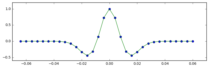
The 95-character Ricker wavelet in green, with the points computed by the function in BRuges.
What else can we do?
In the notebook for this post, I run through some more algorithms for which I have unit-tested examples in bruges:
- The Ormsby wavelet, reduced from 1545 characters in bruges to 168 characters. (Not bad, considering it took me 111 characters just to express the mathematical equation in the wiki!)
- The 4-term Aki-Richards equation, weighing in at only 179 characters (9.8% of the 1828 characters in bruges).
- The exact Zoeppritz solution for a PP reflection, at 386 characters.
To give you some idea of why we don't normally code like this, here's what the Aki–Richards solution looks like:
def r(a,c,e,b,d,f,t):import numpy as n;w=f-e;x=f+e;y=d+c;p=n.pi*t/180;s=n.sin(p);return w/x-(y/a)**2*w/x*s**2+(b-a)/(b+a)/n.cos((p+n.arcsin(b/a*s))/2)**2-(y/a)**2*(2*(d-c)/y)*s**2
A bit hard to debug! But there is still some point to all this — I've found I've had to really understand Python's order of mathematical operations, and find different ways of doing familiar things. Playing code golf also makes you think differently about repetition and redundancy. All good food for developing the programming brain.

Do have a play with the notebook, which you can even run in Microsoft Azure, right in your browser! Give it a try. (You'll need an account to do this. Create one for free.)
Many thanks to Jesper Dramsch and Ari Hartikainen for helping get my head into the right frame of mind for this silliness!


 Except where noted, this content is licensed