Slicing seismic arrays

Scientific computing is largely made up of doing linear algebra on matrices, and then visualizing those matrices for their patterns and signals. It's a fundamental concept, and there is no better example than a 3D seismic volume.

Seeing in geoscience, literally

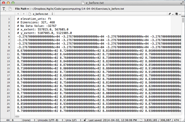
Digital seismic data is nothing but an array of numbers, decorated with header information, sorted and processed along different dimensions depending on the application.

In Python, you can index into any sequence, whether it be a string, list, or array of numbers. For example, we can index into the fourth character (counting from 0) of the word 'geoscience' to select the letter 's':

>>> word = 'geosciences'
>>> word[3]
's'

Or, we can slice the string with the syntax word[start:end:step] to produce a sub-sequence of characters. Note also how we can index backwards with negative numbers, or skip indices to use defaults:

>>> word[3:-1]  # From the 4th character to the penultimate character.
'science'
>>> word[3::2]  # Every other character from the 4th to the end.
'sine'

Seismic data is a matrix

In exactly the same way, we index into a multi-dimensional array in order to select a subset of elements. Slicing and indexing is a cinch using the numerical library NumPy for crunching numbers. Let's look at an example... if data is a 3D array of seismic amplitudes:

timeslice = data[:,:,122] # The 122nd element from the third dimension.
inline = data[30,:,:]     # The 30th element from the first dimension.
crossline = data[:,60,:]  # The 60th element from the second dimension.

Here we have sliced all of the inlines and crosslines at a specific travel time index, to yield a time slice (left). We have sliced all the crossline traces along an inline (middle), and we have sliced the inline traces along a single crossline (right). There's no reason for the slices to remain orthogonal however, and we could, if we wished, index through the multi-dimensional array and extract an arbitrary combination of all three.

Questions involving well logs (a 1D matrix), cross sections (2D), and geomodels (3D) can all be addressed with the rigours of linear algebra and digital signal processing. An essential step in working with your data is treating it as arrays.

View the notebook for this example, or get the get the notebook from GitHub and play with around with the code.

Sign up!

If you want to practise slicing your data into bits, and other power tools you can make, the Agile Geocomputing course will be running twice in the UK this summer. Click one of the buttons below to buy a seat.

Eventbrite - Agile Geocomputing, Aberdeen

Eventbrite - Agile Geocomputing, London

More locations in North America for the fall. If you would like us to bring the course to your organization, get in touch.

Great geophysicists #11: Thomas Young

Painting of Young by Sir Thomas LawrenceThomas Young was a British scientist, one of the great polymaths of the early 19th century, and one of the greatest scientists. One author has called him 'the last man who knew everything'¹. He was born in Somerset, England, on 13 June 1773, and died in London on 10 May 1829, at the age of only 55. 

Like his contemporary Joseph Fourier, Young was an early Egyptologist. With Jean-François Champollion he is credited with deciphering the Rosetta Stone, a famous lump of granodiorite. This is not very surprising considering that at the age of 14, Young knew Greek, Latin, French, Italian, Hebrew, Chaldean, Syriac, Samaritan, Arabic, Persian, Turkish and Amharic. And English, presumably. 

But we don't include Young in our list because of hieroglyphics. Nor  because he proved, by demonstrating diffraction and interference, that light is a wave — and a transverse wave at that. Nor because he wasn't a demented sociopath like Newton. No, he's here because of his modulus

Elasticity is the most fundamental principle of material science. First explored by Hooke, but largely ignored by the mathematically inclined French theorists of the day, Young took the next important steps in this more practical domain. Using an empirical approach, he discovered that when a body is put under pressure, the amount of deformation it experiences is proportional to a constant for that particular material — what we now call Young's modulus, or E:

This well-known quantity is one of the stars of the new geophysical pursuit of predicting brittleness from seismic data, and a renewed interested in geomechanics in general. We know that Young's modulus on its own is not enough information, because the mechanics of failure (as opposed to deformation) are highly nonlinear, but Young's disciplined approach to scientific understanding is the best model for figuring it out. 

Sources and bibliography

Footnote

¹ Thomas Young wrote a lot of entries in the 1818 edition of Encyclopædia Britannica, including pieces on bridges, colour, double refraction, Egypt, friction, hieroglyphics, hydraulics, languages, ships, sound, tides, and waves. Considering that lots of Wikipedia is from the out-of-copyright Encyclopædia Britannica 11th ed. (1911), I wonder if some of Wikipedia was written by the great polymath? I hope so.

The nonlinear ear

Hearing, audition, or audioception, is one of the Famous Five of our twenty or so senses. Indeed, it is the most powerful sense, having about 100 dB of dynamic range, compared to about 90 dB for vision. Like vision, hearing — which is to say, the ear–brain system — has a nonlinear response to stimuli. This means that increasing the stimulus by, say, 10%, does not necessarily increase the response by 10%. Instead, it depends on the power and bandwidth of the signal, and on the response of the system itself.

What difference does it make if hearing is nonlinear? Well, nonlinear perception produces some interesting effects. Some of them are especially interesting to us because hearing is analogous to the detection of seismic signals — which are just very low frequency sounds, after all.

Stochastic resonance (Zeng et al, 2000)

One of the most unintuitive properties of nonlinear detection systems is that, under some circumstances, most importantly in the presence of a detection threshold, adding noise increases the signal-to-noise ratio.

I'll just let you read that last sentence again.

Add noise to increase S:N? It might seem bizarre, and downright wrong, but it's actually a fairly simple idea. If a signal is below the detection threshold, then adding a small Goldilocks amount of noise can make the signal 'peep' above the threshold, allowing it to be detected. Like this:

I have long wondered what sort of nonlinear detection system in geophysics might benefit from a small amount of noise. It also occurs to me that signal reconstruction methods like compressive sensing might help estimate that 'hidden' signal from the few semi-random samples that peep above the threshold. If you know of experiments in this, I'd love to hear about it.

Better than Heisenberg (Oppenheim & Magnasco, 2012)

Denis Gabor realized in 1946 that Heisenberg's uncertainty principle also applies to linear measures of a signal's time and frequency. That is, methods like the short-time Fourier transform (STFT) cannot provide the time and the frequency of a signal with arbitrary precision. Mathematically, the product of the uncertainties has some minimum, sometimes called the Fourier limit of the time–bandwidth product.

So far so good. But it turns out our hearing doesn't work like this. It turns out we can do better — about ten times better.

Oppenheim & Magnasco (2012) asked subjects to discriminate the timing and pitch of short sound pulses, overlapping in time and/or frequency. Most people were able to localize the pulses, especially in time, better than the Fourier limit. Unsurprisingly, musicians were especially sensitive, improving on the STFT by a factor of about 10. While seismic signals are not anything like pure tones, it's clear that human hearing does better than one of our workhorse algorithms.

Isolating weak signals (Gomez et al, 2014)

One of the most remarkable characteristics of biological systems is adaptation. It seems likely that the time–frequency localization ability most of us have is a long-term adaption. But it turns out our hearing system can also rapidly adapt itself to tune in to specific types of sound.

Listening to a voice in a noisy crowd, or a particular instrument in an orchestra, is often surprisingly easy. A group at the University of Zurich has figured out part of how we do this. Surprisingly, it's not high-level processing in the auditory cortex. It's not in the brain at all; it's in the ear itself.

That hearing is an active process was known. But the team modeled the cochlea (right, purple) with a feature called Hopf bifurcation, which helps describe certain types of nonlinear oscillator. They established a mechanism for the way the inner ear's tiny mechanoreceptive hairs engage in active sensing.

What does all this mean for geophysics?

I have yet to hear of any biomimetic geophysical research, but it's hard to believe that there are no leads here for us. Are there applications for stochastic resonance in acquisition systems? We strive to make receivers with linear responses, but maybe we shouldn't! Could our hearing do a better job of time-frequency localization than any spectral decomposition scheme? Could turning seismic into music help us detect weak signals in the geological noise?

All very intriguing, but of course no detection system is perfect... you can fool your ears too!

References

Zeng FG, Fu Q, Morse R (2000). Human hearing enhanced by noise. Brain Research 869, 251–255.

Oppenheim, J, and M Magnasco (2013). Human time-frequency acuity beats the Fourier uncertainty principle. Physical Review Letters. DOI 10.1103/PhysRevLett.110.044301 and in the arXiv.

Gomez, F, V Saase, N Buchheim, and R Stoop (2014). How the ear tunes in to sounds: A physics approach. Physics Review Applied 1, 014003. DOI 10.1103/PhysRevApplied.1.014003.

The stochastic resonance figure is original, inspired by Simonotto et al (1997), Physical Review Letters 78 (6). The figure from Oppenheim & Magnasco is copyright of the authors. The ear image is licensed CC-BY by Bruce Blaus

Lusi's 8th birthday

Lusi is the nickname of Lumpur Sidoarjo — 'the mud of Sidoarjo' — the giant mud volcano in the city of Sidoarjo, East Java, Indonesia. This week, Lusi is eight years old.

Google MapsBefore you read on, I recommend taking a look at it in Google Maps. Actually, Google Earth is even better — especially with the historical imagery. 

The mud flow was [may have been; see comments below — edit, 26 June 2014] triggered by the Banjar Panji 1 exploration well, operated by Lapindo Brantas, though the conditions may have been set up by a deadly earthquake. Mud loss events started in the early hours of 27 May 2006, seven minutes after the 6.2 Mw Yogyakarta earthquake that killed about 6,000 people. About 24 hours later, a large kick was killed and the blow-out preventer activated. Another 22 hours after this, while fishing in the killed well, mud, steam, and natural gas erupted from a fissure about 200 m southwest of the well. A few weeks after that, it was venting 180,000 m³ every day — enough mud to fill 72 Olympic swimming pools.

Thousands of years

In the slow-motion disaster that followed, as hot water from Miocene carbonates mobilized volcanic mud from Pleistocene mudstones, at least 15,000 people — and maybe as many as 50,000 people — were displaced from their homes. Davies et al. (2011) estimated that the main eruption may last 26 years, though recent sources suggest it is easing quickly. Still, during this time, we might expect 95–475 m of subsidence. And in the long term? 

By analogy with natural mud volcanoes it can be expected to continue to flow at lower rates for thousands of years. — Davies et al. (2011)

So we're only 8 years into a thousand-year man-made eruption. And there's already enough mud thrown up from the depths to cover downtown Calgary...

References and further reading

Quite a bit has been written about LUSI. The Hot Mud Flow blog tracks a lot of it. The National University of Singapore has a lot of satellite photographs, besides those you'll find in Google Earth. The Wikipedia article links to a lot of information, as you'd expect. The Interweb has a few others, including this article by Tayvis Dunnahoe in E&P Magazine. 

There are also some scholarly articles. These two are worth tracking down:

Davies, R, S Mathias, R Swarbrick and M Tingay (2011). Probabilistic longevity estimate for the LUSI mud volcano, East Java. Journal of the Geological Society 168, 517–523. DOI 10.1144/0016-76492010-129

Sawolo, N, E Sutriono, B Istadi, A Darmoyo (2009). The LUSI mud volcano triggering controversy: was it caused by drilling? Marine & Petroleum Geology 26 (9), 1766–1784. DOI 10.1016/j.marpetgeo.2009.04.002


The satellite images in this post are © DigitalGlobe and Google, captured from Google Earth, and are used here in accordance with their terms of use. The maps are © OpenStreetMap and licensed ODbL. The seismic section is from Davies et al. 2011 and © The Geological Society of London and is used here in accordance with their terms of use. The text of this post is © Agile Geoscience and openly licensed under the terms of CC-BY, as always!

Fibre optic seismology at #GeoCon14

We've been so busy this week, it's hard to take time to write. But for the record, here are two talks I liked yesterday at the Canada GeoConvention. Short version — Geophysics is awesome!

DAS good

Todd Bown from OptaSense gave an overview of the emerging applications for distributed acoustic sensing (DAS) technology. DAS works by shining laser pulses down a fibre optic cable, and measuring the amount of backscatter from impurities in the cable. Tiny variations in strain on the cable induced by a passing seismic wave, say, are detected as subtle time delays between light pulses. Amazing.

Fibre optic cables aren't as sensitive as standard geophone systems (yet?), but compared to conventional instrumentation, DAS systems have several advantages:

  • Deployment is easy: fibre is strapped to the outside of casing, and left in place for years.
  • You don't have to re-enter and interupt well operations to collect data.
  • You can build ultra-long receiver arrays — as long as your spool of fibre.
  • They are sensitive to a very broad band of signals, from DC to kilohertz.

Strain fronts

Later in the same session, Paul Webster (Shell) showed results from an experiment that used DAS as a fracture diagnosis tool. That means you can record for minutes, hours, even days; if you can cope with all that data. Shell has accumulated over 300 TB of records from a handful of projects, and seems to be a leader in this area.

By placing a cable in one horizontal well in order to listen to the frac treatment from another, the cable can effectively designed to record data similar to a conventional shot gather, except with a time axis of 30 minutes. On the gathers he drew attention to slow-moving arcuate events that he called strain fronts. He hypothesized a number of mechanisms that might cause these curious signals: the flood of fracking fluids finding their way into the wellbore, the settling and closing creep of rock around proppant, and so on. This work is novel and important because it offers insight into the mechanical behavoir of engineered reservoirs, not just during the treatment, but long after.

Why is geophysics awesome? We can measure sound with light. A mile underground. That's all.

Looking forward to #GeoCon14

Agile is off to Calgary on Sunday. We have three things on our List of Thing To Do: 

  1. We're hosting another Unsession on Monday... If you're in Calgary, please come along! It's just like any other session at the conference, only a bit more awesome.
  2. We'll be blogging from GeoConvention 2014. If there's a talk you'd like to send us to, we take requests! Just drop us a line or tweet at us!
  3. Evan is teaching his Creative Geocomputing class. Interested? There are still places. A transformative experience, or your money back.

What's hot at GeoCon14

Here's a run-down of what we're looking forward to catching:

  • Monday: Maybe it's just me, but I always find seismic acquisition talks stimulating. In the afternoon, the Unsession is the place to be. Not Marco Perez's probably awesome talk about brittleness and stress. Definitely not. 
  • Tuesday: If it wasn't for the fear of thrombosis, it'd be tempting to go to Glen 206 and stay in Log Analysis sessions all day. In the afternoon, the conference is trying something new and interesting — Jen Russel-Houston (a bright spark if ever there was one) is hosting a PechaKucha — lightning versions of the best of GeoConvention 2013. 
  • Wednesday: This year's conference is unusually promising, because there is yet another session being given over to 'something different' — two actually. A career-focused track will run all day in Macleod D, called (slightly weirdly) ‘On Belay’: FOCUSing on the Climb that is a Career in Geoscience. Outside of that, I'd head for the Core Analysis sessions.
  • Friday: We won't be there this year, but the Core Conference is always worth going to. I haven't been to anything like it at any other conference. It's open on Thursday too, but go on the Friday for the barbeque (tix required).

The GeoConvention is always a good conference. It surprises me how few geoscientists come from outside of Canada to this event. Adventurous geophysicists especially should consider trying it one year — Calgary is really the epicentre of seismic geophysics, and perhaps of petrophysics too.

And the ski hills are still open.

How much rock was erupted from Mt St Helens?

One of the reasons we struggle when learning a new skill is not necessarily because this thing is inherently hard, or that we are dim. We just don't yet have enough context for all the connecting ideas to, well, connect. With this in mind I wrote this introductory demo for my Creative Geocomputing class, and tried it out in the garage attached to START Houston, when we ran the course there a few weeks ago.

I walked through the process of transforming USGS text files to data graphics. The motivation was to try to answer the question: How much rock was erupted from Mount St Helens?

This gorgeous data set can be reworked to serve a lot of programming and data manipulation practice, and just have fun solving problems. My goal was to maintain a coherent stream of instructions, especially for folks who have never written a line of code before. The challenge, I found, is anticipating when words, phrases, and syntax are being heard like a foriegn language (as indeed they are), and to cope by augmenting with spoken narrative.

Text file to 3D plot

To start, we'll import a code library called NumPy that's great for crunching numbers, and we'll abbreviate it with the nickname np:

>>> import numpy as np

Then we can use one of its functions to load the text file into an array we'll call data:

>>> data = np.loadtxt('z_after.txt')

The variable data is a 2-dimensional array (matrix) of numbers. It has an attribute that we can call upon, called shape, that holds the number of elements it has in each dimension,

>>> data.shape
(1370, 949)

If we want to make a plot of this data, we might want to take a look at the range of the elements in the array, we can call the peak-to-peak method on data,

>>> data.ptp()
41134.0

Whoa, something's not right, there's not a surface on earth that has a min to max elevation that large. Let's dig a little deeper. The highest point on the surface is,

>>> np.amax(data)
8367.0

Which looks to the adequately trained eye like a reasonable elevation value with units of feet. Let's look at the minimum value of the array,

>>> np.amin(data)
-32767.0 

OK, here's the problem. GIS people might recognize this as a null value for elevation data, but since we aren't assuming any knowledge of GIS formats and data standards, we can simply replace the values in the array with not-a-number (NaN), so they won't contaminate our plot.

>>> data[data==-32767.0] = np.nan

To view this surface in 3D we can import the mlab module from Mayavi

>>> from mayavi import mlab

Finally we call the surface function from mlab, and pass the input data, and a colormap keyword to activate a geographically inspired colormap, and a vertical scale coefficient.

>>> mlab.surf(data,
              colormap='gist_earth',
              warp_scale=0.05)

After applying the same procedure to the pre-eruption digits, we're ready to do some calculations and visualize the result to reveal the output and its fascinating characteristics. Read more in the IPython Notebook.

If this 10 minute introduction is compelling and you'd like to learn how to wrangle data like this, sign up for the two-day version of this course next week in Calgary. 

Eventbrite - Agile Geocomputing

April linkfest

It's time for our regular linkfest!

There's a new book in town... Rob Simm and Mike Bacon have put together a great-looking text on seismic amplitude intepretation (Cambridge, 2014). Mine hasn't arrived yet, so I can't say much more — for now, you can preview it in Google Books. I should add it to my list.

Staying with new literature, I started editing a new column in SEG's magazine The Leading Edge in February. I wrote about the first instalment, and now the second is out, courtesy of Leo Uieda — check out his tutorial on Euler deconvolution, complete with code. Next up is Evan with a look at synthetics.

On a related note, Matteo Niccoli just put up a great blog post on his awesome perceptual colourmaps, showing how to port them to matplotlib, the MATLAB-like plotting environment lots of people use with the Python programming language. 

Dolf Seilacher, the German ichnologist and palaeontologist, died 4 days ago at the age of 89. For me at least, his name is associated with the mysterious trace fossil Palaeodictyon — easily one of the weirdest things on earth (right). 

Geoscience mysteries just got a little easier to solve. As I mentioned the other day, there's a new place on the Internet for geoscientists to ask questions and help each other out. Stack Exchange, the epic Q&A site, has a new Earth Science site — check out this tricky question about hydrocarbon generation.

And finally, who would have thought that waiting 13 years for a drop of bitumen could be an anticlimax? But in the end, the long (if not eagerly) awaited 9th drop in the University of Queensland's epic experiment just didn't have far enough to fall...

If you can't get enough of this, you can wait for the 10th drop here. Or check back here in 2027.

More AAPG highlights

Here are some of our highlights from the second half of the AAPG Annual Convention in Houston.

Conceptual uncertainty in interpretation

Fold-thrust belt, offshore Nigeria. Virtual Seismic Atlas.Rob Butler's research is concerned with the kinematic evolution of mountain ranges and fold thrust belts in order to understand the localization of deformation across many scales. Patterns of deformed rocks aren't adequately explained by stress fields alone; they are also controlled by the mechancial properties of the layers themselves. Given this fact, the definition of the layers becomes a doubly important part of the interpretation.

The biggest risk in structural interpretation is not geometrical accuracy but whether or not the concept is correct. This is not to say that we don't understand geologic processes. Rather, a section can always be described in more than one way. It is this risk in the first order model that impacts everything we do. To deal with conceptual uncertainty we must first capture the range, otherwise it is useless to do any more refinement. 

He showed a crowd-sourced compiliation of 24 interpretations from the Virtual Seismic Atlas as a way to stack up a series of possible structural frameworks. Fifteen out of twenty-four interviewees interpreted a continuous, forward-propagating thrust fault as the main structure. The disagreements were around the existence and location of a back thrust, linkage between fore- and back-thrusts, the existence and location of a detachment surface, and its linkage to the fault planes above. Given such complexity, "it's rather daft," he said, "to get an interpretation from only one or two people." 

CT scanning gravity flows

Mike Tilston and Bill Arnott gave a pair of talks about their research into sediment gravity flows in the lab. This wouldn't be newsworthy in itself, but their 2 key innovations caught our attention: 

  1. A 3D velocity profiler capable of making 23 measurements a second
  2. The flume tank ran through a CT scanner, giving a hi-res cross-section view

These two methods sidestep the two major problems with even low-density (say 4% by weight) sediment gravity flows: they are acoustically attenuative, and optically opaque. Using this approach Tilston and Arnott investigated the effect of grain size on the internal grain distribution, finding that fine-grained turbidity currents sustain a plug-like wall of sediment, while coarse-grained flows have a more carpet-like distribution. Next, they plan to look at particle shape effects, finer grain sizes, and grain mixtures. Technology for the win!

Hypothesizing a martian ocean

Lorena Moscardelli showed topograhic renderings of the Eberswalde delta (right) on the planet Mars, hypothesizing that some martian sedimentary rocks have been deposited by fluvial processes. An assertion that posits the red planet with a watery past. If there are sedimentary rocks formed by fluids, one of the fluids could have been water. If there has been water, who knows what else? Hydrocarbons? Imagine that! Her talk was in the afternoon session on Space and Energy Frontiers, sandwiched by less scientific speakers raising issues for staking claims and models for governing mineral and energy resources away from earth. The idea of tweaking earthly policies and state regulations to manage resources on other planets, somehow doesn't align with my vision of an advanced civilization. But the idea of doing seismic on other planets? So cool.

Poster gorgeousness

Matt and I were both invigorated by the quality, not to mention the giant size, of the posters at the back of the exhibition hall. It was a place for the hardcore geoscientists to retreat from the bright lights, uniformed sales reps, and the my-carpet-is-cushier-than-your-carpet marketing festival. An oasis of authentic geoscience and applied research.

We both finally got to meet Brian Romans, a sedimentologist at Virginia Tech, amidst the poster-paneled walls. He said that this is his 10th year venturing to the channel deposits that crop out in the Magallanes Basin of southern Chile. He is now one of the three young, energetic profs behind the hugely popular Chile Slope Systems consortium.

Three years ago he joined forces with Lisa Stright (University of Utah), and Steve Hubbard (University of Calgary) and formed the project investigating processes of sediment transfer across deepwater slopes exposed around Patagonia. It is a powerhouse of collaborative research, and the quality of graduate student work being pumped out is fantastic. Purposeful and intentional investigations carried out by passionate and tech-savvy scientists. What can be more exciting than that?

Do you have any highlights of your own? Please leave a note in the comments.

Dynamic geology at AAPG

Brad Moorman stands next to his 48 inch (122 cm) Omni Globe spherical projection system on the AAPG exhibition floor, greeting passers by drawn in by its cycling animations of Getech's dynamic plate reconstructions. His map-lamp projects evolutionary visions of geologic processes like a beacon of inspiration for petroleum explorers.

I've attended several themed sessions over the first day and a half at AAPG and the ones that have stood out for me have had this same appeal.

Computational stratigraphy

Processes such as accommodation rate and sedimentation rate can be difficult to unpeel from stratal geometries. Guy Prince's PhD Impact of non-uniqueness on sequence stratigraphy used a variety of input parameters and did numerical computations to make key stratigraphic surfaces with striking similarity. By forward modeling the depositional dynamics, he showed that there are at least two ways to make a maximum flooding surface, a sequence boundary, and top set aggradations. Non-uniqueness implies that there isn't just one model that fits the data, nor two, however Guy cleverly made simple comparisons to illustrate such ambiguities. The next step in this methodology, and it is a big step, is to express the entire model space: just how many solutions are there? 

If you were a farmer here, you lost your land

Henry Posamentier, seismic geomorphologist at Chevron, showed extremely high-resolution 3D sparker seismic imaging just beneath the seafloor in the Gulf of Thailand. Because this locale is more than 1000 km from the nearest continental shelf, it has been essentially unaffected by sea-level change, making it an ideal place to study pure fluvial depositional patterns. Such fluvial systems result in reservoirs in their accretionary point bars, but they are hard to predict.

To make his point, Henry showed a satellite image of the Ping River from a few years ago in the north of Chiang Mai, where meander loops had shifted sporadically in response to one flood season: "If you were a farmer here, you lost your land."

Wells can tell about channel thickness, and seismic may resolve the channel width and the sinuosity, but only a dynamic model of the environment can suggest how well-connected is the sand.

The evolution of a single meandering channel belt

Ron Boyd from ConocoPhillips showed a four-step process investigating the evolution of a single channel belt in his talk, Tidal-Fluvial Sedimentology and Stratigraphy of the McMurray Formation.

  1. Start with a cartoon facies interpretation of channel evolution.
  2. Trace out the static geomorphological model on seismic time slices.
  3. Identify directions of fluvial migrations point by point, time step by time step.
  4. Distribute petrophysical properties within each channel element in chronological sequence.

Mapping the dynamics of a geologic scenario along a timeline gives you access to all the pieces of a single geologic puzzle. But what really matters is how that puzzle compares with the handful of pieces in your hand.

More tomorrow — stay tuned.

Google Earth imagery ©2014 DigitalGlobe, maps ©2014 Google

This post was modified on April 16, 2014, mentioning and giving redirects to Getech.